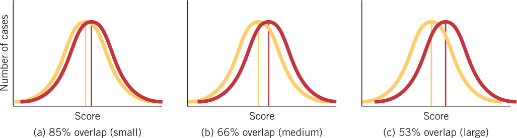
FIGURE 15.3 Effect sizes in three typical distributions of scores The effect sizes shown in graphs (a), (b), and (c) depict the overlap between males and females on three hypothetical dimensions and are typical of most gender differences. The distribution shown in yellow on each graph represents one gender, and the distribution shown in red represents the other gender. On many attributes, differences in average performance are statistically significant but very small, and the overlap between the scores for girls and boys is considerable. Note also the considerable variation on each graph within each gender, as revealed by the bell-shaped curves.