16c Formatting print and digital texts
Contents:
Using white space (negative space)
Using color
Choosing type sizes and fonts
Using margin and line spacing
Using headings
With so many options available, you should always spend some time thinking about appropriate formatting for elements of your text. Although the following guidelines often apply, remember that print documents, Web pages, slide shows, videos, and so on all have their own formatting conventions. (To learn more about formatting requirements for academic research projects in MLA style, see 32b; in APA style, see 33b; in Chicago style, see 34b; in CSE style, see 35a.)
 Using white space (negative space)
The parts of a page or screen left intentionally blank are called white space or negative space, and they emphasize content and direct readers’ eyes. Too little white space makes a page look crowded, while too much can make it seem empty or unfinished. Think about the amount of white space at the page level (top and side margins), paragraph level (the space between paragraphs), and sentence level (the space between sentences). Within the page, you can also use white space around particular content, such as an image, an embedded video, or a list, to make it “pop” or stand out.
Using color
As you design your documents, keep in mind that some colors can evoke powerful responses, so take care that the colors you use match the message you are sending. Color can enliven texts that are mainly alphabetic, but using color poorly can also make a text seem less readable and inviting.
- Use color to draw attention to elements you want to emphasize: headings, text boxes, or graphs, for example.
- Be consistent in your use of color; use the same color for all of your subheads, for example, or the same background color for all of your PowerPoint slides.
- Keep the color palette fairly small for most projects; too many colors can create a jumbled or confused look.
- Choose color combinations that are easy to read. Ask a few peers or colleagues whether your text is legible against the background before presenting, submitting, or posting your work for a wider audience.
- Make sure all color visuals and text are legible in the format where they will be read. Colors can be sharper on a computer monitor than in a print document, and slides may look dramatically different when you project them.
Choosing type sizes and fonts
For words in the body of a traditional report, essay, or Web posting, an 11- or 12-point type size is conventional. (A 12-point type size is larger than an 11-point type size of the same font, but type size in different fonts can vary considerably, so aim for a size that seems neither unreadably small nor surprisingly large.)
Choose a readable font, either a serif font (used in this sentence) or a sans serif font (used in headings on this page). Although unusual fonts might seem attractive at first glance, readers may find such styles distracting and hard to read over long stretches of material. Remember that fonts help you create the tone of a document, so consider your audience and purpose when selecting type.
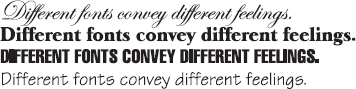
Most important, be consistent in the size and style of typeface you use, especially for the main part of your text. Unless you are striving for some special effect, shifting sizes and fonts within a document can give an appearance of disorderliness. But purposeful use of special fonts can signal imagination, humor, and even spontaneity. One student who wanted to go into graphic design created a new font and then animated it in a three-minute video that really captured her audience’s attention.
Using margin and line spacing
For traditional print projects, you will probably use a single column of text with standard one-inch margins for your writing, but many other kinds of projects call for text columns of variable widths or for multiple columns. Both very short and very long text lines can be difficult to read. Online readers generally prefer short, manageable chunks of text rather than long paragraphs; consider breaking up a long online piece with headings or visuals.
Computers allow you to decide whether or not you want left and right margins justified, or squared off—as they are on typical book pages (including this one). Readers will often expect you to justify the left margin, except in posters and other texts where you are trying to achieve a distinctive visual effect. However, most readers—and many instructors—prefer the right margin to be “ragged,” or unjustified, as it is in the Wikipedia entry in 16b.
For college writing assignments that are submitted in print, you will usually use double-spaced type with the first line of each paragraph indented one-half inch. Letters, memorandums, and online texts are usually single-spaced and may use spaces between paragraphs instead of paragraph indentation. Check the conventions of the genre, or ask about your instructor’s preference.
Using headings
For brief essays and reports, you may need no headings at all. For longer texts, however, headings call attention to the organization and thus help readers understand. Headings can help break long Web texts into the short, manageable chunks that online readers expect. Some kinds of reports require conventional headings (such as Abstract and Summary), which writers must provide; see 33e for an example.
You can distinguish headings by type size and font as well as by color, as this book does—for example, by using capital letters, boldface type, italics, and so on. Position each level of heading consistently throughout the text. And remember that headings need to appear above the text they introduce; be careful, for example, not to put a heading at the bottom of a printed page.
For formal academic work, look for the most succinct and informative way to word headings. In general, state a topic in a single word, usually a noun (Toxicity); in a phrase, usually a noun phrase (Levels of Toxicity) or a gerund phrase (Measuring Toxicity); in a question that will be answered in the text (How Can Toxicity Be Measured?); or in an imperative that tells readers what steps to take (Measure the Toxicity). Informal texts might use more playful headings. For both informal and formal texts, use the same structure consistently for all headings of the same level.
For Multilingual Writers: Reading patterns
Considering Disabilities: Color for contrast