Types of Presentation Aids
A variety of presentation aids are at your disposal. Base your choices on which aid will most effectively convey the information visually (or aurally, or both). Here we move from least to most high-tech. (See Chapter 22 for a discussion on using presentation software.)
Props and Models
A prop can be any object, inanimate or live. Sometimes, the prop is the subject of the speech, as when a student brings a snake to class for a speech about snakes. (See the checklist on using props effectively.) A model is a three-dimensional, scale-size representation of an object. Presentations in engineering, architecture, medicine, the visual arts, and many other disciplines often make use of models. When using a prop or model:
- In most cases, keep the prop or model hidden until you are ready to use it.
- Make sure it is big enough for everyone to see (and read, if applicable).
- Practice your speech using the prop or model.
Pictures
Pictures are two-dimensional representations and include photographs, line drawings, diagrams, maps, and posters of people, places, ideas, or objects.
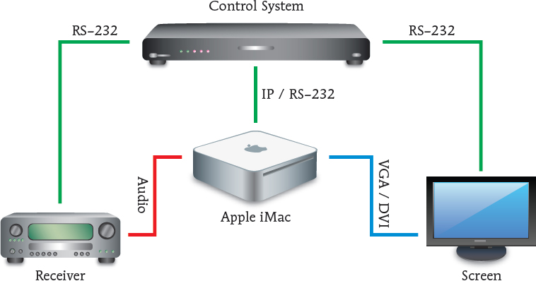
A diagram or schematic drawing explains how something works or how it is constructed or operated, and is well suited to clarifying precise procedures and operations. Figure 20.1 is a diagram that shows how to connect a computer and other elements of a home media center.
Maps help audience members visualize geographic areas and understand various relationships among them: They also illustrate the proportion of one thing to something else in different areas.
A poster is a large, bold, two-dimensional design incorporating words, shapes, and (if desired) color, placed on an opaque backing. Because posters are economical and easy to use, they are a good choice for speakers who give the same presentation many times. They are the mainstay in one form of presentation called the poster session (see Chapter 30).
Graphs and Charts
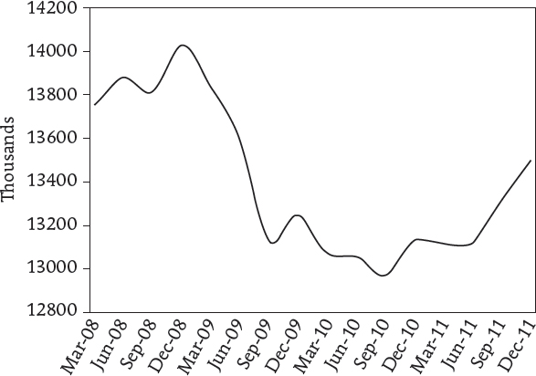
A graph represents relationships among two or more things. Four types of graphs are line graphs, bar graphs, pie graphs, and pictograms. A line graph uses points connected by lines to demonstrate how something changes or fluctuates in value. For example, Figure 20.2 represents fluctuations in the South African employment rate for the years 2008–2011. Line graphs are the most versatile and extensively used family of graphs6 because they are easier to read at a glance than more complicated tables and charts of data.
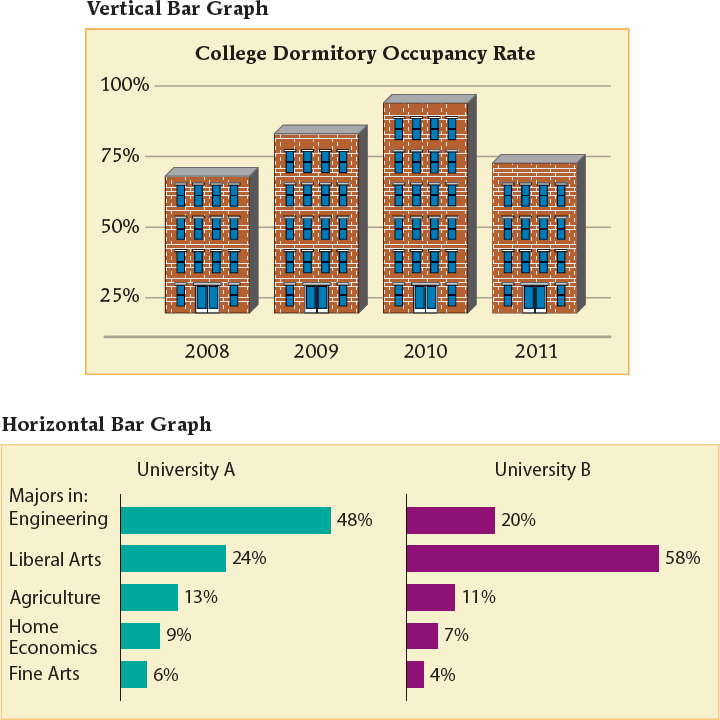
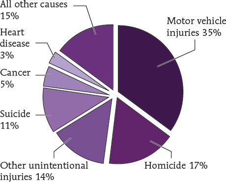
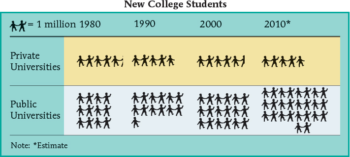
A bar graph uses bars of varying lengths to compare quantities or magnitudes. Bars may be arranged either vertically (column graphs) or horizontally (true bar graphs). Multidimensional bar graphs—bar graphs distinguished by different colors or markings—compare two or more different kinds of information or quantities in one chart (see Figure 20.3). A pie graph depicts the division of a whole with portions or segments called slices. Each slice constitutes a percentage of the whole (see Figure 20.4). A pictogram uses picture symbols (icons) to illustrate relationships and trends. Figure 20.5 is a pictogram that demonstrates an increase in the number of college students.
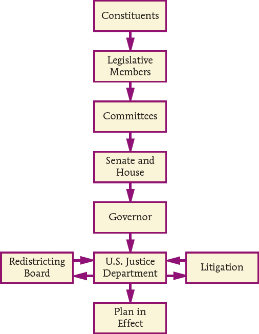
A chart visually organizes complex information into compact form. Several different types of charts are helpful for speakers. A flowchart is a diagram that shows step-by-step progression through a procedure, a relationship, or a process. A flowchart is the visual aid of choice to show a sequence of activities or the directional flow in a process (see Figure 20.6).
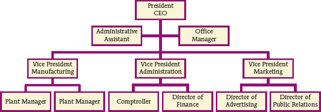
An organizational chart illustrates the organizational structure or chain of command in an organization. It shows the interrelationship of the different positions, divisions, departments, and personnel (see Figure 20.7). A table (tabular chart) systematically arranges data in column form, allowing viewers to examine and make comparisons about information quickly. Table 20.1 below, for example, summarizes the best uses of different types of graphs and charts.
Audio, Video, and Multimedia
Introducing an audio clip—a short recording of sounds, music, or speech—can enliven certain presentations. Similarly, video—including clips from movies, television, and other recording sources—can serve to motivate attention by helping to introduce, transition into, and clarify points in a speech.7 Because audio and video clips can be linked to PowerPoint slides, are easily stored on personal digital devices, and are transportable to a variety of playback devices, both are generally a safe choice as presentation aids. (See the checklist below for incorporating tips on various media into your presentation.)
Multimedia combines several media (stills, sound, video, text, and data) into a single production. This rich variety of information cues can potentially boost audience attention, comprehension, and retention.8 But multimedia does require more planning and time commitment than other forms of presentation aids. To produce multimedia, you need to become familiar with presentation software programs such as Windows Movie Maker and Apple iMovie (see Chapter 22).
TIPS FOR CREATING EFFECTIVE PICTOGRAMS
- ______ 1. When creating pictograms, choose pictures that symbolize the subject being represented to a broad spectrum of viewers.
- ______ 2. To avoid confusing the eye, make all pictograms the same size.
- ______ 3. Clearly label what the pictogram symbolizes.
- ______ 4. Clearly label the axes of the pictogram graph.
TABLE 20.1 Best Use of Different Types of Graphs and Charts
| Best Use | Type of Graph or Chart |
| Line graph | To represent trends or information that changes over time |
| Bar and column graph | To compare magnitude or volume among categories |
| Pie graph | To show proportions of the total |
| Pictogram | To depict comparisons in picture form |
| Flowchart | To diagram processes |
| Organizational chart | To show lines and direction of reporting in a hierarchy |
| Table | To summarize information or data in an easily viewable form |
TIPS FOR CREATING EFFECTIVE LINE, BAR, AND PIE GRAPHS
- ______ 1. Label both axes of the line or bar graph appropriately.
- ______ 2. Start the numerical axis of the line or bar graph at zero.
- ______ 3. Compare only like variables.
- ______ 4. Put no more than two lines of data on one graph.
- ______ 5. Assign a clear title to the graph.
- ______ 6. Clearly label all relevant points of information in the graph.
- ______ 7. When creating multidimensional bar graphs, do not compare more than three kinds of information.
- ______ 8. When creating a pie graph, restrict the number of pie slices to seven.
- ______ 9. When creating a pie graph, identify the value or percentage of each pie slice, and check that each slice of the pie accurately represents the value or percentage (e.g., use half of the pie to show 50 percent).
- ______ 10. When creating a pie graph, consider using color or background markings to distinguish the different slices of the pie.
TIPS ON INCORPORATING AUDIO AND VIDEO INTO YOUR PRESENTATION
- ______
 Use the audio or video clip in a manner consistent with copyright.
- ______ Cue the audio or video clip to the appropriate segment before the presentation.
- ______ Alert audience members to what they will be hearing or viewing before you play it back.
- ______ Reiterate the relevance of the audio or video clip to your key points once it is over.