| TABLE 12.2 Variations on the Basic Bar Graph |
|
|
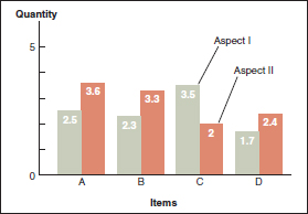
Grouped bar graph. The grouped bar graph lets you compare two or three aspects for each item. Grouped bar graphs would be useful, for example, for showing the numbers of full-time and part-time students at several universities. One bar could represent full-time students; the other, part-time students. To distinguish between the bars, use hatching (striping), shading, or color, and either label one set of bars or provide a key. |
|
|
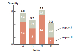
Subdivided bar graph. In the subdivided bar graph, Aspect I and Aspect II are stacked like wooden blocks placed on top of each. Although totals are easy to compare in a subdivided bar graph, individual quantities are not. |
|
|
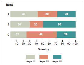
100-percent bar graph. The 100-percent bar graph, which shows the relative proportions of the aspects that make up several items, is useful in portraying, for example, the proportion of full-scholarship, partial-scholarship, and no-scholarship students at a number of colleges. |
|
|
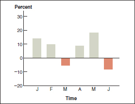
Deviation bar graph. The deviation bar graph shows how various quantities deviate from a norm. Deviation bar graphs are often used when the information contains both positive and negative values, such as profits and losses. Bars on the positive side of the norm line (above it) represent profits; bars on the negative side (below it), losses. |
|
|
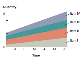
Stratum graph. The stratum graph, also called an area graph, shows the change in quantities of several items over time. Although stratum graphs are used frequently in business and scientific fields, general readers sometimes have trouble understanding how to read them. |