
The title slide shows the title of the presentation and the name and affiliation of each speaker. You might also want to include the date of the presentation.

The next slide presents an overview, which outlines the presentation. The arrow identifies the point the speaker is addressing.
At the bottom of each slide in the body of the presentation is a footer with the date, the title of the presentation, and the number of the slide. The slide number gives audience members a way to refer to the slide when they ask questions.
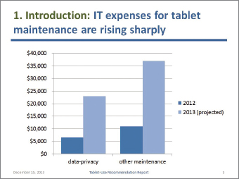
This slide uses a simple bar graph created in PowerPoint. Don’t try to present a lot of information on a single slide.
The title of this slide uses the numbering system introduced in the previous slide. This cue helps the audience understand the structure of the presentation. Following the colon is an independent clause that presents the claim that will be supported in the slide.

If the images in your presentation are your own intellectual property or are clip art that comes with the software, you can legally display them anywhere. If they are not, you need to cite their sources and obtain written permission. You have three choices for placing the source statements: at the bottom of the appropriate slides, in a sources slide that you show at the end of the presentation, or on a paper handout that you distribute at the end of the presentation.
Mobile Clinical Assistant: Courtesy of Panasonic Corporation.

For second and subsequent slides within the same section of the presentation, use the “continued” abbreviation shown here. Notice that the speakers use one color for the generic term (“Introduction”) and a different color for the claim.
Photo: kurhan/Shutterstock.

This slide is identical to Slide 2, except that the arrow has moved. Use this organizing slide to help your audience remember the overall organization of your presentation. Don’t overdo it; if you presented this organizing slide just a few slides ago, don’t use it again until you make the transition to the next major unit in the presentation.
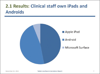
A pie chart is a logical choice for representing a small number of components (usually, seven or fewer) that add up to 100 percent.
Note that the speakers use conservative blues for all their graphics on the slide set. You don’t need a rainbow full of colors. You need just enough difference so that the audience can distinguish between the different slices.

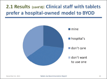
Slides work best if the text is brief. The speaker will explain that here are the responses to the statement “I consider myself an expert user of my tablet.”


This slide was made using SmartArt graphics, which are part of PowerPoint. SmartArt graphics help you show logical relationships. Here, the relationship is that the hospital-supplied model is “heavier”—that is, has more to recommend it—than the BYOD model.
The speakers added the checkmark to emphasize that the hospital-supplied model is preferable to the BYOD model.
If the images you show are not your own intellectual property, you can legally display them in a college classroom because they are covered by the fair-use provisions of U.S. copyright law. However, if you display them in a business presentation, you would need formal written permission from the copyright holders. See Ch. 2, pp. 24–26, for more information.
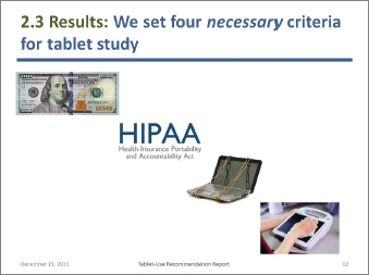
Money: Bureau of Engraving and Printing. Chains on laptop: Elnur/Shutterstock. Mobile Clinical Assistant: Courtesy of Panasonic Corporation.
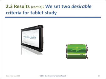
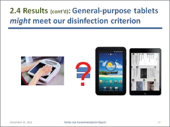
The speakers used the “appear” animation to display first the picture of the tablet and then the picture of the battery. This feature lets the speakers display on the screen only what they are discussing so that the audience is not distracted by other images.
TMT-1830-10 MEDICAL TABLET PC: Courtesy Teguar Corporation. Battery: oxanaart/Shutterstock.
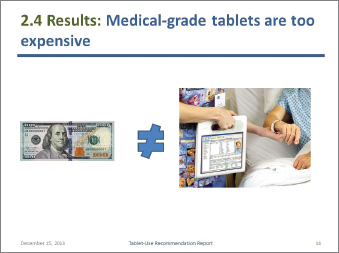
Money: Bureau of Engraving and Printing. Photo of Motion C5: Courtesy Motion Computing.
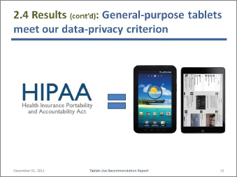
HootSuite App for iPod: Courtesy of HootSuite. Verizon Wireless Samsung Galaxy Tab: PRNewsFoto/Verizon Wireless.
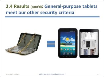
Chains on laptop: Elnur/Shutterstock. HootSuite App for iPad: Courtesy of HootSuite. Verizon Wireless Samsung Galaxy Tab: PRNewsFoto/Verizon Wireless.
The formatting that appears throughout the slide set—the background color, the horizontal rule, and the footer—is created in the Slide-Master view. This formatting appears in every slide unless you modify or delete it for that slide.
Note that the speakers use color—sparingly—for emphasis.
Mobile Clinical Assistant: Courtesy of Panasonic Corporation. HootSuite App for iPad: Courtesy of HootSuite. Verizon Wireless Samsung Galaxy tab: PRNewsFoto/Verizon Wireless.
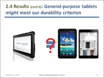
TMT-1830-10 MEDICAL TABLET PC: Courtesy Teguar Corporation. HootSuite App for iPad: Courtesy of HootSuite. Verizon Wireless Samsung Galaxy tab: PRNewsFoto/Verizon Wireless.
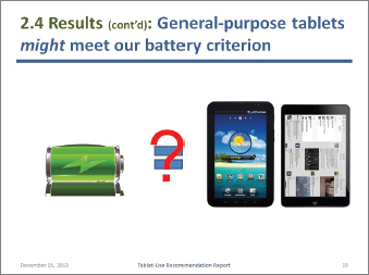
Battery: oxanaart/Shutterstock. HootSuite App for iPad: Courtesy of HootSuite. Verizon Wireless Samsung Galaxy Tab: PRNewsFoto/Verizon Wireless.


As discussed in Ch. 18, conclusions are inferences you draw from results.
Photo: kurhan/Shutterstock.

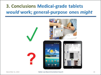
Photo of Motion C5: Courtesy Motion Computing. HootSuite App for iPad: Courtesy of HootSuite. Verizon Wireless Samsung Galaxy Tab: PRNewsFoto/Verizon Wireless.

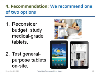
FIGURE 21.4 Sample PowerPoint Presentation
As discussed in Ch. 19, recommendations are statements about what you think should be done next.
Some speakers like to make a final slide with the word “Questions?” on it to signal the end of the presentation. You can also display contact information (such as your email address) to encourage audience members to get in touch with you.
Photo of Motion C5: Courtesy Motion Computing. HootSuite App for iPad: Courtesy of HootSuite. Verizon Wireless Samsung Galaxy Tab: PRNewsFoto/Verizon Wireless.