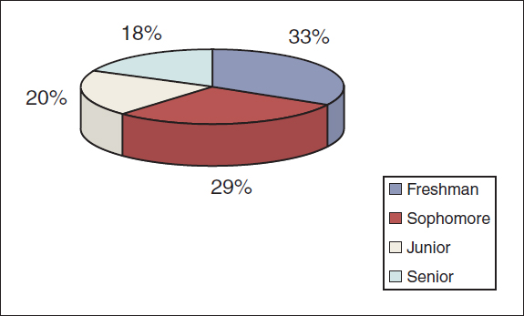
In this three-dimensional pie chart about the percentages of a college’s student body, by year, the sophomore slice looks bigger than the freshman slice, even though it isn’t, because it appears closer to the reader. To communicate clearly, make pie charts two-dimensional.