Designing Print Documents
Printed Page 259
Designing Print Documents
Before you design the individual pages of a printed document, design the overall document. Decide whether you are creating a document that looks like a book, with content on both sides of the page, or a document that looks like a report, with content on only one side of the page. Decide whether to use paper of standard size (8.5 × 11 inches) or another size, choose a grade of paper, and decide how you will bind the pages together. Decide about the accessing elements you will include, such as a table of contents, index, and tabs. You want the different elements to work together to accomplish your objectives, and you want to stay within your budget for producing and (perhaps) shipping. That is, in designing the whole document, consider these four elements: size, paper, bindings, and accessing aids.
Size refers to two aspects of print-document design: page size and page count.
- Page size. Think about the best page size for your information and about how the document will be used. For a procedures manual that will sit on a shelf most of the time, three-hole 8.5 × 11-inch paper is a good choice. For a software tutorial that must fit easily on a desk while the reader works at the keyboard, consider a 5.5 × 8.5-inch size. Paper comes precut in a number of sizes, including 4.5 × 6 inches and 6 × 9 inches. Although paper can be cut to any size, nonstandard sizes are more expensive.
- Page count. Because paper is expensive and heavy, you want as few pages as possible, especially if you are printing and mailing many copies. And there is a psychological factor, too: people don’t want to spend a lot of time reading technical documents. Therefore, if you can design a document so that it is 15 pages long rather than 30—but still attractive and easy to read—your readers will appreciate it.
Paper is made not only in different standard sizes but also in different weights and with different coatings. Heavier paper costs more than lighter paper but provides better resolution for text and graphics. Coated paper is stronger and more durable than non-coated paper and provides the best resolution, but some coatings can produce a glare. To deal with this problem, designers often choose paper with a slight tint.
Work closely with printing professionals. They know, for example, about UV-coated paper, which greatly reduces fading, and about recycled paper, which is continually improving in quality and decreasing in price.
Although the pages of a very short document can be attached with a paper clip or a staple, longer documents require more-sophisticated binding techniques. Table 11.1 illustrates and describes the four types of bindings commonly used in technical communication.
| TABLE 11.1 Common Types of Binding | |||
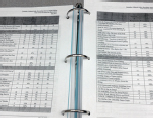
Image Credit: © 2014 Macmillan. Photo by Regina Tavani.
|
Loose-leaf binders. Loose-leaf binders are convenient when pages must be added and removed frequently. A high-quality binder can cost as much as several dollars. | ||
Image Credit: © 2014 Macmillan. Photo by Regina Tavani.
|
Ring or spiral binders. The wire or plastic coils or combs that hold the pages together enable you to open the document flat on a desk or even fold it over so that it takes up the space of only one page. Print shops can bind documents of almost any size in plastic coils or combs for about a dollar each. | ||
Image Credit: © 2014 Macmillan. Photo by Regina Tavani.
|
Saddle binding. The document is opened to its middle pages, and large staples are inserted from the outside. Saddle binding is impractical for large documents. | ||
Image Credit: © 2014 Macmillan. Photo by Regina Tavani.
|
Perfect binding. Pages are glued together along the spine edge, and a cover is attached. Perfect binding, used in book publishing, produces the most formal appearance, but it is relatively fragile, and the open document usually does not lie flat. | ||
In a well-designed document, readers can easily find the information they seek. Most accessing aids use the design principles of repetition and contrast to help readers navigate the document. Table 11.2 explains six common kinds of accessing aids.
| TABLE 11.2 Typical Accessing Aids | |||
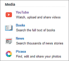
Source: Google, 2013: http://www.google.com/intl/en/about/products.
|
Icons. Icons are pictures that symbolize actions or ideas. Perhaps the most important icon is the stop sign, which alerts you to a warning. Icons depend on repetition: every time you see the warning icon, you know what kind of information the writer is presenting. Don’t be too clever in thinking up icons. One computer manual uses a cocktail glass about to fall over to symbolize “tip.” This is a bad idea, because the pun is not functional: when you think of a cocktail glass, you don’t think of a tip for using computers. Don’t use too many different icons, or your readers will forget what each one represents. |
||
|
Read more about using color in Ch. 12. 
Here green is used to emphasize the titles of the sections, the box at the top left, and the bar along the edge of the page.
Source: Excerpt from MEDIA & CULTURE: MASS COMMUNICATION IN A DIGITAL AGE, Ninth Edition (Boston: Bedford/St. Martin’s, 2014). Richard Campbell, Christopher R. Martin, Bettina Fabos, p. 113.
|
Color. Perhaps the strongest visual attribute is color (Keyes, 1993). Use color to draw attention to important features of the document, such as warnings, hints, major headings, and section tabs. But use it sparingly, or it will overpower everything else in the document. Color exploits the principles of repetition (every item in a particular color is logically linked) and contrast (items in one color contrast with items in another color). Use color logically. Third-level headings should not be in color, for example, if first- and second-level headings are printed in black. Using paper of a different color for each section of a document is another way to simplify access. |
||
Image Credit: © 2014 Macmillan. Photo by Regina Tavani.
|
Dividers and tabs. You are already familiar with dividers and tabs from loose-leaf notebooks. A tab provides a place for a label, which enables readers to identify and flip to a particular section. Sometimes dividers and tabs are color-coded. Tabs work according to the design principle of contrast: the tabs literally stick out. | ||
|
Read . . To learn to … Ch. 1 connect to the router Ch. 2 set up a firewall |
Cross-reference tables. These tables, which exploit the principle of alignment, refer readers to related discussions. | ||
Source: General Services Administration, 2013.
|
Headers and footers. Headers and footers help readers see where they are in the document. In a book, for example, the headers on the left-hand pages might repeat the chapter number and title; those on the right-hand pages might contain the most recent first-level heading. Sometimes writers build other identifying information into the headers. For example, your instructor might ask you to identify your assignments with a header like the following: “Smith, Progress Report, English 302, page 6.” Headers and footers work according to the principle of repetition: readers learn where to look on the page to see where they are in the document. | ||
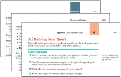
Source: Excerpt from THE BEDFORD GUIDE FOR COLLEGE WRITERS, Tenth Edition (Boston: Bedford/St. Martin’s, 2014). X. J. Kennedy, Dorothy M. Kennedy, and Marcia F. Murth, pp. 11i, 703, A-21.
|
Page numbering. For one-sided documents, use Arabic numerals in the upper right corner, although the first page of most documents does not have a number on it. For two-sided documents, put the page numbers near the outside margins. Complex documents often use two number sequences: lowercase Roman numerals (i, ii, and so on) for front matter and Arabic numerals for the body. There is no number on the title page, but the page following it is ii. Appendixes are often paginated with a letter and number combination: Appendix A begins with page A-1, followed by A-2, and so on; Appendix B starts with page B-1. Sometimes documents list the total number of pages in the document (so recipients can be sure they have all of them). The second page is “2 of 17,” and the third page is “3 of 17.” Documents that will be updated are sometimes numbered by section: Section 3 begins with page 3-1, followed by 3-2; Section 4 begins with 4-1. This way, a complete revision of one section does not affect the page numbering of subsequent sections. |
||