A Look at Three Technical Documents
Printed Page 12-15
A Look at Three Technical Documents
Figures 1.1, 1.2, and 1.3 present excerpts from technical documents. Together, they illustrate a number of the ideas about technical communication discussed in this chapter.
This screen from a video produced by the Department of Energy is intended to educate the general public about the basics of solar energy. Because it includes narration, still images, video, and animation, creating it required the efforts of many professionals.
The video is meant to be easy to share on social media.
The video takes advantage of our cultural assumptions about color: red suggests heat, blue suggests cold.
The video was designed to accommodate people with disabilities: the viewer can listen to the narration or turn on the subtitles.
The video includes a text-only version that provides a complete transcript of the narration and describes the images.
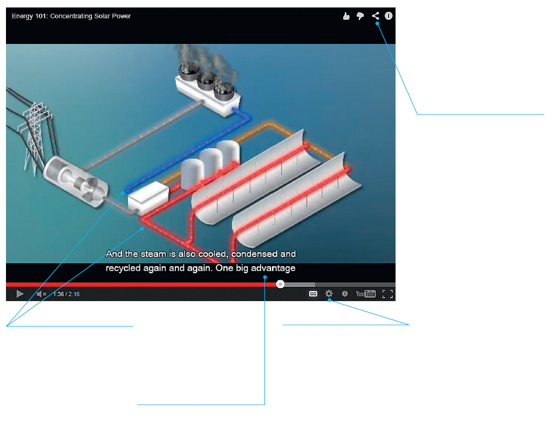
Figure 1.1 A Video That Educates the Public About A Technical Subject
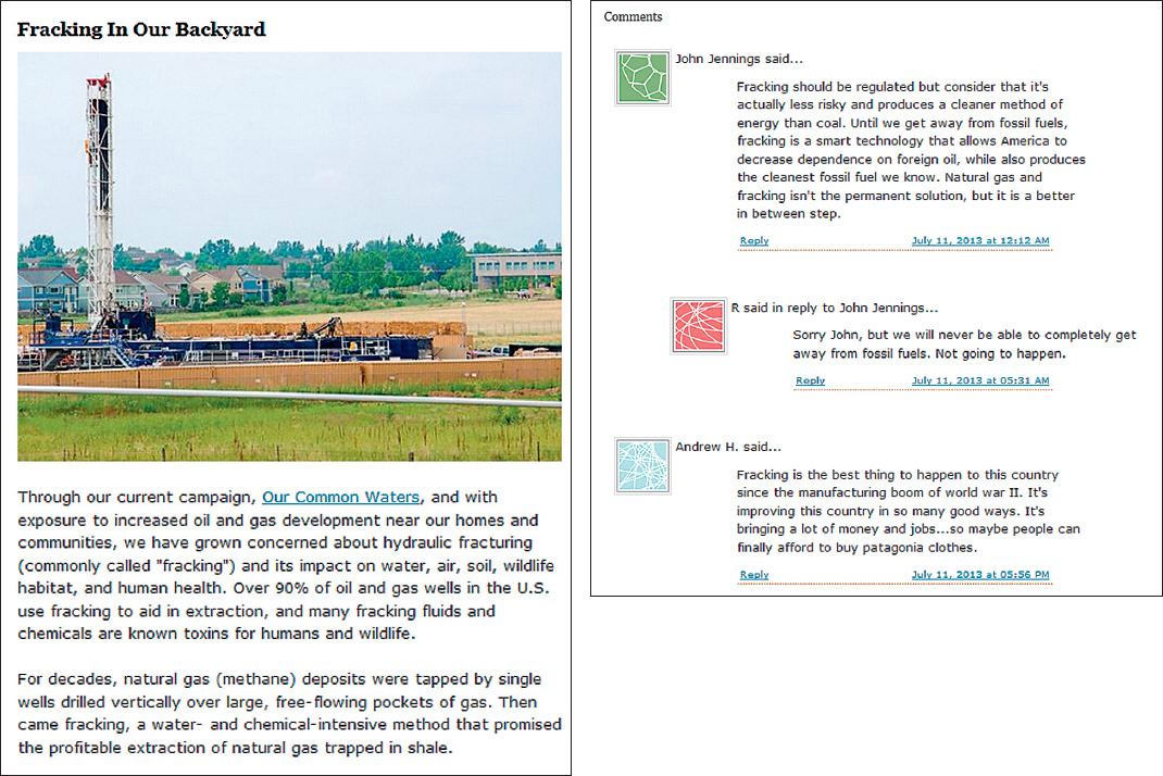
Patagonia, the manufacturer of outdoor clothing, hosts a blog called The Cleanest Line. In one recent post, “Fracking In Our Backyard,” the company sought to educate its readers about the controversy surrounding hydraulic fracturing. The post included links to many online sources about the controversy and presented the company’s perspective: “Because of fracking’s wide-ranging risks and impacts, we support each community’s right to educate itself and regulate and/or ban fracking, and we support local, state and federal government efforts to monitor and regulate fracking.”
The post generated many comments, of which the first three are presented here. Notice that the third comment ends with a swipe at the company. Blogs are a popular way for organizations to interact with their stakeholders, and even though blog posts routinely elicit negative comments, most organizations believe that the occasionally embarrassing or critical comment is a reasonable price to pay for the opportunity to generate honest discussions about issues—and thereby learn what is on the minds of their stakeholders.
Figure 1.2 A Corporate Blog Post Presenting a Public-Policy Viewpoint
Source: Patagonia, 2013: http://www.thecleanestline.com/2013/07/fracking-in-our-backyard.html#more. Reprinted by permission of The Cleanest Line.