Elements of Design
Readable fonts; informative headings; bulleted or numbered lists; and appropriate use of color, white space, and visuals like photographs, charts, and diagrams all help readers learn from your compositions.
Choose readable fonts.
Typography is a design term for the letters and symbols that make up the print on a page or a screen. You are already using important aspects of typography when you use capital letters, italics, boldface, or different sizes of type to signal a new sentence, identify the title of a book, or distinguish a heading from body text.
Word processing programs enable you to use dozens of different fonts, or typefaces; bold and italic versions of these fonts; and a range of font sizes. Fortunately, you can rely on some simple design principles to make good typographic choices for your compositions.
741
Perhaps the most important advice for working with typography is to choose fonts that are easy to read. Some fonts are meant for decorative or otherwise very minimal use, and are hard to read in extended passages. Font style, font size, and combinations of style and size are features that can add to or detract from readability.
Considering Font Style For most academic and business writing, you will probably want to choose a traditional font that is easy to read, such as ![]() or
or ![]() . Texts that will be read on paper may be easier to read if composed in a serif font like
. Texts that will be read on paper may be easier to read if composed in a serif font like ![]() or
or ![]() . (A serif is the little line projecting from the ends of letters.) Texts that will be read on screen may be easier to read if composed in sans serif fonts like
. (A serif is the little line projecting from the ends of letters.) Texts that will be read on screen may be easier to read if composed in sans serif fonts like ![]() and
and ![]() .
.
Sentences and paragraphs printed in fonts that imitate ![]() (typically called script fonts) or those that mimic
(typically called script fonts) or those that mimic ![]() are not only difficult to read but also too informal for most academic and business purposes.
are not only difficult to read but also too informal for most academic and business purposes.
Considering Font Size To ensure that your documents can be read easily, you also need to choose an appropriate font size (traditionally measured in units called points). For most types of academic writing, a 12-
Combining Font Styles and Sizes Although technology now makes hundreds of font styles and sizes available to writers, you should avoid confusing readers with too many different fonts in one composition. Limit the number of fonts to one or two that complement each other well. A common practice, for instance, is to choose one font for all titles and headings (such as Arial, 14-
Use headings to organize your writing.
Titles and headings are often distinguished from body text by boldface, italics, or font size. Headings are helpful in calling attention to certain parts or sections of a piece of writing and in offering readers visual cues to its overall organization. Always check with your instructor about the conventions for using (or not using) these elements in the particular discipline you are studying.
Distinguishing between Headings and Subheadings Typically, headings for major sections (level-
742
LEVEL-
Level-
Level-
For more on selecting appropriate headings and subheadings, see Chapter 13.
Notice that the level-
Positioning Headings Consistently In addition to keeping track of the font size and style of headings, you need to position headings in the same way throughout a piece of writing. You will want to consider the spacing above and below headings and determine whether the headings should be aligned with the left margin, indented a fixed amount of space, or centered. In this book, headings like the one that begins this paragraph — Positioning Headings Consistently— are aligned with the left margin and followed by a fixed amount of space.
Using Type Size to Differentiate Headings from Text In documents that do not need to observe MLA or APA style, which have specific rules about formatting, you may wish to use font size to help make headings visually distinct from the body of the text. If you do so, avoid making the headings too large. To accompany 12-
Use lists to highlight steps or key points.
Lists are often an effective way to present information in a logical and visually coherent way. Use a numbered list (1, 2, 3) to present the steps in a process or to list items that readers will need to refer to easily (for instance, see the sample e-
Use colors with care.
Color printers, photocopiers, and online technology facilitate the use of color, but color does not necessarily make text easier to read. In most academic print documents, the only color you should use is black. Though color is typically used more freely in academic writing produced in other media (for example, Web pages or multimodal presentations), it should still be used in moderation and always with the aim of increasing your readers’ understanding of what you have to say. Always consider, too, whether your readers might be color-
743
Although the slideshow design in Figure 32.1 is visually interesting and the heading is readable, the bulleted text is very hard to read because there is too little contrast between the text color and the background color.
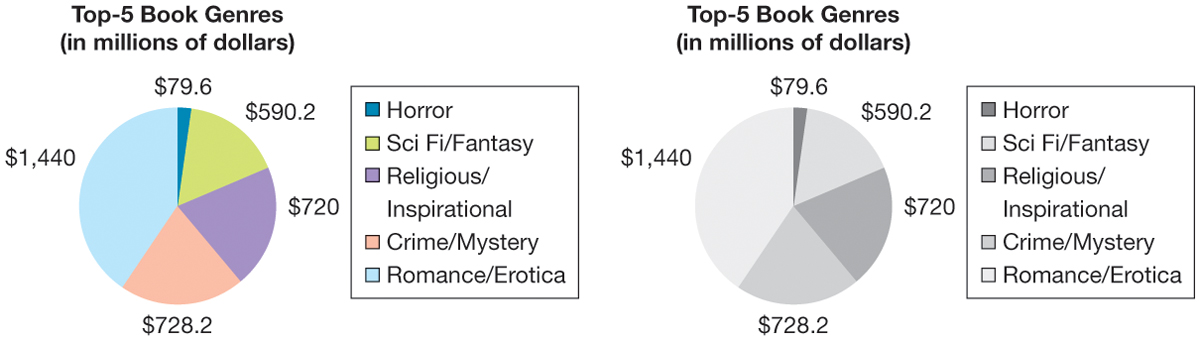
In Figure 32.2, it is clear that the person who created the pie chart carefully chose the colors to represent the different data. What the person did not consider, however, is how the colors would look when printed out on a black-
744
Also consider the meanings associated with different colors. For example, in the United States and other Western cultures, white is typically associated with goodness and purity; in China, however, white represents grief and mourning. Although your use of color in a report, blog, or multimodal presentation might not carry such deep meaning, bear in mind that most people have emotional or psychological responses to colors and color combinations.
Use white space to make text readable.
Another basic element of document design, white space, is the open, or blank, space surrounding the text. White space is usually used between a heading and the paragraph that follows the heading. You also use white space when you set the margins on the page, and even when you double-
Chunking Chunking, the breaking up of text into smaller units, also facilitates reading. Paragraphing is a form of chunking that divides text into units of closely related information. In most academic essays and reports, text is double-
In single-
Margins Adequate margins are an important component of readability, especially in printed documents. If the margins are too small, your page will seem cluttered. For academic essays, use one-