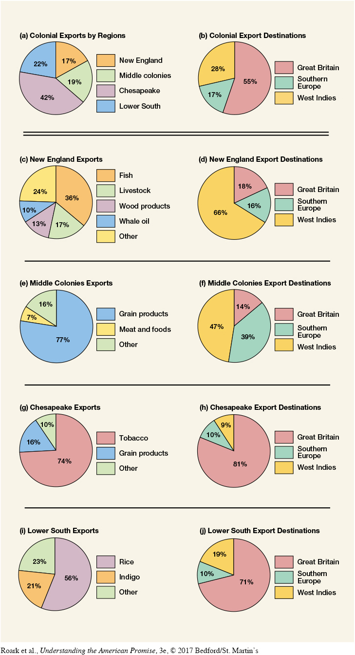
Figure 5.1 Colonial Exports, 1768–1772 These pie charts provide an overview of the colonial export economy in the 1760s. The first two show that almost two-thirds of colonial exports came from the South and that the majority of the colonies’ exports went to Great Britain. The remaining charts illustrate the distinctive patterns of exports in each colonial region. What do these patterns reveal about regional variations in Britain’s North American colonies? What do they suggest about Britain’s economic interest in the colonies?