Visual fallacies.
Visual fallacies. Fallacies can also take the form of misleading images. The sheer power of images can make them especially difficult to analyze—people tend to believe what they see. Nevertheless, photographs and other visuals can be manipulated to present a false impression.
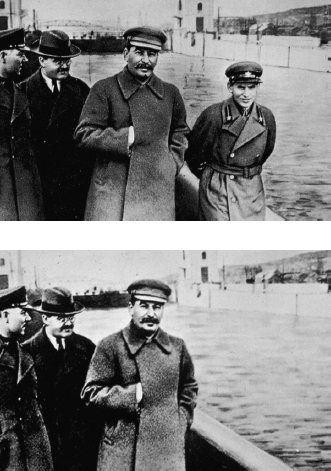
misleading photographs. Faked or altered photos have existed since the invention of photography. On the following page, for example, is a photograph of Joseph Stalin, the Soviet Union’s leader from 1929 to 1953, with his commissar Nikolai Yezhov. Stalin and the commissar had a political disagreement that resulted in Yezhov’s execution in 1940. The second image shows the same photo after Stalin had it doctored to rewrite history.
Today’s technology makes such photo alterations easier than ever. But photographs need not be altered to try to fool viewers. Think of all the photos that make a politician look misleadingly bad or good. In these cases, you should closely examine the motives of those responsible for publishing the images.
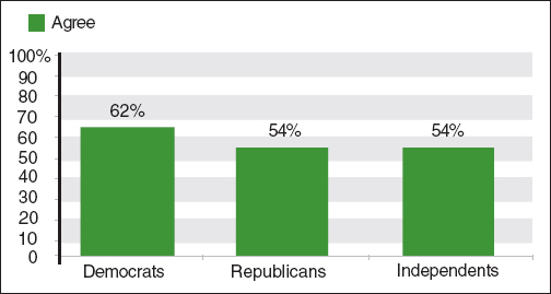
misleading charts and graphs. Facts and statistics, too, can be presented in ways that mislead readers. For example, the following bar graph purports to deliver an argument about how differently Democrats, on the one hand, and Republicans and Independents, on the other, felt about an issue.
Data Presented Misleadingly
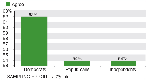
Look closely and you’ll see a visual fallacy: the vertical axis starts not at zero but at 53 percent, so the apparently large difference between the groups is misleading. In fact, a majority of all respondents agree about the issue, and only eight percentage points separate Democrats from Republicans and Independents (in a poll with a margin of error of +/− seven percentage points). Here’s how the graph would look if the vertical axis began at zero:
Data Presented More Accurately