4.1 Consumer Surplus and the Demand Curve
The market in used textbooks is a big business in terms of dollars and cents—
So let’s begin by looking at the market for used textbooks, starting with the buyers. The key point, as we’ll see in a minute, is that the demand curve is derived from buyers’ tastes or preferences—
Willingness to Pay and the Demand Curve
An individual consumer’s willingness to pay for a good is the maximum price at which he or she would buy that good.
A used book is not as good as a new book—
The table in Figure 4-1 shows five potential buyers of a used book that costs $100 new, listed in order of their willingness to pay. At one extreme is Aleisha, who will buy a second-
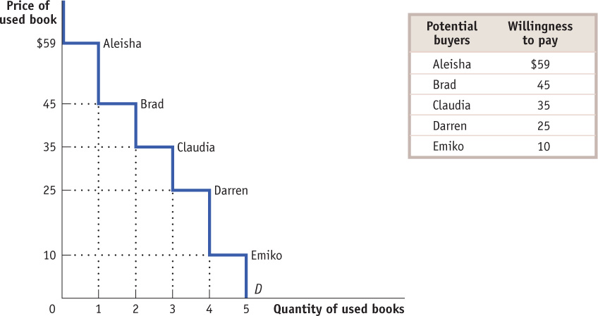
How many of these five students will actually buy a used book? It depends on the price. If the price of a used book is $55, only Aleisha will buy one; if the price is $40, both Aleisha and Brad will buy used books, and so on. So the information in the table can be used to construct the demand schedule for used textbooks.
As we saw in Chapter 3, we can use this demand schedule to derive the market demand curve shown in Figure 4-1. Because we are considering only a small number of consumers, this curve doesn’t look like the smooth demand curves of Chapter 3, where markets contained hundreds or thousands of consumers. Instead, this demand curve is step-
Willingness to Pay and Consumer Surplus
Suppose that the campus bookstore makes used textbooks available at a price of $30. In that case Aleisha, Brad, and Claudia will buy used books. Do they gain from their purchases, and if so, how much?
The answer, shown in Table 4-1, is that each student who purchases a used book does achieve a net gain but that the amount of the gain differs among students.

Aleisha would have been willing to pay $59, so her net gain is $59 – $30 = $29. Brad would have been willing to pay $45, so his net gain is $45 – $30 = $15. Claudia would have been willing to pay $35, so her net gain is $35 – $30 = $5. Darren and Emiko, however, wouldn’t be willing to buy a used book at a price of $30, so they would neither gain nor lose.
Individual consumer surplus is the net gain to an individual buyer from the purchase of a good. It is equal to the difference between the buyer’s willingness to pay and the price paid.
The net gain that a buyer achieves from the purchase of a good is called that buyer’s individual consumer surplus. What we learn from this example is that whenever a buyer pays a price less than his or her willingness to pay, the buyer achieves some individual consumer surplus.
Total consumer surplus is the sum of the individual consumer surpluses of all the buyers of a good in a market.
The sum of the individual consumer surpluses achieved by all the buyers of a good is known as the total consumer surplus achieved in the market. In Table 4-1, the total consumer surplus is the sum of the individual consumer surpluses achieved by Aleisha, Brad, and Claudia: $29 + $15 + $5 = $49.
The term consumer surplus is often used to refer both to individual and to total consumer surplus.
Economists use the term consumer surplus to refer to both individual and total consumer surplus. We will follow this practice; it will always be clear in context whether we are referring to the consumer surplus achieved by an individual or by all buyers.
Total consumer surplus can be represented graphically. Figure 4-2 reproduces the demand curve from Figure 4-1. Each step in that demand curve is one used book wide and represents one consumer. For example, the height of Aleisha’s step is $59, her willingness to pay. This step forms the top of a rectangle, with $30—the price she actually pays for a used book—
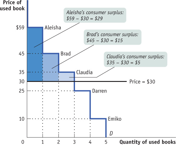
In addition to Aleisha, Brad and Claudia will also each buy a used book when the price is $30. Like Aleisha, they will benefit from their purchases, though not as much, because they each have a lower willingness to pay. Figure 4-2 also shows the consumer surplus gained by Brad and Claudia; again, this can be measured by the areas of the appropriate rectangles. Darren and Emiko, because they do not buy used books at a price of $30, receive no consumer surplus.
The total consumer surplus achieved in this market is the sum of the individual consumer surpluses received by Aleisha, Brad, and Claudia. So total consumer surplus is equal to the combined area of the three rectangles—
Figure 4-2 illustrates the following general principle: The total consumer surplus generated by purchases of a good at a given price is equal to the area below the demand curve but above that price. The same principle applies regardless of the number of consumers.
When we consider large markets, this graphical representation of consumer surplus becomes extremely helpful. Consider, for example, the sales of tablet computers to millions of potential buyers. Each potential buyer has a maximum price that he or she is willing to pay. With so many potential buyers, the demand curve will be smooth, like the one shown in Figure 4-3.
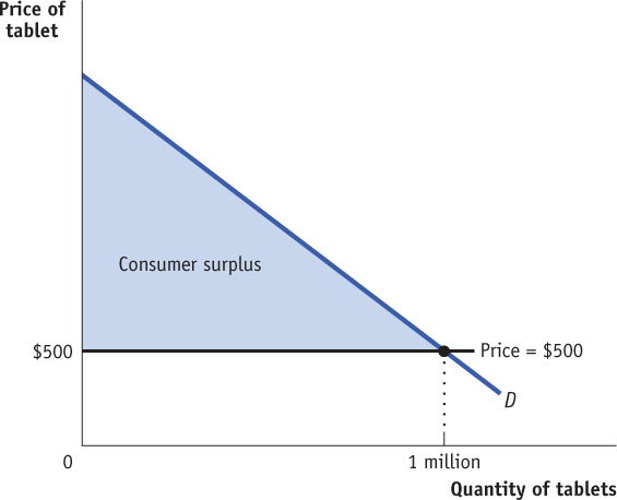
All other things equal, a shift in the demand curve will lead to a change in the consumer surplus. For example, an increase in the demand for tablets increases the consumer surplus for any given price level, as the maximum willingness to pay rises. In the graph, as the demand curve shifts right, the shaded area gets larger.
Suppose that at a price of $500, a total of 1 million tablets are purchased. How much do consumers gain from being able to buy those 1 million tablets? We could answer that question by calculating the individual consumer surplus of each buyer and then adding these numbers up to arrive at a total. But it is much easier just to look at Figure 4-3 and use the fact that total consumer surplus is equal to the shaded area. As in our original example, consumer surplus is equal to the area below the demand curve but above the price. (You can refresh your memory on how to calculate the area of a right triangle by reviewing Appendix 2A.)
How Changing Prices Affect Consumer Surplus
It is often important to know how much consumer surplus changes when the price changes. For example, we may want to know how much consumers are hurt if a flood in Pakistan drives up cotton prices or how much consumers gain if the introduction of fish farming makes salmon steaks less expensive. The same approach we have used to derive consumer surplus can be used to answer questions about how changes in prices affect consumers.
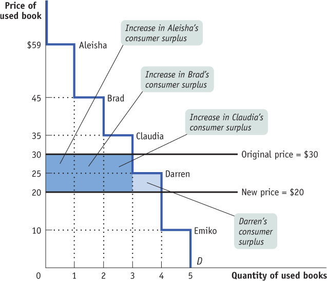
Let’s return to the example of the market for used textbooks. Suppose that the bookstore decided to sell used textbooks for $20 instead of $30. How much would this fall in price increase consumer surplus?
The answer is illustrated in Figure 4-4. As shown in the figure, there are two parts to the increase in consumer surplus. The first part, shaded dark blue, is the gain of those who would have bought used books even at the higher price of $30. Each of the students who would have bought used books at $30—Aleisha, Brad, and Claudia—now pays $10 less, and therefore each gains $10 in consumer surplus from the fall in price to $20. So the dark blue area represents the $10 × 3 = $30 increase in consumer surplus to those three buyers.
A MATTER OF LIFE AND DEATH
In 2011, while slightly more than 2100 organ transplants were performed in Canada, 265 people died while waiting for a transplant and almost 4600 Canadians were wait-listed. Of those waiting for an organ transplant, about three-quarters are waiting for a kidney transplant. Since the number of those in need of an organ far exceeds availability, what is the best way to allocate available organs? A market isn’t feasible. For understandable reasons, the sale of human body parts is illegal in this country. In the case of the sickest individuals needing a kidney, Canadian transplant hospitals have set up a national wait-list that gives these patients priority. For other organs, and patients needing a kidney who are not extremely ill, there is no single national wait-list. Each province is free to set its own mechanism to allocate donated organs. But a national, coordinated system (excluding Quebec) for handling the donation and transplant-ation of organs (and tissues) is being developed by Canadian Blood Services.
Under current kidney transplant guidelines, if a donated kidney does not go to a critically ill patient who will die in days without this organ, it goes to the person who has been waiting the longest. This is very similar to what happens in the United States, where the kidney allocation protocol has been devised by the non-profit group United Network for Organ Sharing (UNOS). According to this system, an available kidney would go to a 75-year-old who has been waiting for 2 years instead of to a 25-year-old who has been waiting 6 months, even though the 25-year-old will likely live longer and benefit from the transplanted organ for a longer period of time.
To address this issue, UNOS is devising a new set of guidelines based on a concept it calls “net benefit.” According to these new guidelines, kidneys would be allocated on the basis of who will receive the greatest net benefit, where net benefit is measured as the expected increase in lifespan from the transplant. And age is by far the biggest predictor of how long someone will live after a transplant. For example, a typical 25-year-old diabetic will gain an extra 8.7 years of life from a transplant, but a typical 55-year-old diabetic will gain only 3.6 extra years.
Under the current UNOS system, based on waiting times, transplants lead to about 44 000 extra years of life for recipients; under the new system, that number would jump to 55 000 extra years. The share of kidneys going to those in their 20s would triple; the share going to those 60 and older would be halved.
What does this have to do with consumer surplus? As you may have guessed, the UNOS concept of “net benefit” is a lot like individual consumer surplus—the individual consumer surplus generated from getting a new kidney. In essence, UNOS has devised a system that allocates donated kidneys according to who gets the greatest individual consumer surplus. In terms of results, then, its proposed “net benefit” system operates a lot like a competitive market.1
The second part, shaded light blue, is the gain to those who would not have bought a used book at $30 but are willing to pay more than $20. In this case that gain goes to Darren, who would not have bought a used book at $30 but will buy one at $20. He gains $5—the difference between his willingness to pay of $25 and the new price of $20. So the light blue area represents a further $5 gain in consumer surplus.
The total increase in consumer surplus is the sum of the shaded areas, $35. Likewise, a rise in price from $20 to $30 would decrease consumer surplus by an amount equal to the sum of the shaded areas.
Figure 4-4 illustrates that when the price of a good falls, the area under the demand curve but above the price—which we have seen is equal to total consumer surplus—increases. Figure 4-5 shows the same result for the case of a smooth demand curve, the demand for tablets. Here we assume that the price of tablets falls from $2000 to $500, leading to an increase in the quantity demanded from 200 000 to 1 million units.
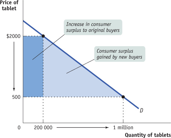
As in the used-textbook example, we divide the gain in consumer surplus into two parts. The dark blue rectangle in Figure 4-5 corresponds to the dark blue area in Figure 4-4: it is the gain to the 200 000 people who would have bought tablets even at the higher price of $2000. As a result of the price reduction, each receives additional surplus of $1500. The light blue triangle in Figure 4-5 corresponds to the light blue area in Figure 4-4: it is the gain to people who would not have bought the good at the higher price but are willing to do so at a price of $500. For example, the light blue triangle includes the gain to someone who would have been willing to pay $1000 for a tablet and therefore gains $500 in consumer surplus when it is possible to buy a tablet for only $500.
As before, the total gain in consumer surplus is the sum of the shaded areas: the increase in the area under the demand curve but above the price. The consumer surplus of the original buyers increases by $300 million. The new lower price encourages new consumers to buy a tablet, and these new consumers gain $600 million of new consumer surplus. The total gain in consumer surplus is $900 million.
What would happen if the price of a good were to rise instead of fall? We would do the same analysis in reverse. Suppose, for example, that for some reason the price of tablets rises from $500 to $2000. This would lead to a fall in consumer surplus, equal to the sum of the shaded areas in Figure 4-5. This loss consists of two parts. The dark blue rectangle represents the loss to consumers who would still buy a tablet, even at a price of $2000. The light blue triangle represents the loss to consumers who would decide not to buy a tablet at the higher price.
WHEN MONEY ISN’T ENOUGH
The key insight we get from the concept of consumer surplus is that purchases yield a net benefit to the consumer because the consumer typically pays a price less than his or her willingness to pay for the good. Another way to say this is that the right to buy a good at the going price is a valuable thing in itself.
Most of the time we don’t think about the value associated with the right to buy a good. In a market economy, we take it for granted that we can buy whatever we want, as long as we are willing to pay the market price.
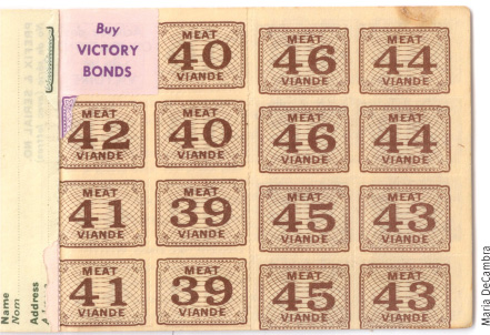
But that hasn’t always been true. For example, during World War II the demands of wartime production created shortages of consumer goods when these goods were sold at pre-war prices. Rather than allow prices to rise, government officials in many countries created a system of rationing. To buy sugar, meat, coffee, gasoline, and many other goods, you not only had to pay cash; you also had to present stamps or coupons from books issued to each family by the government. These pieces of paper, which represented the right to buy goods at the government-regulated price, quickly became valuable commodities in themselves.
As a result, illegal markets in meat stamps and gasoline coupons sprang into existence. Moreover, criminals began stealing coupons and even counterfeiting stamps.
The funny thing was that even if you had bought a gasoline coupon on the illegal market, you still had to pay to purchase gasoline. So what you were buying on the illegal market was not the good but the right to buy the good at the government-regulated price. That is, people who bought ration coupons on the illegal market were paying for the right to get some consumer surplus.

Quick Review
The demand curve for a good is determined by each potential consumer’s willingness to pay.
Individual consumer surplus is the net gain an individual consumer gets from buying a good.
The total consumer surplus in a given market is equal to the area below the market demand curve but above the price.
All other things equal, a fall in the price of a good increases consumer surplus through two channels: a gain to consumers who would have bought at the original price and a gain to consumers who are persuaded by the lower price to buy. A rise in the price of a good reduces consumer surplus in a similar fashion.
Check Your Understanding 4-1
CHECK YOUR UNDERSTANDING 4-1
Question 4.1
Consider the market for cheese-stuffed jalapeno peppers. There are two consumers, Casey and Josey, and their willingness to pay for each pepper is given in the accompanying table. (Neither is willing to consume more than 4 peppers at any price.) Use the table (i) to construct the demand schedule for peppers for prices of $0.00, $0.10, and so on, up to $0.90, and (ii) to calculate the total consumer surplus when the price of a pepper is $0.40.
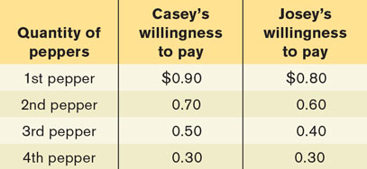
A consumer buys each pepper if the price is less than (or just equal to) the consumer’s willingness to pay for that pepper. The demand schedule is constructed by asking how many peppers will be demanded at any given price. The accompanying table illustrates the demand schedule.
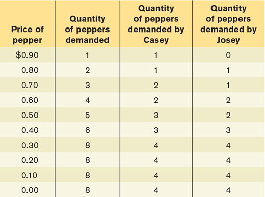
When the price is $0.40, Casey’s consumer surplus from the first pepper is $0.50, from his second pepper $0.30, from his third pepper $0.10, and he does not buy any more peppers. Casey’s individual consumer surplus is therefore $0.90. Josey’s consumer surplus from her first pepper is $0.40, from her second pepper $0.20, from her third pepper $0.00 (since the price is exactly equal to her willingness to pay, she buys the third pepper but receives no consumer surplus from it), and she does not buy any more peppers. Josey’s individual consumer surplus is therefore $0.60. Total consumer surplus at a price of $0.40 is therefore $0.90 + $0.60 = $1.50.