Understanding Design Principles
Your biggest challenge in thinking about how to design a document is that, more than ever, readers control how the document appears. Although you can still write a memo, print it on a piece of 8.5 × 11-inch paper, and stick it in an interoffice envelope, that model of print-only communication is becoming increasingly rare. Most of the time, readers encounter your document online. Even if you produced it with a word processor, designed it to fit on a piece of 8.5 × 11-inch paper, and saved it as a PDF to preserve the design, your readers can still zoom in or out, altering what appears on their screen.
For documents that are intended to be viewed online, readers can control many aspects of the design, including color and the size, shape, and location of objects on the screen. Perhaps the most significant variable that you have to consider is screen size. Some devices on which your readers will use your document will be as large as big-screen TVs, whereas others will be as small as wrist watches.
In this chapter, the term print document will be used to refer to documents that are designed to be printed on paper, such as letters, memos, and reports, regardless of whether readers hold pieces of paper in their hands or view the documents online. The term online document will be used to refer to documents that are designed to be used online, such as websites, apps, and other software programs.
Because there are so many different types of print and online documents used in so many different environments by so many different people for so many different purposes, it is impossible to provide detailed advice about “how to design” a technical document. Still, there are some powerful and durable principles that can help you design any kind of print or online document. The following discussion is based on Robin Williams’s The Non-designer’s Design Book (2008), which describes four principles of design: proximity, alignment, repetition, and contrast.
PROXIMITY
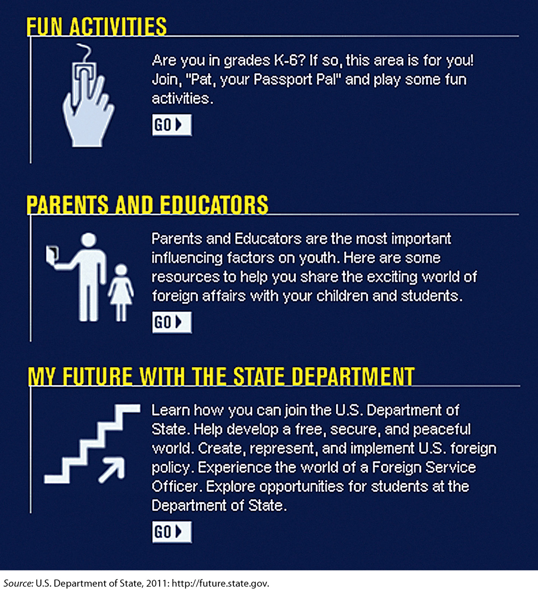
The principle of proximity is simple: if two items appear close to each other, the reader will interpret them as related to each other. If they are far apart, the reader will interpret them as unrelated. Text describing a graphic should be positioned close to the graphic, as shown in Figure 7.1.

Text and graphics are clearly related by the principle of proximity. The textual descriptions are placed next to the drawings to which they refer.
ALIGNMENT
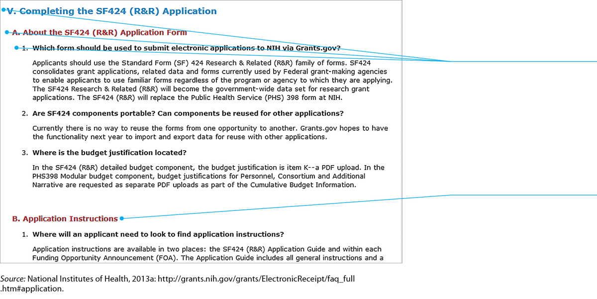
The principle of alignment says that you should consciously line up text and graphics along a real or imaginary vertical axis so that the reader can understand the relationships among elements. Figure 7.2 shows how alignment works to help organize information.

This panel from an FAQ section of a website uses alignment to help organize the information.
The writer is using three levels of importance, each signaled by a different alignment.
Writers often use more than one technique at a time to help organize information. In this case, text size and color also indicate levels of importance.
Watch a tutorial on proofreading. <WL> Proofreading for Format Consistency.
REPETITION
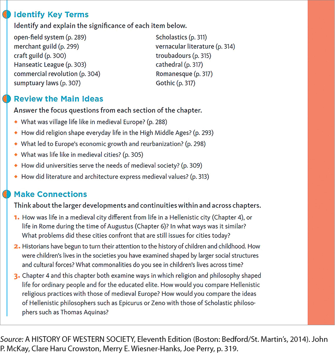
The principle of repetition says that you should format the same kind of information in the same way so that readers can recognize consistent patterns. For example, all first-level headings should have the same typeface, type size, spacing above and below, and so forth. This repetition signals a connection between headings, making the content easier to understand. Other elements that are used to create consistent visual patterns are colors, icons, rules, and screens. Figure 7.3 shows an effective use of repetition.

This page shows repetition used effectively as a design element.
Different colors, typefaces, and type sizes are used for the headings, instructions, and text.
The two lists make use of stylized bullets and oversize numbers, both in one of the two main colors.
CONTRAST
The principle of contrast says that the human eye is drawn to—and the brain interprets—differences in appearance between two items. For example, the principle of contrast explains why black print is easier to read against a white background than against a dark gray background; why 16-point type stands out more clearly against 8-point type than against 12-point type; and why information printed in a color, such as red, grabs readers’ attention when the information around it is printed in black. Figure 7.4 shows effective use of contrast.

Notice that you do not have to use a strikingly different color to show contrast. The human brain can easily tell the difference between the paler blue and the navy blue of the other boxes