Level Two: Observing the Characteristics of an Image
As you read a written text literally, you become aware of what it presents, what it means, and how it applies in other situations. Similarly, your close reading of an image includes observing its denotative or literal characteristics. At this stage, you focus on exactly what the image depicts—observing it objectively—rather than probing what it means or signifies.
Cast of Characters
Objects. Examine the condition, colors, sizes, functions, and positions of the objects included in the image. In Figure 14.2, for example, the main object outside is a luxurious black car, parked at the far right. Though little of the car is visible, its sleek design, wide tire, and position near the Batman figure mark it as the iconic Batmobile. In contrast, the objects inside the restaurant are mundane and predictable: a trash can, three potted plants, a narrow blue cash machine, tables and chairs, stainless steel food-service machines, a napkin dispenser, and stacks of empty cups.
Figures. Look closely at any figures (people, animals) in the image. Consider facial expressions, poses, hairstyles and colors, ages, sexes, ethnicity, possible education or occupation, apparent relationships, and so on.
Figure 14.2 shows a lone, seated man, framed by the window panel and silhouetted against the white floor-to-ceiling blinds. The man wears a black cape, a close-fitting, rubberized suit, a wide gold belt, gloves, and boots, an outfit that accentuates his muscled physique. A mask hides all but the lower part of his face. Like no other detail, the mask’s large, pointy ears identify the figure as the comic-book superhero Batman.
Story of the Image
Action. The action shown in an image suggests its “plot” or story, the events surrounding the moment it captures. Figure 14.2 shows Batman eating a quick dinner or late-night snack. It suggests his earlier actions driving to the place, parking outside, ordering his food, and taking a seat at a small corner table.
Background. The background in an image shows where and when the action takes place. In Figure 14.2, the background is a bagel and donut shop on a winter night. This eatery—well lit and ordinary—sharply contrasts with its only customer, the figure of Batman, who is dark and mysterious, both in costume and mission. Because he is usually engaged in dangerous and high-minded crime-fighting crusades, the background seems designed to surprise viewers, who might ask, “What is the Dark Knight doing in a place like this?” Beyond the physical details of the photograph’s background, fans will know that Batman is the secret disguise of the billionaire industrialist-playboy Bruce Wayne, a man traumatically orphaned who has vowed to devote his life to bringing criminals to justice. For anonymity, he does his crime-fighting and detective work clothed in the mystique and costume of Batman, a creature of the night. Throughout all his comic-book exploits, he is known for his intelligence, athleticism, command of technology, sense of justice—and damaged psyche.
Design and Arrangement
Selection of Elements. When you look at the design of an image, reflect on both the elements included and their organization.
What are the major colors and shapes? How are they arranged?
Does the image look balanced? Are light and dark areas symmetrical?
Does the image appear organized or chaotic?
Is one area darker (heavier) or brighter (lighter) than other areas?
What emotion, historical period, or memory does the image evoke?
In Figure 14.2, the shapes and colors are arranged so that the building’s interior looks like daytime—bright, safe, warm, and cozy—which accentuates the cold, dark, and dangerous night outside. The bright areas in the middle of the photograph are surrounded by shadowy spaces with Batman sitting on the edge between the two. In this way, the image balances light and dark. Batman has come in for a few moments, but the photo’s organization still connects him with the inhospitable world outside.
Relationship of Elements. Visual elements may be related to one another or to written text that appears with them. In Figure 14.2, for instance, the sign identifies a familiar, everyday location. However, the four big plate glass window panels, stretching across the front of the shop, suggest the way that drawings in a comic book march across a page, separated into neat rectangular frames. But here, no “thought balloon” emerges from Batman’s head, allowing viewers to share his thoughts and learn why he is out of context. The photograph is arranged to raise, not answer, the question of what Batman is doing here. It invites viewers to interpret what is happening, to insert their own thought balloons over Batman’s head. At the same time, it makes the point that we rarely know other people’s stories, thoughts, and interior lives. When we see strangers in public settings, they are essentially unknowable, as this figure is.
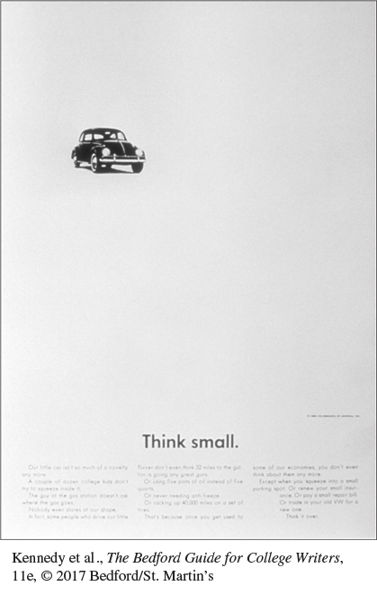
Use of Space. An image may be surrounded by “white space”—empty space without text or graphics—or it may be “busy,” filled with visual and written elements. Effective white space provides relief from a busy layout or directs the reader’s eye to key elements. The image in Figure 14.2 uses the white-tiled wall above the counter and the white blinds to set off the shadowy darkness. Figure 14.6 specifically uses empty white space to call attention to the Volkswagen’s small size. When this advertisement was produced back in 1959, many American cars were large and heavy. The VW, a German import, provided consumers with an alternative, and the advertising emphasized this contrast.
Artistic Choices
Whatever the form of an image, the person who composes it considers its artistic effect, function, and connection to related text.
Composition Decisions. Aesthetic or artistic choices may vary with the designer’s preferences and the characteristics of the medium. A photographer might use a close-up, medium, or wide-angle shot—and also determine the angle of the shot, the lighting, and the use of color. Compare Figures 14.2 and 14.5 to see how a close-up may leave out context but accent detail, such as Batman’s white cup. On the other hand, in the Volkswagen ad (Figure 14.6), the white space creates the effect of a long shot taken from below with a telephoto lens. We see the car as it might appear through the wrong end of a pair of binoculars. This vantage point shrinks the car so that the small vehicle looks even smaller.
For sample presentation visuals, see Learning from Other Writers: Visuals for Oral Presentations in Ch. 16 and Brochures and Presentation Visuals in Ch. 17. For sample tables and figures, see section B in the Quick Format Guide. For sample photographs, see the images opening Chs. 4-12 and 25-29.
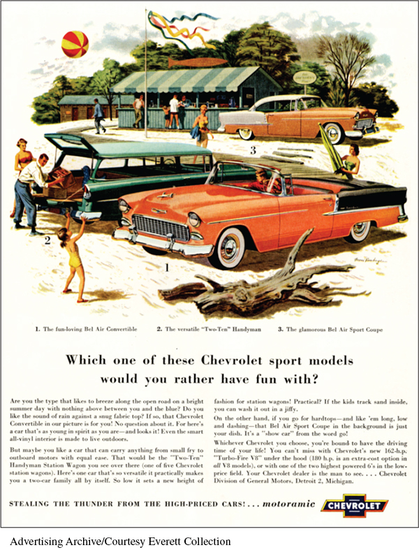
Function Decisions. An image that illustrates a point needs to serve the overall purpose of the document. In other words, form should follow function. Of the many illustrations available—photographs, drawings, charts, graphs, tables—certain types are especially suited to certain functions. For example, the 1955 Chevrolet ad, Figure 14.7, shows people having a good time enjoying a summer day near the shore. This illustration suggests that Chevrolet purchasers will enjoy life, a notion that undoubtedly suits the advertiser’s goals. Likewise, a pie chart effectively conveys parts of a whole, while a photograph captures the drama and intensity of the moment—a child’s rescue, a family’s grief, an earthquake’s toll. When you look at visuals in publications, consider how they function and why the writer might have chosen them.
Typeface Options. Many images, especially advertisements, combine image and text, using the typeface to set a mood and convey an impression. For example, Times New Roman is a common typeface, easy to read and somewhat conservative, whereas  is considered informal—almost playful—and looks handwritten. Any printed element in an image may be trendy or conservative, large or small, in relation to the image as a whole. Further, it may inform, evoke emotion, or decorate the page.
Look back at Figure 14.6, the 1959 Volkswagen ad. The words “Think small” are printed in a sans serif typeface, one “without serifs,” the small tails at the ends of the letters. This type is spare and unadorned, just like the VW itself. The ad also includes significant text across the bottom of the page. While this text is difficult to read in the reproduction in this book, it humorously points out the benefits of driving a small imported vehicle instead of one of the large, roomy cars common at the time.
In contrast to the VW ad campaign, the 1955 Chevrolet marketing strategy promoted big vehicles, as Figure 14.7 illustrates. Here the cars are shown in medium to close-up view to call attention to their length. Happy human figures in and beside the cars emphasize their size, and the cars are painted in bright colors, unlike the VW’s serviceable black. The primary text below the scene is large enough to be read in the reproduction here. It asks which sporty Chevy would be most fun for the reader—the Bel Air Convertible, the Handyman Station Wagon, or the stylish Sport Coupe. Then some “fine print”—difficult to read in the reproduction—notes other features of each car, such as its top, interior, and power.
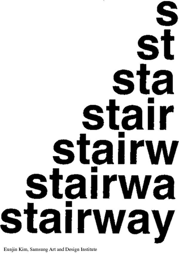
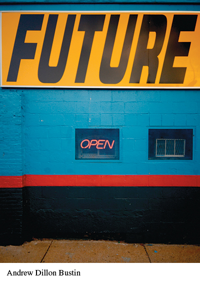
Other images besides ads use type to set a mood or convey feelings and ideas. Figure 14.8 is a design student’s response to an assignment that called for using letters to create an image. The simple typeface and stairlike arrangement help viewers “experience” the word stairway. Similarly, the plain, slanted type in Figure 14.9 suggests movement toward the future, reinforcing the message of the words.
VISUAL ANALYSIS CHECKLIST
Observing the Characteristics of an Image
What objects are included in the image?
What figures (people or animals) appear in the image?
What action takes place in the image? What is its “plot” or story?
What is in the background? In what place does the action take place?
What elements, colors, and shapes contribute to the design? How are they arranged or balanced? What feeling, memory, or association is evoked?
How are the pictorial elements related to one another? How are they related to any written material? What do these relationships tell you as a viewer?
Does the image include white space, fill its space, or seem busy?
What composition decisions has the designer or artist made? What type of shot, shot angle, lighting, or color is used?
What is the function of the image? How does form support function?
What typefaces are used? What impressions do they convey?
Learning by Doing Observing Characteristics
Learning by Doing Observing Characteristics
Working with a classmate or a small group, continue analyzing the image you selected for the activity Seeing the Big Picture. Examine a major characteristic—such as characters, story, design, or artistic choices—to determine exactly what it shows. Report or post your conclusions for your class or another group.