13.1 Introduction to the Pearson Correlation Coefficient
There are multiple statistical tests that measure relationships by calculating correlation coefficients. In subsequent chapters, we’ll cover the Spearman rank-order correlation coefficient and the chi-square test of independence. But, the focus of this chapter is the head of the relationship test household, the most commonly used relationship test, the Pearson correlation coefficient. Usually, it is referred to as the Pearson r, or simply r.
Here is what we’ll cover in the first part of the chapter as we introduce r:
Defining Pearson r and “relationship”
Exploring what a relationship says about cause and effect
Seeing how to visualize a relationship
Learning the difference between weak and strong relationships
Seeing how z scores define the Pearson r
Learning how the Pearson r quantifies relationship strength
Exploring the two directions a relationship can take
Learning about conditions that affect Pearson r
Defining Pearson r and Relationship
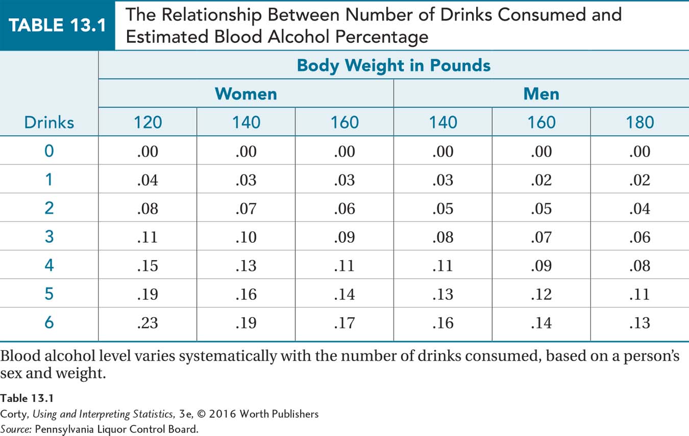
Measures of association are statistics that quantify the degree of relationship between two variables. If two variables are related, they are said to be correlated. This means that the variables vary together systematically, that a change in one variable is associated with a change in the other. For example, alcohol consumption and blood alcohol level vary together systematically—the more alcohol a person consumes, the higher the level of alcohol in his or her blood. Depending on sex and weight as shown in Table 13.1, the relationship between the number of drinks consumed and blood alcohol level is well established.
The Pearson r is a specific measure of association. A Pearson correlation coefficient quantifies the degree of linear relationship between two interval and/or ratio variables. Because the Pearson r uses interval and/or ratio variables, distances between points can be measured, z scores calculated, and graphs made. The graphs, called scatterplots, can be examined for the degree to which the relationship between the two variables takes the form of a straight line because the Pearson r measures the degree of linear relationship. (We’ll discuss nonlinear relationships, and why Pearson r is not appropriate to use in those cases, later in this chapter.)
A Common Question
Q If the Pearson r only measures association between two interval and/or ratio variables, what is used for ordinal and/or nominal variables?
A If one variable is ordinal and the other is an ordinal, interval, or ratio variable, then association can be measured with a test called the Spearman rank-order correlation coefficient, or Spearman r for short. Association between two nominal variables is measured with the chi-square test of independence. Both of these tests are covered in Chapter 15.
Correlation, Causation, and Association
If two variables correlate, the relationship may be a cause-and-effect relationship, but it doesn’t have to be. Statisticians love to say, “Correlation is not causation.” That’s because correlation between two variables does not guarantee a cause-and-effect relationship between them. A correlation between two variables only guarantees there is an association between the two variables, not that one causes the other.
To understand this, look at Figure 13.1. This type of graph, called a scatterplot, displays the relationship between two variables. For a random sample of 24 states, this graph shows the association between the number of community hospitals in a state (on the X-axis) and the number of deaths per year in the state (on the Y-axis). Each point represents a state. For example, Delaware, the state at the bottom left of the graph, has 6 community hospitals and about 7,000 deaths per year; New York, the state at the top right, has 206 community hospitals and about 153,000 deaths.
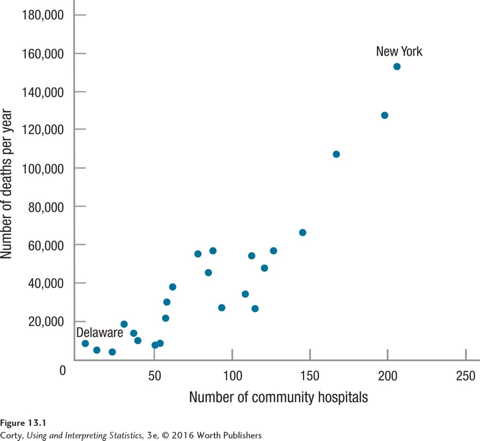
The scatterplot shows clear evidence of an association between the two variables. The two variables vary together systematically: states like Delaware, with few hospitals have few deaths, and states like New York, with a lot of hospitals, experience a lot of deaths.
The relationship can be read in either direction. So far, this relationship has been viewed as states with more hospitals have more deaths. But, the scatterplot can be viewed just as legitimately as showing that states with more deaths have more hospitals.
If two variables are correlated, it simply means that they vary together systematically. A cause-and-effect relationship may exist between them, but there does not have to be. The number of deaths in a state and the number of community hospitals are correlated, but it doesn’t seem plausible that there is a cause-and-effect relationship between them. If such a relationship did exist, then a state could reduce the number of people who die each year by closing down hospitals. That doesn’t seem to be a course of action likely to work.
The number of hospitals per state and the number of deaths vary together systematically, but they don’t cause each other. Their correlation most likely results because each is associated with a third variable, population. States with more people, like New York, have more of everything than states with fewer people, like Delaware. New York, with a population of almost 20 million, has more pencils, cars, barbers, and murders than Delaware, with under a million residents. New York also has more community hospitals and more deaths, simply because more people live there.
Correlation just means two variables systematically vary together. If the goal of science is to understand cause and effect, it may seem that drawing a conclusion that two variables are associated represents a second-place finish. Not so. Correlation does not have to mean causation, but it may mean causation. If there is a cause-and-effect relationship between two variables, then they are correlated. An association exists between how much alcohol a person consumes and what his or her blood alcohol level is because consuming alcohol causes the alcohol concentration in the blood to rise.
Correlation may not prove cause and effect, but it can suggest cause. For example, finding that children who watch more violent TV tend to exhibit more aggressive behaviors doesn’t prove that TV is the culprit, but it certainly raises such a question and leads to more research. Thus, correlations are not proof of cause and effect, but they often serve as a jumping off point for using experimental techniques to explore cause and effect.
Studies in which the variables in a relationship test are not manipulated by the researcher do not address cause and effect. In a relationship test, it is rare that the explanatory variable is an independent variable and the outcome variable is called a dependent variable. Most commonly, they are just called X and Y and that’s what we’ll do here. However, if the researcher believes there is an order to the relationship, then the explanatory variable is called the predictor variable and the outcome variable is called the outcome variable. The language is meant to be straightforward—the variable that comes first, that is thought of as leading to or influencing the other variable, is the predictor variable. The one that comes second, and is influenced by the first variable, is the outcome variable.
A Common Question
Q Can a correlation give cause-and-effect information?
A There is a difference between correlation, referring to the statistical test, and a correlational study. In the latter, the explanatory variable is not controlled by the experimenter, so a cause-and-effect conclusion cannot be reached. But, it would be possible to design a study where the experimenter manipulates the explanatory variable and where the results would be analyzed with a Pearson r. In such a case, a correlation coefficient would give cause-and-effect information.
Visualizing Relationships
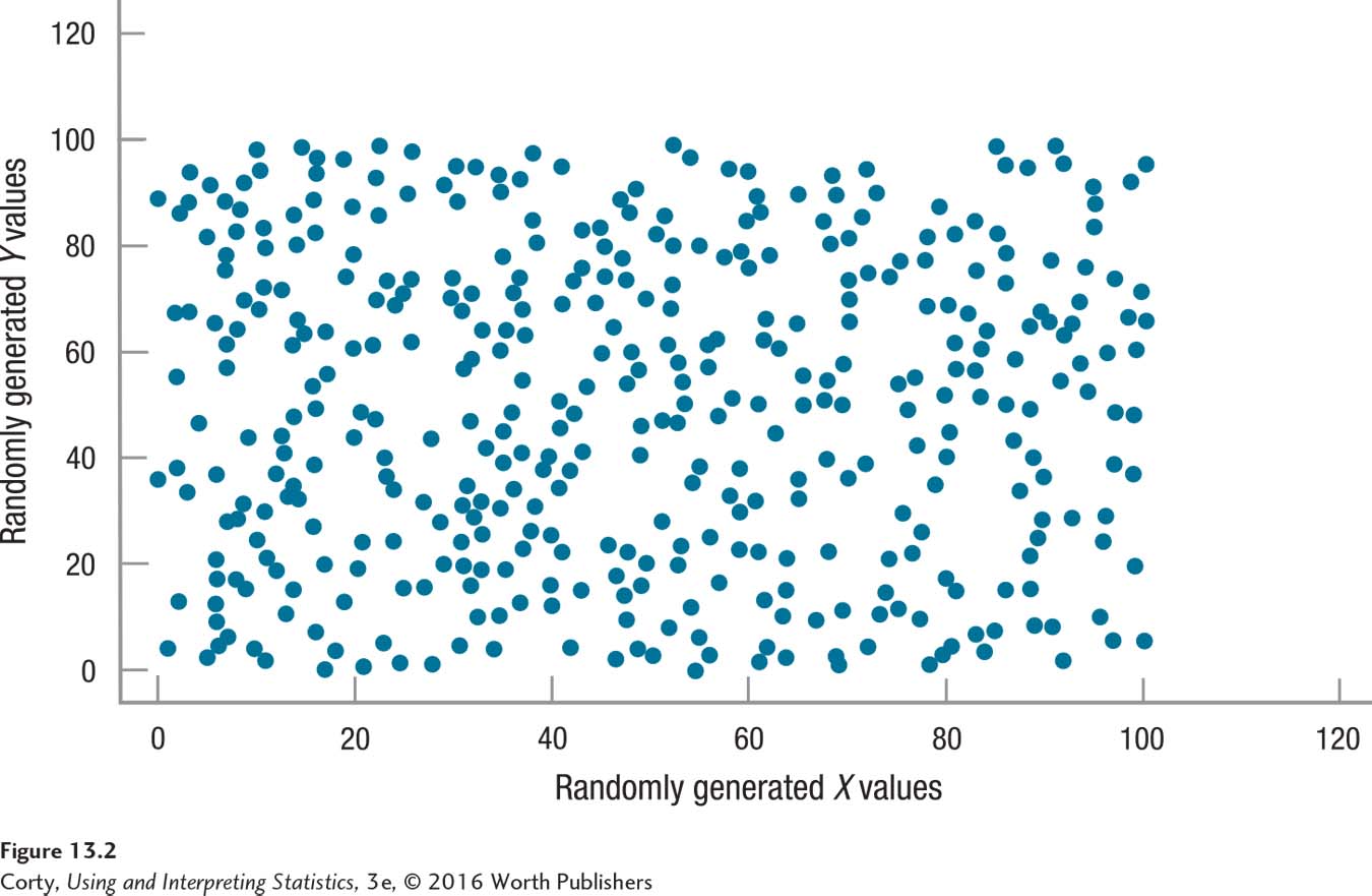
The degree to which two variables vary together determines whether the relationship is strong or weak. The strength of the relationship can be visualized in a scatterplot. Figure 13.2 shows the relationship between randomly generated numbers. If X values are randomly selected and each X is paired with a randomly selected Y, then the two do not vary together systematically. Figure 13.2 shows a rectangular scatterplot where there is no relationship, what is called a zero correlation, between two variables. Cases with low values on X could have low, medium, or high values on Y. And, the same is true for cases with medium or high values on X.
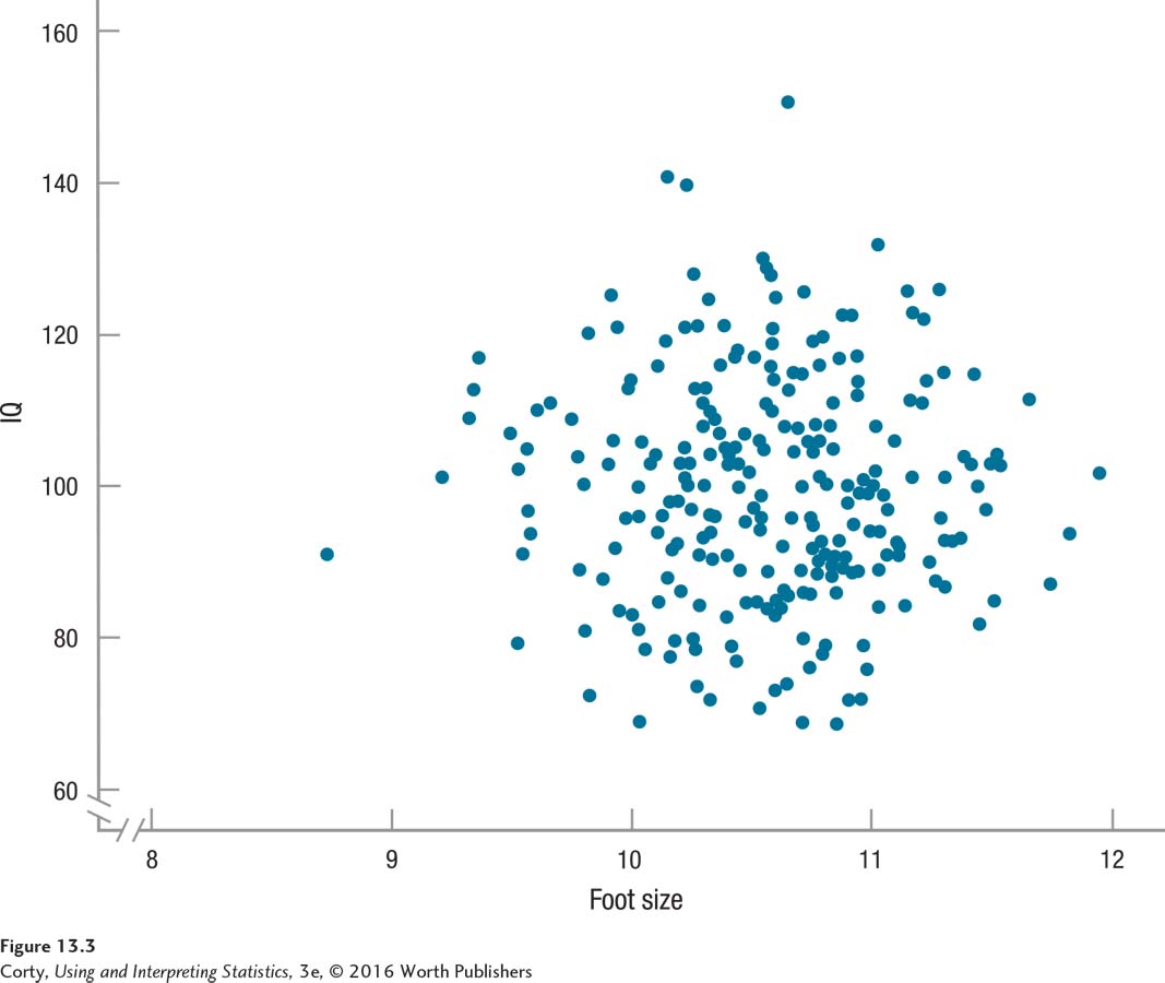
Though the rectangular scatterplot shows a zero correlation clearly, that is not how statisticians illustrate a zero correlation. Statisticians use a circular scatterplot to demonstrate no relationship between two variables. If both variables are normally distributed, which is one of the assumptions for the Pearson r, then the scatterplot has a circular shape when no relationship exists. Figure 13.3 uses the traditional circular shape to illustrate the lack of relationship between two normally distributed variables.
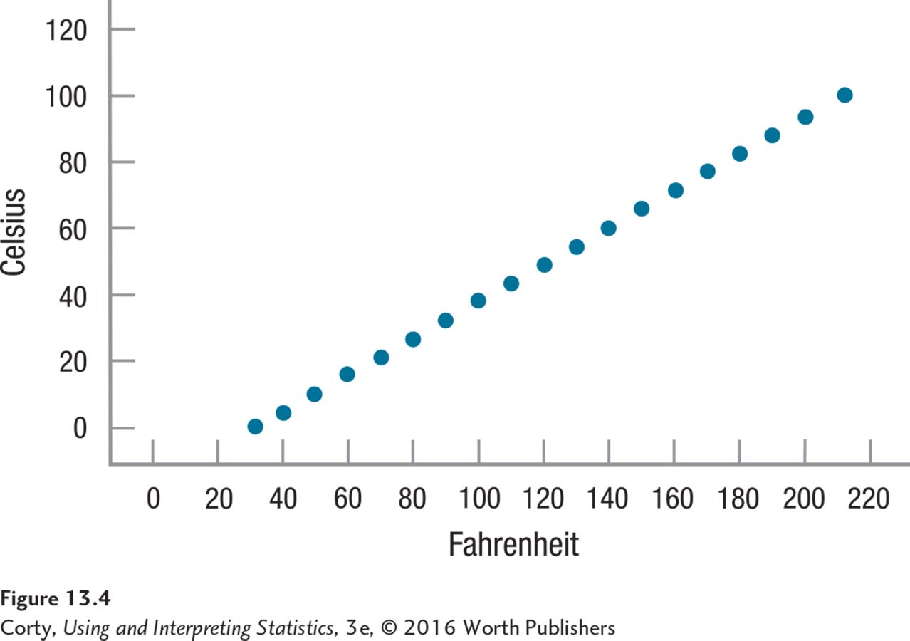
What does a scatterplot look like when there is a relationship between two variables and they vary systematically? Figure 13.4 illustrates the relationship between the temperatures of objects measured in both degrees Fahrenheit and Celsius. This figure is an example of the strongest possible linear relationship between two variables, a perfect relationship. In a perfect relationship, all the data points fall along a straight line. Figure 13.4 shows that knowing an object’s temperature in Fahrenheit tells one exactly what it is in Celsius.
Strength of Relationships
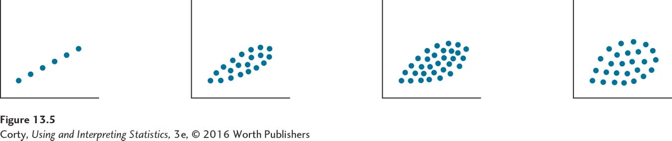
A strong relationship is one in which cases’ scores on variable X are closely allied with their scores on variable Y. When looking at a scatterplot, strength is shown by how well the points fall along a straight line. The more the points fall in a straight line, the stronger the association. Figure 13.5 gives four scatterplots. As the points form less of a line and more of a blob, as they move from a line to an oval or a circle, the relationship grows weaker.
Two situations exist in which the points in a scatterplot form a straight line, but the relationship is not a perfect one. These occur when the line is horizontal or vertical. When the line is horizontal, for example, every value of X is paired with the same value of Y. There is no variability in Y. With a vertical line, the opposite is true and there is no variability in X. The Pearson r formula needs both variables to have variability, and if either variable has none, Pearson r can’t be calculated. In these situations, r is said to be undefined.
Correlations Defined by z Scores
A scatterplot can also be drawn using z scores, not raw scores. z scores, also called standard scores, were introduced in Chapter 4. They are a transformation of raw scores into scores that reveal how far away from the mean the scores are in standard deviation units. z scores can be positive or negative, which means they fall above the mean or below the mean.
Figure 13.6 offers scatterplots for the community hospital/number of deaths data. The panel on the left in 13.6, like Figure 13.1, illustrates the relationship with raw scores, and the panel on the right shows what the scatterplot looks like when the same variables are transformed into z scores. Note that transforming from raw scores to z scores doesn’t change the relationship. The pattern of the dots, the shape, is exactly the same, whether raw scores or z scores are being plotted.
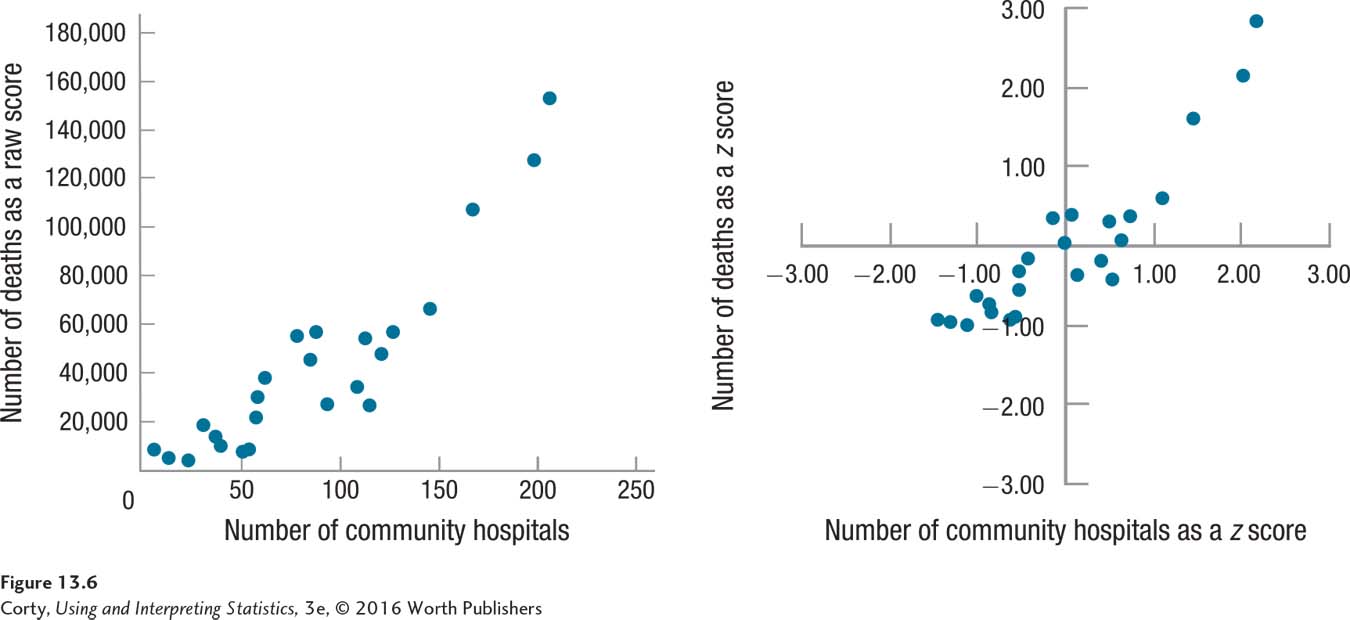
Figure 13.7 shows the scatterplot for the relationship between temperature as measured in Fahrenheit and Celsius both with raw scores (the panel on the left) and with z scores (the panel on the right). These z scores give a new perspective on what a correlation means. Look at the dot on the upper right, which is for boiling water. In the panel on the left, the X value for this point is 212° (Fahrenheit) and the Y value is 100° (Celsius). To a person who doesn’t know much about Fahrenheit and Celsius, those scores don’t sound similar as they are 112 points apart. In the panel on the right, the z scores for this point are zX = 1.63 and zY = 1.63. That is, the boiling point of water is exactly as far above the mean when measured in Fahrenheit as when it is measured in Celsius. That’s what a perfect correlation means.
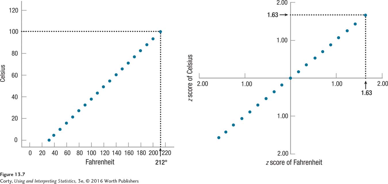
As correlations get weaker, the similarity between zX and zY lessens. The community hospital/number of deaths data show a strong correlation, but not a perfect one. The point on the upper right is New York with 206 hospitals and 153,000 deaths. Converted, those are z scores of 2.2 and 2.8. The two z scores are not the same, but they are in the same ballpark, both far above the mean. As correlations grow weaker and weaker, the similarity between the two z scores for each data point becomes less and less.
In fact, the similarity–dissimilarity of the pairs of z scores is one way of calculating what a Pearson correlation coefficient is. This formula, called the definitional formula, calculates a Pearson r as the average of multiplied-together pairs of z scores. Each case’s raw score on X is transformed into a z score and its raw score on Y is transformed into a z score. The two z scores for each case are multiplied together and the mean of these products is calculated. The mean of all such multiplied-together scores is a Pearson correlation coefficient. Thus, the stronger the correlation, the more similar—on average—the z scores are.
Here is a quick example to illustrate the benefit of the z score method. Many years ago, the United States Postal Service ran an ad showing that they, compared to the United Parcel Service and FedEx, had the largest fleet of trucks. The totals were, respectively, 200,000, 130,000, and 35,000. The USPS also had the lowest price for overnight delivery among the three shippers—respectively, $3, $6, and $12. As the scatterplot in Figure 13.8 makes clear, this is a strong relationship: more trucks is associated with lower cost.
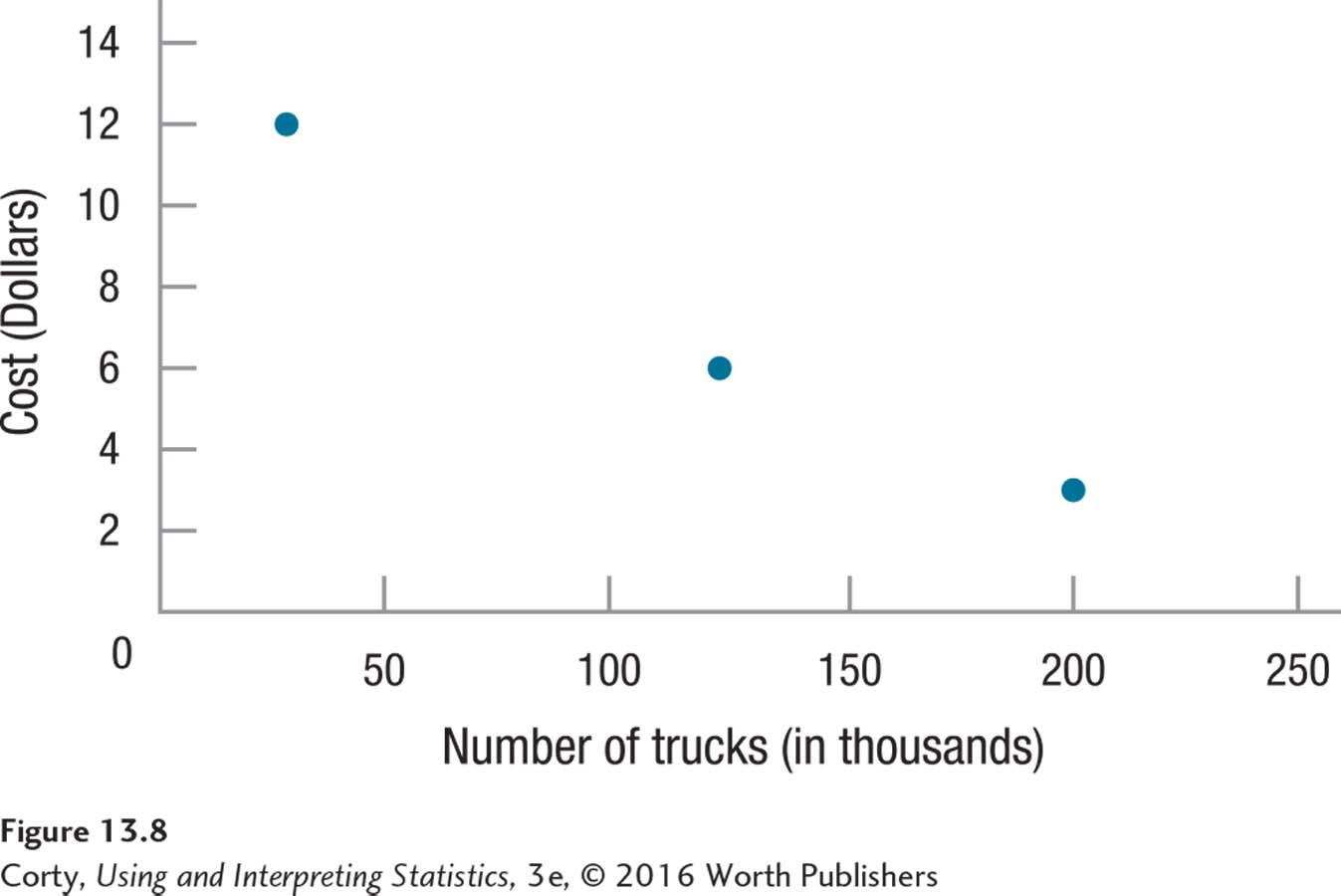
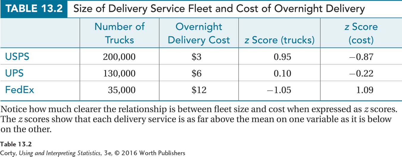
Table 13.2 shows the data, both as raw scores and transformed into z scores. Note how much clearer the relationship between the two variables is when expressed in z scores. The number of trucks the United States Postal Service has is as far above the mean, z = 0.95, as its price is below the mean, z = –0.87. This, the strength of the relationship between variable X expressed as a z score and variable Y expressed as a z score, is what the Pearson r expresses.
Quantifying Relationships
A correlation coefficient is a number that summarizes the strength of the relationship between two variables.
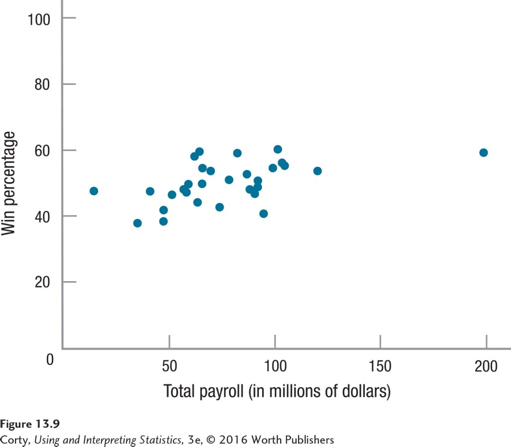
Scatterplots are great for visualizing relationships, but their interpretation is subjective. For example, can the owner of a baseball team buy his or her way to the World Series? Figure 13.9 is a scatterplot showing the relationship between the payrolls of Major League Baseball teams and their winning percentages. How strong is the association? Just by looking at the graph, it is difficult to tell how strong the relationship between these two variables is. Deciding how strong a relationship is on the basis of a scatterplot is subjective and different people can have different—and valid—opinions. One person might interpret the points on Figure 13.9 as roughly linear and conclude that the payroll is strongly related to a team’s performance. Another may see the circular clump of scores in the middle of the graph and conclude that there doesn’t appear to be much of a relationship.
The Pearson r gets around this problem of how specific the prediction is by calculating a statistic called a correlation coefficient. A correlation coefficient is a number that summarizes the strength of the linear relationship between two variables. For the Pearson r, the correlation coefficient is abbreviated as r (think of r as being short for “relationship”). For a Pearson correlation, r is a value that ranges from –1.00 to +1.00. An r value of zero is less than a weak relationship; it means that there is no relationship between the two variables. Figure 13.2, where the dots form a rectangle, and Figure 13.3, where the dots form a circle, have Pearson r values of zero.
As the r value moves further away from zero, in either a negative or positive direction, it represents a stronger relationship between X and Y. For example, an r of –.60 represents a stronger relationship than an r of .30. Pearson r values of –1.00 and 1.00, though they differ in sign, both represent perfect relationships.
Direction of the Relationship
Though Pearson r values of –1.00 and 1.00 both represent perfect relationships, the two indicate different types of relationships because their signs differ. The sign of a Pearson r, either positive or negative, gives information about the direction of the relationship. There are two options for direction: positive or negative.
Positive relationships. Positive r’s are found for what are called direct relationships. Direct relationships have scatterplots where the points tend to fall along a line moving from the bottom on the left, up and to the right. This means that cases with low scores on the X variable tend to have low scores on the Y variable and those with high scores on the X variable will tend to have high scores on the Y variable. For example, within a community there’s a positive relationship between the size of a house and how much it costs. In general, smaller houses cost less money and bigger houses cost more money. This positive relationship is illustrated in Figure 13.10.
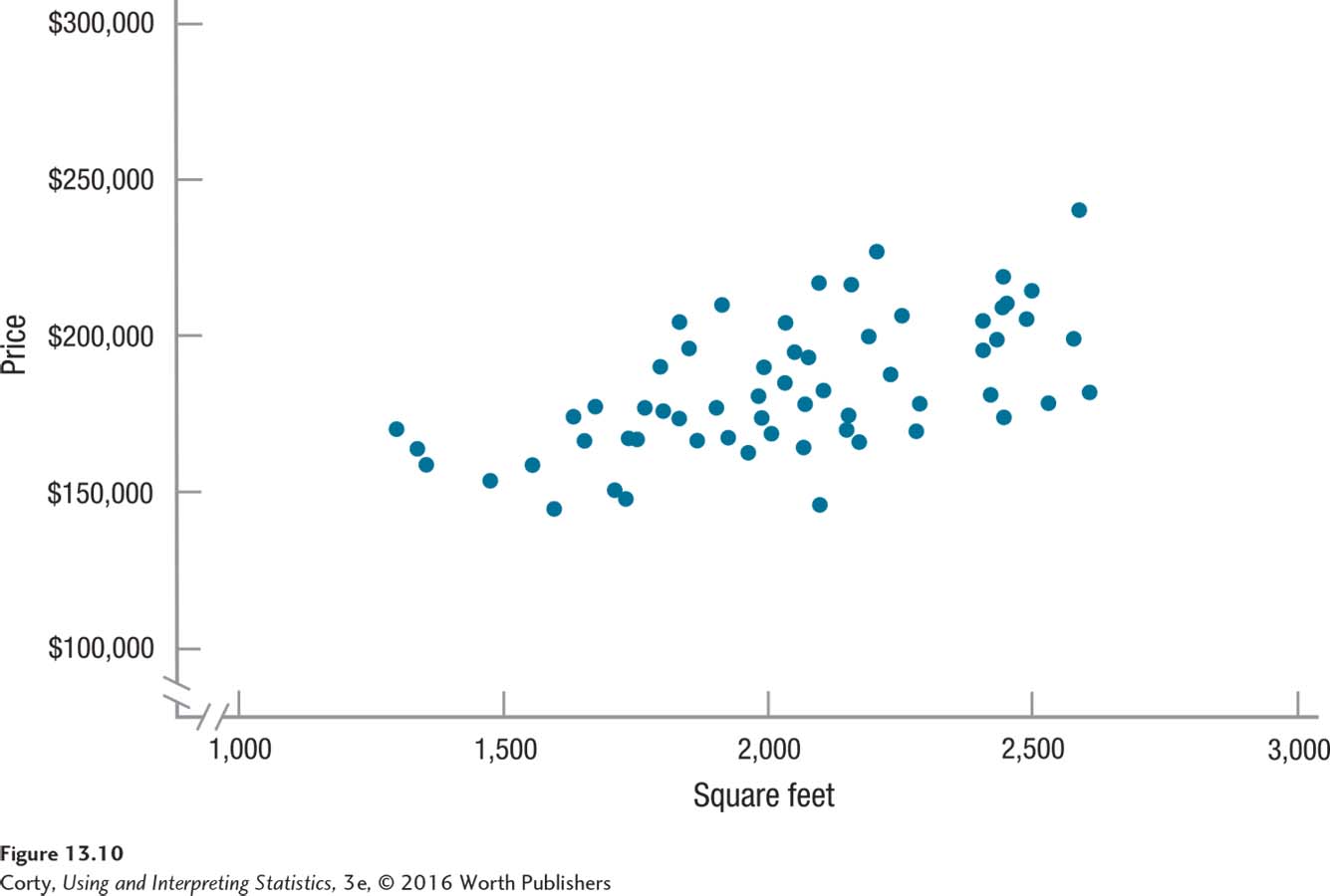 Figure 13.12 Figure 13.10 Positive Relationship Between the Size of a House and Its Cost In a positive relationship, the data points in a scatterplot fall along a diagonal line that moves up and to the right. In this scatterplot, as the size of the house increases, the price generally does as well.Page 490
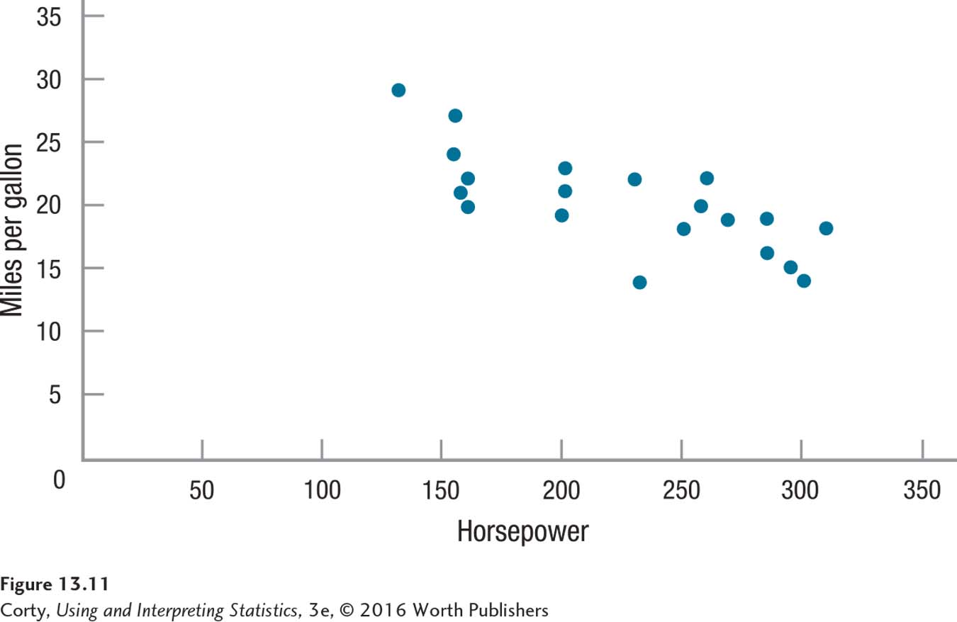
Negative relationships. Negative r’s are also called inverse relationships. Inverse relationships have scatterplots where the points fall along a line moving from the top left, down and to the right. This means that cases with low scores on X tend to have high scores on Y and cases with high scores on the X variable will tend to have low scores on the Y variable. For example, Figure 13.11 shows a relationship between a car’s horsepower and its fuel economy. The relationship is a negative one—in general, lower horsepower means better fuel economy and higher horsepower means worse fuel economy.
Conditions Affecting Pearson r
There are three conditions that affect a Pearson r: (1) nonlinearity, (2) outliers, and (3) restriction of range.
Nonlinearity
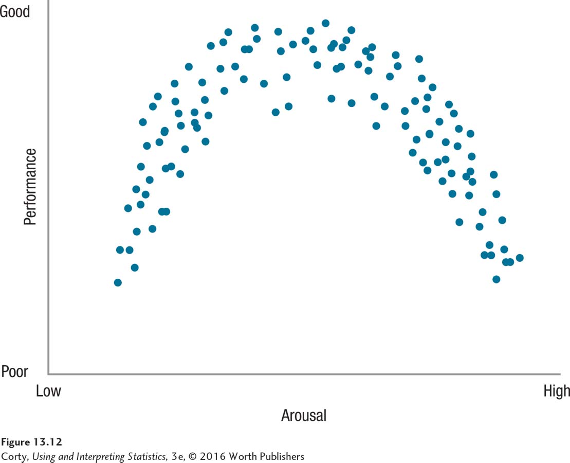
The Pearson r only measures how much linear relationship exists between two variables.
The Pearson r is used to measure the degree of linear relationship between two variables. A linear relationship exists when the points in the scatterplot for the relationship between X and Y fall along a straight line. Figure 13.12 illustrates a nonlinear association, what is called the Yerkes-Dodson law. The Yerkes-Dodson law states that arousal affects performance in an orderly way—low arousal leads to poor performance, moderate arousal leads to optimal performance, and high arousal impairs performance. This scatterplot shows a relationship between X and Y, but the points in the scatterplot don’t fall on a straight line. Using a Pearson correlation to quantify this relationship would provide a value close to zero, meaning there is little linear relationship between the two variables. The Pearson r only measures how much linear relationship exists between two variables. If the relationship appears nonlinear, do not use a Pearson r to measure it.
Outliers
Outliers are cases with extreme values, values that fall far away from the values that other cases have. One outlier in a data set can dramatically change the value of a correlation. The left panel in Figure 13.13 shows a scatterplot for a small data set. The points form a rough circle and the correlation between X and Y is zero.
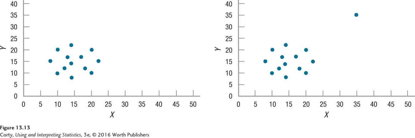
The right panel in Figure 13.13 adds one data point, an outlier with extreme values on both X and Y. This data point has an X value and a Y value that are dramatically higher than any other case. As a result of adding this one case, the correlation between X and Y changes from r = .00 to r = .63.
Outliers inflate the strength of a relationship between two variables. Because outliers may exist, it is always a good idea to create and inspect a scatterplot before calculating a correlation coefficient.
Restriction of Range
While outliers inflate the value of a correlation, restriction of range tends to deflate the value of a correlation. This means that a restricted range could lead a researcher to conclude that there is less of a relationship between two variables than actually exists.
What is restriction of range? Let’s consider an unrestricted range first. Look at the left panel of Figure 13.14, a scatterplot showing the hypothetical relationship between IQ and GPA in a sample of high school students. There is a full (unrestricted) range of IQ scores, ranging from 70 to 130. And, there is a full (unrestricted) range of GPA, from 0 to 4. Judging by the noncircular shape of the scatterplot, the correlation between these two variables is strong.
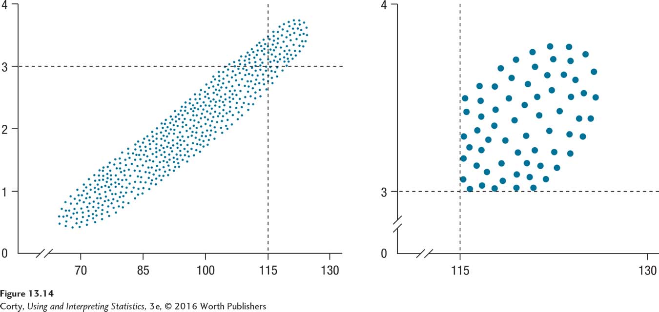
Suppose a researcher decided to restrict her examination of the relationship between IQ and GPA to students likely to be accepted at Ivy League colleges. Thus, she restricted her sample to students with IQs above 115 and GPAs above 3.00. The two lines in the top panel are the cut-off values for her sample and the few cases that fall in the upper right quadrant are the new sample.
This subsample has a restricted range on both the X variable and the Y variable. The new sample is shown in a scatterplot all by itself, in the right panel of Figure 13.14. What is the shape of this scatterplot? The points fall roughly in a circle, meaning that little correlation will be found between X and Y. Restricting the range of one or both variables in a correlation deflates its value.
Practice Problems 13.1
Apply Your Knowledge
13.01 Make a scatterplot for these data:
| X | Y | X | Y |
| 100 | 110 | 80 | 95 |
| 90 | 85 | 100 | 95 |
| 85 | 95 | 110 | 115 |
| 90 | 95 | 85 | 80 |
| 80 | 85 | 90 | 105 |
| 110 | 125 |
Use the nine scatterplots below to answer Problems 13.02–13.07.
13.02 Which figure or figures have a linear relationship?
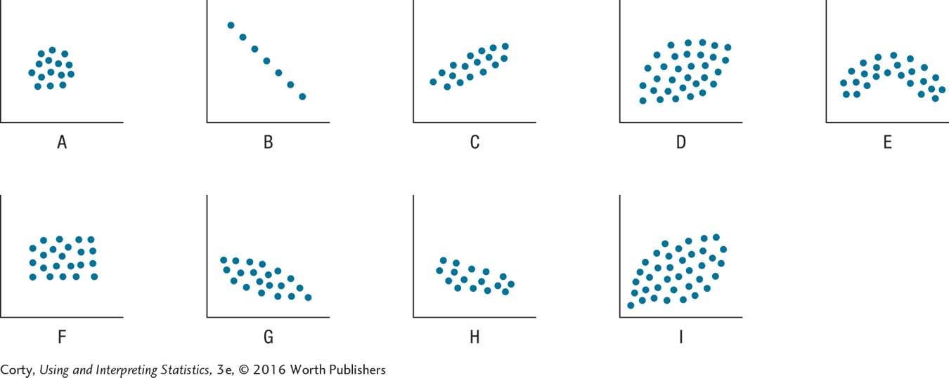
13.03 Which figure or figures represent no relationship?
13.04 Which figure or figures have a weak linear relationship?
13.05 Which figure or figures have a strong, but not perfect, linear relationship?
13.06 Which figure or figures have a perfect linear relationship?
13.07 Which figure or figures have a negative linear relationship?