STEP-BY-STEP TECHNOLOGY GUIDE: Time Series Plots
We illustrate how to construct a time series plot using Example 24 (page 89).
TI-83/84
- Step 1 Enter your time index (integers 1, 2, …) into list L1.
- Step 2 Enter the values of your time series variable into list L2.
- Step 3 Press 2nd, then Y =. In the STAT PLOTS menu, highlight 1: and press ENTER.
- Step 4 Highlight ON, and press ENTER. Select the time series icon (Figure 50), and press ENTER.
- Step 5 Press ZOOM > 9:ZOOMSTAT, and press ENTER. The time series plot is shown in Figure 51.
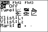 FIGURE 50 Selecting the time series icon.
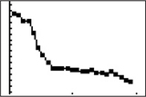 FIGURE 51 TI-83/84 time series plot.
EXCEL
- Step 1 Enter the values of your time series variable into column A. Put the variable name at the top of the column.
- Step 2 Select cells A1–A26. Click Insert > Insert Line Chart (in the Chart section).
- Step 3 Choose Line with Markers.
MINITAB
- Step 1 Enter the values of your time series variable into column C1.
- Step 2 Click Graph > Time Series Plot…
- Step 3 Select Simple and click OK.
- Step 4 For Series, double-click on C1.
- Step 5 Click Time/Scale. Select Calendar > Year.
- Step 6 For Start value, enter 1990. For Data Increment, enter 1.
- Step 7 Click OK and OK.
Page 92
SPSS
- Step 1 Enter the year data into the first column and the values of the time series into the second column. In the Variable View tab, name the columns Year and Rate and assign Year a Decimals value of zero.
- Step 2 Click Analyze > Forecasting > Sequence Charts…
- Step 3 Click the name of the column that contains the time series values (Rate), then click the first arrow to move it to the Variables box.
- Step 4 Click the name of the column that contains the months (Year), then click the second arrow to move it to the Time Axis Labels box.
- Step 5 Click OK. The time series plot is shown in Figure 52.
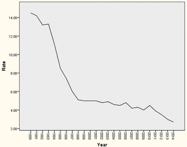 FIGURE 52 SPSS time series plot.
JMP
- Step 1 Click File > New > Data Table.
- Step 2 Enter the year data into Column 1, and the time series values into Column 2. Name the columns Year and Rate.
- Step 3 Click Graph > Graph Builder.
- Step 4 Drag Year (in the Variables section) to the X axis, and Rate to the Y axis.
- Step 5 Select Line from the graph options shown above the plot. Click Done.
CRUNCHIT!
- Step 1 Click File, highlight Load from Larose, Discostat3e > Chapter 2, and click Table 03_37.
- Step 2 Click Graphics, then Scatterplot.
- Step 3 For X, choose Month. For Y, choose Rate. Under Parameters, for Show choose Both. Click Calculate.
[Leave] [Close]