Chapter 2 Review Exercises
section 2.1
Question 2.331
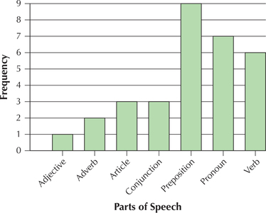
1. Parts of Speech. The accompanying bar graph summarizes the frequencies for the various parts of speech in a sample of English words. Should we be interested in determining whether this graph is symmetric or skewed? Clearly explain why or why not.
2.99.1
No, because the variable is categorical.
For Exercises 2–6, refer to the bar graph from Exercise 1 to construct the following for the variable parts of speech.
Question 2.332
2. Relative frequency bar graph
Question 2.333
3. Frequency distribution
2.99.3
| Part of speech | Frequency | Relative frequency |
|---|---|---|
| Adjective | 1 | 0.0323 |
| Adverb | 2 | 0.0645 |
| Article | 3 | 0.0968 |
| Conjunction | 3 | 0.0968 |
| Preposition | 9 | 0.2903 |
| Pronoun | 7 | 0.2258 |
| Verb | 6 | 0.1935 |
| Total | 31 | 31/31=1.000 |
Question 2.334
4. Relative frequency distribution
Question 2.335
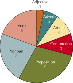
5. Frequency pie chart
2.99.5
Question 2.336
6. Relative frequency pie chart
Happiness in Marriage. The General Social Survey tracks trends in American society through annual surveys. Use the following contingency table for Exercises 7–11.
| Happiness of marriage | ||||
|---|---|---|---|---|
| Respondents' gender |
Very happy |
Pretty happy |
Not too happy |
Total |
| Male | 242 | 115 | 9 | 366 |
| Female | 257 | 149 | 17 | 423 |
| Total | 499 | 264 | 26 | 789 |
Question 2.337
7. What proportion of the males responded that they were very happy in their marriage?
2.99.7
0.6612
Question 2.338
8. What proportion of the females responded that they were very happy in their marriage?
Question 2.339
9. What proportion of the males responded that they were not too happy in their marriage?
2.99.9
0.0246
Question 2.340
10. What proportion of the females responded that they were not too happy in their marriage?
Question 2.341
11. Construct a clustered bar graph of the data.
2.99.11
Answers will vary. May have clustered bar graph by happiness of marriage or clustered bar graph by sex.
section 2.2
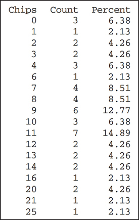
Student-Run Café Business. Use the Minitab relative frequency distribution of potato chip sales for Exercises 12–14. The distribution shows the number of days each number of chips was sold. For example, four bags of chips were sold on three different days.
Question 2.342
12. Construct a relative frequency distribution of 4 classes, each of class width 7. Let the leftmost class be: 0 to < 7.
Question 2.343
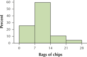
13. Use the relative frequency distribution to construct a histogram of potato chip sales.
2.99.13
Question 2.344
14. For what percentage of days were more than 20 bags of chips sold?
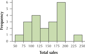
Student-Run Café Business. Use the data in the following table for Exercises 15–20. The data represent the total sales (in dollars) for the first 20 days of sales for the Student-Run café. You will construct a histogram of the sales data, with 8 classes, each with class width 25.
totalsales20
| 199.95 | 186.94 | 172.31 | 181.43 |
| 195.74 | 120.18 | 137.65 | 125.57 |
| 102.68 | 228.78 | 197.56 | 180.63 |
| 162.88 | 88.02 | 70.00 | 75.87 |
| 101.76 | 119.57 | 97.00 | 150.51 |
Question 2.345
15. Find the class limits, and draw the horizontal axis. Let the leftmost lower class limit equal 50.
2.99.15
Question 2.346
16. Determine the frequencies, and draw the vertical axis.
Question 2.347
17. Draw the rectangles.
2.99.17

Question 2.348
18. What percentage of days had sales over $200?
Question 2.349
19. What proportion of days had sales of at most $149.99?
2.99.19
0.5
Question 2.350
20. Find the percentage of days with sales between $150 and $199.99 inclusive.
section 2.3
Question 2.351
21. Fraud Cases in Brooklyn. Use the data from Table 31 on page 82 of Section 2.2 to
- construct a cumulative frequency distribution.
- construct a cumulative relative frequency distribution.
2.99.21
(a) and (b)
| Frauds | Frequency | Relative frequency | Cumulative frequency | Cumulative relative frequency |
|---|---|---|---|---|
| 0 to<40 | 8 | 8/23=0.3478 | 8 | 0.3478 |
| 40 to<80 | 13 | 13/23=0.5652 | 21 | 0.9130 |
| 80 to<120 | 1 | 1/23=0.0435 | 22 | 0.9565 |
| 120 to<160 | 1 | 1/23=0.0435 | 23 | 1.0000 |
| Total | 23 | 1.0000 |
Question 2.352
22. Fraud Cases in Brooklyn. Use the data from Table 31 on page 82 of Section 2.2 to
- construct a frequency ogive.
- construct a relative frequency ogive.
Question 2.353
tradedeficits
23. Trade Deficit. Table 47 presents the annual trade deficits (imports minus exports) for the United States from 1991 to 2013, in billions of dollars.
- Construct a time series plot of the data.
- Describe any trends that you see.
| Year | Trade deficit in $ billions |
Year | Trade deficit in $ billions |
|---|---|---|---|
| 1991 | 31 | 2003 | 494 |
| 1992 | 39 | 2004 | 609 |
| 1993 | 70 | 2005 | 714 |
| 1994 | 98 | 2006 | 759 |
| 1995 | 96 | 2007 | 702 |
| 1996 | 104 | 2008 | 698 |
| 1997 | 108 | 2009 | 374 |
| 1998 | 166 | 2010 | 495 |
| 1999 | 264 | 2011 | 548 |
| 2000 | 379 | 2012 | 538 |
| 2001 | 364 | 2013 | 476 |
| 2002 | 421 |
2.99.23
(a)
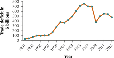
(b) The trade deficit generally increased from 1991 to 2006, then it generally decreased from 2006 until 2009, then it increased from 2009 until 2011, and then it decreased from 2011 to 2013.
section 2.4
Question 2.354
24. Carbon Dioxide Emissions. The following table contains the energy-related carbon dioxide emissions (in millions of metric tons), by end-use sector, as reported by the U.S. Energy Information Administration.
co2emissions
| Sector | Emissions |
|---|---|
| Residential | 1213.9 |
| Commercial | 1034.1 |
| Industrial | 1736.0 |
| Transportation | 1939.2 |
- Construct a bar graph that overemphasizes the differences among the sectors.
- Which of the common methods for making misleading graphics are you using in (a)?
- Construct a bar graph that underemphasizes the differences among the sectors.
- Which of the common methods for making graphics misleading are you using in (c)?
- Construct a bar graph that fairly represents the data.