2.2 Graphs and Tables for Quantitative Data
 This page includes Video Technology Manuals
 This page includes Statistical Videos
OBJECTIVES By the end of this section, I will be able to …
- Construct and interpret a frequency distribution and a relative frequency distribution for discrete and continuous data.
- Use histograms and frequency polygons to summarize quantitative data.
- Construct and interpret stem-and-leaf displays and dotplots.
- Use graphs and tables to obtain useful information.
- Recognize distribution shape, symmetry, and skewness.
1 Frequency Distributions and relative Frequency Distributions for Discrete and Continuous Data
In Section 2.1, we introduced tables and graphs for summarizing qualitative data. However, most of the data sets that we will encounter in this book are quantitative instead of qualitative. Recall from Chapter 1 that quantitative data take on numerical values on which arithmetic can be meaningfully performed. We can apply frequency and relative frequency distributions to quantitative data, just as we did for the qualitative data in Section 2.1
EXAMPLE 9 Frequency distribution and relative frequency distribution for discrete data
The Recording Industry Association of America (RIAA) awards multi-platinum status for any musical recording that sells more than 2 million copies. Table 17 contains a random sample of 20 of the musical artists with the most multi-platinum singles.
| Artist | Multi-platinums | Artist | Multi-platinums |
|---|---|---|---|
| Beyoncé | 4 | Linkin Park | 2 |
| Bruno Mars | 4 | Madonna | 2 |
| Chris Brown | 2 | Michael Jackson | 1 |
| Elton John | 1 | Nicki Minaj | 2 |
| Fergie | 3 | Red Hot Chili Peppers | 2 |
| Jay-Z | 4 | Shakira | 1 |
| Justin Timberlake | 1 | Sugarland | 1 |
| Kanye West | 7 | Taylor Swift | 8 |
| Katy Perry | 8 | The Beatles | 4 |
| Lady Gaga | 6 | Tim McGraw | 2 |
Use this raw data to construct a frequency distribution and a relative frequency distribution of the number of multi-platinum singles.
Solution
We begin by making a tally of how many artists had one multi-platinum, how many had two, and so on. We then construct the frequency distribution for the variable Multiplatinums. Finally, we construct the relative frequency distribution by dividing the frequency by the total number of observations, 20. See Table 18.
| Multi-platinums | Tally | Frequency | Relative frequency |
|---|---|---|---|
| 1 |

|
5 | 5/20=0.25 |
| 2 |

|
6 | 6/20=0.30 |
| 3 | | | 1 | 1/20=0.05 |
| 4 | |||| | 4 | 4/20=0.20 |
| 5 | 0 | 0/20=0.00 | |
| 6 | | | 1 | 1/20=0.05 |
| 7 | | | 1 | 1/20=0.05 |
| 8 | || | 2 | 2/20=0.10 |
| Total | 20 | 20/20=1.00 |
NOW YOU CAN DO
Exercises 9–12.
We can combine several numbers of multi-platinums together into “classes,” in order to produce a more concise distribution. Classes represent a range of data values and are used to group the elements in a data set.
EXAMPLE 10 Frequency and relative frequency distributions using classes
Combine the data from Table 18 into three classes, and construct frequency and relative frequency distributions.
Solution
Let us define the following classes for the numbers of multi-platinum records:
- 1–3 Multi-platinums
- 4–6 Multi-platinums
- 7–9 Multi-platinums
For each class, we group together all the musical artists in the class. Table 19 provides the frequency distribution and relative frequency distribution for these three classes.
| Class | Frequency | Relative frequency |
|---|---|---|
| 1–3 | 12 | 12/20=0.60 |
| 4–6 | 5 | 5/20=0.25 |
| 7–9 | 3 | 3/20=0.15 |
| Total | 20 | 20/20=1.00 |
The class with the highest frequency (and therefore highest relative frequency) is the class with 1–3 multi-platinum singles: 12, or 60% of the total. Therefore, we can say that most of the artists in our sample had between one and three multi-platinum singles.
NOW YOU CAN DO
Exercises 13–16.
Developing Your Statistical Sense
Choosing Which Distribution to Use
So which frequency distribution is the “right” one—Table 18 or Table 19? There is no absolute answer. It depends on the goals of the analysis, as well as other factors. For example, from Table 19, we can see that most of the artists in our sample had between one and three multi-platinum singles, a finding that was not immediately apparent from Table 18. Therefore, combining data values into classes can lead to interesting overall findings. However, whenever data values are combined into classes, some information is lost. For example, it is not possible, using Table 19 alone, to determine that the number of multi-platinums occurring with the greatest frequency in our sample is two.
We use the following definitions to construct frequency distributions and histograms (for a discussion of histograms, see page 65).
The lower class limit of a class equals the smallest value within that class.
The upper class limit of a class equals the largest value within that class.
The class width equals the difference between the lower class limits of two successive classes.
The class boundary of two successive classes is found by taking the sum of the upper class limit of a class and the lower class limit of the class to its right, and dividing this sum by two. The lower class boundary of the leftmost class equals its upper class boundary minus the class width. The upper class boundary of the rightmost class equals its lower class boundary plus the class width.
EXAMPLE 11 Class limits, class widths, and class boundaries
For the classes in Example 10, find the following:
- The lower class limits and the upper class limits
- The class width
- The class boundaries
Solution
- The following table shows the lower class limits and the upper class limits for the classes in Example 10.
Class Lower class limit
(smallest value)Upper class limit
(largest value)1–3 1 3 4–6 4 6 7–9 7 9 Page 63 - Our lower class limits are 1, 4, and 7; therefore, the class width of each class is 3 because the lower class limits differ by 3. For example, 4-1=3.
- To find the class boundary of the first and second class, we find the sum of the upper class limit of the first class and the lower class limit of the second class, and divide this sum by 2, giving us (3+4)/2=3.5. Similarly, the class boundary of the second class with the third class is (6+7)/2=6.5. The lower class boundary of the leftmost class equals its upper class boundary minus the class width (that is, 3.5-3=0.5). The upper class boundary of the rightmost class equals its lower class boundary plus the class width (that is, 6.5+3=9.5).
Next, we show how to construct frequency distributions for continuous data.
To construct a frequency distribution for continuous data:
- Choose the number of classes.
- Determine the class width. It is best (though not required) to use the same width for all classes.
- Find the upper and lower class limits. Make sure the classes are nonoverlapping.
- Calculate the class boundaries.
- Find the frequencies of each class.
EXAMPLE 12 Constructing a frequency distribution for continuous data
carbon
The U.S. Department of Energy reported the total 2011 carbon emissions emitted for a sample of 20 states, in millions of metric tons of carbon dioxide (Table 20).
| State | Carbon emissions | State | Carbon emissions |
|---|---|---|---|
| Arizona | 93.28 | New Jersey | 117.56 |
| Arkansas | 67.56 | New Mexico | 56.60 |
| Colorado | 91.98 | Oklahoma | 107.92 |
| Iowa | 87.42 | South Carolina | 80.21 |
| Kansas | 72.36 | Tennessee | 105.73 |
| Maryland | 65.80 | Virginia | 99.86 |
| Massachusetts | 68.89 | Washington | 70.81 |
| Minnesota | 92.69 | West Virginia | 95.97 |
| Mississippi | 61.21 | Wisconsin | 98.05 |
| Nebraska | 52.26 | Wyoming | 63.89 |
Construct a frequency distribution of the carbon emissions data.
Solution
Step 1 Choose the number of classes.
It is generally recommended that between 5 and 20 classes be used, with the number of classes increasing with the sample size; a small data set such as this will do just fine with 7 classes. In general, choose the number of classes to be large enough to show the variability in the data set, but not so large that many classes are nearly empty.
Page 64Step 2 Determine the class widths.
First, find the range of the data, that is, the difference between the largest and smallest data points. Then, divide this range by the number of classes you chose in Step 1. This gives an estimate of the class width. Here, our largest data value is 117.56 and our smallest is 52.26, giving us a range of 117.56-52.26=65.3. In Step 1, we chose 7 classes, so that our estimated class width is 65.3/6≈10.9 For convenience, we will round this to a class width of 10. It is recommended that each class have the same width.
Step 3 Find the upper and lower class limits.
Choose limits so that each data point belongs to only one class. For example, suppose we chose one class to be 50–60 and the next class to be 60–70. Then, to which class would an emissions value of exactly 60 belong? The classes should not overlap. Therefore, we define the following classes.
50 to<60,60 to<70,70 to<80,80 to<90,90 to<100,100 to<110,110 to<120
Note that the lower class limit of the first class, 50, is slightly below that of the smallest value in the data set, 52. Also note that the class width equals 60-50=10, as desired.
Step 4 Calculate the class boundaries.
The class boundary for the first two classes is (60+60)/2=60. Similarly, the other class boundaries are 70, 80, 90, 100, and 110. The lower class boundary of the leftmost class is 60-10=50. The upper class boundary of the rightmost class is 110+10=120.
Step 5 Find the frequencies for each class.
Using these seven classes, we now proceed to construct the frequency and relative frequency distributions (see Table 21) for the carbon emissions data. We count the number of data values that fall into each class, and we divide each frequency by the sample size (20) to obtain the relative frequency.
| Class: x= | Tally | Frequency | Relative frequency |
|---|---|---|---|
| 50 to < 60 | || | 2 | 2/20=0.10 |
| 60 to < 70 |

|
5 | 5/20=0.25 |
| 70 to < 80 | || | 2 | 2/20=0.10 |
| 80 to < 90 | || | 2 | 2/20=0.10 |
| 90 to < 100 |

|
6 | 6/20=0.30 |
| 100 to < 110 | || | 2 | 2/20=0.10 |
| 110 to < 120 | | | 1 | 1/20=0.05 |
| Total | 20 | 20/20=1.00 |
The notation “50 to < 60” indicates that this class contains values from 50 (inclusive) up to but not including 60.
NOW YOU CAN DO
Exercises 17–40.
YOUR TURN#7
A country's unemployment rate is an indicator of its general economic health. Table 22 contains the unemployment rates in August 2014 for a sample of 20 countries from around the world.
| Country | Unemployment rate | Country | Unemployment rate |
|---|---|---|---|
| Britain | 6.4 | Japan | 3.7 |
| Canada | 7.0 | Mexico | 4.8 |
| China | 4.1 | Pakistan | 6.2 |
| France | 10.2 | Philippines | 7.0 |
| Germany | 6.7 | Poland | 12.0 |
| India | 8.8 | Russia | 4.9 |
| Indonesia | 5.7 | Singapore | 2.0 |
| Ireland | 11.5 | South Korea | 3.4 |
| Israel | 6.3 | Turkey | 8.8 |
| Italy | 12.3 | United States | 6.2 |
Use five classes of class width 2.5 each, and define the leftmost class as follows: 1.0 to < 3.5. Calculate the class boundaries. Find the frequencies and relative frequencies for each class, and construct a frequency distribution and a relative frequency distribution of the unemployment rates.
(The solution is shown in Appendix A.)
2 Histograms and Frequency Polygons
Histograms
Many different methods are available for graphically summarizing numeric data. One example of a graphical summary for quantitative data is a histogram.
A histogram is constructed using rectangles for each class of data. The heights of the rectangles represent the frequencies or relative frequencies of the class. The widths of the rectangles represent the class widths of the corresponding frequency distribution. The class boundaries are placed on the horizontal axis, so that the rectangles are touching each other.
EXAMPLE 13 Constructing a histogram
Construct a histogram of the frequency of the carbon emissions data from Example 12.
Solution
Step 1 Find the class limits, and draw the horizontal axis.
Note that the class boundaries for these data were found in Example 12: 60, 70, 80, 90, 100, 110, and 120. Draw the horizontal axis, with the numbers 60, 70, 80, 90, 100, 110, and 120 equally spaced along it. The numbers indicate where the rectangles will touch each other.
Step 2 Determine the frequencies, and draw the vertical axis.
Use the frequencies given in Table 21. These will indicate the heights of the five rectangles along the vertical axis. Find the largest frequency, which is 6. It is a good idea to provide a little bit of extra vertical space above the tallest rectangle, so make 7 your highest label along the vertical axis. Then provide equally spaced labels along the vertical axis between 0 and 7.
Page 66Step 3 Draw the rectangles.
Draw your first rectangle from 50 to 60, with height 2, the first frequency, and your second rectangle from 60 to 70, with height 5. Proceed to draw the remaining rectangles similarly.
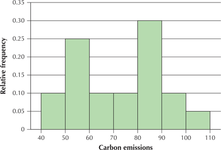
The resulting frequency histogram is shown in Figure 19a. The relative frequency histogram is shown in Figure 19b. Note that the two histograms have identical shapes and differ only in the labeling along the vertical axis.

NOW YOU CAN DO
Exercises 41–52.
YOUR TURN#8
Using the unemployment rate data from Table 22, construct a histogram of unemployment rates, using the same classes you used previously.
(The solution is shown in Appendix A.)
Note that the histogram, unlike the frequency distribution, provides us with a graphical impression of the data distribution. This characteristic will be crucial later on, when we evaluate the fitness of data sets to undergo certain data analysis methods. Also, notice that the rectangles are contiguous (touching), unlike the rectangles of the bar graphs in Section 2.1. Because the data are quantitative, the horizontal axis in a histogram should be considered as the number line.
A class midpoint is the average of two consecutive lower class limits. For example, the class midpoint for the leftmost class in Figure 19 is (50+60)/2=55.
Note: Histograms are often presented using class midpoints instead of class boundaries. The class boundaries can then be inferred by splitting the difference between the class midpoints. In Figure 19c, the upper class boundary for the leftmost class is halfway between 55 and 65, that is, 60. Otherwise, Figure 19c is equivalent to Figure 19b.
 What If Scenario: Give the Calculator a Rest!
What if scenarios offer you a chance to reflect on how changes in the initial conditions will percolate through the various aspects of a problem. The only requirement is to put your calculator down and think through the problem. You are asked to find the answers by using your knowledge of what the statistics represent.
Shifting the histogram to the left
What if we subtracted 10 million metrics tons from each state's carbon emissions? How would that affect the frequency histogram in Figure 19a? Assume that the number of classes and the class width would stay the same.
Solution
The new class limits and class boundaries would each be 10 points lower than the corresponding class limits and class boundaries from Example 12. However, the frequencies for each corresponding class would be the same as those from Example 12. Thus, the rectangles would look the same, with the only difference being that they are “shifted left” 10 points along the number line (Figure 20). We discuss more about the shapes of histograms later in this section.
 The One Variable Statistics and Graphs applet can display histograms for a selection of data sets in this textbook, including the carbon emissions data. The applet allows you to experiment with different class widths.
Frequency Polygons
Frequency polygons provide the same information as histograms, but in a slightly different format.
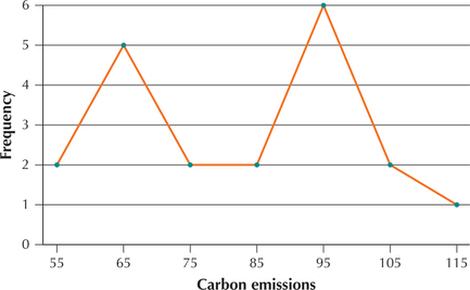
A frequency polygon is constructed as follows. For each class, plot a point at the class midpoint, at a height equal to the frequency for that class. Then join each consecutive pair of points with a line segment.
EXAMPLE 14 Constructing a frequency polygon
carbon
Construct a frequency polygon for the carbon emissions data in Example 12.
Solution
The midpoints for the classes are shown in Figure 19c. Plot a point for each frequency above each midpoint, and join consecutive points. The result is the frequency polygon in Figure 21.
NOW YOU CAN DO
Exercises 53–56.
YOUR TURN#9
Using the unemployment rate data from Table 22, construct a frequency polygon of unemployment rates, using the same classes as last time.
(The solution is shown in Appendix A.)
3 Stem-and-Leaf Displays and Dotplots
Stem-and-Leaf Displays
Stem-and-leaf displays were developed by Professor John Tukey of Princeton University in the late 1960s. This type of display generally contains more information than either a frequency distribution or a histogram. We will demonstrate how to construct a stem-and-leaf display in Example 15.
EXAMPLE 15 Constructing a stem-and-leaf display
dangerousweapons
 We will construct a stem-and-leaf display for the number of misdemeanors: dangerous weapons cases in 20 Manhattan precincts, shown here in Table 23.
| Precinct | Dangerous weapons cases | Precinct | Dangerous weapons cases |
|---|---|---|---|
| 1 | 19 | 20 | 24 |
| 5 | 24 | 22 | 9 |
| 6 | 42 | 23 | 91 |
| 7 | 79 | 24 | 22 |
| 9 | 52 | 25 | 109 |
| 10 | 21 | 26 | 67 |
| 13 | 93 | 28 | 40 |
| 17 | 12 | 32 | 90 |
| 18 | 45 | 33 | 82 |
| 19 | 23 | 34 | 88 |
Solution

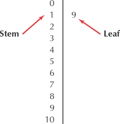
Each of these data values may be broken down into a certain number of “tens” and a certain number of “ones.” For example, take the number of dangerous weapons cases for Precinct 1: 19. Notice that 19=(1⋅10)+(9⋅1), where we have 1 ten and 9 ones. Also note for Precinct 25:109=(10⋅10)+(9⋅1), where we have 10 tens and 9 ones. For 19, the tens value is 1, whereas for 109, the tens value is 10. So we begin constructing a stem-and-leaf display by first collecting all the tens values and putting them in order in a column (Figure 22). These are called the stems.
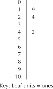
Next, consider the ones place of each data value. For example, the first data value, 19, has 1 in the tens place (the stem) and 9 in the ones place. Place this number, called the leaf, next to its stem (Figure 23).
The second data value, 24, has 2 in the tens place and 4 in the ones place, and the third data value, 42, has 4 in the tens place and 2 in the ones place. Place the leaf 4 on the same line as its stem, 2, to make 24. Place the leaf 2 on the same line as its stem, 4, to make 42 (Figure 24). Continue this process with the remaining data, placing each ones value next to its stem. Then, for each stem, order the leaves from left to right in increasing order. This produces the stem-and-leaf display in Figure 25.
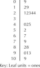

In general, the leaf units represent the smallest decimal place represented in the data values. Then, the stem unit consists of the remainder of the number. For example, suppose we have a data value of 127. Then, the 7 is the leaf unit, and the 12 is the stem. Or else, suppose our data value is 0.146. Then, our leaf unit is the 6, and the stem is the 14. Note that the stem-and-leaf display contains all the information that a histogram turned on its side contains, but it also contains more information than a histogram because the stem-and-leaf display shows the original values.
Split stems may sometimes be used in a stem-and-leaf display to provide a clearer idea of the data distribution when too many data points fall on just a few stems. When using split stems, each stem appears twice, with the leaves 0 to 4 on the upper stem and the leaves 5 to 9 on the lower stem. Figure 26 shows how the stem-and-leaf display of dangerous weapons data would appear when using split stems.
NOW YOU CAN DO
Exercises 57–60.
YOUR TURN#10
Using the unemployment rate data from Table 22, do the following:
- Construct a stem-and leaf display of unemployment rates.
- Build a stem-and-leaf display of unemployment rates, using split stems.
(The solution is shown in Appendix A.)
EXAMPLE 16 Stem-and-leaf displays of decimal-valued data
Here follows a sample of the grade point averages of the author's advisees. Construct a stem-and-leaf display of the data.
| 2.9 | 3.5 | 3.7 | 4.0 | 2.8 | 3.9 | 3.2 | 4.0 | 3.5 | 3.8 |
Solution
Here, we define the “ones” decimal place to represent the stem, and the “tenths” decimal place to represent the leaves. The resulting stem-and-leaf display is shown in Figure 27. Note that the two “0” leaves next to the “4” stem represent two different students whose GPA is 4.0.

 The One Variable Statistics and Graphs applet can display stem-and-leaf displays for a selection of data sets in this textbook. The applet allows you to experiment with split stems if you want to.
Dotplots
A simple but effective graphical display is a dotplot. In a dotplot, each data point is represented by a dot above the number line. When the sample size is large, each dot may represent more than one data point.
EXAMPLE 17 Dotplots
Construct a dotplot of the carbon emissions data.
Solution
Figure 28 is a dotplot of the carbon emissions data.

NOW YOU CAN DO
Exercises 61–64.
YOUR TURN#11
Using the unemployment rate data from Table 22, construct a dotplot of the unemployment rates.
(The solution is shown in Appendix A.)
Dotplots are useful for comparing two variables, as shown in the following example.
EXAMPLE 18 Comparison dotplots
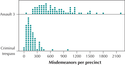
 Suppose a criminal justice researcher wants to compare the occurrences of third-degree assault and criminal trespass across the police precincts of New York City. The researcher could construct a comparison dotplot, as shown in Figure 29. This graph shows that the number of criminal trespass misdemeanors per precinct lie mostly below 300, whereas the number of third-degree assaults per-precinct frequencies lie mostly above 300.
Note: All of the graphs and tables learned in this section may be used for quantitative data. But histograms, frequency polygons, stem-and-leaf displays, and dotplots cannot be used for qualitative data.
NOW YOU CAN DO
Exercises 65–66.
Note that the two groups are graphed using the same number line, which makes comparison easier.
4 Obtaining information from Graphs and tables
Graphs and tables make it easy to acquire useful information about the data that we could not get just by looking at the raw data. In fact, that is the whole point of constructing the graphs and tables in the first place: to allow us to more easily observe patterns and trends in the data. Example 19 illustrates this.
EXAMPLE 19 Obtaining information from graphs and tables
- Using the relative frequency distribution in Table 21, what proportion of states in the sample has carbon emissions of 100 million or more metric tons?
- Using the histogram in Figure 19a, how many states have carbon emissions between 70 (inclusive) and 90 (not inclusive) million metric tons?
- Using the stem-and-leaf display in Figure 25 on page 69, how many precincts had between 22 and 24 (inclusive) dangerous weapons cases?
- Now, using the histogram in Figure 19a, can you determine how many states had between 94 and 104 million metric tons of carbon emissions?
Solution
- From Table 21, 100 (million) or more metric tons is represented by two classes: 100–109 and 110–119. Adding their relative frequencies gives us the proportion of states with 100 million or more metric tons of carbon emissions: 0.10+0.05=0.15.
- From Figure 19a, there are two classes whose values together contain the values 70 to < 90, each of which has a frequency of two. Therefore, there are 2+2=4 states with carbon emissions between 70 (inclusive) and 90 (not inclusive) million metric tons.
- The stem-and-leaf display shows us that there are precincts with 22, 23, 24, and 24 dangerous weapons cases. This makes four precincts.
- It is not possible to answer this question using the histogram because the histogram does not tell us how many states are above or below 94—just how many are in the 90s.
NOW YOU CAN DO
Exercises 67–78.
YOUR TURN#12
Using the graphs you constructed for the unemployment rate data from Table 22, answer the following:
- Using the histogram you constructed earlier, how many countries had unemployment rates below 6.0?
- Using the histogram alone, can you determine how many countries had unemployment rates between 6.5 and 7.5 (inclusive)? Explain.
- Now, using the stem-and-leaf display, how many countries had unemployment rates between 6.5 and 7.5 (inclusive)?
(The solutions are shown in Appendix A.)
5 Distribution Shape, Symmetry, and Skewness
Frequency distributions are tabular summaries of the set of values that a variable takes. We now generalize the concept of distribution.
The distribution of a variable is a table, graph, or formula that identifies the variable values and frequencies for all elements in the data set.
For example, a frequency distribution is a distribution because it is a table that specifies each of the values that a variable can take, along with the frequencies. However, our definition of “distribution” also includes histograms, stem-and-leaf displays, dotplots, and other graphical summaries. (In Chapter 6, we will introduce distributions defined by formulas.) These graphical distributions invite us to consider the shape of a distribution. The shape of a distribution is the overall form of a graphical summary approximated by a smooth curve.
The Bell-Shaped Curve
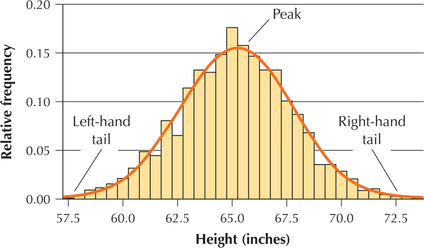
Figure 30 contains the relative frequency histogram of the heights of 1000 college women. Note that relatively fewer women are in both the left-hand tail (shorter women) and the right-hand tail (taller women). Instead, as height increases from left to right, the relative frequency gradually increases until it reaches a peak near 65 inches tall and then gradually decreases. Thus, the distribution of heights is said to be bell-shaped.
The rectangles represent the actual data. However, the smoothed curve represents an approximation of the overall form of the distribution, and thus the smoothed curve represents the shape of the distribution, which is bell-shaped. The formal name of this bell-shaped distribution is the normal distribution. In Chapter 6, we will learn much more about this important distribution, which occurs often in nature and the real world. For example, student heights (within a given gender) follow a bell-shaped distribution. In Chapter 7, we will learn how to assess whether or not a particular distribution is normal (bell-shaped). Starting in Chapter 8, many of the methods for statistical inference that we will learn will depend on this distribution.

Note: Only quantitative data, not qualitative data, may be described as symmetric or skewed.
Analyzing the Shape of a Distribution
Next, we learn some tools for analyzing the shape of a distribution. An image has symmetry (or is symmetric) if a line (axis of symmetry) splits the image in half, so that one side is the mirror image of the other. For example, the butterfly in Figure 31 has symmetry because a line drawn down the middle of the butterfly would create two mirror images of each other. It is important to develop the talent for recognizing which distribution shapes are symmetric.
For example, the smoothed curve in Figure 30 is perfectly symmetric. However, the histogram rectangles reflecting the actual data are only nearly symmetric, because a vertical line drawn down the middle of the distribution would not result in two perfect mirror images. Due to random variation, data from the real world rarely exhibit perfect symmetry. With this in mind, the data analyst is usually content with the approximate symmetry exhibited by the data (the rectangles) in Figure 30.
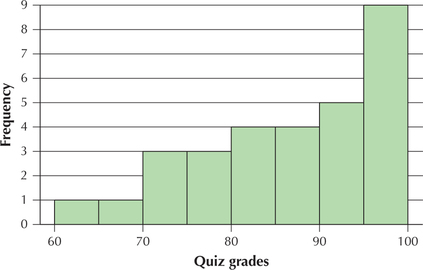
However, not all distributions are symmetric. Instead, a distribution may be skewed. Skewed distributions may be either left-skewed or right-skewed. Left-skewed distributions have a longer “tail” on the left than on the right. For example, the distribution of quiz grades from the author's Summer 2014 Business Statistics course has a longer tail on the left than on the right (Figure 32). This can happen with quizzes because several students bump up against the 100% boundary on the right, most students are somewhere in the middle, and only a few students are in the left tail.
 In Figure 32, do not say that the distribution is right-skewed because most of the data are on the right. This is a common mistake. Instead, skewness follows the longer tail, making Figure 32 left-skewed.
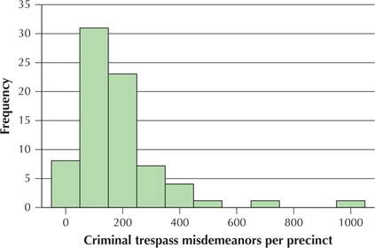
Alternatively, a data distribution may be right-skewed, where the distribution has a longer tail on the right than on the left. For example, in the Chapter 2 case study data, the number of criminal trespass misdemeanors per precinct is right-skewed because the right tail is longer than the left tail (Figure 33).

EXAMPLE 20 Identifying the shape of a distribution
Student-Run Café Business
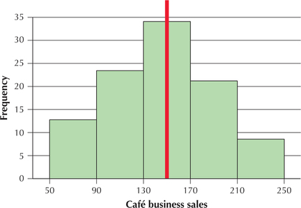
We return to the Student-Run café business data set first introduced in Example 8 on page 49 of Section 2.1. Figure 34 contains a histogram of the daily sales (in dollars) for the Student-Run café business. Identify whether the distribution is symmetric, right-skewed, or left-skewed.
Solution
The histogram in Figure 34 has a vertical axis of symmetry (red vertical line). Although the two halves are not perfect mirror images of each other, they are close. In the real world, data are seldom perfectly symmetric, due to random variation. Thus, we can accept that the café business sales data are symmetric.
NOW YOU CAN DO
Exercises 79–82.
Different graphical summaries may be appropriate for different situations. Example 21 illustrates this.
EXAMPLE 21 Choosing the appropriate graphical summary
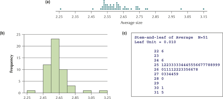
Statistically literate citizens recognize that one may select different graphical summaries, depending on the intention of the presenter. Figures 35a, 35b, and 35c contain a dotplot, a histogram, and a stem-and-leaf display, respectively, of the average size of households in the 50 states and the District of Columbia. Which graphical summary— the dotplot, the histogram, or the stem-and-leaf display—is most useful if our primary objective is to
- assess symmetry and skewness?
- be able to construct it quickly using paper and pencil?
- retain complete knowledge of the original data set?
- give a presentation to people who have never taken a stats course?
Solution
- All three graphics are good at assessing symmetry and skewness.
- The dotplot's great asset is its simplicity. It can be quickly drawn, with minimal preparation, in contrast to the other two summaries, which require some organization or calculation.
- The stem-and-leaf display was invented in order to retain complete knowledge of the data set. Histograms are the least effective in this regard.
- The histogram is widely used in the real world and is probably the best choice for a presentation to those who have never taken a stats course.