3.5 Five-Number Summary and Boxplots
 This page includes Video Technology Manuals
 This page includes Statistical Videos
OBJECTIVES By the end of this section, I will be able to …
- Calculate the five-number summary of a data set.
- Construct and interpret a boxplot for a given data set.
- Detect outliers using the IQR method.
1 The Five-number summary
Because the mean and the standard deviation are sensitive to the presence of outliers, data analysts sometimes prefer a less sensitive set of statistics to summarize a data set. The five-number summary is an alternative method of summarizing a data set. It includes the median and the quartiles, which are less sensitive to the presence of outliers than are the mean and standard deviation. On the other hand, it also includes the minimum and maximum data values, which are very sensitive to outliers. The five-number summary consists of five measures we have already seen.
The five-number summary consists of the following set of statistics:
- Minimum; the smallest value in the data set
- First quartile, Q1
- Median, Q2
- Third quartile, Q3
- Maximum; the largest value in the data set
EXAMPLE 31 The five-number summary for a small data set
Find the five-number summary for the state export data from Table 22, which is repeated here for convenience as Table 26.
stateexports
| State | VA | NC | NJ | GA | PA | OH | MI | FL | LA | IL | WA | NY |
|---|---|---|---|---|---|---|---|---|---|---|---|---|
| Exports ($ millions) |
1.6 | 2.7 | 3.3 | 3.5 | 3.5 | 4.6 | 4.7 | 4.8 | 5.0 | 5.8 | 7.5 | 7.7 |
Solution
From Example 28, we have the quartiles of the export data: Q1=3.4, median=Q2=4.65, and Q3=5.4. From Table 26, the minimum is Virginia's 1.6 and the maximum is New York's 7.7, which are all in millions of dollars. Thus, the fve-number summary is:
- Minimum=1.6
- First quartile,Q1=3.4
- Median=Q2=4.65
- Third quartile,Q3=5.4
- Maximum=7.7
NOW YOU CAN DO
Exercises 7–8, 13–14, and 19–20.
YOUR TURN#19
Jason is analyzing the movie ratings in the accompanying sample. Find the five-number summary of movie ratings.
| 8.7 | 5.4 | 7.1 | 3.6 | 1.9 | 5.7 | 4.2 | 9.3 | 2.5 |
(The solution is shown in Appendix A.)
EXAMPLE 32 The five-number summary for a large data set: Cholesterol levels in food
nutrition
Find the fve-number summary for the cholesterol data from Example 29 on page 164.
Solution
Minitab's reporting of the descriptive statistics makes it particularly straightforward to report the fve-number summary, as shown here in Figure 33 (repeated from page 164) for the cholesterol data.
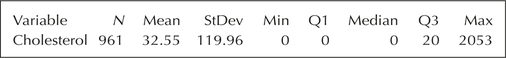
The five-number summary for the cholesterol data set is:
- Smallest value in the data set=Min=0
- First quartile, Q1=0
- Median=0
- Third quartile, Q3=20
- Largest value in the data set=Max=2053
Or, simply, Min=0, Q1=0, Med=0, Q3=20, Max=2053.
The five-number summary is associated with a certain type of graphical summary of data, called a boxplot, which we examine next.
2 The Boxplot
The boxplot (sometimes called a box-and-whisker plot) is a convenient graphical display of the five-number summary of a data set. The boxplot allows the data analyst to evaluate the symmetry or skewness of a data set.
EXAMPLE 33 The characteristics of a boxplot
Interpret the boxplot for the export data in Figure 34.
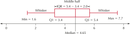
Solution
Let's examine this boxplot carefully. The horizontal axis represents the export values. The red box itself represents the middle half of the data set. The left-hand side of the box, called the lower hinge, is located at Q1, which is 3.4. The right-hand side of the box, called the upper hinge, is located at Q3, which is 5.4. The solid vertical line inside the box is located at the median, which is 4.65. The horizontal lines emanating from the left and right of the box are called the whiskers. If no outliers exist, the whiskers extend as far as the maximum and minimum values of the data set, which are represented by the vertical lines at Min=1.6 and Max=7.7.
Constructing a Boxplot by Hand
- The lower and upper fences (represented by brackets in Figure 35b below) represent limits, beyond which data values are considered outliers. Determine the lower and upper fences as follows:
- Lower fence=Q1-1.5(IQR)
- Upper fence=Q1+1.5(IQR), where IQR=Q3-Q1
- Draw a horizontal number line that encompasses the range of your data, including the fences. Above the number line, draw vertical lines at Q1, the median, and Q3. Connect the lines for Q1 and Q3 to each other so as to form a box.
- Temporarily indicate the fences as brackets ([ and ]) above the number line.
- Draw a horizontal line from Q1 to the smallest data value greater than the lower fence. This is the lower whisker. Draw a horizontal line from Q3 to the largest data value smaller than the upper fence. This is the upper whisker.
- Indicate any data values smaller than the lower fence or larger than the upper fence using an asterisk (*). These data values are outliers. Remove the temporary brackets.
EXAMPLE 34 Constructing a boxplot by hand
Construct a boxplot by hand for the export data.
Solution
From Example 31, the fve-number summary for the state export data is Min=1.6, Q1=3.4, Med=4.65, Q3=5.4, Max=7.7. The interquartile range for the state export data is IQR=Q3-Q1=5.4-3.4=2.0.
- Step 1 Determine the lower and upper fences:
- Lower fence=Q1-1.5(IQR)=3.4-1.5(2)=0.4
- Upper fence=Q3+1.5(IQR)=5.4+1.5(2)=8.4
- Step 2 Draw a horizontal number line that encompasses the range of your data, including the fences. Above the number line, draw vertical lines at Q1=3.4, median=4.65, and Q3=5.4. Connect the lines for Q1 and Q3 to each other so as to form a box, as shown in Figure 35a.
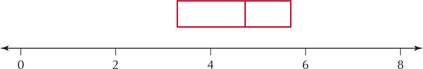 FIGURE 35A Constructing a boxplot by hand: Steps 1 and 2.
 - Step 3 Temporarily indicate the fences (lower fence=0.4 and upper fence=8.4) as brackets above the number line. (See Figure 35b.)
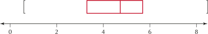 FIGURE 35B Constructing a boxplot by hand: Step 3.
 - Step 4 Draw a horizontal line from Q1=3.4 to the smallest data value greater than the lower fence. The lowest data value is min=1.6. This is greater than the lower fence=0.4, so draw the line from 3.4 to 1.6. Draw a horizontal line from Q3=5.4 to the largest data value smaller than the upper fence. The largest data value is Max=7.7, which is smaller than the upper fence, so draw the line from 5.4 to 7.7. (See Figure 35c.)Page 175
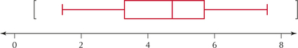 FIGURE 35C Constructing a boxplot by hand: Step 4.
 - Step 5 No data values are lower than the lower fence or greater than the upper fence. Thus, no outliers exist in this data set. Therefore, simply remove the temporary brackets, and the boxplot is complete, as shown in Figure 35d.
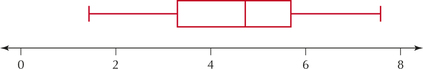 FIGURE 35D The completed boxplot.
NOW YOU CAN DO
Exercises 9–10, 15–16, and 21–22.
YOUR TURN#20
Previously, you found the five-number summary for Jason's movie ratings. Use the five-number summary to construct a boxplot of the data.
| 8.7 | 5.4 | 7.1 | 3.6 | 1.9 | 5.7 | 4.2 | 9.3 | 2.5 |
(The solution is shown in Appendix A.)
The next examples show how to recognize when boxplots indicate that a data set is right-skewed, left-skewed, or symmetric.
EXAMPLE 35 Boxplot for right-skewed data
The population of the 50 U.S. states in 2013 (Source: U.S. Census Bureau) is a right-skewed distribution, as shown in the histogram of the data in Figure 36, where the results are shown in millions of people living in the state. The fve-number summary is Min=0.6, Q1=1.8, Med=4.5, Q3=7.1, and Max=37.7. Note that, in the right-skewed boxplot (Figure 37), the upper whisker is much longer than the lower whisker. Also, it is often the case that the median is closer to Q1 than to Q3 in right-skewed data, but that didn't happen with this data.
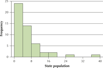
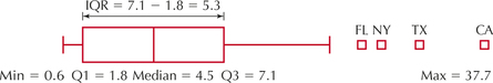
The four little boxes at the right represent outliers. (The TI-83/84 uses little boxes instead of asterisks.) These states are California, Texas, New York, and Florida. When no outliers exist, the whiskers extend as far as the minimum and maximum values. However, when outliers exist, the whiskers extend only as far as the most extreme data value that is not an outlier.
EXAMPLE 36 Boxplot for left-skewed data
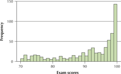
Figure 38 is a histogram of 650 exam scores. Clearly, the data are left-skewed, with many students getting scores in the 90s and fewer getting grades in the 70s or 80s.
Solution
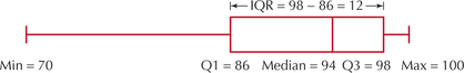
The fve-number summary is Min=70, Q1=86, Med=94, Q3=98, and Max=100. So, this time, with left-skewed data, the median is closer to Q3 than to Q1. Bet you guessed it!
In the boxplot (Figure 39), notice that the median (94) is closer to the upper hinge (Q3, 98) than to the lower hinge (Q1, 86), and the lower whisker is much longer than the upper whisker. This combination of characteristics indicates a left-skewed data set.
NOW YOU CAN DO
Exercises 25 and 26.
What Results Might We Expect?
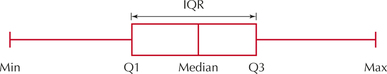
Symmetric Data and Boxplots
So, can you now predict how a boxplot of symmetric data will look? The median will be about the same distance from Q1 (lower hinge) and Q3 (upper hinge). And the upper and lower whiskers will be about the same length. An example of a box-plot of symmetric data is shown in Figure 40.
3 Detecting Outliers using the iQr Method
When using the mean and standard deviation as your summary measures, in most cases, outliers occur more than 3 standard deviations from the mean. However, due to the sensitivity of these measures to the outliers themselves, we often use a more robust method of detecting outliers. Earlier, we mentioned that, when constructing a boxplot, data values lower than the lower fence and higher than the upper fence are considered outliers. We can use this method to detect outliers without constructing a boxplot.
IQR Method to Detect Outliers
A data value is an outlier if
- it is located 1.5(IQR) or more below Q1, or
- it is located 1.5(IQR) or more above Q3.
EXAMPLE 37 IQR method for detecting outliers
Table 27 contains the value of exports by the United States to a sample of 12 countries around the world. Determine if there are any outliers in the country export data.
| Country | U.S. exports ($ millions) |
|---|---|
| Italy | 1.2 |
| Saudi Arabia | 1.7 |
| India | 1.9 |
| France | 2.8 |
| Brazil | 3.5 |
| South Korea | 3.8 |
| United Kingdom | 4.4 |
| Germany | 4.5 |
| Japan | 5.6 |
| China | 9.7 |
| Mexico | 20.3 |
| Canada | 26.3 |
Solution
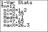
The TI 1-Var Stats analysis provides the five-number summary shown in Figure 41.
Using these statistics, we calculate the IQR to be Q3-Q1=7.65-2.35=5.3. The quantity 1.5(IQR)=1.5(5.3)=7.95. We next find the two quantities Q1-1.5(IQR) and Q3+1.5(IQR):
Q1-1.5(IQR)=2.35-7.95=−5.6Q3+1.5(IQR)=7.65+7.95=15.6
Thus, for this data set, a data value would be an outlier if it were –5.6 or less or 15.6 or more. No data values are —5.6 or less. However, both Mexico (20.3) and Canada (26.3) have values greater than 15.6. Therefore, both the $20.3 million in exports to Mexico and the $26.3 in exports to Canada may be considered outliers, using the IQR method.
NOW YOU CAN DO
Exercises 11–12, 17–18, and 23–24.
YOUR TURN#21
Use the IQR method to determine whether any outliers exist in the movie review data.
| 8.7 | 5.4 | 7.1 | 3.6 | 1.9 | 5.7 | 4.2 | 9.3 | 2.5 |
(The solution is shown in Appendix A.)
The next example shows how comparison boxplots may be used to compare two data sets side-by-side.
EXAMPLE 38 Comparison boxplots: Comparing body temperatures for women and men
Determine whether the body temperatures of women or men exhibit greater variability.
Solution
Consider the comparison boxplots in Figure 42. The box for females (on top) lies slightly to the right of that for the males, meaning that the frst quartile, the median, and the third quartile are each higher for the women than the men. Therefore, the middle 50% of the body temperatures is higher for women than for men.
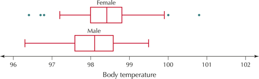
We will formally test whether a difference exists in the true mean body temperature between women and men in Chapter 10.
This figure seems to offer some evidence that the mean body temperature for women may be higher than that for men. The location of the box is an indication of the center of the data, but where would we look for a difference in the variability of body temperatures between women and men? From Figure 43, for the females we have
IQR=Q3-Q1=98.8-98.0=0.8.
For the males, we have
IQR=Q3-Q1=98.6-98.6=1.0.
Therefore, the IQR for males is greater.
Let's determine which data set has greater variability based on the three different measures of spread that we have learned: the range, the standard deviation, and the IQR.
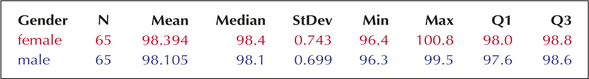
Range for women = 100.8−96.4=4.4Standard deviation for women = 0.743IQR for women = 0.8Range for men = 99.5−96.3=3.2Standard deviation for men = 0.699IQR for men = 1.0
NOW YOU CAN DO
Exercises 27–30.
Developing Your Statistical Sense
When Measures of Spread Disagree
Two measures of spread that are sensitive to the presence of extreme values— range and standard deviation—find that the female body temperatures are more variable. The measure of spread that is resistant to the effects of extreme values— IQR—finds that the male body temperatures are more variable. How do we resolve this apparent inconsistency? What appears to be happening is that, for the middle 50% of each data set, the men are more variable, but as we move toward the tails, the women are more spread out.
Note that outliers exist for the women but not for the men. In part, this may be because the IQR for the women is smaller, and thus the distance 1.5(IQR) is also smaller. For example, the woman whose body temperature is 100 degrees is identified as an outlier because 100 is the same as the outlier threshold Q3+1.5(IQR)=98.8+1.5(0.8)=100. The same temperature in a man would not be classified as an outlier, even though the male temperatures are lower overall (and Q3, specifically, is lower). This is because the temperature of 100 is not higher than Q3+1.5(IQR)=98.6+1.5(1.0)=100.1, which is the male outlier threshold. Thus, the measures of spread that are sensitive to outliers indicate that women have greater variability, whereas the measure of spread that is not sensitive to outliers indicates that men have greater variability.