4.1 Scatterplots and Correlation
 This page includes Video Technology Manuals
 This page includes Statistical Videos
OBJECTIVES By the end of this section, I will be able to …
- Construct and interpret scatterplots for two quantitative variables.
- Calculate and interpret the correlation coefficient.
So far, most of our work has looked at ways to describe only one quantitative variable at a time. But there may exist a relationship between two quantitative variables (for example, height and weight) that we want to graph or quantify. We may also want to use the value of one variable, say, height, to predict the value of the other variable, weight. In Section 4.1, we explore scatterplots, which are graphs of the relationship between two quantitative variables, and we learn about correlation, which quantifies this relationship.
1 Scatterplots
Whenever you are examining the relationship between two quantitative variables, your best bet is to start with a scatterplot. A scatterplot is used to summarize the relationship between two quantitative variables that have been measured on the same element. An example of a scatterplot is given in Figure 1.
Note: The predictor variable and response variable are sometimes referred to as the independent variable and dependent variable, respectively. This textbook avoids this terminology because it may be confused with the definition of independent and dependent events and variables in probability (Chapter 5) and categorical data analysis (Chapter 11).
A scatterplot is a graph of points (x, y), each of which represents one observation from the data set. One of the variables is measured along the horizontal axis and is called the x variable. The other variable is measured along the vertical axis and is called the y variable.
Often, the value of the x variable can be used to predict or estimate the value of the y variable. For this reason, the x variable is referred to as the predictor variable, and the y variable is called the response variable. We also say that the value of the response variable depends on the value of the predictor variable.
EXAMPLE 1 Predictor variables and response variables
For the following pairs of variables, identify which is the predictor (x) variable and which is the response (y) variable:
- The cost of an engagement ring, and the size of the diamond (in carats)
- The heights of primary school children, and their ages
Solution
- The cost of an engagement ring depends in part on the size of the diamond. We can use the size of the diamond to predict the cost of the ring. Thus, the diamond size is the predictor (x) variable, and the cost is the response (y) variable.
- Because the response variable depends on the predictor variable, and because a child's age depends on nothing but the calendar, then age cannot be the response variable. Age must therefore be the predictor (x) variable, with height as the response (y) variable.
NOW YOU CAN DO
Exercises 9–12.
YOUR TURN#1
For the following variables, identify which is the predictor (x) variable and which is the response (y) variable: the number of hours spent studying for an exam, and the grade on the exam.
(The solution is shown in Appendix A.)
EXAMPLE 2 Constructing a scatterplot
sqrfootsale
Suppose you are interested in moving to Glen Ellyn, Illinois, and want to purchase a lot upon which to build a new house. Table 1 contains a random sample of eight lots for sale in Glen Ellyn, with their square footage and prices.
- Identify the predictor variable and the response variable.
- Construct a scatterplot.
| Lot | x=square footage (100s of sq. ft.) | y=sales price ($1000s) |
|---|---|---|
| Harding St. | 75 | 155 |
| Newton Ave. | 125 | 210 |
| Stacy Ct. | 125 | 290 |
| Eastern Ave. | 175 | 360 |
| Second St. | 175 | 250 |
| Sunnybrook Rd. | 225 | 450 |
| Ahlstrand Rd. | 225 | 530 |
| Eastern Ave. | 275 | 635 |
Note: The square footage is expressed in 100s of square feet, so that “90” represents 90×100=9000 square feet. Similarly, the sales price is expressed in $1000s, so that .
Solution
- It is reasonable to expect that the price of a new lot depends in part on the size of the lot. Thus, we define our predictor variable to be and our response variable to be .
- Next, we construct the scatterplot using the data from Table 1. Draw the horizontal axis so that it can contain all the values of the predictor variable, and similarly for the vertical axis. Then, at each data point , draw a dot. For example, for the Harding Street lot, move along the x axis to 75, then go up until you reach a spot level with , at which point you draw a dot. Proceed similarly for the other seven properties. The result should look similar to the scatterplot in Figure 1.FIGURE 1 Scatterplot of sales price versus square footage.
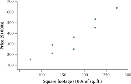
From this scatterplot, we can see that larger lots tend to have higher prices. This is not the case for each observation. For example, the Second Street property is larger than the Stacy Court property, but it has a lower price. Nevertheless, the overall tendency remains.
NOW YOU CAN DO
Exercises 13a–20a.
YOUR TURN#2
 Measuring the Human Body
Table 2 contains the heights in inches and weights in pounds of the first eight women in the body_females Case Study data set. Do the following:
- Identify the predictor variable and the response variable.
- Construct a scatterplot.
| 63.5 | 113.8 |
| 65.9 | 130.1 |
| 62.8 | 108.5 |
| 61.8 | 138.9 |
| 61.3 | 118.2 |
| 66.9 | 130.1 |
| 62.6 | 104.9 |
| 65.4 | 153.9 |
(The solutions are shown in Appendix A.)
Developing Your Statistical Sense
Scatterplot Terminology
Note the terminology in the caption to Figure 1. When describing a scatterplot, always indicate the variable first, and then use the term versus (vs.) or against the variable. This terminology reinforces the notion that the variable depends on the variable.
The relationship between two quantitative variables can take many different forms. We illustrate four of the most common relationships.
Note the phrase, “as increases in value …”. When interpreting scatterplots, we always move from left to right.
- Positive linear relationship. Figure 2 shows a positive linear relationship between and .
- Smaller values of height are associated with smaller values of weight .
- Larger values of height are associated with larger values of weight .
- As height increases, weight also tends to increase.
- Negative linear relationship. Figure 3 illustrates a negative linear relationship between and .
- Smaller values of age are associated with larger values of cost .
- Larger values of age are associated with smaller values of cost .
- As increases, tends to decrease.
Page 191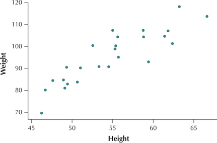 FIGURE 2 Height and weight have a positive linear relationship.
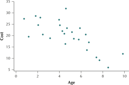 FIGURE 3 Age of used cars and cost have a negative linear relationship.
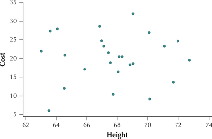
No apparent relationship. Figure 4 shows that no apparent relationship exists between the height of people who purchase used cars and the cost of the used car .
- Smaller values and larger values of height are associated with essentially similar values for vehicle cost .
- As increases, tends to remain unchanged.
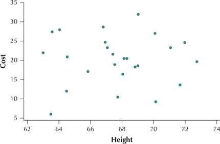 FIGURE 4 Height of car purchasers and car cost have no apparent relationship.Page 192
Nonlinear relationship. Figure 5 illustrates an example of a nonlinear relationship. When there is either too little salad dressing , or too much salad dressing, the tastiness of a salad can be lower than when a moderate amount of salad dressing is used. Thus, in this case, as the salad dressing increases, at first the tastiness also tends to increase, but then it tends to decrease as too much salad dressing is applied. This is only one example of many different types of nonlinear relationships.
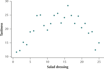 FIGURE 5 The amount of salad dressing and the tastiness of salad have a nonlinear relationship.
EXAMPLE 3 Characterize the relationship between two variables using a scatterplot
Using Figure 1 on page 189, characterize the relationship between lot square footage and lot price.
Solution
The scatterplot in Figure 1 most resembles Figure 2 on page 191, where a positive linear relationship exists between the variables. Thus, smaller lot sizes tend to be associated with lower prices, and larger lot sizes tend to be associated with higher prices. Put another way, as the lot size increases, the lot price also tends to increase.
NOW YOU CAN DO
Exercises 13b–20b and 21–26.
YOUR TURN#3
Measuring the Human Body
Characterize the relationship between height and weight, using the scatterplot you constructed from Table 2.
(The solution is shown in Appendix A.)
2 Correlation Coefficient
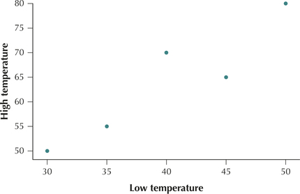
Scatterplots provide a visual description of the relationship between two quantitative variables. The correlation coefficient is a numerical measure for quantifying the linear relationship between two quantitative variables. Table 3 contains the low and high temperatures in degrees Fahrenheit (°F) for five American cities on a particular day. The variables are and . Applying what we have just learned, we construct a scatterplot of the data set, which is presented in Figure 6.
Figure 6 shows us that a positive relationship exists between the high temperature and the low temperature of a city. That is, colder low temperatures are associated with colder high temperatures. Warmer low temperatures are associated with warmer high temperatures. In this section, we seek to quantify this relationship between two numerical variables, using the correlation coefficient . The correlation coefficient (sometimes known as the Pearson product moment correlation coefficient) measures the strength and direction of the linear relationship between two variables. By linear, we mean straight line. The correlation coefficient does not measure the strength of a curved relationship between two variables.

| City | ||
|---|---|---|
| Boston | 30 | 50 |
| Chicago | 35 | 55 |
| Philadelphia | 40 | 70 |
| Washington, DC | 45 | 65 |
| Dallas | 50 | 80 |
The correlation coefficient measures the strength and direction of the linear relationship between two variables. The correlation coefficient is
where is the sample standard deviation of the data values, and is the sample standard deviation of the data values.
EXAMPLE 4 Calculating the correlation coefficient
highlowtemp
Find the value of the correlation coefficient for the temperature data in Table 3.
Solution
We will outline the steps used in calculating the value of using the temperature data.
- Step 1 Calculate the respective sample means, and .
- Step 2 Construct a table, as shown here in Table 4.Page 194Table 4.4: Table 4 Calculation table for the correlation coefficient
City Boston 30 50 −10 100 −14 196 140 Chicago 35 55 −5 25 −9 81 45 Philadelphia 40 70 0 0 6 36 0 Washington, DC 45 65 5 25 1 1 5 Dallas 50 80 10 100 16 256 160 Note on Rounding: Whenever you calculate a quantity that will be needed for later calculations, do not round. Round only when you arrive at the final answer. Here, because the quantities and are used to calculate the correlation coefficient , neither of them is rounded until the end of the calculation.
- Step 3 Calculate the respective sample standard deviations and . Using the sums calculated from Table 4, we have
- Step 4 Put these values all together in the formula for the correlation coefficient :
The correlation coefficient for the high and low temperatures is 0.9272.
NOW YOU CAN DO
Exercises 13c–20c.
YOUR TURN#4
Measuring the Human Body
Use Steps 1–4 to calculate the correlation coefficient between height and weight for the data in Table 2.
(The solution is shown in Appendix A.)
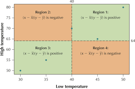
What Does This Formula Mean?
The Correlation Coefficient
Let's analyze the definition formula for the correlation coefficient . When would be positive, and when would it be negative? We see that the formula
consists of a ratio.
- Note that the denominator can never be negative because it is the product of three non-negative values (standard deviations can never be negative). Therefore, the numerator determines whether will be positive or negative.
- We know that is positive whenever the data value is greater than , and it is negative when is less than . This relationship is similar for .
Four cases (or regions, which are illustrated in Figure 7) describe when the product will be positive or negative, as shown in Table 5.
| Region | |||
|---|---|---|---|
| 1 | Positive | Positive | Positive |
| 2 | Negative | Positive | Negative |
| 3 | Negative | Negative | Positive |
| 4 | Positive | Negative | Negative |
- If most of the data values fall in Regions 1 and 3, then will tend to be positive.
- If most of the data values fall in Regions 2 and 4, then will tend to be negative.
Let's explore how our high and low temperature data fit into the above framework. The mean low temperature is , whereas the mean high temperature is . We find the point in our scatterplot of the high and low temperatures, draw the lines and , and mark out our four regions, as shown in Figure 7. Note that four of the five data points fall in Regions 1 and 3, with the fifth falling exactly on a boundary line. Therefore, we expect the value of for this data set to be positive, which is indeed the case, because we observed in Example 4.
Next, we outline the properties of the correlation coefficient .
 If your calculations give you a value of outside this range, try it again.
Properties of the correlation coefficient
The correlation coefficient always takes on values between −1 and 1, inclusive.
That is, .
- When , a perfect positive relationship exists between and . Figure 8 illustrates the perfect positive relationship between , and .FIGURE 8 Perfect positive relationship between and .
- Positive values of indicate a positive relationship between and (Figures 9 and 10):
- The closer gets to +1, the stronger the evidence for a positive relationship.
- The variables are said to be positively correlated.
As increases, tends to increase.
Figure 9 repeats Figure 1, the scatterplot of sales price versus square footage, for which . Figure 10 repeats Figure 2, the scatterplot of height and weight of middle school children, for which .
FIGURE 9 for and .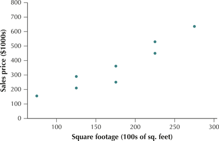 FIGURE 10 for and .
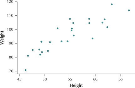
- When , a perfect negative relationship exists between and . Figure 11 illustrates the perfect negative relationship between , and .Page 197FIGURE 11 Perfect negative relationship between and .
- Negative values of indicate a negative relationship between and (Figures 12 and 13):FIGURE 12 for and .
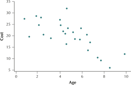 FIGURE 13 for and .
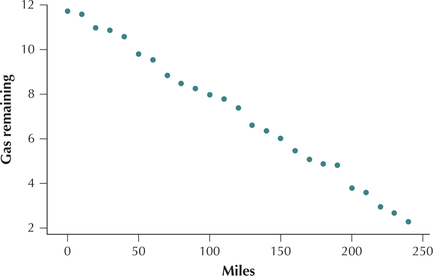
- The closer gets to −1, the stronger the evidence for a negative relationship.
- The variables are said to be negatively correlated.
As increases, tends to decrease.
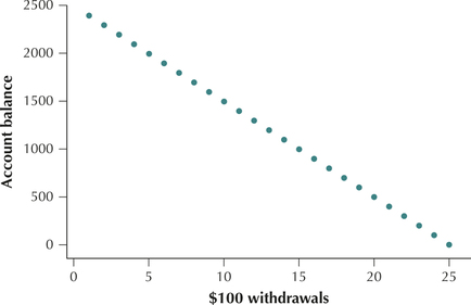
Figure 12 repeats Figure 3, the scatterplot of the cost of used cars versus their age, for which . Figure 13 shows a scatterplot of , and , for a trip combining city and highway travel. The correlation is .
- Values of near 0 indicate that no linear relationship exists between and (Figure 14):
- The closer gets to 0, the weaker the evidence for a linear relationship.
- The variables are not linearly correlated.
- A nonlinear relationship may exist between and .
Figure 14 repeats Figure 4, the scatterplot of and , for which .
EXAMPLE 5 Interpreting the correlation coefficient
Interpret the value of the correlation coefficient found in Example 4.
Solution
In Example 4, we found the correlation coefficient for the relationship between high and low temperatures to be . This value of is very close to the maximum value . We would therefore say that high and low temperatures for these five American cities are strongly positively correlated. As low temperature increases, high temperature also tends to increase.
NOW YOU CAN DO
Exercises 13d–20d.
YOUR TURN#5
Measuring the Human Body
Interpret the value of the correlation coefficient you found for the data in Table 2.
(The solution is shown in Appendix A.)
Developing Your Statistical Sense
![]() Note: The Correlation and Regression applet allows you to insert your own data values and see how the regression line changes.
Note: The Correlation and Regression applet allows you to insert your own data values and see how the regression line changes.
Correlation Is Not Causation
If we conclude that two variables are correlated, it does not necessarily follow that one variable causes the other to occur. For example, in the late 1940s, before the development of a vaccine for the disease polio, analysts noticed a strong correlation between the amounts of ice cream consumed nationwide and higher levels of the onset of polio. Some doctors went on to recommend eliminating ice cream as a way to fight polio. But did ice cream really cause polio? No. Ice cream consumption and polio outbreaks both peaked in the hot summer months, and so were correlated seasonally. Ice cream did not cause polio. After the development of the polio -vaccine by Jonas Salk in the 1950s, the disease disappeared from most countries in the world.