Section 4.1 Exercises
CLARIFYING THE CONCEPTS
Question 4.1
1. When investigating the relationship between two quantitative variables, what graph should you use first? (p. 188)
4.1.1
Scatterplot
Question 4.2
2. In your own words, explain what the correlation coefficient measures. What is the symbol that we use for the correlation coefficient? (p. 192)
Question 4.3
3. What is the range of values the correlation coefficient can take? (p. 195)
4.1.3
Between −1 and 1, inclusive
Question 4.4
4. What do the following values of r indicate about the relationship between two variables? What can we say about the variables?
- A value of r close to 1 (p. 196)
- A value of r close to −1 (p. 197)
- A value of r close to 0 (p. 197)
Question 4.5
5. Why do we call x the predictor variable? (p. 188)
4.1.5
Often, the value of the x variable can be used to predict or estimate the value of the y variable.
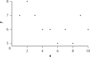
Question 4.6
6. Suppose two quantitative variables have a positive relationship. What can we say about the values of the y variable as the x variable increases? (p. 190)
Question 4.7
7. Suppose two quantitative variables have a negative relationship. What can we say about the values of the y variable as the x variable increases? (p. 190)
4.1.7
They decrease.
Question 4.8
8. Suppose that the correlation coefficient r equals 0. Does this mean that x and y have no relationship? Explain. (pp. 192, 197)
PRACTICING THE TECHNIQUES
 CHECK IT OUT!
| To do | Check out | Topic |
|---|---|---|
| Exercises 9–12 | Example 1 | Predictor variables and response variables |
| Exercises 13a–20a | Example 2 | Constructing a scatterplot |
| Exercises 13b–20b and 21–26 |
Example 3 | Describing the relationship between xandy |
| Exercises 13c–20c and 31–34 |
Example 4 | Calculating the correlation coefficient r |
| Exercises 13d–20d and 27–30 |
Example 5 | Interpreting the correlation coefficient r |
For Exercises 9–12, two variables are given. Determine which variable is the predictor variable (x) and which is the response variable (y).
Question 4.9
9. The heights (in inches) and weights (in pounds) of a sample of five women are recorded.
4.1.9
Predictor (x): Height
Response (y): Weight
Question 4.10
10. The number of days absent from a class, and the course grade.
Question 4.11
11. The cost of a repair job and the number of hours spent on the repair.
4.1.11
Predictor (x): The number of hours spent on the repair
Response (y): The cost of a repair job
Question 4.12
12. Attendance at a baseball game (in thousands), and the amount of rainfall at a baseball stadium that day (in inches).
For Exercises 13–20, do the following for the indicated data set:
- Construct a scatterplot of the relationship between x and y.
- Interpret the scatterplot.
- Calculate the correlation coefficient r.
- Interpret the value of the correlation coefficient r.
Question 4.13
13. The values of x and y are as follows:
| x | y |
|---|---|
| 10 | 2 |
| 20 | 2 |
| 30 | 3 |
| 40 | 4 |
| 50 | 4 |
4.1.13
(a)
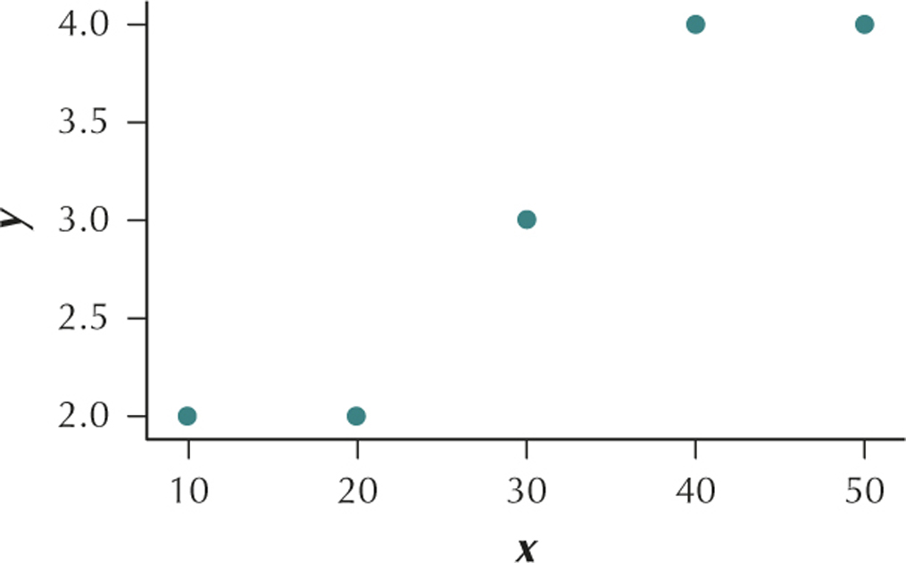
(b) The variables x and y have a positive linear relationship. (c) r=0.9487 (d) This value of r is very close to the maximum value r=1. We would therefore say that x and y are positively correlated. As x increases, y also tends to increase.
Question 4.14
14. The values of x and y are given as follows:
| x | y |
|---|---|
| 1 | 10 |
| 2 | 9 |
| 3 | 8 |
| 4 | 8 |
| 5 | 7 |
Question 4.15
15. The predictor variable (x) and the response variable (y) take the following values:
| x | y |
|---|---|
| −5 | −5 |
| −5 | −15 |
| 0 | −20 |
| 5 | −25 |
| 5 | −30 |
4.1.15
(a)
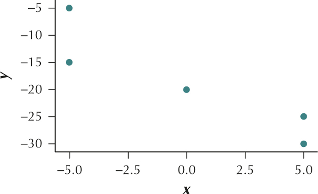
(b) The variables x and y have a negative linear relationship. (c) r=−0.9098 (d) This value of r is very close to the minimum value r=−1. We would therefore say that x and y are negatively correlated. As x increases, y tends to decrease.
Question 4.16
16. The predictor variable (x) and the response variable (y) take the following values:
| x | y |
|---|---|
| 0 | 10 |
| 20 | 10 |
| 40 | 15 |
| 60 | 20 |
| 80 | 20 |
Question 4.17
17. The heights (in inches) and weights (in pounds) of a sample of five women are recorded:
| Height | Weight |
|---|---|
| 66 | 122 |
| 67 | 133 |
| 69 | 153 |
| 68 | 138 |
| 65 | 125 |
4.1.17
(a)
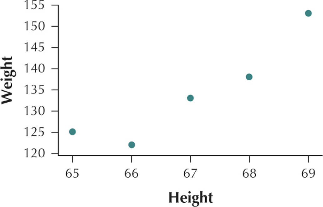
(b) The variables height and weight have a positive linear relationship. (c) r=0.9274 (d) This value of r is very close to the maximum value r=1.
We would therefore say that height and weight are positively correlated. As height increases, weight also tends to increase.
Question 4.18
18. The number of days absent from a class, and the course grade:
| Days absent | Course grade |
|---|---|
| 0 | 95 |
| 2 | 90 |
| 4 | 85 |
| 6 | 70 |
| 8 | 60 |
Question 4.19
19. The cost of a repair job, and the number of hours spent on the repair:
| Cost | Hours |
|---|---|
| 120 | 2 |
| 180 | 3 |
| 230 | 5 |
| 350 | 8 |
| 380 | 10 |
4.1.19
(a)
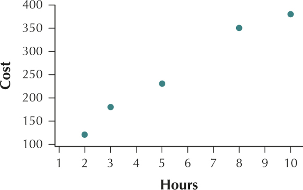
(b) The hours a repair job takes and the cost of the repair job have a positive linear relationship. (c) r=0.9896 (d) This value of r is very close to the maximum value r=1. We would therefore say that hours worked and cost are positively correlated. As the number of hours worked increases, the cost also tends to increase.
Question 4.20
20. Attendance at a baseball game (in thousands), and the amount of rainfall at a baseball stadium that day (in inches):
| Rain | Attendance |
|---|---|
| 0.0 | 40 |
| 0.0 | 42 |
| 0.1 | 38 |
| 0.5 | 30 |
| 1.0 | 20 |
For Exercises 21–26, do the following:
- Characterize the relationship between x and y.
- State what happens to the values of the y variable as the x-values increase.
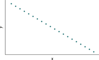
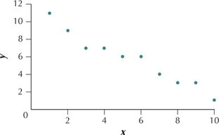
Question 4.21
21. 
4.1.21
(a) Strong negative linear relationship (b) They decrease.
Question 4.22
22. 
Question 4.23
23. 
4.1.23
(a) Moderate positive linear relationship (b) They increase.
Question 4.24
24. 
Question 4.25
25. 
4.1.25
(a) Perfect negative linear relationship (b) They decrease.
Question 4.26
26. 
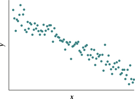
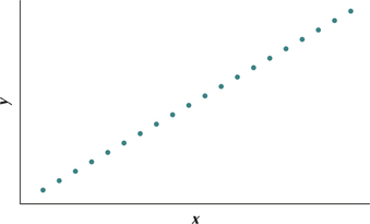
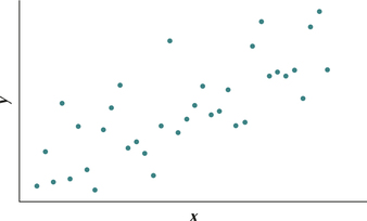
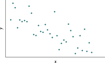
For Exercises 27–30, identify which of the scatterplots in i–iv represents the data set with the following correlation coefficients:
Question 4.27
27. Near 1
4.1.27
i
Question 4.28
28. Near zero
Question 4.29
29. Near −0.5
4.1.29
iii
Question 4.30
30. Near −1
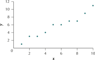
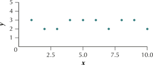
In Exercises 31–34, the values for x and y in each scatterplot are integer-valued. For each scatterplot, (a) reconstruct the original data set, and (b) calculate the correlation coefficient for the data.
Question 4.31
31. The data in scatterplot i
4.1.31
(a) (1,1), (2,3), (3,3), (4,4), (5,6), (6,6), (7,7), (8,7), (9,9), (10,11)
(b) Minitab: Pearson correlation of x and y=0.978. TI-83/84: r=0.9781316853
Question 4.32
32. The data in scatterplot ii
Question 4.33
33. The data in scatterplot iii
4.1.33
(a) (1,7), (2,8), (3,7), (4,6), (5,6), (6,5), (7,6), (8,5), (9,7), (10,6) (b) Minitab: Pearson correlation of x and y=−0.522. TI-83/84: r=−0.5222329679
Question 4.34
34. The data in scatterplot iv
APPLYING THE CONCEPTS
For Exercises 35–49, do the following:
- Construct a scatterplot of the relationship between x and y.
- Interpret the scatterplot.
- Calculate the correlation coefficient r.
- Interpret the value of the correlation coefficient r.
Question 4.35
videogamereg
35. Video Game Sales. The Chapter 1 Case Study looked at video game sales for the top 30 video games. The following table contains the weeks on the top 30 list (x) and the total sales (y, in millions of game units).
| Video game | Weeks (x) | Total sales in millions of units (y) |
|---|---|---|
| Super Mario Bros. U for WiiU |
78 | 1.7 |
| NBA 2K14 for PS4 | 27 | 0.6 |
| Battlefield 4 for PS3 | 29 | 0.9 |
| Titanfall for Xbox One | 10 | 1.2 |
| Yoshi's New Island for 3DS |
10 | 0.2 |
4.1.35
(a)
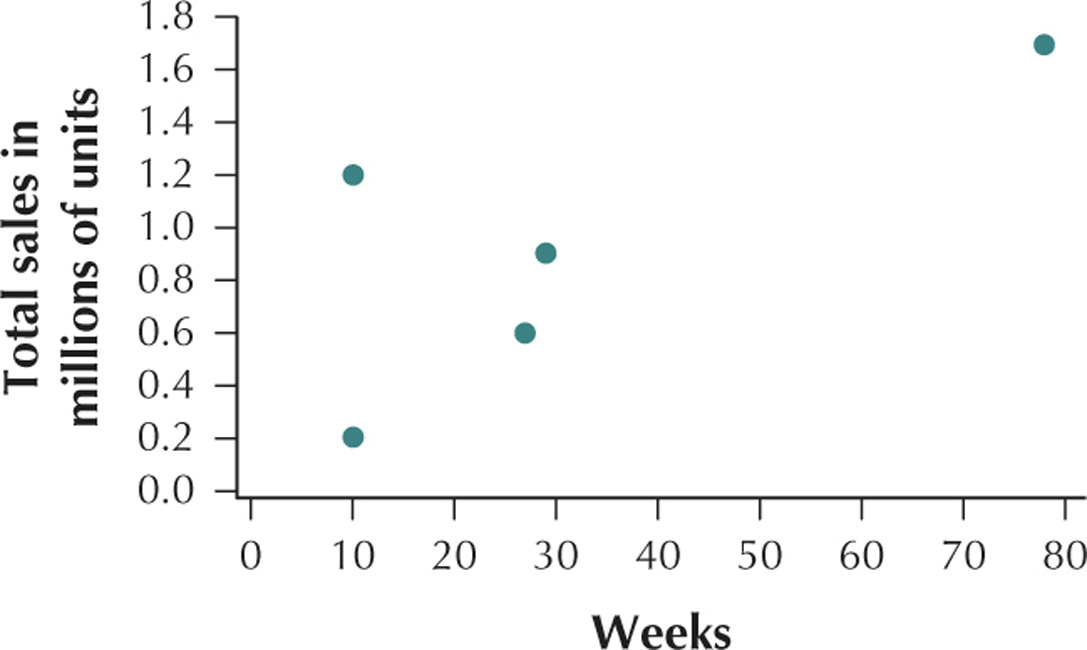
(b) The number of weeks on the top 30 list and the total sales in millions of game units have a positive linear relationship. (c) r=0.7403 (d) This value of r is close to the maximum value r=1. We would therefore say that weeks and total sales are positively correlated. As the number of weeks on the top 30 lists increases, the total sales also tends to increase.
Question 4.36
edunemploy
36. Does It Pay to Stay in School? The U.S. Census Bureau reported the following unemployment rates (y) associated with the given years of education (x).
| x=years of education | y=unemployment rate |
|---|---|
| 5.0 | 16.8 |
| 7.5 | 17.1 |
| 8.0 | 15.3 |
| 10.0 | 20.6 |
| 12.0 | 11.7 |
| 14.0 | 8.1 |
| 16.0 | 3.8 |
Question 4.37
dartsdjia
37. Darts and the Dow Jones. The following table contains a random sample of eight days from the Chapter 3 Case Study data set, indicating the stock market gain or loss for the portfolio chosen by the random darts (y), as well as the Dow Jones Industrial Average (DJIA) gain or loss for that day (x).
| Darts (y) | DJIA (x) |
|---|---|
| −27.4 | −12.8 |
| 18.7 | 9.3 |
| 42.2 | 8.0 |
| −16.3 | −8.5 |
| 11.2 | 15.8 |
| 28.5 | 10.6 |
| 1.8 | 11.5 |
| 16.9 | −5.3 |
4.1.37
(a)
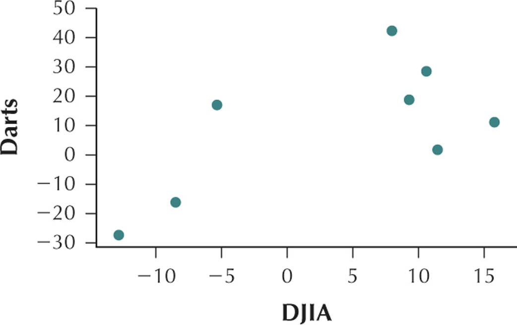
(b) The change in price of the stocks in the DJIA and the change in price of the stocks in the portfolio selected by the darts have a positive linear relationship. (c) r=0.6639 (d) This value of r is close to the maximum value r=1. We would therefore say that DJIA and Darts are positively correlated. As the change in stock prices of the stocks in the DJIA increases, the change in stock prices selected by darts also tends to increase.
Question 4.38
ageheight
38.  Age and Height. The following table provides a random sample from the Chapter 4 Case Study data set body_females, showing the age (x) and height (y) of eight women.
| Age (x) | Height (y) |
|---|---|
| 40 | 63.5 |
| 28 | 63.0 |
| 25 | 64.4 |
| 34 | 63.0 |
| 26 | 63.8 |
| 21 | 68.0 |
| 19 | 61.8 |
| 24 | 69.0 |
Question 4.39
gardasilreg
39. Gardasil Shots and Age. The accompanying table shows a random sample of 10 patients from the Chapter 5 Case Study data set, Gardasil, including the age of the patient (x) and the number of shots taken by the patient (y).
| Age (x) | Shots (y) |
|---|---|
| 13 | 3 |
| 21 | 3 |
| 16 | 3 |
| 17 | 2 |
| 17 | 3 |
| 18 | 1 |
| 25 | 2 |
| 15 | 3 |
| 12 | 1 |
| 16 | 1 |
4.1.39
(a)
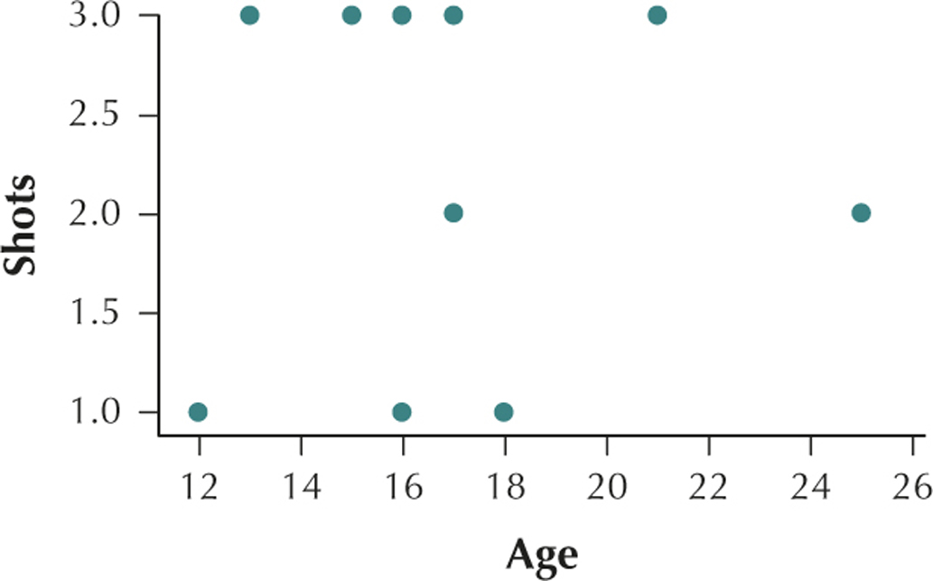
(b) Age and number of shots have no apparent relationship. (c) r=0.0641 (d) This value of r is very close to the value r=0. We would therefore say that there is no linear relationship between age and shots.
Question 4.40
ncaa2014
40. NCAA Power Ratings. The accompanying table shows the top 10 teams' winning percentages (x) and power ratings (y) for the 2013–2014 NCAA basketball season, according to www.teamrankings.com.
| Team | Winning proportion (x) |
Power rating (y) |
|---|---|---|
| Florida | 0.923 | 121.2 |
| Wichita State | 0.971 | 119.1 |
| Arizona | 0.868 | 118.8 |
| Louisville | 0.838 | 117.9 |
| Connecticut | 0.800 | 117.2 |
| Virginia | 0.811 | 116.8 |
| Wisconsin | 0.789 | 116.6 |
| Villanova | 0.853 | 116.4 |
| Michigan State | 0.763 | 115.9 |
| Michigan | 0.757 | 115.9 |
Question 4.41
satfatcorr
41. Saturated Fat and Calories. The table contains the calories and saturated fat in a sample of 10 food items.
| Food item | Calories | Grams of saturated fat |
|---|---|---|
| Chocolate bar (1.45 ounces) | 216 | 7.0 |
| Meat & veggie pizza (large slice) |
364 | 5.6 |
| New England clam chowder (1 cup) |
149 | 1.9 |
| Baked chicken drumstick (no skin, medium size) |
75 | 0.6 |
| Curly fries, deep-fried (4 ounces) |
276 | 3.2 |
| Wheat bagel (large) | 375 | 0.3 |
| Chicken curry (1 cup) | 146 | 1.6 |
| Cake doughnut hole (one) | 59 | 0.5 |
| Rye bread (1 slice) | 67 | 0.2 |
| Raisin bran cereal (1 cup) | 195 | 0.3 |
4.1.41
(a)
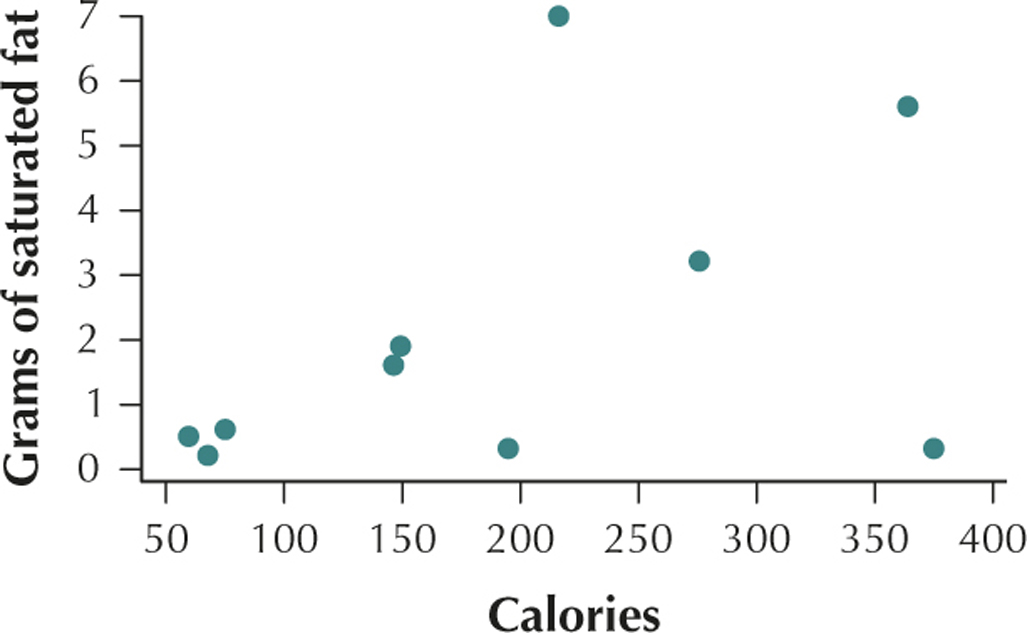
(b) The number of calories in a serving of food and the grams of saturated fat in a serving of food have a positive linear relationship. (c) r=0.4482 (d) This value of r is positive. We would therefore say that the number of calories in a serving of food and the grams of saturated fat in a serving of food are positively correlated. As the number of calories in a serving of food increases, the grams of saturated fat in a serving of food also tends to increase.
Question 4.42
displacement
42. Engine Displacement and Gas Mileage. The table provides the engine displacement (size, in liters) and the city mpg (miles per gallon) gas mileage of a random sample of 12 vehicles taken from the Chapter 6 Case Study data set, FuelEfficiency.
| Vehicle | Engine displacement |
City mpg |
|---|---|---|
| GMC Yukon Denali | 6.2 | 13 |
| Ford E350 Wagon | 5.4 | 11 |
| BMW435i Coupe | 3.0 | 20 |
| Land Rover Range Rover | 5.0 | 13 |
| Infiniti Q50a | 3.7 | 19 |
| Dodge Journey | 3.6 | 17 |
| Jaguar XF | 5.0 | 15 |
| Dodge Challenger | 6.4 | 14 |
| Toyota Highlander Hybrid | 3.5 | 28 |
| Mercedes-Benz S550 | 4.7 | 17 |
| Ford Fiesta | 1.6 | 29 |
| Hyundai Elantra | 2.0 | 24 |
Question 4.43
collegecompleters
43. Completing College. The twenty-first century economy not only needs students to attend college; it needs students to complete their college degrees, in order to compete in the information age. The table contains a sample of 10 states, with data on the percentage of residents who have attended college (x) and the percentage of college attendees who have completed their college degrees (y).
| State | x=college attenders | y=college completers |
|---|---|---|
| California | 30.9 | 38.8 |
| Florida | 26.6 | 35.5 |
| Georgia | 30.1 | 34.1 |
| Illinois | 35.7 | 39.1 |
| Massachusetts | 45.2 | 45.9 |
| New York | 38.7 | 42.8 |
| North Carolina | 30.1 | 35.5 |
| Ohio | 28.4 | 37.1 |
| Pennsylvania | 32.5 | 40.2 |
| Texas | 26.2 | 32.2 |
4.1.43
(a)
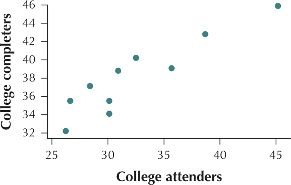
(b) The percent of residents of a state who attend college and the percent of residents of a state who graduate from college have a positive linear relationship. (c) r=0.9196 (d) This value of r is very close to the maximum value r=1. We would therefore say that college attenders and college completers are positively correlated. As the number of college attenders increases, the number of college completers also tends to increase.
Question 4.44
walkbike
44. Walking or Biking to Work. In these days of high gas prices, it is worth considering alternative methods of commuting. The table contains, for a sample of 10 American cities, the percentage of people who walk to work (x) and the percentage of people who bike to work (y).
| City | x=walk to work | y=bike to work |
|---|---|---|
| Anaheim | 1.8 | 0.9 |
| Baltimore | 6.5 | 0.8 |
| Buffalo | 6.2 | 0.9 |
| Cincinnati | 5.4 | 0.5 |
| Detroit | 3.1 | 0.3 |
| Jacksonville | 1.4 | 0.4 |
| Las Vegas | 1.9 | 0.4 |
| New Orleans | 5.1 | 2.1 |
| Orlando | 1.9 | 0.4 |
| Sacramento | 3.2 | 2.5 |
Question 4.45
teenbirth
45. Teenage Birth Rate. The National Center for Health Statistics publishes data on state birth rates. The table contains the overall birth rate and the teenage birth rate for eight randomly chosen states. The overall birth rate is defined by the NCHS as “live births per 1000 women,” and the teenage birth rate is defined as “live births per 1000 women aged 15–19.”
| State | x=overall birth rate | y=teen birth rate |
|---|---|---|
| California | 62.0 | 23.6 |
| Florida | 59.3 | 24.6 |
| Georgia | 61.6 | 30.5 |
| New York | 58.8 | 17.7 |
| Ohio | 62.7 | 27.2 |
| Pennsylvania | 58.4 | 20.9 |
| Texas | 69.9 | 41.0 |
| Virginia | 60.9 | 20.1 |
4.1.45
(a)
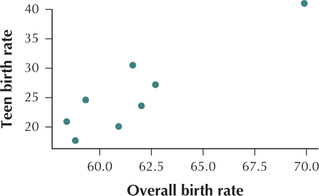
(b) The overall birth rate and the teenage birth rate have a positive linear relationship. (c) r=0.9059 (d) This value of r is very close to the maximum value r=1. We would therefore say that overall birth rate and teen birth rate are positively correlated. As the overall birth rate increases, the teen birth rate also tends to increase.
Question 4.46
brainbody
46. Brain and Body Weight. A study compared the body weight (in kilograms) and brain weight (in grams) for a sample of mammals, with the results shown in the following table.2
| x=body weight(kg) | y=brain weight(g) |
|---|---|
| 52.16 | 440.0 |
| 60.00 | 81.0 |
| 27.66 | 115.0 |
| 85.00 | 325.0 |
| 36.33 | 119.5 |
| 100.00 | 157.0 |
| 35.00 | 56.0 |
| 62.00 | 132.0 |
| 83.00 | 98.2 |
| 55.50 | 175.0 |
Question 4.47
consumersentiment
47. Consumer Sentiment. Would you expect the consumer sentiment (a measure of how upbeat a consumer feels about his or her personal economic condition) of those with lower incomes to be correlated with that of those with higher incomes, over time? The University of Michigan's Survey of Consumers published the data in the following table, showing the consumer sentiment in 2013 month by month for the two groups.
| Month | x=consumer sentiment for incomes under $75,000 | y=consumer sentiment for incomes $75,000 or higher |
|---|---|---|
| Jan | 71.6 | 80.2 |
| Feb | 75.7 | 82.4 |
| Mar | 78.3 | 83.7 |
| Apr | 74.5 | 79.8 |
| May | 80.3 | 94.1 |
| Jun | 76.1 | 98.9 |
| Jul | 82.4 | 90.0 |
| Aug | 78.0 | 89.6 |
| Sep | 72.3 | 86.2 |
| Oct | 71.4 | 77.0 |
| Nov | 67.9 | 88.7 |
| Dec | 78.9 | 88.0 |
4.1.47
(a)
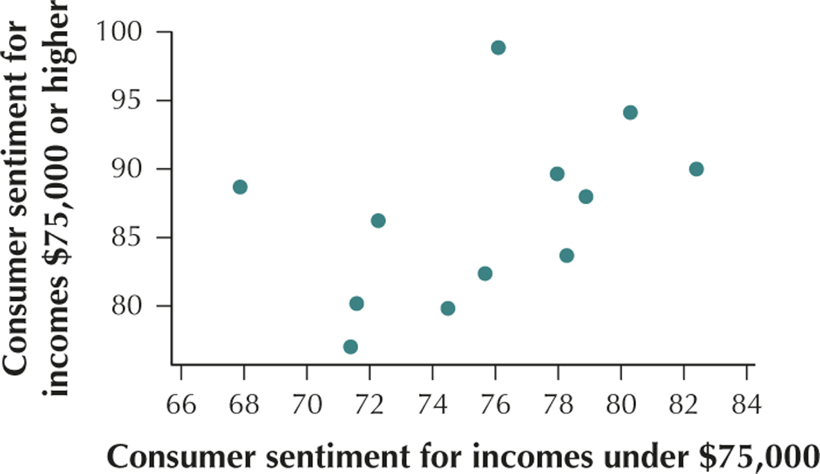
(b) The consumer sentiment for incomes under $75,000 and the consumer sentiment for incomes $75,000 or higher have a positive linear relationship. (c) r=0.4296 (d) This value of r is positive. We would therefore say that the consumer sentiment for incomes under $75,000 and the consumer sentiment for incomes $75,000 or higher are positively correlated. As the consumer sentiment for incomes under $75,000 increases, the consumer sentiment for incomes $75,000 or higher also tends to increase.
Question 4.48
satlanguages
48. SAT Scores, by Foreign Language. The table contains the mean 2014 SAT Critical Reading and Math scores, which are categorized by the foreign language taken in high school or spoken at home.
| Language | SAT Critical Reading score |
SAT Mathematics score |
|---|---|---|
| Chinese | 535 | 606 |
| French | 519 | 525 |
| German | 530 | 540 |
| Greek | 526 | 543 |
| Hebrew | 526 | 541 |
| Italian | 497 | 509 |
| Japanese | 521 | 552 |
| Korean | 490 | 576 |
| Latin | 556 | 556 |
| Russian | 483 | 535 |
| Spanish | 498 | 508 |
Question 4.49
batters2014
49. Batting Average and Runs Scored. The table shows the top 10 hitters in the American League of Major League Baseball for 2014. We are interested in estimating the number of runs scored (y) using the player's batting average (x).
| Batter | Team | Runs scored |
Batting average |
|---|---|---|---|
| Jose Altuve | Houston Astros | 85 | 0.341 |
| Victor Martinez | Detroit Tigers | 87 | 0.335 |
| Michael Brantley | Cleveland Indians |
94 | 0.327 |
| Adrian Beltre | Texas Rangers | 79 | 0.324 |
| Jose Abreu | Chicago White Sox |
80 | 0.317 |
| Robinson Cano | Seattle Mariners | 77 | 0.314 |
| Miguel Cabrera | Detroit Tigers | 101 | 0.313 |
| Melky Cabrera | Toronto Blue Jays |
81 | 0.301 |
| Adam Eaton | Chicago White Sox |
76 | 0.300 |
| Howie Kendrick | Los Angeles Angels |
85 | 0.293 |
4.1.49
(a)
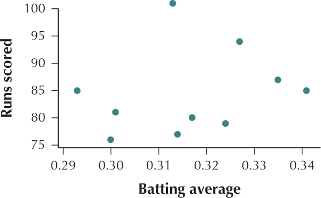
(b) The batting average of a baseball player and the number of runs scored by a baseball player have no apparent relationship. (c) r=0.2332 (d) This value of r is very close to the value r=0. We would therefore say that there is no linear relationship between batting average and runs scored.
Correlation in Accounting. A company's current ratio measures its ability to pay its short-term obligations. Use the data in the table, which contains a random sample of large technology companies in 2010, for Exercises 50–56. Total assets and total liabilities are in billions of dollars.
| Company | Current ratio |
Price- earnings ratio |
Assets | Liabilities |
|---|---|---|---|---|
| Microsoft | 1.82 | 12.51 | 77.9 | 38.3 |
| Intel | 2.79 | 18.44 | 53.1 | 11.4 |
| Dell | 1.28 | 10.95 | 33.7 | 28.0 |
| Apple | 1.88 | 24.57 | 53.9 | 26.0 |
| 10.62 | 18.87 | 40.5 | 4.5 |
Question 4.50
accountingcorr
50. Provide and interpret a scatterplot of liabilities versus assets.
Question 4.51
accountingcorr
51. Calculate and interpret the correlation coefficient between liabilities and assets.
4.1.51
r=0.5554; This value of r is positive. We would therefore say that assets and liabilities are positively correlated. As assets increase, liabilities also tend to increase.
Question 4.52
accountingcorr
52. Provide and interpret a scatterplot of current ratio versus price-earnings ratio.
Question 4.53
accountingcorr
53. Calculate and interpret the correlation coefficient between current ratio and price-earnings ratio.
4.1.53
r=0.2443; This value of r is very close to the value r=0. We would therefore say that there is no linear relationship between price–earnings ratio and current ratio.
Question 4.54
accountingcorr
54. Compute a new variable, called net worth, which equals assets – liabilities.
Question 4.55
accountingcorr
55. Provide and interpret a scatterplot of net worth versus current ratio.
4.1.55
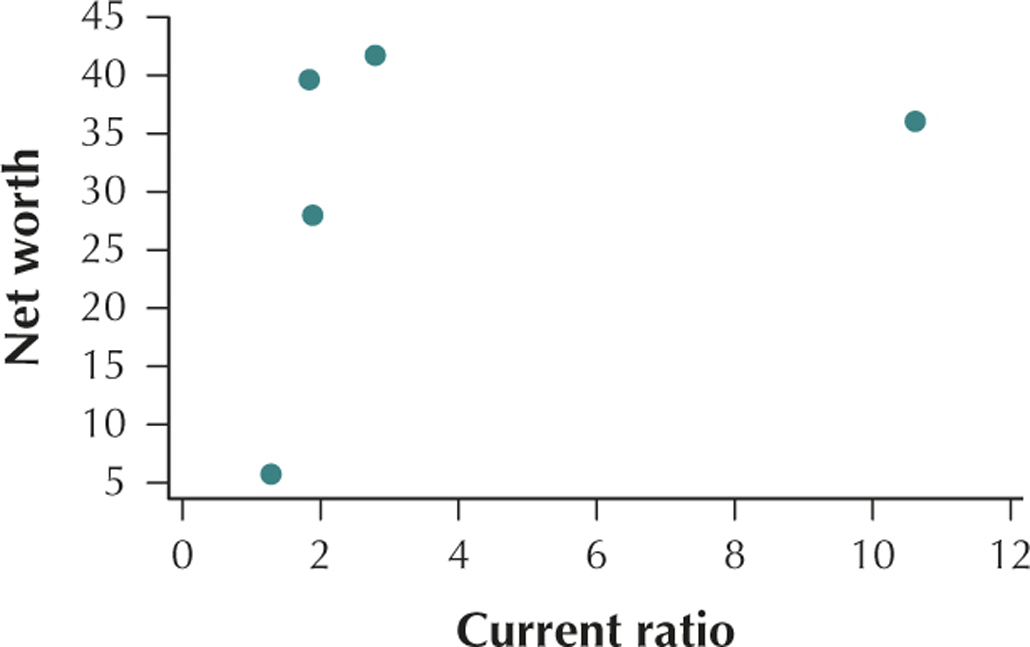
The current ratio of a company and the company's net worth have a positive linear relationship.
Question 4.56
accountingcorr
56. Calculate and interpret the correlation coefficient between net worth and current ratio.
Best Places for Dating. Sperling's Best Places published the list of best places for dating in America. The table shows the top 10 places, along with the overall dating score (y) and a set of predictor variables. Use this information for Exercises 57–59.
| City | y= overall dating score | Percentage 18–24 years old |
Percentage 18–24 who are single |
Online dating score |
|---|---|---|---|---|
| Austin | 100.0 | 13.4% | 81.2% | 77.8 |
| Colorado Springs |
88.7 | 10.5% | 74.2% | 88.9 |
| San Diego | 84.0 | 11.3% | 79.4% | 77.4 |
| Raleigh | 80.7 | 11.6% | 82.9% | 79.2 |
| Seattle | 78.7 | 9.0% | 83.9% | 100.0 |
| Charleston | 78.7 | 11.2% | 82.7% | 66.9 |
| Norfolk | 77.0 | 11.2% | 75.6% | 82.9 |
| Ann Arbor | 75.5 | 12.9% | 90.3% | 51.1 |
| Springfield | 75.2 | 11.7% | 89.8% | 63.5 |
| Honolulu | 75.2 | 10.1% | 82.3% | 50.2 |
Question 4.57
bestdating
57. Construct and interpret a scatterplot for each of the following predictor variables versus the overall dating score:
- Percentage 18–24 years old
- Percentage 18–24 years old who are single
- Online dating score
4.1.57
(a)
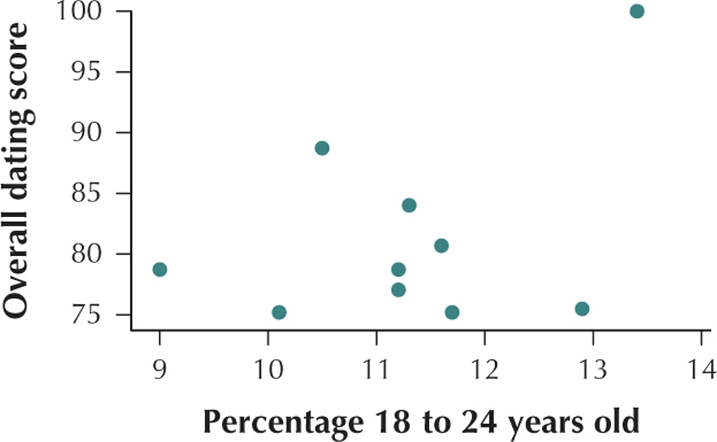
The percentage of 18- to 24-year-olds in a city and the overall dating score in a city have a positive linear relationship.
(b)
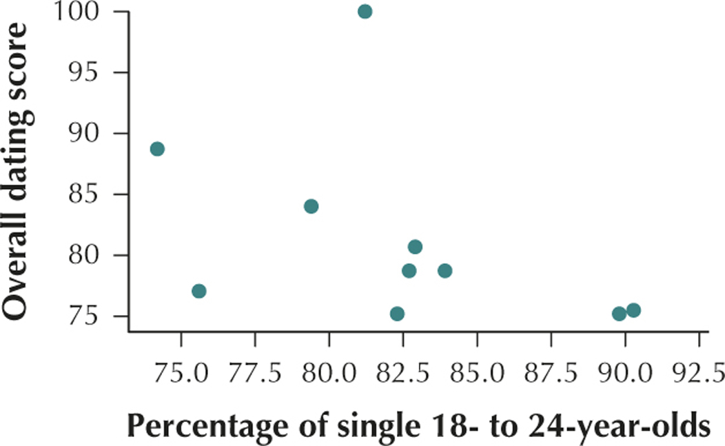
The percentage of a city's residents who are 18- to 24-year-olds and single and the overall dating score of a city have a negative linear relationship.
(c)
The online dating score of a city and the overall dating score of a city have a positive linear relationship.
Question 4.58
bestdating
58. Calculate and interpret the correlation coefficient between each of the following predictor variables and the overall dating score:
- Percentage 18–24 years old
- Percentage 18–24 years old who are single
- Online dating score
Question 4.59
bestdating
59. Based on your work in Exercises 57 and 58, which predictor variable is the best indicator of the overall dating score, and thus an indicator of the best places for dating?
4.1.59
Percentage of 18- to 24-year-olds who are single
Virginia Weather. The table contains data on weather in a sample of cities in the state of Virginia. Use this information for Exercises 60–65.
| Data on the weather in Virginia | ||||
|---|---|---|---|---|
| City | Average January temperature |
Heating degree- days |
Average July temperature |
Cooling degree- days |
| Alexandria | 34.9 | 4055 | 79.2 | 1531 |
| Arlington | 34.9 | 4055 | 79.2 | 1531 |
| Blacksburg | 30.9 | 5559 | 71.1 | 533 |
| Charlottesville | 35.5 | 4103 | 76.9 | 1212 |
| Chesapeake | 40.1 | 3368 | 79.1 | 1612 |
| Danville | 36.6 | 3970 | 78.8 | 1418 |
| Hampton | 39.4 | 3535 | 78.5 | 1432 |
| Harrisonburg | 30.5 | 5333 | 73.5 | 758 |
| Leesburg | 31.5 | 5031 | 75.2 | 911 |
| Lynchburg | 34.5 | 4354 | 75.1 | 1075 |
| Manassas | 31.7 | 4925 | 75.7 | 1075 |
| Newport News | 41.2 | 3179 | 80.3 | 1682 |
| Norfolk | 40.1 | 3368 | 79.1 | 1612 |
| Petersburg | 39.7 | 3334 | 79.6 | 1619 |
| Portsmouth | 40.1 | 3368 | 79.1 | 1612 |
| Richmond | 36.4 | 3919 | 77.9 | 1435 |
| Roanoke | 35.8 | 4284 | 76.2 | 1134 |
| Suffolk | 39.6 | 3467 | 78.5 | 1427 |
| Virginia Beach | 40.7 | 3336 | 78.8 | 1482 |
Question 4.60
vaweather
60. Construct and interpret a scatterplot for the average January temperature versus the cooling degree-days.
Question 4.61
vaweather
61. Based on your scatterplot, what would you expect the sign of the correlation coefficient to be? Why?
4.1.61
Positive. The scatterplot indicates a positive linear relationship between cooling-degree days and the average January temperature.
Question 4.62
vaweather
62. Calculate the correlation coefficient between the average January temperature and the cooling degree-days.
Question 4.63
vaweather
63. Build and interpret a scatterplot for the average July temperature versus the heating degree-days.
4.1.63
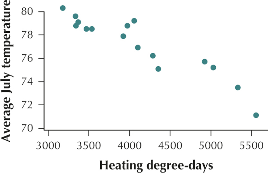
Heating degree-days and the average July temperature have a negative linear relationship.
Question 4.64
vaweather
64. Calculate the correlation coefficient between the average July temperature and the heating degree-days.
Question 4.65
vaweather
65. Which relationship would you say is stronger: the relationship between the average January temperatures with the cooling degree-days, or the relationship between the average July temperatures and the heating degree-days?
4.1.65
The relationship between the average July temperatures and the heating degree-days is stronger.
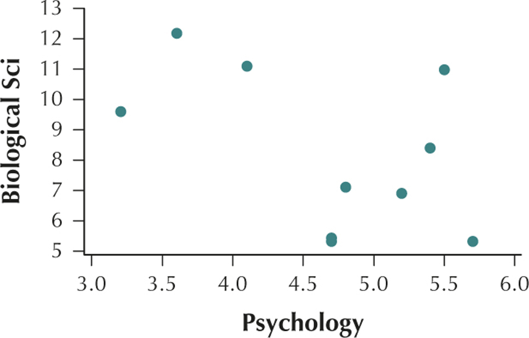
What's Your Major? The table contains the percentages of students majoring in (i) Mathematics/Statistics/Computer Science, (ii) Biological Sciences, and (iii) Psychology, for a sample of 10 states. Use this information for Exercises 66–71.
| State | Math/Stat/ Comp Sci |
Biological Sci |
Psychology |
|---|---|---|---|
| Alaska | 2.0 | 11.0 | 5.5 |
| Connecticut | 4.1 | 5.3 | 5.7 |
| Hawaii | 2.9 | 6.9 | 5.2 |
| Idaho | 3.7 | 9.6 | 3.2 |
| Maryland | 5.7 | 7.1 | 4.8 |
| Montana | 2.7 | 11.1 | 4.1 |
| New Jersey | 5.3 | 5.3 | 4.7 |
| Oregon | 3.2 | 8.4 | 5.4 |
| Virginia | 5.5 | 5.4 | 4.7 |
| Wyoming | 2.2 | 12.2 | 3.6 |
Question 4.66
statemajors
66. Construct a scatterplot of the Math/Stat/Comp Sci majors versus the Psychology majors.
Question 4.67
statemajors
67. Based on your scatterplot, would you say that a relationship exists between the two sets of majors?
4.1.67
No.
Question 4.68
statemajors
68. Calculate the correlation coefficient between the Math/Stat/Comp Sci majors and the Psychology majors. Was your intuition in Exercise 67 confirmed?
Question 4.69
statemajors
69. Construct a scatterplot of the Biological Science majors versus the Psychology majors.
4.1.69
Question 4.70
statemajors
70. Based on your scatterplot in Exercise 69, would you say that a relationship exists between the two sets of majors?
Question 4.71
statemajors
71. Calculate the correlation coefficient between the Biological Science majors and the Psychology majors. Was your intuition in Exercise 70 confirmed?
4.1.71
. Yes.
Worldwide Indicators of Well-Being. The Statistics Online Computational Resource (SOCR) provides resources for statistics students and educators. The following table, sampled from data provided by SOCR, includes 10 countries, along with 3 indicators of their well-being: an indicator of economic dynamism, a measure of literacy, and a health indicator. Use this information for Exercises 72–82.
| Country | Economy | Literacy | Health |
|---|---|---|---|
| Australia | 71.5 | 91.5 | 95.2 |
| Canada | 68.5 | 96.7 | 92.8 |
| Germany | 61.9 | 91.1 | 92.8 |
| India | 50.0 | 66.2 | 51.7 |
| Japan | 69.0 | 94.0 | 100.0 |
| Mexico | 42.0 | 74.7 | 78.3 |
| Pakistan | 41.5 | 66.9 | 49.3 |
| South Korea | 73.0 | 96.7 | 87.9 |
| United Kingdom | 72.9 | 92.8 | 90.3 |
| United States | 77.8 | 89.4 | 85.5 |
Question 4.72
wellbeing
72. Some analysts claim that literacy depends on the economy of a country. Provide a scatterplot of literacy versus economy . Describe any relationship between the variables.
Question 4.73
wellbeing
73. Calculate and interpret the correlation coefficient for the linear relationship between and .
4.1.73
. This value of is very close to the maximum value . We would therefore say that economy and literacy are positively correlated. As the economy increases, literacy also tends to increase.
Question 4.74
wellbeing
74. Other analysts state that a country's economy depends on the country's literacy. Build a scatterplot of economy versus literacy . Describe any relationship between the variables. Compare this scatterplot with the one in Exercise 72. Discuss similarities and differences.
Question 4.75
wellbeing
75. Do you expect that the correlation coefficient between and will be the same as that between and ? Calculate and interpret the correlation coefficient for the linear relationship between and . Was your intuition confirmed?
4.1.75
Yes. . Yes.
Question 4.76
wellbeing
76. Provide a scatterplot of literacy versus health . Describe any relationship between the variables.
Question 4.77
wellbeing
77. Calculate and interpret the correlation coefficient for the linear relationship between and .
4.1.77
. This value of is very close to the maximum value . We would therefore say that health and literacy are positively correlated. As health increases, literacy also tends to increase.
Question 4.78
wellbeing
78. Without calculating it, state what the correlation coefficient would be for the linear relationship between and .
Question 4.79
wellbeing
79. Provide a scatterplot of health versus economy . Describe any relationship between the variables.
4.1.79
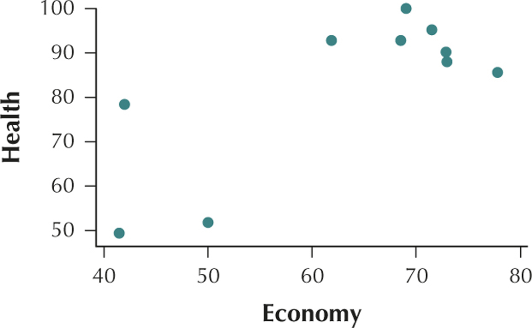
Economy and health have a positive linear relationship.
Question 4.80
wellbeing
80. Calculate and interpret the correlation coefficient for the linear relationship between and .
Question 4.81
wellbeing
81. Without calculating it, state what the correlation coefficient would be for the linear relationship between and .
4.1.81
Question 4.82
wellbeing
82. Based on your work in the previous exercises, state a general rule about the correlation between and , and the correlation between and .
Question 4.83
83. Computational Formula for . The following computational formula may be used as an equivalent of the definition formula for the correlation coefficient :
Use the computational formula and the TI-83/84 to calculate the correlation coefficient for the relationship between square footage and sales price of the eight home lots for sale in Glen Ellyn from Example 2 (page 189).
4.1.83
 sqrfootsale
BRINGING IT ALL TOGETHER
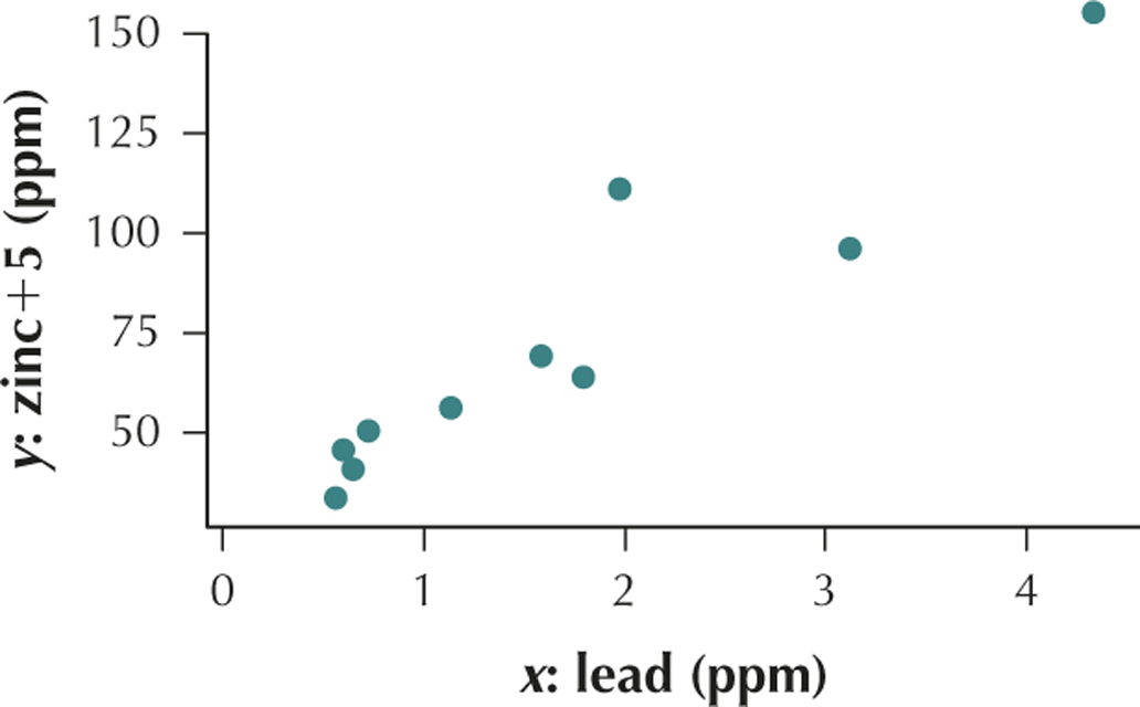
Lead and Zinc Concentrations in River Fish. Like to go fishing? In some areas, it may not be healthy to eat the fish you catch, due to the pollutants in the river that the fish ingest. Use the information in the table for Exercises 84–88. The table contains the lead and zinc concentrations in river fish from the Spokane River in Washington State, in parts per million.3
| Fish |
|
|
|---|---|---|
| 1 | 0.73 | 45.3 |
| 2 | 1.14 | 50.8 |
| 3 | 0.60 | 40.2 |
| 4 | 1.59 | 64.0 |
| 5 | 4.34 | 150.0 |
| 6 | 1.98 | 106.0 |
| 7 | 3.12 | 90.8 |
| 8 | 1.80 | 58.8 |
| 9 | 0.65 | 35.4 |
| 10 | 0.56 | 28.4 |
Question 4.84
leadzincfish
84. Investigate the relationship.
- Construct a scatterplot of the variables. Make sure the variable goes on the y axis.
- What type of relationship do these variables have: positive, negative, or no apparent linear relationship?
- Will the correlation coefficient be positive, negative, or near zero?
Question 4.85
leadzincfish
85. Calculate and interpret the correlation coefficient.
- Compute the value of the correlation coefficient.
- Does this value for concur with your judgment in part (c) of the previous exercise?
- Interpret the meaning of this value of the correlation coefficient.
4.1.85
(a) (b) Yes. (c) This value of is very close to the maximum value . We would therefore say that lead and zinc are positively correlated. As the lead content in the fish increases, the zinc content in the fish also tends to increase.
Question 4.86
leadzincfish
86. Determine whether we can conclude that and are correlated.
Question 4.87
leadzincfish
87. Transformation. Add 5 to each value for .
- Redraw the scatterplot. Comment on the similarity or difference from the scatterplot in Exercise 84(a).
- Recalculate the correlation coefficient.
- Compare your answers from Exercises 85(a) and 87(b).
- Compose a rule that states the behavior of the correlation coefficient when a constant is added to each data value.
4.1.87
(a)
Everything is the same except the dots are shifted up 5 ppm. (b) (c) They are the same. (d) When a constant is added to each -data value the correlation coefficient stays the same.
Question 4.88
leadzincfish
 88. Transformation. What if, starting with the original data in the table, we added a certain unknown constant amount to each value for ?
- Without redrawing the scatterplot, describe how this change would affect the scatterplot you drew in Exercise 84(a).
- Without recalculating the correlation coefficient, state what you think the effect of this change would be on the correlation coefficient. Why do you think that?
- Compose a rule that states the behavior of the correlation coefficient when a constant is added to each data value.
CONSTRUCT YOUR OWN DATA SETS
Question 4.89
89. Describe two variables from real life that would have a value of close to 1. Explain why they are positively correlated.
4.1.89
Answers will vary.
Question 4.90
90. Create a sample of five observations from each of your variables in the previous exercise, and put them into a table similar to Table 4 (page 194). Next, construct a scatterplot of the variables. Finally, draw a single straight line through the data points in the plot in a manner that you think best approximates the relationship between the variables.
![]() Use the Correlation and Regression applet for Exercises 91–93.
Use the Correlation and Regression applet for Exercises 91–93.
Question 4.91
91. Create a set of points such that the correlation coefficient takes approximately the following values.
Note that you can drag points up or down to adjust your value of .
4.1.91
(a)–(c) Answers will vary.
Question 4.92
92. Describe the relationship between the variables for each of the sets of points in the previous exercise.
Question 4.93
93. Select “Show mean and mean lines.” Create a set of points such that the correlation coefficient takes approximately the following values. Note that you can drag points up or down to adjust your value of .
4.1.93
(a)–(c) Answers will vary.
WORKING WITH LARGE DATA SETS
Chapter 4 Case Study: Measuring the Human Body. Open the data sets body_females body_males. We shall explore the relationships between height and weight for the women and men in these data sets using the tools and techniques we have learned in this section. Use technology to do the following:
Question 4.94
body_females
body_males
94. Construct a scatterplot of weight versus height for the men.
Question 4.95
body_females
body_males
95. Characterize the relationship between male height and weight.
Question 4.96
body_females
body_males
96. Find the correlation coefficient between height and weight for the males.
Question 4.97
body_females
body_males
97. Interpret the correlation coefficient for men's height and weight.
Question 4.98
body_females
body_males
98. Discuss similarities and differences among your results for the females (from the Your Turn exercises in this section) and the males, as follows:
- The scatterplots
- The relationships between height and weight
- The correlation coefficients