APPENDIX The Language and Meaning of Maps
A-1
The late, renowned cultural geographer Barney Nietschmann used to tell his students at the University of California at Berkeley, “The map is the starting point not the ending point for geographers.” What he meant was that the practice of human geography is not to produce maps. (Map making is a technical field called cartography.) Rather, human geographers use the spatial arrangement of social and natural phenomena to formulate and answer questions about relationships, including causal relations. Maps are the common language for pursuing these questions.
For our purposes in Contemporary Human Geography, maps are two-dimensional representations of three-dimensional spatial phenomena. Cartographers have agreed on certain graphic conventions that are shared by all maps. These conventions allow cartographers to represent a wide range of spatial phenomena including movement, qualitative and quantitative variation across space, boundaries, and location, to name just a few. We will start with some of the basic conventions and then move on to discuss how different mapping choices can provide different answers.
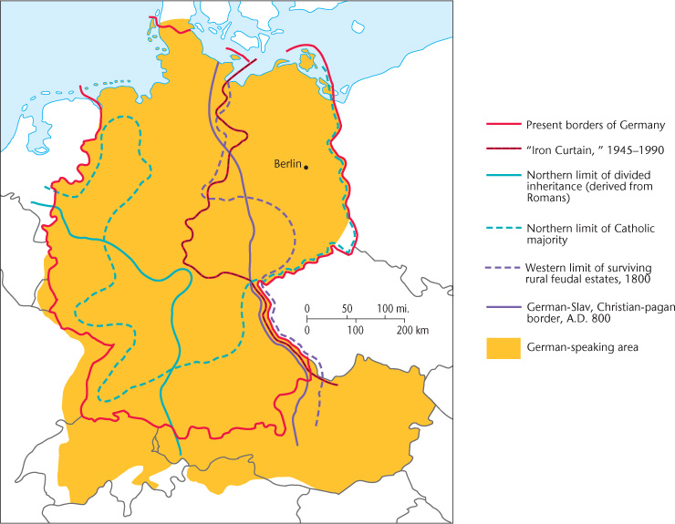
Most maps will have a scale. Map (or cartographic) scale is the distance on the map in relation to distance in actual space. For example, 1 centimeter on the map equals 1 kilometer of distance in actual space. Scale on a map can be represented by a bar, as we see in Figure 1.6, or it can be represented as a numerical ratio, as in 1/100,000 or 1:100,000.
scale
The distance on a map in relation to the distance in actual space.
A-2
A map will also have a legend. Legends are essential for reading maps, for they tell what map symbols mean. Map symbols are graphic figures that represent any number of real-world phenomena. The legend for Figure 1.6 consists mostly of line symbols representing different types of boundaries (e.g., religious, ethnic) by using different types and colors of lines. Dots are used to represent specific location (in this example, Berlin) and are so intuitively understood that they often are not included in map legends. Finally, all maps have an orientation, which refers to the compass direction of the top of the map. Many map legends include an arrow indicating north so that the reader knows the map’s orientation. The north arrow is essential in maps used for way finding, but less so for maps used for other purposes. Figure 1.6 does not have an arrow, because orientation is not particularly important to the map’s purpose. Established convention dictates that maps are oriented to the north and so we can safely assume that is the case with Figure 1.6.
legend
Explains what the symbols on a map mean.
map symbols
Graphic figures that represent any number of real-world phenomena
orientation
Refers to the compass direction of the top of a map.
Maps are broadly categorized as either baseline maps (also called general maps) or thematic maps. Baseline maps provide basic information of coastlines, country boundaries, and so forth. Thematic maps emphasize a specific phenomenon or process, such as transportation, migration, and agricultural production. Most maps in Contemporary Human Geography are thematic.
baseline maps
Also called general maps, baseline maps provide basic information such as coastlines, country, and boundaries.
thematic maps
Maps that emphasize a specific phenomenon or process, such as transportation, migration, and agricultural production.
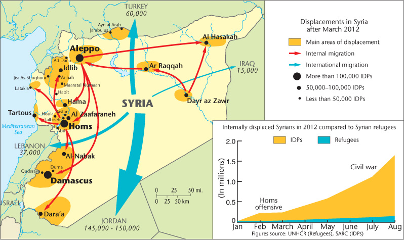
The theme of Figure 5.16, for example, is the geographic displacement of people resulting from armed conflict. The theme requires that a fixed, two-dimensional map symbol somehow represent the mass movement of people in space. Arrow-tipped lines are a common map symbol for showing movement, with the arrow end indicating movement direction and the flat end indicating the origin point. In Figure 5.16, the arrow symbols convey other information in addition to origin and direction. The width of the line indicates quantity, in this case, the number of people displaced. The color of the line indicates either internal or external migration.
A-3
Note in the case of Figure 5.16 that the quantitative measure (number of people) represented by the two colors remains the same, while the qualitative information (locations of origin and destination) changes. Internal migrants are shown as leaving from and arriving in specific cities and regions, while external migrants are shown as leaving from and arriving in countries. This reflects the way displaced people’s identities shift when they cross international borders. They become simply “Syrian refugees” and their particular home city or region becomes largely irrelevant to their new classification.
As we see in these examples, simple symbols can carry a wealth of information, and the more closely we look, the more we are able to discern patterns and relationships. We are also increasingly able to read the limitations of the symbols and to think about what maps hide as well as reveal. We see, for instance, how the same data can be rescaled, as in Figure 5.16’s arrows, to tell a different story.
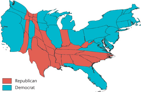
Let’s look at Figures 6.10 and 6.12 to further illustrate this last point. These are common thematic maps known as choropleth maps. A choropleth map uses data aggregated over a predefined geographic area, typically a political designation such as a county, province, or state. Often colors are used to represent differences in values in different areas. In Figure 6.10, red represents a majority vote for the Republican Party and blue represents a majority vote for the Democratic Party.
choropleth maps
Maps that use data aggregated over a predefined geographic area, typically a political designation such as a county, province, or state.
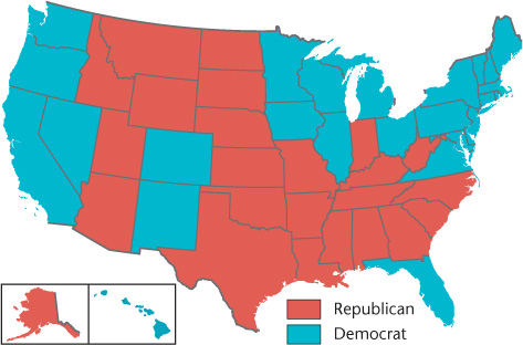
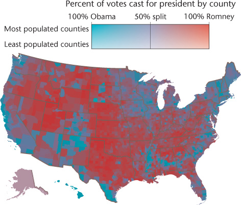
As noted in Chapter 6, the story of political party divisions within the United States changes depending on which geographic unit we decide to use. If we aggregate data at the state level, as in Figure 6.10, we tell one sort of story. If we aggregate the data at the county level, as in Figure 6.12, the story of political difference changes by becoming more nuanced and less starkly defined. In addition, the coloring technique changed from a color binary in Figure 6.10 to a color progression in Figure 6.12. Progressive color shading is better able to represent the subtle geographic variation in voting patterns.
A-4
Another type of thematic map used in Contemporary Human Geography is the cartogram. A cartogram is a map that results from using some thematic variable—the number of people voting Republican or Democrat in the case of Figure 6.11—rather than geographic area or distance. (Note: Map scale is no longer relevant for such maps.) Once again, we see that the story of electoral geography in the United States changes when we represent the data differently through different mapping choice.
cartogram
A map that results from using a thematic variable rather than geographic area or distance.
Equipped with these basic map-reading skills, we are ready to use maps as tools for formulating and answering questions about spatial relations. Take a look at Figure 5.24, which accompanies our discussion of environmental racism in Chapter 5. The problem of environmental racism is fundamentally a spatial problem, the scope of which only becomes evident through mapping. Early researchers of the problem noticed that many toxic facilities were located near minority communities in the United States. Based on these observations, they asked what would happen if we created a map that included the location of toxic facilities and census data on residence by race. Maps such as Figure 5.24 were the result, clearly demonstrating a close spatial relationship between minority neighborhoods and pollution sources.
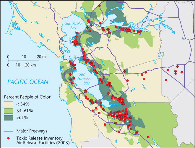
Thus, we see how maps can be powerful analytical tools, not just handy aids for finding the nearest Starbucks. The environmental racism map, for example, both answered the question of scope and raised new questions about how structural racism operates geographically. Armed with a basic understanding of how information can be represented spatially in the form of maps, we are better able to interpret the message of maps, sometimes even finding undisclosed ideologies or political agendas. Just as importantly, we can begin to ask our own questions—sometimes based on everyday observations, sometimes in an effort to solve difficult real-world problems—and to discover important spatial relations that only maps can reveal.