Chapter 5 Exercises
![]() Chapter 5 Exercises
Chapter 5 Exercises![]() Challenge
Challenge![]() Discussion
Discussion
Some exercises require use of a calculator (or software or Internet applet) that will find mean and standard deviation from keyed-in data.
5.1 Displaying Distributions: Histograms
Question 5.31
1. Table 5.11 shows a small part of a dataset that describes the fuel economy (in miles per gallon) of 2014 model motor vehicles.
- What are the individuals in this dataset?
- For each individual, what variables are given?
- For which of these variables would a histogram be helpful? (That is, which variables do not yield categorical data?)
| Make and Model |
Vehicle Type |
Transmission Type |
Number of Cylinders |
City mpg |
Highway mpg |
|---|---|---|---|---|---|
| Mazda MX-5 | Two-seater | Manual | 4 | 22 | 28 |
| Toyota Yaris | Subcompact | Automatic | 4 | 30 | 36 |
| Honda Accord | Large car | Automatic | 6 | 21 | 34 |
| Jaguar XF | Midsize car | Automatic | 8 | 15 | 23 |
1.
(a) Vehicle makes and models (i.e., the four cars)
(b) Vehicle type, transmission type, number of cylinders, city mpg, and highway mpg
(c) Cylinders (maybe) and city mpg and highway mpg (certainly)
Question 5.32
2. The femur (thighbone) is the longest bone in the human body. Femur lengths (in millimeters) of 15 people are given below.
| 435 | 507 | 448 | 435 | 463 |
| 440 | 448 | 413 | 432 | 458 |
| 473 | 465 | 428 | 472 | 439 |
- Summarize the data on femur lengths in a frequency table. Use class intervals that start at 400 and have width 20.
- Add a column to your table from part (a) for the relative frequencies.
- Draw a histogram that represents your frequency table. (Use either frequency or relative frequency for the vertical axis.)
Question 5.33
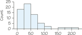
![]() 3. Eating fish contaminated with mercury can cause serious health problems. Mercury contamination from historic gold mining operations is fairly common in sediments of rivers, lakes, and reservoirs today. A study was conducted on Lake Natoma in California to determine whether the mercury concentration in fish in the lake exceeded guidelines for safe human consumption. A sample of 83 largemouth bass was collected, and the concentration of mercury from sample tissue was measured. Mercury concentration is measured in micrograms of mercury per gram or μg/g. Figure 5.28 presents a histogram of the results of the study.
3. Eating fish contaminated with mercury can cause serious health problems. Mercury contamination from historic gold mining operations is fairly common in sediments of rivers, lakes, and reservoirs today. A study was conducted on Lake Natoma in California to determine whether the mercury concentration in fish in the lake exceeded guidelines for safe human consumption. A sample of 83 largemouth bass was collected, and the concentration of mercury from sample tissue was measured. Mercury concentration is measured in micrograms of mercury per gram or μg/g. Figure 5.28 presents a histogram of the results of the study.
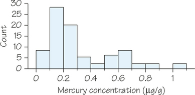
- Which class interval contains the highest number of data values? Approximately what percentage of the fish in the sample had mercury concentrations that fell within this class interval?
- The primary objective of the study was to determine whether mercury concentrations in fish tissue exceeded safety guidelines for human consumption. The U.S. Environmental Protection Agency (USEPA) human-health criterion for methylmercury in fish is 0.30μg/g. Approximately how many of the fish in the sample had mercury concentrations below the level set by the USEPA (and hence were considered safe for human consumption)?
- Approximately what percentage of the sample had mercury concentrations higher than the level set by the USEPA? Show how you arrived at your answer.
3.
(a) The interval between 0.1μg/g and 0.2μg/g; around 28 data values fell within this interval, which means that (28/83×100)% or approximately 33.7% of the fish had mercury concentrations that fell in this class interval.
(b) Approximatly 56 of the fish had mercury levels below 0.30μg/g.
(c) Approximately 27 of the fish from the sample had mercury levels at or above 0.30μg/g. Hence, around 32.5% of the fish in the sample had levels of mercury concentration above the USEPA guidelines.
5.2 Interpreting Histograms
Question 5.34
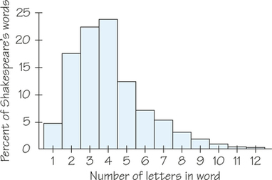
![]() 4. Figure 5.29 is a histogram of the lengths of words used in Shakespeare’s plays. Because there are so many words in the plays, the vertical axis of the graph is the percentage of words that are of each length, rather than the count. In this case, the class intervals are centered at integer values, since the data consist only of counting numbers.
4. Figure 5.29 is a histogram of the lengths of words used in Shakespeare’s plays. Because there are so many words in the plays, the vertical axis of the graph is the percentage of words that are of each length, rather than the count. In this case, the class intervals are centered at integer values, since the data consist only of counting numbers.
What is the overall shape of this distribution? What does this shape say about word lengths in Shakespeare? Do you expect other authors to have word-length distributions of the same general shape? Why?
Question 5.35
![]() 5. Suppose that you and your friends emptied your pockets of coins and recorded the year marked on each coin. Would you expect the histogram for the distribution of dates to be skewed to the left or right? Explain your answer and make a sketch of this histogram.
5. Suppose that you and your friends emptied your pockets of coins and recorded the year marked on each coin. Would you expect the histogram for the distribution of dates to be skewed to the left or right? Explain your answer and make a sketch of this histogram.
5.
Most coins in circulation were minted in recent years, so we would expect a peak at the right (highest-numbered years, like 2012 and 2014) and lower bars trailing out to the left of the peak. There are few coins from 1990 and even fewer from 1980, etc.
Question 5.36
6. Make a histogram of the city gas mileages of the midsized cars in Table 5.7 (page 196). Use classes with widths of 5 mpg. Do you prefer the histogram or the dotplot in Figure 5.14 (page 197) of the same data? Why?
Question 5.37
7. Burning fuels in power plants or motor vehicles emits carbon dioxide (CO2), which contributes to global warming. Table 5.12 displays CO2 emissions per person from 48 countries with populations of at least 20 million.
- Why do you think we choose to measure emissions per person rather than total CO2 emissions for each country?
- Display the data of Table 5.12 in a histogram. Describe the shape, center, and variability of the distribution. Which countries appear to be outliers?
| Country | CO2 | Country | CO2 | Country | CO2 | Country | CO2 |
|---|---|---|---|---|---|---|---|
| Algeria | 2.3 | Germany | 10.0 | Myanmar | 0.2 | South Korea | 8.8 |
| Argentina | 3.9 | Ghana | 0.2 | Nepal | 0.1 | Spain | 6.8 |
| Australia | 17.0 | India | 0.9 | Nigeria | 0.3 | Sudan | 0.2 |
| Bangladesh | 0.2 | Indonesia | 1.2 | North Korea | 9.7 | Tanzania | 0.1 |
| Brazil | 1.8 | Iran | 3.8 | Pakistan | 0.7 | Thailand | 2.5 |
| Canada | 16.0 | Iraq | 3.6 | Peru | 0.8 | Turkey | 2.8 |
| China | 2.5 | Italy | 7.3 | Philippines | 0.9 | Ukraine | 7.6 |
| Colombia | 1.4 | Japan | 9.1 | Poland | 8.0 | United Kingdom | 9.0 |
| Congo | 0.0 | Kenya | 0.3 | Romania | 3.9 | United States | 19.9 |
| Egypt | 1.7 | Malaysia | 4.6 | Russia | 10.2 | Uzbekistan | 4.8 |
| Ethiopia | 0.0 | Mexico | 3.7 | Saudi Arabia | 11.0 | Venezuela | 5.1 |
| France | 6.1 | Morocco | 1.0 | South Africa | 8.1 | Vietnam | 0.5 |
7.
(a) Big countries (in terms of population) would always top the list if total emissions were used, even if they had low emissions for their size. However, that would not provide a measure of the energy consumption per person.
(b) Using class widths of 2 metric tons per person, we have the following:
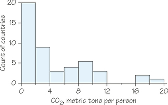
The distribution is skewed to the right. There appear to be three high outliers: Canada, Australia, and the United States.
Question 5.38
8. A survey of a large college class asked the following questions:
- (i) Are you female or male? (In the data, male = 0, female = 1.)
- (ii) Are you right-handed or left-handed? (In the data, right = 0, left = 1.)
- (iii) What is your height in inches?
- (iv) How many minutes do you study on a typical weeknight?
Figure 5.30 shows histograms of the student responses, in scrambled order and without scale markings. Which histogram goes with each variable? Explain your reasoning. Would the 0-1 coding scheme work for someone who is ambidextrous (or transgendered)?
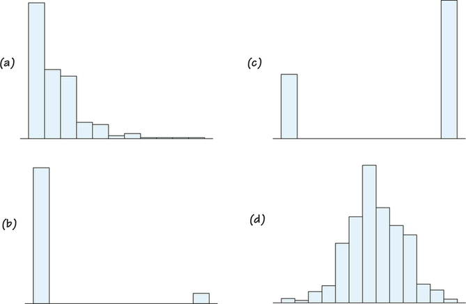
Table 5.13 lists the top 100 baseball players ranked by career batting average. (These data were collected after the completion of the 2014 season.) Exercises 9 and 10 require use of the data from Table 5.13. (You will revisit these data in Chapter 6, Exercise 60.)
| Rank | First | Last | Career Years | Last Career Year | Career Batting Average | Career Home Runs | |
|---|---|---|---|---|---|---|---|
| 1 | Ty | Cobb | 24 | 1928 | 0.3664 | 117 | |
| 2 | Rogers | Hornsby | 23 | 1937 | 0.3585 | 301 | |
| 3 | Shoeless Joe | Jackson | 13 | 1920 | 0.3558 | 54 | |
| 4 | Lefty | O’Doul | 11 | 1934 | 0.3493 | 113 | |
| 5 | Ed | Delahanty | 16 | 1903 | 0.3458 | 101 | |
| 6 | Tris | Speaker | 22 | 1928 | 0.3447 | 117 | |
| 7 | Billy | Hamilton | 14 | 1901 | 0.3444 | 40 | |
| Ted | Williams | 19 | 1960 | 0.3444 | 521 | ||
| 9 | Dan | Brouthers | 19 | 1904 | 0.3421 | 106 | |
| Babe | Ruth | 22 | 1935 | 0.3421 | 714 | ||
| 11 | Dave | Orr | 8 | 1890 | 0.3420 | 37 | |
| 12 | Harry | Heilmann | 17 | 1932 | 0.3416 | 183 | |
| 13 | Pete | Browning | 13 | 1984 | 0.3415 | 16 | |
| 14 | Willie | Keeler | 19 | 1910 | 0.3413 | 33 | |
| 15 | Billy | Terry | 14 | 1936 | 0.3412 | 154 | |
| 16 | Lou | Gehrig | 17 | 1939 | 0.3401 | 493 | |
| George | Sisler | 15 | 1930 | 0.3401 | 102 | ||
| 18 | Jesse | Burkett | 16 | 1905 | 0.3382 | 75 | |
| Tony | Gwynn | 20 | 2001 | 0.3382 | 135 | ||
| Nap | Lajoie | 21 | 1916 | 0.3382 | 82 | ||
| 21 | Jake | Stenzel | 9 | 1899 | 0.3378 | 71 | |
| 22 | Riggs | Stephenson | 14 | 1934 | 0.3361 | 63 | |
| 23 | Al | Simmons | 20 | 1944 | 0.3342 | 307 | |
| 24 | Cap | Anson | 27 | 1897 | 0.3341 | 97 | |
| 25 | John | McGraw | 16 | 1906 | 0.3336 | 13 | |
| 26 | Eddie | Collins | 25 | 1930 | 0.3332 | 47 | |
| Paul | Waner | 20 | 1945 | 0.3332 | 113 | ||
| 28 | Mike | Donlin | 12 | 1914 | 0.3326 | 51 | |
| 29 | Sam | Thompson | 15 | 1906 | 0.3314 | 126 | |
| 30 | Stan | Musial | 22 | 1963 | 0.3308 | 475 | |
| 31 | Billy | Lange | 7 | 1899 | 0.3298 | 39 | |
| Heinie | Manush | 17 | 1939 | 0.3298 | 110 | ||
| 33 | Wade | Boggs | 18 | 1999 | 0.3279 | 118 | |
| 34 | Rod | Carew | 19 | 1985 | 0.3278 | 92 | |
| 35 | Honus | Wagner | 21 | 1917 | 0.3276 | 101 | |
| 36 | Tip | O’Neill | 10 | 1892 | 0.326 | 52 | |
| 37 | Hugh | Duffy | 17 | 1906 | 0.3255 | 106 | |
| Bob | Fothergill | 12 | 1933 | 0.3255 | 36 | ||
| 39 | Jimmie | Foxx | 20 | 1945 | 0.3253 | 534 | |
| 40 | Earle | Combs | 12 | 1935 | 0.3247 | 58 | |
| 41 | Joe | DiMaggio | 13 | 1951 | 0.3246 | 361 | |
| 42 | Babe | Herman | 13 | 1945 | 0.3245 | 181 | |
| 43 | Joe | Medwick | 17 | 1948 | 0.3236 | 205 | |
| 44 | Eddie | Roush | 18 | 1931 | 0.3227 | 68 | |
| 45 | Sam | Rice | 20 | 1934 | 0.3223 | 34 | |
| 46 | Ross | Youngs | 10 | 1926 | 0.3222 | 42 | |
| 47 | Kiki | Cuyler | 18 | 1938 | 0.321 | 128 | |
| 48 | Charles | Gehringer | 19 | 1942 | 0.3204 | 184 | |
| 49 | Miquel | Cabrera | 12 | 2014+ | 0.3201 | 390 | |
| Chuck | Klein | 17 | 1944 | 0.3201 | 300 | ||
| 51 | Mickey | Cochrane | 13 | 1937 | 0.3196 | 119 | |
| Pie | Traynor | 17 | 1937 | 0.3196 | 58 | ||
| 53 | Ken | Williams | 14 | 1929 | 0.3192 | 196 | |
| 54 | Joe | Mauer | 11 | 2014+ | 0.3186 | 109 | |
| 55 | Kirby | Puckett | 12 | 1995 | 0.3181 | 207 | |
| 56 | Earl | Averill | 13 | 1941 | 0.3178 | 238 | |
| 57 | Vladimir | Guerrero | 16 | 2011 | 0.3176 | 449 | |
| Arky | Vaughan | 14 | 1948 | 0.3176 | 96 | ||
| 59 | Billy | Everitt | 7 | 1901 | 0.3174 | 11 | |
| 60 | Roberto | Clemente | 18 | 1972 | 0.3173 | 240 | |
| Joe | Harris | 10 | 1928 | 0.3173 | 47 | ||
| Ichiro | Sizuki | 14 | 2014+ | 0.3173 | 112 | ||
| 63 | Albert | Pujols | 14 | 2014+ | 0.3171 | 520 | |
| 64 | Chick | Hafey | 13 | 1937 | 0.317 | 164 | |
| 65 | Joe | Kelley | 17 | 1908 | 0.3169 | 65 | |
| 66 | Zack | Wheat | 19 | 1927 | 0.3167 | 132 | |
| 67 | Roger | Connor | 18 | 1897 | 0.3164 | 138 | Page 228 |
| Todd | Helton | 17 | 2013 | 0.3164 | 369 | ||
| Lloyd | Waner | 18 | 1945 | 0.3164 | 27 | ||
| 70 | George | Van Haltren | 17 | 1903 | 0.3163 | 69 | |
| 71 | Frankie | Frisch | 19 | 1937 | 0.3161 | 105 | |
| 72 | Goose | Goslin | 18 | 1938 | 0.3160 | 248 | |
| 73 | Lew | Fonseca | 12 | 1933 | 0.3158 | 31 | |
| 74 | Bibb | Falk | 12 | 1931 | 0.3145 | 69 | |
| 75 | Cecil | Travis | 12 | 1947 | 0.3142 | 27 | |
| 76 | Hank | Greenberg | 13 | 1947 | 0.3135 | 331 | |
| 77 | Jack | Fournier | 15 | 1927 | 0.3132 | 136 | |
| 78 | Elmer | Flick | 13 | 1910 | 0.313 | 48 | |
| 79 | Ed | Morgan | 7 | 1934 | 0.3128 | 52 | |
| 80 | Nomar | Garciaparra | 14 | 2009 | 0.3127 | 229 | |
| Larry | Walker | 17 | 2005 | 0.3127 | 383 | ||
| 82 | Billy | Dickey | 17 | 1946 | 0.3125 | 202 | |
| 83 | Dale | Mitchell | 11 | 1956 | 0.3122 | 41 | |
| Manny | Ramirez | 19 | 2014+ | 0.3122 | 555 | ||
| 85 | Jonny | Mize | 15 | 1953 | 0.3121 | 359 | |
| Joe | Sewell | 14 | 1933 | 0.3121 | 49 | ||
| 87 | Fred | Clarke | 21 | 1915 | 0.3120 | 67 | |
| Deacon | White | 20 | 1890 | 0.3120 | 24 | ||
| 89 | Bug | Holliday | 10 | 1898 | 0.3119 | 65 | |
| 90 | Barney | McCosky | 11 | 1953 | 0.3118 | 24 | |
| 91 | Hughie | Jennings | 18 | 1918 | 0.3117 | 18 | |
| 92 | Edgar | Martinez | 18 | 2004 | 0.3115 | 309 | |
| 93 | Johnny | Hodapp | 9 | 1933 | 0.3114 | 28 | |
| Freddie | Lindstrom | 13 | 1936 | 0.3114 | 103 | ||
| 95 | Bing | Miller | 16 | 1936 | 0.3113 | 116 | |
| Jackie | Robinson | 10 | 1956 | 0.3113 | 137 | ||
| 97 | Baby Doll | Jacobson | 11 | 1927 | 0.3112 | 83 | |
| Taffy | Wright | 9 | 1949 | 0.3112 | 38 | ||
| 99 | Rip | Radcliff | 10 | 1943 | 0.3110 | 42 | |
| 100 | Ginger | Beaumont | 12 | 1910 | 0.3108 | 39 |
Question 5.39
9. Focus on the variable "Career Home Runs" in Table 5.13.
- Create a frequency distribution for career home runs. Use class intervals of width 100.
- Draw a histogram that represents your frequency distribution from part (a).
- Describe the shape of the career home runs data. Identify any gaps in the data and potential outliers.
9.
(a)
| Class Interval | Frequency |
|---|---|
| 0 = career home runs < 100 | 45 |
| 100 = career home runs < 200 | 30 |
| 200 = career home runs < 300 | 7 |
| 300 = career home runs < 400 | 10 |
| 400 = career home runs < 500 | 3 |
| 500 = career home runs < 600 | 4 |
| 600 = career home runs < 700 | 0 |
| 700 = career home runs < 800 | 1 |
(b)
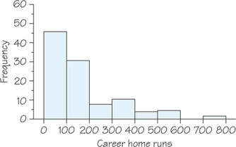
(c) The shape of the histogram is skewed to the right. There is a gap in the data between 600 and 700 and one potential outlier between 700 and 800 (Babe Ruth's 714 career home runs).
Question 5.40
10. Focus on the variable "Career Years" in Table 5.13. (Note that the career years were based on data from 2014. Some players continued after 2014, which is noted by 2014+ in the "Last Career Year" column.)
(a) Make two histograms for career years. Use the following class intervals for your two histograms.
- Histogram 1: 5210, 10215, 15220, 20225, and 25230.
- Histogram 2: 527, 729, 9211, 11213, 13215, 15217, 17219, 19221, 21223, 23225, 25227, and 27229.
If a data value falls on the boundary of a class interval, classify that data value in the interval to the right. (For example, a player with 10 career years would be counted in the interval 10-15 for histogram 1.)
(b) Describe the overall shape of each of the two histograms. Did changing the class intervals affect the shape of the distribution? Explain.
5.3 Displaying Distributions: Stemplots
Question 5.41
11. The population of the United States is aging, though less rapidly than in other developed countries. Figure 5.31 is a stemplot of the percentage of residents aged 65 and over in the 50 states, according to the 2010 Census. The stems are whole percentages and the leaves are tenths of a percentage. (The software JMP was used to create the stemplot. Notice that this software put the low stems at the bottom of the plot and the high stems at the top of the plot.)
- Alaska is an outlier with the lowest percentage of older residents. Florida has the highest. What is the percentage for Florida?
- Ignoring Alaska, describe the shape, center, and variability of this distribution.
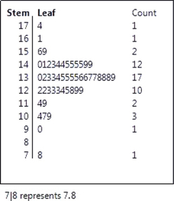
11.
(a) 17.4%
(b) The shape is single-peaked and roughly symmetric; the center is near 13.5%; the percentages vary between 7.8% and 17.4%.
Question 5.42
12. People with diabetes must monitor and control their blood glucose level. The goal is to maintain "fasting plasma glucose" between about 90 and 130 milligrams per deciliter (mg/dl). Here are the fasting plasma glucose levels for 18 diabetics enrolled in a diabetes management class, 5 months after the end of the class:
| 78 | 103 | 141 | 148 | 172 | 255 |
| 95 | 112 | 145 | 153 | 172 | 271 |
| 96 | 134 | 147 | 158 | 200 | 359 |
- Round these values to the nearest 10 and then drop the zero. For example, 141 rounds to 14 and 158 rounds to 16. Make a stemplot of the rounded data.
- Describe the main features of the distribution. Are there outliers? How well is the group as a whole achieving the goal for controlling glucose levels?
Question 5.43
13. The Survey of Study Habits and Attitudes (SSHA) is a psychological test that evaluates college students’ motivation, study habits, and attitudes toward school. A private college gives the SSHA to 18 of its incoming first-year women students. Their scores are (sorted in ascending order):
| 101 | 115 | 129 | 140 | 154 | 165 |
| 103 | 126 | 137 | 148 | 154 | 178 |
| 109 | 126 | 137 | 152 | 165 | 200 |
- Make a stemplot of these data. The overall shape of the distribution is irregular, as often happens if only a few observations are available. Are there any outliers?
- About where is the center of the distribution (the score with half the scores above it and half below)? What is the variability of the scores (ignoring any outliers)?
13.
(a)
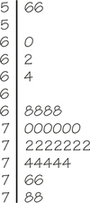
There is one high outlier: 200.
(b) The center of the 17 observations other than the outlier is 137 (9th of 17). Ignoring the outlier, there are values between 101 and 178.
Question 5.44
14. In 1798, the English scientist Henry Cavendish measured the density of the Earth in a careful experiment with a torsion balance. In sorted order, here are his 29 measurements of the same quantity (the density of the Earth relative to that of water) made with the same instrument. [Source: S. M. Stigler, Do robust estimators work with real data? Annals of Statistics, 5 (1977): 1055-1098.]
| 4.88 | 5.29 | 5.36 | 5.47 | 5.58 | 5.68 |
| 5.07 | 5.29 | 5.39 | 5.50 | 5.61 | 5.75 |
| 5.10 | 5.30 | 5.42 | 5.53 | 5.62 | 5.79 |
| 5.26 | 5.34 | 5.44 | 5.55 | 5.63 | 5.85 |
| 5.27 | 5.34 | 5.46 | 5.57 | 5.65 |
- Make a stemplot of the data.
- Describe the distribution: Is it approximately symmetric or distinctly skewed? Are there gaps or outliers?
Question 5.45
15. Here is a stemplot for the percentage of live births to unmarried mothers for each state in the United States in 2007. (Source: 2010 report on Centers for Disease Control website.)
- Explain how and why there are repeated stems.
- Describe the shape of the distribution.
15.
(a) The repeated stems break up the intervals further. For example, the two "2 stems" break the twenties into 20-24 and 25-29. Also, if stems were not repeated, too few stems would make the stemplot less informative.
(b) The distribution is reasonably symmetric and single-peaked.
5.4 Describing Center: Mean and Median
Question 5.46
![]() 16. In Malay, the expression for the mean is sama rata, which roughly translates as "same level." To understand this cultural and conceptual connection, take some poker chips (or other equal-sized, stackable objects) and make stacks with 3, 7, and 8 chips.
16. In Malay, the expression for the mean is sama rata, which roughly translates as "same level." To understand this cultural and conceptual connection, take some poker chips (or other equal-sized, stackable objects) and make stacks with 3, 7, and 8 chips.
- Explain how to redistribute chips among the stacks until they are at the same level.
- How does this relate to the mean?
Question 5.47
17. Refer to the data and the stemplot in Exercise 13.
- Find the mean of the 18 values in Exercise 13.
- Your stemplot of the scores suggests that the score 200 is an outlier. Find the mean for the 17 observations that remain when you drop the outlier. [Hint: Can you use the work you did in part (a) to avoid calculating this new mean from scratch?]
- How does the outlier change the mean?
17.
(a) ˉx=253918≈141.06
(b) Without the outlier, ˉx=2539−20017=233917≈137.6.
(c) The high outlier pulls the mean up.
Question 5.48
18. As of 2014, the Major League Baseball career and single-season home run records are held by Barry Bonds of the San Francisco Giants. Here are Bonds’s annual home run totals from 1986 (his first year) through 2007 (his last year):
| 16 | 25 | 24 | 19 | 33 | 25 | 34 | 46 |
| 37 | 33 | 42 | 40 | 37 | 34 | 49 | 73 |
| 46 | 45 | 45 | 5 | 26 | 28 |
- Make a stemplot of the data. Are there any outliers?
- Find Bonds’s career mean and median number of home runs. How do these change when you drop his 2001 season total of 73? What general fact about the mean and median does your result illustrate?
Question 5.49
19. A male nursing home patient has his pulse taken every day. His pulse readings (beats per minute) over a 1-month period appear below.
| 72 | 56 | 56 | 68 | 78 | 72 | 70 | 70 | 60 | 72 | 68 | 74 |
| 76 | 64 | 70 | 62 | 74 | 70 | 72 | 74 | 72 | 78 | 76 | 74 |
| 72 | 68 | 70 | 72 | 68 | 74 | 70 |
- Make a stemplot of the pulse data. Expand the stem into five (for digits 0 and 1, 2 and 3, 4 and 5, 6 and 7, 8 and 9).
- Determine the mean, median, and mode for these data. Be sure to include units in your answers.
- Based on these data, which measure(s)—the mean, median, or mode—best describe(s) the man’s typical pulse rate? Explain your reasoning.
19.
(a)
(b) Mean≈70.1 beats/min; median=72 beats/min
(c) The median or mode of 72 beats/min best describes a "typical" pulse rate for this man. There are a few days when the man's pulse rate was very low. These low values tend to pull the mean down.
Question 5.50
![]() 20. The distribution of income in the United States is skewed to the right. According to the Census Bureau’s Current Population Survey report, the mean and median incomes of American households were $51,017 and $71,274 in 2012. Explain how you can tell which of these numbers is the mean and which is the median.
20. The distribution of income in the United States is skewed to the right. According to the Census Bureau’s Current Population Survey report, the mean and median incomes of American households were $51,017 and $71,274 in 2012. Explain how you can tell which of these numbers is the mean and which is the median.
Question 5.51
21. The basic unit of census data is the household, not the person. If divorce breaks one household into two, but no individual person’s income changes, how (if at all) is mean household income affected?
21.
The mean household income will decrease. Even though separately the two divorced parties have the same combined income, the total number of households has increased. By thinking about the formula for ˉx, the numerator will remain the same, but the denominator will increase by the number of divorces that establish new households.
Question 5.52
![]() 22. Which college football team is #1? In addition to polls of coaches and journalists, rankings from six computer programs (which have various ways to value factors such as the quality of the opponent played) determine the Bowl Championship Series (BCS) standings in major college football.
22. Which college football team is #1? In addition to polls of coaches and journalists, rankings from six computer programs (which have various ways to value factors such as the quality of the opponent played) determine the Bowl Championship Series (BCS) standings in major college football.
- At the end of the 2007 regular season, Hawaii (the only undefeated team) received these computer rankings: 12th, 8th, 14th, 10th, 8th, and 13th. The BCS formula throws out the high and low of the six computer rankings and uses the mean of the remaining four ranks. Find this mean.
- Why do you think the high and low values are excluded from the mean? Is your reason connected to why the median is sometimes preferred to the mean?
Question 5.53
23. Make up an example of a small set of data for which the mean lies in the top 25% of the observations.
23.
Examples will vary. One possible answer is 1, 2, 2, 2, 3, 3, 4, 17. The third quartile is 3.5; ˉx=4.25, which is above Q3.
Question 5.54
![]() 24. A sample of five households is selected, and the size of each household is recorded. The median size is 3 and the mode is 5. What is the mean? (Hint: Find the only possible dataset.)
24. A sample of five households is selected, and the size of each household is recorded. The median size is 3 and the mode is 5. What is the mean? (Hint: Find the only possible dataset.)
5.5 Describing Variability: Range and Quartiles
5.6 The Five-Number Summary and Boxplots
Question 5.55
25. The stemplot in Figure 5.31 (page 229) displays the distribution of the percentage of residents aged 65 and over in the 50 states. Stemplots help you find the five-number summary because they arrange the observations in order from smallest to largest. Give the five-number summary of this distribution.
25.
The five-number summary is 7.8, 12.4, 13.5, 14.3, 17.4.
Question 5.56
26. In chronological order, here are the percentages of the popular vote won by each successful candidate in the last 16 presidential elections, starting in 1952:
| Year | Percent | Year | Percent |
|---|---|---|---|
| 1952 | 54.9 | 1984 | 58.8 |
| 1956 | 57.4 | 1988 | 53.4 |
| 1960 | 49.7 | 1992 | 43 |
| 1964 | 61.1 | 1996 | 49.2 |
| 1968 | 43.4 | 2000 | 47.9 |
| 1972 | 60.7 | 2004 | 50.7 |
| 1976 | 50.1 | 2008 | 52.9 |
| 1980 | 50.7 | 2012 | 51.1 |
- Make a stemplot of the winners’ percentages.
- What is the median percentage of the vote won by the successful candidate in presidential elections?
- Call an election a landslide if the winner’s percentage falls at or above the third quartile. Find the third quartile. Which elections were landslides?
- Find the range.
Question 5.57
27. Figure 5.7 (page 193) is a histogram of the tuition and fees charged by the 64 four-year colleges in the state of Massachusetts for the 2014/2015 academic year. Here are those charges (in dollars), arranged in increasing order:
- Find the five-number summary and make a boxplot.
- What distinctive feature of the Figure 5.7 histogram do these summaries miss? Remember that numerical summaries are not a substitute for looking at the data.
| 7519 | 8054 | 8080 | 8110 | 8157 | 8297 | 8524 | 8985 |
| 10,355 | 11,881 | 12,097 | 13,258 | 24,320 | 26,180 | 29,012 | 29,320 |
| 29,494 | 29,930 | 29,950 | 30,447 | 30,859 | 30,968 | 31,000 | 31,000 |
| 32,630 | 32,660 | 32,830 | 32,870 | 33,455 | 34,060 | 34,390 | 35,415 |
| 35,532 | 35,750 | 36,160 | 36,215 | 36,230 | 37,350 | 37,426 | 38,910 |
| 40,730 | 40,954 | 41,865 | 42,325 | 42,511 | 42,656 | 43,440 | 43,498 |
| 43,938 | 44,025 | 44,222 | 44,724 | 45,078 | 45,080 | 45,120 | 45,692 |
| 46,664 | 46,671 | 47,436 | 47,710 | 47,725 | 48,310 | 48,488 | 49,812 |
27.
(a) Minimum=7519, Q1=29,407, M=35,473.5, Q3=43,718, maximum=49,812. (If using software, the results for Q1 and Q3 may differ from the hand calculations above.)
(b) The boxplot does not show the two distinctive clusters of values corresponding to the public and private colleges and universities.
Question 5.58
28. Find the five-number summary of Cavendish’s measurements of the density of the Earth in Exercise 14 (page 230). How is the symmetry of the distribution reflected in the five-number summary?
Question 5.59
29. Table 5.12 (page 225) gives CO2 emissions per person for countries with populations of at least 20 million. The distribution is strongly skewed to the right. The United States and several other countries appear to be high outliers. Give the five-number summary. Explain why this summary suggests that the distribution is right-skewed.
29.
The five-number summary is 0.0, 0.75, 3.2, 7.8, 19.9. The third quartile and maximum are much farther from the median than the first quartile and minimum, showing that the right side of the distribution has more variability than the left side.
Question 5.60
30. Find the five-number summary of the data from Exercise 11 (Figure 5.31, page 229).
Question 5.61
![]() 31. Figure 5.32 at the top of this page shows boxplots of the incomes of a large sample of people who have a high school diploma but no further education and another large group of people with a bachelor’s degree but no higher degree. The data come from a Census Bureau survey and represent all people aged 25 to 64 in the United States. Because there are a few extremely high incomes, the boxplot leaves out the highest 5% in each group. Based on the plot, compare the distributions of income for these two levels of education. Comment on both center and variability.
31. Figure 5.32 at the top of this page shows boxplots of the incomes of a large sample of people who have a high school diploma but no further education and another large group of people with a bachelor’s degree but no higher degree. The data come from a Census Bureau survey and represent all people aged 25 to 64 in the United States. Because there are a few extremely high incomes, the boxplot leaves out the highest 5% in each group. Based on the plot, compare the distributions of income for these two levels of education. Comment on both center and variability.
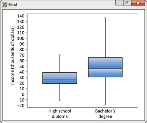
31.
The income distribution for bachelor's degree holders is generally higher than for high school graduates: The median for bachelor's is greater than Q3 for high school. The bachelor's distribution has much more variability, especially at the high-income end but also between the quartiles.
Question 5.62
32. The data that generate Figure 5.32 include the incomes of 14,959 people whose highest level of education is a bachelor’s degree.
- What is the position of the median in the ordered list of incomes (1 to 14,959)? From the boxplot, about what is the median income of people with a bachelor’s degree?
- What is the position of the first and third quartiles in the ordered list of incomes for these people? About what are the numerical values of Q1 and Q3?
Question 5.63
![]() 33.
33.
 How much oil the wells in a given field will ultimately produce is key information in deciding whether to drill more wells. Below are the estimated total amounts of oil recovered from 64 wells in the Devonian Richmond Dolomite area of the Michigan basin, in thousands of barrels. [Source: J. Marcus Jobe and Hutch Jobe, A statistical approach for additional infill development, Energy Exploration and Exploitation, 18 (2000): 89-103.]
| 2.0 | 18.5 | 34.6 | 47.6 | 69.5 |
| 2.5 | 20.1 | 34.6 | 49.4 | 69.8 |
| 3.0 | 21.3 | 35.1 | 50.4 | 79.5 |
| 7.1 | 21.7 | 36.6 | 51.9 | 81.1 |
| 10.1 | 24.9 | 37.0 | 53.2 | 82.2 |
| 10.3 | 26.9 | 37.7 | 54.2 | 92.2 |
| 12.0 | 28.3 | 37.9 | 56.4 | 97.7 |
| 12.1 | 29.1 | 38.6 | 57.4 | 103.1 |
| 12.9 | 30.5 | 42.7 | 58.8 | 118.2 |
| 14.7 | 31.4 | 43.4 | 61.4 | 156.5 |
| 14.8 | 32.5 | 44.5 | 63.1 | 196.0 |
| 17.6 | 32.9 | 44.9 | 64.9 | 204.9 |
| 18.0 | 33.7 | 46.4 | 65.6 |
- Make a histogram and describe its main features.
- Find the mean and median of the amounts recovered. Explain how the relationship between the mean and the median reflects the shape of the distribution.
- Give the five-number summary and explain briefly how it reflects the shape of the distribution.
33.
(a) The histogram below shows the distribution to be unimodal and right-skewed. There are some potential outliers. (Histograms can vary depending on the choice of class width.)
(b) ˉx=48.25, M=37.8; the long right tail inflates the mean.
(c) The five-number summary is 2.0, 21.5, 37.8, 60.1, 204.9. (Note: Results for Q1 and Q3 may differ if calculated using computer software.) Q3 and the maximum are much farther above the median than Q1 and the minimum are below it, showing that the right side of the distribution has more variability than the left side.
Question 5.64
![]() 34. Look at the histogram of lengths of words in Shakespeare’s plays shown in Figure 5.29 (page 224). The heights of the bars tell us what percentage of words have each length. (Analysis of such tendencies helps determine authorship of newly discovered manuscripts.)
34. Look at the histogram of lengths of words in Shakespeare’s plays shown in Figure 5.29 (page 224). The heights of the bars tell us what percentage of words have each length. (Analysis of such tendencies helps determine authorship of newly discovered manuscripts.)
- The median length is the length with half of all words shorter and half longer. What is the median length of the words Shakespeare used?
- Give the five-number summary for Shakespeare’s word lengths.
Question 5.65
35. A common criterion for identifying an outlier in a set of data is if an observation falls more than 1.5×IQR above the third quartile or below the first quartile. (IQR stands for the interquartile range, which is the difference between the quartiles: Q3−Q1, the width of the box in a boxplot.)
- Use the stemplot in Figure 5.11 (page 195) to determine a five-number summary for the data on percentage of Hispanics.
- Calculate IQR, Q1−1.5×IQR, and Q3+1.5×IQR.
- Any data value below Q1−1.5×IQR or above Q3+1.5×IQR should be considered an outlier. Determine the outliers, and then use Table 5.5 (page 189) to find which states are associated with the outliers.
35.
(a) The five-number summary is 1.0, 3.5, 6.85, 10.2, 42.3.
(b) IQR=Q3−Q1=10.2−3.5=6.7; Q1−1.5× IQR=−6.55; Q3+1.5× IQR=20.25
(c) There are six data values above 20.25: 21.1, 22.3, 25.0, 33.1, 33.6, and 42.3. These values correspond to the states Florida, Nevada, Arizona, California, Texas, and New Mexico, respectively.
Question 5.66
36. Forty 6-year-olds were randomly selected from the participants in a study investigating childhood obesity. The children’s weights (in kilograms) are arranged below in order from smallest to largest:
| 16.9 | 17.0 | 17.1 | 17.5 | 17.7 | 18.1 | 18.3 | 18.6 | 18.8 | 18.9 |
| 19.1 | 19.1 | 19.2 | 19.5 | 19.6 | 19.9 | 20.0 | 20.2 | 20.3 | 20.4 |
| 20.5 | 20.8 | 20.8 | 20.8 | 21.0 | 21.3 | 21.9 | 22.2 | 22.5 | 22.7 |
| 22.9 | 23.0 | 23.4 | 23.5 | 24.4 | 25.6 | 26.5 | 34.2 | 38.2 | 44.8 |
- Give the five-number summary of the weights of these 6-year-olds, and then draw a boxplot to represent this summary.
- The width of your box, Q3−Q1, gives the interquartile range (IQR). Calculate the IQR for these data.
- Consider any weights that fall more than 1.5×IQR above the third quartile or below the first quartile as outliers. Identify any outliers.
- Use the information from parts (a) through (c) to draw a modified boxplot of the weight data (similar to the ones shown in Figure 5.17 on page 203).
- Which boxplot do you think better represents these data, the one from part (a) or the modified boxplot in part (d)? Why?
5.7 Describing Variability: The Standard Deviation
Question 5.67
37. Do you think the standard deviation of the tuition and fees of the public colleges in Massachusetts (Figure 5.7 on page 193) is likely to be bigger or smaller than the standard deviation for the private colleges? Why?
37.
The standard deviation of the tuition and fees of Massachusetts's public colleges will be smaller than the standard deviation of the private colleges. The tuition and fees for the public colleges is spread over two class intervals, whereas the data for the private colleges is spread over six class intervals.
Question 5.68
38. The level of various substances in the blood influences our health. Here are measurements of the level of phosphate in the blood of a patient, in milligrams of phosphate per deciliter of blood, made on six consecutive visits to a clinic:
| 5.6 | 5.2 | 4.6 | 4.9 | 5.7 | 6.4 |
- Find the mean.
- Find the standard deviation.
Question 5.69
39. Many standard statistical methods are intended for use with distributions that are symmetric and have no outliers. These methods start with the mean and standard deviation, ̄x and s. An example of scientific data for which standard methods should work well is Cavendish’s measurements of the density of the Earth in Exercise 14 (page 230).
- Summarize this dataset by giving ̄x and s.
- Find the median. Is the median quite close to the mean, as we expect it to be for symmetric distributions?
39.
(a) ˉx=5.448, s=0.221
(b) M=5.46; yes
Question 5.70
![]() 40. Here is a tale of two cities: Portland, Oregon, and Montreal, Canada. The average monthly precipitation (in inches) of these two cities is given in the table below.
40. Here is a tale of two cities: Portland, Oregon, and Montreal, Canada. The average monthly precipitation (in inches) of these two cities is given in the table below.
| Month | Portland | Montreal |
|---|---|---|
| January | 5.4 | 2.8 |
| February | 3.9 | 2.6 |
| March | 3.7 | 2.8 |
| April | 2.5 | 2.9 |
| May | 2.2 | 2.7 |
| June | 1.5 | 3.3 |
| July | 0.6 | 3.4 |
| August | 0.9 | 3.6 |
| September | 1.5 | 3.3 |
| October | 3.1 | 3.0 |
| November | 5.5 | 3.5 |
| December | 5.9 | 3.4 |
Calculate the mean and standard deviation of the monthly average precipitation data for each city. What can you conclude about precipitation in these two cities from these means and standard deviations?
Question 5.71
41. The mean ̄x and standard deviation s are not generally a complete description. Datasets with different shapes can have the same mean and standard deviation.
- To demonstrate this fact, use your calculator (or software) to find ̄x and s for the two small datasets below.
- Make a stemplot of each dataset and comment on the shape of each distribution. (Either round or truncate data values to one decimal place.)
| Dataset A: | 9.14 | 8.14 | 8.74 | 8.77 |
| 9.26 | 8.10 | 6.13 | 3.10 | |
| 9.13 | 7.26 | 4.74 | ||
| Dataset B: | 7.46 | 6.77 | 12.74 | 7.11 |
| 7.81 | 8.84 | 6.08 | 5.39 | |
| 8.15 | 6.42 | 5.73 |
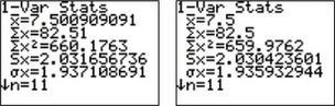
41.
(a) Using the TI-83, we have the following for datasets A and B, respectively:
Thus, for each data set we have x≈7.50 and s≈2.03.
(b) From the stemplots below, we observe that dataset A has two low potential outliers and dataset B has one high potential outlier. (For these stemplots, the data have been rounded.)
Dataset A:
Dataset B:
Question 5.72
![]() 42. "Conservationists have despaired over destruction of tropical rainforest by logging, clearing, and burning." These words begin a report on a statistical study of the effects of logging in Borneo. [Source: C. H. Cannon, D. R. Peart, and M. Leighton, Tree species diversity in commercially logged Bornean rainforest, Science, 281 (1998): 1366-1368.] Researchers compared forest plots that had never been logged (Group 1) with similar plots nearby that had been logged one year earlier (Group 2) and eight years earlier (Group 3). All plots were 0.1 hectare in area. Here are the counts of trees for plots in each group, courtesy of Charles Cannon:
42. "Conservationists have despaired over destruction of tropical rainforest by logging, clearing, and burning." These words begin a report on a statistical study of the effects of logging in Borneo. [Source: C. H. Cannon, D. R. Peart, and M. Leighton, Tree species diversity in commercially logged Bornean rainforest, Science, 281 (1998): 1366-1368.] Researchers compared forest plots that had never been logged (Group 1) with similar plots nearby that had been logged one year earlier (Group 2) and eight years earlier (Group 3). All plots were 0.1 hectare in area. Here are the counts of trees for plots in each group, courtesy of Charles Cannon:
| Group 1: | 27 | 22 | 29 | 21 | 19 | 33 |
| 16 | 20 | 24 | 27 | 28 | 19 | |
| Group 2: | 12 | 12 | 15 | 9 | 20 | 18 |
| 17 | 14 | 14 | 2 | 17 | 19 | |
| Group 3: | 18 | 4 | 22 | 15 | 18 | |
| 19 | 22 | 12 | 12 |
Give a complete comparison of the three distributions, using both graphs and numerical summaries. To what extent has logging affected the count of trees? The researchers used an analysis based on x and s. Explain why using this analysis is reasonably well justified.
Question 5.73
![]() 43. This is a standard deviation contest. You must choose four numbers from the whole numbers 0 to 10, with repeats allowed.
43. This is a standard deviation contest. You must choose four numbers from the whole numbers 0 to 10, with repeats allowed.
- Choose four numbers that have the smallest possible standard deviation.
- Choose four numbers that have the largest possible standard deviation.
- Is more than one choice possible in part (a)? Explain.
- Is more than one choice possible in part (b)? Explain.
43.
(a) One possible answer is 1, 1, 1, 1.
(b) 0, 0, 10, 10
(c) Yes. Any set of four equal numbers yields the smallest possible value for s: 0.
(d) No. Within the 0 to 10 constraint, numbers can't deviate any further from the mean.
Question 5.74
44. Your data consist of observations on the ages of several subjects (measured in years) and the reaction times of these subjects (measured in seconds). In what units are each of the following descriptive statistics measured?
- Mean age of the subjects
- Standard deviation of the subjects’ reaction times
- Variance of the subjects’ reaction times
- Median age of the subjects
5.8 Normal Distributions
Question 5.75
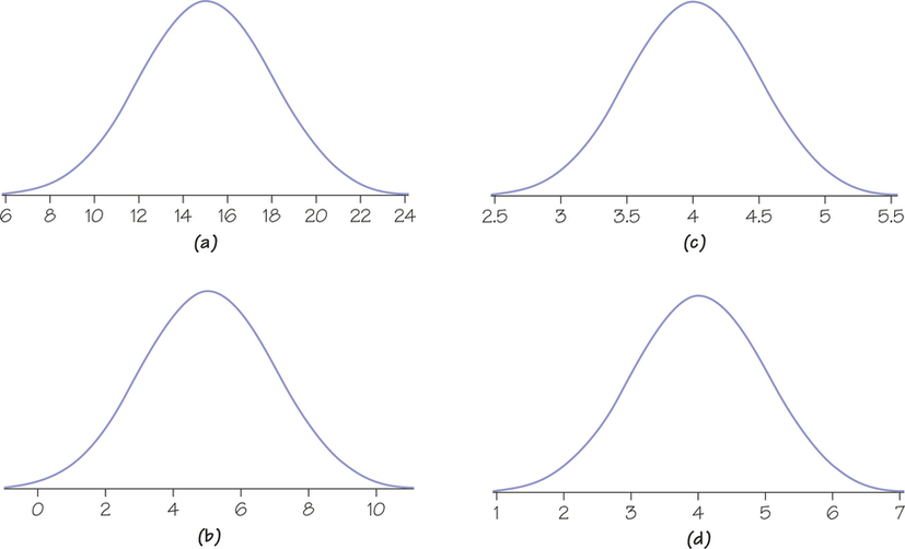
![]() 45. Figure 5.33 shows four normal density curves. Match the density curves with each of the following means, μ, and standard deviations, σ. Explain how you matched the curves to their means and standard deviations.
45. Figure 5.33 shows four normal density curves. Match the density curves with each of the following means, μ, and standard deviations, σ. Explain how you matched the curves to their means and standard deviations.
- μ=4 and σ=1
- μ=5 and σ=2
- μ=4 and σ=0.5
- μ=15 and σ=3
Question 5.76
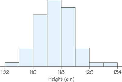
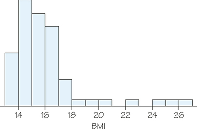
46. Figures 5.34 and 5.35 show histograms of the height and body mass index (BMI), respectively, of 6-year-olds participating in an investigation into childhood obesity.
- Make a sketch of the histogram in Figure 5.34. Do you think that the height of 6-year-olds follows a normal distribution? If yes, draw a normal curve over your histogram. If no, explain why not and draw a density curve that provides a better fit.
- Make a sketch of the histogram in Figure 5.35. Do you think that the BMI of 6-year-olds follows a normal distribution? If yes, draw a normal curve over it. If no, explain why not and draw a density curve that provides a better fit.
5.9 The 68-95-99.7 Rule for Normal Distributions
Question 5.77
47. Some teachers grade on a "(bell) curve" based on the belief that classroom test scores are normally distributed. One way of doing this is to assign a "C" to all scores within 1 standard deviation of the mean. The teacher then assigns a "B" to all scores between 1 and 2 standard deviations above the mean and an "A" to all scores more than 2 standard deviations above the mean, and uses symmetry to define the regions for "D" and "F" on the left side of the normal curve. If 200 students take an exam, determine the number of students who receive a B.
47.
Approximately 68% of the students will receive a grade of C. Approximately (95−682)%272%=13.5% of students will receive a grade of B. Thus, 0.135(200)=27 students will receive a grade of B.
Question 5.78
48. The length of human pregnancies from conception to birth varies according to a distribution that is approximately normal, with a mean of 266 days and a standard deviation of 16 days. Draw a normal curve for this distribution on which the mean and standard deviation are correctly located. (Hint: First draw the curve and then mark the axis.)
Question 5.79
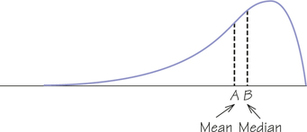
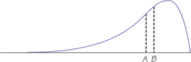
49. Figure 5.36 shows a smooth curve used to describe a distribution that is not symmetric. The mean and median do not coincide. Which of the points marked is the mean of the distribution, and which is the median? Explain your answer.
49.
The distribution is left-skewed, so the mean is pulled toward the long tail. Therefore, A is the mean and Bis the median, as shown in the diagram.
Question 5.80
50. Sketch a smooth curve that describes a distribution that is symmetric but has two peaks (that is, two strong clusters of observations).
Question 5.81
51. Consider the CSRSX fund in Table 5.10 (whose standard deviation is 24.1%) discussed in Example 14 (page 207). Complete these sentences: In about two-thirds of future annual returns, the fund is expected to earn about 12.15% each year, plus or minus ______. This means that in two-thirds of future years, the fund may do as well as ______% or as poorly as _____%.
51.
24.1%; 36.25 (about 1 standard deviation above the mean); 211.95 (about 1 standard deviation below the mean)
Question 5.82
52. Consider the CSRSX fund in Table 5.10 (whose standard deviation is 24.1%) discussed in Example 14 (page 207).
- Complete these sentences, a slight variation of which is commonly used in investment advising: In about 95% of future annual returns, the fund is expected to earn about 12.15% each year, plus or minus ______. This means that in 95% of future years, the fund may do as well as ___% or as poorly as _____ %.
- Based on your answers to part (a), would this kind of fund be more attractive to an 80-year-old retired person living on a modest fixed pension or to a young working professional? Explain.
Question 5.83
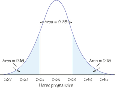
53. Bigger animals tend to carry their young longer before birth. The length of horse pregnancies from conception to birth varies according to a roughly normal distribution, with a mean of 336 days and a standard deviation of 3 days. Use the 68-95-99.7 rule to answer the following questions.
- Almost all (99.7%) horse pregnancies fall in what interval of lengths?
- What percentage of horse pregnancies is longer than 339 days?
53.
(a) μ±3σ=336±3(3)=336±9, or 327 to 345 days
(b) 16% lie above 339.
Question 5.84
54. According to the College Board, scores on the math section of the SAT Reasoning college entrance test for the class of 2010 had a mean of 516 and a standard deviation of 116. Assume that they are roughly normal.
- What was the interval spanned by the middle 68% of scores?
- How high must a student score in order to be in the top 2.5% of scores?
Question 5.85
55. What are the quartiles of scores from the math section of the SAT Reasoning test, according to the distribution in Exercise 54?
55.
The quartiles are μ±0.67σ=516±0.67(116)≈516±78, or Q1=438 and Q3=594.
Question 5.86
56. The Wechsler Adult Intelligence Scale (WAIS) is the most common "IQ test." The scale of scores is set separately for each age group and is approximately normal, with a mean of 100 and a standard deviation of 15. People with WAIS scores below 70 are generally considered eligible to apply for Social Security disability benefits. By this criterion, what percentage of adults are in this IQ category?
Question 5.87
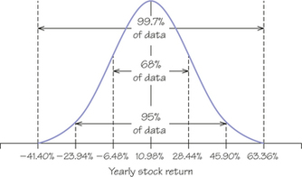
57. The yearly rate of return on the Standard & Poor’s 500 (an index of 500 large-cap corporations) is approximately normal. From January 1, 1960, through December 31, 2009, the S&P 500 had a mean yearly return of 10.98%, with a standard deviation of about 17.46%. Take this normal distribution to be the distribution of yearly returns over a long period.
- In what interval do the middle 95% of all yearly returns lie?
- Stocks can go down as well as up. What are the worst 2.5% of annual returns?
57.
(a) μ±2σ=10.98±2(17.46)=10.98±34.92, or −23.94% to 45.90% (see diagram)
(b) A loss of at least 23.94%
Question 5.88
58. What is the interval of the middle 50% of annual returns on stocks, according to the distribution given in Exercise 57 (Hint: What two numbers mark off the middle 50% of any distribution?)
Question 5.89
59. The concentration of the active ingredient in capsules of a prescription painkiller varies according to a normal distribution with μ=10% and σ=0.2%.
- What is the median concentration? Explain your answer.
- What interval of concentrations covers the middle 95% of all the capsules?
- What interval covers the middle half of all capsules?
59.
(a) Normal curves are symmetric, so median=mean=10%.
(b) Because 95% of values lie within 2σ of μ,μ±2σ=10±2(0.2)=10±0.4 implies that 9.6% to 10.4% is the interval of concentrations that cover the middle 95% of all the capsules.
(c) The interval between the two quartiles covers the middle half of all capsules. Thus, μ±0.67σ=10±0.67(0.2)=10±0.134 implies that 9.866% to 10.134% is the desired range.
Question 5.90
60. Answer the following questions for the painkiller in Exercise 59.
- What percentage of all capsules has a concentration of the active ingredient higher than 10.4%?
- What percentage has a concentration higher than 10.6%?
Question 5.91
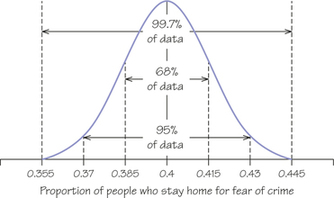
61. One reason that normal distributions are important is that they describe how the results of an opinion poll would vary if the poll were repeated many times. About 40% of adult Americans say they are afraid to go out at night because of crime. Take many randomly chosen samples of 1050 people. The proportions of people in these samples who stay home for fear of crime will follow the normal distribution with a mean of 0.4 and a standard deviation of 0.015. Use this fact and the 68-95-99.7 rule to answer these questions.
- In many samples, what percentage of samples gives results above 0.4? Above 0.43?
- In a large number of samples, what interval contains the middle 95% of proportions of people who stay home because of crime?
61.
(a) Because of the symmetry of the normal curves, 50% give results above 0.4; because 0.43 is 2σ above μ,2.5% give results above 0.43.
(b) μ±2σ=0.4±2(0.015)=0.4±0.03,, or 0.37 to 0.43
Question 5.92
![]() 62. You can compare observations from different normal distributions if you measure in standard deviations away from the mean. Scores expressed in standard deviation units are called standard scores (or z-scores), and tables and technology commands can convert z-scores into percentiles. A z-score that is more than 3 or less than 23 would definitely be considered an outlier.
62. You can compare observations from different normal distributions if you measure in standard deviations away from the mean. Scores expressed in standard deviation units are called standard scores (or z-scores), and tables and technology commands can convert z-scores into percentiles. A z-score that is more than 3 or less than 23 would definitely be considered an outlier.
- Scores on the ACT college entrance exam in a recent year were roughly normal, with a mean of 21.2 and a standard deviation of 4.8. Jermaine scores 27 on the ACT. Express his score in standard deviation units by calculating
standard score=score-meanstandard deviation
- Scores on the SAT Reasoning college entrance exam in the same year were roughly normal, with mean 1511 and standard deviation 194. Tonya scores 1718 on the SAT. What is her standard score?
- Assuming that the ACT and the SAT tests measure the same thing, did Jermaine or Tonya have the better performance?
Question 5.93
![]() 63. The Boston Beanstalks Club is a social club for tall people. To join the club, women must be at least 5 feet 10 inches (70 inches) and men at least 6 feet 2 inches (74 inches). Both men’s and women’s heights are approximately normally distributed, but from different normal distributions. You can compare observations from different normal distributions if you measure in standard deviations away from the mean, which converts the observation to a z-score. To compute an observation’s z-score, subtract the mean and then divide the result by the standard deviation:
63. The Boston Beanstalks Club is a social club for tall people. To join the club, women must be at least 5 feet 10 inches (70 inches) and men at least 6 feet 2 inches (74 inches). Both men’s and women’s heights are approximately normally distributed, but from different normal distributions. You can compare observations from different normal distributions if you measure in standard deviations away from the mean, which converts the observation to a z-score. To compute an observation’s z-score, subtract the mean and then divide the result by the standard deviation:
z=observation-meanstandard deviation
- Assume that women’s heights follow an approximately normal distribution with μ=63.8 inches and σ=4.2 inches. How many standard deviations above the mean must a woman be in order to join the Boston Beanstalks?
- Assume that men’s heights follow an approximately normal distribution with μ=69.4 inches and σ=4.7 inches. How many standard deviations above the mean must a man be in order to join the Boston Beanstalks?
- In terms of joining the Boston Beanstalks, which is more stringent, the height requirements for women or the height requirements for men? Explain.
63.
(a) z-score=(70−63.8)/4.2=1.48. A woman's height must be 1.48 standard deviations above the mean height for women in order to join the Boston Beanstalks.
(b) z–. A man's height must be 0.98 standard deviations above the mean height for men in order to join the Boston Beanstalks.
(c) The height requirements for women are more stringent than for men. Women need to be a half standard deviation further from the mean than their male counterparts.
Question 5.94
64. In order for men to join the Boston Beanstalks (see Exercise 63), they must be at least 6 feet 2 inches (74 inches) tall. Assume that men’s heights are approximately normal with inches and inches. Use the 68-95-99.7 rule to estimate the percentage of men who are eligible to join the Boston Beanstalks.
Chapter Review
Different varieties of the bright tropical flower Heliconia are fertilized by different species of hummingbirds. Over time, the lengths of the flowers and the form of the hummingbirds’ beaks have evolved to match each other. Below are data on the lengths in millimeters of two varieties of these flowers on the island of Dominica. Exercises 65-69 use these data.
| Heliconia caribaea Red | ||||
| 37.40 | 38.07 | 38.87 | 40.66 | 41.93 |
| 37.78 | 38.10 | 39.16 | 41.47 | 42.01 |
| 37.87 | 38.20 | 39.63 | 41.69 | 42.18 |
| 37.97 | 38.23 | 39.78 | 41.90 | 43.09 |
| 38.01 | 38.79 | 40.57 | ||
| Heliconia caribaea Yellow | ||||
| 34.57 | 35.45 | 36.03 | 36.66 | 37.02 |
| 34.63 | 35.68 | 36.11 | 36.78 | 37.10 |
| 35.17 | 36.03 | 36.52 | 36.82 | 38.13 |
Question 5.95
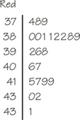
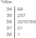
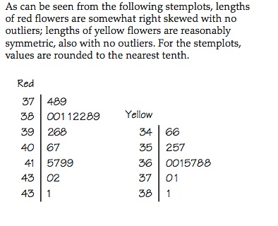
65. Make stemplots of the lengths of each of the two varieties (red and yellow). Briefly describe the overall shape of the two distributions.
65.
As can be seen from the following stemplots, lengths of red flowers are somewhat right skewed with no outliers; lengths of yellow flowers are reasonably symmetric, also with no outliers. For the stemplots, values are rounded to the nearest tenth.
Question 5.96
66. Find the five-number summaries of the two distributions of flower lengths. Make side-by-side boxplots to give a quick picture that compares the two distributions.
Question 5.97
67. The biologists who collected the flower length data compared the two Heliconia varieties using statistical methods based on the mean and standard deviation.
- Find and for each variety.
- Based on Exercise 65, which distribution is more suitable for use of and as summaries? Why?
67.
(a) Red: , ; yellow: ,
(b) The mean and standard deviation are better suited to the symmetrical yellow distribution.
Question 5.98
68. Your stemplot in Exercise 65 suggests that the distribution of lengths of yellow Heliconia flowers is roughly normal. Suppose that the distribution is exactly normal. Use the mean and standard deviation you found in Exercise 67 as the and of the distribution.
- What interval of lengths covers the middle 50% of yellow flowers?
- What interval of lengths covers the middle 95% of yellow flowers?
Question 5.99
69. Continue to work with the normal distribution of lengths of yellow flowers in Exercise 68. The shortest red flower was 37.4 millimeters long. Using the 68-95-99.7 rule and the location of the quartiles in normal distributions, what can you say about the percentage of yellow flowers that are longer than 37.4 millimeters?
69.
The top 2.5% of the distribution lies above
The top 16% of the distribution lies above
The top 25% of the distribution lies above
The value 37.4 is between 37.155 and 38.13, so between 2.5% and 16% of yellow flowers are longer that 37.4 millimeters.
Question 5.100
70. Without a calculator (or other technology), find the standard deviation of these five numbers: 0, 1, 3, 4, 12. Use the approach in the standard deviation definition box on page 204.
Question 5.101
71. If every number in a dataset is increased by 10, which of these measures will increase: range, standard deviation, mode, mean, or median?
71.
If every number in a dataset is increased by 10, then the mode, mean, and median will each increase by 10. The range and standard deviation, however, willnot change.
Question 5.102
72. Bob is two years older than one brother and five years younger than his other brother. Find the standard deviation of the three brothers’ ages.
Question 5.103
73. If you ask a computer (or your graphing calculator) to generate "random numbers" between 0 and 1, you will get data from a uniform distribution. Figure 5.37 shows a graph of the density curve for this distribution.
- Check that the area under the uniform density curve is 1.
- What is the mean of this distribution?
- What proportion of outcomes from this distribution lie between 0.2 and 0.8?
- What percentage of random numbers between 0 and 1 would you expect to lie between 0 and 0.5?
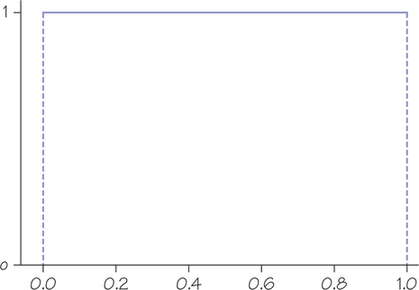
73.
(a) Since the uniform density curve forms a rectangle, the area is found by multiplying the length of the rectangle by its height: .
(b) —that's the balance point for the region under the density function.
(c) Area under the density curve over this interval is . (Since it is rectangular in shape, just multiply width times height.)
(d) 50%