Chapter 6 Exercises
Chapter 6 Exercises
Some exercises require use of a calculator (or software or Internet applet) that will find correlation and the slope and intercept of the least-squares regression line from keyed-in data.
Question 6.36
1. In each of the following situations, is it more reasonable simply to explore the relationship between the two variables or to view one of the variables as an explanatory variable and the other as a response variable? In the latter case, which is the explanatory variable?
- The amount of time spent studying for a statistics exam and the grade on the exam
- The weight in kilograms and height in centimeters of a person
- The inches of rain in the growing season and the yield of corn in bushels per acre
- A student’s scores on the SAT and ACT standardized tests
1.
(a) Latter case; study time
(b) Relationship only
(c) Latter case; rainfall
(d) Relationship only
6.1 Displaying Relationships: Scatterplot
Question 6.37
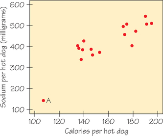
2.Figure 6.22 shows the calories and salt content (in milligrams of sodium) in 17 brands of beef hot dogs. Describe the overall pattern (form, direction, and strength) of these data. In what way is the point marked A unusual?
Question 6.38
![]() 3. Figure 6.23 is a scatterplot of data from the World Bank. The individuals are all the world’s nations for which data are available. The explanatory variable is a measure of how rich a country is, which is the gross domestic product (GDP) per person. GDP is the total value of the goods and services produced in a country, converted into dollars. The response variable is life expectancy at birth. Three African nations are outliers, with lower life expectancy than usual for their GDP. A full study would ask what special circumstances explain these outliers.
3. Figure 6.23 is a scatterplot of data from the World Bank. The individuals are all the world’s nations for which data are available. The explanatory variable is a measure of how rich a country is, which is the gross domestic product (GDP) per person. GDP is the total value of the goods and services produced in a country, converted into dollars. The response variable is life expectancy at birth. Three African nations are outliers, with lower life expectancy than usual for their GDP. A full study would ask what special circumstances explain these outliers.
- Describe the direction and form of the relationship. Aside from the outliers, it is moderately strong.
- Explain why the direction and form of this relationship make sense.
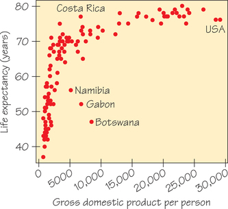
3.
(a) Life expectancy increases with GDP in a curved pattern. The increase is very rapid at first, but it levels off for GDP above roughly $5000 per person.
(b) Sample response: As countries go from very poor to moderate economies, improvements in quality/ quantity of food, housing, and medical care have a great impact on increasing life expectancy. As countries move from moderate economies to rich economies, such improvements still improve life expectancy but at a lower rate.
Question 6.39
4. Global warming is due to increased concentrations of greenhouse gases such as carbon dioxide (CO2). Here are data from the National Oceanic and Atmospheric Administration website (www.noaa.gov), where atmospheric CO2 is measured in parts per million per unit of volume. The data below were measured at the Mauna Loa Observatory:
| CO2 | 315.98 | 324.62 | 336.78 | 352.90 | 368.14 | 387.35 |
| Year | 1959 | 1969 | 1979 | 1989 | 1999 | 2009 |
(You will revisit these data in Exercise 20.)
- Which is the explanatory variable?
- Make a scatterplot. Is the association between these variables positive or negative? Explain why you expect the relationship to have this direction.
- Describe the form and strength of the relationship.
Question 6.40
5.
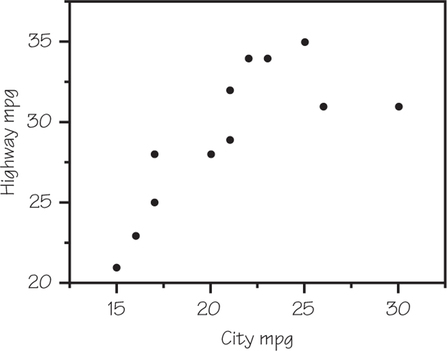
 Table 5.7 (page 196) gives the city and highway gas mileages for 13 midsized cars. Omit the hybrid car (Toyota Prius) and make a scatterplot, taking city mileage as the explanatory variable. Describe in words the form, direction, and strength of the relationship between highway mileage and city mileage. (You will revisit these data in Exercise 19.)
5.
The scatterplot below shows a fairly strong, positive, straight-line relationship.
Question 6.41
6. How fast do icicles grow? Here are data on two variables, Time measured in minutes and Length measured in centimeters, for one set of conditions: no wind, temperature −11∘C, and water flowing over the icicle at 12 milligrams per second.
| Time (minutes) | 10 | 20 | 30 | 40 | 50 |
| Length (centimeters) | 0.6 | 1.8 | 2.9 | 4.0 | 5.0 |
| Time (minutes) | 60 | 70 | 80 | 90 | 100 |
| Length (centimeters) | 6.1 | 7.9 | 10.1 | 10.9 | 12.7 |
| Time (minutes) | 110 | 120 | 130 | 140 | 150 |
| Length (centimeters) | 14.4 | 16.6 | 18.1 | 19.9 | 21.0 |
Which is the explanatory variable? Make a scatterplot. Describe in words the direction, form, and strength of the relationship.
Question 6.42
![]() 7. How does the fuel consumption of a car change as its speed increases? Here are data for a British Ford Escort. Fuel consumption is measured in miles per gallon of gasoline used and speed is measured in miles per hour.
7. How does the fuel consumption of a car change as its speed increases? Here are data for a British Ford Escort. Fuel consumption is measured in miles per gallon of gasoline used and speed is measured in miles per hour.
| Speed | 6.2 | 12.4 | 18.6 | 24.9 | 31.1 |
| Fuel | 11.2 | 18.1 | 23.5 | 29.4 | 33.6 |
| Speed | 37.3 | 43.5 | 49.7 | 55.9 | 62.1 |
| Fuel | 39.9 | 37.3 | 33.8 | 31.1 | 28.4 |
| Speed | 68.4 | 74.6 | 80.8 | 87.0 | 93.2 |
| Fuel | 26.0 | 23.8 | 21.8 | 20.0 | 18.3 |
- Which is the explanatory variable?
- Make a scatterplot. Describe the form of the relationship. Explain why the form of the relationship makes sense.
- How would you describe the direction of this relationship?
- Is the relationship reasonably strong or quite weak? Explain your answer.
7.
(a) Speed
(b)
Sample response: Initially, the form is linear, but then it switches direction and bends upward.
(c) Relationship is positive for speeds under 40 mph; relationship is negative for speeds above 40 mph.
(d) Quite strong; little scatter about the piecewise linear then curved pattern
Question 6.43
![]() 8. Give an example of two variables from everyday life that have a positive association. Give an example of two variables that have a negative association.
8. Give an example of two variables from everyday life that have a positive association. Give an example of two variables that have a negative association.
Question 6.44
9. The following table shows excerpted and rounded data collected on crickets by Harvard physics professor George W. Pierce in his 1948 book The Song of Insects:
| Chirps per 15 seconds | 44 | 37 | 31 | 25 | 15 |
| Ground temperature (in °F) | 80 | 68 | 73 | 63 | 55 |
- Which is the explanatory variable?
- Make a scatterplot. Is the association between these variables positive or negative?
- Describe the form and strength of the relationship.
- Do the data seem consistent with a rule of thumb from The Old Farmer’s Almanac to count the number of chirps in 14 seconds and then add 40 to get the (Fahrenheit) temperature?
9.
(a) Ground temperature
(b) Positive association
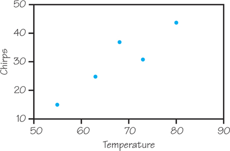
(c) Strong, straight-line pattern
(d) Yes
Question 6.45
10. On the NASA space shuttle, six primary O-rings were used to seal the sections of the two solid-fuel rocket motors and keep hot gases from escaping and catastrophically igniting the liquid hydrogen fuel tank. The number of O-ring erosion problems and the launch temperature (in degrees Fahrenheit) are given for 23 successful flights between April 12, 1981, and January 12, 1986:
| Mission | O-Ring Incidents | °F | Mission | O-Ring Incidents | °F |
|---|---|---|---|---|---|
| 1 | 0 | 66 | 13 | 0 | 67 |
| 2 | 1 | 70 | 14 | 2 | 53 |
| 3 | 0 | 69 | 15 | 0 | 67 |
| 4 | 0 | 68 | 16 | 0 | 75 |
| 5 | 0 | 67 | 17 | 0 | 70 |
| 6 | 0 | 72 | 18 | 0 | 81 |
| 7 | 0 | 73 | 19 | 0 | 76 |
| 8 | 0 | 70 | 20 | 0 | 79 |
| 9 | 1 | 57 | 21 | 2 | 75 |
| 10 | 1 | 63 | 22 | 0 | 76 |
| 11 | 1 | 70 | 23 | 1 | 58 |
| 12 | 0 | 78 |
- Which is the explanatory variable?
- Make a scatterplot. Is the association between these variables positive or negative?
- Describe the form and strength of the relationship.
- The forecasted temperature the morning of the January 28, 1986, launch of the Challenger was between 26°F and 29°F. Should this have been a cause for concern or not? Why?
- Would a different conclusion be reached by someone whose scatterplot contained only the seven flights for which there was at least one problem? Explain.
Question 6.46
![]() 11. Use spreadsheet software or a graphing calculator for this exercise. (Spotlight 6.1 on page 249 provides instruction for TI-83/84 graphing calculators and Excel.) The presence of mercury in fish is a health hazard, particularly for women who may become pregnant and children. Table 6.8 contains data on mercury concentration in tissue samples from 20 largemouth bass taken from Lake Natoma (California). Only fish of legal/edible size were used in this study. (Save your data and work from this exercise for use in Exercise 31.)
11. Use spreadsheet software or a graphing calculator for this exercise. (Spotlight 6.1 on page 249 provides instruction for TI-83/84 graphing calculators and Excel.) The presence of mercury in fish is a health hazard, particularly for women who may become pregnant and children. Table 6.8 contains data on mercury concentration in tissue samples from 20 largemouth bass taken from Lake Natoma (California). Only fish of legal/edible size were used in this study. (Save your data and work from this exercise for use in Exercise 31.)
| Total Length, x (mm) | Mercury Concentration, y (μg/g wet wt.) |
|---|---|
| 341 | 0.515 |
| 353 | 0.268 |
| 387 | 0.450 |
| 375 | 0.516 |
| 389 | 0.342 |
| 395 | 0.495 |
| 407 | 0.604 |
| 415 | 0.695 |
| 425 | 0.577 |
| 446 | 0.692 |
| 490 | 0.807 |
| 315 | 0.320 |
| 360 | 0.332 |
| 385 | 0.584 |
| 390 | 0.580 |
| 410 | 0.722 |
| 425 | 0.550 |
| 480 | 0.923 |
| 448 | 0.653 |
| 460 | 0.755 |
- Which is the explanatory variable and which is the response variable?
- Make a scatterplot of the response variable against the explanatory variable.
- Based on your scatterplot, as fish length increases, does mercury concentration in fish tissue tend to increase, decrease, or remain about the same? Is this an example of positive or negative association?
- Would you describe the form of the relationship as linear or nonlinear? Explain.
- Why do you think that only fish of edible/legal size were included in the dataset?
11.
(a) Fish length is the explanatory variable; mercury level is the response variable.
(b)
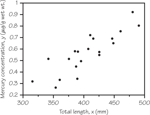
(c) Increase; positive association
(d) Linear; the dots appear to form a pattern about a
straight line.
(e) The relationship between mercury in fish tissue may be different for fish that are below the edible/ legal size. In terms of health, only the fish that are of edible size pose a health risk if their mercury levels are too high.
Question 6.47
12. Use spreadsheet software or a graphing calculator for this exercise. (Spotlight 6.1 on page 249 provides instruction for TI-83l84 graphing calculators and Excel.) Satellites are one of the many tools used for predicting flash floods, heavy rainfall, and large amounts of snow. Geostationary (GEOS) satellites collect data on cloud top brightness temperatures (measured in degrees Kelvin). It turns out that colder cloud temperatures are associated with higher and thicker clouds, which in turn are associated with heavier precipitation. Data consisting of temperature and rainfall rate measured by ground radar appear in Table 6.9. Because ground radar can be limited by location and obstructions, having an alternative for predicting the rainfall rates can be useful. (Save your data and work from this exercise for use in Exercise 32.)
| Temperature (°K) | Radar Rain Rate (mm/h) | Temperature (°K) | Radar Rain Rate (mm/h) |
|---|---|---|---|
| 195 | 150 | 203 | 44 |
| 196 | 150 | 204 | 39 |
| 197 | 150 | 205 | 39 |
| 198 | 118 | 206 | 35 |
| 199 | 109 | 207 | 38 |
| 200 | 95 | 208 | 31 |
| 201 | 63 | 209 | 20 |
| 202 | 66 | 210 | 24 |
- You want to use cloud top temperature to explain rainfall rate. With this in mind, make a scatterplot of the data from Table 6.9.
- Is the association between cloud top temperature and radar rainfall rate positive or negative?
- Would you describe the form of the relationship as linear?
6.2 Making Predictions: Regression Line
Question 6.48
13.Figure 6.22 (page 278) shows the salt content (in milligrams of sodium) and calories in 17 brands of beef hot dogs. If we ignore the outlying point marked A, a regression line for predicting sodium from calories passes close to these two observations:
calories=139, sodium=386 mgcalories=191, sodium=506 mg

Slope of a Line
Use this fact to estimate the slope of this regression line (round your answer to two decimal places).
13.
2.31
Question 6.49
14. Exercise 4 (page 278) gives data on CO2 concentration (in parts per million) over time. A regression line for predicting CO2 for a given year is
predicted CO2 concentration=311.662+1.43866×(years elapsed since 1959)
- What is the slope of this line? What does the slope say about how CO2 is changing over time?
- What does the model predict the CO2 concentration for 2006 to be? In fact, the observed value that year was 381.85. How accurate is your prediction?
Question 6.50
15. Researchers studying acid rain measured the acidity of precipitation in a Colorado wilderness area for 150 consecutive weeks. Acidity is measured by pH, and lower pH values mean higher acidity. The acid rain researchers observed a straight-line pattern in acidity levels over time. They reported that the regression line
predicted pH=5.43−(0.0053×weeks)
fit the data well. [Data from W. M. Lewis and M. C. Grant, Acid precipitation in the western United States, Science, 207 (1980): 176–177.]
- Draw a graph of this line. Explain what the line says about how pH was changing over time.
- According to the regression line, what was the pH at the beginning of the study (weeks = 1)? At the end (weeks = 150)?
- What is the slope of the regression line? Explain what this slope says about the rate of change in pH.
15.
(a) The pH decreases as the number of weeks increases.
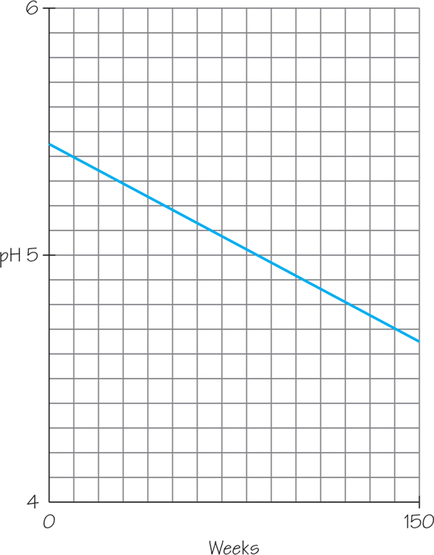
(b) 5.42; 4.64 (both rounded to two decimal places)
(c) −0.0053; on average, pH declined by 0.0053 per week during the study period.
Question 6.51
16. A study at the University of Massachusetts, Amherst, published in the May 2007 Journal of Marriage and Family found that married women do about one fewer hour of housework a week for every $7500 they earn as full-time workers outside the home, regardless of their husband’s income.
- What would be the numerical value of the slope coefficient in the regression model that predicts women’s housework hours from their income? What does the sign of the slope (positive or negative) tell us about the relationship between these variables?
- Suppose Lynette’s salary is $30,000 greater than Gabrielle’s. What would you predict to be the difference in hours of housework they each do?
Question 6.52
17. A 21-year-old college student drinks heavily at a party until his BAC is 0.15 g/dl—almost twice the legal driving limit of 0.08. He now stops drinking, and each hour his BAC falls by 0.015 g/dl.
Using Formulas
- What is a regression-line equation that would predict his BAC from the number of hours after he stopped drinking?
- In how many hours would the student be able to drive legally?
- In how many hours would no alcohol be present in his body?
17.
(a) predicted BAC=0.15−0.015× number of hours after drinking stopped
(b) 423≈4.67 hours
(c) 10
Question 6.53
18. Suppose that the slope of the regression line of weight on height for a group of young men is m=1.1 when we measure height x in centimeters and weight y in kilograms. That is, when height increases by 1 centimeter, weight increases by 1.1 kilograms. There are 1000 grams in a kilogram. If we measured weight in grams, what would the slope be?
6.3 Correlation
Question 6.54
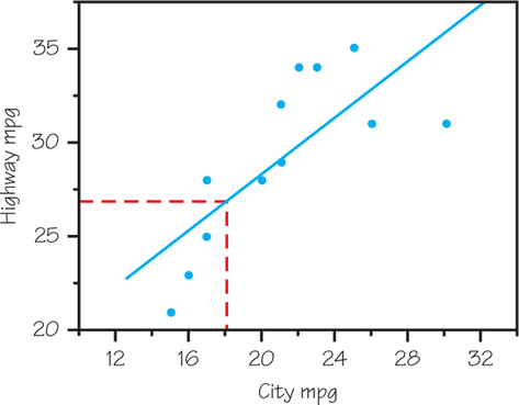
19. Find the correlation between the city and highway gas mileages for the 12 nonhybrid midsized cars (i.e., omit the Toyota Prius) in Table 5.7 (page 196). Explain why the value of r supports the scatterplot that you created in Exercise 5.
19.
r=0.7514, reflecting the moderate, positive, straightline pattern in the Exercise 5 scatterplot.
Question 6.55
20. Exercise 4 (page 278) gives data on CO2 concentration (in parts per million) over time.
- Use a calculator or spreadsheet software such as Excel to find the correlation r (refer to Spotlight 6.2 on page 259). Explain from looking at the scatterplot why this value of r is reasonable.
- Suppose that the concentration had been recorded in parts per billion instead of parts per million. For example, the value 354.16 would become 354,160. How would the value of r change?
Question 6.56
21. Find the correlation between city and highway mileage for all 13 midsized cars in Table 5.7 (page 196), including the Toyota Prius. Compare your r with the value you found in Exercise 19. Explain why adding the Prius changes r in this direction.
21.
r=0.9262; correlation has increased; the point is an outlier that pulls the line toward it.
Question 6.57
22. In Example 11, Table 6.7 (page 270), the positive association between family income and SAT score is clear from the lockstep pattern, but to calculate a specific numerical value for the correlation, we need to make a simplifying assumption. For each income bracket with fixed endpoints, choose its midpoint. Now, use a calculator (or Excel) to calculate a correlation value (refer to Spotlight 6.2 on page 259).
Question 6.58
23. Exercise 7 (page 279) gives data on gas used versus speed for a small car. Make a scatterplot, if you did not do so in Exercise 7. Calculate the correlation. Explain why r is close to 0 despite a strong relationship between speed and gas use.
23.
r=−0.0435; the relationship is strong because the points form a pattern that shows little scatter, but the pattern is curved, not linear.
Question 6.59
24. Consider the data in Exercise 6 (page 278) on forming icicles.
- Find the correlation between time and icicle length.
- If icicle length were measured in inches rather than centimeters (Note:1 inch=2.54 cm ), how would the correlation change?
Question 6.60
25. If heterosexual women always dated men who are three years older than themselves, what would the correlation be between the ages of each man and each woman? (Hint: Draw a scatterplot for several ages.)
25.
r=1; the data would fall exactly on a straight line.
Question 6.61
26. We want to find the correlation between
- the heights of fathers and the heights of their adult sons.
- the heights of married men and the heights of their wives.
- the heights of women at age 4 and their heights at age 18.
The answers (in scrambled order) are r=0.2, r=0.5, and r=0.8. Match the r values to the variable pairings and explain your choices.
Question 6.62
27. For each of the following pairs of variables, would you expect a substantial negative correlation, a substantial positive correlation, or a small correlation?
- The age of used cars and their prices
- The weight of new cars and their gas mileages in miles per gallon
- The heights and weights of adult women
- The heights and IQ scores of adult men
27.
(a) Negative
(b) Negative
(c) Positive
(d) Small
Question 6.63
![]() 28. Each of the following statements contains a mistake. Explain what is wrong in each case.
28. Each of the following statements contains a mistake. Explain what is wrong in each case.
- “There is a high correlation (r=0.89) between the hair color of American workers and their income.”
- “We found a high correlation (r=1.09) between students’ ratings of faculty teaching and ratings made by other faculty members.”
- “The correlation between age and income was found to be r=0.53 years.”
Question 6.64
![]() 29. Mutual fund reports often give correlations to describe how the prices of different investments are related. You look at the correlations between three Fidelity funds and the Standard & Poor’s 500 Stock Index, which describes stocks of large U.S. companies. The three funds are Dividend Growth (stocks of large U.S. companies), Small Cap Stock (stocks of small U.S. companies), and Emerging Markets (stocks in developing countries). For a recent year, the three correlations are r=0.35, r=0.81, and r=0.98.
29. Mutual fund reports often give correlations to describe how the prices of different investments are related. You look at the correlations between three Fidelity funds and the Standard & Poor’s 500 Stock Index, which describes stocks of large U.S. companies. The three funds are Dividend Growth (stocks of large U.S. companies), Small Cap Stock (stocks of small U.S. companies), and Emerging Markets (stocks in developing countries). For a recent year, the three correlations are r=0.35, r=0.81, and r=0.98.
- Which correlation goes with each fund? Explain your answer.
- The correlations of the three funds with the index are all positive. Does this tell you that stocks went up that year? Explain your answer.
29.
(a) Dividend Growth: 0.98; Small Cap Stock: 0.81; Emerging Markets: 0.35
(b) No, just that they moved in the same direction
Question 6.65
![]() 30.Archaeopteryx is an extinct animal that had feathers like a bird but teeth and a long bony tail like a reptile. Only six fossil specimens are known. If the specimens belong to the same species and differ in size because some are younger than others, there should be a straight-line relationship between the lengths of a pair of bones from all individuals. An outlier from this relationship would suggest a different species. Here are data on the lengths in centimeters of the femur (a leg bone) and the humerus (a bone in the upper arm) for the five specimens that preserve both bones:
30.Archaeopteryx is an extinct animal that had feathers like a bird but teeth and a long bony tail like a reptile. Only six fossil specimens are known. If the specimens belong to the same species and differ in size because some are younger than others, there should be a straight-line relationship between the lengths of a pair of bones from all individuals. An outlier from this relationship would suggest a different species. Here are data on the lengths in centimeters of the femur (a leg bone) and the humerus (a bone in the upper arm) for the five specimens that preserve both bones:
| Femur length x | 38 | 56 | 59 | 64 | 74 |
| Humerus length y | 41 | 63 | 70 | 72 | 84 |
- Make a scatterplot. Do you think that all five specimens come from the same species?
- Find the correlation r step by step, as in the procedure box in Section 6.3 (page 257).
- Now use one of the methods discussed in Spotlight 6.2 (page 259) to find r and check that you get the same result as in part (b).
Question 6.66
![]() 31. Exercise 11, Table 6.8 (page 280) presented data on fish length and mercury concentration in fish tissue.
31. Exercise 11, Table 6.8 (page 280) presented data on fish length and mercury concentration in fish tissue.
- If you did not do so in Exercise 11, make a scatterplot of mercury concentration against fish length. Based on your scatterplot, would you expect the correlation between these two variables to be positive or negative? Explain.
- Using either your calculator or spreadsheet software such as Excel, calculate the correlation between mercury concentration and fish length (refer to Spotlight 6.2). Using the guidelines in Figure 6.10 (page 255), classify the strength of the linear relationship as strong, moderate, or weak.
31.
(a) Correlation is positive because the association between fish length and mercury concentration in fish tissue is positive.
(b) r≈0.852; there is a strong linear relationship between these two variables.
Question 6.67
32. Exercise 12, Table 6.9 (page 280) presented data on cloud top brightness temperatures (measured from a satellite) and radar rain rate.
- If you did not do so in Exercise 12, make a scatterplot of radar rain rate against temperature. Based on your scatterplot, would you expect the correlation between these two variables to be positive or negative? Explain.
- Using either your calculator or spreadsheet software such as Excel, calculate the correlation between temperature and rain rate (refer to Spotlight 6.2). Using the guidelines in Figure 6.10 (page 255), classify the strength of the linear relationship as strong, moderate, or weak.
6.4 Least-Squares Regression
Question 6.68
33.
In Exercise 5, you made a scatterplot of city and highway gas mileage for the 12 nonhybrid midsized cars (omitting the Prius) in Table 5.7 (page 196).
The equation of the least-squares regression line for predicting highway mileage from city mileage is
highway mpg=13.4+0.75 city mpg
Redo your scatterplot of highway mileage against city mileage from Exercise 5 (omitting the Prius). Add a graph of the least-squares regression line to the plot. Be sure to show how you were able to plot the line starting with its equation.
 Page 283
- Use the “up-and-across” method illustrated in Figure 6.6 (page 251) to show the predicted highway mileage of a midsized car that gets 18 mpg in the city. Approximately what is the predicted highway mileage for this car?
- Now use the equation of the least-squares regression line to predict the highway mileage of a car that gets 18 mpg in the city. Compare your result with your graphical estimate in part (b).
- Based on the scatterplot and the graph of the least- squares regression line, do you expect your prediction from part (c) to be very accurate? Why or why not?
Graphing a Line in Slope-Intercept Form
33.
(a) One way to graph the least-squares regression line is to mark its m=0.75=3/4, to mark a second point and draw the line.
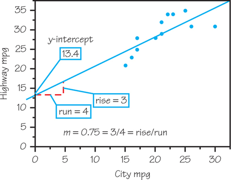
(b) Approximately 27 mpg, as shown below
(c) 26.9 mpg
(d) Sample response: If we look at the two data points associated with 17 City mpg (the closest in City mpg to what we are trying to predict), we see that one car gets 25 City mpg and another gets 28. The corresponding residuals are −1.18 and 1.82, respectively. So, in our prediction, we might expect to be off by as much as 1.82 mpg.
(a) 11.2, 37.3, and 18.3, respectively
(b) 26.96, 26.49, and 25.87, respectively
(c)
(d) No; the least-squares line gives the best straight-line fit and these data do not show a straight-line pattern.
Question 6.69
34. In Exercise 6 (page 278), you made a scatterplot of the length of an icicle and the number of minutes that water has been flowing over the icicle.
The equation of the least-squares regression line for predicting icicle length from time is
icicle length=−1.9+0.15×time
Redo your scatterplot of icicle length against time from Exercise 6. Add a graph of the least-squares regression line to the plot. Be sure to show how you were able to plot the line starting with its equation.
- Use the “up-and-across” method illustrated in Figure 6.6 (page 251) to show the predicted length of the icicle after 75 minutes. Approximately what is the predicted length?
- Now use the equation of the least-squares regression line to predict the length of the icicle after 75 minutes.
Question 6.70
35. Exercise 7 (page 279) gives data on fuel consumption in miles per gallon (mpg) and speed in miles per hour (mph) for a small car. From these data, the least-squares regression line to predict gas performance from speed is
predicted fuel=27.033−0.0125×speed
- What are the observed fuel consumption values for speeds of 6.2, 43.5, and 93.2 mph?
- What are the predicted fuel consumption values for speeds of 6.2, 43.5, and 93.2 mph? (Round your answers to two decimal places.)
- Redo your scatterplot of fuel against speed from Exercise 7. Draw the least-squares regression line on your scatterplot.
- Based on the answer to part (c), is this line a useful model? Why or why not?
Question 6.71
![]() 36. Scientists are concerned that rising sea temperatures will have an adverse effect on coral growth. A small study on this issue produced the data in the table below:
36. Scientists are concerned that rising sea temperatures will have an adverse effect on coral growth. A small study on this issue produced the data in the table below:
| Temperature (°C), x | 29.7 | 29.9 | 30.2 | 30.2 | 30.5 | 30.7 | 30.9 |
| Coral growth (mm), y | 2.63 | 2.58 | 2.60 | 2.48 | 2.26 | 2.38 | 2.26 |
- Make a scatterplot of coral reef growth versus the average sea surface temperature. Do these data tend to support or refute the scientists’ concern? Explain.
- After drawing a scatterplot, Jason thought that the line through the points (29.7, 2.63) and (30.9, 2.26) did a good job summarizing the pattern of these data. Draw Jason’s line on your scatterplot from part (a). Do you agree with Jason?
Verify that Jason’s line can be represented by the following equation:
coral growth=11.78−0.308×temperature
Show the calculations for obtaining the slope and y-intercept.
Carol used her calculator to find the equation of something called the median-median line. The equation of her line is
coral growth=11.09−0.285×temperature
Using the least-squares criterion (i.e., the line with the smaller sum of squares of residual errors), which line is better, Jason’s or Carol’s? Justify your answer. (Feel free to use spreadsheet software or operations on calculator lists to respond to this question.)
Question 6.72
37. A random sample of femur bone lengths (in millimeters) and heights (in centimeters) from six males appears in the table below (these data are from the Forensic Data Bank at the University of Tennessee):
| Person | Femur length (mm) | Height (cm) |
|---|---|---|
| 1 | 520 | 191 |
| 2 | 422 | 160 |
| 3 | 522 | 193 |
| 4 | 459 | 170 |
| 5 | 447 | 168 |
| 6 | 482 | 178 |
The equation of the least-squares regression line for predicting height from femur length is
height=21.48+0.3265×femur length
- Calculate the residual error for Person 2. Based on this residual, does the data point for Person 2 lie above or below the regression line?
- Calculate the residual error for Person 4. Based on this residual, does the data point for Person 4 lie above or below the regression line?
37.
(a) Predicted height=21.48+0.3265×422=159.263; residual=160−159.263=0.737. Since the residual is positive, Person 2’s data point lies above the regression line.
(b) Predicted height=21.48+0.3265×459=171.3435; residual=170−171.3435=−1.3435. Since the residual is negative, Person 4’s data point lies below the regression line.
Question 6.73
38. The length of the icicle in Exercise 6 (page 278) is measured in centimeters. There are 2.54 centimeters in an inch. If length were measured in inches, how would the slope of the regression line given in Exercise 34 change?
Question 6.74
39. The mean height of American women in their early twenties is about 64.5 inches and the standard deviation is about 2.5 inches. The mean height of men the same age is about 68.5 inches, with a standard deviation of about 2.7 inches.
- If the correlation between the heights of married heterosexual men and their wives is about r=0.5, what is the equation of the regression line of the husband’s height on the wife’s height in young couples?
- Predict the height of the husband of a married heterosexual woman who is 67 inches tall.
39.
(a) Predicted height of husband=33.67+0.54×(height of woman)
(b) 69.85 in.
Question 6.75
40. These data, from the National Oceanic and Atmospheric Administration website (www.noaa.gov), are the mean annual number of named Atlantic storms (hurricanes, tropical storms, and tropical depressions), during five-year windows ending with the year shown in the table:
| Five-year period ending | 2012 | 2007 | 2002 | 1997 | 1992 | 1987 | 1982 | 1977 |
| Number named storms | 16.2 | 16.2 | 13.6 | 11.0 | 10.4 | 8.2 | 10.0 | 8.8 |
| Five-year period ending | 1972 | 1967 | 1962 | 1957 | 1952 | 1947 | 1942 | |
| Number named storms | 11.2 | 9.2 | 8.8 | 10.6 | 10.4 | 9.4 | 7.4 |
- What is the slope of the least-squares regression line of named storms against year? What is the intercept?
- Use the regression line to predict the mean annual number of named storms for the five-year window ending with the year 2017.
Question 6.76
![]() 41. Use the general equation for the least-squares regression line to show that this line always passes through the point (ˉx, ˉy). That is, set x=ˉx and show that the line predicts that y=ˉy.
41. Use the general equation for the least-squares regression line to show that this line always passes through the point (ˉx, ˉy). That is, set x=ˉx and show that the line predicts that y=ˉy.
41.
The predicted y corresponding to x=ˉx is ˆy=mˉx+b. Now substitute b=ˉy−(rsysx)ˉx and m=rsysx into this equation to get ˆy=ˉy.
Question 6.77
![]() 42. Exercise 6 gives data on the growth of an icicle (page 278).
42. Exercise 6 gives data on the growth of an icicle (page 278).
- Find the mean and standard deviation of the times and icicle lengths. Find the correlation between the two variables. Use these five numbers to find the equation of the regression line for predicting length from time. Verify that your result agrees with that given in Exercise 34.
- Use the same five numbers to find the equation of the regression line for predicting from an icicle’s length the time that it has been growing. Use your line to predict the time that an icicle 15 centimeters long has been growing. There is just one correlation between two variables, but there are two different least-squares lines, depending on which variable you choose as the response variable.
Question 6.78
![]() 43. Fidelity Investments, like other large mutual fund companies, offers many “sector funds” that concentrate their investments in narrow segments of the stock market. These funds often rise or fall by much more than the market as a whole. Here are the percent returns for 23 Fidelity “Select Portfolios” funds for the years 2002 (when stocks fell) and 2003 (when stocks went up).
43. Fidelity Investments, like other large mutual fund companies, offers many “sector funds” that concentrate their investments in narrow segments of the stock market. These funds often rise or fall by much more than the market as a whole. Here are the percent returns for 23 Fidelity “Select Portfolios” funds for the years 2002 (when stocks fell) and 2003 (when stocks went up).
| 2002 return | 2003 return | 2002 return | 2003 return | 2002 return | 2003 return |
|---|---|---|---|---|---|
| −17.1 | 23.9 | −0.7 | 36.9 | −37.8 | 59.4 |
| −6.7 | 14.1 | −5.6 | 27.5 | −11.5 | 22.9 |
| −21.1 | 41.8 | −26.9 | 26.1 | −0.7 | 36.9 |
| −12.8 | 43.9 | −42.0 | 62.7 | 64.3 | 32.1 |
| −18.9 | 31.1 | −47.8 | 68.1 | −9.6 | 28.7 |
| −7.7 | 32.3 | −50.5 | 71.9 | −11.7 | 29.5 |
| −17.2 | 36.5 | −49.5 | 57.0 | −2.3 | 19.1 |
| −11.4 | 30.6 | −23.4 | 35.0 |
Do a careful statistical analysis of these data, using both graphs and whatever numerical measures you think are appropriate. Make a side-by-side comparison of the distributions of returns in 2002 and 2003 and also describe the relationship between the returns of the same funds in these two years. What are your most important findings? (The outlier is Fidelity Gold Fund.)
43.
Answers will vary. Below are plots that would be useful for the analyses.
One-variable analysis:
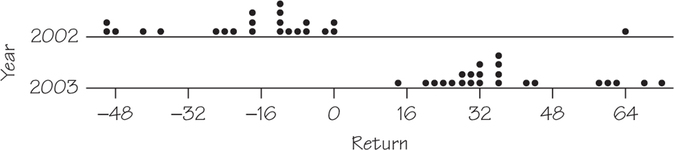
If the outlier for the 2002 returns is removed, the mean and standard deviation become −19.68 and 16.06, respectively.
Two-variable analysis:
The equation of the least-squares regression line is predicted 2003 . After removing the outlier, the equation becomes predicted . This regression line appears to do a better job of summarizing the pattern in the data.
6.5 Interpreting Correlation and Regression
Question 6.79
44. Here are data collected on six individuals:
| 1 | 2 | 3 | 4 | 10 | 10 | |
| 1 | 3 | 3 | 5 | 1 | 11 |
- Make a scatterplot of the data.
- Use your calculator to show that the correlation is about 0.5.
- What feature of the data is responsible for reducing the correlation to this value despite a strong straight-line association between and in most of the observations?
Question 6.80
45.Table 6.10 offers four datasets prepared by statistician Frank Anscombe to show the dangers of calculating without first plotting the data.
- Without making scatterplots, find the correlation and least-squares regression line for all four datasets. What do you notice? Use the regression line to predict for .
- Make a scatterplot for each of the datasets and add the regression line to each plot.
- In which of the four cases would you be willing to use the regression line to describe the dependence of on ? Explain your answer in each case.
| Dataset A | |||||||||||
| 10 | 8 | 13 | 9 | 11 | 14 | 6 | 4 | 12 | 7 | 5 | |
| 8.04 | 6.95 | 7.58 | 8.81 | 8.33 | 9.96 | 7.24 | 4.26 | 10.84 | 4.82 | 5.68 | |
| Dataset B | |||||||||||
| 10 | 8 | 13 | 9 | 11 | 14 | 6 | 4 | 12 | 7 | 5 | |
| 9.14 | 8.14 | 8.74 | 8.77 | 9.26 | 8.10 | 6.13 | 3.10 | 9.13 | 7.26 | 4.74 | |
| Dataset C | |||||||||||
| 10 | 8 | 13 | 9 | 11 | 14 | 6 | 4 | 12 | 7 | 5 | |
| 7.46 | 6.77 | 12.74 | 7.11 | 7.81 | 8.84 | 6.08 | 5.39 | 8.15 | 6.42 | 5.73 | |
| Dataset D | |||||||||||
| 8 | 8 | 8 | 8 | 8 | 8 | 8 | 8 | 8 | 8 | 19 | |
| 6.58 | 5.76 | 7.71 | 8.84 | 8.47 | 7.04 | 5.25 | 5.56 | 7.91 | 6.89 | 12.50 | |
45.
(a) All four have .
(b)
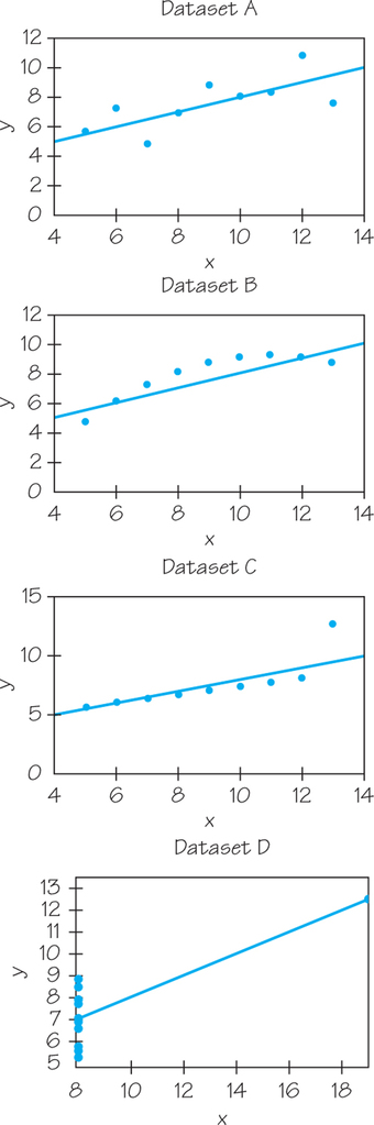
(c) Dataset A; additional answers will vary.
| Variable Return | Year | Mean | StDev | Minimum | Median | Maximum | ||
| 2002 | −16.03 | 23.51 | −50.50 | −26.90 | −12.80 | −6.70 | 64.30 | |
| 2003 | 37.74 | 15.78 | 14.10 | 27.50 | 32.30 | 43.90 | 71.90 |
Question 6.81
![]() 46. Children who watch many hours of TV get lower grades in school, on average, than those who watch less TV. Explain clearly why this fact does not show that watching TV causes poor grades. In particular, suggest some other characteristics of households where children watch lots of TV that may contribute to poor grades.
46. Children who watch many hours of TV get lower grades in school, on average, than those who watch less TV. Explain clearly why this fact does not show that watching TV causes poor grades. In particular, suggest some other characteristics of households where children watch lots of TV that may contribute to poor grades.
Question 6.82
![]() 47. People who use artificial sweeteners in place of sugar tend to be heavier than people who use sugar. Does this mean that artificial sweeteners cause weight gain? Give a more plausible explanation for this association.
47. People who use artificial sweeteners in place of sugar tend to be heavier than people who use sugar. Does this mean that artificial sweeteners cause weight gain? Give a more plausible explanation for this association.
47.
Sample response: People who consume products with artificial sweeteners get hooked on the taste of sweet foods and thus end up consuming more sweet foods than those who do not consume products with artificial sweeteners.
Question 6.83
![]() 48. Based on an examination of 22 companies that announced large layoffs during 1994, Downs found a strong correlation between the size of the layoffs and the compensation of the CEOs” (K. Phillips, Wealth and Democracy, Broadway Books, New York, 2002, p. 151). Discuss why this positive correlation is probably explained by a third variable, the size of the company as measured by its number of employees.
48. Based on an examination of 22 companies that announced large layoffs during 1994, Downs found a strong correlation between the size of the layoffs and the compensation of the CEOs” (K. Phillips, Wealth and Democracy, Broadway Books, New York, 2002, p. 151). Discuss why this positive correlation is probably explained by a third variable, the size of the company as measured by its number of employees.
Question 6.84
![]() 49. The positive correlation between health ® and income per capita is one of the best-known relations in international development. This correlation is commonly thought to reflect a causal link running from income to health…. Recently, however, another intriguing possibility has emerged: that the health-income correlation is partly explained by a causal link running the other way—from health to income” [D. E. Bloom and D. Canning, The health and wealth of nations, Science, 287 (2000): 1207–1208]. Explain how higher income in a nation can cause better health. Then explain how better health can cause higher national income. There is no simple way to determine the direction of the link.
49. The positive correlation between health ® and income per capita is one of the best-known relations in international development. This correlation is commonly thought to reflect a causal link running from income to health…. Recently, however, another intriguing possibility has emerged: that the health-income correlation is partly explained by a causal link running the other way—from health to income” [D. E. Bloom and D. Canning, The health and wealth of nations, Science, 287 (2000): 1207–1208]. Explain how higher income in a nation can cause better health. Then explain how better health can cause higher national income. There is no simple way to determine the direction of the link.
49.
Sample response: Higher income means that more money can be spent on health care, which leads to overall better health. On the other hand, better health means workers can be more productive (because they feel good) and will take fewer days off due to illness. The higher productivity and higher number of work days will lead to a higher national income.
Question 6.85
![]() 50. The effect of an outside variable can be surprising when individuals are divided into groups. In recent years, the mean SAT score of all high school seniors has increased. But the mean SAT score has decreased for students at each level of high school grades (A, B, C, etc.). Explain how grade inflation in high school can account for this pattern. A relationship that holds for each group within a population need not hold (and may even be in the opposite direction!) for the population as a whole.
50. The effect of an outside variable can be surprising when individuals are divided into groups. In recent years, the mean SAT score of all high school seniors has increased. But the mean SAT score has decreased for students at each level of high school grades (A, B, C, etc.). Explain how grade inflation in high school can account for this pattern. A relationship that holds for each group within a population need not hold (and may even be in the opposite direction!) for the population as a whole.
Chapter Review
Question 6.86
51. Consider the dataset below:
| 4 | 8 | |
| 7 | 12 |
- Calculate .
- Calculate the correlation . Round your answer to two decimal places. (Why should you not be surprised at this result?)
- Use your results from parts (a) and (b) to find the slope and -intercept of the least-squares regression line.
- In this case, did you really need to work through the procedure for finding the least-squares regression line in order to find the equation of the best-fitting line? Explain.
51.
(a)
(b)
(c)
(d) No. You can find the equation using basic algebra. Using the slope formula, we get . The equation of the line will have the form . Substitute one of the two points into this equation and solve for , which gives . The equation is .
Question 6.87
52. A vehicle’s tire pressure can affect tire wear (in terms of the length of life of the tire). When tire pressure is low, the tire flattens out and more of its surface contacts the road. This causes more friction between the tire and the roadway and increases the amount of wear on the tire. Data collected on tire pressure and tire wear appear in the table below:
| Tire Pressure (psi), | Tire Wear (in thousands of miles driven), |
|---|---|
| 30 | 29.8 |
| 30 | 30.2 |
| 31 | 32.4 |
| 31 | 34.5 |
| 32 | 36.2 |
| 32 | 35.0 |
| 33 | 38.4 |
| 33 | 37.6 |
- Fit a least-squares regression line to these data. What is the equation?
- Make a scatterplot of the data with a graph of the least-squares regression line superimposed. Does the line do a reasonable job of describing the pattern in these data?
- Use the equation of the least-squares line to predict the tire wear corresponding to a tire pressure of 40 psi. Is this an example of interpolation or extrapolation?
Four more data values shown in the table below were collected for tire pressures higher than 33 psi. Redraw your scatterplot so that it includes these additional data values. Does the least-squares regression line from part (a) do a reasonable job of describing the pattern in the complete dataset? Explain.
Tire Pressure (psi), Tire Wear (1000 miles), 34 38.0 34 37.2 35 35.3 35 34.6 - Based on your answer to part (d), comment on the accuracy of your prediction in part (c).
Question 6.88
53. Major recalls of toys with lead paint refocused people on the dangers of lead exposure. Below are data from research exploring the association with student achievement for blood lead levels below the “danger threshold” of 10 mcg/dl set by the Centers for Disease Control [M. L. Miranda et al., The relationship between early childhood blood lead levels and performance on end-of-grade tests, Environmental Health Perspectives, 115 (2007): 1242–1247].
| Blood lead level | 1 | 2 | 3 | 4 | 5 |
| Mean fourth-grade reading score | 255.9 | 253.8 | 252.6 | 251.0 | 250.4 |
| Blood lead level | 6 | 7 | 8 | 9 | |
| Mean fourth-grade reading score | 249.5 | 248.5 | 247.8 | 249.3 |
- What are the explanatory and response variables?
- Do you expect a positive or negative association between these variables? Why? Does the scatterplot support your answer?
53.
(a) Lead level is the explanatory variable; reading score is the response variable.
(b) Negative; sample response: Due to lead being toxic, expect that increases in lead levels will affect children’s brains and impede reading; yes, the scatterplot supports this answer.
Question 6.89
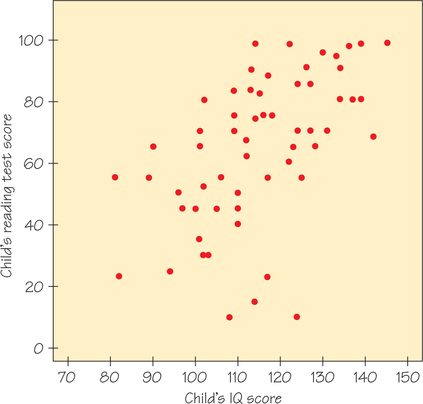
54. A study of reading ability in schoolchildren chose 60 fifth-grade children at random from a school. The researchers obtained the children’s scores on an IQ test and on a test of reading ability. Figure 6.24 plots reading test score (response variable) against IQ score (explanatory variable).
- Explain why we should expect a positive association between IQ score and reading score for children in the same grade.
- Does the scatterplot show a positive association?
- Four points in a group appear to be outliers. In what way do these children’s IQ and reading scores deviate from the overall pattern?
- Ignoring the outliers, is the form of the association between IQ score and reading score roughly a straight line? Is it very strong? Explain your answers.
Question 6.90
55. A student wonders if tall women tend to date taller people than do short women. She measures herself, her sister, and the women in the adjoining dorm rooms. Then she measures the next person each woman dates and obtains the following data (in inches):
| Heights of women () | 66 | 64 | 63 | 65 | 70 | 65 |
| Heights of their dates () | 72 | 68 | 70 | 68 | 71 | 64 |
- Based on a scatterplot (with the women’s heights as the explanatory variable), do you expect the correlation to be positive or negative? Near ±1 or not?
- Find the correlation between the heights of the women and their dates.
55.
(a) Positive; not close to ±1
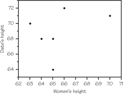
(b)
Question 6.91
56. In Exercise 55, you found the correlation between the heights in inches of several college women and the heights in inches of the next person each woman dates.
- How would change if all the dates were 2 inches shorter than the heights given in the table?
- How would change if heights were measured in centimeters rather than inches? (Note: .)
Question 6.92
57. The equation of the least-squares regression line for predicting dates’ heights from women’s heights for the data in Exercise 55 is
- What is the slope of this line?
- Explain in simple language what the numerical value of the slope tells us about the heights of the people these women date.
- Use the regression line to predict the height of the next person dated by a woman who is 67 inches tall.
57.
(a) 0.42
(b) For each additional inch of a woman’s height, the height of the next person dated goes up by 0.42 in., on average.
(c) 69.22 in.
Question 6.93
58. From 2000 to 2005, sales and file sharing (i.e., free downloading) intensity were tracked within seven musical genres (rock, alternative, R&B, rap/hip-hop, country, jazz, classical). The correlation between change in sales and file-sharing intensity was −0.648. Is this evidence that file sharing helps or hurts sales? Explain.
Question 6.94
59. In issue 49 of Stats: The Magazine for Students of Statistics, Schuyler Huck presents a dataset of 100 ordered pairs in which 25 of them are (17, 1), 25 are (18, 2), 25 are (19, 3), and 25 are (20, 4).
- Without doing much formal calculation, find the value of r and the slope of the least-squares regression line.
- Now, suppose someone adds the 101st point to the dataset: the ordered pair (1, 20). Predict the new value of r and the slope of the regression line, and then do a calculation to see how close your answer is.
59.
(a) The 100 points lie on a line with slope . Because the points lie on a line with positive slope, .
(b) Here is a scatterplot of the data with the additional data point. (Note: Each dot in the lower right represents data points.) Guesses for the slope and correlation will vary. However, the outlier will pull the line toward it, possibly turning the slope from positive to negative. If that happens, then the correlation will also be negative.
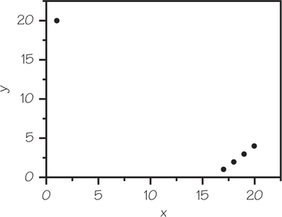
To find the value of , we first find and . (See Chapter 5, page 204, for the standard deviation formula.) First, we will need and :
Next, we find the squared deviations from the mean and then the standard deviations.
| Times observed | Observations | Deviations | Squared deviations |
| 25 | 17 | ||
| 25 | 18 | ||
| 25 | 19 | ||
| 25 | 20 | ||
| 1 | 1 |
Repeating the process for , we find that .
Since , we have the following:
Next, we determine the slope using the formula .
However, since we know
Thus,
Question 6.95
60. Return to Table 5.13 (page 226), which lists the top 100 baseball players ranked by career batting average. Consider only the top 50 players—Ty Cobb to Chuck Klein. Enter the data on career batting averages and career home runs into an Excel spreadsheet or calculator lists.
- Without first looking at the data, would you expect the correlation to be positive, negative, or close to zero? Explain.
- Calculate the correlation between career batting average and career home runs. What, if anything, does this tell you about the relationship between career batting averages and career home runs?
- Make a scatterplot of career batting average against career home runs. What, if anything, can we learn about career batting averages and career home runs from looking at this scatterplot?
- Find the equation of the least-squares regression line for predicting career home runs from a career batting average. Given what you know from parts (b) and (c), do you think this equation will yield reasonably accurate predictions? Explain.