6.2 6.1 Displaying Relationships: Scatterplot
The world is full of relationships between variables. For example, children’s weight and height are related. As seen in Figure 6.1, taller 4-year-olds tend to be heavier than shorter 4-year-olds. In this case, neither height nor weight explains or causes the other. The two variables just go together in describing bigger or smaller 4-year-old children. Now contrast the height-weight situation with the relationship between smoking cigarettes and life expectancy. In this case, there is a great deal of evidence that smoking does explain or influence life expectancy. People who smoke more cigarettes per day tend to not live as long as those who smoke fewer. So, we call smoking an explanatory variable and life expectancy a response variable.
Response Variable DEFINITION
A response variable measures an outcome or result of a study.
Explanatory Variable DEFINITION
An explanatory variable is a variable that we think explains or causes changes in the response variables.
Even when we know two quantitative variables are related, the relationship is rarely an exact trend such as a line-shaped pattern, free of any “scatter” or deviation from that pattern. The most useful graph for displaying the relationship between two quantitative variables (whether that relationship fits a trend perfectly or not) is a scatterplot.
Scatterplot DEFINITION
A scatterplot is a graph of plotted points showing the relationship between two numerical variables measured on the same individuals. In the case of one explanatory and one response variable, the values of the explanatory variable are shown on the horizontal (x) axis and the values of the response variable are shown on the vertical (y) axis. The values of the explanatory and response variables for one particular individual in the dataset become the x- and y-coordinates, respectively, of a point representing that individual in the scatterplot.
EXAMPLE 1![]() Beer and Blood Alcohol
Beer and Blood Alcohol
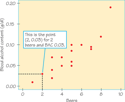
How well does the number of beers a student drinks predict his or her blood alcohol content (BAC)? In a study at The Ohio State University, 16 student volunteers drank a randomly assigned number of cans of beer. Thirty minutes later, a police officer measured their BAC in grams of alcohol per deciliter of blood. Throughout the United States, the legal BAC limit is 0.08. Here are the data:
| Student | 1 | 2 | 3 | 4 | 5 | 6 | 7 | 8 |
|---|---|---|---|---|---|---|---|---|
| Beers | 5 | 2 | 9 | 8 | 3 | 7 | 3 | 5 |
| BAC | 0.10 | 0.03 | 0.19 | 0.12 | 0.04 | 0.095 | 0.07 | 0.06 |
| Student | 9 | 10 | 11 | 12 | 13 | 14 | 15 | 16 |
| Beers | 3 | 5 | 4 | 6 | 5 | 7 | 1 | 4 |
| BAC | 0.02 | 0.05 | 0.07 | 0.10 | 0.085 | 0.09 | 0.01 | 0.05 |
The students were equally divided between men and women and differed in weight and usual drinking habits. Because of this variation, many students don’t believe that the number of drinks ingested predicts BAC well. What do the data say?
Figure 6.2 is a scatterplot of these data. Because we think that the number of beers helps explain BAC, “number of beers” is the explanatory variable and hence is put on the horizontal axis. This is also indicated by the wording used in the Figure 6.2 caption—it is common usage for the word “against” to follow the response variable and precede the explanatory variable. in terms of plotting the data values, one student (Student 2) drank 2 beers and had a BAC of 0.03. This student’s point on the scatterplot is (2, 0.03), above x=2 and to the right of y=0.03. We have marked this point in Figure 6.2.
Self Check 1
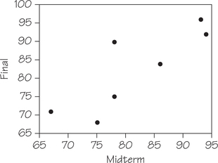
Table 6.2 contains the midterm and final exam scores of a sample of students in an introductory statistics course. Make a scatterplot of these data. Which variable did you use for the explanatory variable? Why?
| Midterm | Final |
|---|---|
| 78 | 90 |
| 86 | 84 |
| 94 | 92 |
| 93 | 96 |
| 67 | 71 |
| 78 | 75 |
| 75 | 68 |
| 86 | 84 |
- Midterm exam scores can be used to explain final exam scores. Hence, Midterm is the explanatory variable. The midterm grade may help explain what a student might get on the final exam. Here's a scatterplot of these data.
Next, we consider a procedure for examining a scatterplot.
Examining a Scatterplot PROCEDURE
- Describe the overall pattern of a scatterplot by the form, direction, and strength of the relationship. (Be open to the possibility that there may be two or more trends or clusters in the same graph.)
- Then look for any striking deviations from the pattern. Identify each occurrence of an outlier—an individual value that falls outside the overall pattern of the relationship.
In discussing the procedure for examining a scatterplot, we start with item 2, identifying outliers (even though in practice, you would begin the analysis with item 1). When dealing with a single quantitative variable (such as city gasoline mileage from Table 5.7 on page 196), potential outliers are easy to identify numerically because they are usually the minimum or maximum values in the data or they satisfy a numerical criterion such as being more than 1.5 box widths below the first quartile or above the third quartile (see Figure 5.17 on page 203 or Chapter 5, Exercise 35, on page 233). When the dataset consists of ordered pairs, however, an outlier may or may not include an extreme value in one or both coordinates. As you will see in Example 2, it is even more critical to use a graphical representation (i.e., a scatterplot) to look for deviations from the overall pattern.
EXAMPLE 2![]() Identification of Outliers
Identification of Outliers
Consider two datasets:
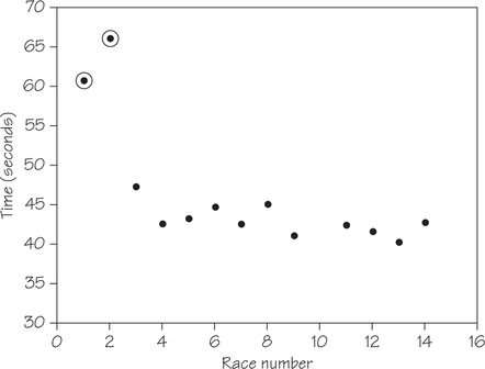
- Table 6.3 gives the results of an 8-year-old competitive swimmer’s first 14 races of the 50-yard butterfly. (The time for race 10 did not get recorded and hence is missing here.)
- Table 6.4 shows reading and IQ test scores for a group of fifth-grade students.
| Race number | 1 | 2 | 3 | 4 | 5 | 6 | 7 |
| Time (seconds) | 60.81 | 66.11 | 47.32 | 42.69 | 43.40 | 44.82 | 42.67 |
| Race number | 8 | 9 | 10 | 11 | 12 | 13 | 14 |
| Time (seconds) | 45.17 | 41.20 | missing | 42.47 | 41.74 | 40.40 | 42.90 |

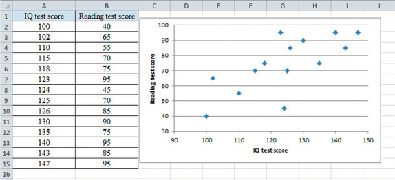
| IQ test score | 100 | 102 | 110 | 115 | 118 | 123 | 124 |
| Reading test score | 40 | 65 | 55 | 70 | 75 | 95 | 45 |
| IQ test score | 125 | 126 | 130 | 135 | 140 | 143 | 147 |
| Reading test score | 70 | 85 | 90 | 75 | 95 | 85 | 95 |

Scatterplots of these datasets appear in Figure 6.3 and Figure 6.4, respectively. Outliers have been circled. The scatterplot in Figure 6.3 shows two circled outliers—they are associated with the highest values of the response variable, time, and lowest values of the explanatory variable, race number. Whenever possible, look for explanations for the presence of outliers. In this case, the swimmer had just learned the butterfly, which explains why her times in the first two races (when she was worried about getting disqualified) were unusually slow.
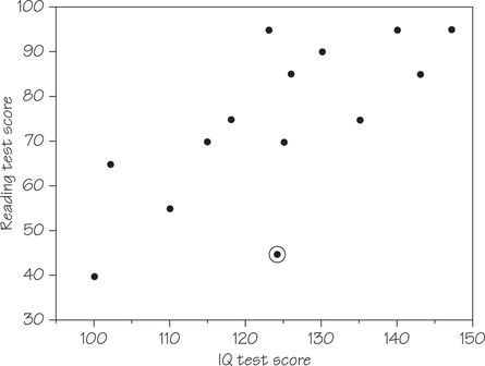
The outlier circled in Figure 6.4 was flagged as an outlier by a statistical program. In this case, the outlier does not correspond to the minimum or maximum values of either the response or explanatory variables. Instead, the point (124, 45) indicates a reading test score that is low in comparison to the reading test scores of other students with IQ test scores close to 124. Without additional information about this student, we don’t have an explanation for the presence of this outlier.
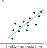
Having dealt with item 2, outliers (deviations from an overall pattern) in the Examining a Scatterplot procedure, we return to item 1, a description of the overall pattern. The form of the relationship between BAC and beers consumed (Example 1, Figure 6.2) is roughly a straight-line pattern. If you look ahead a bit, Figure 6.6 (page 251) shows a line drawn through the plot to describe the overall pattern. The direction of the relationship is clear: As the number of beers increases, BAC also increases. We call this a positive association between the two variables.
Positive Association DEFINITION
Two variables have positive association if their changes tend to be in the same direction. This means an increase in one variable tends to accompany an increase in the other variable. Also, a decrease in one variable tends to accompany a decrease in the other variable.
Negative Association DEFINITION
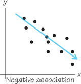
Two variables have negative association if their changes tend to be in opposite directions. This means an increase in one variable tends to accompany a decrease in the other variable.
Self Check 2
Identify whether the scatterplots in Example 2, Figures 6.3 and 6.4, are examples of positive or negative association. Justify your answers.
- The scatterplot in Figure 6.3 (page 246) is an example of negative association. As the race number increases, the times tend to decrease. Figure 6.4 (page 246) provides an example of positive association. As IQ test scores increase, the reading test scores also tend to increase.
The strength of a relationship describes how closely the points in a scatterplot follow a simple form such as a straight line. Figure 6.2 shows only a small amount of scatter about the straight line, so the relationship is fairly strong. (We will soon learn, in Section 6.3, a numerical measure of the strength of a straight-line relationship.)
EXAMPLE 3![]() SAT Mathematics Scores by State
SAT Mathematics Scores by State
Each year, more than 1 million high school seniors take the SAT standardized test, which has three parts: Mathematics, Critical Reading, and Writing. We sometimes see individual states rated or ranked by the average SAT scores of their high school seniors. However, this is misleading because the mean SAT score is explained largely by what percentage of a state’s graduating seniors take the SAT. For example, the scatterplot in Figure 6.5 shows a negative association between the mean score on the Mathematics section and the percentage of test-takers for the class of 2013. Each dot represents a particular state.
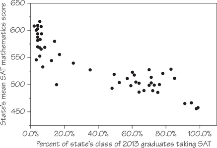
The form of Figure 6.5 is a bit irregular, but there are two distinct clusters of states. In each state in the lower-right cluster, a majority or near-majority of high school graduating seniors take the SAT, and the mean scores are low. In the upper-left cluster’s states, 35% or fewer of seniors take the SAT—and these states have higher mean scores. Clusters in a graph suggest that the data describe several distinct kinds of individuals, and the two clusters in Figure 6.5 indeed describe two distinct sets of states.
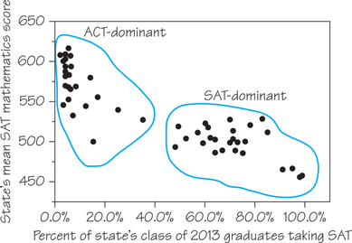
There are two common college entrance examinations, the SAT and the ACT, and each state tends to prefer one or the other. In ACT-dominant states (the left cluster in Figure 6.5, where a smaller fraction of those states’ seniors take the SAT), most students who do take the SAT are applying to selective, out-of-state colleges. This select group performs well. In SAT-dominant states (the right cluster), a higher percentage of seniors take the SAT, and this broader group has a lower mean score.
The relationship in Figure 6.5 also has a clear direction: States in which a higher percentage of students take the SAT tend to have lower mean scores. This is true both between the clusters and within each cluster. That is, there is a negative association between the two variables.
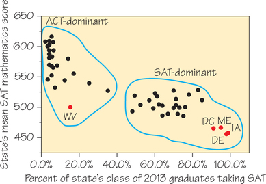
There are no clear outliers in Figure 6.5, but each cluster does include at least one state whose mean SAT Mathematics score is lower than we would expect from the percentage of its students who take the SAT. In the cluster of ACT-dominant states, this occurs with West Virginia (WV). In the cluster of SAT-dominant states, this occurs with the District of Columbia (DC)—which is actually a federal district, not a state— and Maine (ME), Delaware (DE), and Iowa (IA).
Although scatterplots can be very informative, they provide reliable information only when properly drawn to scale, which can be difficult and/or tedious to do by hand. Spotlight 6.1 provides instructions for creating a scatterplot using a graphing calculator (TI/83/84) or spreadsheet software (Excel).
Creating Scatterplots Using Technology 6.1
6.1
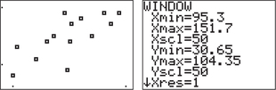
In this spotlight, we provide instructions for making a scatterplot of the IQ-Reading score data in Table 6.4 (page 245) using either a TI-83/84 graphing calculator or Excel.
Using a TI-84
Step 1. Preparation
- Turn off all STAT PLOTS: 2nd Y= (for STAT PLOT) 4ENTER.
- Press I Y= and erase (or turn off) any functions stored in the Y=menu.
- Press I STAT 1. Clear any data from lists L1 and L2.
Step 2. Entering the data and making the scatterplot:
You should still be in the lists from Step 1. Enter the data on the explanatory variable, IQ test score, in list L1, and the response variable, Reading test score, in list L2 (be sure not to interchange these lists).
Page 250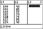
- Press 2nd Y= (for STAT PLOT) 1 ENTER I to turn on STATPLOT 1.
For TYPE select the first scatterplot; L1 and L2 should be entered as the Xlist and Ylist, respectively; choose the mark to be used for the dots in the scatterplot.
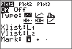
Press I ZOOM 9 (for ZoomStat). You can press WINDOW and adjust the scaling on the axes if desired.
- Step 3. Turn off all STAT PLOTS, as shown in Step 1.
Using Excel
Again, we use the data from Table 6.4.
- Enter the IQ test scores into column A and the Reading test scores into column B. (Don’t interchange the order of the columns.)
- Highlight your data by clicking at the top of column A, dragging over to the top of column B, and then down to your last data entry in column B.
- Click the Insert tab and then the Scatter tab. Select the first scatterplot (Scatter with only Markers). You should now see a scatterplot of the data. Here’s how to adjust the scaling on the axes:
- Click the Layout tab → Axes → Primary horizontal axis → More primary horizontal axis.
- To change the minimum, click the circle for Fixed and then enter a new minimum, for example, 90. The maximum should be fine as it is. Then click Close.
- Adapt the process above for the vertical axis, setting its minimum value to 30.
- If desired, click Axis Titles and add labels to the axes.