9.5 The Winners and Losers from Market Power
Given that a firm with market power charges a price that is above its marginal cost, you might suspect that having market power is beneficial for firms, and it is. We see just exactly how beneficial it is in this section. We also see how market power affects consumers (Hint: badly). To do all this, we use the same tools utilized to analyze competitive markets in Chapter 3—consumer and producer surplus. This approach allows us to directly compare markets in which firms have market power to those that are competitive.
Consumer and Producer Surplus under Market Power
Let’s return to the Apple iPad. Recall that Apple had a marginal cost of $200 and an inverse demand curve of P = 1,000 – 5Q (where Q is in millions). This demand curve implied a marginal revenue curve MR = 1,000 – 10Q. We set that equal to marginal cost to solve for Q and found that, to maximize profit, Apple should produce 80 million iPads and set its price at $600 per iPad.
We can compute the consumer and producer surplus when a firm has market power in the same way we computed these surpluses in a competitive market. The consumer surplus is the area under the demand curve and above the price. The producer surplus is the area below the price and above the marginal cost curve. At first glance, you might think this is different from producer surplus in a competitive market, which is the area below the price and above the supply curve. But remember that the supply curve in a perfectly competitive market is actually part of its marginal cost curve, so there is no difference in the case of market power.
We illustrate these surplus values in Figure 9.6. Apple’s profit-
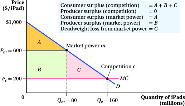
 or $16 billion. The producer surplus, rectangle B, is (80 million) × ($600 – $200) or $32 billion. The deadweight loss is triangle C and can be calculated as
  ($600 – $200) or $16 billion.
We can compute these surplus values easily. The consumer surplus triangle has a base equal to the quantity sold and a height equal to the difference between the demand choke price and the market price. The demand choke price is especially easy to calculate from an inverse demand curve; you just plug in Q = 0 and solve for the price. In this case, it’s PDChoke = 1,000 – 5(0) = 1,000. So, the consumer surplus is

357
The producer surplus is a rectangle with a base equal to the quantity sold and a height equal to the difference between the monopoly price and marginal cost. Therefore,
PS = Rectangle B = (80 million) × ($600 – $200) = $32 billion
So far, so good. Consumers earn $16 billion of consumer surplus from buying iPads, a fairly sizable sum, and Apple does well, making $32 billion of surplus.
Consumer and Producer Surplus under Perfect Competition
Now let’s think about how the market would look if Apple behaved like a competitive firm and priced at marginal cost. The price would be $200 because marginal cost is constant at $200. Plugging $200 into the demand curve equation yields a quantity of 160 million. Therefore, in the competitive equilibrium, Apple would sell 160 million iPads at a price of $200 (point c in Figure 9.6). Note that because P = MC, Apple would earn zero producer surplus in a competitive market.
With competition, then, iPad prices would be lower, the quantity sold would be higher, and Apple would make a lot less money—
Consumer surplus, however, would go way up under perfect competition. In Figure 9.6, consumer surplus under perfect competition is the entire triangular area A + B + C below the demand curve and above the competitive price of $200. The triangle’s base is the competitive quantity of 160 million and its height is the difference between the demand choke price of $1,000 and the competitive price. This means consumer surplus under perfect competition is

Recall that when Apple exercised its market power, consumer surplus was only $16 billion. In this example, consumers have 4 times the consumer surplus under competition than when Apple has market power. On the other side, by exploiting its market power, Apple moves from having no producer surplus to $32 billion of producer surplus. That’s why firms want to use their market power whenever they can, even if it costs their customers a large amount of consumer surplus.
Application: Southwest Airlines
Southwest Airlines, the once-
The impact can be dramatic. Prices fall 25 to 50% on routes that Southwest starts to fly, and the number of passengers flying the route goes up substantially. It’s probably no coincidence that among the 25 busiest airports in the United States, the four that saw the biggest drops in average inflation-
Passengers across the country have become familiar with these sorts of changes, which have become known as the “Southwest effect.” As a result, many local governments and airport authorities have actively tried to recruit Southwest to come to or expand service in their city. We suspect you could hear a collective cheer coming from students at schools in the cities where Southwest came to town. Thanks to competition from Southwest, their consumer surplus was bound to rise, because returning home to visit mom and dad or heading down to spring break was going to become more affordable. 
358
The Deadweight Loss of Market Power
We’ve just seen how exercising market power can be great for firms and bad for consumers. Firms can earn more producer surplus by restricting output and raising price, but this costs consumers a sizable chunk of their consumer surplus. That’s not the only consequence of market power, though. Notice that, in the example above, the total surplus under market power of $48 billion ($16 billion consumer surplus + $32 billion producer surplus) is smaller than the total surplus under competition of $64 billion. That missing $16 billion of surplus has been destroyed by the firm’s exercise of market power. It’s important to recognize that this loss is not surplus that is transferred from consumers to producers when producers restrict output and raise prices. No one gets it. It just disappears. In other words, it is the deadweight loss from market power.
The deadweight loss of market power can be seen in Figure 9.6. It is the area of triangle C whose base is the difference between the firm’s output with market power and its output under perfect competition and whose height is the difference between the prices under market power (Pm) and competition (Pc). We know from our comparison of the total surplus of the market power and competitive cases above that this area is $16 billion. We can confirm that value by calculating the area of triangle C:

The deadweight loss (DWL) is the inefficiency of market power. Note that this cost is exactly like the DWL from a tax or regulation we discussed in Chapter 3—a triangular area below the demand curve and above the marginal cost curve (supply curve, in Chapter 3). A firm with pricing power essentially puts a market power “tax” on consumers and keeps the revenue for itself. The DWL comes about because there are consumers in the market who are willing to buy the product (an iPad in this example) at a price above its cost of production, but can’t because the firm has hiked up prices to increase its profit. Just as with the DWL from taxes and regulations, the size of the DWL from market power is related to the size of the difference between the monopoly and competitive output levels. The more the firm withholds output to maximize profits, the bigger is the efficiency loss.
359
 See the problem worked out using calculus
figure it out 9.4
Let’s return to our earlier problem regarding Babe’s Bats (BB). Remember that BB faces an inverse demand curve of P = 25 – 2.5Q and a marginal cost curve MC = 5Q. Calculate the deadweight loss from market power at the firm’s profit-
Solution:
The easiest way to find deadweight loss is to use a diagram. Therefore, we should start by drawing a graph with demand, marginal revenue, and marginal cost:
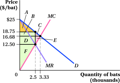
We know from our earlier problem that the profit-
To find the deadweight loss from market power, we need to consider the consumer and producer surplus and compare it with the competitive outcome. If BB participated in a competitive market, it would set price equal to marginal cost to determine its output:
P = MC
25 – 2.5Q = 5Q
25 = 7.5Q
Q* = 3.33
Therefore, BB would sell 3,333 bats. Of course, the price will be lower at this level of output:
P* = 25 – 2.5Q*
= 25 – 2.5(3.33)
= 16.68
If the market were competitive, the bats would sell for $16.68 each. Consumer surplus would be areas A + B + C (the area below the demand curve and above the competitive price), and producer surplus would be areas D + E + F (the area below the competitive price but above the marginal cost curve). Total surplus would be areas A + B + C + D + E + F.
When BB exercises its market power, it reduces its output to 2,500 bats and increases its price to $18.75. In this situation, consumer surplus is only area A (the area below demand but above the monopoly price). Producer surplus is areas B + D + F (the area below the monopoly price but above marginal cost). Total surplus under market power is A + B + D + F.
So, what happens to areas C and E? Area C was consumer surplus but no longer exists. Area E was producer surplus but also has disappeared. These areas are the deadweight loss from market power. We can calculate this area by measuring the area of the triangle that encompasses areas C + E. To do so, we have one more important calculation to make. We need to be able to calculate the height of the triangle, so we need to determine the marginal cost of producing 2,500 units:
MC = 5Q
= 5(2.5)
= 12.5
Now, we can calculate the area of the deadweight loss triangle:
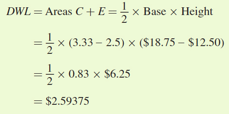
Remember that the quantity is measured in thousands, so the deadweight loss is equal to $2,593.75.
360
Differences in Producer Surplus for Different Firms
One more important point about the implications of market power concerns how the slope of the demand curve influences the relative size of consumer and producer surplus in the market.
Consider two different markets: one with a relatively steep (inelastic) demand curve and one with a flatter (elastic) one. Each is served by a monopolist. To keep things easy to follow, imagine that both firms have the same constant marginal cost curves, and that it just so happens each firm’s profit-
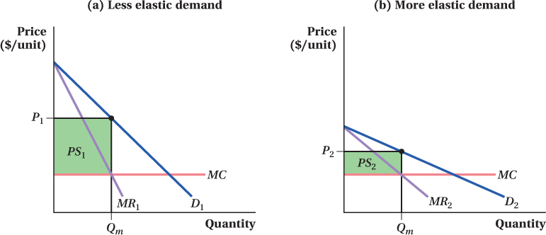
(b) When buyers are price-
In the market in panel a of Figure 9.7, buyers aren’t very price-
Firms with market power love to operate in markets in which consumers are relatively price-