1.2 1.2 Displaying Distributions with Graphs
When you complete this section, you will be able to:
• Analyze the distribution of a categorical variable using a bar graph.
• Analyze the distribution of a categorical variable using a pie chart.
• Analyze the distribution of a quantitative variable using a stemplot.
• Analyze the distribution of a quantitative variable using a histogram.
• Examine the distribution of a quantitative variable with respect to the overall pattern of the data and deviations from that pattern.
• Identify the shape, center, and spread of the distribution of a quantitative variable.
• Identify and describe any outliers in the distribution of a quantitative variable.
• Use a time plot to describe the distribution of a quantitative variable that is measured over time.
Statistical tools and ideas help us examine data to describe their main features. This examination is called exploratory data analysisexploratory data
analysis. Like an explorer crossing unknown lands, we want first to simply describe what we see. Here are two basic strategies that help us organize our exploration of a set of data:
• Begin by examining each variable by itself. Then move on to study the relationships among the variables.
• Begin with a graph or graphs. Then add numerical summaries of specific aspects of the data.
We follow these principles in organizing our learning. This chapter presents methods for describing a single variable. We will study relationships among several variables in Chapter 2. Within each chapter, we will begin with graphical displays, then add numerical summaries for a more complete description.
Categorical variables: Bar graphs and pie charts
The values of a categorical variable are labels for the categories, such as “yes” and “no.” The distribution of a categorical variabledistribution of a
categorical variable lists the categories and gives either the countcount or the percentpercent of cases that fall in each category. An alternative to the percent is the proportionproportion, the count divided by the sum of the counts. Note that the percent is simply the proportion times 100.
EXAMPLE 1.7
How do you do online research? A study of 552 first-year college students asked about their preferences for online resources. One question asked them to pick their favorite.3 Here are the results:
| Resource | Count (n) |
|---|---|
| Google or Google Scholar | 406 |
| Library database or website | 75 |
| Wikipedia or online encyclopedia | 52 |
| Other | 19 |
| Total | 552 |
Resource is the categorical variable in this example, and the values are the names of the online resources.

Note that the last value of the variable resource is “Other,” which includes all other online resources that were given as selection options. For data sets that have a large number of values for a categorical variable, we often create a category such as this that includes categories that have relatively small counts or percents. Careful judgment is needed when doing this. You don’t want to cover up some important piece of information contained in the data by combining data in this way.
![]()
EXAMPLE 1.8
Favorites as percents. When we look at the online resources data set, we see that Google is the clear winner. We see that 406 reported Google or Google Scholar as their favorite. To interpret this number, we need to know that the total number of students polled was 552. When we say that Google is the winner, we can describe this win by saying that 73.6% (406 divided by 552, expressed as a percent) of the students reported Google as their favorite. Here is a table of the preference percents:
| Resource | Percent (%) |
|---|---|
| Google or Google Scholar | 73.6 |
| Library database or website | 13.6 |
| Wikipedia or online encyclopedia | 9.4 |
| Other | 3.4 |
| Total | 100.0 |
The use of graphical methods allows us to see this information and other characteristics of the data easily. We now examine two types of graphs.
EXAMPLE 1.9
Bar graph for the online resource preference data. Figure 1.2 displays the online resource preference data using a bar graphbar graph. The heights of the four bars show the percents of the students who reported each of the resources as their favorite.
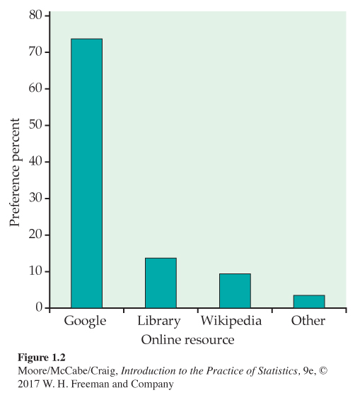
The categories in a bar graph can be put in any order. In Figure 1.2, we ordered the resources based on their preference percents. For other data sets, an alphabetical ordering or some other arrangement might produce a more useful graphical display.
![]()
You should always consider the best way to order the values of the categorical variable in a bar graph. Choose an ordering that will be useful to you. If you have difficulty, ask a friend if your choice communicates what you expect. Note that a bar graph using counts will look the same as a bar graph using percents. A pie chart naturally uses percents.
EXAMPLE 1.10
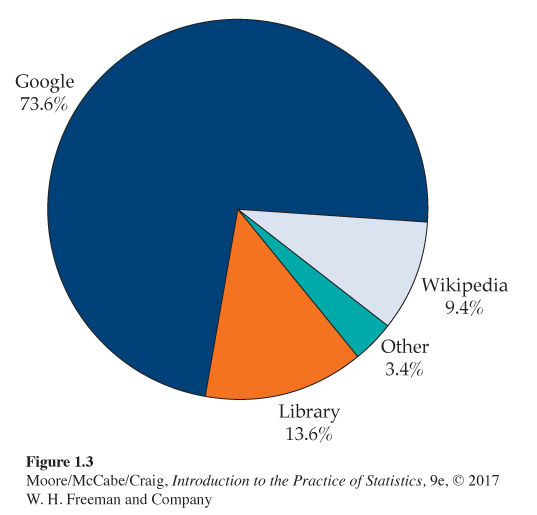
Pie chart for the online resource preference data. The pie chartpie chart in Figure 1.3 helps us see what part of the whole each group forms. Here it is very easy to see that Google is the favorite for about three-quarters of the students.
USE YOUR KNOWLEDGE
Question 1.16
1.16 Compare the bar graph with the pie chart. Refer to the bar graph in Figure 1.2 and the pie chart in Figure 1.3 for the online resource preference data. Which graphical display does a better job of describing the data? Give reasons for your answer.
To make a pie chart, you must include all the categories that make up a whole. A category such as “Other” in this example can be used, but the sum of the percents for all the categories should be 100%. This constraint makes bar graphs more flexible.
![]()
Quantitative variables: Stemplots and histograms
A stemplot (also called a stem-and-leaf plot) gives a quick picture of the shape of a distribution while including the actual numerical values in the graph. Stemplots work best for small numbers of observations that are all greater than 0.
STEMPLOT
To make a stemplot,
1. Separate each observation into a stem consisting of all but the final (rightmost) digit and a leaf, the final digit. Stems may have as many digits as needed, but each leaf contains only a single digit.
2. Write the stems in a vertical column with the smallest at the top, and draw a vertical line at the right of this column.
3. Write each leaf in the row to the right of its stem, in increasing order out from the stem.
EXAMPLE 1.11
Soluble corn fiber and calcium. Soluble corn fiber (SCF) has been promoted for various health benefits. One study examined the effect of SCF on the absorption of calcium of adolescent boys and girls. Calcium absorption is expressed as a percent of calcium in the diet. Here are the data for the condition where subjects consumed 12 grams per day (g/d) of SCF.4
| 50 | 43 | 43 | 44 | 50 | 44 | 35 | 49 | 54 | 76 | 31 | 48 |
| 61 | 70 | 62 | 47 | 42 | 45 | 43 | 59 | 53 | 53 | 73 |
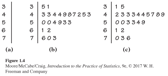
To make a stemplot of these data, use the first digits as stems and the second digits as leaves. Figure 1.4 shows the steps in making the plot, We use the first digit of each value as the stem. Figure 1.4(a) shows the stems that have values 3, 4, 5, 6, and 7. The first entry in our data set is 50. This appears in Figure 1.4(b) on the 5 stem with a leaf of 0. Similarly, the second value, 43, appears in the 4 stem with a leaf of 3. The stemplot is completed in Figure 1.4(c), where the leaves are ordered from smallest to largest.
The center of the distribution is in the 40s, and the data are more stretched out toward high values than low values (the highest value is 76, while the lowest is 31). In the plot, we do not see any extreme values that lie far from the remaining data.
USE YOUR KNOWLEDGE
Question 1.17
1.17 Make a stemplot. Here are the scores on the first exam in an introductory statistics course for 30 students in one section of the course:
| 82 | 73 | 92 | 82 | 75 | 98 | 94 | 57 | 80 | 90 | 92 | 80 | 87 | 91 | 65 |
| 73 | 70 | 85 | 83 | 61 | 70 | 90 | 75 | 75 | 59 | 68 | 85 | 78 | 80 | 94 |
Use these data to make a stemplot. Then use the stemplot to describe the distribution of the first-exam scores for this course.
1.17 The first-exam scores are left-skewed, the middle is around 80.
When you wish to compare two related distributions, a back-to-back stemplotback-to-back stemplot with common stems is useful. The leaves on each side are ordered out from the common stem.
EXAMPLE 1.12
Soluble corn fiber and calcium. Refer to Example 1.11, which gives the data for subjects consuming 12 g/d of SCF. Here are the data for subjects under control conditions (0 g/d of SCF):
| 42 | 33 | 41 | 49 | 42 | 47 | 48 | 47 | 53 | 72 | 47 | 63 |
| 68 | 59 | 35 | 46 | 43 | 55 | 38 | 49 | 51 | 51 | 66 |
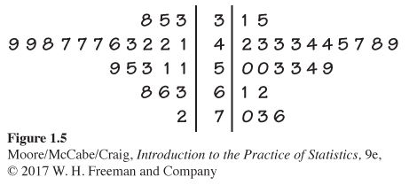
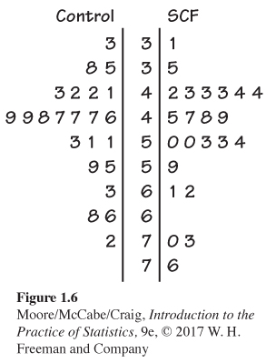
Figure 1.5 gives the back-to-back stemplot for the SCF and control conditions. The values on the left give absorption for the control condition, while the values on the right give absorption when SCF was consumed. The values for SCF appear to be somewhat higher than the controls.
There are two modifications of the basic stemplot that can be helpful in different situations. You can double the number of stems in a plot by splitting each stemsplitting stems into two: one with leaves 0 to 4 and the other with leaves 5 through 9. When the observed values have many digits, it is often best to trimtrimming the numbers by removing the last digit or digits before making a stemplot. If you are using software, you can round the data, which is what was done for the data given in Example 1.11.
You must use your judgment in deciding whether to split stems and whether to trim or round, though statistical software will often make these choices for you. Remember that the purpose of a stemplot is to display the shape of a distribution. If there are many stems with no leaves or only one leaf, trimming will reduce the number of stems. Let’s take a look at the effect of splitting the stems for our SCF data.
EXAMPLE 1.13
Stemplot with split stems for SCF. Figure 1.6 presents the data from Example 1.12 in a stemplot with split stems.
USE YOUR KNOWLEDGE
Question 1.18
1.18 Which stemplot do you prefer? Look carefully at the stemplots for the SCF data in Figures 1.5 and 1.6. Which do you prefer? Give reasons for your answer.
Question 1.19
1.19 Why should you keep the space? Suppose that you had a data set similar to the one given in Example 1.12, but in which the control values of 66 and 68 were both changed to 64.
(a) Make a stemplot of these data using split stems.
(b) Should you use one stem or two stems for the 60s? Give a reason for your answer. (Hint: How would your choice reveal or conceal a potentially important characteristic of the data?)
1.19 (b) Use two stems, even though one is blank. Seeing the gap is useful.
Histograms
Stemplots display the actual values of the observations. This feature makes stemplots awkward for large data sets. Moreover, the picture presented by a stemplot divides the observations into groups (stems) determined by the number system rather than by judgment.
Histograms do not have these limitations. A histogramhistogram breaks the range of values of a variable into classes and displays only the count or percent of the observations that fall into each class. You can choose any convenient number of classes, but you should choose classes of equal width.
Making a histogram by hand requires more work than a stemplot. Histograms do not display the actual values observed. For these reasons, we prefer stemplots for small data sets.
The construction of a histogram is best shown by example. Most statistical software packages will make a histogram for you.
EXAMPLE 1.14
Distribution of IQ scores. You have probably heard that the distribution of scores on IQ tests is supposed to be roughly “bell-shaped.” Let’s look at some actual IQ scores. Table 1.1 displays the IQ scores of 60 fifth-grade students chosen at random from one school.
1. Divide the range of the data into classes of equal width. Let’s use
75 ≤ IQ score < 85
85 ≤ IQ score < 95
⋮
145 ≤ IQ score < 155
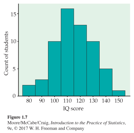
Table : TABLE 1.1 IQ Test Scores for 60 Randomly Chosen Fifth-Grade Students145 139 126 122 125 130 96 110 118 118 101 142 134 124 112 109 134 113 81 113 123 94 100 136 109 131 117 110 127 124 106 124 115 133 116 102 127 117 109 137 117 90 103 114 139 101 122 105 97 89 102 108 110 128 114 112 114 102 82 101 Page 15Be sure to specify the classes precisely so that each individual falls into exactly one class. A student with IQ 84 would fall into the first class, but IQ 85 falls into the second.
2. Count the number of individuals in each class. These counts are called frequenciesfrequency, and a table of frequencies for all classes is a frequency tablefrequency table.
Class Count Class Count 75 ≤ IQ score < 85 2 115 ≤ IQ score < 125 13 85 ≤ IQ score < 95 3 125 ≤ IQ score < 135 10 95 ≤ IQ score < 105 10 135 ≤ IQ score < 145 5 105 ≤ IQ score < 115 16 145 ≤ IQ score < 155 1 3. Draw the histogram. First, on the horizontal axis mark the scale for the variable whose distribution you are displaying. That’s the IQ score. The scale runs from 75 to 155 because that is the span of the classes we chose. The vertical axis contains the scale of counts. Each bar represents a class. The base of the bar covers the class, and the bar height is the class count. There is no horizontal space between the bars unless a class is empty, so its bar has height zero. Figure 1.7 is our histogram. It does look roughly “bell-shaped.”
Large sets of data are often reported in the form of frequency tables when it is not practical to publish the individual observations. In addition to the frequency (count) for each class, we may be interested in the fraction or percent of the observations that fall in each class. A histogram of percents looks just like a frequency histogram such as Figure 1.7. Simply relabel the vertical scale to read in percents. Use histograms of percents for comparing several distributions that have different numbers of observations.
USE YOUR KNOWLEDGE
Question 1.20
1.20 Make a histogram. Refer to the first-exam scores from Exercise 1.17 (page 12). Use these data to make a histogram with classes 50 to 59, 60 to 69, etc. Compare the histogram with the stemplot as a way of describing this distribution. Which do you prefer for these data?
Our eyes respond to the area of the bars in a histogram. Because the classes are all the same width, area is determined by height and all classes are fairly represented. There is no one right choice of the classes in a histogram. Too few classes will give a “skyscraper” graph, with all values in a few classes with tall bars. Too many will produce a “pancake” graph, with most classes having one or no observations. Neither choice will give a good picture of the shape of the distribution. You must use your judgment in choosing classes to display the shape. Statistical software will choose the classes for you. The software’s choice is often a good one, but you can change it if you want.
![]()
You should be aware that the appearance of a histogram can change when you change the classes. The histogram function in the One-Variable Statistical Calculator applet on the text website allows you to change the number of classes by dragging with the mouse, so that it is easy to see how the choice of classes affects the histogram.
USE YOUR KNOWLEDGE
Question 1.21
1.21 Change the classes in the histogram. Refer to the first-exam scores from Exercise 1.17 (page 12) and the histogram that you produced in Exercise 1.20. Now make a histogram for these data using classes 40 to 59, 60 to 79, and 80 to 100. Compare this histogram with the one that you produced in Exercise 1.20. Which do you prefer? Give a reason for your answer.
1.21 The larger classes hide a lot of detail; there are now only three bars in the histogram.
Question 1.22
1.22 Use smaller classes. Repeat the previous exercise using classes 55 to 59, 60 to 64, 65 to 69, etc. Of the three histograms, which do you prefer? Give reasons for your answer.
Although histograms resemble bar graphs, their details and uses are distinct. A histogram shows the distribution of counts or percents among the values of a single variable. A bar graph compares the counts or percents of different items. The horizontal axis of a bar graph need not have any measurement scale but simply identifies the items being compared.
Draw bar graphs with blank space between the bars to separate the items being compared. Draw histograms with no space, to indicate that all values of the variable are covered. Some spreadsheet programs, which are not primarily intended for statistics, will draw histograms as if they were bar graphs, with space between the bars. Often, you can tell the software to eliminate the space to produce a proper histogram.
![]()
Data analysis in action: Don’t hang up on me
Many businesses operate call centers to serve customers who want to place an order or make an inquiry. Customers want their requests handled thoroughly. Businesses want to treat customers well, but they also want to avoid wasted time on the phone. They therefore monitor the length of calls and encourage their representatives to keep calls short.
| 77 | 289 | 128 | 59 | 19 | 148 | 157 | 203 |
| 126 | 118 | 104 | 141 | 290 | 48 | 3 | 2 |
| 372 | 140 | 438 | 56 | 44 | 274 | 479 | 211 |
| 179 | 1 | 68 | 386 | 2631 | 90 | 30 | 57 |
| 89 | 116 | 225 | 700 | 40 | 73 | 75 | 51 |
| 148 | 9 | 115 | 19 | 76 | 138 | 178 | 76 |
| 67 | 102 | 35 | 80 | 143 | 951 | 106 | 55 |
| 4 | 54 | 137 | 367 | 277 | 201 | 52 | 9 |
| 700 | 182 | 73 | 199 | 325 | 75 | 103 | 64 |
| 121 | 11 | 9 | 88 | 1148 | 2 | 465 | 25 |
EXAMPLE 1.15
How long are customer service center calls? We have data on the lengths of all 31,492 calls made to the customer service center of a small bank in a month. Table 1.2 displays the lengths of the first 80 calls.5
Take a look at the data in Table 1.2. In this data set, the cases are calls made to the bank’s call center. The variable recorded is the length of each call. The units are seconds. We see that the call lengths vary a great deal. The longest call lasted 2631 seconds, almost 44 minutes. More striking is that 8 of these 80 calls lasted less than 10 seconds.
We started our study of the customer service center data by examining a few cases, the ones displayed in Table 1.2. It would be very difficult to examine all 31,492 cases in this way. How can we do this? Let’s try a histogram.
EXAMPLE 1.16
Histogram for customer service center call lengths. Figure 1.8 is a histogram of the lengths of all 31,492 calls. We did not plot the few lengths greater than 1200 seconds (20 minutes). As expected, the graph shows that most calls last between about 1 and 5 minutes, with some lasting much longer when customers have complicated problems. More striking is the fact that 7.6% of all calls are no more than 10 seconds long.
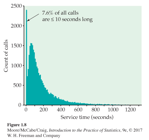
It turned out that the bank penalized representatives whose average call length was too long—so some representatives just hung up on customers to bring their average length down. Neither the customers nor the bank were happy about this. The bank changed its policy, and later data showed that calls under 10 seconds had almost disappeared.
The extreme values of a distribution are in the tailstails of the distribution. The high values are in the upper, or right, tail and the low values are in the lower, or left, tail. The overall pattern in Figure 1.8 is made up of the many moderate call lengths and the long right tail of more lengthy calls. The striking deviation from the overall pattern is the surprising number of very short calls in the left tail.
Our examination of the call center data illustrates some important principles:
• After you understand the background of your data (cases, variables, units of measurement), the first thing to do is plot your data.
• When you look at a plot, look for an overall pattern and also for any striking deviations from the pattern.
Examining distributions
Making a statistical graph is not an end in itself. The purpose of the graph is to help us understand the data. After you make a graph, always ask, “What do I see?” Once you have displayed a distribution, you can see its important features as follows.
EXAMINING A DISTRIBUTION
In any graph of data, look for the overall pattern and for striking deviations from that pattern.
You can describe the overall pattern of a distribution by its shape, center, and spread.
An important kind of deviation is an outlier, an individual value that falls outside the overall pattern.
In Section 1.3, we will learn how to describe center and spread numerically. For now, we can describe the center of a distribution by its midpoint, the value with roughly half the observations taking smaller values and half taking larger values. We can describe the spread of a distribution by giving the smallest and largest values. Stemplots and histograms display the shape of a distribution in the same way. Just imagine a stemplot turned on its side so that the larger values lie to the right.
Some things to look for in describing shape are
• Does the distribution have one or several major peaks, called modesmodes? A distribution with one major peak is called unimodalunimodal.
• Is it approximately symmetric or is it skewed in one direction? A distribution is symmetricsymmetric if the pattern of values smaller and larger than its midpoint are mirror images of each other. It is skewed to the rightskewed if the right tail (larger values) is much longer than the left tail (smaller values).
Some variables commonly have distributions with predictable shapes. Many biological measurements on specimens from the same species and sex—lengths of bird bills, heights of young women—have symmetric distributions. Money amounts, on the other hand, usually have right-skewed distributions. There are many moderately priced houses, for example, but the few very expensive mansions give the distribution of house prices a strong right-skew.
EXAMPLE 1.17
Examine the histogram of IQ scores. What does the histogram of IQ scores (Figure 1.7, page 15) tell us?
Shape: The distribution is roughly symmetric with a single peak in the center. We don’t expect real data to be perfectly symmetric, so in judging symmetry, we are satisfied if the two sides of the histogram are roughly similar in shape and extent.
Center: You can see from the histogram that the midpoint is not far from 110. Looking at the actual data shows that the midpoint is 114.
Spread: The histogram has a spread from 75 to 155. Looking at the actual data shows that the spread is from 81 to 145. There are no outliers or other strong deviations from the symmetric, unimodal pattern.
EXAMPLE 1.18
Examine the histogram of call lengths. The distribution of call lengths in Figure 1.8 (page 17), on the other hand, is strongly skewed to the right. The midpoint, the length of a typical call, is about 115 seconds, or just under 2 minutes. The spread is very large, from 1 second to 28,739 seconds.
The longest few calls are outliers. They stand apart from the long right tail of the distribution, though we can’t see this from Figure 1.8, which omits the largest observations. The longest call lasted almost 8 hours—that may well be due to equipment failure rather than an actual customer call.
USE YOUR KNOWLEDGE
Question 1.23
1.23 Describe the first-exam scores. Refer to the first-exam scores from Exercise 1.17 (page 12). Use your favorite graphical display to describe the shape, the center, and the spread of these data. Are there any outliers?
Dealing with outliers
![]()
In data sets smaller than the service call data, you can spot outliers by looking for observations that stand apart (either high or low) from the overall pattern of a histogram or stemplot. Identifying outliers is a matter for judgment. Look for points that are clearly apart from the body of the data, not just the most extreme observations in a distribution. You should search for an explanation for any outlier. Sometimes outliers point to errors made in recording the data. In other cases, the outlying observation may be caused by equipment failure or other unusual circumstances.
EXAMPLE 1.19
College students. How does the number of undergraduate college students vary by state? Figure 1.9 is a histogram of the numbers of undergraduate students in each of the states.6 Notice that more than 50% of the states are included in the first bar of the histogram. These states have fewer than 300,000 undergraduates. The next bar includes another 30% of the states. These have between 300,000 and 600,000 students. The bar at the far right of the histogram corresponds to the state of California, which has 2,685,893 undergraduates. California certainly stands apart from the other states for this variable. It is an outlier.
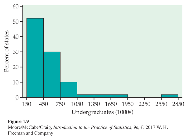
The state of California is an outlier in the previous example because it has a very large number of undergraduate students. California has the largest population of all the states, so we might expect it to have a large number of college students. Let’s look at these data in a different way.
EXAMPLE 1.20
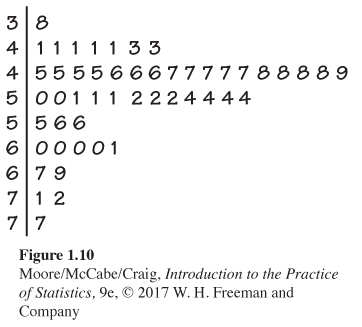
College students per 1000. To account for the fact that there is large variation in the populations of the states, for each state we divide the number of undergraduate students by the population and then multiply by 1000. This gives the undergraduate college enrollment expressed as the number of students per 1000 people in each state. Figure 1.10 gives a stemplot of the distribution. California has 60 undergraduate students per 1000 people. This is one of the higher values in the distribution, but it is clearly not an outlier.
USE YOUR KNOWLEDGE
Question 1.24
1.24 Four states with large populations. There are four states with populations greater than 15 million.
(a) Examine the data file and report the names of these four states.
(b) Find these states in the distribution of number of undergraduate students per 1000 people. To what extent do these four states influence the distribution of number of undergraduate students per 1000 people?
In Example 1.19, we looked at the distribution of the number of undergraduate students, while in Example 1.20, we adjusted these data by expressing the counts as number per 1000 people in each state. Which way is correct? The answer depends upon why you are examining the data.
If you are interested in marketing a product to undergraduate students, the unadjusted numbers would be of interest because you want to reach the most people. On the other hand, if you are interested in comparing states with respect to how well they provide opportunities for higher education to their residents, the population-adjusted values would be more suitable. Always think about why you are doing a statistical analysis, and this will guide you in choosing an appropriate analytic strategy.
![]()
Here is an example with a different kind of outlier.
EXAMPLE 1.21
Healthy bones and PTH. Bones are constantly being built up (bone formation) and torn down (bone resorption). Young people who are growing have more formation than resorption. When we age, resorption increases to the point where it exceeds formation. (The same phenomenon occurs when astronauts travel in space.) The result is osteoporosis, a disease associated with fragile bones that are more likely to break. The underlying mechanisms that control these processes are complex and involve a variety of substances. One of these is parathyroid hormone (PTH). Here are the values of PTH measured on a sample of 29 boys and girls aged 12 to 15 years:7
| 39 | 59 | 30 | 48 | 71 | 31 | 25 | 31 | 71 | 50 | 38 | 63 | 49 | 45 | 31 |
| 33 | 28 | 40 | 127 | 49 | 59 | 50 | 64 | 28 | 46 | 35 | 28 | 19 | 29 |
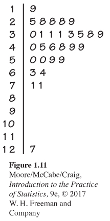
The data are measured in picograms per milliliter (pg/ml) of blood. The original data were recorded with one digit after the decimal point. They have been rounded to simplify our presentation here. Figure 1.11 gives a stemplot of the data.
The observation 127 clearly stands out from the rest of the distribution. A PTH measurement on this individual taken on a different day was similar to the rest of the values in the data set. We conclude that this outlier was caused by a laboratory error or a recording error, and we are confident in discarding it for any additional analysis.
Time plots
Whenever data are collected over time, it is a good idea to plot the observations in time order. Displays of the distribution of a variable that ignore time order, such as stemplots and histograms, can be misleading when there is systematic change over time.
![]()
TIME PLOT
A time plot of a variable plots each observation against the time at which it was measured. Always put time on the horizontal scale of your plot and the variable you are measuring on the vertical scale.
EXAMPLE 1.22
Seasonal variation in vitamin D. Although we get some of our vitamin D from food, most of us get about 75% of what we need from the sun. Cells in the skin make vitamin D in response to sunlight. If people do not get enough exposure to the sun, they can become deficient in vitamin D, resulting in weakened bones and other health problems. The elderly, who need more vitamin D than younger people, and people who live in northern areas, where there is relatively little sunlight in the winter, are particularly vulnerable to these problems.
Figure 1.12 is a plot of the serum levels of vitamin D versus time of year for samples of subjects from Switzerland.8 The units measuring Vitamin D are nanomoles per liter (nmol/l) of blood. The observations are grouped into periods of two months for the plot. Means are marked by filled-in circles and are connected by a line in the plot. The effect of the lack of sunlight in the winter months on vitamin D levels is clearly evident in the plot.
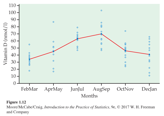
The data described in the preceding example are based on a subset of the subjects in a study of 248 subjects. The researchers were particularly concerned about subjects whose levels were deficient, defined as a serum vitamin D level of less than 50 nmol/l. They found that there was a 3.8-fold higher deficiency rate in February–March than in August–September: 91.2% versus 24.3%. To ensure that individuals from this population have adequate levels of vitamin D, some form of supplementation is needed, particularly during certain times of the year.