1.3 1.3 Describing Distributions with Numbers
When you complete this section, you will be able to:
• Describe the center of a distribution by using the mean.
• Describe the center of a distribution by using the median.
• Compare the mean and the median as measures of center for a particular set of data.
• Describe the spread of a distribution by using quartiles.
• Describe a distribution by using the five-number summary.
• Describe a distribution by using a boxplot.
• Compare one or more sets of data measured on the same variable by using side-by-side boxplots.
• Identify outliers by using the 1.5 × IQR rule.
• Describe the spread of a distribution by using the standard deviation.
• Choose measures of center and spread for a particular set of data.
• Compute the effects of a linear transformation on the mean, the median, the standard deviation, and the interquartile range.
We can begin our data exploration with graphs, but numerical summaries make our analysis more specific. For categorical variables, numerical summaries are the counts or percents that we use to construct pie charts or bar graphs. In this section, we focus on numerical summaries for quantitative variables. A brief description of the distribution of a quantitative variable should include its shape and numbers describing its center and spread. We describe the shape of a distribution based on inspection of a histogram or a stemplot. Now we will learn specific ways to use numbers to measure the center and spread of a distribution. We can calculate these numerical measures for any quantitative variable. But to interpret measures of center and spread, and to choose among the several measures we will learn, you must think about the shape of the distribution and the meaning of the data. The numbers, like graphs, are aids to understanding, not “the answer” in themselves.
EXAMPLE 1.23
The distribution of business start times. An entrepreneur faces many bureaucratic and legal hurdles when starting a new business. The World Bank collects information about starting businesses throughout the world. They have determined the time, in days, to complete all the procedures required to start a business.20 Data for 189 countries are included in the data set, TTS. For this section, we examine data, rounded to integers, for a sample of 24 of these countries. Here are the data:
| 16 | 4 | 5 | 6 | 5 | 7 | 12 | 19 | 10 | 2 | 25 | 19 |
| 38 | 5 | 24 | 8 | 6 | 5 | 53 | 32 | 13 | 49 | 11 | 17 |
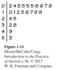
The stemplot in Figure 1.13 shows us the shape, center, and spread of the business start times. The stems are tens of days and the leaves are days. The distribution is skewed to the right with a very long tail of high values. All but six of the times are less than 20 days. The center appears to be about 10 days, and the values range from 2 days to 53 days. There do not appear to be any outliers.
Measuring center: The mean
Numerical description of a distribution begins with a measure of its center or average. The two common measures of center are the mean and the median. The mean is the “average value” and the median is the “middle value.” These are two different ideas for “center,” and the two measures behave differently. We need precise recipes for the mean and the median.
THE MEAN ˉx
To find the mean ˉx of a set of observations, add their values and divide by the number of observations. If the n observations are x1, x2, . . . , xn, their mean is
ˉx=x1+x2+⋯+xnn
or, in more compact notation,
ˉx=1n∑xi
The Σ (capital Greek sigma) in the formula for the mean is short for “add them all up.” The bar over the x indicates the mean of all the x-values. Pronounce the mean ˉx as “x-bar.” This notation is so common that writers who are discussing data use ˉx, ˉy, etc., without additional explanation. The subscripts on the observations xi are a way of keeping the n observations separate.
EXAMPLE 1.24
Mean time to start a business. The mean time to start a business is
ˉx=x1+x2+⋯+xnn=16+4+⋯+1724=39124=16.292
The mean time to start a business for the 24 countries in our data set is 16.3 days. Note that we have rounded the answer. Our goal in using the mean to describe the center of a distribution is not to demonstrate that we can compute with great accuracy. The additional digits do not provide any additional useful information. In fact, they distract our attention from the important digits that are meaningful. Do you think it would be better to report the mean as 16 days?
The value of the mean will not necessarily be equal to the value of one of the observations in the data set. Our example of time to start a business illustrates this fact.
In practice, you can key the data into your calculator and hit the Mean key. You don’t have to actually add and divide. But you should know that this is what the calculator is doing.
USE YOUR KNOWLEDGE
Question 1.43
1.43 Include the outlier. For Example 1.23, a random sample of 24 countries was selected from a data set that included 189 countries. The South American country of Suriname, where the start time is 208 days, was not included in the random sample. Consider the effect of adding Suriname to the original set. Show that the mean for the new sample of 25 countries has increased to 24 days. (This is a rounded number. You should report the mean with two digits after the decimal to show that you have performed this calculation.)
1.43 Without Suriname: ˉX = 16.29. With Suriname: ˉX = 23.96.
Question 1.44
1.44 Find the mean. Here are the scores on the first exam in an introductory statistics course for 10 students:
| 83 | 74 | 93 | 85 | 75 | 97 | 93 | 55 | 92 | 81 |
Find the mean first-exam score for these students.
Exercise 1.43 illustrates an important weakness of the mean as a measure of center: the mean is sensitive to the influence of a few extreme observations. These may be outliers, but a skewed distribution that has no outliers will also pull the mean toward its long tail. Because the mean cannot resist the influence of extreme observations, we say that it is not a resistant measureresistant measure of center.
A measure that is resistant does more than limit the influence of outliers. Its value does not respond strongly to changes in a few observations, no matter how large those changes may be. The mean fails this requirement because we can make the mean as large as we wish by making a large enough increase in just one observation. A resistant measure is sometimes called a robust measurerobust measure.
Measuring center: The median
We used the midpoint of a distribution as an informal measure of center in Section 1.2. The median is the formal version of the midpoint, with a specific rule for calculation.
THE MEDIAN M
The median M is the midpoint of a distribution. Half the observations are smaller than the median and the other half are larger than the median. Here is a rule for finding the median:
1. Arrange all observations in order of size, from smallest to largest.
2. If the number of observations n is odd, the median M is the center observation in the ordered list. Find the location of the median by counting (n+1)/2 observations up from the bottom of the list.
3. If the number of observations n is even, the median M is the mean of the two center observations in the ordered list. The location of the median is again (n+1)/2 from the bottom of the list.
![]()
Note that the formula (n+1)/2 does not give the median, just the location of the median in the ordered list. Medians require little arithmetic, so they are easy to find by hand for small sets of data. Arranging even a moderate number of observations in order is tedious, however, so that finding the median by hand for larger sets of data is unpleasant. Even simple calculators have an ˉx button, but you will need computer software or a graphing calculator to automate finding the median.
EXAMPLE 1.25
Median time to start a business. To find the median time to start a business for our 24 countries, we first arrange the data in order from smallest to largest:
| 2 | 4 | 5 | 5 | 5 | 5 | 6 | 6 | 7 | 8 | 10 | 11 |
| 12 | 13 | 16 | 17 | 19 | 19 | 24 | 25 | 32 | 38 | 49 | 53 |
The count of observations n=24 is even. The median, then, is the average of the two center observations in the ordered list. To find the location of the center observations, we first compute
location of M=n+12=252=12.5
Therefore, the center observations are the 12th and 13th observations in the ordered list. The median is
M=11+122=11.5
Note that you can use the stemplot in Figure 1.13 (page 28) directly to compute the median. In the stemplot the cases are already ordered and you simply need to count from the top or the bottom to the desired location.
USE YOUR KNOWLEDGE
Question 1.45
1.45 Include the outlier. Include Suriname, where the start time is 208 days, in the data set, and show that the median is 12 days. Note that with this case included, the sample size is now 25 and the median is the 13th observation in the ordered list. Write out the ordered list and circle the outlier. Describe the effect of the outlier on the median for this set of data.
1.45 The ordered list is: 2 4 5 5 5 5 6 6 7 8 10 11 12 13 16 17 19 19 24 25 32 38 49 53
M = 12. Without the outlier, the median is 11.5; with the outlier, the median is 12. The outlier does not influence the median greatly.
Question 1.46
1.46 Calls to a customer service center. The service times for 80 calls to a customer service center are given in Table 1.2 (page 17). Use these data to compute the median service time.
Question 1.47
1.47 Find the median. Here are the scores on the first exam in an introductory statistics course for 10 students:
| 83 | 74 | 93 | 85 | 75 | 97 | 93 | 55 | 92 | 81 |
Find the median first-exam score for these students.
1.47 M = 84.
Mean versus median
Exercises 1.43 and 1.45 illustrate an important difference between the mean and the median. Suriname is an outlier. It pulls the mean time to start a business up from 16 days to 24 days. The median increased slightly, from 11.5 days to 12 days.
The median is more resistant than the mean. If the largest start time in the data set was 1200 days, the median for all 25 countries would still be 12 days. The largest observation just counts as one observation above the center, no matter how far above the center it lies. The mean uses the actual value of each observation and so will chase a single large observation upward.
![]()
The best way to compare the response of the mean and median to extreme observations is to use an interactive applet that allows you to place points on a line and then drag them with your computer’s mouse. Exercises 1.83, 1.84, and 1.85 use the Mean and Median applet on the website for this text to compare the mean and the median.
The median and mean are the most common measures of the center of a distribution. The mean and median of a symmetric distribution are close together. If the distribution is exactly symmetric, the mean and median are exactly the same. In a skewed distribution, the mean is farther out in the long tail than is the median.
The endowment for a college or university is money set aside and invested. The income from the endowment is usually used to support various programs. The distribution of the sizes of the endowments of colleges and universities is strongly skewed to the right. Most institutions have modest endowments, but a few are very wealthy. The median endowment of colleges and universities in a recent year was $93 million—but the mean endowment was $498 million.21 The few wealthy institutions pull the mean up but do not affect the median. Don’t confuse the “average” value of a variable (the mean) with its “typical” value, which we might describe by the median.
![]()
We can now give a better answer to the question of how to deal with outliers in data. First, look at the data to identify outliers and investigate their causes. You can then correct outliers if they are wrongly recorded, delete them for good reason, or otherwise give them individual attention. The outlier in Example 1.21 (page 21) can be dropped from the data once we discover that it is an error. If you have no clear reason to drop outliers, you may want to use resistant measures in your analysis, so that outliers have little influence over your conclusions. The choice is often a matter for judgment.
Measuring spread: The quartiles
A measure of center alone can be misleading. Two countries with the same median family income are very different if one has extremes of wealth and poverty and the other has little variation among families. A drug manufactured with the correct mean concentration of active ingredient is dangerous if some batches are much too high and others much too low.
We are interested in the spread or variability of incomes and drug potencies as well as their centers. The simplest useful numerical description of a distribution consists of both a measure of center and a measure of spread.
We can describe the spread or variability of a distribution by giving several percentiles. The median divides the data in two; half of the observations are above the median and half are below the median. We could call the median the 50th percentile. The upper quartilequartile is the median of the upper half of the data. Similarly, the lower quartile is the median of the lower half of the data. With the median, the quartiles divide the data into four equal parts; 25% of the data are in each part.
We can do a similar calculation for any percent. The pth percentile percentile of a distribution is the value that has p percent of the observations fall at or below it. To calculate a percentile, arrange the observations in increasing order and count up the required percent from the bottom of the list.
Our definition of percentiles is a bit inexact because there is not always a value with exactly p percent of the data at or below it. We will be content to take the nearest observation for most percentiles, but the quartiles are important enough to require an exact rule.
THE QUARTILES Q1 AND Q3
To calculate the quartiles:
1. Arrange the observations in increasing order and locate the median M in the ordered list of observations.
2. The first quartile Q1 is the median of the observations whose positions in the ordered list are to the left of the location of the overall median.
3. The third quartile Q3 is the median of the observations whose positions in the ordered list are to the right of the location of the overall median.
Here is an example.
EXAMPLE 1.26
Finding the quartiles. Here is the ordered list of the times to start a business in our sample of 24 countries:
| 2 | 4 | 5 | 5 | 5 | 5 | 6 | 6 | 7 | 8 | 10 | 11 |
| 12 | 13 | 16 | 17 | 19 | 19 | 24 | 25 | 32 | 38 | 49 | 53 |
The count of observations n=24 is even, so the median is at position (24+1)/2=12.5, that is, between the 12th and the 13th observation in the ordered list. There are 12 cases above this position and 12 below it. The first quartile is the median of the first 12 observations, and the third quartile is the median of the last 12 observations. Check that Q1=5.5 and Q3=21.5.
Notice that the quartiles are resistant. For example, Q3 would have the same value if the highest start time was 530 days rather than 53 days.
![]()
Be careful when several observations take the same numerical value. Write down all the observations and apply the rules just as if they all had distinct values.
USE YOUR KNOWLEDGE
Question 1.48
1.48 Find the quartiles. Here are the scores on the first exam in an introductory statistics course for 10 students:
| 83 | 74 | 93 | 85 | 75 | 97 | 93 | 55 | 92 | 81 |
Find the quartiles for these first-exam scores.
![]()
There are several rules for calculating quartiles, which often give slightly different values. The differences are generally small. For describing data, just report the values that your software gives.
The five-number summary and boxplots
In Section 1.2, we used the smallest and largest observations to indicate the spread of a distribution. These single observations tell us little about the distribution as a whole, but they give information about the tails of the distribution that is missing if we know only Q1, M, and Q3. To get a quick summary of both center and spread, use all five numbers.
THE FIVE-NUMBER SUMMARY
The five-number summary of a set of observations consists of the smallest observation, the first quartile, the median, the third quartile, and the largest observation, written in order from smallest to largest. In symbols, the five-number summary is
Minimum Q1 M Q3 Maximum
EXAMPLE 1.27
Service center call lengths. Table 1.2 (page 17) gives the service center call lengths for the sample of 80 calls that we discussed in Example 1.15. The five-number summary for these data is 1.0, 54.5, 103.5, 200, and 2631. The distribution is highly skewed. The mean is 197 seconds, a value that is very close to the third quartile.
USE YOUR KNOWLEDGE
Question 1.49
1.49 Verify the calculations. Refer to the five-number summary and the mean for service center call lengths given in Example 1.27. Verify these results. Do not use software for this exercise and be sure to show all your work.
1.49 196.575 minutes (the value 197 in the text was rounded). The quartiles and median are in positions 20.5, 40.5, and 60.5. Based on this, Q1 = 54.5, M = 103.5, Q3 = 200.
Question 1.50
1.50 Find the five-number summary. Here are the scores on the first exam in an introductory statistics course for 10 students:
| 83 | 74 | 93 | 85 | 75 | 97 | 93 | 55 | 92 | 81 |
Find the five-number summary for these first-exam scores.
The five-number summary leads to another visual representation of a distribution, the boxplot.
BOXPLOT
A boxplot is a graph of the five-number summary.
• A central box spans the quartiles Q1 and Q3.
• A line in the box marks the median M.
• Lines extend from the box out to the smallest and largest observations.
The lines extending to the smallest and largest observations are sometimes called whiskerswhiskers
box-and-whisker plots, and boxplots are sometimes called box-and-whisker plots. Software provides many varieties of boxplots, some of which use different choices for the placement of the whiskers.
When you look at a boxplot, first locate the median, which marks the center of the distribution. Then look at the spread. The quartiles show the spread of the middle half of the data, and the extremes (the smallest and largest observations) show the spread of the entire data set.
EXAMPLE 1.28
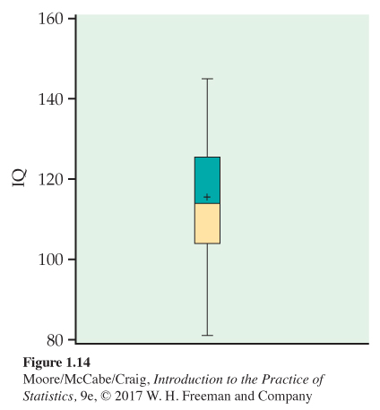
IQ scores. In Example 1.14 (page 14), we used a histogram to examine the distribution of a sample of 60 IQ scores. A boxplot for these data is given in Figure 1.14. Note that the mean is marked with a “+” and appears very close to the median. The two quartiles are each approximately the same distance from the median, and the two whiskers are approximately the same distance from the corresponding quartiles. All these characteristics are consistent with a symmetric distribution, as illustrated by the histogram in Figure 1.7.
USE YOUR KNOWLEDGE
Question 1.51
1.51 Make a boxplot. Here are the scores on the first exam in an introductory statistics course for 10 students:
| 83 | 74 | 93 | 85 | 75 | 97 | 93 | 55 | 92 | 81 |
Make a boxplot for these first-exam scores.
The 1.5 × IQR rule for suspected outliers
If we look at the data in Table 1.2 (page 17), we can spot a clear outlier, a call lasting 2631 seconds, more than twice the length of any other call. How can we describe the spread of this distribution? The smallest and largest observations are extremes that do not describe the spread of the majority of the data. The distance between the quartiles (the range of the center half of the data) is a more resistant measure of spread than the range. This distance is called the interquartile range.
THE INTERQUARTILE RANGE IQR
The interquartile range IQR is the distance between the first and third quartiles,
IQR = Q3 − Q1
EXAMPLE 1.29
IQR for service center call length data. In Exercise 1.49 (page 34) you verified that the five-number summary for our data on service center call lengths was 1.0, 54.5, 103.5, 200, and 2631. Therefore, we calculate
IQR=Q3-Q1IQR=200-54.5=145.5
The quartiles and the IQR are not affected by changes in either tail of the distribution. They are resistant, therefore, because changes in a few data points have no further effect once these points move outside the quartiles.
![]()
However, no single numerical measure of spread, such as IQR, is very useful for describing skewed distributions. The two sides of a skewed distribution have different spreads, so one number can’t summarize them. We can often detect skewness from the five-number summary by comparing how far the first quartile and the minimum are from the median (left tail) with how far the third quartile and the maximum are from the median (right tail). The interquartile range is mainly used as the basis for a rule of thumb for identifying suspected outliers.
THE 1.5 × IQR RULE FOR OUTLIERS
Call an observation a suspected outlier if it falls more than 1.5 × IQR above the third quartile or below the first quartile.
EXAMPLE 1.30
Suspected outliers for call length data. For the call length data in Table 1.2 (page 17),
1.5 × IQR = 1.5 × 145.5 = 218.25
Any values below 54.5 − 218.25 = −163.75 or above 200 + 218.25 = 418.25 are flagged as possible outliers. There are no low outliers, but the eight longest calls are flagged as possible high outliers. Their lengths are
438 465 479 700 700 951 1148 2631
It is difficult to imagine calls lasting this long.
USE YOUR KNOWLEDGE
Question 1.52
1.52 Find the IQR. Here are the scores on the first exam in an introductory statistics course for 10 students:
| 83 | 74 | 93 | 85 | 75 | 97 | 93 | 55 | 92 | 81 |
Find the interquartile range and use the 1.5 × IQR rule to check for outliers. How low would the lowest score need to be for it to be an outlier according to this rule?
Two variations on the basic boxplot can be very useful. The first, called a modified boxplotmodified boxplot, uses the 1.5 × IQR rule. The lines that extend out from the quartiles are terminated in whiskers that are 1.5 × IQR in length. Points beyond the whiskers are plotted individually and are classified as outliers according to the 1.5 × IQR rule.
The other variation is to use two or more boxplots in the same graph to compare groups measured on the same variable. These are called side-by-side boxplotsside-by-side boxplots. The following example illustrates these two variations.
EXAMPLE 1.31
Do poets die young? According to William Butler Yeats, “She is the Gaelic muse, for she gives inspiration to those she persecutes. The Gaelic poets die young, for she is restless, and will not let them remain long on earth.” One study designed to investigate this issue examined the age at death for writers from different cultures and genders.22
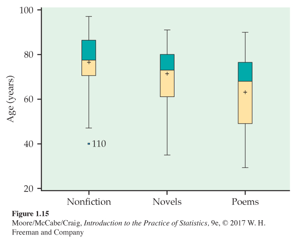
Three categories of writers examined were novelists, poets, and nonfiction writers. We examine the ages at death for female writers in these categories from North America. Figure 1.15 shows modified side-by-side boxplots for the three categories of writers.
Displaying the boxplots for the three categories of writers lets us compare the three distributions. We see that nonfiction writers tend to live the longest, followed by novelists. The poets do appear to die young! There is one outlier among the nonfiction writers, which is plotted individually along with the value of its label. This writer died at the age of 40, young for a nonfiction writer, but not for a novelist or a poet!
Measuring spread: The standard deviation
The five-number summary is not the most common numerical description of a distribution. That distinction belongs to the combination of the mean to measure center and the standard deviation to measure spread, or variability. The standard deviation measures spread by looking at how far the observations are from their mean.
THE STANDARD DEVIATION s
The variance s2 of a set of observations is the average of the squares of the deviations of the observations from their mean. In symbols, the variance of n observations x1, x2, . . . , xn is
s2=(x1−ˉx)2+(x2−ˉx)2+⋯+(xn−ˉx)2n−1
or, in more compact notation,
s2=1n−1∑(xi−ˉx)2
The standard deviation s is the square root of the variance s2:
s=√1n−1∑(xi−ˉx)2
The idea behind the variance and the standard deviation as measures of spread is as follows: The deviations xi−ˉx display the spread of the values xi about their mean ˉx. Some of these deviations will be positive and some negative because some of the observations fall on each side of the mean. In fact, the sum of the deviations of the observations from their mean will always be zero. Squaring the deviations makes the negative deviations positive so that observations far from the mean in either direction have large positive squared deviations. The variance is the average squared deviation. Therefore, s2 and s will be large if the observations are widely spread about their mean and small if the observations are all close to the mean.
EXAMPLE 1.32
Metabolic rate. A person’s metabolic rate is the rate at which the body consumes energy. Metabolic rate is important in studies of weight gain, dieting, and exercise. Here are the metabolic rates of seven men who took part in a study of dieting. (The units are calories per 24 hours. These are the same calories used to describe the energy content of foods.)
1792 1666 1362 1614 1460 1867 1439
Enter these data into your calculator or software and verify that
ˉx=1600 calories s=189.24 calories
Figure 1.16 plots these data as dots on the calorie scale, with their mean marked by an asterisk (*). The arrows mark two of the deviations from the mean. If you were calculating s by hand, you would find the first deviation as
x1−ˉx=1792−1600=192

Exercise 1.80 asks you to calculate the seven deviations from Example 1.32, square them, and find s2 and s directly from the deviations. Working one or two short examples by hand helps you understand how the standard deviation is obtained. In practice, you will use either software or a calculator that will find s.
USE YOUR KNOWLEDGE
Question 1.53
1.53 Find the variance and the standard deviation. Here are the scores on the first exam in an introductory statistics course for 10 students:
| 83 | 74 | 93 | 85 | 75 | 97 | 93 | 55 | 92 | 81 |
Find the variance and the standard deviation for these first-exam scores.
1.53 From software: s2 = 157.07, s = 12.53.
The idea of the variance is straightforward: it is the average of the squares of the deviations of the observations from their mean. The details we have just presented, however, raise some questions.
Why do we square the deviations?
• First, the sum of the squared deviations of any set of observations from their mean is the smallest that the sum of squared deviations from any number can possibly be. This is not true of the unsquared distances. So squared deviations point to the mean as center in a way that distances do not.
• Second, the standard deviation turns out to be the natural measure of spread for a particularly important class of symmetric unimodal distributions, the Normal distributions. We will meet the Normal distributions in the next section.
Why do we emphasize the standard deviation rather than the variance?
• One reason is that s, not s2, is the natural measure of spread for Normal distributions, which are introduced in the next section.
• There is also a more general reason to prefer s to s2. Because the variance involves squaring the deviations, it does not have the same unit of measurement as the original observations. The variance of the metabolic rates, for example, is measured in squared calories. Taking the square root gives us a description of the spread of the distribution in the original measurement units.
Why do we average by dividing by n − 1 rather than n in calculating the variance?
• Because the sum of the deviations is always zero, the last deviation can be found once we know the other n − 1. So we are not averaging n unrelated numbers. Only n − 1 of the squared deviations can vary freely, and we average by dividing the total by n − 1.
Page 40• The number n − 1 is called the degrees of freedomdegrees of freedom of the variance or standard deviation. Many calculators offer a choice between dividing by n and dividing by n − 1, so be sure to use n − 1.
Properties of the standard deviation
Here are the basic properties of the standard deviation s as a measure of spread.
PROPERTIES OF THE STANDARD DEVIATION
• s measures spread about the mean and should be used only when the mean is chosen as the measure of center.
• s = 0 only when there is no spread. This happens only when all observations have the same value. Otherwise, s > 0. As the observations become more spread out about their mean, s gets larger.
• s, like the mean ˉx, is not resistant. A few outliers can make s very large.
USE YOUR KNOWLEDGE
Question 1.54
1.54 A standard deviation of zero. Construct a data set with 6 cases that has a variable with s = 0.
![]()
The use of squared deviations renders s even more sensitive than ˉx to a few extreme observations. For example, when we add Suriname to our sample of 24 countries for the analysis of the time to start a business (Exercise 1.43, page 29, and Exercise 1.45, page 31), we increase the standard deviation from 14.2 to 40.8! Distributions with outliers and strongly skewed distributions have standard deviations that do not give much helpful information about such distributions.
USE YOUR KNOWLEDGE
Question 1.55
1.55 Effect of an outlier on the IQR. Find the IQR for the time to start a business with and without Suriname. What do you conclude about the sensitivity of this measure of spread to the inclusion of an outlier?
1.55 Without Suriname: Min = 55, Q1 = 75, M = 84, Q3 = 93, Max = 97. With Suriname: Min = 2, Q1 = 5.5, M = 11.5, Q3 = 21.5, Max = 53. The max changes drastically with the outlier removed, but otherwise, the other numbers in the five-number summary do not change drastically. This shows that generally the five-number summary is robust.
Choosing measures of center and spread
How do we choose between the five-number summary and ˉx and s to describe the center and spread of a distribution? Because the two sides of a strongly skewed distribution have different spreads, no single number such as s describes the spread well. The five-number summary, with its two quartiles and two extremes, does a better job.
CHOOSING A SUMMARY
The five-number summary is usually better than the mean and standard deviation for describing a skewed distribution or a distribution with strong outliers. Use ˉx and s for reasonably symmetric distributions that are free of outliers.
![]()
Remember that a graph gives the best overall picture of a distribution. Numerical measures of center and spread report specific facts about a distribution, but they do not describe its shape. Numerical summaries do not disclose the presence of multiple modes or gaps, for example. Always plot your data.
EXAMPLE 1.33
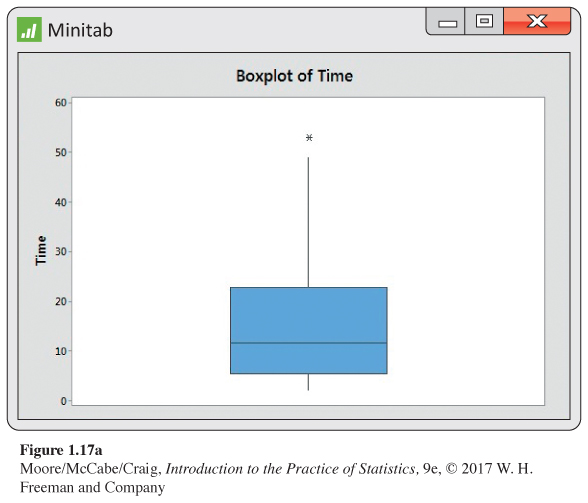
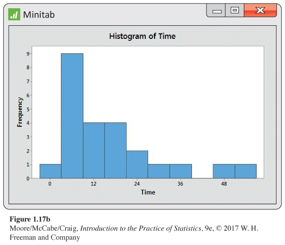
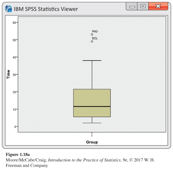
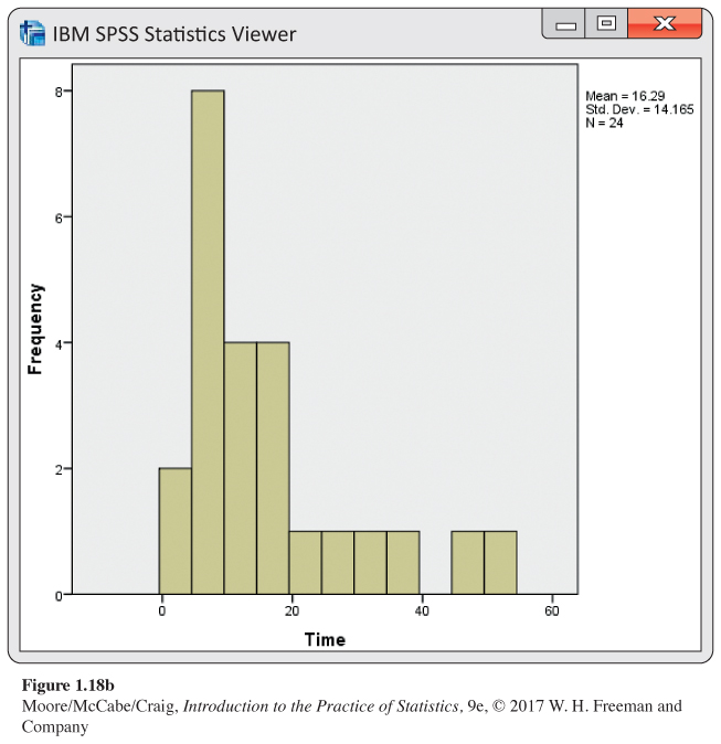
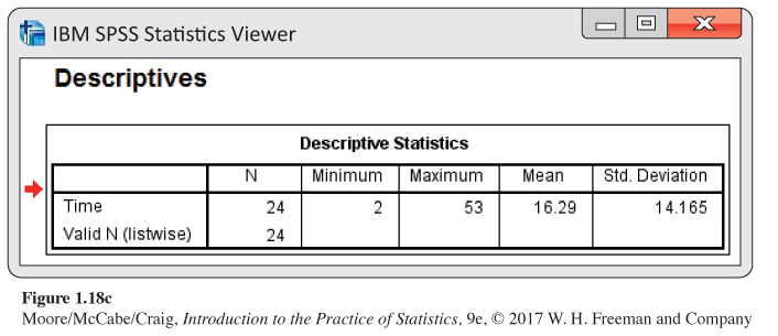
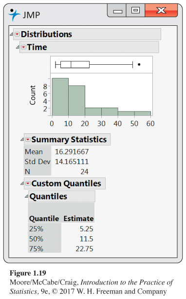
Results from software. We prefer to examine the numerical summaries and graphical summaries together. Figure 1.17 gives (a) a boxplot, (b) a histogram, and (c) numerical summaries for the time to start a business from Example 1.23 (page 28) using Minitab. Similar displays are given for SPSS in Figure 1.18 (a), (b), and (c) and for JMP in Figure 1.19. Examine and compare the outputs carefully. Notice that they give different numbers of significant digits for some of these numerical summaries. There are also variations in how they make the boxplots and how they define classes for the histograms.

Changing the unit of measurement
The same variable can be recorded in different units of measurement. Americans commonly record distances in miles and temperatures in degrees Fahrenheit, while the rest of the world measures distances in kilometers and temperatures in degrees Celsius. Fortunately, it is easy to convert numerical descriptions of a distribution from one unit of measurement to another. This is true because a change in the measurement unit is a linear transformation of the measurements.
LINEAR TRANSFORMATIONS
A linear transformation changes the original variable x into the new variable xnew given by an equation of the form
xnew
Adding the constant a shifts all values of x upward or downward by the same amount. In particular, such a shift changes the origin (zero point) of the variable. Multiplying by the positive constant b changes the size of the unit of measurement.
EXAMPLE 1.34
Change the units.
(a) If a distance x is measured in kilometers, the same distance in miles is
For example, a 10-kilometer race covers 6.2 miles. This transformation changes the units without changing the origin—a distance of 0 kilometers is the same as a distance of 0 miles.
(b) A temperature x measured in degrees Fahrenheit must be reexpressed in degrees Celsius to be easily understood by the rest of the world. The transformation is
Thus, the high of 95°F on a hot American summer day translates into 35°C. In this case,
This linear transformation changes both the unit size and the origin of the measurements. The origin in the Celsius scale (0°C, the temperature at which water freezes) is 32° in the Fahrenheit scale.
Linear transformations do not change the shape of a distribution. If measurements on a variable x have a right-skewed distribution, any new variable obtained by a linear transformation (for ) will also have a right-skewed distribution. If the distribution of x is symmetric and unimodal, the distribution of remains symmetric and unimodal.
Although a linear transformation preserves the basic shape of a distribution, the center and spread will change. Because linear changes of measurement scale are common, we must be aware of their effect on numerical descriptive measures of center and spread. Fortunately, the changes follow a simple pattern.
EXAMPLE 1.35
Use scores to find the points. In an introductory statistics course, homework counts for 300 points out of a total of 1000 possible points for all course requirements. During the semester, there were 12 homework assignments, and each was given a grade on a scale of 0 to 100. The maximum total score for the 12 homework assignments is therefore 1200. To convert the homework scores to final grade points, we need to convert the scale of 0 to 1200 to a scale of 0 to 300. We do this by multiplying the homework scores by 300/1200. In other words, we divide the homework scores by 4. Here are the homework scores and the corresponding final grade points for five students:
| Student | 1 | 2 | 3 | 4 | 5 |
|---|---|---|---|---|---|
| Score | 1056 | 1080 | 900 | 1164 | 1020 |
| Points | 264 | 270 | 225 | 291 | 255 |
These two sets of numbers measure the same performance on homework for the course. Because we obtained the points by dividing the scores by 4, the mean of the points will be the mean of the scores divided by 4. Similarly, the standard deviation of points will be the standard deviation of the scores divided by 4.
USE YOUR KNOWLEDGE
Question 1.56
1.56 Calculate the points for a student. Use the setting of Example 1.35 to find the points for a student whose score is 950.
Here is a summary of the rules for linear transformations:
EFFECT OF A LINEAR TRANSFORMATION
To see the effect of a linear transformation on measures of center and spread, apply these rules:
• Multiplying each observation by a positive number b multiplies both measures of center (mean and median) and measures of spread (interquartile range and standard deviation) by b.
• Adding the same number a (either positive or negative) to each observation adds a to measures of center and to quartiles and other percentiles but does not change measures of spread.
In Example 1.35, when we converted from score to points, we described the transformation as dividing by 4. The multiplication part of the summary of the effect of a linear transformation applies to this case because division by 4 is the same as multiplication by 0.25. Similarly, the second part of the summary applies to subtraction as well as addition because subtraction is simply the addition of a negative number.
The measures of spread IQR and s do not change when we add the same number a to all the observations because adding a constant changes the location of the distribution but leaves the spread unaltered. You can find the effect of a linear transformation by combining these rules. For example, if x has mean , the transformed variable by combining these rules. For example, if x has mean has mean .