Demographic Regions
Demographic Regions

In what ways do demographic traits vary regionally? How is the theme of culture region expressed in terms of population characteristics? The principal characteristics of human populations—their densities, spatial distributions, age and gender structures, the ways they increase and decrease, and how rapidly population numbers change—vary enormously from place to place. Understanding the demographic characteristics of populations, and why and how they change over time, gives us important clues to their cultural characteristics.
59
Population Distribution and Density
Population Distribution and Density
population density A measurement of population per unit area (for example, per square mile).
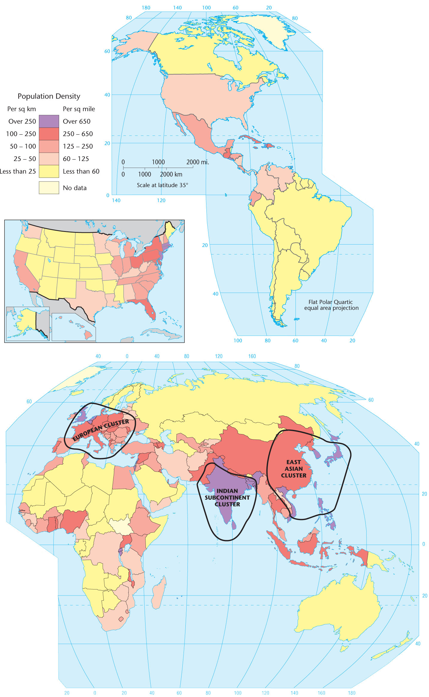
If the over 7 billion inhabitants of Earth were evenly distributed across the land area, the population density would be about 121 persons per square mile (47 per square kilometer). However, people are very unevenly distributed, creating huge disparities in density. Iceland, for example, has approximately eight people per square mile (three per square kilometer), whereas Bangladesh has 2,709 people per square mile (1,046 per square kilometer) (Figure 3.1).
Population Density
Thinking Geographically
Question
Is the northeastern part of the United States a fourth cluster?
If we consider the distribution of people by continents, we find that 70.8 percent of the human race lives in Eurasia—Europe and Asia. North America (Canada, the United States, and Mexico) is home to only 6.6 percent of people, Africa to 15 percent, South America to 5.7 percent, and Australia and the Pacific islands to 0.5 percent. When we consider population distribution by country, we find that 19.3 percent of humans live in China (including Hong Kong and Macao), 17.7 percent in India, and only 4.5 percent in the third-largest nation in the world, the United States (Table 3.1, below). In fact, one in 50 humans lives in only one valley of one province of China: the Sichuan Basin.
Table 3.1:
The World’s 10 Most Populous Countries, 2011 and 2050
| Most Populous Countries, 2011 | Population in 2011 (in millions) | Most Populous Countries, 2050 (estimated) | Population in 2050 (estimated, in millions) |
|---|---|---|---|
| China | 1,346 | India | 1,692 |
| India | 1,241 | China | 1,313 |
| United States | 312 | Nigeria | 433 |
| Indonesia | 238 | United States | 423 |
| Brazil | 197 | Pakistan | 314 |
| Pakistan | 177 | Indonesia | 309 |
| Nigeria | 162 | Bangladesh | 226 |
| Bangladesh | 151 | Brazil | 223 |
| Russia | 143 | Ethiopia | 174 |
| Japan | 128 | Philippines | 150 |
| (Source: Population Reference Bureau, 2011 World Population Data Sheet) | |||
formal demographic region A demographic region based on the single trait of population density.
Due to the variation in population density from one country to another, it is important to analyze population data on a global scale. Figure 3.1 clearly shows certain patterns in population density in different regions of the world. On one end of the spectrum, there are thickly settled areas that have over 250 people per square mile (100 or more per square kilometer). On the other end of the spectrum, there are largely unpopulated areas that have fewer than 2 persons per square mile (less than 1 per square kilometer). Moderately settled areas and thinly settled areas fall between these two extremes. These categories of settlement create formal demographic regions based on the single trait of population density.
60
As Figure 3.1 shows, a fragmented crescent of densely settled areas stretches along the western, southern, and eastern edges of the huge Eurasian continent. Two-thirds of the human race is concentrated in this crescent, which contains three major population clusters: eastern Asia, the Indian subcontinent, and Europe. Outside of Eurasia, only scattered districts are so densely settled. Despite the image of a crowded world, thinly settled regions are much more extensive than thickly settled ones, and they appear on every continent. Thin settlement characterizes the northern sections of Eurasia and North America, the interior of South America, most of Australia, and a desert belt through North Africa and the Arabian Peninsula into the heart of Eurasia.
carrying capacity The maximum number of people who can be supported in a given area.
As geographers, we want to know more about population geography than simply population density. For example, what are people’s standards of living, and are they related to population density? Some of the most thickly populated areas in the world have the highest standards of living—and even suffer from labor shortages (for example, the major industrial areas of western Europe and Japan). In other cases, thinly settled regions may actually be severely overpopulated relative to their ability to support their population, a situation that is usually associated with marginal agricultural lands. Although 1000 persons per square mile (400 per square kilometer) is a sparse population for an industrial district, it is dense for a rural area. For this reason, carrying capacity—the population beyond which a given environment cannot provide support without becoming significantly damaged—provides a far more meaningful index of overpopulation than density alone. Often, however, it is difficult to determine carrying capacity until the region under study is near or over the limit. Sometimes the carrying capacity of one place can be expanded by drawing on the resources of another place. Americans, for example, consume far more food, products, and natural resources than do most other people in the world: 22 percent of the entire world’s petroleum production, for instance, is consumed in the United States. The carrying capacity of the United States would be exceeded if it did not utilize the resources—including the labor—of much of the rest of the world.
A critical feature of population geography is the demographic changes that occur over time. Analyzing these gives us a dynamic perspective from which we can glean insights into cultural changes occurring at local, regional, and global scales. Populations change primarily in two ways: people are born and others die in a particular place, and people move into and out of that place. The latter refers to migration, which we will consider later in this chapter. For now we discuss births and deaths, which can be thought of as additions to and subtractions from a population. They provide what demographers refer to as natural increases and natural decreases.
61
Patterns of Natality
Patterns of Natality
crude birthrate The annual number of births per thousand population.
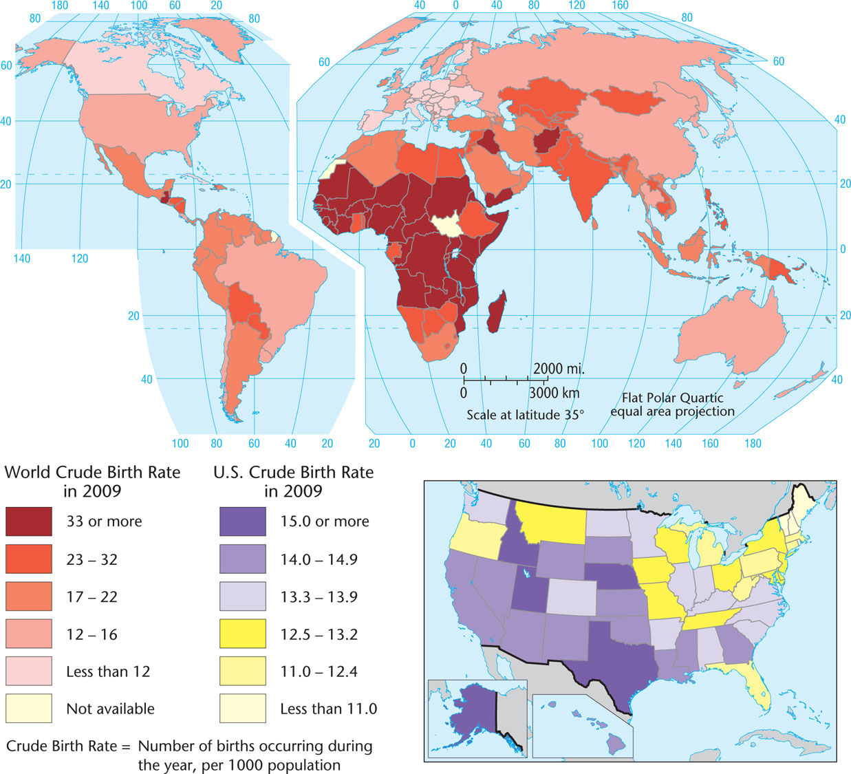
Births can be measured by several methods. One way is to calculate the crude birthrate—the number of births per thousand people per year (Figure 3.2). Birthrates ranging from 10 to 20 births per thousand are considered low, while rates from 40 to 50 births per thousand are considered high. While high birthrates can present problems for governments attempting to care for populations with large numbers of children, low birthrates can also put stress on governments to provide for senior citizens, since there will be fewer people of working age to support this segment of the population.
Crude Birth Rate
Thinking Geographically
Question
Do you think that crude birthrate data is consistently accurate from country to country around the world?
total fertility rate (TFR) The number of children the average woman will bear during her reproductive lifetime (15 to 49 years old).
zero population growth A condition of population stability; zero population growth is achieved when an average of only 2.1 children per couple survive to adulthood, so that eventually the number of deaths equals the number of births.
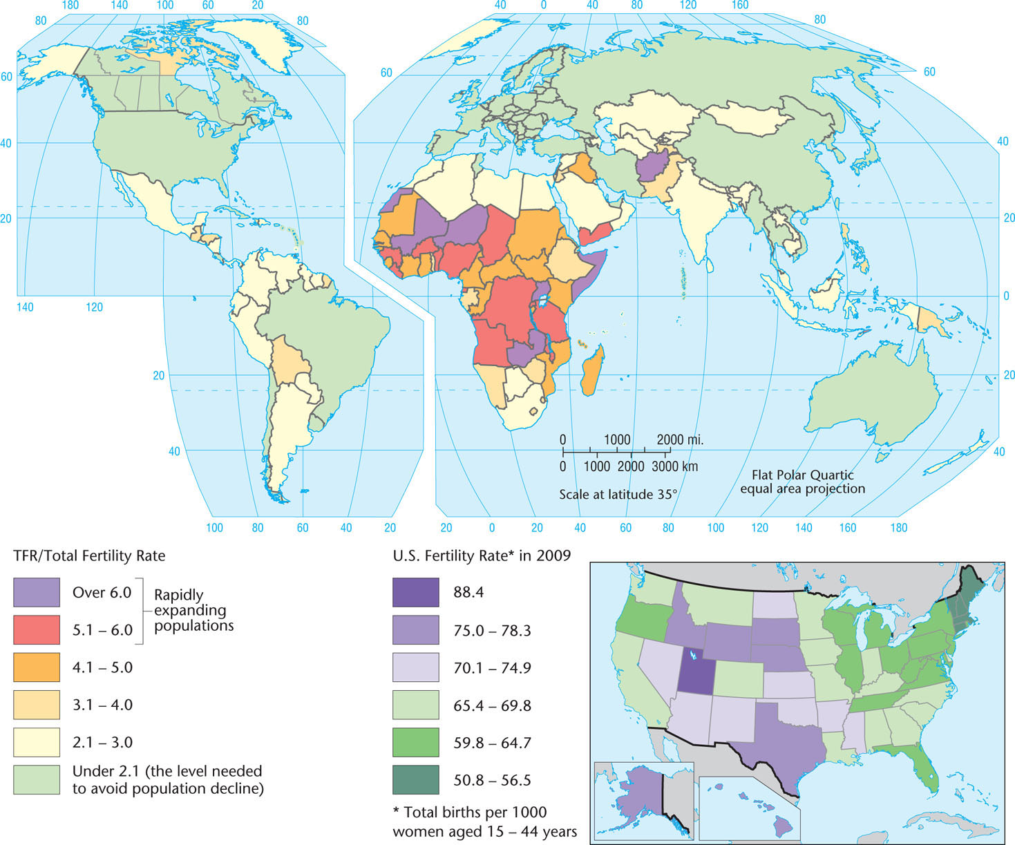
Another revealing statistic is the total fertility rate, or TFR, which is measured as the average number of children born per woman during her reproductive lifetime, which is considered to be from 15 to 49 years of age. The TFR is a more useful measure than the birthrate because it focuses on the female segment of the population, reveals average family size, and gives an indication of future changes in the population structure. A TFR of 2.1 is needed to produce an eventually stabilized population—that is, one that does not increase or decrease. Once achieved, this condition is called zero population growth.
62
The TFR varies markedly from one part of the world to another, revealing a vivid geographical pattern (Figure 3.3). In southern and eastern Europe, the average TFR is well under 2.0, so every country in these regions can eventually expect population decline. Bulgaria, for example, has a TFR of 1.5 and is expected to lose 15 percent of its population by 2050. By contrast, sub-Saharan Africa has the highest TFR of any region of the world, led by Niger, with a TFR of 7.0. Therefore, Niger can expect its population to increase by 112 percent by 2050. Elsewhere in the world, only Afghanistan in south-central Asia and the Arabian peninsula can rival the sub-Saharan African rates. Interestingly, according to the World Bank, during the past two decades, TFRs have begun to fall in all sub-Saharan African nations.
Fertility Rate
Thinking Geographically
Question
Why do you think the TFR in many developing states is higher than that in more developed regions?
63
The Geography of Mortality
The Geography of Mortality
crude death rate The annual deaths per thousand persons in the population.
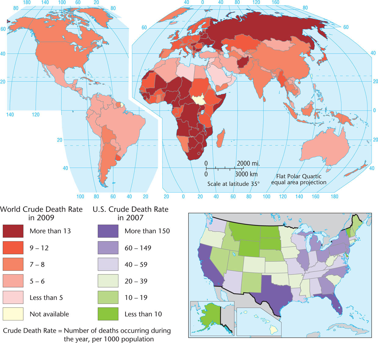
Another way to assess demographic change is to analyze the crude death rate: the deaths per year per thousand people (Figure 3.4). In looking at the map of world crude death rates, we can observe patterns across different regions, with lower death rates occurring in developed states that can offer better and more widely available health care to citizens.
Crude Death Rate
Thinking Geographically
Question
Why do you think that the crude death rates for Florida and Texas are higher than in most other U.S. states?
Of course, death is a natural part of the life cycle, and there is no way to achieve a death rate of zero. Geographically speaking, death comes in different forms. In the developed world, most people die of age-induced degenerative conditions, such as heart disease, or from maladies caused by industrial pollution of the environment. Many types of cancer fall into the latter category. By contrast, contagious diseases such as malaria, HIV/AIDS, and diarrheal diseases are a leading cause of death in poorer countries. Civil warfare, inadequate health services, and the age structure of a country’s population also affect its death rate.
64
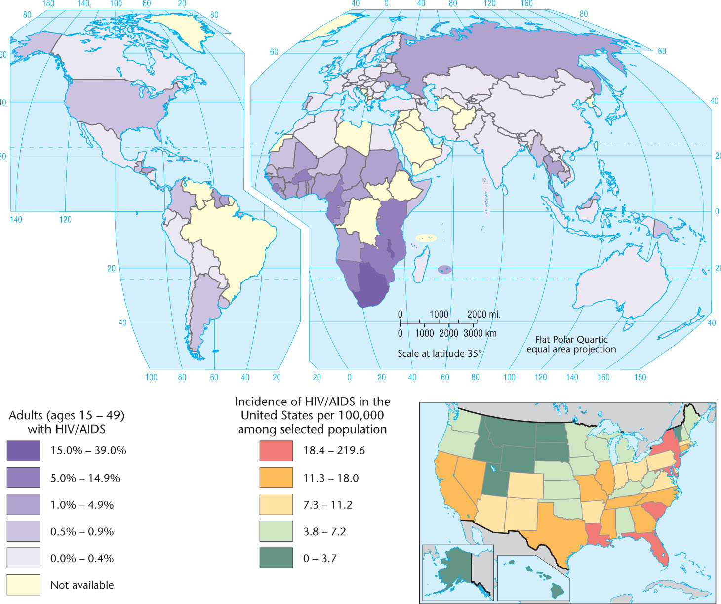
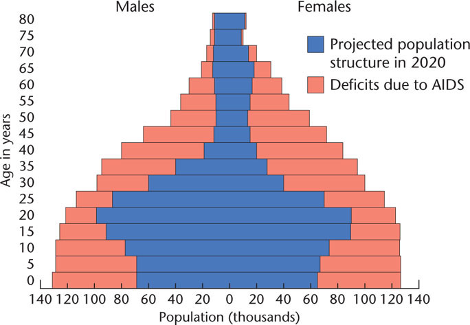
The highest death rates occur in sub-Saharan Africa, the poorest world region and the one most afflicted by life-threatening diseases and civil strife. (Figure 3.5 illustrates the geography of HIV/AIDS.) In general, death rates of more than 25 per thousand people are uncommon today. The world’s highest death rate as of 2007—slightly more than 30 per thousand people—was found in Swaziland, in southern Africa, and is the result in great part because of the HIV/AIDS prevalence rate there, which is nearly 40 percent among the adult population. By contrast, the American tropics generally have rather low death rates, as does the desert belt across North Africa, the Middle East, and central Asia. In these regions, the predominantly young population depresses the death rate. Compared to Swaziland, Ecuador’s death rate of only 5 per thousand seems quite low. Because of its older population, the average death rate in the European Union is 10 per thousand. Australia, Canada, and the United States, which continue to attract young immigrants, have lower death rates than most of Europe. Canada’s death rate, for instance, is slightly less than 8 people per thousand.
Adult HIV/AIDS Cases
Thinking Geographically
Question
The highest rates of HIV/AIDS are in Africa. What parts of Africa have lower rates? What cultural factors might explain this?
65
Population Explosion?
Population Explosion?
population explosion The rapid, accelerating increase in world population since about 1650 and especially since 1900.
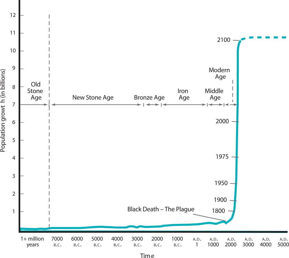
One of the fundamental issues of the modern age is the population explosion: a dramatic increase in world population since 1900 (Figure 3.6). The crucial element triggering this explosion has been a steep decline in the death rate, particularly for infants and children, in most of the world, without an accompanying universal decline in fertility. At one time in traditional cultures, only two or three offspring in a family of six to eight children might live to adulthood, but when improved health conditions allowed more children to survive, the cultural norm encouraging large families persisted.
Thinking Geographically
Question
What assumptions underlie the broken line at the right side of the graph?
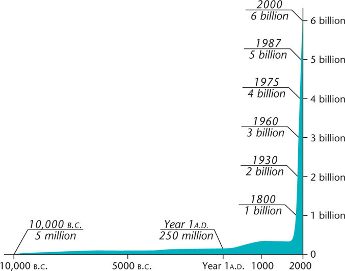
Until very recently, the number of people in the world has been increasing geometrically, doubling in shorter and shorter periods. It took from the beginning of human history until a.d. 1800 for the Earth’s population to grow to 1 billion people, but from 1800 to 1930, it grew to 2 billion, and in only 45 more years it doubled again (Figure 3.7). Looking at the population explosion in another way, it is estimated that 61 billion humans have lived in the entire 200,000-year period since Homo sapiens originated. Of these, 7 billion (roughly 11 percent) are alive today. Approximately one of every 10 humans who ever lived on Earth is alive today. If we were to consider only those humans who survived into adulthood, the proportion alive today would come closer to one in five!
Thinking Geographically
Question
Relate the shape of this growth to the demographic transition (Figure 3.9).
Some scholars foresaw long ago that an ever-increasing global population would eventually present difficulties. The most famous pioneer observer of population growth, the English economist and cleric Thomas Malthus, published An Essay on the Principle of Population—known as the “dismal essay”—in 1798. He believed that the human ability to multiply far exceeds our ability to increase food production. Consequently, Malthus maintained that “a strong and constantly operating check on population” will necessarily act as a natural control on numbers. Malthus regarded famine, disease, and war as the inevitable outcome of the human population’s outstripping the food supply. He wrote, “Population, when unchecked, increases in a geometrical ratio. Subsistence only increases in an arithmetical ratio. A slight acquaintance with numbers will show the immensity of the first power in comparison of the second.”
Malthusian One who holds the views of Thomas Malthus, who believed that overpopulation is the root cause of poverty, illness, and warfare.
The word Malthusian entered the English language to describe the dismal future Malthus foresaw and the people who subscribe to Malthus’s views. Being a cleric as well as an economist, however, Malthus believed that if humans could voluntarily restrain the “passion between the sexes,” they might avoid their otherwise miserable fate.
Was Malthus right? From the very first, his ideas were controversial. The founders of communism, Karl Marx and Friedrich Engels, blamed poverty and starvation on the evils of capitalist society. Taking this latter view might lead one to believe that the miseries of starvation, warfare, and disease are more the result of maldistribution of the world’s wealth than of overpopulation. Indeed, severe food shortages within the past decade in several regions point to precisely this issue of inequitable food distribution and its catastrophic consequences.
Malthus did not consider that when faced with conundrums such as scarce food supplies, human beings are highly creative. This has led critics of Malthus and his modern-day followers to point out that while the global population has doubled three times since Malthus wrote his essay, food supplies have doubled five times. Scientific innovations such as the green revolution have led to food increases that far outpaced population growth (see chapter 8). Other measures of well-being, including life expectancy, air quality, and average education levels, have all improved, too.
The fact is that at the beginning of the new millennium, the world’s population is growing more slowly than before. The world’s TFR has fallen to 2.8; one demographer has declared that “the population explosion is over”; and Figure 3.5 depicts a leveling-off of global population at about 11 billion by the year 2100. Relatively stable population totals worldwide, however, mask the population declines and aging of the population structure already under way in some regions of the world.
It is difficult to speculate about the state of the world’s population beyond the year 2050. What is clear, however, is that the lifestyles we adopt will affect how many people Earth can ultimately support. In particular, whether wealthy countries continue to use the amount of resources they currently do, and whether developing countries decide to follow a Western-style route toward more and more resource consumption, will bear greatly on whether we have already overpopulated the planet.
The Demographic Transition
The Demographic Transition
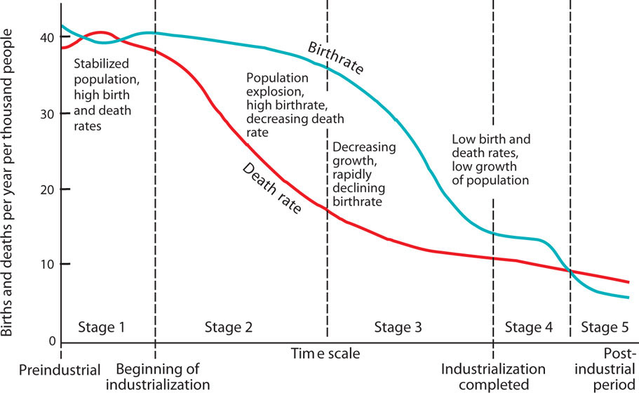
demographic transition The movement from high birth and death rates to low birth and death rates.
All industrialized, technologically advanced countries have low fertility rates and stabilized or declining populations, having passed through what is called the demographic transition (Figure 3.8). In preindustrial societies, birth and death rates were both high, resulting in almost no population growth. Because these were agrarian societies that depended on family labor, many children meant larger workforces, thus the high birthrates. But low levels of public health and limited access to health care, particularly for the very young, also meant high death rates. With the coming of the industrial era, medical advances and improvements in diet set the stage for a drop in death rates. Human life expectancy in industrialized countries soared from an average of 35 years in the eighteenth century to 75 years or more at present. Yet birthrates did not fall so quickly, leading to a population explosion as fertility outpaced mortality. In Figure 3.7, this is shown in late stage 2 and early stage 3 of the model. Eventually, a decline in the birthrate followed the decline in the death rate, slowing population growth. An important reason leading to lower fertility levels involves the high cost of children in industrial societies, particularly because childhood itself becomes a prolonged period of economic dependence on parents. Finally, in the postindustrial period, the demographic transition produced zero population growth or actual population decline (Figure 3.9).
Thinking Geographically
Question
Why does the death rate decline before the birthrate?
Annual Population Change
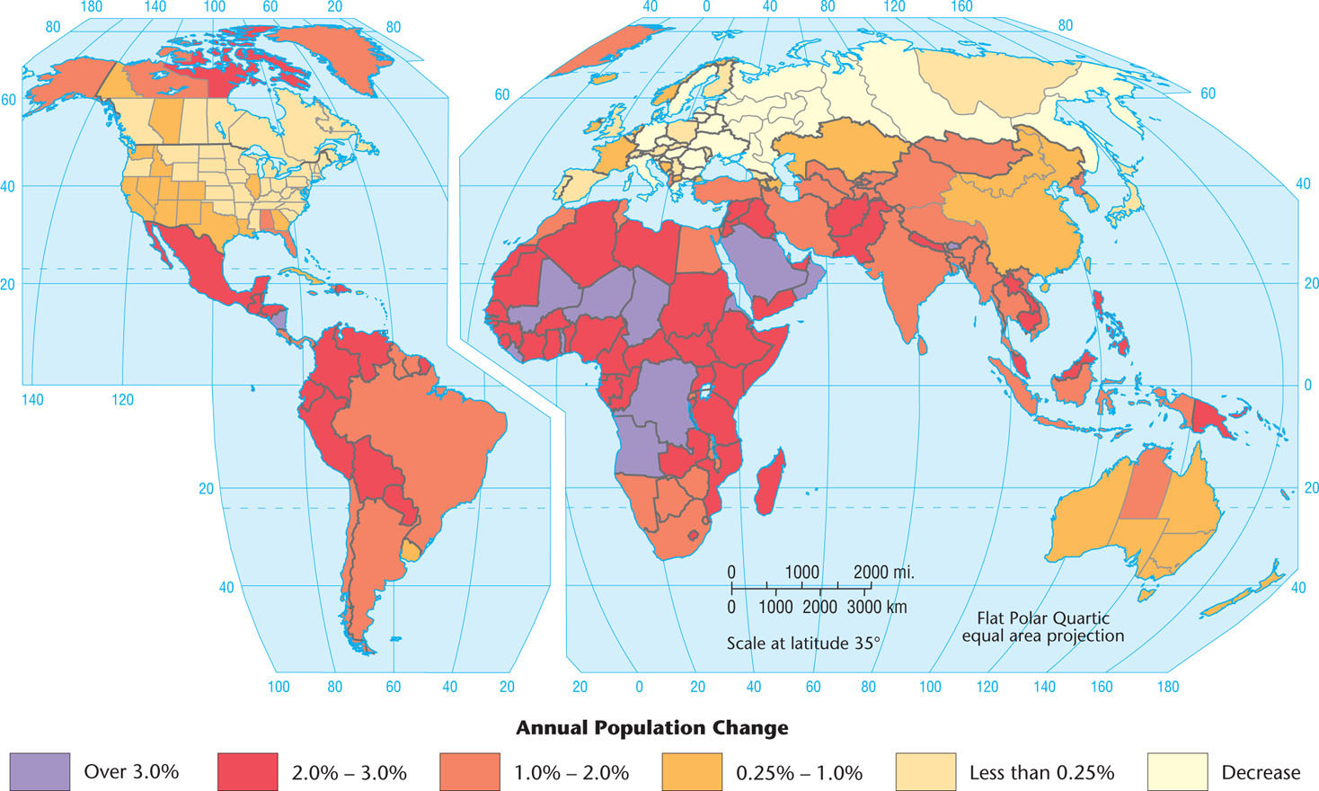
Thinking Geographically
Question
In what places do countries with high population growth rates border places with low rates? What consequences could result?
66
67
Achieving lower death rates is relatively cost effective, historically requiring little more than the provision of safe drinking water and vaccinations against common infectious diseases. Less death tends to be uncontroversial and fast acting, demographically speaking. Getting birthrates to fall, however, can be far more difficult, especially for a government official who wants to be reelected. Birth control, abortion, and challenging long-held beliefs about family size can prove quite controversial, and political leaders may be reluctant to legislate for them. Indeed, the Chinese implementation of its one child per couple policy probably would never have been possible in a country with a democratically elected government. In addition, because it involves changing a cultural norm, the idea of smaller families can take three or four generations to take hold. Increasing educational levels for women is closely associated with falling fertility levels, as is access to various contraceptive devices (Figure 3.10).
Geography Of Contraception
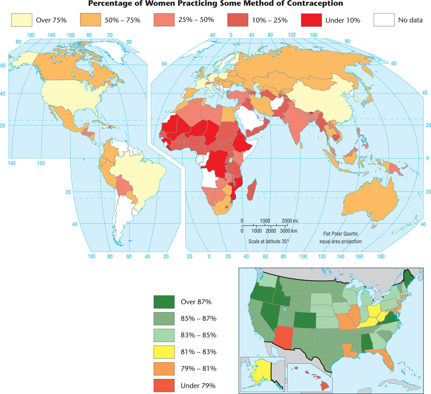
Thinking Geographically
Question
Compare this map with Figure 3.8. How do you explain the areas (for example, much of Latin America) where contraceptive use is relatively high and yet population growth rates are also high?
The demographic transition is a model that predicts trends in birthrates, death rates, and overall population levels in the abstract. It does a good job of describing population patterns over time in Europe, as well as in other wealthy regions. However, it has several shortcomings. First is the inexorable stage-by-stage progression implicit in the model. Have countries or regions ever skipped a stage or regressed? Certainly. The case of China shows how policy, in this case government-imposed restrictions on births, can fast-forward an entire nation to stage 4. War, too, can occasion a return to an earlier stage in the model by increasing death rates. For instance, Angola and Sierra Leone are two African countries with recent histories of conflict and with some of the highest death rates in the world: 24 per thousand and 22 per thousand, respectively. In other cases, wealth has not led to declining fertility. Indeed, the Population Reference Bureau has pointed to a “demographic divide” between countries where the demographic transition model applies well and others—mostly poorer countries or those with widespread conflict or disease—where birth and death rates do not necessarily follow the model’s predictions.
Age Distributions
Age Distributions
Some countries have overwhelmingly young populations. In a majority of countries in Africa, as well as some countries in Latin America and tropical Asia, close to half the population is younger than 15 years of age. In Uganda, for example, 51 percent of the population is younger than 15 years of age. In sub-Saharan Africa, 44 percent of all people are younger than 15. Other countries, generally those that industrialized early, have a preponderance of people aged 15 to 65. A growing number of affluent countries have remarkably aged populations. In Sweden, for example, fully 17 percent of the people have now passed the traditional retirement age of 65. Many other European countries are not far behind. A sharp contrast emerges when Europe is compared with Africa, Latin America, or parts of Asia, where the average person never even lives to age 65. In Mauritania, Niger, Afghanistan, Guatemala, and many other countries, only 2 to 3 percent of the people have reached that age.
68
Countries with disproportionate numbers of old or young people often address these imbalances in innovative ways. Italy, for example, has one of the lowest birthrates in the world, with a TFR of only 1.4. In addition, Italy’s population is one of the oldest in the world; 18.6 percent of its population is age 65 or older. As a result of both its TFR and age distribution, Italy’s population is projected to shrink by 10 percent between 2004 and 2050.
Given that the Italian culture does not embrace the institutionalization of the growing ranks of their elderly, and faced with the reality that more Italian women than ever work outside the home and thus few adult women are willing or able to stay at home full time to care for their elders, Italians have gotten creative. Elderly Italians can apply for adoption by families in need of grandfathers or grandmothers. One such man, Giorgio Angelozzi, recently moved in with the Rivas, a Roman family with two teenagers. Angelozzi said that Marlena Riva’s voice reminded him of his deceased wife, Lucia, and this is what convinced him to choose the Riva family (adapted from D’Emilio, 2004).
Age structure also differs spatially within individual countries. For example, rural populations in the Unit ed States and many other countries are usually older than those in urban areas. The flight of young people to the cities has left some rural counties in the midsection of the United States with populations whose median age is 45 years or older. Some warm areas of the United States have become retirement havens for the elderly; parts of Arizona and Florida, for example, have populations far above the average age. Communities such as Sun City near Phoenix, Arizona, legally restrict residence to the elderly (Figure 3.11). In Great Britain, coastal districts have a much higher proportion of elderly than does the interior, suggesting that many of the aged migrate to seaside locations when they retire.

Thinking Geographically
Question
What are the advantages and disadvantages to living in a community like this?
69
70
population pyramid A graph used to show the age and sex composition of a population.
A very useful graphic device for comparing age characteristics is the population pyramid (Figure 3.12). Careful study of such pyramids not only reveals the past progress of birth control but also allows geographers to predict future population trends. Youth-weighted pyramids, those that are broad at the base, suggest the rapid growth typical of the population explosion. What’s more, broad-based population pyramids not only reflect past births but also show that future growth will rely on the momentum of all of those young people growing into their reproductive years and having their own family, regardless of how small those families may be in contrast to earlier generations. Those population pyramids with more of a cylindrical shape represent countries approaching population stability or in demographic decline. A quick look at a country’s population pyramid can tell volumes about its past as well as its future. How many dependent people—the very old and the very young—live there? Has the country suffered the demographic effects of genocide or a massive disease epidemic (Figure 3.13)? Are significantly more boys than girls being born? These questions and more can be explored at a glance using a population pyramid.
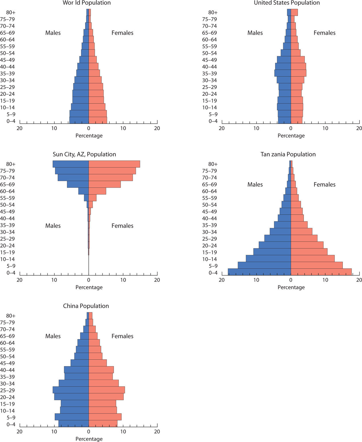
Thinking Geographically
Question
How do these pyramids help predict future population growth?
Thinking Geographically
Question
Which are the widest bars in the blue pyramid in the 10- to 20-year cohorts? What does the rapid narrowing of the blue pyramid after age 20 indicate? What problems result?
Geography of Gender
Geography of Gender
sex ratio The numerical ratio of males to females in a population.
Although the human race is divided almost evenly between females and males, geographical differences do occur in the sex ratio, the ratio between men and women in a population. Slightly more boys than girls are born, but infant boys have slightly higher mortality rates than do infant girls. Recently settled areas typically have more males than females. Examples of such areas are Alaska, northern Canada, and tropical Australia. At the latest census, males constituted 52 percent of Alaska’s inhabitants. By contrast, Rhode Island’s population was nearly 52 percent female. This figure reflects in part the state’s aging population, because statistically women outlive men. Globally, differentials in gender ratios can also be found. For example, states in Eastern Europe such as Russia, Ukraine, and Estonia all have populations wherein women significantly outnumber men. In Estonia, this figure reaches nearly 54 percent female. These imbalances are in large part due to the emigration of large numbers of young males from these countries in search of better economic opportunities elsewhere. The population pyramid is also useful in showing gender ratios. Note, for instance, the larger female populations in the upper bars for both the United States and Sun City, Arizona, in Figure 3.12.
gender role What it means to be a man and what it means to be a woman in different cultural and historical contexts.
Beyond such general patterns, gender often influences demographic traits in specific ways. Often, gender roles—culturally specific notions of what it means to be a man and what it means to be a woman—are closely tied to how many children are produced by couples. In many cultures, women are considered more womanly when they produce many offspring. Men are seen as more manly when they father many children. Because the raising of children often falls to women, the spaces that many cultures associate with women tend to be the private family spaces of the home. Public spaces such as streets, plazas, and the workplace, by contrast, are often associated with men. Some cultures go so far as to restrict where women and men may and may not go, resulting in a distinctive geography of gender. Falling fertility levels that coincide with higher levels of education for women, however, have resulted in numerous challenges to these cultural ideas of male and female spaces. As more and more women enter the workplace, for instance, ideas of where women should and should not go slowly become modified.
71
Standard of Living
Standard of Living
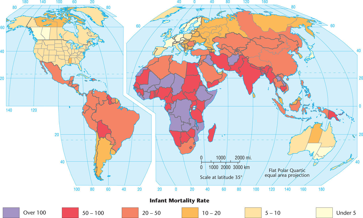
infant mortality rate The number of infants per thousand live births who die before reaching one year of age.
Various demographic traits can be used to assess standard of living and analyze it geographically. Figure 3.14 is a simple attempt to map living standards using the infant mortality rate: a measure of how many children per thousand population die before reaching one year of age. Many experts believe that the infant mortality rate is the best single index of living standards because it is affected by many factors: health, nutrition, sanitation, access to doctors, availability of clinics, education, ability to obtain medicines, and adequacy of housing. A vivid geographical pattern is revealed by the infant mortality rate.
Infant Mortality Rate
Thinking Geographically
Question
Why might infant mortality be the best measure of living standards?
72
Another good measure of quality of life is the United Nations HDI, or Human Development Index, which combines measures of literacy, life expectancy, education, and wealth (see Figure 3.12). The highest possible score is 1.000, and the two top-ranked countries in 2011 were Norway and Australia.
Examination of the HDI reveals some surprises. If all countries spent equally on those things that improve their HDI rankings, such as education and health care, then we would expect the wealthiest countries to place first on the list. According to the International Monetary Fund, the United States ranked fourth among 177 nations in wealth as measured by the gross domestic product, or GDP, per capita in 2006. Yet it ranked twelfth in the world on the HDI. Compare this to Barbados, which ranked forty-first by GDP per capita but came in much higher on the HDI at thirty-first. Why did Barbados rank higher in living standards than its monetary wealth would indicate, whereas the United States ranked lower? We would have to conclude that the government of Barbados places a relative priority on spending for education and health care, whereas the government of the United States does not.
Even more striking is the low standing of the United States when the Human Poverty Index, or HPI, is used. The HPI measures social and economic deprivation by examining the prevalence of factors such as low life expectancy, illiteracy, poverty, and unemployment. Among the world’s high-income countries, the United States ranks near the bottom, with only Italy and Ireland having larger numbers of deprived peoples.
Other Key Concepts in Population Geography
Other Key Concepts in Population Geography
In previous sections, we explored several key concepts used by population geographers to discuss and analyze population. The following are some other key concepts you may encounter:
-
Natural decrease: Calculated as the birthrate minus the death rate, this decrease results in fertility that is not high enough to replace a country or region’s population. In countries or regions experiencing this trend, population growth can occur only when net in-migration outweighs natural decrease.
natural decrease The birthrate minus the death rate.
absolute population density A country’s population divided by its total land area. Also known as arithmetic population density.
physiological population density A country’s population divided by its total arable land.
- Absolute population density: The population of a country divided by its total land area. This measure is also known as arithmetic population density.
-
Physiological population density: The population of a country divided by its total arable land (land that is suitable and/or available for agriculture). This measure provides insight into the relationship between a population and its available resources. Table 3.2 provides a comparison of absolute population density and physiological population density for selected countries.
Table 3.2:
Comparison of Absolute Population Density and Physiological Population Density for Selected Countries
Country Absolute Population Density (persons/square kilometer) Physiological Population Density (persons/square kilometer of arable land) Hong Kong 6,488 131,101 Kuwait 131 15,603 Oman 14 11,780 Iceland 3 4,229 Japan 339 2,924 Egypt 83 2,668 United Kingdom 250 1,077 China 140 943 United States 32 179 Canada 4 78 (Sources: Population Reference Bureau, World Population Data Sheet, 2011; CIA World Factbook, 2012.) -
Dependency ratio: Calculated as the number of dependent individuals (those under age 15 or over age 64) in a population divided by the number of productive individuals, expressed as a percentage. This measure provides insight into the pressure on the productive portion of a population to provide for its nonworking citizens.
dependency ratio The number of dependent individuals (those under age 15 or over age 64) in a population divided by the number of productive individuals, expressed as a percentage.
population growth rate The increase in a country’s population during a period of time (usually one year), expressed as a percentage of the population at the start of that period.
population doubling time The time it takes a population to double in size from any given numerical point. Determined by dividing the growth rate for a population into the number 72.
- Population growth rate: The increase in a country’s population during a period (usually one year), expressed as a percentage of the population at the start of that period. This measure reflects the number of births and deaths during that year as well as the number of people migrating to and from that country. A country’s population growth rate can be a negative number if death rates and out-migration have surpassed birthrates and in-migration for that year.
- Population doubling time: The time it takes a population to double in size from any given numerical point. This length of time is determined by dividing the population growth rate by the number 72. For example, the natural annual growth of the United States in 2007 was 0.6 percent. Dividing 72 by 0.6 yields 120, which means that the population of the United States will double every 120 years. This does not, however, factor in the relatively high levels of immigration to the United States, which will cause its population to double faster than every 120 years.
74
What about countries with faster rates of growth? Consider Guatemala, which is growing at 2.8 percent per year. Doing the math, we find that Guatemala’s population is doubling every 25.7 years!
Percentages such as 0.6 or 2.8 don’t sound like such high rates. If we were discussing your bank account rather than the populations of countries, you would hope that your money would double more quickly than every 25 years! (Incidentally, you can apply the rule of 72 to your bank account or to any other figure that grows at a steady annual rate.) You may be tempted to say, “There are only 12 million people in Guatemala, so it doesn’t really matter if its population is doubling quickly. What really matters is that at an annual increase of 1.7 percent, India’s 1 billion people will double to 2 billion in 42 years, and China’s 1.3 billion will double as fast as the U.S. population—every 120 years—but that will add another 1.3 billion to the world’s population, more than four times what the United States will add by doubling!”
This assessment is partly right and partly wrong, depending on your vantage point. Viewed at the global scale, it does indeed make a significant difference when China’s or India’s population doubles. But if you are a resident of Guatemala or an official of the Guatemalan government, a doubling of your country’s population every 25 years means that health care, education, jobs, fresh water, and housing must be supplied to twice as many people every 25 years.