The Demand Curve
How many pounds of cotton, packaged in the form of blue jeans, do consumers around the world want to buy in a given year? You might at first think that we can answer this question by multiplying the number of pairs of blue jeans purchased around the world each day by the amount of cotton it takes to make a pair of jeans, and then multiplying by 365. But that’s not enough to answer the question because how many pairs of jeans—
So the answer to the question “How many pounds of cotton do consumers want to buy?” depends on the price of a pound of cotton. If you don’t yet know what the price will be, you can start by making a table of how many pounds of cotton people would want to buy at a number of different prices. Such a table is known as a demand schedule. This, in turn, can be used to draw a demand curve, which is one of the key elements of the supply and demand model.
The Demand Schedule and the Demand Curve
A demand schedule shows how much of a good or service consumers will be willing and able to buy at different prices.
A demand schedule is a table that shows how much of a good or service consumers will want to buy at different prices. On the right side of Figure 5.1, we show a hypothetical demand schedule for cotton. It’s hypothetical in that it doesn’t use actual data on the world demand for cotton, and it assumes that all cotton is of equal quality.
| Figure 5.1 | The Demand Schedule and the Demand Curve |
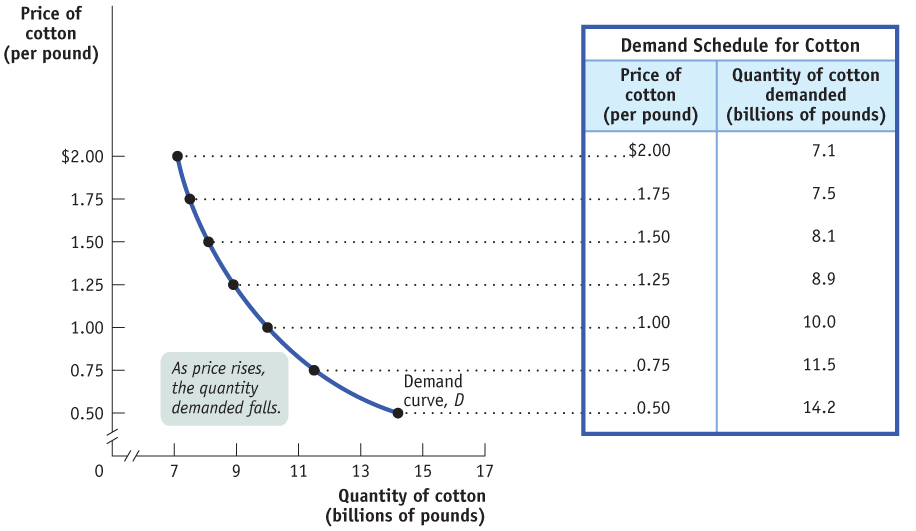
The quantity demanded is the actual amount of a good or service consumers are willing and able to buy at some specific price.
According to the table, if cotton costs $1 a pound, consumers around the world will want to purchase 10 billion pounds of cotton over the course of a year. If the price is $1.25 a pound, they will want to buy only 8.9 billion pounds; if the price is only $0.75 a pound, they will want to buy 11.5 billion pounds; and so on. So the higher the price, the fewer pounds of cotton consumers will want to purchase. In other words, as the price rises, the quantity demanded of cotton—
A demand curve is a graphical representation of the demand schedule. It shows the relationship between quantity demanded and price.
The graph in Figure 5.1 is a visual representation of the information in the table. The vertical axis shows the price of a pound of cotton and the horizontal axis shows the quantity of cotton in pounds. Each point on the graph corresponds to one of the entries in the table. The curve that connects these points is a demand curve, a graphical representation of the demand schedule, which is another way of showing the relationship between the quantity demanded and the price.
The law of demand says that a higher price for a good or service, all other things being equal, leads people to demand a smaller quantity of that good or service.
Note that the demand curve shown in Figure 5.1 slopes downward. This reflects the general proposition that a higher price reduces the quantity demanded. For example, jeans-
Shifts of the Demand Curve
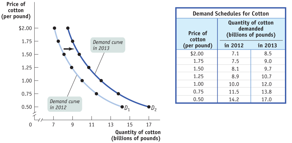
Even though cotton prices were higher in 2013 than they had been in 2012, total world consumption of cotton was higher in 2013. How can we reconcile this fact with the law of demand, which says that a higher price reduces the quantity demanded, all other things being equal?
AP® Exam Tip
In several common economics graphs including the graph of supply and demand, the dependent variable is on the vertical axis and the independent variable is on the horizontal axis. You learned the opposite convention in math and science classes, so graphing in economics may be a little difficult at first.
The answer lies in the crucial phrase all other things being equal. In this case, all other things weren’t equal: there were changes between 2012 and 2013 that increased the quantity of cotton demanded at any given price. For one thing, the world’s population increased by 77 million, and therefore the number of potential wearers of cotton clothing increased. In addition, higher incomes in countries like China allowed people to buy more clothing than before. These changes led to an increase in the quantity of cotton demanded at any given price. Figure 5.2 illustrates this phenomenon using the demand schedule and demand curve for cotton. (As before, the numbers in Figure 5.2 are hypothetical.)
| Figure 5.2 | An Increase in Demand |
AP® Exam Tip
A price change causes a change in the quantity demanded, shown by a movement along the demand curve. When a nonprice factor of demand changes, this changes demand, and therefore shifts the demand curve. It would be correct to say that an increase in the price of apples decreases the quantity of apples demanded; it would be incorrect to say that an increase in the price of apples decreases the demand for apples.
The table in Figure 5.2 shows two demand schedules. The first is a demand schedule for 2012, the same one shown in Figure 5.1. The second is a demand schedule for 2013. It differs from the 2012 demand schedule due to factors such as a larger population and higher incomes, factors that led to an increase in the quantity of cotton demanded at any given price. So at each price, the 2013 schedule shows a larger quantity demanded than the 2012 schedule. For example, the quantity of cotton consumers wanted to buy at a price of $1 per pound increased from 10 billion to 12 billion pounds per year, the quantity demanded at $1.25 per pound went from 8.9 billion to 10.7 billion pounds, and so on.
A change in demand is a shift of the demand curve, which changes the quantity demanded at any given price.
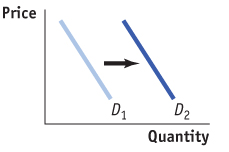
What is clear from this example is that the changes that occurred between 2012 and 2013 generated a new demand schedule, one in which the quantity demanded was greater at any given price than in the original demand schedule. The two curves in Figure 5.2 show the same information graphically. As you can see, the demand schedule for 2013 corresponds to a new demand curve, D2, that is to the right of the demand curve for 2012, D1. This change in demand shows the increase in the quantity demanded at any given price, represented by the shift in position of the original demand curve, D1, to its new location at D2.
A movement along the demand curve is a change in the quantity demanded of a good that is the result of a change in that good’s price.
It’s crucial to make the distinction between such changes in demand and movements along the demand curve, changes in the quantity demanded of a good that result from a change in that good’s price. Figure 5.3 illustrates the difference.
| Figure 5.3 | A Movement Along the Demand Curve Versus a Shift of the Demand Curve |
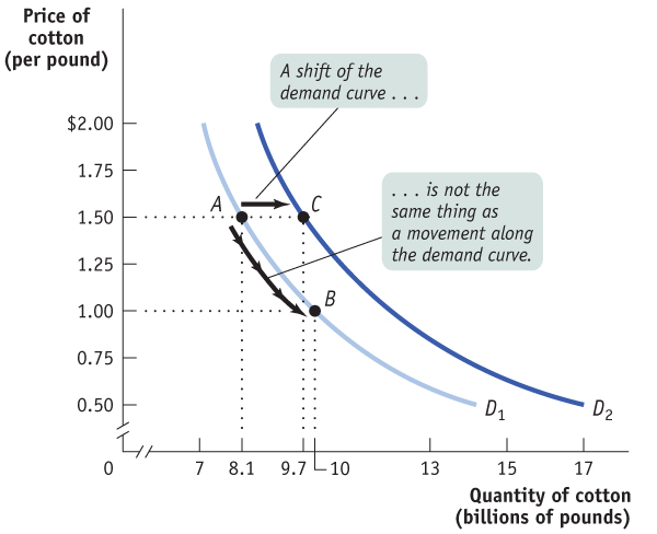
The movement from point A to point B is a movement along the demand curve: the quantity demanded rises due to a fall in price as you move down D1. Here, a fall in the price of cotton from $1.50 to $1 per pound generates a rise in the quantity demanded from 8.1 billion to 10 billion pounds per year. But the quantity demanded can also rise when the price is unchanged if there is an increase in demand—a rightward shift of the demand curve. This is illustrated in Figure 5.3 by the shift of the demand curve from D1 to D2. Holding the price constant at $1.50 a pound, the quantity demanded rises from 8.1 billion pounds at point A on D1 to 9.7 billion pounds at point C on D2.
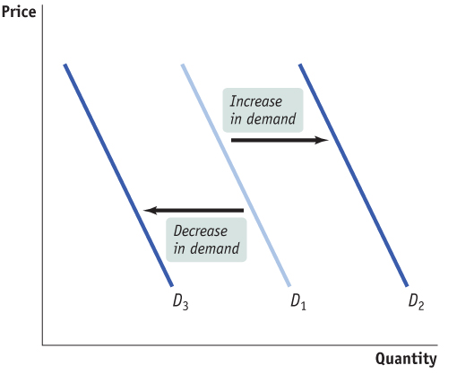
When economists talk about a “change in demand,” saying “the demand for X increased” or “the demand for Y decreased,” they mean that the demand curve for X or Y shifted—
AP® Exam Tip
When shifting curves, left is less and right is more.
Understanding Shifts of the Demand Curve

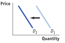
Figure 5.4 illustrates the two basic ways in which demand curves can shift. When economists talk about an “increase in demand,” they mean a rightward shift of the demand curve: at any given price, consumers demand a larger quantity of the good or service than before. This is shown by the rightward shift of the original demand curve D1 to D2. And when economists talk about a “decrease in demand,” they mean a leftward shift of the demand curve: at any given price, consumers demand a smaller quantity of the good or service than before. This is shown by the leftward shift of the original demand curve D1 to D3.
What caused the demand curve for cotton to shift? We have already mentioned two reasons: changes in population and income. If you think about it, you can come up with other things that would be likely to shift the demand curve for cotton. For example, suppose that the price of polyester rises. This will induce some people who previously bought polyester clothing to buy cotton clothing instead, increasing the demand for cotton.
| Figure 5.4 | Shifts of the Demand Curve |
There are five principal factors that shift the demand curve for a good or service:
Changes in the prices of related goods or services
Changes in income
Changes in tastes
Changes in expectations
Changes in the number of consumers
Although this is not an exhaustive list, it contains the five most important factors that can shift demand curves. So when we say that the quantity of a good or service demanded falls as its price rises, all other things being equal, we are in fact stating that the factors that shift demand are remaining unchanged. Let’s now explore, in more detail, how those factors shift the demand curve.
Changes in the Prices of Related Goods or Services While there’s nothing quite like a comfortable pair of all-
Two goods are substitutes if a rise in the price of one of the goods leads to an increase in the demand for the other good.
Two goods are complements if a rise in the price of one of the goods leads to a decrease in the demand for the other good.
But sometimes a fall in the price of one good makes consumers more willing to buy another good. Such pairs of goods are known as complements. Complements are usually goods that in some sense are consumed together: computers and software, cookies and milk, cars and gasoline. Because consumers like to consume a good and its complement together, a change in the price of one of the goods will affect the demand for its complement. In particular, when the price of one good rises, the demand for its complement decreases, shifting the demand curve for the complement to the left. So a rise in the price of cookies is likely to precipitate a leftward shift in the demand curve for milk, as people consume fewer snacks of cookies and milk. Likewise, when the price of one good falls, the quantity demanded of its complement rises, shifting the demand curve for the complement to the right. This means that if, for some reason, the price of cookies falls, we should see a rightward shift in the demand curve for milk, as people consume more cookies and more milk.
Changes in Income When individuals have more income, they are normally more likely to purchase a good at any given price. For example, if a family’s income rises, it is more likely to take that summer trip to Disney World—
When a rise in income increases the demand for a good—
When a rise in income decreases the demand for a good, it is an inferior good.
Why do we say “most goods,” rather than “all goods”? Most goods are normal goods—the demand for them increases when consumer income rises. However, the demand for some products falls when income rises. Goods for which demand decreases when income rises are known as inferior goods. Usually an inferior good is one that is considered less desirable than more expensive alternatives—
One example of the distinction between normal and inferior goods that has drawn considerable attention in the business press is the difference between so-
Changes in Tastes Why do people want what they want? Fortunately, we don’t need to answer that question—
For example, once upon a time men wore hats. Up until around World War II, a respectable man wasn’t fully dressed unless he wore a dignified hat along with his suit. But the returning soldiers adopted a more informal style, perhaps due to the rigors of the war. And President Eisenhower, who had been supreme commander of Allied Forces before becoming president, often went hatless. After World War II, it was clear that the demand curve for hats had shifted leftward, reflecting a decrease in the demand for hats.

Economists have little to say about the forces that influence consumers’ tastes. (Marketers and advertisers, however, have plenty to say about them!) However, a change in tastes has a predictable impact on demand. When tastes change in favor of a good, more people want to buy it at any given price, so the demand curve shifts to the right. When tastes change against a good, fewer people want to buy it at any given price, so the demand curve shifts to the left.
Changes in Expectations When consumers have some choice about when to make a purchase, current demand for a good is often affected by expectations about its future price. For example, savvy shoppers often wait for seasonal sales—
Changes in expectations about future income can also lead to changes in demand. If you learned today that you would inherit a large sum of money sometime in the future, you might borrow some money today and increase your demand for certain goods. On the other hand, if you learned that you would earn less in the future than you thought, you might reduce your demand for some goods and save more money today.
Changes in the Number of Consumers As we’ve already noted, one of the reasons for rising cotton demand between 2012 and 2013 was a growing world population. Because of population growth, overall demand for cotton would have risen even if the demand of each individual wearer of cotton clothing had remained unchanged.
An individual demand curve illustrates the relationship between quantity demanded and price for an individual consumer.
Let’s introduce a new concept: the individual demand curve, which shows the relationship between quantity demanded and price for an individual consumer. For example, suppose that Darla is a consumer of cotton blue jeans; also suppose that all blue jeans are the same, so they sell for the same price. Panel (a) of Figure 5.5 shows how many pairs of jeans she will buy per year at any given price per pound. Then DDarla is Darla’s individual demand curve.
| Figure 5.5 | Individual Demand Curves and the Market Demand Curve |
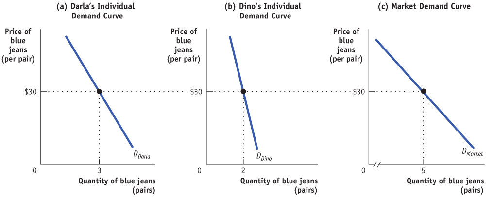
The market demand curve shows how the combined quantity demanded by all consumers depends on the market price of that good. (Most of the time, when economists refer to the demand curve, they mean the market demand curve.) The market demand curve is the horizontal sum of the individual demand curves of all consumers in that market. To see what we mean by the term horizontal sum, assume for a moment that there are only two consumers of blue jeans, Darla and Dino. Dino’s individual demand curve, DDino, is shown in panel (b). Panel (c) shows the market demand curve. At any given price, the quantity demanded by the market is the sum of the quantities demanded by Darla and Dino. For example, at a price of $30 per pair, Darla demands 3 pairs of jeans per year and Dino demands 2 pairs per year. So the quantity demanded by the market is 5 pairs per year.
AP® Exam Tip
A mnemonic to help you remember the factors that shift demand is TRIBE. Demand is shifted by changes in . . . Tastes and preferences, prices of Related goods Income, the number of Buyers, and Expectations.
Clearly, the quantity demanded by the market at any given price is larger with Dino present than it would be if Darla were the only consumer. The quantity demanded at any given price would be even larger if we added a third consumer, then a fourth, and so on. So an increase in the number of consumers leads to an increase in demand.
For an overview of the factors that shift demand, see Table 5.1.
Table 5.1 Factors That Shift Demand
| When this happens . . . | . . . demand increases | But when this happens . . . | . . . demand decreases |
| When the price of a substitute rises . . . |
|
When the price of a substiture falls . . . |
|
| When the price of a complement falls . . . |
|
When the price of a complement rises . . . |
|
| When income rises . . . |
|
When income falls . . . |
|
| When income falls . . . |
|
When income rises . . . |
|
| When tastes change in favor of a good . . . |
|
When tastes change against a good . . . |
|
| When the price is expected to rise in the future . . . |
|
When the price is expected to fall in the future . . . |
|
| When the number of consumers rises . . . |
|
When the number of consumers falls . . . |
|
Beating the Traffic
Beating the Traffic
All big cities have traffic problems, and many local authorities try to discourage driving in the crowded city center. If we think of an auto trip to the city center as a good that people consume, we can use the economics of demand to analyze anti-
One common strategy of local governments is to reduce the demand for auto trips by lowering the prices of substitutes. Many metropolitan areas subsidize bus and rail service, hoping to lure commuters out of their cars.
An alternative strategy is to raise the price of complements: several major U.S. cities impose high taxes on commercial parking garages, both to raise revenue and to discourage people from driving into the city. High tolls for bridges and tunnels going into cities such as New York serve the same purposes.
However, few cities have been willing to adopt the politically controversial direct approach: reducing congestion by raising the price of simply driving in the city. So it was a shock when, in 2003, London imposed a “congestion charge” on all cars entering the city center during business hours—
Compliance is monitored with automatic cameras that photograph license plates. People can either pay the charge in advance or pay it by midnight of the day they have driven. If they pay on the day after they have driven, the charge increases to £12 (about $20). And if they don’t pay and are caught, a fine of £130 (about $212) is imposed for each transgression. (A full description of the rules can be found at www.cclondon.com.)
Not surprisingly, the result of the new policy confirms the law of demand: three years after the charge was put in place, traffic in central London was about 10 percent lower than before the charge. In February 2007, the British government doubled the area of London covered by the congestion charge, and it suggested that it might institute congestion charging across the country by 2015. Several American and European municipalities, having seen the success of London’s congestion charge, have said that they are seriously considering adopting a congestion charge as well.