Economic Inequality
The United States is a rich country. In 2012, the average U.S. household had an income of more than $71,000, far exceeding the poverty threshold. How is it possible, then, that so many Americans still live in poverty? The answer is that income is unequally distributed, with many households earning much less than the average and others earning much more.
Table 78.2 shows the distribution of pre-
Table 78.2U.S. Income Distribution in 2012
| Income group | Income range | Average income | Percent of total income |
| Bottom quintile | Less than $20,599 | $11,490 | 3.2% |
| Second quintile | $20,599 to $39,764 | 29,696 | 8.3 |
| Third quintile | $39,764 to $64,582 | 51,179 | 14.4 |
| Fourth quintile | $64,582 to $104,096 | 82,098 | 23.0 |
| Top quintile | More than $104,096 | 181,905 | 51.0 |
| Top 5% | More than $191,156 | 318,052 | 22.3 |
| Mean Income = $71,274 | Median Income = $51,017 | ||
| Source: U.S. Census Bureau. | |||
For each group, Table 78.2 shows three numbers. The second column shows the range of incomes that define the group. For example, in 2012, the bottom quintile consisted of households with annual incomes of less than $20,599; the next quintile of households with incomes between $20,599 and $39,764; and so on. The third column shows the average income in each group, ranging from $11,490 for the bottom fifth to $318,052 for the top 5 percent. The fourth column shows the percentage of total U.S. income received by each group.
Mean household income is the average income across all households.
Median household income is the income of the household lying in the middle of the income distribution.
At the bottom of Table 78.2 are two useful numbers for thinking about the incomes of American households. Mean household income, also called average household income, is the total income of all U.S. households divided by the number of households. Median household income is the income of a household in the exact middle of the income distribution—
AP® Exam Tip
The Course Description published for AP® Economics teachers by the College Board recommends coverage of the Lorenz curve and the Gini coefficient. Although you will not need to calculate the Gini coefficient, you may need to interpret Gini coefficient values for the AP® exam.
What we learn from Table 78.2 is that income in the United States is quite unequally distributed. The average income of the poorest fifth of families is less than a quarter of the average income of families in the middle, and the richest fifth have an average income more than three times that of families in the middle. On average, the incomes of the richest fifth of the population are about 15 times as high as those of the poorest fifth. In fact, the distribution of income in America has become more unequal since 1980, rising to a level that has made it a significant political issue. The FYI at the end of this section discusses long-
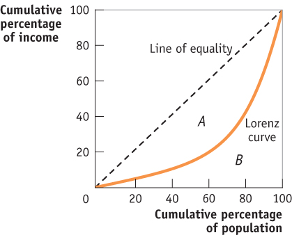
The Lorenz curve shows the percentage of all income received by the poorest members of the population, from the poorest 0% to the poorest 100%.
We can visualize income inequality with the Lorenz curve as shown in Figure 78.2. The Lorenz curve indicates the percentage of all income received by the poorest members of the population, starting from the poorest 0% who receive 0% of the income and ending with the poorest 100% who receive 100% of the income. If income were equally distributed—
| Figure 78.2 | The Lorenz Curve |
The Gini coefficient is a number that summarizes a country’s level of income inequality based on how unequally income is distributed.
It’s often convenient to have a single number that summarizes a country’s level of income inequality. The Gini coefficient, the most widely used measure of inequality, is the ratio of area A in Figure 78.2, between the line of equality and the Lorenz curve, to area B, below the line of equality. So we have
Gini coefficient = A/(A + B)
A country with a perfectly equal distribution of income would have a Gini coefficient of 0, because the Lorenz curve would follow the line of equality, and area A would be zero. At the other extreme, the highest possible value for the Gini coefficient is 1—
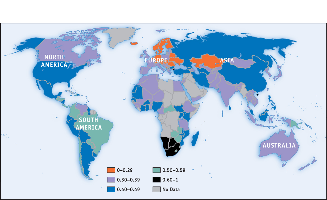
One way to get a sense of what Gini coefficients mean in practice is to look at international comparisons. Figure 78.3 shows the most recent estimates of the Gini coefficient for many of the world’s countries. Aside from a few countries in Africa, the highest levels of income inequality are found in Latin America; countries with a high degree of inequality, such as Brazil, have Gini coefficients close to 0.6. The most equal distributions of income are in Europe, especially in Scandinavia; countries with very equal income distributions, such as Sweden, have Gini coefficients around 0.25. Compared to other wealthy countries, the United States, with a Gini coefficient of 0.477 in 2012, has unusually high inequality, though it isn’t as unequal as in Latin America.
| Figure 78.3 | Income Inequality Around the World |
Long-Term Trends in Income Inequality in the United States
Long-Term Trends in Income Inequality in the United States
Does inequality tend to rise, fall, or stay the same over time? The answer is yes—
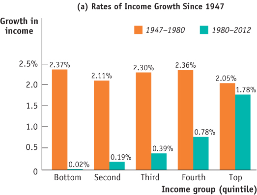
Detailed U.S. data on income by quintiles, as shown in Table 78.2, are only available starting in 1947. The figure shows the annual rate of growth of income, adjusted for inflation, for each quintile over two periods: from 1947 to 1980, and from 1980 to 2012. There’s a clear difference between the two periods. In the first period, income within each group grew at about the same rate—
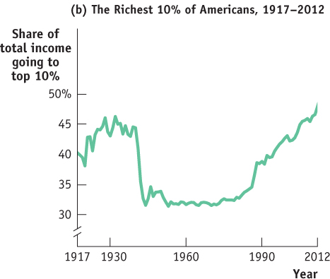
Although detailed data on income distribution aren’t available before 1947, economists have instead used other information including income tax data to estimate the share of income going to the top 10% of the population all the way back to 1917. Panel (b) of the figure shows this measure from 1917 to 2012. These data, like the more detailed data available since 1947, show that American inequality was more or less stable between 1947 and the late 1970s but has risen substantially since. The longer-
The Great Compression roughly coincided with World War II, a period during which the U.S. government imposed special controls on wages and prices. Evidence indicates that these controls were applied in ways that reduced inequality—
Since the 1970s, as we’ve already seen, inequality has increased substantially. In fact, pre-
All of these explanations, however, fail to account for one key feature: much of the rise in inequality doesn’t reflect a rising gap between highly educated workers and those with less education, but rather growing differences among highly educated workers themselves. For example, schoolteachers and top business executives have similarly high levels of education, but executive paychecks have risen dramatically and teachers’ salaries have not. For some reason, the economy now pays a few “superstars”—a group that includes literal superstars in the entertainment world but also such groups as Wall Street traders and top corporate executives—
How serious an issue is income inequality? In a direct sense, high income inequality means that some people don’t share in a nation’s overall prosperity. As we’ve seen, rising inequality explains how it’s possible that the U.S. poverty rate has failed to fall for the past 35 years even though the country as a whole has become considerably richer. Also, extreme inequality, as found in Latin America, is often associated with political instability, because of tension between a wealthy minority and the rest of the population.
It’s important to realize, however, that the data shown in Table 78.2 overstate the true degree of inequality in America, for several reasons. One is that the data represent a snapshot for a single year, whereas the incomes of many individual families fluctuate over time. That is, many of those near the bottom in any given year are having an unusually bad year and many of those at the top are having an unusually good one. Over time, their incomes will revert to a more normal level. So a table showing average incomes within quintiles over a longer period, such as a decade, would not show as much inequality. Furthermore, a family’s income tends to vary over its life cycle: most people earn considerably less in their early working years than they will later in life, and then experience a considerable drop in income when they retire. Consequently, the numbers in Table 78.2, which combine young workers, mature workers, and retirees, show more inequality than would a table that compares families of similar ages.
Despite these qualifications, there is a considerable amount of genuine inequality in the United States. Moreover, the fact that families’ incomes fluctuate from year to year isn’t entirely good news. Measures of inequality in a given year do overstate true inequality. But those year-