Poverty, Inequality, and Public Policy
The welfare state is the collection of government programs designed to alleviate economic hardship.
During World War II, a British clergyman gave a speech in which he contrasted the “warfare state” of Nazi Germany, dedicated to conquest, with Britain’s “welfare state,” dedicated to serving the welfare of its people. Since then, the term welfare state has come to refer to the collection of government programs that are designed to alleviate economic hardship. A large share of the government spending of all wealthy countries consists of government transfers—payments by the government to individuals and families—
A government transfer is a government payment to an individual or a family.
The Logic of the Welfare State
There are three major economic rationales for the creation of the welfare state. We’ll turn now to a discussion of each.
1. Alleviating Income Inequality Suppose that the Taylor family, which has an income of only $15,000 a year, were to receive a government check for $1,500. This check might allow the Taylors to afford a better place to live, eat a more nutritious diet, or in other ways significantly improve their quality of life. Also suppose that the Fisher family, which has an income of $300,000 a year, were to face an extra tax of $1,500. This probably wouldn’t make much difference to their quality of life: at worst, they might have to give up a few minor luxuries.
A poverty program is a government program designed to aid the poor.
This hypothetical exchange illustrates the first major rationale for the welfare state: alleviating income inequality. Because a marginal dollar is worth more to a poor person than a rich one, modest transfers from the rich to the poor will do the rich little harm but benefit the poor a lot. So, according to this argument, a government that plays Robin Hood, taking from the rich to give to the poor, does more good than harm. Programs that are designed to aid the poor are known as poverty programs.
2. Alleviating Economic Insecurity The second major rationale for the welfare state is alleviating economic insecurity. Imagine ten families, each of which can expect an income next year of $50,000 if nothing goes wrong. But suppose the odds are that something will go wrong for one of the families, although nobody knows which one. For example, suppose each of the families has a one in ten chance of experiencing a sharp drop in income because one family member is laid off or incurs large medical bills. And assume that this event will produce severe hardship for the family—
A social insurance program is a government program designed to provide protection against unpredictable financial distress.
Now suppose there’s a government program that provides aid to families in distress, paying for that aid by taxing families that are having a good year. Arguably, this program will make all the families better off, because even families that don’t currently receive aid from the program might need it at some point in the future. Each family will therefore feel safer knowing that the government stands ready to help when disaster strikes. Programs designed to provide protection against unpredictable financial distress are known as social insurance programs.
These two rationales for the welfare state, alleviating income inequality and alleviating economic insecurity, are closely related to the ability-
JUSTICE AND THE WELFARE STATE
In 1971 the philosopher John Rawls published A Theory of Justice, the most famous attempt to date to develop a theory of economic fairness. He asked readers to imagine deciding economic and social policies behind a “veil of ignorance” about their own identity. That is, suppose you knew you would be a human being but did not know whether you would be rich or poor, healthy or sick, and so on. Rawls argued that the policies that would emerge if people had to make decisions behind the veil of ignorance define what we mean by economic justice. It’s sort of a generalized version of the Golden Rule: do unto others as you would have them do unto you if you were in their place.
Rawls further argued that people behind the veil of ignorance would choose policies that placed a high value on the well-
Three years after Rawls published his book, another philosopher, Robert Nozick, published Anarchy, State, and Utopia, which is often considered the libertarian response. Nozick argued that justice is a matter of rights, not results, and that the government has no right to force people with high incomes to support others with lower incomes. He argued for a minimal government that enforces the law and provides security—
Philosophers, of course, don’t run the world. But real-
3. Reducing Poverty and Providing Access to Health Care The third and final major rationale for the welfare state involves the social benefits of poverty reduction and access to health care, especially when applied to children of poor households. Researchers have documented that such children, on average, suffer lifelong disadvantage. Even after adjusting for ability, children from economically disadvantaged backgrounds are more likely to be underemployed or unemployed, engage in crime, and to suffer chronic health problems—
More broadly, as the following For Inquiring Minds explains, some political philosophers argue that principles of social justice demand that society take care of the poor and unlucky. Others disagree, arguing that welfare state programs go beyond the proper role of government. To an important extent, the difference between those two philosophical positions defines what we mean in politics by “liberalism” and “conservatism.”
But before we get carried away, it’s important to realize that things aren’t quite that cut and dried. Even conservatives who believe in limited government typically support some welfare state programs. And even economists who support the goals of the welfare state are concerned about the effects of large-
We’ll turn to the costs and benefits of the welfare state later in this chapter. First, however, let’s examine the problems the welfare state is supposed to address.
The Problem of Poverty
For at least the past 75 years, every U.S. president has promised to do his best to reduce poverty. In 1964 President Lyndon Johnson went so far as to declare a “war on poverty,” creating a number of new programs to aid the poor. Antipoverty programs account for a significant part of the U.S. welfare state, although social insurance programs are an even larger part.
The poverty threshold is the annual income below which a family is officially considered poor.
But what, exactly, do we mean by poverty? Any definition is somewhat arbitrary. Since 1965, however, the U.S. government has maintained an official definition of the poverty threshold, a minimum annual income that is considered adequate to purchase the necessities of life. Families whose incomes fall below the poverty threshold are considered poor.
The official poverty threshold depends on the size and composition of a family. In 2014 the poverty threshold for an adult living alone was $11,670; for a household consisting of two adults and two children, it was $23,850.
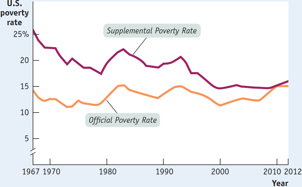
Trends in Poverty Contrary to popular misconceptions, although the official poverty threshold is adjusted each year to reflect changes in the cost of living, it has not been adjusted upward over time to reflect the long-
Somewhat surprisingly, however, this hasn’t happened. The orange line in Figure 18-1 shows the official U.S. poverty rate—the percentage of the population living below the poverty threshold—
18-1
Trends in the U.S. Poverty Rate, 1967-
The poverty rate is the percentage of the population living below the poverty threshold.
But have we really made no progress at all in reducing poverty since the 1960s? Researchers both inside and outside the government have identified a number of limitations to the official poverty measure, of which the most important is that the definition of income doesn’t actually include many forms of government aid. For example, it excludes the monetary value of food stamps. In response to criticisms leveled at the limitations, the U.S. Census Bureau has begun releasing a Supplemental Poverty Measure that includes these sources of income while deducting certain expenses. For this reason, experts consider this measure to be more accurate. The burgundy line in Figure 18-1 shows how this measure has changed over time. It shows more progress than the standard measure, but still surprisingly little considering that GDP—
Who Are the Poor? Many Americans probably hold a stereotyped image of poverty: an African-
In 2013, 45.3 million Americans were in poverty—
There is also a correlation between family makeup and poverty. Female-
What really stands out in the data, however, is the association between poverty and inadequate employment. Adults who work full time are very unlikely to be poor: only 2.7% of full-
What Causes Poverty? Poverty is often blamed on lack of education, and educational attainment clearly has a strong positive effect on income level—
Lack of proficiency in English is also a barrier to higher income. For example, Mexican-
And it’s important not to overlook the role of racial and gender discrimination; although less pervasive today than 50 years ago, discrimination still erects formidable barriers to advancement for many Americans. Non-
In addition, one important source of poverty that should not be overlooked is bad luck. Many families find themselves impoverished when a wage-
Consequences of Poverty The consequences of poverty are often severe, particularly for children. In 2013, 19.9% of children in the United States lived in poverty. Poverty is often associated with lack of access to health care, which can lead to further health problems that erode the ability to attend school and work later in life. Affordable housing is also frequently a problem, leading poor families to move often, disrupting school and work schedules. Recent medical studies have shown that children raised in severe poverty tend to suffer from lifelong learning disabilities. As a result, American children growing up in or near poverty don’t have an equal chance at the starting line: they tend to be at a disadvantage throughout their lives. Even talented children who come from poor families are unlikely to finish college.
Table 18-1 shows the results of a long-
18-1
Percent of Eighth-Graders Finishing College, 1988
|
Parents’ socioeconomic status |
Mathematics test score in bottom quartile |
Mathematics test score in top quartile |
|---|---|---|
|
Parents in bottom quartile |
3% |
29% |
|
Parents in top quartile |
30 |
74 |
|
Source: National Center for Education Statistics, The Condition of Education 2003, p. 47. |
||
As you can see, the results were disturbing: among students who were in the highest-
| Income, Redistribution, and Inequality in Rich Countries |
Spend some time traveling around the United States, then spend some more time traveling around Sweden and Denmark. You’ll almost surely come away with the impression that Scandinavia has substantially less income inequality than America, that the rich aren’t as rich and the poor aren’t as poor. And the numbers confirm this impression: Gini coefficients, a number that summarizes a country’s level of income inequality, for Sweden and Denmark, and indeed for most of Western Europe, are substantially lower than in the United States. But why?
The answer, to a large extent, is the role of government, which, in the United States, plays a significant role in redistributing income away from those with the highest incomes to those who earn the least. But European nations have substantially bigger welfare states than we do, and do a lot more income redistribution.
The accompanying figure shows two measures of the Gini coefficient for a number of rich countries. A country with a perfectly equal income distribution—
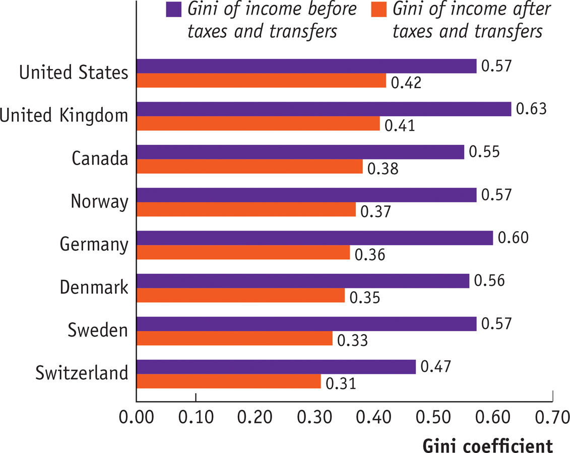
There are some caveats to this conclusion. On one side, the data probably don’t do a very good job of tracking very high incomes, which are probably a bigger factor in the United States than elsewhere. On the other side, European welfare states may indirectly increase measured income inequality through their effects on incentives. Still, the data strongly suggest that differences in inequality among rich countries largely reflect different policies rather than differences in the underlying economic situation. We’ll have more to say about Gini coefficients shortly.
Source: Luxembourg Income Study.
Economic Inequality
The United States is a rich country. In 2007, before the recession hit, the average U.S. household had an income (in 2012 prices) of $74,869, far exceeding the poverty threshold. Even after a devastating recession followed by a sluggish recovery, average household income in 2013 was $72,641. How is it possible, then, that so many Americans still live in poverty? The answer is that income is unequally distributed, with many households earning much less than the average and others earning much more.
Table 18-2 shows the distribution of pre-
18-2
U.S. Income Distribution in 2013
|
Income group |
Income range |
Average income |
Percent of total income |
|---|---|---|---|
|
Bottom quintile |
Less than $20,900 |
$11,657 |
3.2% |
|
Second quintile |
$20,900 to $40,187 |
30,127 |
8.3 |
|
Third quintile |
$40,187 to $65,501 |
51,933 |
14.4 |
|
Fourth quintile |
$65,501 to $105,910 |
83,291 |
23.0 |
|
Top quintile |
More than $105,910 |
184,548 |
51.0 |
|
Top 5% |
More than $196,000 |
322,674 |
22.2 |
|
Mean income = $72,641 |
Median income = $51,939 |
||
|
Source: U.S. Census Bureau. |
|||
For each group, Table 18-2 shows three numbers. The second column shows the income ranges that define the group. For example, in 2013, the bottom quintile consisted of households with annual incomes of less than $20,900, the next quintile of households had incomes between $20,900 and $40,187, and so on. The third column shows the average income in each group, ranging from $11,657 for the bottom fifth to $322,674 for the top 5%. The fourth column shows the percentage of total U.S. income received by each group.
Mean household income is the average income across all households.
Mean versus Median Household Income At the bottom of Table 18-2 are two useful numbers for thinking about the incomes of American households. Mean household income, also called average household income, is the total income of all U.S. households divided by the number of households. Median household income is the income of a household in the exact middle of the income distribution—
Median household income is the income of the household lying at the exact middle of the income distribution.
Economists often illustrate the difference by asking people first to imagine a room containing several dozen more or less ordinary wage-
This example helps explain why economists generally regard median income as a better guide to the economic status of typical American families than mean income: mean income is strongly affected by the incomes of a relatively small number of very-
What we learn from Table 18-2 is that income in the United States is quite unequally distributed. The average income of the poorest fifth of families is less than a quarter of the average income of families in the middle, and the richest fifth have an average income more than three times that of families in the middle. The incomes of the richest fifth of the population are, on average, about 15 times as high as those of the poorest fifth. In fact, the distribution of income in America has become more unequal since 1980, rising to a level that has made it a significant political issue. The upcoming Economics in Action discusses long-
The Gini coefficient is a number that summarizes a country’s level of income inequality based on how unequally income is distributed across quintiles.
The Gini Coefficient It’s often convenient to have a single number that summarizes a country’s level of income inequality. The Gini coefficient, the most widely used measure of inequality, is based on how disparately income is distributed across the quintiles (as we learned in the preceding Global Comparison). A country with a perfectly equal distribution of income—
One way to get a sense of what Gini coefficients mean in practice is to look at international comparisons. Figure 18-2 shows recent estimates of the Gini coefficient for many of the world’s countries. Aside from a few countries in Africa, the highest levels of income inequality are found in Latin America, especially Colombia; countries with a high degree of inequality have Gini coefficients close to 0.6. The most equal distributions of income are in Europe, especially in Scandinavia; countries with very equal income distributions, such as Sweden, have Gini coefficients around 0.25. Compared to other wealthy countries, as of 2012 the United States, with a Gini coefficient of 0.47, has unusually high inequality, though it isn’t as unequal as in Latin America.
18-2
Income Inequality Around the World
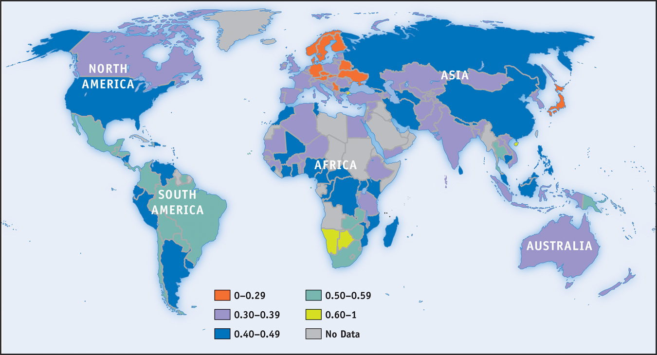
How serious an issue is income inequality? In a direct sense, high income inequality means that some people don’t share in a nation’s overall prosperity. As we’ve seen, rising inequality explains how it’s possible that the U.S. poverty rate has failed to fall for the past 40 years even though the country as a whole has become considerably richer. Also, extreme inequality, as found in Latin America, is often associated with political instability because of tension between a wealthy minority and the rest of the population.
It’s important to realize, however, that the data shown in Table 18-2 overstate the true degree of inequality in America, for several reasons. One is that the data represent a snapshot for a single year, whereas the incomes of many individual families fluctuate over time. That is, many of those near the bottom in any given year are having an unusually bad year and many of those at the top are having an unusually good one. Over time, their incomes will revert to a more normal level. So a table showing average incomes within quintiles over a longer period, such as a decade, would not show as much inequality.
Furthermore, a family’s income tends to vary over its life cycle: most people earn considerably less in their early working years than they will later in life, then experience a considerable drop in income when they retire. Consequently, the numbers in Table 18-2, which combine young workers, mature workers, and retirees, show more inequality than would a table that compares families of similar ages.
Despite these qualifications, there is a considerable amount of genuine inequality in the United States. In fact, inequality not only persists for long periods of time for individuals, it extends across generations. The children of poor parents are much more likely to be poor than the children of affluent parents, and vice versa—
Economic Insecurity As we stated earlier, although the rationale for the welfare state rests in part on the social benefits of reducing poverty and inequality, it also rests in part on the benefits of reducing economic insecurity, which afflicts even relatively well-
One form economic insecurity takes is the risk of a sudden loss of income, which usually happens when a family member loses a job and either spends an extended period without work or is forced to take a new job that pays considerably less. In a given year, according to recent estimates, about one in six American families will see their income cut in half from the previous year. Related estimates show that the percentage of people who find themselves below the poverty threshold for at least one year over the course of a decade is several times higher than the percentage of people below the poverty threshold in any given year.
Even if a family doesn’t face a loss in income, it can face a surge in expenses. Until implementation of the Affordable Care Act in 2014, the most common reason for such surges was a medical problem that required expensive treatment, such as heart disease or cancer. In fact, in 2013 it was estimated that 60 percent of the personal bankruptcies of Americans were due to medical expenses. The rise in medical-
ECONOMICS in Action: Long-term Trends in Income Inequality in the United States
Long-
Does inequality tend to rise, fall, or stay the same over time? The answer is yes—
Detailed U.S. data on income by quintiles, as shown in Table 18-2, are only available starting in 1947. Panel (a) of Figure 18-3 shows the annual rate of growth of income, adjusted for inflation, for each quintile over two periods: from 1947 to 1980, and from 1980 to 2013. There’s a clear difference between the two periods. In the first period, income within each group grew at about the same rate—
18-3
Trends in U.S. Income Inequality
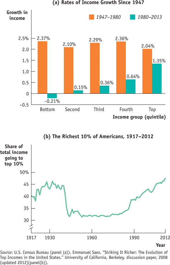
After 1980, however, incomes grew much more quickly at the top than in the middle, and more quickly in the middle than at the bottom. So inequality has increased substantially since 1980. Overall, inflation-
Although detailed data on income distribution aren’t available before 1947, economists have instead used other information like income tax data to estimate the share of income going to the top 10% of the population all the way back to 1917. Panel (b) of Figure 18-3 shows this measure from 1917 to 2012. These data, like the more detailed data available since 1947, show that American inequality was more or less stable between 1947 and the late 1970s but has risen substantially since.
The longer-
The Great Compression roughly coincided with World War II, a period during which the U.S. government imposed special controls on wages and prices. Evidence indicates that these controls were applied in ways that reduced inequality—
Since the 1970s, as we’ve already seen, inequality has increased substantially. In fact, pre-
There is intense debate among economists about the causes of this widening inequality. The most popular explanation is rapid technological change, which has increased the demand for highly skilled or talented workers more rapidly than the demand for other workers, leading to a rise in the wage gap between the highly skilled and other workers. Growing international trade may also have contributed by allowing the United States to import labor-
All these explanations, however, fail to account for one key feature: much of the rise in inequality doesn’t reflect a rising gap between highly educated workers and those with less education but rather growing differences among highly educated workers themselves. For example, schoolteachers and top business executives have similarly high levels of education, but executive paychecks have risen dramatically and teachers’ salaries have not. For some reason, a few “superstars”—a group that includes literal superstars in the entertainment world but also such groups as Wall Street traders and top corporate executives—
Quick Review
Welfare state programs, which include government transfers, absorb a large share of government spending in wealthy countries.
The ability-
to- pay principle explains one rationale for the welfare state: alleviating income inequality. Poverty programs do this by aiding the poor. Social insurance programs address the second rationale: alleviating economic insecurity. The external benefits to society of poverty reduction and access to health care, especially for children, is a third rationale for the welfare state. The official U.S. poverty threshold is adjusted yearly to reflect changes in the cost of living but not in the average standard of living. But even though average income has risen significantly, the U.S. poverty rate is no lower than it was 30 years ago.
The causes of poverty can include lack of education, the legacy of racial and gender discrimination, and bad luck. The consequences of poverty are dire for children.
Median household income is a better indicator of typical household income than mean household income. Comparisons of Gini coefficients across countries shows that the United States has less income inequality than poor countries but more than all other rich countries.
The United States has seen declining and increasing income inequality. Since 1980, income inequality has increased substantially, largely due to increased inequality among highly educated workers.
18-1
Question 18.1
Indicate whether each of the following programs is a poverty program or a social insurance program.
A pension guarantee program, which provides pensions for retirees if they have lost their employment-
based pension due to their employer’s bankruptcy A pension guarantee program is a social insurance program. The possibility of an employer declaring bankruptcy and defaulting on its obligation to pay employee pensions creates insecurity. By providing pension income to those employees, such a program alleviates this source of economic insecurity.The federal program known as SCHIP, which provides health care for children in families that are above the poverty threshold but still have relatively low income
The SCHIP program is a poverty program. By providing health care to children in low-income households, it targets its spending specifically to the poor.The Section 8 housing program, which provides housing subsidies for low-
income households The Section 8 housing program is a poverty program. By targeting its support to low-income households, it specifically helps the poor.The federal flood program, which provides financial help to communities hit by major floods
The federal flood program is a social insurance program. For many people, the majority of their wealth is tied up in the home they own. The potential for a loss of that wealth creates economic insecurity. By providing assistance to those hit by a major flood, the program alleviates this source of insecurity.
Question 18.2
Recall that the poverty threshold is not adjusted to reflect changes in the standard of living. As a result, is the poverty threshold a relative or an absolute measure of poverty? That is, does it define poverty according to how poor someone is relative to others or according to some fixed measure that doesn’t change over time? Explain.
The poverty threshold is an absolute measure of poverty. It defines individuals as poor if their incomes fall below a level that is considered adequate to purchase the necessities of life, irrespective of how well other people are doing. And that measure is fixed: in 2014, for instance, it took $11,670 for an individual living alone to purchase the necessities of life, regardless of how well-off other Americans were. In particular, the poverty threshold is not adjusted for an increase in living standards: even if other Americans are becoming increasingly well-off over time, in real terms (that is, how many goods an individual at the poverty threshold can buy) the poverty threshold remains the same.Question 18.3
The accompanying table gives the distribution of income for a very small economy.
Income
Sephora
$39,000
Kelly
17,500
Raul
900,000
Vijay
15,000
Oskar
28,000
What is the mean income? What is the median income? Which measure is more representative of the income of the average person in the economy? Why?
To determine mean (or average) income, we take the total income of all individuals in this economy and divide it by the number of individuals. Mean income is ($39,000 + $17,500 + $900,000 + $15,000 + $28,000)/5 = $999,500/5 = $199,900. To determine median income, look at the accompanying table, which ranks the five individuals in order of their income.
Income
Vijay
$15,000
Kelly
17,500
Oskar
28,000
Sephora
39,000
Raul
900,000
The median income is the income of the individual in the exact middle of the income distribution: Oskar, with an income of $28,000. So the median income is $28,000.
Median income is more representative of the income of individuals in this economy: almost everyone earns income between $15,000 and $39,000, close to the median income of $28,000. Only Raul is the exception: it is his income that raises the mean income to $199,900, which is not representative of most incomes in this economy.What income range defines the first quintile? The third quintile?
The first quintile is made up of the 20% (or one-fifth) of individuals with the lowest incomes in the economy. Vijay makes up the 20% of individuals with the lowest incomes. His income is $15,000, so that is the average income of the first quintile. Oskar makes up the 20% of individuals with the third-lowest incomes. His income is $28,000, so that is the average income of the third quintile.
Question 18.4
Which of the following statements more accurately reflects the principal source of rising inequality in the United States today?
The salary of the manager of the local branch of Sunrise Bank has risen relative to the salary of the neighborhood gas station attendant.
The salary of the CEO of Sunrise Bank has risen relative to the salary of the local branch bank manager, although the two have similar education levels.
As the Economics in Action pointed out, much of the rise in inequality reflects growing differences among highly educated workers. That is, workers with similar levels of education earn very dissimilar incomes. As a result, the principal source of rising inequality in the United States today is reflected by statement b: the rise in the bank CEO’s salary relative to that of the branch manager.
Solutions appear at back of book.