14.2 Interpretation and Prediction
In this section, we explore how the logic of regression is already a part of our everyday reasoning. Then we discuss why regression doesn’t allow us to designate causation as we interpret data; for instance, MSU researchers could not say that spending more time on Facebook caused students to bridge more social capital with more online connections. This discussion of causation then leads us to a familiar warning about interpreting the meaning of regression, this time due to the process called regression to the mean. Finally, we learn how to calculate effect sizes so we can make interpretations about how well a regression equation predicts behavior.
Regression and Error
For many different reasons, predictions are full of errors, and that margin of error is factored into the regression analysis. For example, we might predict that a student would get a certain grade based on how many classes she skipped, but we could be wrong in our prediction. Other factors, such as her intelligence, the amount of sleep she got the night before, and the number of related classes she’s taken all are likely to affect her grade as well. The number of skipped classes is highly unlikely to be a perfect predictor.
Errors in prediction lead to variability—
The Standard Error of the Estimate
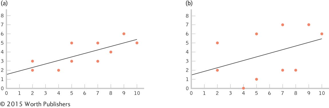
Data points clustered closely around the line of best fit, as in graph (a), are described by a small standard error of the estimate. Data points clustered far away from the line of best fit, as in graph (b), are described by a large standard error of the estimate. We have a high level of confidence in the predictive ability of the independent variable when the data points are tightly clustered around the line of best fit, as in (a). That is, there is much less error. And we have a low level of confidence in the predictive ability of the independent variable when the data points vary widely around the line of best fit, as in (b). That is, there is much more error.
The standard error of the estimate is a statistic that indicates the typical distance between a regression line and the actual data points.
The amount of error around the line of best fit can be quantified. The number that describes how far away, on average, the data points are from the line of best fit is called the standard error of the estimate, a statistic that indicates the typical distance between a regression line and the actual data points. The standard error of the estimate is essentially the standard deviation of the actual data points around the regression line. We usually get the standard error of the estimate using software, so its calculation is not covered here.
Applying the Lessons of Correlation to Regression
In addition to understanding the ways in which regression can help us, it is important to understand the limitations associated with using regression. It is extremely rare that the data analyzed in a regression equation are from a true experiment (one that used randomization to assign participants to conditions). Typically, we cannot randomly assign participants to conditions when the independent variable is a scale variable (rather than a nominal variable), as is usually the case with regression. So, the results are subject to the same limitations in interpretation that we discussed with respect to correlation.
In Chapter 13, we introduced the A-
In fact, regression, like correlation, can be wildly inaccurate in its predictions. As with the Pearson correlation coefficient, a good statistician questions causality after the statistical analysis (to identify potential confounding variables). But one more source of error can affect fair-
Regression to the Mean
In the study that we considered earlier in this chapter (Ruhm, 2006), economic factors predicted several indicators of health. The study also reported that “the drop in tobacco use disproportionately occurs among heavy smokers, the fall in body weight among the severely obese, and the increase in exercise among those who were completely inactive” (p. 2). What Ruhm describes captures the meaning of the word regression, as defined by its early proponents. Those who were most extreme on a given variable regressed (toward the mean). In other words, they became somewhat less extreme on that variable.
MASTERING THE CONCEPT
14-
Francis Galton (Darwin’s cousin) was the first to describe the phenomenon of regression to the mean, and he did so in a number of contexts (Bernstein, 1996). For example, Galton asked nine people—
Similarly, among people, Galton documented that, although tall parents tend to have taller-

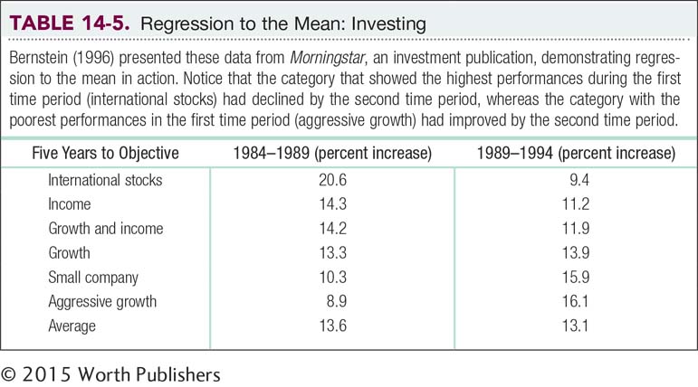
An understanding of regression to the mean can help us make better choices in our daily lives. For example, regression to the mean is a particularly important concept to remember when we begin to save for retirement and have to choose the specific allocations of our savings. Table 14-5 shows data from Morningstar, an investment publication. The percentages represent the increase in that investment vehicle over two 5-
Proportionate Reduction in Error
The proportionate reduction in error is a statistic that quantifies how much more accurate predictions are when we use the regression line instead of the mean as a prediction tool; also called the coefficient of determination.
In the previous section, we developed a regression equation to predict a final exam score from number of absences. Now we want to know: How good is this regression equation? Is it worth having students use this equation to predict their own final exam grades from the numbers of classes they plan to skip? To answer this question, we calculate a form of effect size, the proportionate reduction in error—a statistic that quantifies how much more accurate predictions are when we use the regression line instead of the mean as a prediction tool. (Note that the proportionate reduction in error is sometimes called the coefficient of determination.) More specifically, the proportionate reduction in error is a statistic that quantifies how much more accurate predictions are when scores are predicted using a specific regression equation rather than when the mean is just predicted for everyone.
Earlier in this chapter, we noted that if we did not have a regression equation, the best we could do is predict the mean for everyone, regardless of number of absences. The average final exam grade for students in this sample is 76. With no further information, we could only tell our students that our best guess for their statistics grade is a 76. There would obviously be a great deal of error if we predicted the mean for everyone. Using the mean to estimate scores is a reasonable way to proceed if that’s all the information we have. But the regression line provides a more precise picture of the relation between variables, so using a regression equation reduces error.
Less error is the same thing as having a smaller standard error of the estimate. And a smaller standard error of the estimate means that we’d be doing much better in our predictions than if we had a larger one; visually, this means that the actual scores are closer to the regression line. And with a larger standard error of the estimate, we’d be doing much worse in our predictions than if we had a smaller one; visually, the actual scores are farther away from the regression line.
But we can do more than just quantify the standard deviation around the regression line. We can determine how much better the regression equation is compared to the mean: We calculate the proportion of error that we eliminate by using the regression equation, rather than the mean, to make a prediction. (In this next section, we learn the long way to calculate this proportion in order to understand exactly what the proportion represents. Then we learn a shortcut.)
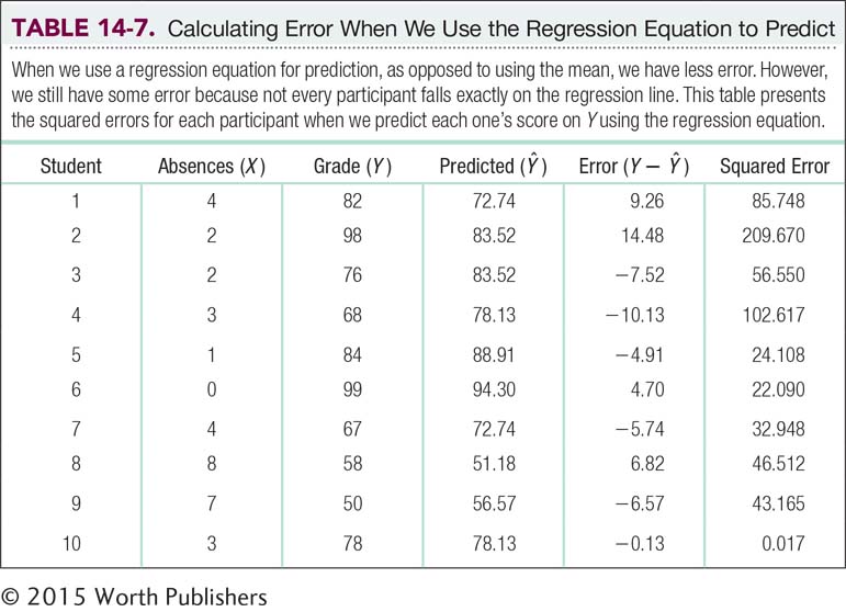
EXAMPLE 14.5
Using a sample, we can calculate the amount of error from using the mean as a predictive tool. We quantify that error by determining how far off a person’s score on the dependent variable (final exam grade) is from the mean, as seen in the column labeled “Error (Y – MY)” in Table 14-6.
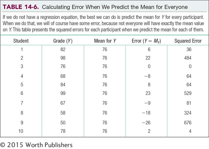
For example, for student 1, the error is 82 – 76 = 6. We then square these errors for all 10 students and sum them. This is another type of sum of squares: the sum of squared errors. Here, the sum of squared errors is 2262 (the sum of the values in the “Squared Error” column). This is a measure of the error that would result if we predicted the mean for every person in the sample. We’ll call this particular type of sum of squared errors the sum of squares total, SStotal, because it represents the worst-
Visualizing Error
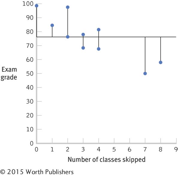
A graph with a horizontal line for the mean, 76, allows us to visualize the error that would result if we predicted the mean for everyone. We draw lines for each person’s point on a scatterplot to the mean. Those lines are a visual representation of error.
The regression equation can’t make the predictions any worse than they would be if we just predicted the mean for everyone. But it’s not worth the time and effort to use a regression equation if it doesn’t lead to a substantial improvement over just predicting the mean. As we can with the mean, we can calculate the amount of error from using the regression equation with the sample. We can then see how much better we do with the regression equation than with the mean.
First, we calculate what we would predict for each student if we used the regression equation. We do this by plugging each X into the regression equation. Here are the calculations using the equation Ŷ = 94.30 – 5.39(X):
Ŷ = 94.30 – 5.39(4); Ŷ = 72.74
Ŷ = 94.30 – 5.39(2); Ŷ = 83.52
Ŷ = 94.30 – 5.39(2); Ŷ = 83.52
Ŷ = 94.30 – 5.39(3); Ŷ = 78.13
Ŷ = 94.30 – 5.39(1); Ŷ = 88.91
Ŷ = 94.30 – 5.39(0); Ŷ = 94.30
Ŷ = 94.30 – 5.39(4); Ŷ = 72.74
Ŷ = 94.30 – 5.39(8); Ŷ = 51.18
Ŷ = 94.30 – 5.39(7); Ŷ = 56.57
Ŷ = 94.30 – 5.39(3); Ŷ = 78.13
The Ŷ’s, or predicted scores for Y, that we just calculated are presented in Table 14-7, where the errors are calculated based on the predicted scores rather than the mean. For example, for student 1, the error is the actual score minus the predicted score: 82 – 72.74 = 9.26. As before, we square the errors and sum them. The sum of squared errors based on the regression equation is 623.425. We call this the sum of squared errors, SSerror, because it represents the error that we’d have if we predicted Y using the regression equation.
As before, we can visualize this error on a graph that includes the regression line, as seen in Figure 14-6. We again add the actual points, as in a scatterplot, and we draw vertical lines from each point to the regression line. These vertical lines give us a visual sense of the error that results from predicting Y for everyone using the regression equation. Notice that these vertical lines in Figure 14-6 tend to be shorter than those connecting each person’s point with the mean in Figure 14-5.
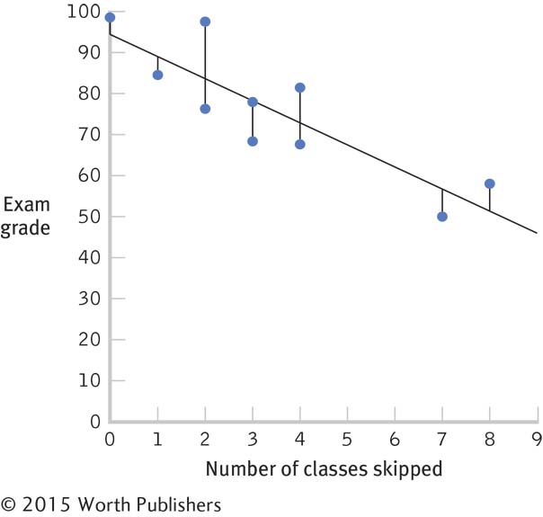
Visualizing Error
A graph that depicts the regression line allows us to visualize the error that would result if we predicted Y for everyone using the regression equation. We draw lines for each person’s point on a scatterplot to the regression line. Those lines are a visual representation of error.
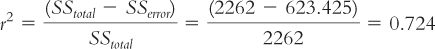
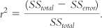
So how much better did we do? The error we predict by using the mean for everyone in this sample is 2262. The error we predict by using the regression equation for everyone in this sample is 623.425. Remember that the measure of how well the regression equation predicts is called the proportionate reduction in error. What we want to know is how much error we have gotten rid of—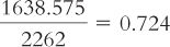 .
.
We have reduced 0.724, or 72.4%, of the original error by using the regression equation versus using the mean to predict Y. This ratio can be calculated using an equation that represents what we just calculated: the proportionate reduction in error, symbolized as:
To recap, we simply have to do the following:
MASTERING THE FORMULA
14-
We can interpret the proportionate reduction in error as we did the effect-
Determine the error associated with using the mean as the predictor.
Determine the error associated with using the regression equation as the predictor.
Subtract the error associated with the regression equation from the error associated with the mean.
Divide the difference (calculated in step 3) by the error associated with using the mean.
The proportionate reduction in error tells us how good the regression equation is. Here is another way to state it: The proportionate reduction in error is a measure of the amount of variance in the dependent variable that is explained by the independent variable. Did you notice the symbol for the proportionate reduction in error? The symbol is r2. Perhaps you see the connection with another number we have calculated. Yes, we could simply square the correlation coefficient!
MASTERING THE CONCEPT
14-
The longer calculations are necessary, however, to see the difference between the error in prediction from using the regression equation and the error in prediction from simply predicting the mean for everyone. Once you have calculated the proportionate reduction in error the long way a few times, you’ll have a good sense of exactly what you’re calculating. In addition to the relation of the proportionate reduction in error to the correlation coefficient, it also is the same as another number we’ve calculated—
Because the proportionate reduction in error can be calculated by squaring the correlation coefficient, we can have a sense of the amount of error that would be reduced simply by looking at the correlation coefficient. A correlation coefficient that is high in magnitude, whether negative or positive, indicates a strong relation between two variables. If two variables are highly related, it makes sense that one of them would be a good predictor of the other. And it makes sense that when we use one variable to predict the other, we’re going to reduce error.
CHECK YOUR LEARNING
| Reviewing the Concepts |
|
|||||||||||||||||||
| Clarifying the Concepts | 14- |
Distinguish the standard error of the estimate around the line of best fit from the error of prediction around the mean. | ||||||||||||||||||
| 14- |
Explain how, for regression, the strength of the correlation is related to the proportionate reduction in error. | |||||||||||||||||||
| Calculating the Statistics | 14- |
Data are provided here with means, standard deviations, a correlation coefficient, and a regression equation: r = –0.77, Ŷ = 7.846 – 0.431(X).
|
||||||||||||||||||
| Applying the Concepts | 14- |
Many athletes and sports fans believe that an appearance on the cover of Sports Illustrated (SI) is a curse. Players or teams, shortly after appearing on the cover of SI, often have a particularly poor performance. This tendency is documented in the pages of (what else?) Sports Illustrated and even has a name, the “SI jinx” (Wolff, 2002). In fact, of 2456 covers, SI counted 913 “victims.” And their potential victims have noticed: After the New England Patriots football team won their league championship, their coach at the time, Bill Parcells, called his daughter, then an SI staffer, and ordered: “No cover.” Using your knowledge about the limitations of regression, what would you say to Coach Parcells? |
Solutions to these Check Your Learning questions can be found in Appendix D.