
Chapter 1
1.1 Data from samples are used in inferential statistics to make an inference about the larger population.
1.2
The average grade for your statistics class would be a descriptive statistic because it’s being used only to describe the tendency of people in your class with respect to a statistics grade.
In this case, the average grade would be an inferential statistic because it is being used to estimate the results of a population of students taking statistics.
1.3
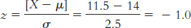
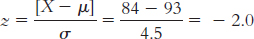
1500 Americans
All Americans
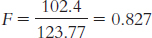
The 1500 Americans in the sample know 600 people, on average.
The entire population of Americans has many acquaintances, on average. The sample mean, 600, is an estimate of the unknown population mean.
1.4 Discrete observations can take on only specific values, usually whole numbers; continuous observations can take on a full range of values.
1.5
These data are continuous because they can take on a full range of values.
The variable is a ratio observation because there is a true zero point.
On an ordinal scale, Lorna’s score would be 2 (or 2nd).
1.6
The nominal variable is gender. This is a nominal variable because the levels of gender, male and female, have no numerical meaning even if they are arbitrarily labeled 1 and 2.
The ordinal variable is hair length. This is an ordinal variable because the three levels of hair length (short, mid-
length, and very long) are arranged in order, but we do not know the magnitude of the differences in length. The scale variable is probability score. This is a scale variable because the distances between probability scores are assumed to be equal.
1.7 Independent; dependent
1.8
There are two independent variables: beverage and subject to be remembered. The dependent variable is memory.
Beverage has two levels: caffeine and no caffeine. The subject to be remembered has three levels: numbers, word lists, and aspects of a story.
1.9
Whether or not trays were available
Trays were available; trays were not available.
Food waste; food waste could have been measured via volume or weight as it was thrown away.
The measure of food waste would be consistent over time.
The measure of food waste was actually measuring how much food was wasted.
1.10 Experimental research involves random assignment to conditions; correlational research examines associations where random assignment is not possible and variables are not manipulated.
1.11 Random assignment helps to distribute confounding variables evenly across all conditions so that the levels of the independent variable are what truly vary across groups or conditions.
1.12 Rank in high school class and high school grade point average (GPA) are good examples.
1.13
Researchers could randomly assign a certain number of women to be told about a gender difference on the test and randomly assign a certain number of other women to be told that no gender difference existed on this test.
If researchers did not use random assignment, any gender differences might be due to confounding variables. The women in the two groups might be different in some way (e.g., in math ability or belief in stereotypes) to begin with.
There are many possible confounds. Women who already believed the stereotype might do so because they had always performed poorly in mathematics, whereas those who did not believe the stereotype might be those who always did particularly well in math. Women who believed the stereotype might be those who were discouraged from studying math because “girls can’t do math,” whereas those who did not believe the stereotype might be those who were encouraged to study math because “girls are just as good as boys in math.”
Math performance is operationalized as scores on a math test.
Researchers could have two math tests that are similar in difficulty. All women would take the first test after being told that women tend not to do as well as men on this test. After taking that test, they would be given the second test after being told that women tend to do as well as men on this test.
Chapter 2
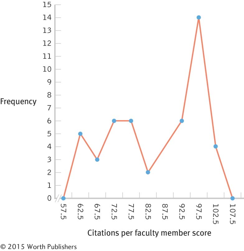
2.1 Frequency tables, grouped frequency tables, histograms, and frequency polygons
2.2 A frequency is a count of how many times a score appears. A grouped frequency is a count for a defined interval, or group, of scores.
2.3
Interval Frequency 100– 104 4 95– 99 14 90– 94 6 85– 89 4 80– 84 2 75– 79 6 70– 74 6 65– 69 3 60– 64 5 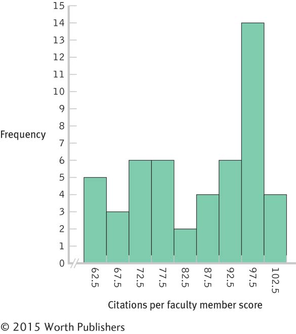
2.4
We can now get a sense of the overall pattern of the data.
Schools in different academic systems may place different emphases on faculty conducting independent research and getting published, as well as have varying ranges of funding or financial resources to assist faculty research and publication.
2.5 A normal distribution is a specific distribution that is symmetric around a center high point: It looks like a bell. A skewed distribution is asymmetric or lopsided to the left or to the right, with a long tail of data to one side.
2.6 Negative; positive
2.7 This distribution is negatively skewed due to the data trailing off to the left and the bulk of the data clustering together on the right.
2.8
Early-
onset Alzheimer’s disease would create negative skew in the distribution for age of onset. Because all humans eventually die, there is a sort of ceiling effect.
2.9 Being aware of these exceptional early-
Chapter 3
3.1 The purpose of a graph is to reveal and clarify relations between variables.
3.2 Five miles per gallon change (from 22 to 27) and 
3.3 The graph on the left is misleading. It shows a sharp decline in annual traffic deaths in Connecticut from 1955 to 1956, but we cannot draw valid conclusions from just two data points. The graph on the right is a more accurate and complete depiction of the data. It includes nine, rather than two, data points and suggests that the sharp 1-
3.4 Scatterplots and line graphs both depict the relation between two scale variables.
3.5 We should typically avoid using pictorial graphs and pie charts because the data can almost always be presented more clearly in a table or in a bar graph.
3.6 The line graph known as a time plot, or time series plot, allows us to calculate or evaluate how a variable changes over time.
3.7
A scatterplot is the best graph choice to depict the relation between two scale variables such as depression and stress.
A time plot, or time series plot, is the best graph choice to depict the change in a scale variable, such as the rise or decline in the number of facilities over time.
Page D-3For one scale variable, such as number of siblings, the best graph choice would be either a frequency histogram or frequency polygon.
In this case, there is a nominal variable (region of the United States) and a scale variable (years of education). The best choice would be a bar graph, with one bar depicting the mean years of education for each region. In a Pareto chart, the bars would be arranged from highest to lowest, allowing for easier comparisons.
Calories and hours are both scale variables, and the question is about prediction rather than relation. In this case, we would calculate and graph a line of best fit.
3.8 Chartjunk is any unnecessary information or feature in a graph that detracts from the viewer’s understanding.
3.9
Scatterplot or line graph
Bar graph
Scatterplot or line graph
3.10
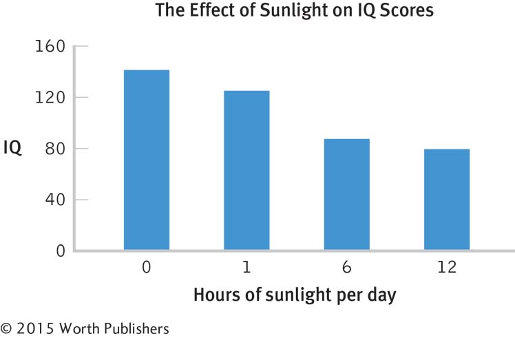
The accompanying graph improves on the chartjunk graph in several ways. First, it has a clear, specific title. Second, all axes are labeled left to right. Third, there are no abbreviations. The units of measurement, IQ and hours of sunlight per day, are included. The y-axis has 0 as its minimum, the colors are simple and muted, and all chartjunk has been eliminated. This graph wasn’t as much fun to create, but it offers a far clearer presentation of the data! (Note: We are treating hours as an ordinal variable.)
Chapter 4
4.1 Statistics are calculated for samples; they are usually symbolized by Latin letters (e.g., M ). Parameters are calculated for populations; they are usually symbolized by Greek letters (e.g., μ).
4.2 An outlier has the greatest effect on the mean, because the calculation of the mean takes into account the numeric value of each data point, including that outlier.
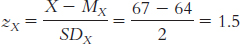
4.3

= [10 + 8 + 22 + 5 + 6 + 1 + 19 + 8 + 13 + 12 + 8]/11
= 112/11 = 10.18
The median is found by arranging the scores in numeric order—
1, 5, 6, 8, 8, 8, 10, 12, 13, 19, 22— then dividing the total number of scores, 11, by − and adding 1/2 to get 6. The 6th score in our ordered list of scores is the median, and in this case the 6th score is the number 8. The mode is the most common score. In these data, the score 8 occurs most often (three times), so 8 is our mode.
-
= (122.5 + 123.8 + 121.2 + 125.8 + 120.2 + 123.8 + 120.5 + 119.8 + 126.3 + 123.6)/10
= 122.7/10 = 122.75
The data ordered are: 119.8, 120.2, 120.5, 121.2, 122.5, 123.6, 123.8, 123.8, 125.8, 126.3. Again, we find the median by ordering the data and then dividing the number of scores (here there are 10 scores) by − and adding 1/2. In this case, we get 5.5, so the mean of the 5th and 6th data points is the median. The median is (122.5 1 123.6)/2 5 123.05.
The mode is 123.8, which occurs twice in these data.
-
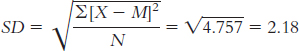
= (0.100 + 0.866 + 0.781 + 0.555 + 0.222 + 0.245 + 0.234)/7
= 3.003/7 = 0.429.
Note that three decimal places are included here (rather than the standard two places used throughout this book) because the data are carried out to three decimal places.
The median is found by first ordering the data: 0.100, 0.222, 0.234, 0.245, 0.555, 0.781, 0.866. Then the total number of scores, 7, is divided by − to get 3.5, to which 1/2 is added to get 4. So, the 4th score, 0.245, is the median. There is no mode in these data. All scores occur once.
4.4
-
= (1 + 0 + 1 + − + 5 + ...4 + 6)/20 = 50/20 = 2.50
In this case, the scores would comprise a sample taken from the whole population, and this mean would be a statistic. The symbol, therefore, would be either M or X.
In this case, the scores would constitute the entire population of interest, and the mean would be a parameter. Thus, the symbol would be m.
To find the median, we would arrange the scores in order: 0, 0, 1, 1, 1, 1, 2, 2, 2, 2, 2, 2, 3, 3, 3, 3, 4, 5, 6, 7. We would then divide the total number of scores, 20, by 2 and add 1/2, which is 10.5. The median, therefore, is the mean of the 10th and 11th scores. Both of these scores are 2; therefore, the median is 2.
The mode is the most common score—
in this case, there are six 2’s, so the mode is 2. The mean is a little higher than the median. This indicates that there are potential outliers pulling the mean higher; outliers would not affect the median.
4.5 By incorrectly labeling the debate as a regular edition of the newsmagazine program, the mean number of viewers for the show would be much higher as a result of the outlier from this special programming event, thus resulting in more advertising dollars for NBC.
4.6 Variability is the concept of variety in data, often measured as deviation around some center.
4.7 The range tells us the span of the data, from highest to lowest score. It is based on just two scores. The standard deviation tells us how far the typical score falls from the mean. The standard deviation takes every score into account.
4.8
The range is: Xhighest − Xlowest = 22 − 1 = 21
The variance is:
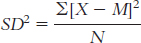
We start by calculating the mean, which is 10.182. We then calculate the deviation of each score from the mean and the square of that deviation.
X X − M (X − M )2 10 −0.182 0.033 8 −2.182 4.761 22 11.818 139.665 5 −5.182 26.853 6 −4.182 17.489 1 −9.182 84.309 19 8.818 77.757 8 −2.182 4.761 13 2.818 7.941 12 1.818 3.305 8 −2.182 4.761 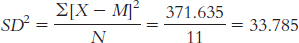
The standard deviation is:
 or
or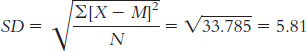
The range is: Xhighest − Xlowest = 126.3 − 119.8 = 6.5
The variance is:

We start by calculating the mean, which is 122.750. We then calculate the deviation of each score from the mean and the square of that deviation.
X X − M (X − M )2 122.500 −0.250 0.063 123.800 1.050 1.103 121.200 −1.550 2.403 125.800 3.050 9.303 120.200 −2.550 6.503 123.800 1.050 1.103 120.500 −2.250 5.063 119.800 −2.950 8.703 126.300 3.550 12.603 123.600 0.850 0.723 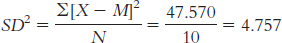
The standard deviation is:
The range is: Xhighest − Xlowest = 0.866 − 0.100 = 0.766
The variance is:
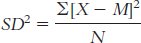
We start by calculating the mean, which is 0.429. We then calculate the deviation of each score from the mean and the square of that deviation.
X X − M (X − M)2 0.100 −0.329 0.108 0.866 0.437 0.191 0.781 0.352 0.124 0.555 0.126 0.016 0.222 −0.207 0.043 0.245 −0.184 0.034 0.234 −0.195 0.038 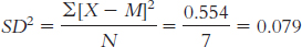
The standard deviation is:
or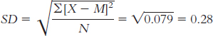
4.9
range = Xhighest − Xlowest = 1460 − 450 = 1010
We do not know whether scores cluster at some point in the distribution—
for example, near one end of the distribution— or whether the scores are more evenly spread out. Page D-5The formula for variance is
The first step is to calculate the mean, which is 927.500. We then create three columns: one for the scores, one for the deviations of the scores from the mean, and one for the squares of the deviations.
X X − M (X − M )2 450 −477.50 228,006.25 670 −257.50 66,306.25 1130 202.50 41,006.25 1460 532.50 283,556.25 We can now calculate variance:
= (228,006.25 + 66,306.25 + 41,006.25 + 283,556.25)/4
= 618,875/4 = 154,718.75.
We calculate standard deviation the same way we calculate variance, but we then take the square root.
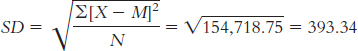
If the researcher were interested only in these four students, these scores would represent the entire population of interest, and the variance and standard deviation would be parameters. Therefore, the symbols would be s2 and s, respectively.
If the researcher hoped to generalize from these four students to all students at the university, these scores would represent a sample, and the variance and standard deviation would be statistics. Therefore, the symbols would be SD2, s2, or MS for variance and SD or s for standard deviation.
Chapter 5
5.1 The risks of sampling are that we might not have a representative sample, and sometimes it is difficult to know whether the sample is representative. If we didn’t realize that the sample was not representative, then we might draw conclusions about the population that are inaccurate.
5.2 The numbers in the fourth row, reading across, are 59808 08391 45427 26842 83609 49700 46058. Each person is assigned a number from 01 to 80. We then read the numbers from the table as two-
5.3 Reading down from the first column, then the second, and so on, noting only the appearance of 0’s and 1’s, we see the numbers 0, 0, 0, 0, 1, and 0 (ending in the sixth column). Using these numbers, we could assign the first through the fourth people and the sixth person to the group designated as 0, and the fifth person to the group designated as 1. If we want an equal number of people in each of the two groups, we would assign the first three people to the 0 group and the last three to the 1 group, because we pulled three 0’s first.
5.4
The likely population is all patients who will undergo surgery; the researcher would not be able to access this population, and therefore random selection could not be used. Random assignment, however, could be used. The psychologist could randomly assign half of the patients to counseling and half to a control group.
The population is all children in this school system; the psychologist could identify all of these children and thus could use random selection. The psychologist could also use random assignment. She could randomly assign half the children to the interactive online textbook and half to the printed textbook.
The population is patients in therapy; because the whole population could not be identified, random selection could not be used. Moreover, random assignment could not be used. It is not possible to assign people to either have or not have a diagnosed personality disorder.
5.5 We regularly make personal assessments about how probable we think an event is, but we base these evaluations on the opinions about things rather than on systematically collected data. Statisticians are interested in objective probabilities that are based on unbiased research.
5.6
probability = successes/trials = 5/100 = 0.05
8/50 = 0.16
130/1044 = 0.12
5.7
In the short run, we might see a wide range of numbers of successes. It would not be surprising to have several in a row or none in a row. In the short run, the observations seem almost like chaos.
Given the assumptions listed for this problem, in the long run, we’d expect 0.50, or 50%, to be women, although there would likely be strings of men and of women along the way.
5.8 When we reject the null hypothesis, we are saying we reject the idea that there is no mean difference in the dependent variable across the levels of our independent variable. Rejecting the null hypothesis means we can support the research hypothesis that there is a mean difference.
5.9 The null hypothesis assumes that no mean difference would be observed, so the mean difference in grades would be zero.
5.10
The null hypothesis is that a decrease in temperature does not affect mean academic performance (or does not decrease mean academic performance).
The research hypothesis is that a decrease in temperature does affect mean academic performance (or decreases mean academic performance).
The researchers would reject the null hypothesis.
The researchers would fail to reject the null hypothesis.
5.11 We make a Type I error when we reject the null hypothesis but the null hypothesis is correct. We make a Type II error when we fail to reject the null hypothesis but the null hypothesis is false.
5.12 In this scenario, a Type I error would be imprisoning a person who is really innocent, and 7 convictions out of 280 innocent people calculates to be 0.025, or 2.5%.
5.13 In this scenario, a Type II error would be failing to convict a guilty person, and 11 acquittals for every 35 guilty people calculates to be 0.314, or 31.4%.
5.14
If the virtual-
reality glasses really don’t have any effect, this is a Type I error, which is made when the null hypothesis is rejected but is really true. If the virtual-
reality glasses really do have an effect, this is a Type II error, which is made when the researchers fail to reject the null hypothesis but the null hypothesis is not true.
Chapter 6
6.1 Unimodal means there is one mode or high point to the curve. Symmetric means the left and right sides of the curve have the same shape and are mirror images of each other.
6.2
6.3 The shape of the distribution becomes more normal as the size of the sample increases (although the larger sample appears to be somewhat negatively skewed).
6.4 In standardization, we convert individual scores to standardized scores for which we know the percentiles.
6.5 The numeric value tells us how many standard deviations a score is from the mean of the distribution. The sign tells us whether the score is above or below the mean.
6.6
6.7
X = z(σ) + µ = 2(2.5) + 14 = 19
X = z(σ) + µ = − 1.4(2.5) + 14 = 10.5
6.8
 approximately 16% of students have a CFC score of 2.5 or less.
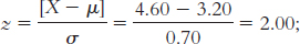 this score is at approximately the 98th percentile.
This student has a z score of 1.
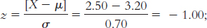
X = z(σ) + µ = 1(0.70) + 3.20 = 3.90; this answer makes sense because 3.90 is above the mean of 3.20, as a z score of 1 would indicate.
6.9
Nicole is in better health because her score is above the mean for her measure, whereas Samantha’s score is below the mean.
Samantha’s z score is
Nicole’s z score is
Nicole is in better health, being 1 standard deviation above the mean, whereas Samantha is − standard deviations below the mean.
We can conclude that approximately 98% of the population is in better health than Samantha, who is − standard deviations below the mean. We can conclude that approximately 16% of the population is in better health than Nicole, who is 1 standard deviation above the mean.
6.10 The central limit theorem asserts that a distribution of sample means approaches the shape of the normal curve as sample size increases. It also asserts that the spread of the distribution of sample means gets smaller as the sample size gets larger.
6.11 A distribution of means is composed of many means that are calculated from all possible samples of a particular size from the same population.
6.12 
6.13
The scores range from 2.0 to 4.5, which gives us a range of 4.5 − 2.0 = 2.5.
Page D-7The means are 3.4 for the first row, 3.4 for the second row, and 3.15 for the third row [e.g., for the first row, M = (3.5 + 3.5 + 3.0 + 4.0 + 2.0 + 4.0 + 2.0 + 4.0 + 3.5 + 4.5)/10 = 3.4]. These three means range from 3.15 to 3.40, which gives us a range of 3.40 − 3.15 = 0.25.
The range is smaller for the means of samples of 10 scores than for the individual scores because the more extreme scores are balanced by lower scores when samples of 10 are taken. Individual scores are not attenuated in that way.
The mean of the distribution of means will be the same as the mean of the individual scores: µM = µ = 3.32. The standard error will be smaller than the standard deviation; we must divide by the square root of the sample size of 10:
Chapter 7
7.1 We need to know the mean, m, and the standard deviation, s, of the population.
7.2 Raw scores are used to compute z scores, and z scores are used to determine what percentage of scores fall below and above that particular position on the distribution. A z score can also be used to compute a raw score.
7.3 Because the curve is symmetric, the same percentage of scores (41.47%) lies between the mean and a z score of −1.37 as between the mean and a z score of 1.37.
7.4 Fifty percent of scores fall below the mean, and 12.93% fall between the mean and a z score of 0.33.
50% + 12.93% = 62.93%
7.5
µM = µ = 156.8
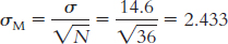
50% below the mean; 49.87% between the mean and this score; 50 + 49.87 = 99.87th percentile
100 − 99.87 = 0.13% of samples of this size scored higher than the students at Baylor.
At the 99.87th percentile, these 36 students from Baylor are truly outstanding. If these students are representative of their majors, clearly these results reflect positively on Baylor’s psychology and neuroscience department.
7.6 For most parametric hypothesis tests, we assume that (1) the dependent variable is assessed on a scale measure—
7.7 If a test statistic is more extreme than the critical value, then the null hypothesis is rejected. If a test statistic is less extreme than the critical value, then we fail to reject the null hypothesis.
7.8 If the null hypothesis is true, he will reject it 8% of the time.
7.9
0.15
0.03
0.055
7.10
(1) The dependent variable—
diagnosis (correct versus incorrect)—is nominal, not scale, so this assumption is not met. Based only on this, we should not proceed with a hypothesis test based on a z distribution. (2) The samples include only outpatients seen over 2 specific months and only those at one community mental health center. The sample is not randomly selected, so we must be cautious about generalizing from it. (3) The populations are not normally distributed because the dependent variable is nominal. (1) The dependent variable, health score, is likely scale. (2) The participants were randomly selected; all wild cats in zoos in North America had an equal chance of being selected for this study. (3) The data are not normally distributed; we are told that a few animals had very high scores, so the data are likely positively skewed. Moreover, there are fewer than 30 participants in this study. It is probably not a good idea to proceed with a hypothesis test based on a z distribution.
7.11 A directional test indicates that either a mean increase or a mean decrease in the dependent variable is hypothesized, but not both. A nondirectional test does not indicate a direction of mean difference for the research hypothesis, just that there is a mean difference.
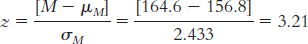
7.12 µM = µ = 1090
7.13 
7.14 Step 1: Population 1 is coffee drinkers who spend the day in coffee shops. Population 2 is all coffee drinkers in the United States. The comparison distribution will be a distribution of means. The hypothesis test will be a z test because we have only one sample and we know the population mean and standard deviation. This study meets two of the three assumptions and may meet the third. The dependent variable, the number of cups coffee drinkers drank, is scale. In addition, there are more than 30 participants in the sample, indicating that the comparison distribution is normal. The data were not randomly selected, however, so we must be cautious when generalizing.
Step 2: The null hypothesis is that people who spend the day working in the coffee shop drink the same amount of coffee, on average, as those in the general U.S. population: H0: µ1 = µ2.
The research hypothesis is that people who spend the day in coffee shops drink a different amount of coffee, on average, than those in the general U.S. population: H1: µ1 ≠ µ2.
Step 3: µM = µ = 3.10
Step 4: The cutoff z statistics are −1.96 and 1.96.
Step 5: 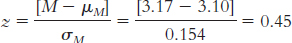
Step 6: Because the z statistic does not exceed the cutoffs, we fail to reject the null hypothesis. We did not find any evidence that the sample was different from what was expected according to the null hypothesis.
Chapter 8
8.1 Interval estimates provide a range of scores in which we have some confidence the population statistic will fall, whereas point estimates use just a single value to describe the population.
8.2 The interval estimate is 17% to 25% (21% − 4% = 17% and 21% + 4% = 25%); the point estimate is 21%.
8.3
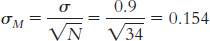
First, we draw a normal curve with the sample mean, 3.20, in the center. Then we put the bounds of the 95% confidence interval on either end, writing the appropriate percentages under the segments of the curve: 2.5% beyond the cutoffs on either end and 47.5% between the mean and each cutoff. Now we look up the z statistics for these cutoffs; the z statistic associated with 47.5%, the percentage between the mean and the z statistic, is 1.96. Thus, the cutoffs are −1.96 and 1.96. Next, we calculate standard error so that we can convert these z statistics to raw means:
Mlower = −z(σM) + Msample = −1.96(0.104) + 3.45 = 3.25
Mupper = z(σM ) + Msample = 1.96(0.104) + 3.45 = 3.65
Finally, we check to be sure the answer makes sense by demonstrating that each end of the confidence interval is the same distance from the mean: 3.25 − 3.45 = −0.20 and 3.65 − 3.45 = 0.20. The confidence interval is [3.25, 3.65].
If we were to conduct this study over and over, with the same sample size, we would expect the population mean to fall in that interval 95% of the time. Thus, it provides a range of plausible values for the population mean. Because the null-
hypothesized population mean of 3.20 is not a plausible value, we can conclude that those who attended the discussion group seem to have higher mean CFC scores than those who did not. This conclusion matches that of the hypothesis test, in which we rejected the null hypothesis. The confidence interval is superior to the hypothesis test because not only does it lead to the same conclusion but it also gives us an interval estimate, rather than a point estimate, of the population mean.
8.4 Statistical significance means that the observation meets the standard for special events, typically something that occurs less than 5% of the time. Practical importance means that the outcome really matters.
8.5 Effect size is a standardized value that indicates the size of a difference with respect to a measure of spread but is not affected by sample size.
8.6 Cohen’s 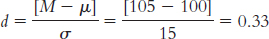
8.7
We calculate Cohen’s d, the effect size appropriate for data analyzed with a z test. We use standard deviation in the denominator, rather than standard error, because effect sizes are for distributions of scores rather than distributions of means.
Cohen’s
Cohen’s conventions indicate that 0.2 is a small effect and 0.5 is a medium effect. This effect size, therefore, would be considered a small-
to- medium effect. If the career discussion group is easily implemented in terms of time and money, the small-
to- medium effect might be worth the effort. For university students, a higher mean level of Consideration of Future Consequences might translate into a higher mean level of readiness for life after graduation, a premise that we could study.
8.8 Three ways to increase power are to increase alpha, to conduct a one-
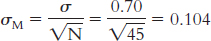
8.9 Step 1: We know the following about population 2: µ = 3.20, σ = 0.70. We assume the following about population 1 based on the information from the sample: N = 45, M = 3.45. We need to calculate standard error based on the standard deviation for population 2 and the size of the sample:
Step 2: Because the sample mean is higher than the population mean, we will conduct this one-
M = z(σM) + µM = 1.64(0.104) + 3.20 = 3.371
This mean of 3.371 marks the point beyond which 5% of all means based on samples of 45 observations will fall.
Step 3: For the distribution based on population 1, centered around 3.45, we need to calculate how often means of 3.371 (the cutoff) and greater occur. We do this by calculating the z statistic for the raw mean of 3.371 with respect to the sample mean of 3.45.
We now look up this z statistic on the table and find that 22.36% falls toward the tail and 27.64% falls between this z statistic and the mean. We calculate power as the proportion of observations between this z statistic and the tail of interest, which is at the high end. So we would add 27.64% and 50% to get statistical power of 77.64%.
8.10
The statistical power calculation means that, if population 1 really does exist, we have a 77.64% chance of observing a sample mean, based on 45 observations, that will allow us to reject the null hypothesis. We fall just short of the desired 80% statistical power.
We can increase statistical power by increasing the sample size, extending or enhancing the career discussion group such that we create a bigger effect, or by changing alpha.
Chapter 9
9.1 The t statistic indicates the distance of a sample mean from a population mean in terms of the estimated standard error.
9.2 First we need to calculate the mean:

We then calculate the deviation of each score from the mean and the square of that deviation.
| X | X − M | (X − M )2 |
| 6 | 0.833 | 0.694 |
| 3 | −2.167 | 4.696 |
| 7 | 1.833 | 3.360 |
| 6 | 0.833 | 0.694 |
| 4 | −1.167 | 1.362 |
| 5 | −0.167 | 0.028 |
The standard deviation is: 
When estimating the population variability, we calculate s: 
9.3 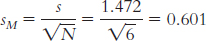
9.4
We would use a distribution of means, specifically a t distribution. It is a distribution of means because we have a sample consisting of more than one individual. It is a t distribution because we are comparing one sample to a population, but we know only the population mean, not its standard deviation.
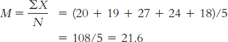
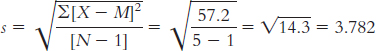
The appropriate mean: µM = µ = 25. The calculations for the appropriate standard deviation (in this case, standard error, sM):
X X − M (X − M )2 20 −1.6 2.56 19 −2.6 6.76 27 5.4 29.16 24 2.4 5.76 18 −3.6 12.96 Numerator: ∑(X − M)2 = (2.56 + 6.76 + 29.16 + 5.76 + 12.96)
= 57.2
9.5 Degrees of freedom is the number of scores that are free to vary, or take on any value, when a population parameter is estimated from a sample.
9.6 A single-
9.7
df = N − 1 = 35 − 1 = 34
df = N − 1 = 14 − 1 = 13
9.8
±2.201
Either −2.584 or +2.584, depending on the tail of interest
9.9 Step 1: Population 1 is the sample of six students. Population 2 is all university students.
The distribution will be a distribution of means, and we will use a single-
Step 2: The null hypothesis is H0: µ1 = µ2; that is, students we’re working with miss the same number of classes, on average, as the population.
The research hypothesis is H1: µ1 ≠ µ2; that is, students we’re working with miss a different number of classes, on average, than the population.
Step 3: µM = µ = 3.7
Step 4: df = N − 1 = 6 − 1 = 5
For a two-
Step 5: 
Step 6: Because the calculated t value falls short of the critical values, we fail to reject the null hypothesis.
9.10 For a paired-
9.11 An individual difference score is a calculation of change or difference for each participant. For example, we might subtract weight before the holiday break from weight after the break to evaluate how many pounds an individual lost or gained.
9.12 The null hypothesis for the paired-
9.13 We calculate Cohen’s d by subtracting 0 (the population mean based on the null hypothesis) from the sample mean and dividing by the standard deviation of the difference scores.
9.14 We want to subtract the before-
| Before Lunch | After Lunch | After − Before |
| 6 | 3 | 3 − 6 = −3 |
| 5 | 2 | 2 − 5 = −3 |
| 4 | 6 | 6 − 4 = 2 |
| 5 | 4 | 4 − 5 = −1 |
| 7 | 5 | 5 − 7 = −2 |
9.15
We first find the t values associated with a two-
tailed hypothesis test and alpha of 0.05. These are ±2.776. We then calculate sM by dividing s by the square root of the sample size, which results in sM = 0.548. Mlower = −t(sM) + Msample = −2.776(0.548) + 1.0 = −0.52
Mupper = t(sM) + Msample = 2.776(0.548) + 1.0 = 2.52
The confidence interval can be written as [−0.52, 2.52]. Because this confidence interval includes 0, we would fail to reject the null hypothesis. Zero is one of the likely mean differences we would get when repeatedly sampling from a population with a mean difference score of 1.
We calculate Cohen’s d as:
This is a large effect size.
9.16
Step 1: Population 1 is students for whom we’re measuring energy levels before lunch. Population 2 is students for whom we’re measuring energy levels after lunch.
The comparison distribution is a distribution of mean difference scores. We use the paired-
samples t test because each participant contributes a score to each of the two samples we are comparing. We meet the assumption that the dependent variable is a scale measurement. However, we do not know whether the participants were randomly selected or if the population is normally distributed, and the sample is less than 30.
Step 2: The null hypothesis is that there is no difference in mean energy levels before and after lunch—
H0: µ1 = µ2. The research hypothesis is that there is a mean difference in energy levels—
H1: µ1 ≠ µ2. Step 3:
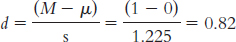
Difference Scores Difference − Mean Difference Squared Deviation −3 −1.6 2.56 −3 −1.6 2.56 2 3.4 11.56 −1 0.4 0.16 −2 −0.6 0.36 Mdifference = −1.4
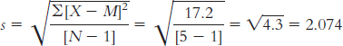
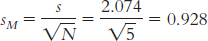
µM = 0, sM = 0.928
Step 4: The degrees of freedom are 5 − 1 = 4, and the cutoffs, based on a two-
tailed test and a p level of 0.05, are ±2.776. Step 5:
Step 6: Because the test statistic, −1.51, did not exceed the critical value of −2.776, we fail to reject the null hypothesis.
9.17
Mlower = −t(sM) + Msample = −2.776(0.928) + (−1.4) = −3.98
Mupper = t(sM) + Msample = 2.776(0.928) + (−1.4) = 1.18
The confidence interval can be written as [ − 3.98, 1.18]. Notice that the confidence interval spans 0, the null-
hypothesized difference between mean energy levels before and after lunch. Because the null value is within the confidence interval, we fail to reject the null hypothesis. 
This is a medium-
to- large effect size, according to Cohen’s guidelines.
Chapter 10
10.1 When the data we are comparing were collected using the same participants in both conditions, we would use a paired-
10.2 Pooled variance is a weighted combination of the variability in both groups in an independent-
10.3
Group 1 is treated as the X variable; its mean is 3.0.
X X − M (X − M)2 3 0 0 2 −1 1 4 1 1 6 3 9 1 −2 4 2 −1 1 
Group 2 is treated as the Y variable; its mean is 4.6.
Y Y − M (Y − M )2 5 0.4 0.16 4 −0.6 0.36 6 1.4 1.96 2 −2.6 6.76 6 1.4 1.96 
= 2.8
dfX = N − 1 = 6 − 1 = 5
dfy = N − 1 = 5 − 1 = 4
The variance version of standard error is calculated for each sample as:
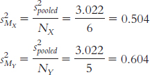
The variance of the distribution of differences between means is:
s2difference = s2MX + s2MY = 0.504 + 0.604 = 1.108
This can be converted to standard deviation units by taking the square root:

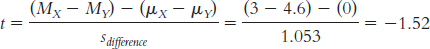
10.4
The null hypothesis asserts that there are no average between-
group differences; employees with low trust in their leader show the same mean level of agreement with decisions as those with high trust in their leader. Symbolically, this would be written H0: µ1 = µ2. The research hypothesis asserts that mean level of agreement is different between the two groups—
H1: µ1 ≠ µ2. The critical values, based on a two-
tailed test, a p level of 0.05, and dftotal of 9, are −2.262 and 2.262. The t value we calculated, −1.519, does not exceed the cutoff of −2.262, so we fail to reject the null hypothesis.
Based on these results, we did not find evidence that mean level of agreement with a decision is different across the two levels of trust, t(9) = −1.519, p > 0.05.
Despite having similar means for the two groups, we failed to reject the null hypothesis, whereas the original researchers rejected the null hypothesis. The failure to reject the null hypothesis is likely due to the low statistical power from the small samples we used.
10.5 We calculate confidence intervals to determine a range of plausible values for the population parameter, based on the data.
10.6 Effect size tells us how large or small the difference we observed is, regardless of sample size. Even when a result is statistically significant, it might not be important. Effect size helps us evaluate practical significance.
10.7
The upper and lower bounds of the confidence interval are calculated as:
(MX − MY)lower = −t(sdifference) + (MX − MY)sample
= −2.262(1.053) + (−1.6) = −3.98
(MX − MY)upper = t(sdifference) + (MX − MY)sample
= 2.262(1.053) + (−1.6) = 0.78
The confidence interval is [−3.98, 0.78].
To calculate Cohen’s d, we need to calculate the pooled standard deviation for the data:
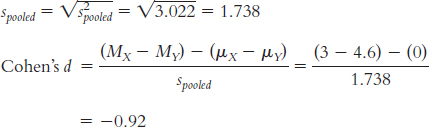
10.8 The confidence interval provides us with a range of differences between means in which we could expect the population mean difference to fall 95% of the time, based on samples of this size. Whereas the hypothesis test evaluates the point estimate of the difference between means—
10.9 The effect size we calculated, Cohen’s d of −0.92, is a large effect according to Cohen’s guidelines. Beyond the hypothesis test and confidence interval, which both lead us to fail to reject the null hypothesis, the size of the effect indicates that we might be on to a real effect here. We might want to replicate the study with more statistical power in an effort to better test this hypothesis.
Chapter 11
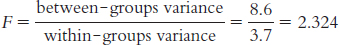
11.1 The F statistic is a ratio of between-
11.2 The two types of research design for a one-
11.3
11.4
We would use an F distribution because there are more than two groups.
We would determine the variance among the three sample means—
the means for those in the control group, for those in the 2- hour communication ban, and for those in the 4- hour communication ban. We would determine the variance within each of the three samples, and we would take a weighted average of the three variances.
11.5 If the F statistic is beyond the cutoff, then we can reject the null hypothesis—
11.6 When calculating SSbetween, we subtract the grand mean (GM) from the mean of each group (M). We do this for every score.
11.7
dfbetween = Ngroups − 1 = 3 − 1 = 2
dfwithin = df1 + df2 + . . . + dflast = (4 − 1) + (4 − 1) + (3 − 1)
= 3 + 3 + 2 = 8
dftotal = dfbetween + dfwithin = 2 + 8 = 10
11.8 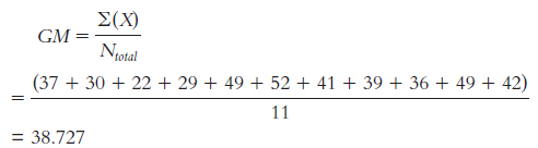
11.9
Total sum of squares is calculated here as SStotal = ∑(X − GM)2:
Sample X (X −GM) (X −GM)2 Group 1 37 −1.727 2.983 M1 = 29.5 30 −8.727 76.161 22 −16.727 279.793 29 −9.727 94.615 Group 2 49 10.273 105.535 M2 = 45.25 52 13.273 176.173 41 2.273 5.167 39 0.273 0.075 Group 3 36 −2.727 7.437 M3 = 42.333 49 10.273 105.535 42 3.273 10.713 GM = 38.73 SStotal = 864.187
Within-
groups sum of squares is calculated here as SSwithin = ∑(X − M)2. Sample X (X −M) (X −M)2 Group 1 37 7.500 56.250 M1 = 29.5 30 0.500 0.250 22 −7.500 56.250 29 −0.500 0.250 Group 2 49 3.750 14.063 M2 = 45.25 52 6.750 45.563 41 −4.250 18.063 39 −6.250 39.063 Group 3 36 −6.333 40.107 M3 = 42.333 49 6.667 44.449 42 −0.333 0.111 GM = 38.73 SSwithin = 314.419
Between-
groups sum of squares is calculated here as SSbetween = ∑(M − GM)2: Sample X (M −GM ) (M −GM )2 Group 1 37 −9.227 85.138 M1 = 29.5 30 −9.227 85.138 22 −9.227 85.138 29 −9.227 85.138 Group 2 49 6.523 42.550 M2 = 45.25 52 6.523 42.550 41 6.523 42.550 39 6.523 42.550 Group 3 36 3.606 13.003 M3 = 42.333 49 3.606 13.003 42 3.606 13.003 GM = 38.73 SSbetween = 549.761
11.10 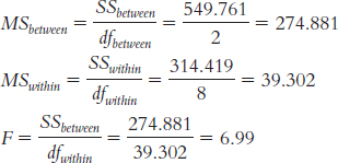
| Source | SS | df | MS | F |
| Between | 549.761 | 2 | 274.881 | 6.99 |
| Within | 314.419 | 8 | 39.302 | |
| Total | 864.187 | 10 |
11.11
According to the null hypothesis, there are no mean differences in efficacy among these three treatment conditions; they would all come from one underlying distribution. The research hypothesis states that there are mean differences in efficacy across some or all of these treatment conditions.
There are three assumptions: that the participants were selected randomly, that the underlying populations are normally distributed, and that the underlying populations have similar variances. Although we can’t say much about the first two assumptions, we can assess the last one using the sample data.
Sample Group 1 Group 2 Group 3 Squared deviations of scores from sample means 56.25 14.063 40.107 0.25 45.563 44.449 56.25 18.063 0.111 0.25 39.063 Sum of squares 113 116.752 84.667 N – 1 3 3 2 Variance 37.67 38.92 42.33 Because these variances are all close together, with the biggest being no more than twice as large as the smallest, we can conclude that we meet the third assumption of homoscedastic samples.
The critical value for F with a p value of 0.05, two between-
groups degrees of freedom, and 8 within- groups degrees of freedom, is 4.46. The F statistic exceeds this cutoff, so we can reject the null hypothesis. There are mean differences between these three groups, but we do not know where.
11.12 If we are able to reject the null hypothesis when conducting an ANOVA, then we must also conduct a post hoc test, such as a Tukey HSD test, to determine which pairs of means are significantly different from one another.
11.13 R2 tells us the proportion of variance in the dependent variable that is accounted for by the independent variable.
11.14
Children’s grade level accounted for 64% of the variability in reaction time. This is a large effect.
11.15 The number of levels of the independent variable is 3 and dfwithin is 32. At a p level of 0.05, the critical values of the q statistic are − 3.49 and 3.49.
11.16 Because we have unequal sample sizes, we must calculate a weighted sample size.
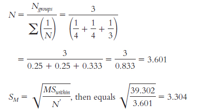
Now we can compare the three treatment groups.
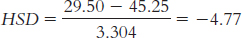
Psychodynamic therapy (M = 29.50) versus interpersonal therapy (M = 45.25):
Psychodynamic therapy (M = 29.5) versus cognitive-
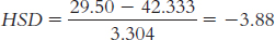
Interpersonal therapy (M = 45.25) versus cognitive-
We look up the critical value for this post hoc test on the q table. We look in the row for 8 within-
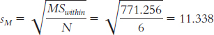
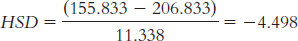
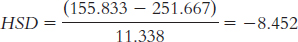
We have just one significant difference, which is between psychodynamic therapy and interpersonal therapy: Tukey HSD = −4.77. Specifically, clients responded at statistically significantly higher rates to interpersonal therapy than to psychodynamic therapy, with an average difference of 15.75 points on this scale.
11.17 Effect size is calculated as
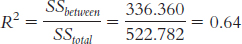
According to Cohen’s conventions for R2, this is a very large effect.
11.18 For the one-
11.19
dfbetween = Ngroups − 1 = 3 − 1 = 2
dfsubjects = n − 1 = 3 − 1 = 2
dfwithin = (dfbetween)(dfsubjects) = (2)(2) = 4
dftotal = dfbetween + dfsubjects + dfwithin = 2 + 2 + 4 = 8; or we can calculate it as dftotal = Ntotal − 1 = 9 − 1 = 8
11.20
SStotal = ∑(X − GM)2 = 24.886
Group Rating (X) X − GM (X − GM )2 1 7 0.111 0.012 1 9 2.111 4.456 1 8 1.111 1.234 2 5 −1.889 3.568 2 8 1.111 1.234 2 9 2.111 4.456 3 6 −0.889 0.790 3 4 −2.889 8.346 3 6 −0.889 0.790 GM = 6.889 ∑(X − GM )2 = 24.886
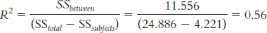
SSbetween = ∑(M − GM)2 = 11.556
GROUP Rating (X) Group Mean (M) M − GM (M − GM)2 1 7 8 1.111 1.234 1 9 8 1.111 1.234 1 8 8 1.111 1.234 2 5 7.333 0.444 0.197 2 8 7.333 0.444 0.197 2 9 7.333 0.444 0.197 3 6 5.333 −1.556 2.421 3 4 5.333 −1.556 2.421 3 6 5.333 −1.556 2.421 GM = 6.889 ∑(M − GM )2 = 11.556
SSsubject = ∑(Mparticipant − GM )2 = 4.221
Participant Group Rating (X ) Participant Mean (MPARTICIPANT) MPARTICIPANT − GM (MPARTICIPANT − GM )2 1 1 7 6 −0.889 0.790 2 1 9 7 0.111 0.012 3 1 8 7.667 0.778 0.605 1 2 5 6 −0.889 0.790 2 2 8 7 0.111 0.012 3 2 9 7.667 0.778 0.605 1 3 6 6 −0.889 0.790 2 3 4 7 0.111 0.012 3 3 6 7.667 0.778 0.605 GM = 6.889 ∑(Mparticipant − GM )2 = 4.221
11.21 
| Source | SS | df | MS | F |
| Between- |
11.556 | 2 | 5.778 | 2.54 |
| Subjects | 4.221 | 2 | 2.111 | 0.93 |
| Within- |
9.109 | 4 | 2.277 | |
| Total | 24.886 | 8 |
11.22
Null hypothesis: People rate the driving experience of these three cars the same, on average—
H0: µ1 = µ2 = µ3. Research hypothesis: People do not rate the driving experience of these three cars the same, on average. Order effects are addressed by counterbalancing. We could create a list of random orders of the three cars to be driven. Then, as a new customer arrives, we would assign him or her to the next random order on the list. With a large enough sample size (much larger than the three participants we used in this example), we could feel confident that this assumption would be met using this approach.
Page D-15The critical value for the F statistic for a p level of 0.05 and 2 and 4 degrees of freedom is 6.95. The between-
groups F statistic of 2.54 does not exceed this critical value. We cannot reject the null hypothesis, so we cannot conclude that there are differences among mean ratings of cars.
11.23 In both cases, the numerator in the ratio is SSbetween, but the denominators differ in the two cases. For the between-
11.24 There are no differences in the way that the Tukey HSD is calculated. The formula for the calculation of the Tukey HSD is exactly the same for both the between-
11.25
First, we calculate sM:
Next, we calculate HSD for each pair of means.
For time 1 versus time 2:
For time 1 versus time 3:
For time − versus time 3:
We have an independent variable with three levels and dfwithin = 10, so the q cutoff value at a p level of 0.05 is 3.88. Because we are performing a two-
tailed test, the cutoff values are 3.88 and −3.88. We reject the null hypothesis for all three of the mean comparisons because all of the HSD calculations exceed the critical value of −3.88. This tells us that all three of the group means are statistically significantly different from one another.
11.26 
11.27
This is a large effect size.
Because the F statistic did not exceed the critical value, we failed to reject the null hypothesis. As a result, Tukey HSD tests are not necessary.
Chapter 12
12.1 A factorial ANOVA is a statistical analysis used with one scale dependent variable and at least two nominal (or sometimes ordinal) independent variables (also called factors).
12.2 A statistical interaction occurs in a factorial design when the two independent variables have an effect in combination that we do not see when we examine each independent variable on its own.
12.3
There are two factors: diet programs and exercise programs.
There are three factors: diet programs, exercise programs, and metabolism type.
There is one factor: gift certificate value.
There are two factors: gift certificate value and store quality.
12.4
The participants are the stocks themselves.
One independent variable is the type of ticker-
code name, with two levels: pronounceable and unpronounceable. The second independent variable is time lapsed since the stock was initially offered, with four levels: 1 day, 1 week, 6 months, and 1 year. The dependent variable is the stocks’ selling price.
This would be a two-
way mixed- design ANOVA. This would be a 2 × 4 mixed-
design ANOVA. This study would have eight cells: 2 × 4 = 8. We multiplied the numbers of levels of each of the two independent variables.
12.5 A quantitative interaction is an interaction in which one independent variable exhibits a strengthening or weakening of its effect at one or more levels of the other independent variable, but the direction of the initial effect does not change. More specifically, the effect of one independent variable is modified in the presence of another independent variable. A qualitative interaction is a particular type of quantitative interaction of two (or more) independent variables in which one independent variable reverses its effect depending on the level of the other independent variable. In a qualitative interaction, the effect of one variable doesn’t just become stronger or weaker; it actually reverses direction in the presence of another variable.
12.6 An interaction indicates that the effect of one independent variable depends on the level of the other independent variable(s). The main effect alone cannot be interpreted because the effect of that one variable depends on another.
12.7
There are four cells.
IV 2 Level A Level B IV I Level A Level B Page D-16IV 2 Level A Level B IV I Level A M = (2 + 1 + 1 + 3)/4
= 1.75
M = (2 + 3 + 3 + 3)/4
= 2.75
Level B M = (5 + 4 + 3 + 4)/4
= 4
M = (3 + 2 + 2 + 3)/4
= 2.5
Because the sample size is the same for each cell, we can compute marginal means as simply the average between cell means.
IV 2 Marginal Means Level A Level B IV I Level A 1.75 2.75 2.25 Level B 4 2.5 3.25 Marginal Means 2.875 2.625 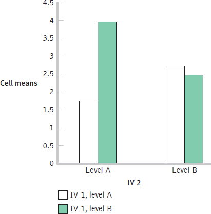
12.8
Independent variables: student (Caroline, Mira); class (philosophy, psychology)
Dependent variable: performance in class
Caroline Mira Philosophy class Psychology class This describes a qualitative interaction because the direction of the effect reverses. Caroline does worse in philosophy class than in psychology class, whereas Mira does better.
Independent variables: game location (home, away); team (own conference, other conference)
Dependent variable: number of wins
Home Away Own conference Other conference This describes a qualitative interaction because the direction of the effect reverses. The team does worse at home against teams in the other conference, but does well against those teams while away; the team does better at home against teams in its own conference, but performs poorly against teams in its own conference when away.
Independent variables: amount of caffeine (caffeine, none); exercise (worked out, did not work out)
Dependent variable: amount of sleep
Caffeine No Caffeine Working out Not working out This describes a quantitative interaction because the effect of working out is particularly strong in the presence of caffeine versus no caffeine (and the presence of caffeine is particularly strong in the presence of working out versus not). The direction of the effect of either independent variable, however, does not change depending on the level of the other independent variable.
12.9 Hypothesis testing for a one-
12.10 Variability is associated with the two main effects, the interaction, and the within-
12.11 dfIV1 = dfrows = Nrows − 1 = 2 − 1 = 1
dfIV2 = dfcolumns = Ncolumns − 1 = 2 − 1 = 1
dfinteraction = (dfrows)(dfcolumns) = (1)(1) = 1
dfwithin = df1A,2A + df1A,2B + df1B,2A + df1B,2B = 3 + 3 + 3 + 3 = 12
dftotal = Ntotal − 1 = 16 − 1 = 15
We can also verify that this calculation is correct by adding all of the other degrees of freedom together: 1 + 1 + 1 + 12 = 15.
12.12 The critical value for the main effect of the first independent variable, based on a between-
12.13
Population 1 is students who received an initial grade of C who received e-
mail messages aimed at bolstering self- esteem. Population 2 is students who received an initial grade of C who received e- mail messages aimed at bolstering their sense of control over their grades. Population 3 is students who received an initial grade of C who received e- mails with just review questions. Population 4 is students who received an initial grade of D or F who received e- mail messages aimed at bolstering self- esteem. Population 5 is students who received an initial grade of D or F who received e- mail messages aimed at bolstering their sense of control over their grades. Population 6 is students who received an initial grade of D or F who received emails with just review questions. Step 2: Main effect of first independent variable—
initial grade: Null hypothesis: The mean final exam grade of students with an initial grade of C is the same as that of students with an initial grade of D or F. H0: µC = µD/F.
Research hypothesis: The mean final exam grade of students with an initial grade of C is not the same as that of students with an initial grade of D or F. H1: µC ≠ µD/F.
Main effect of second independent variable—
type of email: Null hypothesis: On average, the mean exam grades among those receiving different types of e-
mails are the same— H0: µSE = µCG = µTR. Research hypothesis: On average, the mean exam grades among those receiving different types of e-
mails are not the same. Interaction: Initial grade × type of e-
mail: Null hypothesis: The effect of type of e-
mail is not dependent on the levels of initial grade. Research hypothesis: The effect of type of e-
mail depends on the levels of initial grade. Step 3: dfbetween/grade + Ngroups − 1 = 2 − 1 = 1
dfbetween/e-
mail = Ngroups − 1 = 3 − 1 = 2dfinteraction = (dfbetween/grade)(dfbetween/e-
mail ) = (1)(2) = 2dfC,SE = N − 1 = 14 − 1 = 13
dfC,C = N − 1 = 14 − 1 = 13
dfC,TR = N − 1 = 14 − 1 = 13
dfD/F,SE = N − 1 = 14 − 1 = 13
dfD/F,C = N − 1 = 14 − 1 = 13
dfD/F,TR = N − 1 =14 − 1 = 13
dfwithin = dfC,SE + dfC,C + dfC,TR + dfD/F,SE + dfD/F,C + dfD/F,TR = 13 + 13 + 13 + 13 + 13 + 13 = 78
Main effect of initial grade: F distribution with 1 and 78 degrees of freedom
Main effect of type of e-
mail: F distribution with − and 78 degrees of freedom Main effect of interaction of initial grade and type of e-
mail: F distribution with − and 78 degrees of freedom Step 4: Note that when the specific degrees of freedom is not in the F table, you should choose the more conservative—
that is, larger— cutoff. In this case, go with the cutoffs for a within- groups degrees of freedom of 75 rather than 80. The three cutoffs are: Main effect of initial grade: 3.97
Main effect of type of e-
mail: 3.12 Interaction of initial grade and type of e-
mail: 3.12 Step 6: There is a significant main effect of initial grade because the F statistic, 20.84, is larger than the critical value of 3.97. The marginal means, seen in the accompanying table, tell us that students who earned a C on the initial exam have higher scores on the final exam, on average, than do students who earned a D or an F on the initial exam. There is no statistically significant main effect of type of e-
mail, however. The F statistic of 1.69 is not larger than the critical value of 3.12. Had this main effect been significant, we would have conducted a post hoc test to determine where the differences were. There also is not a significant interaction. The F statistic of 3.02 is not larger than the critical value of 3.12. (Had we used a cutoff based on a p level of 0.10, we would have rejected the null hypothesis for the interaction. The cutoff for a p level of 0.10 is 2.38.) If we had rejected the null hypothesis for the interaction, we would have examined the cell means in tabular and graph form. Self- Esteem Take Responsibility Control Group Marginal Means C 67.31 69.83 71.12 69.42 D/F 47.83 60.98 62.13 56.98 Marginal means 57.57 65.41 66.63
Chapter 13
13.1 (1) The correlation coefficient can be either positive or negative. (2) The correlation coefficient always falls between –1.00 and 1.00. (3) It is the strength, also called the magnitude, of the coefficient, not its sign, that indicates how large it is.
13.2 When two variables are correlated, there can be multiple explanations for that association. The first variable can cause the second variable; the second variable can cause the first variable; or a third variable can cause both the first and second variables. In fact, there may be more than one “third” variable causing both the first and second variables.
13.3
According to Cohen, this is a large (strong) correlation. Note that the sign (negative in this case) is not related to the assessment of strength.
Page D-18This is just above a medium correlation.
This is lower than the guideline for a small correlation, 0.10.
13.4 Students will draw a variety of different scatterplots. The important thing to note is the closeness of data points to an imaginary line drawn through the data.
A scatterplot for a correlation coefficient of –0.60 might look like this:
A scatterplot for a correlation coefficient of 0.35 might look like this:
A scatterplot for a correlation coefficient of 0.04 might look like this:
13.5 It is possible that training while listening to music (A) causes an increase in a country’s average finishing time (B), perhaps because music decreases one’s focus on running. It is also possible that high average finishing times (B) cause an increase in the percentage of marathon runners in a country who train while listening to music (A), perhaps because slow runners tend to get bored and need music to get through their runs. It also is possible that a third variable, such as a country’s level of wealth (C), causes a higher percentage of runners who train while listening to music (because of the higher presence of technology in wealthy countries) (A) and also causes higher (slower) finishing times (perhaps because long-
13.6 The Pearson correlation coefficient is a statistic that quantifies a linear relation between two scale variables. Specifically, it describes the direction and strength of the relation between the variables.
13.7 The two issues are variability and sample size.
13.8
13.9 Step 1 is calculating the numerator:
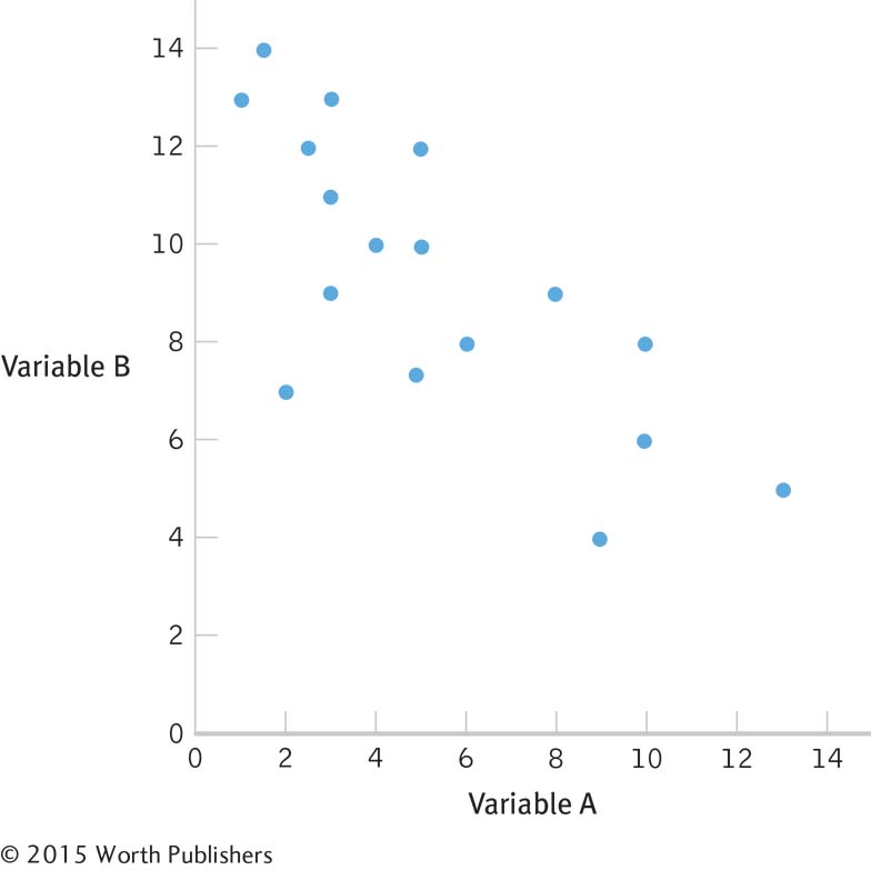
| Variable A (X ) | (X – Mx) | Variable B (Y ) | (Y – My) | (X – Mx) (Y – My) |
| 8 | 1.812 | 14 | 3.187 | 5.775 |
| 7 | 0.812 | 13 | 2.187 | 1.776 |
| 6 | –0.188 | 10 | –0.813 | 0.153 |
| 5 | –1.188 | 9.5 | –1.313 | 1.56 |
| 4 | –2.188 | 8 | –2.813 | 6.155 |
| 5.5 | –0.688 | 9 | –1.813 | 1.247 |
| 6 | –0.188 | 12 | 1.187 | –0.223 |
| 8 | 1.812 | 11 | 0.187 | 0.339 |
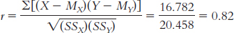
MX = 6.118 MY = 10.813 ∑[(X – MX ) (Y – MY)] = 16.782
Step 2 is calculating the denominator:
| Variable A (X ) | (X – Mx) | (X – Mx)2 | Variable B (Y ) | (Y – MY ) | (Y – MY )2 |
| 8 | 1.812 | 3.283 | 14 | 3.187 | 10.157 |
| 7 | 0.812 | 0.659 | 13 | 2.187 | 4.783 |
| 6 | –0.188 | 0.035 | 10 | –0.813 | 0.661 |
| 5 | –1.188 | 1.411 | 9.5 | –1.313 | 1.724 |
| 4 | –2.188 | 4.787 | 8 | –2.813 | 7.913 |
| 5.5 | –0.688 | 0.473 | 9 | –1.813 | 3.287 |
| 6 | –0.188 | 0.035 | 12 | 1.187 | 1.409 |
| 8 | 1.812 | 3.283 | 11 | 0.187 | 0.035 |
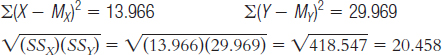
Step 3 is computing r:
13.10 Step 1: Population 1: Children like those we studied. Population 2: Children for whom there is no relation between observed and performed acts of aggression. The comparison distribution is made up of correlations based on samples of this size, 8 people, selected from the population.
We do not know if the data were randomly selected, the first assumption, so we must be cautious when generalizing the findings. We also do not know if the underlying population distributions for witnessed aggression and performed acts of aggression by children are normally distributed. The sample size is too small to make any conclusions about this assumption, so we should proceed with caution. The third assumption, unique to correlation, is that the variability of one variable is equal across the levels of the other variable. Because we have such a small data set, it is difficult to evaluate this. However, we can see from the scatterplot that the data are somewhat consistently variable.
Step 2: Null hypothesis: There is no correlation between the levels of witnessed and performed acts of aggression among children—
Step 3: The comparison distribution is a distribution of Pearson correlations, r, with the following degrees of freedom: dfr = N – 2 = 8 – 2 = 6.
Step 4: The critical values for an r distribution with 6 degrees of freedom for a two-
Step 5: The test statistic, r = 0.82, is larger in magnitude than the critical value of 0.707. We can reject the null hypothesis and conclude that a strong positive correlation exists between the number of witnessed acts of aggression and the number of acts of aggression performed by children.
13.11 Psychometricians calculate correlations when assessing the reliability and validity of measures and tests.
13.12 Coefficient alpha is a measure of reliability. To calculate coefficient alpha, we take, in essence, the average of all split-
13.13
The test does not have sufficient reliability to be used as a diagnostic tool. As stated in the chapter, when using tests to diagnose or make statements about the ability of individuals, a reliability of at least 0.90 is necessary.
We do not have enough information to determine whether the test is valid. The coefficient alpha tells us only about the reliability of the test.
To assess the validity of the test, we would need the correlation between this measure and other measures of reading ability or between this measure and students’ grades in the nonremedial class (i.e., do students who perform very poorly in the nonremedial reading class also perform poorly on this measure?).
13.14
The psychometrician could assess test–
retest reliability by administering the quiz to 100 readers who have boyfriends, and then one week later readministering the test to the same 100 readers. If their scores at the two times are highly correlated, the test would have high test– retest reliability. She also could calculate a coefficient alpha using computer software. The computer would essentially calculate correlations for every possible two groups of five items and then calculate the average of all of these split- half correlations. The psychometrician could assess validity by choosing criteria that she believed assessed the underlying construct of interest, a boyfriend’s devotion to his partner. There are many possible criteria. For example, she could correlate the amount of money each participant’s boyfriend spent on his partner’s most recent birthday with the number of minutes the participant spent on the phone with his or her boyfriend today or with the number of months the relationship ends up lasting.
Page D-20Of course, we assume that these other measures actually assess the underlying construct of a boyfriend’s devotion, which may or may not be true! For example, the amount of money that the boyfriend spent on the participant’s last birthday might be a measure of his income, not his devotion.
Chapter 14
14.1 Simple linear regression is a statistical tool that lets statisticians predict the score on a scale dependent variable from the score on a scale independent variable.
14.2 The regression line allows us to make predictions about one variable based on what we know about another variable. It gives us a visual representation of what we believe is the underlying relation between the variables, based on the data we have available to us.
14.3
zŷ = (rXY)(zX)
= (0.28)(1.5) = 0.42
Ŷ = zŷ(SDY) + MY = (0.42)(15) + 155 = 161.3 pounds
14.4
Ŷ = 12 + 0.67 [X] = 12 + 0.67 [78] = 64.26
Ŷ = 12 + 0.67 [−14 ] = 2.62
Ŷ = 12 + 0.67 [52] = 46.84
14.5
The y intercept, 2.586, is the GPA we might expect if someone played no minutes. The slope of 0.016 is the increase in GPA that we would expect for each 1-
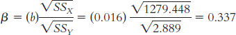
minute increase in playing time. Because the correlation is positive, it makes sense that the slope is also positive. The standardized regression coefficient is equal to the correlation coefficient for simple linear regression, 0.344. We can also check that this is correct by computing ß:
X (X −MX) (X −MX)2 Y (Y −MY) (Y −MY)2 29.70 13.159 173.159 3.20 0.343 0.118 32.14 15.599 243.329 2.88 0.023 0.001 32.72 16.179 261.760 2.78 −0.077 0.006 21.76 5.219 27.238 3.18 0.323 0.104 18.56 2.019 4.076 3.46 0.603 0.364 16.23 −0.311 0.097 2.12 −0.737 0.543 11.80 −4.741 22.477 2.36 −0.497 0.247 6.88 −9.661 93.335 2.89 0.033 0.001 6.38 −10.161 103.246 2.24 −0.617 0.381 15.83 −0.711 0.506 3.35 0.493 0.243 2.50 −14.041 197.150 3.00 0.143 0.020 4.17 −12.371 153.042 2.18 −0.677 0.458 16.36 −0.181 0.033 3.50 0.643 0.413 Σ(X − MX )2 = 1279.448 Σ(Y − MY )2 = 2.899
There is some difference due to rounding decisions, but in both cases, these numbers would be expressed as 0.34.
Strong correlations indicate strong linear relations between variables. Because of this, when we have a strong correlation, we have a more useful regression line, resulting in more accurate predictions.
According to the hypothesis test for the correlation, this r value, 0.34, fails to reach statistical significance. The critical values for r with 11 degrees of freedom at a p level of 0.05 are −0.553 and 0.553. In this chapter, we learned that the outcome of hypothesis testing is the same for simple linear regression as it is for correlation, so we know we also do not have a statistically significant regression.
14.6 The standard error of the estimate is a statistic that indicates the typical distance between a regression line and the actual data points. When we do not have enough information to compute a regression equation, we often use the mean as the “best guess.” The error of prediction when the mean is used is typically greater than the standard error of the estimate.
14.7 Strong correlations mean highly accurate predictions with regression. This translates into a large proportionate reduction in error.
14.8
X Y (MY) Mean For Y Error (Y −MY) Squared Error (Y −MY)2 5 6 5.333 0.667 0.445 6 5 5.333 −0.333 0.111 4 6 5.333 0.667 0.445 5 6 5.333 0.667 0.445 7 4 5.333 −1.333 1.777 8 5 5.333 −0.333 0.111 SStotal = Σ(Y − MY)2 = 3.334
X Y Regression Equation Ŷ Error (Y −Ŷ) Squared Error 5 6 Ŷ = 7.846 − 0.431 (5) = 5.691 0.309 0.095 6 5 Ŷ = 7.846 − 0.431 (6) = 5.260 −0.260 0.068 4 6 Ŷ = 7.846 − 0.431 (4) = 6.122 −0.122 0.015 5 6 Ŷ = 7.846 − 0.431 (5) = 5.691 0.309 0.095 7 4 Ŷ = 7.846 − 0.431 (7) = 4.829 −0.829 0.687 8 5 Ŷ = 7.846 − 0.431 (8) = 4.398 0.602 0.362 SSerror = Σ(Y − Ŷ)2 = 1.322
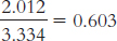
We have reduced error from 3.334 to 1.322, which is a reduction of 2.012. Now we calculate this reduction as a proportion of the total error:
 Page D-21
r2=(−0.77)(−0.77) = 0.593, which closely matches our calculation of r2 above, 0.603. These numbers are slightly different due to rounding decisions.
This can also be written as:
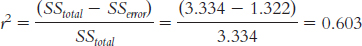
We have reduced 0.603, or 60.3%, of error using the regression equation as an improvement over the use of the mean as our predictor.
14.9 Tell Coach Parcells that prediction suffers from the same limitations as correlation. First, just because two variables are associated doesn’t mean one causes the other. This is not a true experiment, and if we didn’t randomly assign athletes to appear on a Sports Illustrated cover or not, then we cannot determine whether a cover appearance causes sporting failure. Moreover, we have a limited range; by definition, those lauded on the cover are the best in sports. Would the association be different among those with a wider range of athletic ability? Finally, and most important, there is the very strong possibility of regression to the mean. Those chosen for a cover appearance are at the very top of their game. There is nowhere to go but down, so it is not surprising that those who merit a cover appearance would soon thereafter experience a decline. There’s likely no need to avoid that cover, Coach.
14.10 Multiple regression is a statistical tool that predicts a dependent variable by using two or more independent variables as predictors. It is an improvement over simple linear regression, which only allows one independent variable to inform predictions.
14.11 Ŷ = 5.251 + 0.06(X1) + 1.105(X2)
14.12
Ŷ = 5.251 + 0.06(40) + 1.105(14) = 23.12
Ŷ = 5.251 + 0.06(101) + 1.105(39) = 54.41
Ŷ = 5.251 + 0.06(76) + 1.105(20) = 31.91
14.13
Ŷ = 2.695 + 0.069(X1) + 0.015(X2) − 0.072(X3)
Ŷ = 2.695 + 0.069(6) + 0.015(20) − 0.072(4) = 3.12
The negative sign in the slope (−0.072) tells us that those with higher levels of admiration for Pamela Anderson tend to have lower GPAs, and those with lower levels of admiration for Pamela Anderson tend to have higher GPAs.
Chapter 15
15.1 A parametric test is based on a set of assumptions about the population, whereas a nonparametric test is a statistical analysis that is not based on assumptions about the population.
15.2 We use nonparametric tests when the data violate the assumptions about the population that parametric tests make. The three most common situations that call for nonparametric tests are (1) having a nominal dependent variable, (2) having an ordinal dependent variable, and (3) having a small sample size with possible skew.
15.3
The independent variable is city, a nominal variable. The dependent variable is whether a woman is pretty or not so pretty, an ordinal variable.
The independent variable is city, a nominal variable. The dependent variable is beauty, assessed on a scale of 1–
10. This is a scale variable. The independent variable is intelligence, likely a scale variable. The dependent variable is beauty, assessed on a scale of 1–
10. This is a scale variable. The independent variable is ranking on intelligence, an ordinal variable. The dependent variable is ranking on beauty, also an ordinal variable.
15.4
We’d choose a hypothesis test from category III. We’d use a nonparametric test because the dependent variable is not scale and would not meet the primary assumption of a normally distributed dependent variable, even with a large sample.
We’d choose a test from category II because the independent variable is nominal and the dependent variable is scale. (In fact, we’d use a one-
way between- groups ANOVA because there is only one independent variable and it has more than two levels.) We’d choose a hypothesis test from category I because we have a scale independent variable and a scale dependent variable. (If we were assessing the relation between these variables, we’d use the Pearson correlation coefficient. If we wondered whether intelligence predicted beauty, we’d use simple linear regression.)
We’d choose a hypothesis test from category III because both the independent and dependent variables are ordinal. We would not meet the assumption of having a normal distribution of the dependent variable, even if we had a large sample.
15.5 We use chi-
15.6 Observed frequencies indicate how often something actually happens in a given category based on the data we collected. Expected frequencies indicate how often we expect something to happen in a given category based on what is known about the population according to the null hypothesis.
15.7 The measure of effect size for chi square is Cramér’s V. It is calculated by first multiplying the total N by the degrees of freedom for either the rows or columns (whichever is smaller) and then dividing the calculated chi-
15.8
dfx2 = k − 1 = 2 − 1 = 1
Observed:
Clear Blue Skies Unclear Skies 59 days 19 days Expected:
Clear Blue Skies Unclear Skies (78)(0.80) = 62.4 (78)(0.20) = 15.6 days Page D-22Category Observed (O) Expected (E) O − E (O − E)2 
Clear blue skies 59 62.4 −3.4 11.56 0.185 Unclear skies 19 15.6 3.4 11.56 0.741 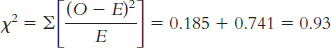
15.9 To calculate the relative likelihood, we first need to calculate two conditional probabilities: the conditional probability of being a Republican given that a person is a business major, which is  , and the conditional probability of being a Republican given that a person is a psychology major, which is 0.537. Now we divide the conditional probability of being a Republican given that a person is a business major by the conditional probability of being a Republican given that a person is a psychology major:
 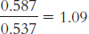 . The relative likelihood of being a Republican given that a person is a business major as opposed to a psychology major is 1.09.
15.10
The participants are the lineups. The independent variable is type of lineup (simultaneous, sequential), and the dependent variable is outcome of the lineup (suspect identification, other identification, no identification).
Step 1: Population 1 is police lineups like those we observed. Population − is police lineups for which type of lineup and outcome are independent. The comparison distribution is a chi-
square distribution. The hypothesis test is a chi- square test for independence because we have two nominal variables. This study meets three of the four assumptions. The two variables are nominal; every participant (lineup) is in only one cell; and there are more than five times as many participants as cells (eight participants and six cells). Step 2: Null hypothesis: Lineup outcome is independent of type of lineup.
Research hypothesis: Lineup outcome depends on type of lineup.
Step 3: The comparison distribution is a chi-
square distribution with − degrees of freedom: dfx2 = (krow − 1)(kcolumn − 1) = (2 − 1) (3 − 1) = (1)(2) = 2
Step 4: The cutoff chi-
square statistic, based on a p level of 0.05 and − degrees of freedom, is 5.992. (Note: It is helpful to include a drawing of the chi- square distribution with the cutoff.) Step 5:
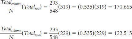
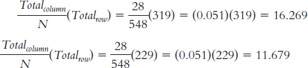
Observed Suspect Id Other Id No Id Simultaneous 191 8 120 319 Sequential 102 20 107 229 293 28 227 548 We can calculate the expected frequencies in one of two ways. First, we can think about it. Out of the total of 548 lineups, 293 led to identification of the suspect, an identification rate of 293/548 = 0.535, or 53.5%. If identification were independent of type of lineup, we would expect the same rate for each type of lineup. For example, for the 319 simultaneous lineups, we would expect: (0.535)(319) = 170.665. For the 229 sequential lineups, we would expect: (0.535)(229) = 122.515. Or we can use the formula; for these same two cells (the column labeled “Suspect ID”), we calculate:
For the column labeled “Other ID”:
For the column labeled “No ID”:
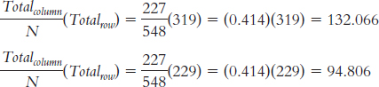
Expected Suspect Id Other Id No Id Simultaneous 170.665 16.269 132.066 319 Sequential 122.515 11.679 94.806 229 293 28 227 548 Category Observed (O) Expected (E) O − E (O − E )2
Sim; suspect 191 170.665 20.335 413.512 2.423 Sim; other 8 16.269 −8.269 68.376 4.203 Sim; no 120 132.066 −12.066 145.588 1.102 Seq; suspect 102 122.515 −20.515 420.865 3.435 Seq; other 20 11.679 8.321 69.239 5.929 Seq; no 107 94.806 12.194 148.694 1.568 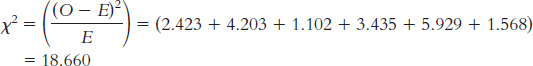
Step 6: Reject the null hypothesis. It appears that the outcome of a lineup depends on the type of lineup. In general, simultaneous lineups tend to lead to a higher-
than- expected rate of suspect identification, lower- than- expected rates of identification of other members of the lineup, and lower- than- expected rates of no identification at all. (Note: It is helpful to add the test statistic to the drawing that included the cutoff.) Page D-23χ2(1, N = 548) = 18.66, p < 0.05
The findings of this study were the opposite of what had been expected by the investigators; the report of results noted that, prior to this study, police departments believed that the sequential lineup led to more accurate identification of suspects. This situation occurs frequently in behavioral research, a reminder of the importance of conducting two-
tailed hypothesis tests. (Of course, the fact that this study produced different results doesn’t end the debate. Future researchers should explore why there are different findings in different contexts in an effort to target the best lineup procedures for specific situations.) 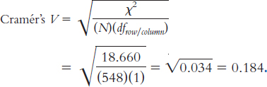
This is a small-
to- medium effect. To create a graph, we must first calculate the conditional proportions by dividing the observed frequency in each cell by the row total. These conditional proportions appear in the table below and are graphed in the figure.
Id Suspect Id Other No Id SIMULTANEOUS 0.599 0.025 0.376 SEQUENTIAL 0.445 0.087 0.467 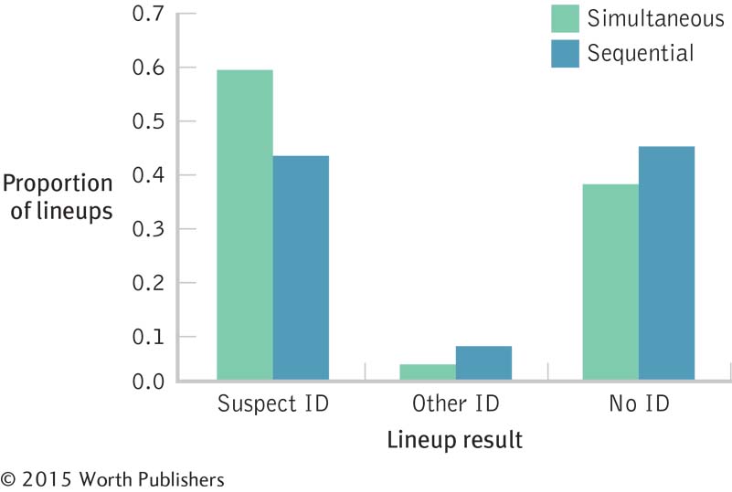
We must first calculate two conditional probabilities: the conditional probability of obtaining a suspect identification in the simultaneous lineups, which is
 , and the conditional probability of obtaining a suspect identification in the sequential lineups, which is
  . We then divide 0.599 by 0.445 to obtain the relative likelihood of 1.35. Suspects are 1.35 times more likely to be identified in simultaneous as opposed to sequential lineups.
15.11 We use such tests when we have an ordinal dependent variable.
15.12 Nonparametric tests are performed on ordinal data, so any data that are scale must be converted to ordinal before we compute the nonparametric test.
15.13
| Variable 1 | Variable 2 | |||
| Observation | Score | Rank | Score | Rank |
| 1 | 1.30 | 3 | 54.39 | 5 |
| 2 | 1.80 | 4.5 | 50.11 | 3 |
| 3 | 1.20 | 2 | 53.39 | 4 |
| 4 | 1.06 | 1 | 44.89 | 1 |
| 5 | 1.80 | 4.5 | 48.50 | 2 |
15.14
| Observation | Variable 1 Rank | Variable − Rank | Difference | Squared Difference |
| 1 | 3 | 5 | −2 | 4 |
| 2 | 4.5 | 3 | 1.5 | 2.25 |
| 3 | 2 | 4 | −2 | 4 |
| 4 | 1 | 1 | 0 | 0 |
| 5 | 4.5 | 2 | 2.5 | 6.25 |
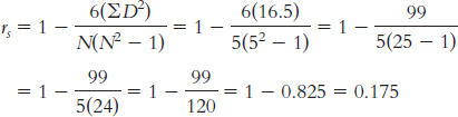
15.15
There is an extreme outlier, 139, suggesting that the underlying population distribution might be skewed. Moreover, the sample size is small.
1, 2, 3, 4, 5, 6, 7, 8, 9, 10 (we chose to rank this way, but you could do the reverse, from 10 to 1).
The outlier was 25 IQ points (139 − 114 = 25) behind the next-
highest score of 114. It now is ranked 10th, compared to the next- highest score’s rank of 9th.
15.16
Step 1:We convert the data from scale to ordinal. The researchers did not indicate whether they used random selection to choose the countries in the sample, so we must be cautious when generalizing from these results. There are some ties, but we will assume that there are not so many as to render the results of the test invalid.
Step 2: Null hypothesis: Countries in which English is a primary language and countries in which English is not a primary language do not tend to differ in accomplishment-
Research hypothesis: Countries in which English is a primary language and countries in which English is not a primary language tend to differ in accomplishment-
Step 3: There are seven countries in the English-
Step 4: The cutoff, or critical value, for a Mann–
Step 5: (Note: “E” stands for English-
| Country | Pride Score | Pride Rank | English Language | E Rank | Ne Rank |
| United States | 4.00 | 1 | E | 1 | |
| Australia | 2.90 | 2.5 | E | 2.5 | |
| Ireland | 2.90 | 2.5 | E | 2.5 | |
| South Africa | 2.70 | 4 | E | 4 | |
| New Zealand | 2.60 | 5 | E | 5 | |
| Canada | 2.40 | 6 | E | 6 | |
| Chile | 2.30 | 7 | NE | 7 | |
| Great Britain | 2.20 | 8 | E | 8 | |
| Japan | 1.80 | 9 | NE | 9 | |
| France | 1.50 | 10 | NE | 10 | |
| Czech Republic | 1.30 | 11.5 | NE | 11.5 | |
| Norway | 1.30 | 11.5 | NE | 11.5 | |
| Slovenia | 1.10 | 13 | NE | 13 | |
| South Korea | 1.00 | 14 | NE | 14 |
ΣRE = 1 + 2.5 + 2.5 + 4 + 5 + 6 + 8 = 29
ΣRNE = 7 + 9 + 10 + 11.5 + 11.5 + 13 + 14 = 76
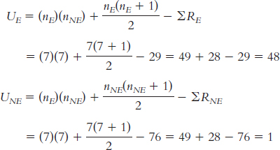
Step 6: The smaller test statistic, 1, is smaller than the critical value, 8. We can reject the null hypothesis; it appears that English-