Chapter 6 Introduction
CHAPTER 6
The Normal Curve, Standardization, and z Scores
The Need for Standardization
Transforming Raw Scores into z Scores
Transforming z Scores into Raw Scores
Using z Scores to Make Comparisons
Transforming z Scores into Percentiles
Creating a Distribution of Means
Characteristics of the Distribution of Means
Using the Central Limit Theorem to Make Comparisons with z Scores
BEFORE YOU GO ON
You should be able to create histograms and frequency polygons (Chapter 2).
You should be able to describe distributions of scores using measures of central tendency, variability, and skewness (Chapters 2 and 4).
You should understand that we can have distributions of scores based on samples, as well as distributions of scores based on populations (Chapter 5).
Abraham De Moivre was still a teenager in the 1680s when he was imprisoned in a French monastery for 2 years because of his religious beliefs. After his release, he found his way to Old Slaughter’s Coffee House in London. The political squabbles, hustling artists, local gamblers, and insurance brokers didn’t seem to bother the young scholar—
A normal curve is a specific bell-
shaped curve that is unimodal, symmetric, and defined mathematically.
The Bell Curve Is Born
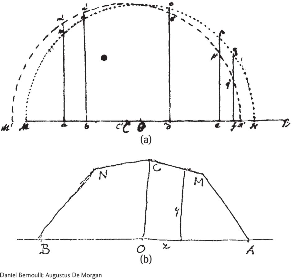
Daniel Bernoulli (a) created an approximation of the bell-
De Moivre’s powerful mathematical idea is far easier to understand as a picture, but that visual insight would take another 200 years. For example, Daniel Bernoulli came close in 1769. Augustus De Morgan came even closer when he mailed a sketch to fellow astronomer George Airy in 1849 (Figure 6-1). They were both trying to draw the normal curve, a specific bell-
The astronomers were trying to pinpoint the precise time when a star touched the horizon, but they couldn’t get independent observers to agree. Some estimates were probably a little early; others were probably a little late. Nevertheless, the findings revealed (a) that the pattern of errors was symmetric; and (b) that the midpoint represented a reasonable estimate of reality. Only a few estimates were extremely high or extremely low; most errors clustered tightly around the middle. They were starting to understand what seems obvious to us today: Their best estimate of reality was a bell-
In this chapter, we learn about the building blocks of inferential statistics: (a) the characteristics of the normal curve; (b) how to use the normal curve to standardize any variable by using a tool called the z score; and (c) the central limit theorem, which, coupled with a grasp of standardization, allows us to make comparisons between means.