Chapter 3 Introduction

47

CHAPTER 3

Visual Displays of Data

How to Lie with Visual Statistics

“The Most Misleading Graph Ever Published”

Techniques for Misleading with Graphs

Common Types of Graphs

Scatterplots

Line Graphs

Bar Graphs

Pictorial Graphs

Pie Charts

How to Build a Graph

Choosing the Appropriate Type of Graph

How to Read a Graph

Guidelines for Creating a Graph

The Future of Graphs

BEFORE YOU GO ON

  • You should understand the different types of variables—nominal, ordinal, and scale (Chapter 1).

  • You should understand the difference between independent variables and dependent variables (Chapter 1).

  • You should know how to construct a histogram (Chapter 2).

48

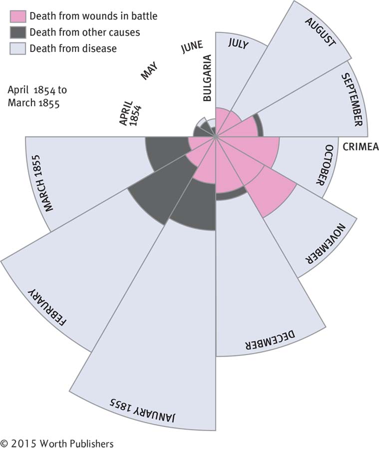
The legendary nineteenth-century nurse Florence Nightingale was also known as the “passionate statistician” (Diamond & Stone, 1981). The lens of time has softened the image of this sarcastic, sharp-elbowed infighter (Gill, 2005) who created trouble simply by counting things. She counted supplies in a closet and discovered corruption; she counted physicians’ diagnoses and discovered incompetence. She created the visual display in Figure 3-1 after counting the causes of death of British soldiers in Bulgaria and the Crimea. The British army was killing more of its own soldiers through poor hygiene than were dying due to wounds of war—and an outraged public demanded change. That is one powerful graph!

Graphs continue to save lives. Recent research documents the power of graphs to guide decisions about health care and even to reduce risky health-related behaviors (Garcia-Retamero & Cokely, 2013).

This chapter shows you how to create graphs, called figures in APA-speak, that tell data stories. We recommend Displaying Your Findings by Adelheid Nicol and Penny Pexman (2010) for a more detailed look, but a checklist at the end of this chapter will answer most of your questions about how to create graphs.

image
Figure 3.1: FIGURE 3-1
Graphs That Persuade
This coxcomb graph, based on Florence Nightingale’s original coxcomb graph, “Diagram of the Causes of Mortality in the Army in the East,” addresses the period from April 1854 to March 1855. It is called a coxcomb graph because the data arrangement resembles the shape of a rooster’s head. The 12 sections represent the ordinal variable of a year broken into 12 months. The size of the sections representing each month indicates the scale variable of how many people died in that particular month. The colors represent the nominal variable of cause of death.