2.1 Frequency Distributions
A raw score is a data point that has not yet been transformed or analyzed.
A frequency distribution describes the pattern of a set of numbers by displaying a count or proportion for each possible value of a variable.
Researchers are usually most interested in the relations between two or more variables, such as the effect of a television show’s pacing (independent variable) on children’s learning (dependent variable). But to understand the relation between variables, we must first understand each individual variable’s data points. The basic ingredients of a data set are called raw scores, data that have not yet been transformed or analyzed. In statistics, we organize raw scores into a frequency distribution, which describes the pattern of a set of numbers by displaying a count or proportion for each possible value of a variable. For example, a frequency distribution can display the pattern of the scores—
A frequency table is a visual depiction of data that shows how often each value occurred, that is, how many scores were at each value. Values are listed in one column, and the numbers of individuals with scores at that value are listed in the second column.
There are several different ways to organize the data in terms of a frequency distribution. The first approach, the frequency table, is also the starting point for each of the three other approaches that we will explore. A frequency table is a visual depiction of data that shows how often each value occurred; that is, how many scores were at each value. Once organized into a frequency table, data can be displayed as a grouped frequency table, a histogram, or a frequency polygon.
MASTERING THE CONCEPT
2.1: A frequency table shows the pattern of the data by indicating how many participants had each possible score. The data in a frequency table can be graphed in a frequency histogram or a frequency polygon.
Frequency Tables
EXAMPLE 2.1
The most popular sport in the world is what Canadians and Americans call soccer (called football by most people in the world). A recent book analyzes soccer from the perspectives of several social sciences—
26

Table 2-3 depicts data from the World Cup Web site (http:/
| Country | Men First Place | Men Second Place | Women First Place | Women Second Place |
|---|---|---|---|---|
| Argentina | 1978, 1986 | 1930, 1990 | ||
| Brazil | 1958, 1962, 1970, 1994, 2002 | 1950, 1998 | 2007 | |
| China | 1999 | |||
| Czechoslovakia | 1934, 1962 | |||
| England | 1966 | |||
| France | 1998 | 2006 | ||
| Hungary | 1938, 1954 | |||
| Italy | 1934, 1938, 1982, 2006 | 1970, 1994 | ||
| Japan | 2011 | |||
| Norway | 1995 | 1991 | ||
| Spain | 2010 | |||
| Sweden | 1958 | 2003 | ||
| The Netherlands | 1974, 1978, 2010 | |||
| United States | 1991, 1999 | 2011 | ||
| Uruguay | 1930, 1950 | |||
| West Germany/Germany | 1954, 1974, 1990 | 1966, 1982, 1986, 2002 | 2003, 2007 | 1995 |
| Data from www.fifa.com (2013) | ||||
27
| First- |
Frequency |
|---|---|
| 10 | 1 |
| 9 | 0 |
| 8 | 1 |
| 7 | 0 |
| 6 | 1 |
| 5 | 0 |
| 4 | 1 |
| 3 | 2 |
| 2 | 6 |
| 1 | 4 |
| 0 | 64 |
| Data from www.fifa.com (2013) | |
At first glance, it is not easy to find a pattern in most lists of numbers. But when we reorder those numbers, a pattern begins to emerge. A frequency table is the best way to create an easy-
There are specific steps to create a frequency table. First, we determine the range of raw scores. For each country, we can count how many first-
After we identify the lowest and highest scores, we create the two columns that we see in Table 2-4. We examine the raw scores and determine how many countries fall at each value in the range. The appropriate number for each value is recorded in the table. For example, there is one country with 10 first-
Here is a recap of the steps to create a frequency table:
- Determine the highest score and the lowest score.
- Create two columns; label the first with the variable name, and label the second “Frequency.”
- List the full range of values that encompasses all the scores in the data set, from highest to lowest. Include all values in the range, even those for which the frequency is 0.
- Count the number of scores at each value, and write those numbers in the frequency column.
As shown in Table 2-5, we can add a column for percentages. To calculate a percentage, we divide the number of countries at a certain value by the total number of countries, and then multiply by 100. As we observed earlier, 1 out of 80 countries had 10 top finishes.

So, for the score of 10 top finishes, the percentage for 1 of 80 countries is 1.25%.
Note that when we calculate statistics, we can come up with different answers depending on the number of steps and how we decide to round numbers. In this book, we round off to three decimal places throughout the calculations, but we report the final answers to two decimal places, rounding up or down as appropriate. Sometimes the numbers don’t add up to 100% exactly, due to rounding. But if you follow this guideline, then you should get the same answers that we get.
28
| First- |
Frequency | Percentage |
|---|---|---|
| 10 | 1 | 1.25 |
| 9 | 0 | 0.00 |
| 8 | 1 | 1.25 |
| 7 | 0 | 0.00 |
| 6 | 1 | 1.25 |
| 5 | 0 | 0.00 |
| 4 | 1 | 1.25 |
| 3 | 2 | 2.50 |
| 2 | 6 | 7.50 |
| 1 | 4 | 5.00 |
| 0 | 64 | 80.00 |
| Data from www.fifa.com (2013) | ||
Creating a frequency table for the data gives us more insight into the set of numbers. We can see that two countries, Brazil and West Germany/Germany, are well above the others. Indeed, the subtitle for Soccernomics includes the phrase Why Germany and Brazil Win. What about England, the country in which soccer is most popular? It’s been one of the top two finishers only once, when it won in 1966. It seems clear that the popularity of the sport doesn’t necessarily relate to World Cup success.
Grouped Frequency Tables
In the previous example, we used data that counted the numbers of countries, which are whole numbers. In addition, the range was fairly limited—
- When data can go to many decimal places, such as in reaction times
- When data cover a huge range, such as countries’ populations
A grouped frequency table is a visual depiction of data that reports frequencies within a given interval rather than the frequencies for a specific value.
In both of these situations, the frequency table would go on for pages and pages. For example, if someone weighed only 0.0003 pound more than the person at the next weight, that first person would belong to a distinctive, unique category. Using such specific values would lead to two problems: We would be creating an enormous amount of unnecessary work for ourselves, and we wouldn’t be able to see trends in the data. Fortunately, we have a technique to deal with these situations: a grouped frequency table allows us to depict data visually by reporting the frequencies within a given interval rather than the frequencies for a specific value.
Language Alert! The word interval is used in more than one way by statisticians. Here, it refers to a range of values (as opposed to an interval variable, the type of variable that has equal distances between values).
EXAMPLE 2.2
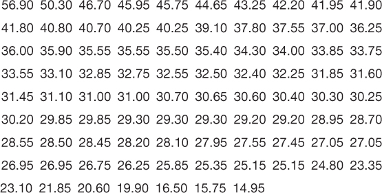
The following data exemplify the first of these two situations in which the data aren’t easily conveyed in a standard frequency table. These are the pacing indices, to two decimal places, for the 87 television shows, some of which are listed in Table 2-1.
29

A quick glance at these data does not really tell us the pacing index of the typical television show. A frequency table wouldn’t be helpful either. The lowest score is 14.95 and the highest is 56.90. So the table would include 14.95, 14.96, 14.97, and so on, all the way to 56.90! Such a table would be absurdly long and would not convey much more useful information than does the list of the original raw data.
Instead of reporting every single value in the range, we can report intervals, or ranges of values. Here are the five steps to generate a standard grouped frequency table:
STEP 1: Find the highest and lowest scores in the frequency distribution.
In the pacing index example, these scores are 56.90 and 14.95.
STEP 2: Get the full range of data.
If there are decimal places, round both the highest and the lowest scores down to the nearest whole numbers. If they already are whole numbers, use these. Subtract the lowest whole number from the highest whole number and add 1 to get the full range of the data. (Why do we add 1? Try it yourself. If we subtract 14 from 56, we get 42—
In the pacing index example, 14.95 and 56.90 round down to 14 and 56, respectively; 56 − 14 = 42, and 42 + 1 = 43. The scores fall within a range of 43.
STEP 3: Determine the number of intervals and the best interval size.
There is no consensus about the ideal number of intervals, but most researchers recommend between 5 and 10 intervals, unless the data set is enormous and has a huge range. To find the best interval size, we divide the range by the number of intervals we want, then round to the nearest whole number (as long as the numbers are not too small—
In the pacing index example, we might choose to have about 9 intervals. If we choose 9, the interval size will be 5.
STEP 4: Figure out the number that will be the bottom of the lowest interval.
We want the bottom of that interval to be a multiple of the interval size. For example, if we have 9 intervals of size 5, then we want the bottom interval to start at a multiple of 5. It could start at 0, 10, 55, or 105, depending on the data. We select the multiple of 5 that is below the lowest score.
30
In the pacing index example, there are 9 intervals of size 5, so the bottom of the lowest interval should be a multiple of 5. The lowest score is 14.95, so the bottom of the lowest interval would be 10. (If the lowest score were 7.22, we would choose 5. Note that this process might lead to one more interval than we planned for; this is perfectly fine. In our case, we have 10, rather than the 9 intervals we had estimated.)
STEP 5: Finish the table by listing the intervals from highest to lowest and then counting the numbers of scores in each.
This step is much like creating a frequency table (without intervals), which we discussed earlier. If we decide on intervals of size 5 and the first one begins at 10, then we count the five numbers that fall in this interval: 10, 11, 12, 13, and 14. The interval in this example runs from 10 to 14. (In reality, it runs from 10 to 14.9999, and the next one begins at 15, five digits higher than the bottom of the preceding interval.) A good rule of thumb is that the bottom of the intervals should jump by the chosen interval size, in this case 5.
In the pacing index example, the lowest interval would be 10 to 14, or 10.00 to 14.99. The next one would be 15.00 to 19.99, and so on.
The grouped frequency table in Table 2-6 gives us a much better sense of the pacing indices of the TV shows in this sample than either the list of raw data or a frequency table without intervals.
| Interval | Frequency |
|---|---|
| 55.00– |
1 |
| 50.00– |
1 |
| 45.00– |
3 |
| 40.00– |
10 |
| 35.00– |
11 |
| 30.00– |
25 |
| 25.00– |
27 |
| 20.00– |
5 |
| 15.00– |
3 |
| 10.00– |
1 |
Histograms
Even more than tables, graphs help us to see data at a glance. The two most common methods for graphing scale data for one variable are the histogram and the frequency polygon. Here we learn to construct and interpret the histogram (more common) and the frequency polygon (less common).
MASTERING THE CONCEPT
2.2: The data in a frequency table can be viewed in graph form. In a histogram, bars are used to depict frequencies at each score or interval. In a frequency polygon, a dot is placed above each score or interval to indicate the frequency, and the dots are connected.
A histogram is a graph that looks like a bar graph but depicts just one variable, usually based on scale data, with the values of the variable on the x-axis and the frequencies on the y-axis.
A histogram is a graph that looks like a bar graph but depicts just one variable, usually based on scale data, with the values of the variable on the x-axis and the frequencies on the y-axis. Each bar reflects the frequency for a value or an interval. The difference between histograms and bar graphs is that bar graphs typically provide scores for nominal data (e.g., men and women) relative to another variable (e.g., height), whereas histograms typically provide frequencies for one scale variable (e.g., levels of pacing indices). We can construct histograms from frequency tables or from grouped frequency tables. Histograms allow for the many intervals that typically occur with scale data. The bars are stacked one against the next, with the intervals meaningfully arranged from lower numbers (on the left) to higher numbers (on the right). With bar graphs, the categories do not need to be arranged in one particular order and the bars should not touch.
31
EXAMPLE 2.3
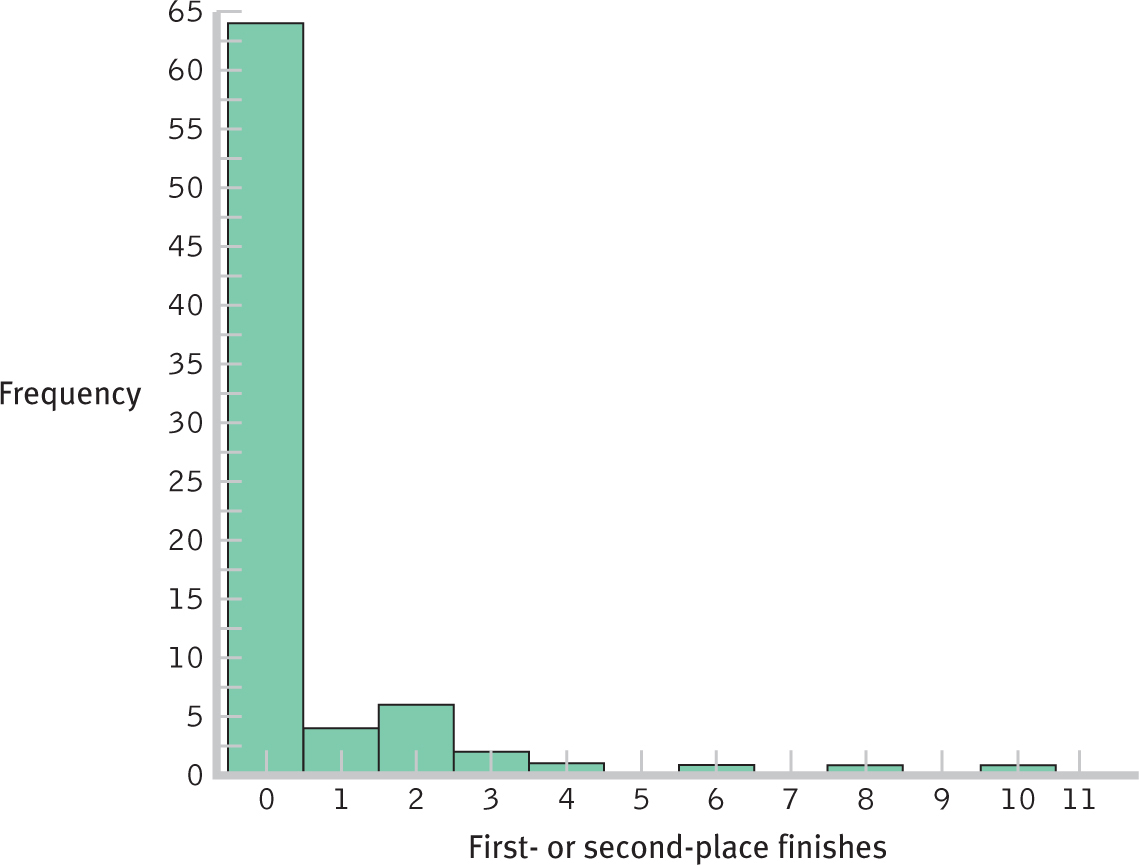
Let’s start by constructing a histogram from a frequency table. Table 2-4 depicts data on countries’ numbers of World Cup top finishes. We construct a histogram by drawing the x-axis (horizontal) and y-axis (vertical) of a graph. We label the x-axis with the variable of interest—
Once we’ve created the graph, we draw a bar for each value. Each bar is centered on the value for which it provides the frequency. The height of the bars represents the numbers of scores that fall at each value—

Figure 2-
Here is a recap of the steps to construct a histogram from a frequency table:
- Draw the x-axis and label it with the variable of interest and the full range of values for this variable. (Include 0 unless all of the scores are so far from 0 that this would be impractical.)
- Draw the y-axis, label it “Frequency,” and include the full range of frequencies for this variable. (Include 0 unless it’s impractical.)
- Draw a bar for each value, centering the bar around that value on the x-axis and drawing the bar as high as the frequency for that value, as represented on the y-axis.
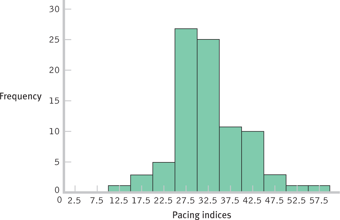
Grouped frequency tables can also be depicted as histograms. Instead of listing values on the x-axis, we list the midpoints of intervals. Students commonly make mistakes in determining midpoints. If an interval ranges from 0 to 9, what is the mid-
EXAMPLE 2.4
Let’s look at the TV pacing index data for which we constructed a grouped frequency histogram. What are the midpoints of the 10 intervals? Let’s calculate the midpoint for the lowest interval, 10 to 14.99. We should look at the bottom of this interval, 10.00, and the bottom of the next interval, 15.00. The midpoint of these numbers is 12.50, so that is the midpoint of this interval. The remaining midpoints can be calculated the same way. For the highest interval, 55.00 to 59.99, it helps to imagine that we had one more interval. If we did, it would start at 60.00. The midpoint of 55.00 and 60.00 is 57.50. Using these guidelines, we calculate the midpoints as 12.50, 17.50, 22.50, 27.50, 32.50, 37.50, 42.50, 47.50, 52.50, and 57.50. (A good check is to see if the midpoints should jump by the interval size—
Here is a recap of the steps to construct a histogram from a grouped frequency table:
- Determine the midpoint for every interval.
- Draw the x-axis, label it with the variable of interest and with the midpoints for each interval on this variable. (Include 0 unless it’s impractical.)
- Draw the y-axis, label it “Frequency,” and include the full range of frequencies for this variable. (Include 0 unless it’s impractical.)
- Draw a bar for each midpoint, centering the bar on that midpoint on the x-axis and drawing the bar as high as the frequency for that interval, as represented on the y-axis.

Figure 2-
33
Frequency Polygons
A frequency polygon is a line graph, with the x-axis representing values (or midpoints of intervals) and the y-axis representing frequencies; a dot is placed at the frequency for each value (or midpoint), and the dots are connected.
Frequency polygons are constructed in a similar way to histograms. As the name might imply, polygons are many-
EXAMPLE 2.5
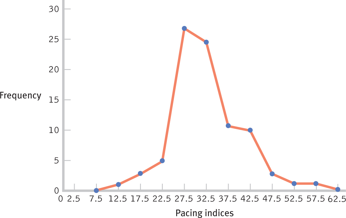
For the most part, we make frequency polygons exactly as we make histograms. Instead of constructing bars above each value or midpoint, however, we draw dots and connect them. The other difference is that we need to add an appropriate value (or midpoint) on either end of the graph so that we can draw lines down to 0, grounding the shape. In the case of the TV pacing data, we calculate one more midpoint on each end by subtracting the interval size, 5, from the bottom midpoint (12.50 − 5 = 7.5) and adding the interval size, 5, to the top midpoint (57.5 + 5 = 62.5). We now can construct the frequency polygon by placing these midpoints on the x-axis, drawing dots at each midpoint that are as high as the frequency for each interval, and connecting the dots. Figure 2-3 shows the frequency polygon for the grouped frequency distribution of TV pacing indices that we constructed previously in Figure 2-2.
Here is a recap of the steps to construct a frequency polygon. When basing a frequency polygon on a frequency table, we place the specific values on the x-axis. When basing it on a grouped frequency table, we place the midpoints of intervals on the x-axis.
- If based on a grouped frequency table, determine the midpoint for every interval. If based on a frequency table, skip this step.
- Draw the x-axis and label it with the variable of interest and either the values or the midpoints. (Include 0 unless it’s impractical.)
- Draw the y-axis, label it “Frequency,” and include the full range of frequencies for this variable. (Include 0 unless it’s impractical.)
- Mark a dot above each value or midpoint depicting the frequency, as represented on the y-axis, for that value or midpoint, and connect the dots.
- Add an appropriate hypothetical value or midpoint on both ends of the x-axis, and mark a dot for a frequency of 0 for each of these values or midpoints. Connect the existing line to these dots to create a shape rather than a “floating” line.

Figure 2-
34
CHECK YOUR LEARNING
Reviewing the Concepts
- The first steps in organizing data for a single variable are to list all the values in order of magnitude and then count how many times each value occurs.
- There are four techniques for organizing information about a single variable: frequency tables, grouped frequency tables, histograms, and frequency polygons.
Clarifying the Concepts
- 2-
1 Name four different ways to organize raw scores visually. - 2-
2 What is the difference between frequencies and grouped frequencies?
Calculating the Statistics
- 2-
3 In 2013, U.S. News & World Report published a list of the citations per faculty member score for the 400 best universities in the world. As examples, the Massachusetts Institute of Technology is number 1 on the list of best universities and McGill University in Montreal is number 18. The citation score tells us how many times a faculty member’s research has been cited by other researchers over the previous 5 years, and is an indicator of research productivity. Here are the data for the top 50 institutions:
- Construct a grouped frequency table of these data.
- Construct a histogram for this grouped frequency table.
- Construct a frequency polygon for this grouped frequency table.
Applying the Concepts
- 2-
4 Consider the data from Check Your Learning 2-3, as well as the table and graphs that you constructed. - What can we tell from the graphs and table that we cannot tell from a quick glance at the list of scores?
- What issues might arise in considering data across countries with a wide range of academic systems?
Solutions to these Check Your Learning questions can be found in Appendix D.