4.1 Central Tendency
Central tendency refers to the descriptive statistic that best represents the center of a data set, the particular value that all the other data seem to be gathering around.
Central tendency refers to the descriptive statistic that best represents the center of a data set, the particular value that all the other data seem to be gathering around—the “typical” score. Creating a visual representation of the distribution, as we did in Chapter 2, reveals its central tendency. The central tendency is usually at (or near) the highest point in the histogram or the polygon. The way that data cluster around their central tendency can be measured in three different ways: mean, median, and mode. For example, Figure 4-1 shows the histogram for the data on World Cup top finishes that we first considered in Chapter 2 (omitting scores for countries with no top finishes). Our guess is that their central tendency is just to the right of the tallest bar.
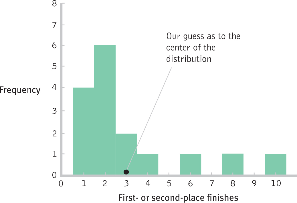
Figure 4-
79
Mean, the Arithmetic Average
The mean is simple to calculate and is the gateway to understanding statistical formulas. The mean is such an important concept in statistics that we provide you with four distinct ways to think about it: verbally, arithmetically, visually, and symbolically (using statistical notation).
The Mean in Plain English
The most commonly reported measure of central tendency is the mean, the arithmetic average of a group of scores. The mean, often called the average, is used to represent the “typical” score in a distribution. Because this is different from the way we sometimes use the word average in everyday conversation, noting that someone is “just” average in athletic ability or that a movie was “only” average, we need to define the mean arithmetically.
The Mean in Plain Arithmetic
The mean is calculated by summing all the scores in a data set and then dividing this sum by the total number of scores. You likely have calculated means many times in your life.
EXAMPLE 4.1
For example, the mean number of top World Cup finishes is calculated by (a) adding the number of top finishes for each country; then (b) dividing by the total number of countries. We’ll do this for the 16 countries that had at least 1 top finish, omitting the 64 with 0 top finishes.
STEP 1: Add all of the scores together.
1 + 1 + 1 + 1 + 2 + 2 + 2 + 2 + 2 + 2 + 3 + 3 + 4 + 6 + 8 + 10 = 50
STEP 2: Divide the sum of all scores by the total number of scores.
In this case, we divide 50, the sum of all scores, by 16, the number of scores in this sample:
50/16 = 3.125
Visual Representations of the Mean
Think of the mean as the visual point that perfectly balances two sides of a distribution. For example, the mean of 3.13 “top finishes” is represented visually as the point that perfectly balances that distribution, as you can see in the Figure 4-2 histogram.
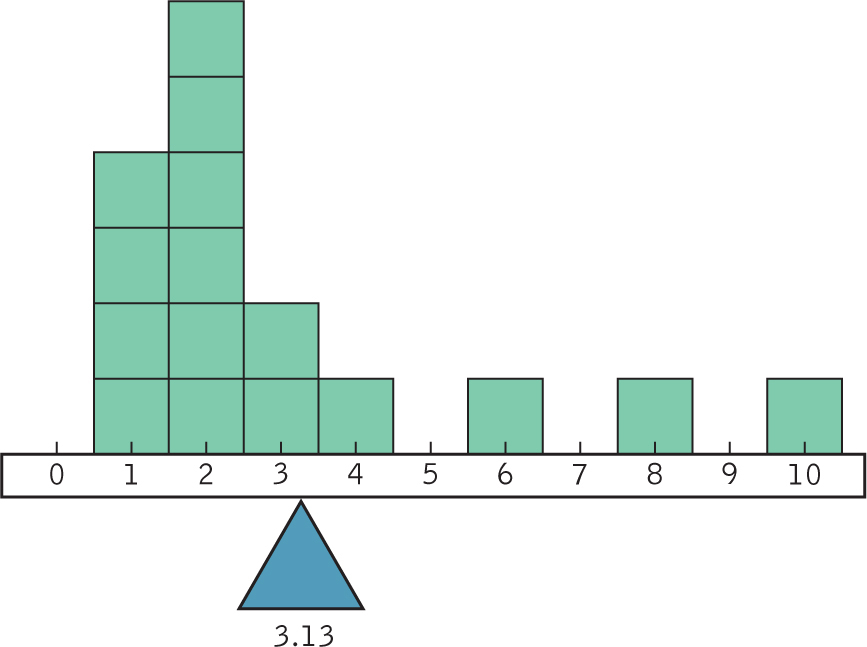
Figure 4-
The Mean Expressed by Symbolic Notation
The mean is the arithmetic average of a group of scores. It is calculated by summing all the scores in a data set and then dividing this sum by the total number of scores.
Symbolic notation may sound more difficult than it really is. After all, you just calculated a mean without symbolic notation and without a formula. Fortunately, we need to understand only a handful of symbols to express the ideas necessary to understand statistics.
80
A statistic is a number based on a sample taken from a population; statistics are usually symbolized by Latin letters.
A parameter is a number based on the whole population; parameters are usually symbolized by Greek letters.
Here are the several symbols that represent the mean. For the mean of a sample, statisticians typically use M or  . In this text, we use M; many other texts also use M, but some use
(pronounced “X bar”). For a population, statisticians use the Greek letter μ (pronounced “mew”) to symbolize the mean. (Latin letters such as M tend to refer to numbers based on samples; Greek letters such as μ tend to refer to numbers based on populations.) The numbers based on samples taken from a population are called statistics; M is a statistic. The numbers based on whole populations are called parameters; μ is a parameter. Table 4-1 summarizes how these terms are used, and Figure 4-3 presents a mnemonic, or memory aid, for these terms to help you grow accustomed to using them.
. In this text, we use M; many other texts also use M, but some use
(pronounced “X bar”). For a population, statisticians use the Greek letter μ (pronounced “mew”) to symbolize the mean. (Latin letters such as M tend to refer to numbers based on samples; Greek letters such as μ tend to refer to numbers based on populations.) The numbers based on samples taken from a population are called statistics; M is a statistic. The numbers based on whole populations are called parameters; μ is a parameter. Table 4-1 summarizes how these terms are used, and Figure 4-3 presents a mnemonic, or memory aid, for these terms to help you grow accustomed to using them.
| Number | Used for | Symbol | Pronounced |
|---|---|---|---|
| Statistic | Sample |
M or
|
“M” or “X bar” |
| Parameter | Population | μ | “Mew” |
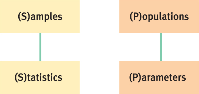
Figure 4-
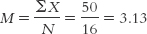
The formula to calculate the mean of a sample uses the symbol M on the left side of the equation; the right side describes how to perform the calculation. A single score is typically symbolized as X. We know that we’re summing all the scores—
Here are step-
Step 1: Add up all of the scores in the sample. In statistical notation, this is ΣX.
Step 2: Divide the total of all of the scores by the total number of scores. The total number of scores in a sample is typically represented by N. (Note that the capital letter N is typically used when we refer to the number of scores in the entire data set; if we break the sample down into smaller parts, as we’ll see in later chapters, we typically use the lowercase letter n.) The full equation would be:
MASTERING THE FORMULA
4- . To calculate the mean, we add up every score, and then divide by the total number of scores.
81
EXAMPLE 4.2
Let’s look at the mean for the World Cup data that we considered earlier in Example 4.1.
STEP 1: We add up every score.
The sum of all scores, as we calculated previously, is 50.
STEP 2: We divide the sum of all scores by the total number of scores.
In this case, we divide the sum of all scores, 50, by the total number of scores, 16. The result is 3.13, rounded up from 3.125.
Here’s how it would look as a formula:
Language Alert! As demonstrated above, almost all symbols are italicized, but the actual numerical values of the statistics are not italicized. In addition, changing a symbol from uppercase to lowercase often indicates a change in meaning. When you practice calculating means using this formula, be sure to italicize the symbols and use capital letters for M, X, and N.
Median, the Middle Score
The median is the middle score of all the scores in a sample when the scores are arranged in ascending order. If there is no single middle score, the median is the mean of the two middle scores.
The second most common measure of central tendency is the median. The median is the middle score of all the scores in a sample when the scores are arranged in ascending order. We can think of the median as the 50th percentile. The American Psychological Association (APA) suggests abbreviating “median” by writing “Mdn.” APA style, by the way, is used across the social and behavioral sciences, so this would be a good time to get used to it.

To determine the median, follow these steps:
Step 1: Line up all the scores in ascending order.
Step 2: Find the middle score. With an odd number of scores, there will be an actual middle score. With an even number of scores, there will be no actual middle score. In this case, calculate the mean of the two middle scores.
Don’t bother with a formula when a distribution has only a few data points. Just list the numbers from lowest to highest and note which score has the same number of scores above it and below it. The calculation is easy even when a distribution has many data points. Divide the number of scores (N) by 2 and add 1/2—
82
EXAMPLE 4.3
Here is an example with an odd number of scores (representing numbers of top finishes for 15 of the 16 countries in the World Cup example; we omitted one score, a 2):
10 1 2 1 8 2 2 3 1 4 2 6 3 1 2
STEP 1: Arrange the scores in ascending order:
1 1 1 1 2 2 2 2 2 3 3 4 6 8 10
STEP 2: Find the middle score.
To do this, first we count. There are 15 scores: 15/2 = 7.5. If we add 0.5 to this result, we get 8. Therefore, the median is the 8th score. We now count across to the 8th score. The median is 2.
EXAMPLE 4.4
Here is an example with an even number of scores. We now include all 16 countries from the World Cup data in Example 4.1, including the score of 2 that we omitted in Example 4.3.
STEP 1: Arrange the scores in ascending order.
The data are now:
1 1 1 1 2 2 2 2 2 2 3 3 4 6 8 10
STEP 2: Find the middle score.
First, we count the scores. There are 16. We then divide the number of scores by 2: 16/2 = 8. If we add 0.5 to this result, we get 8.5; therefore, the median is the average of the 8th and 9th scores. The 8th and 9th scores are 2 and 2. The median is their mean—
Mode, the Most Common Score
The mode is the most common score of all the scores in a sample.
The mode is perhaps the easiest of the three measures of central tendency to calculate. The mode is the most common score of all the scores in a sample. It is readily picked out on a frequency table, a histogram, or a frequency polygon. Like the median, the APA style for the mode does not have a symbol—
EXAMPLE 4.5
Determine the mode for the World Cup data for the 16 countries. Remember that each score represents the number of that country’s top finishes in World Cup tournaments. The mode can be found either by searching the list of numbers for the most common score or by constructing a frequency table:

Did you get 2? If you didn’t, you might have made a common mistake. The mode is the score that occurs most frequently, not the frequency of that score. So, in the data set above, the score 2 occurs 6 times. The mode is 2, not 6.
83
A unimodal distribution has one mode, or most common score.
A bimodal distribution has two modes, or most common scores.
A multimodal distribution has more than two modes, or most common scores.
The mode in this example is particularly easy to determine because it is easy to see that there is one most common score. Sometimes a data set has no specific mode. This is especially true when the scores are reported to several decimal places (and no number occurs twice). When there is no specific mode, we sometimes report the most common interval as the mode; for example, we may say that the mode on a statistics exam is 70–
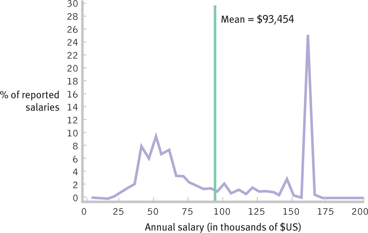
Figure 4-
As demonstrated in the law salary example, the mode can be used with scale data; however, it is more commonly used with nominal data. For example, the British newspaper the Guardian (Rogers, 2013) published maps based on census data that showed how residents of England and Wales typically commute to work. They reported that 3.5% work at home; 10.5% use public transportation; 40.4% commute by car; 0.5% ride a motorcycle; 1.9% ride a bicycle; 0.3% take a taxi; and 6.9% walk. In this data set, the modal commute is by car. (Note that this doesn’t add up to 100 because the remaining people are not employed.)
How Outliers Affect Measures of Central Tendency
The mean is not the best measure of central tendency when the data are skewed by one or a few statistical outliers—
| San Marino | 47.35 |
| Cuba | 6.40 |
| Greece | 6.04 |
| Monaco | 5.81 |
| Belarus | 4.87 |
EXAMPLE 4.6
To get a sense of overall physician density, we might want to calculate a measure of central tendency for these five countries. We’ll use the formula to get a little more practice with the symbols of statistics.

84
In Figure 4-5, weights are placed to represent each of the scores in the sample, and they demonstrate an important feature of the mean. Like a seesaw, the mean is the point at which all the other scores are perfectly balanced. The physician density scores range from 4.87 to 47.35 and demonstrate the problem with using the mean when there is an outlier: The mean is not typical for any of the five countries in this sample, even though the seesaw is perfectly balanced if we put its fulcrum at the mean of 14.09.
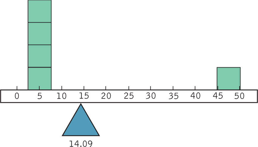
Figure 4-
We can’t help but notice that the tiny country of San Marino (an enclave within Italy; population 33,000) is very different from the other countries. Four of the scores are between 4.87 and 6.4 physicians per 1000 people, a much smaller range. But San Marino enjoys 47.35 physicians per 1000 people. When there is an outlier like San Marino, it is important to consider what this score does to the mean, especially if we have only a few observations.
EXAMPLE 4.7
When we eliminate San Marino’s score, the data are now 6.40, 6.04, 5.81, and 4.87, and the new mean is:
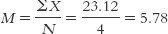
The new mean of these scores, 5.78, is a good deal lower than the original mean of the scores that included San Marino’s outlier. We see from Figure 4-6 that this new mean, like the original mean, marks the point at which all other scores are perfectly balanced around it. However, this new mean is a little more representative of the scores: 5.78 is a more typical score for these four countries. Pay attention to outliers; they usually tell an interesting story!
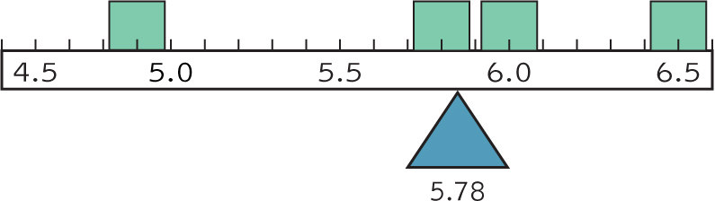
Figure 4-
Which Measure of Central Tendency Is Best?

Different measures of central tendency can lead to different conclusions, but when a decision needs to be made, the choice is usually between the mean and the median. The mean usually wins, especially when there are many observations—
85
The mode is generally used in three situations: (1) when one particular score dominates a distribution; (2) when the distribution is bimodal or multimodal; and (3) when the data are nominal. When you are uncertain as to which measure is the best indicator of central tendency, report all three.
Central tendency communicates an enormous amount of information with a single number, so it is not surprising that measures of central tendency are among the most widely reported of descriptive statistics. Unfortunately, consumers can be tricked by reports that use the mean instead of the median. When you hear a radio report about the central tendency of housing prices, for example, first notice whether it is reporting an average (mean) or a median. You’ll see an example of the housing market and a celebrity outlier in the photograph above.
MASTERING THE CONCEPT
4.2: The mean is the most common indicator of central tendency, but it is not always the best. When there is an outlier or few observations, it is usually better to use the median.
CHECK YOUR LEARNING
Reviewing the Concepts
- The central tendency of a distribution is the one number that best describes what is typical in that distribution (often its high point).
- The three measures of central tendency are the mean (arithmetic average), the median (middle score), and the mode (most frequently occurring score).
- The mean is the most commonly used measure of central tendency, but the median is preferred when the distribution is skewed.
- The symbols used in statistics have very specific meanings; changing a symbol even slightly can change its meaning a great deal.
86
Clarifying the Concepts
- 4-
1 What is the difference between statistics and parameters? - 4-
2 Does an outlier have the greatest effect on the mean, the median, or the mode?
Calculating the Statistics
- 4-
3 Calculate the mean, median, and mode of the following sets of numbers.- 10 8 22 5 6 1 19 8 13 12 8
- 122.5 123.8 121.2 125.8 120.2 123.8 120.5 119.8 126.3 123.6
- 0.100 0.866 0.781 0.555 0.222 0.245 0.234
Applying the Concepts
- 4-
4 Let’s examine fictional data for 20 seniors in college. Each score represents the number of nights a student spends socializing in one week: 1 0 1 2 5 3 2 3 1 3 1 7 2 3 2 2 2 0 4 6- Using the formula, calculate the mean of these scores.
- If the researcher reported the mean of these scores to the university as an estimate for the whole university population, what symbol would she use for the mean? Why?
- If the researcher were interested only in the scores of these 20 students, what symbol would she use for the mean? Why?
- What is the median of these scores?
- What is the mode of these scores?
- Are the median and mean similar to or different from each other? What does this tell you about the distribution of scores?
- 4-
5 Savvy companies can use their knowledge of outliers to trick consumers. For example, television networks need high average ratings to attract advertising dollars; the U.S. network NBC aired the Republican presidential primary debate in January 2012, a show that should have been labeled as “special programming.” A New York Times article explained the trickery: “Careful viewers noticed that the debate was labeled a regular edition of the network’s ratings-challenged newsmagazine program, ‘Rock Center with Brian Williams’—one that, as it turned out, just happened to double the show’s usual audience to just over 7.1 million viewers” (Carter, 2012). In your own words, explain why this labeling would be useful to NBC.
Solutions to these Check Your Learning questions can be found in Appendix D.