13.3 Modeling Trend and Seasonality Using Regression
A time plot along with randomness checks (for example, runs test and ACF) provide us with the basic tools to assess whether a time series is random or not. With a random time series, our “modeling” of the series trivializes to using a single numerical summary such as the sample mean. However, if we find evidence that the time series is not random, then the challenge is to model the systematic patterns. In the special case of random walks, modeling involves only the simple technique of differencing to capture the systematic pattern.
By capturing the essential features of the time series in a statistical model, we position ourselves for improved forecasting. In this section, we consider two common systematic patterns found in practice: (1) trend and (2) seasonality. We learn how the regression methods covered in Chapters 10 and 11 can be used to model these time series effects.
Identifying trends
As we saw in Figure 13.2 (page 645), a trend is a steady movement of the time series in a particular direction. Trends are frequently encountered and are of practical importance. A trend might reflect growth in company sales. Continual process improvement efforts might cause a process, such as defect levels, to steadily decline.
EXAMPLE 13.12 Monthly Cable Sales
wire
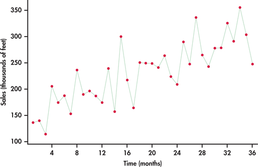
Consider the monthly sales data for festoon cable manufactured by a global distributor of electric wire and cable taken over a three-year horizon starting with January.10 Festoon cable is a flat cable used in overhead material-handling equipment such as cranes, hoists, and overhead automation systems. The sales data are specifically the total number of linear feet (in thousands of feet) sold in a given month. In the time plot of Figure 13.19, the upward trend is clearly visible.
If we ignore the line connections made between successive observations, the plot of Figure 13.19 can be viewed as a scatterplot of the response variable (sales) against the explanatory variable, which is simply the indexed numbers 1, 2, …, 36. With this perspective we can use the ideas of simple linear regression (Chapter 2) and software to estimate the upward trend. From the following Excel regression output, we estimate the linear trend to be
S^ALESt=147.186+4.533t
where t is a time index of the number of months elapsed since the first month of the time series; that is, t=1 corresponds to first month (January), t=2 corresponds to second month (February), and so on. Figure 13.20 is the time plot of Figure 13.19 with the estimated trend line superimposed.
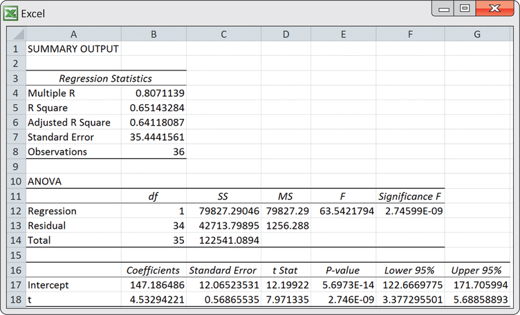
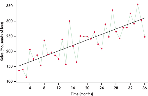
The equation of the line provides a mathematical model for the observed trend in sales. The estimated slope of 4.533 indicates that festoon cable sales increased an average of 4.533 thousand feet per month.
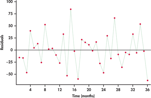
In Chapters 10 and 11, we discussed how a plot of the residuals against the explanatory variables can be used to check whether certain conditions of the regression model are being met. When using regression for time series data, we need to recognize that the residuals are themselves time ordered. If we are successful in modeling the systematic component(s) of a time series, then the residuals will behave as a random process. Figure 13.21 shows a time plot of the residuals. The plot indicates that the residuals are consistent with randomness, which, in turn, implies that the linear trend is a good fit for the time series.
In Example 13.12, we created a column of the time index values (1,2,…,36) to represent our x variable, and then we ran a regression of sales on the time index. It turns out that some software, including Excel and Minitab, provide a direct trend fitting option, saving us from having to create the time index variable and then separately running the regression procedure. We use this convenient option in Example 13.13.
In Chapter 11, we used regression techniques to fit a variety of models to data. For example, we used a polynomial model to predict the prices of houses in Example 11.19 (pages 569–570). Trends in time series data may also be best described by a curved model like a polynomial. The techniques of Chapter 11 help us fit such models to time series data. Example 13.13 illustrates the fitting of a curved model to a nonlinear trend.

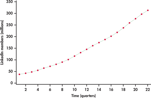
EXAMPLE 13.13 LinkedIn Members
linked
LinkedIn is the largest professional networking service. Unlike Facebook, LinkedIn is a business-oriented social network allowing its members to place online resumes and to connect with other members for career opportunities. Figure 13.22 shows the number of LinkedIn members (in millions) by quarter starting from the first quarter of 2009 and ending with the second quarter of 2014.11
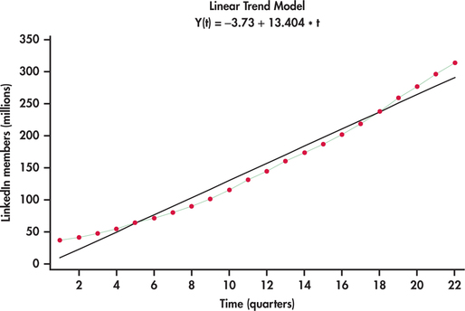
The number of members are clearly increasing with time. However, the trend appears not to be linear. Created using Excel’s trendline option with charts, Figure 13.23 shows a linear trend fit to the LinkedIn series. It is clear that the linear trend model fit is systematically off. The linear model is not able to capture the curvature in the series. One possible approach to fitting curved trends is to introduce the square of the time index to the model:
ˆyt=b0+b1t+b2t2
Such a fitted model is known as a quadratic trend model. Figure 13.24 shows the best-fitting quadratic trend model. In comparison to the linear trend model, the quadratic trend model fits the data series remarkably well.
quadratic trend model
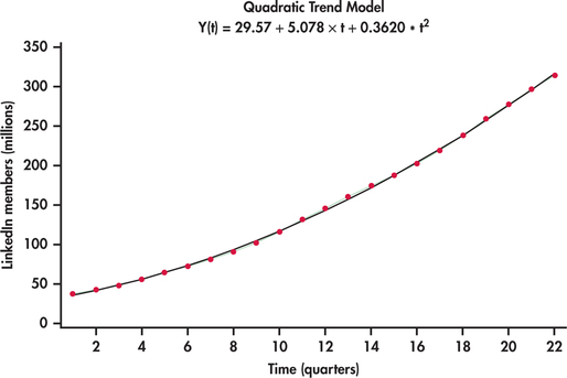
Quadratic trends can be quite flexible is adapting to a variety of curvature in practice but there can be nonlinear patterns that challenge the quadratic model as seen with our next example.
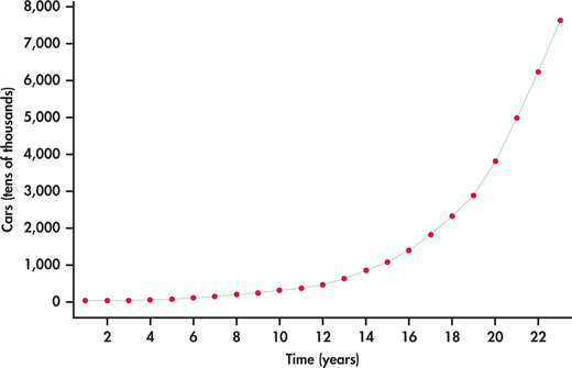
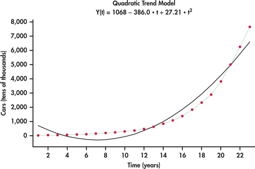
EXAMPLE 13.14 Chinese Car Ownership
china
China’s rapid economic growth can be measured on numerous dimensions. Consider Figure 13.25, which shows the time plot of the number of passenger cars owned (in tens of thousands) in China from 1990 to 2012.12 What we see is an increasing rate of growth with time. Figure 13.26 shows the best-fitting quadratic trend model. It is clear that a quadratic model does not follow the growth pattern well.
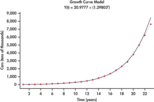
exponential trend model
An alternative model that is often well suited to rapidly growing (or decaying) data series is an exponential trend model. Figure 13.27 shows the China car ownership data with an exponential trend superimposed. This model does a much nicer job than the quadratic model in tracking the growth in passenger car ownership. Minitab reports the estimated exponential trend to be
ˆyt=20.9777(1.29803t)
The estimated model has direct interpretation on the growth rate. In particular, as the time index t increases by one unit, we multiply the estimate for the number of cars from the previous year by 1.29803. This implies that the yearly growth rate in the number of passenger cars is estimated to be 29.8%. However, it appears that actual growth might be slowing down in that the exponential fit is over predicting by a bit in years 2011 and 2012. As more data come in, it will be important to monitor the forecasts relative to actual observations. When the forecasts are consistently off, this is a critical signal to reestimate the trend model.
If the exponential trend fit option were done in Excel, Excel would report the fit as:
ˆyt=20.9777e0.26085t
The mathematical constant e was introduced in Chapter 5 with the Poisson distribution on page 268. We see here that the reported models are the same in the end:
ˆyt=20.9777e0.26085t=20.9777(e0.26085)t=20.9777(1.29803t)
Apply Your Knowledge
Question 13.18
13.18 Percent of Canadian Internet users.
Below are data on the time series of the percent of Canadians using the Internet for eight consecutive years ending in 2013.13
| Year | 2006 | 2007 | 2008 | 2009 | 2010 | 2011 | 2012 | 2013 |
| Percent (%) | 72.4 | 73.2 | 76.7 | 80.3 | 80.3 | 83.0 | 83.0 | 85.8 |
We usually want a time series longer than just eight time periods, but this short series will give you a chance to do some calculations by hand. Hand calculations take the mystery out of what computers do so quickly and efficiently for us.
- Make a time plot of these data.
- Using the following summary information, calculate the least-squares regression line for predicting the percent of Canadians using the Internet. The variable t simply takes on the values 1, 2, 3, …, 8 in time order.Page 671
Variable Mean Standard deviation Correlation t 4.5 2.44949 0.977 Percent users 79.3375 4.82847 - Sketch the least-squares line on your time plot from part (a). Does the linear model appear to fit these data well?
- Interpret the slope in the context of the application.
Question 13.19
13.19 Monthly cable sales.
Refer to the computer output for the linear trend fit of Example 13.12 (pages 665–666).
- Test the null hypothesis that the regression coefficient for the trend term is zero. Give the test statistic, P-value, and your conclusion.
- The series ended at t=36. Provide forecasts for festoon cable sales for periods t=37 and t=38.
13.19
(a) H0:β1=0, Ha:β1≠0, t=7.97, P-value=2.74599E-09. The data show a significant non-zero trend term. (b) 314.907. 319.44.
Question 13.20
13.20 LinkedIn members.
Refer to the quadratic fit shown in Figure 13.24 (page 668) for the number of LinkedIn members by quarter. The series ended on the second quarter of 2014. Provide a forecast for the number of members for the third and fourth quarters of 2014.
Seasonal patterns
Variables of economic interest are often tied to other events that repeat with regular frequency over time. Agriculture-related variables will vary with the growing and harvesting seasons. Sales data may be linked to events like regular changes in the weather, the start of the school year, and the celebration of certain holidays. As a result, we find a repeating pattern in the data series that relates to a particular “season,” such as month of the year, day of the week, or hour of the day. In the applications to follow, we see that to improve the accuracy of our forecasts, we need to account for seasonal variation in the time series.
EXAMPLE 13.15 Monthly warehouse Club and Superstore Sales
club
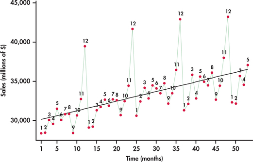
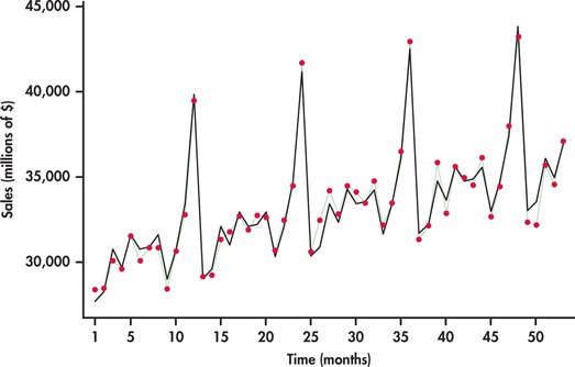
The Census Bureau tracks a variety of retail and service sales using the Monthly Retail Trade Survey.14 Consider, in particular, monthly sales (in millions of dollars) from January 2010 through May 2014 for warehouse clubs (for example, Costco, Sam’s Club, and BJ’s Wholesale Club) and superstores (for example, Target and Walmart).
Figure 13.28 plots monthly sales with the months labeled “1” for January, “2” for February, and so on. The plot reveals interesting characteristics of sales for this sector:
- Sales are increasing over time. The increase is reflected in the superimposed trend line fit.
- A distinct pattern repeats itself every 12 months: January, February, and September sales are consistently below the trend line; sales pick up in the spring months and seem to level off; and, finally, there is an initial increase in November sales followed by a more dramatic increase to a peak in December.
A trend line fitted to the data in Figure 13.28 ignores the seasonal variation in the sales time series. Because of this, using a trend model to forecast sales for, say, December 2015 will most likely result in a gross underestimate because the line underestimates sales for all the Decembers in the data set. We need to take the month-to-month pattern into account if we wish to accurately forecast sales in a specific month.
Using indicator variables
Indicator variables were introduced in Chapter 11. We can use indicator variables to add the seasonal pattern in a time series to a trend model. Let’s look at the details for the monthly sales data of Example 13.15.
EXAMPLE 13.16 Monthly warehouse Club and Superstore Sales
club
The seasonal pattern in the sales data seems to repeat every 12 months, so we begin by creating 12−1=11 indicator variables.
Jan={1if the month is January0otherwiseFeb={1if the month is February0otherwise⋮Nov={1if the month is November0otherwise
December data are indicated when all 11 indicator variables are 0.
We can extend the trend model with these indicator variables. The new model captures the trend along with the seasonal pattern in the time series.
SALESt=β0+β1t+β2Jan+⋯+β12Nov+εt
Fitting this multiple regression model to our data, we get the regression output shown in Figure 13.29. Figure 13.30 displays the time plot of sales observations with the trend-and-season model superimposed. You can see the dramatic improvement over the trend-only model by comparing Figure 13.28 with Figure 13.30. The improved model fit is reflected in the R2-values for the two models: R2=97.2% for the trend-and-season model and R2=32.3% for the trend-only model. The significance of seasonal
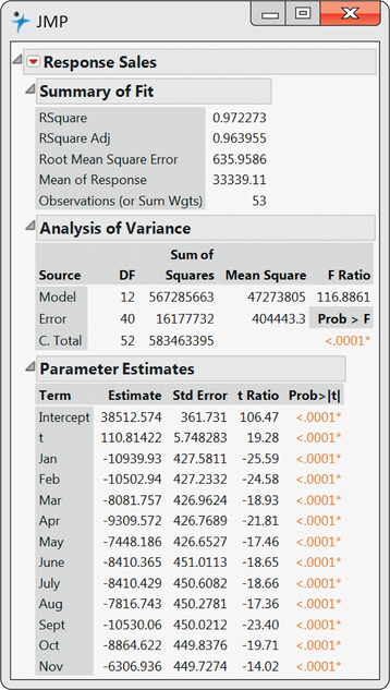
variables can be collectively tested with an F-test introduced in Chapter 11. The heart of the test is based on the change in R2. In our case, we find the seasonal variables significantly contribute to the prediction of sales (F=85.15 and P<0.001).
Notice from the regression output that all the monthly coefficients are negative. The reason for this is because of the exclusion of the December indicator variable in the model. December would be associated with all the other indicator variables being 0. When all of these 0’s are substituted into the model, we obtain a baseline trend model fit for the Decembers. Each of the other months have an estimated trend line a certain amount below December depending on the magnitude of the month’s coefficient.
When using indicator variables to incorporate seasonality into a trend model as we did in Example 13.16, we view the model as a trend component plus a seasonal component:
ˆy=TREND+SEASON
You can see this in Example 13.16, where we added the indicator variables to the trend model. A time series well represented by such a model is said to have additive seasonal effects. With an additive seasonal model, the implication is that the average amount of increase or decrease in sales for a given month around the trend line is the same from year to year.
additive seasonal effects
EXAMPLE 13.17 Amazon Sales
CASE 13.1 Refer back to Figure 13.4 (page 648) showing a time plot of quarterly Amazon sales. We noted that sales is increasing at a greater rate over time. This implies the need for a nonlinear trend model. We also noted that the fourth-quarter seasonal surge increases over time. One explanation for this phenomenon is that the seasonal variation is proportional to the general level of sales. Consider, for example, that fourth-quarter sales are, on average, 40% greater than third-quarter sales. Even though the fourth-quarter percent increase remains fairly constant, the amount of increase in dollars will be greater and greater as the sales series grows.
From our discussion in Example 13.17, it is evident that an additive seasonal model is not appropriate for modeling the Amazon series. Instead, we need to consider the situation in which each particular season is some proportion of the trend. Such a perspective views the model for the time series as a trend component times a seasonal component:
ˆy=TREND×SEASON
multiplicative seasonal effects
A time series well represented by such a model is said to have multiplicative seasonal effects. One strategy for constructing a multiplicative model is to utilize the logarithmic function. Consider the result of applying the logarithm to the product of the trend and seasonal components:
log(ˆy)=log(TREND×SEASON)=log(TREND)+log(SEASON)
We can see that the logarithm changes the modeling of trend and seasonality from a multiplicative relationship to an additive relationship. When the trend component is an exponential trend ˆy=aebt, we can gain another insight from the application of the logarithm:
log(ˆy)=log(aebt)=log(a)+log(ebt)=log(a)+bt
This breakdown implies that fitting an exponential trend model can be accomplished by fitting a simple linear trend model with log(y) as the response variable. Because the logarithm can simplify the seasonal and trend fitting process, it is commonly used for time series model building.
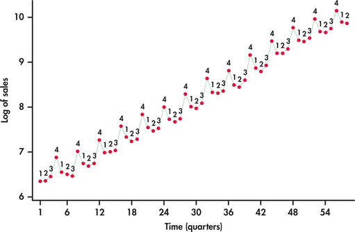
EXAMPLE 13.18 Fitting and Forecasting Amazon Sales
amazon
CASE 13.1 In Case 13.1 (page 647), we observed that the time series was growing at an increasing rate, which leads us to consider an exponential trend model. Additionally, we saw that the seasonal variation increases with the growth of sales. This indicates that an additive seasonal model is probably not the best choice.
It seems that this data series is a good candidate for logarithmic transformation. Figure 13.31 displays the sales series in logged units. Compare this time plot with Figure 13.4 (page 648). In logged units, the trend is now nearly perfectly linear. Furthermore, the seasonal variation from the trend is much more constant. These facts together imply that we can model logged sales as a linear trend with additive seasonal indicator variables:
log(SALESt)=β0+β1t+β2Q1+β3Q2+β4Q3+ϵt
where Q1, Q2, and Q3 are indicator variables for quarters 1, 2, and 3, respectively. Statistical software calculates the fitted model to be
log(S^ALESt)=6.5091+0.065954t−0.3409Q1−0.4454Q2−0.4351Q3
To make predictions of sales in the original units, millions of dollars, we can first predict sales in logged units using the preceding fitted equation. The series ended with the second quarter of 2014 and with t=58. The next period would than be the third quarter of 2014 with t=59, which means a forecast of
log(S^ALES59)=6.5091+0.065954t−0.3409Q1−0.4454Q2−0.4351Q3=6.5091+0.065954(59)−0.3409(0)−0.4454(0)−0.4351(1)=9.965286
At this stage, we untransform the log prediction value by applying the exponential function, which on your calculator is the ex key.
e9.965286=21274.96
However, it should be noted that by exponentiating the predicted value of log(y), the untransformed value provides an estimate of the median response at the given values of the predictor variables. Recall that standard regression provides an estimate for the mean response at given values of the predictor variables. If prediction of the mean is desired, then an adjustment factor must be applied to the untranformed prediction.15
The adjustment is accomplished by multiplying the untransformed prediction by es2/2, where s is the regression standard error from the log-based regression. From the regression output for the fitting of logged sales, we find s=0.073661. The predicted mean sales is then
S^ALES59=21274.96es2/2=21274.96e0.0736612/2=21274.96(1.0027)=21332.40
In this application, the regression standard error is small, which results in only a slight adjustment to the initial untransformed value. The forecast is in millions of dollars. So third-quarter sales are forecasted to be about $21.332 billion.
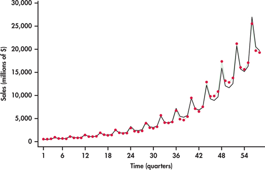
Figure 13.32 displays the original sales series with the trend-and-season model predictions using the mean adjustment described in the preceding example. The fitted values not only follow the trend nicely, but also do a good job of adapting to the increasing seasonal variation.
Be aware that the adjustment made in Example 13.18 to the untransformed log prediction is not automatically done by most software. For example, consider the exponential trend fitted models reported by Minitab and Excel in Example 13.14 (pages 669–670) for the number of cars owned in China. These models are simply the result of exponentiating a linear trend fit of log(y) with no adjustments made. Technically, this implies that the reported exponential trend models from software are estimating the median response in original units. However, as we saw in Example 13.18, the differences in predicted values with or without the adjustment are relatively small when the log fit has a small regression standard error, as is also the case in the application of Example 13.14.
Finally, it is important to note that no adjustments are required when untransforming a prediction interval. To obtain a prediction interval for a response in original units, we first obtain the prediction interval using the regression for the transformed data and then simply untransform back the lower and upper endpoints of the prediction interval. Hence, if the prediction interval for log(y) is (a, b), then the prediction interval for y in original units is (ea, eb).
Apply Your Knowledge
Question 13.21
13.21 Monthly warehouse club and superstore sales.
Consider the monthly warehouse club and superstore sales series discussed in Examples 13.15 and 13.16 (pages 671–674). Using the trend-and-season fitted model shown in Example 13.16, provide forecasts for the seven remaining months of 2014.
13.21
For June: $36,086.18. For July: $36,196.93. For August: $36,901.43. For September: $34,298.92. For October: $36,075.18. For November: $38,743.68. For December: $45,161.43.
Question 13.22
13.22 Number of iPhones sold globally.
Consider data on the quarterly global sales (in millions of dollars) of iPhones from the first quarter of 2012 to the third quarter of 2014. Create indicator variables for the first, second, and third quarters along with a trend index. Call these indicator variables Q1, Q2, and Q3.
- Use statistical software to fit a multiple regression model of trend plus the three indicator variables. Write down the estimated trend-and-season model.
- Eliminate any insignificant predictor variables found in the regression output from part (a), and reestimate the trend-and-season model. Write down the estimate trend-and-season model.
- Based on the model found in part (b), provide forecasts of quarterly sales for the next four quarters in the future.
iphone
Question 13.23
13.23 Chinese car ownership.
In Example 13.14 (pages 669–670), we found that an exponential trend model was a reasonable fit to the time series of the number of passenger cars owned in China. Based on the fitted model provided in the example, what is the fitted model for the number of passenger cars owned in logged units? This problem should be done without the use of computer software. Only a calculator is needed.
13.23
log(PredCars)=3.04346+0.26085t.
Residual checking
In our discussions following the trend fit of cable sales in Example 13.12, we noted that if the residuals from a regression applied to time series data are consistent with a random process, then the estimated model has captured well the systematic components of the series (page 666). Because the cable series seems to be only influenced by trend effect, the residuals from the trend-only model are consistent with a random process, as seen in Figure 13.21 (page 667). In contrast, fitting a trend-only model to a time series influenced by both trend and seasonality will result in residuals that show seasonal variation. Similarly, fitting a seasonal-only model to a time series influenced by both trend and seasonality will result in residuals that show trend behavior.
Modeling the trend and seasonal components correctly does not, however, guarantee that the residuals will be random. What trend and seasonal models do not capture is the influence of past values of time series observations on current values of the same series. A simple form of this dependence on past values is known as autocorrelation. In Section 13.1, we introduced the ACF, which provides us with correlation estimates between observations separated by certain numbers of periods apart known as the lags. Let’s see what insights the ACF can provide us in our modeling of the Amazon sales series.
EXAMPLE 13.19 Residual Analysis of Amazon Sales Model
CASE 13.1 Figure 13.33 plots the residuals from the trend-and-season regression model for logged Amazon sales given in Example 13.18. Notice the pattern of long runs of positive residuals and long runs of negative residuals. The residual series appears to “snake” or “meander” around the mean line. This appearance is due to the fact that successive observations tend to be close to each other. A precise technical term for this behavior is positive autocorrelation.
positive autocorrelation
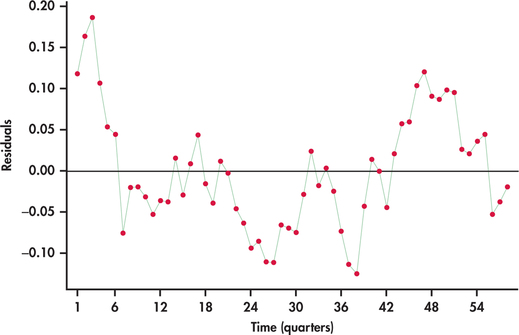
Our visual impression of nonrandomness is confirmed by the ACF of the residuals shown in Figure 13.34. We see that the first two autocorrelations are positive and significant. Furthermore, the remaining autocorrelations show a pattern within the ACF significance limits.
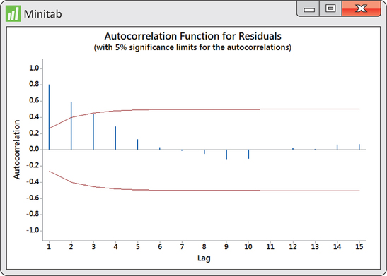
Autocorrelation in the residuals indicates an opportunity to improve the model fit. There are several approaches for dealing with autocorrelation in a time series. In the next section, we explore using past values of the time series as explanatory variables added to the model.
Apply Your Knowledge
Question 13.24
13.24 Chinese car ownership.
In Example 13.14 (pages 669–670), an exponential trend-only model was fitted to the yearly time series of the number of passenger cars owned in China. In Exercise 13.23 (page 677), you were asked to determine the fitted model for the number of passenger cars in logged units.
- Calculate the predicted number of passenger cars in logged units for each year in the time series.
Calculate the residuals using the fitted values from part (a). That is, calculate
et=log(CARSt)−log(^CARSt)
for each year in the time series.
- Make a time plot of the residuals. Is there visual evidence of autocorrelation in this plot? If so, describe the evidence.
- Compute the correlation between successive residuals et−1 and et and test the hypothesis of zero correlation. Is there evidence of autocorrelation? Explain.
china