STATISTICS IN SUMMARY
Chapter Specifics
• A scatterplot is a graph of the relationship between two quantitative variables. If you have an explanatory and a response variable, put the explanatory variable on the x (horizontal) axis of the scatterplot.
• When you examine a scatterplot, look for the direction, form, and strength of the relationship and also for possible outliers.
• If there is a clear direction, is it positive (the scatterplot slopes upward from left to right) or negative (the plot slopes downward)?
• Is the form straight or curved? Are there clusters of observations? Is the relationship strong (a tight pattern in the plot) or weak (the points scatter widely)?
• The correlation r measures the direction and strength of a straight-line relationship between two quantitative variables.
• Correlation is a number between −1 and 1. The sign of r shows whether the association is positive or negative. The value of r gets closer to −1 or 1 as the points cluster more tightly about a straight line. The extreme values −1 and 1 occur only when the scatterplot shows a perfectly straight line.
 Chapters 11, 12, and 13 discussed graphical and numerical summaries suitable for a single quantitative variable. In practice, most statistical studies examine relationships between two or more variables. In this chapter, we learn about scatterplots, a type of graph that displays the relationship between two quantitative variables, and correlation, a number that measures the direction and strength of a straight-line relationship between two quantitative variables.
As with other graphics and numbers that summarize data, scatterplots and correlations help us see what the data are telling us, in this case about the possible relationship between two quantitative variables. The goal is to draw conclusions about whether the relationships observed in our data are true in general. In the next chapter, we discuss this in detail.
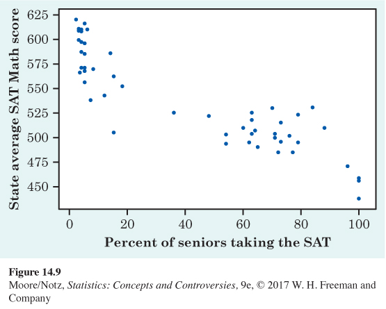
CASE STUDY EVALUATED Figure 14.9 is a scatterplot of each state’s average SAT Mathematics score and the proportion of that state’s high school seniors who took the SAT exam. SAT score is the response variable, and the proportion of a state’s high school seniors who took the SAT exam is the explanatory variable.
1. Describe the overall pattern in words. Is the association positive or negative? Is the relationship strong?
2. The plot shows two groups of states. In one group, no more than 20% took the SAT. In the other, at least 36% took the exam and the average scores tend to be lower. There are two common college entrance exams, the SAT and the ACT. In ACT states, only students applying to selective colleges take the SAT. Which group of states in the plot corresponds to states in which most students take the ACT exam?
3. Write a paragraph, in language that someone who knows no statistics would understand, explaining why comparing states on the basis of average SAT scores alone would be misleading as a way of comparing the quality of education in the states.
![]() Online Resources
Online Resources
• The StatBoards Video Creating and Interpreting Scatterplots describes how to create and interpret a scatterplot in the context of an example exploring the relationship between the cost of attending a baseball game and the team’s performance.
• The StatBoards Video Computing a Correlation describes how to compute the correlation in the context of an example exploring the relationship between the cost of attending a baseball game and the team’s performance.
fig14-09