CHAPTER 15 EXERCISES
Question 15.9
15.9 Obesity in mothers and daughters. The study in Example 7 found that the correlation between the body mass index of young girls and their hours of physical activity in a day was r=−0.18. Why might we expect this correlation to be negative? What percentage of the variation in BMI among the girls in the study can be explained by the straight-line relationship with hours of activity?
15.9 Inactive girls are more likely to be obese, so if hours of activity are small, we expect BMI to be high, and vice versa. 3.2%.
Question 15.10
15.10 State SAT scores. Figure 14.9 (page 329) plots the average SAT Mathematics score of each state’s high school seniors against the percentage of each state’s seniors who took the exam. In addition to two clusters, the plot shows an overall roughly straight-line pattern. The least-squares regression line for predicting average SAT Math score from percentage taking is
average Math SAT score=588.4
−(1.2283percentage taking)
(a) What does the slope b = tell us about the relationship between these variables?
(b) In New York State, the percentage of high school seniors who took the SAT was 76%. Predict their average score. (The actual average score in New York was 502.)
(c) On page 345, we mention that using least-squares regression to do prediction outside the range of available data is risky. For what range of data is it reasonable to use the least-squares regression line for predicting average SAT Math score from percentage taking?
Question 15.11
15.11 The endangered manatee. Figure 14.10 (page 331) plots the number of manatee deaths by boats versus the number of boats registered in Florida (in thousands). There is a clear straight-line pattern with a modest amount of scatter. The correlation between these variables is . What percentage of the observed variation among the manatees deaths by boats is explained by the straight-line relationship between manatee deaths and number of boats registered?
15.11 90.8%.
Question 15.12
15.12 State SAT scores. The correlation between the average SAT Mathematics score in the states and the percent of high school seniors who take the SAT is .
(a) The correlation is negative. What does that tell us?
(b) How well does proportion taking predict average score? (Use in your answer.)
Question 15.13
15.13 The endangered manatee. The least-squares line for predicting manatee deaths by boats from number of boats registered in Florida, based on the data plotted in Figure 14.10 (page 331), is
Explain in words the meaning of the slope . Then predict the number of manatee deaths by boats when the number of boats registered in Florida is 1000.
15.13 Number of manatee deaths by boats goes up by 0.132 when number of boats registered in Florida goes up by 1; 87.41 manatee deaths.
ex15-14
Question 15.14
15.14 Global warming. Here are annual average global temperatures for the last 21 years in degrees Celsius:
| Year | 1994 | 1995 | 1996 |
| Temperature | 14.23 | 14.35 | 14.22 |
| Year | 1997 | 1998 | 1999 |
| Temperature | 14.42 | 14.54 | 14.36 |
| Year | 2000 | 2001 | 2002 |
| Temperature | 14.33 | 14.45 | 14.51 |
| Year | 2003 | 2004 | 2005 |
| Temperature | 14.52 | 14.48 | 14.55 |
| Year | 2006 | 2007 | 2008 |
| Temperature | 14.50 | 14.49 | 14.41 |
| Year | 2009 | 2010 | 2011 |
| Temperature | 14.50 | 14.56 | 14.43 |
| Year | 2012 | 2013 | 2014 |
| Temperature | 14.48 | 14.52 | 14.59 |
You made a scatterplot of these data in Exercise 14.18 (page 332). The least-squares regression line is
What would you predict for the annual average temperature for 2014 based on this line? How accurate is your prediction?
Question 15.15
15.15 Wine and heart disease. Drinking moderate amounts of wine may help prevent heart attacks. Let’s look at data for entire nations. Table 15.1 gives data on yearly wine consumption (liters of alcohol from drinking wine, per person) and yearly deaths from heart disease (deaths per 100,000 people) in 19 developed countries in 2001.
(a) Make a scatterplot that shows how national wine consumption helps explain heart disease death rates.
(b) Describe in words the direction, form, and strength of the relationship.
(c) The correlation for these variables is . Why does this value agree with your description in part (b)?
ta15-01
| Country | Alcohol from winea |
Heart disease death rateb |
Country | Alcohol from winea |
Heart disease death rateb |
|---|---|---|---|---|---|
| Australia | 3.25 | 80 | Italy | 7.50 | 60 |
| Austria | 4.75 | 100 | Netherlands | 2.75 | 70 |
| Belgium | 2.75 | 60 | New Zealand | 2.50 | 100 |
| Canada | 1.50 | 80 | Norway | 1.75 | 80 |
| Denmark | 4.50 | 90 | Spain | 5.00 | 50 |
| Finland | 3.00 | 120 | Sweden | 2.50 | 90 |
| France | 8.50 | 40 | Switzerland | 6.00 | 70 |
| Germany | 3.75 | 90 | United Kingdom | 2.75 | 120 |
| Iceland | 1.25 | 110 | United States | 1.25 | 120 |
| Ireland | 2.00 | 130 | |||
| aLiters of alcohol from drinking wine, per person. | |||||
| bDeaths per 100,000 people, ischemic heart disease. | |||||
15.15 (b) The association is negative (direction), somewhat linear (form), and moderately strong (strength). (c) The sign of r is negative which agrees with our observation of the direction of the association. An r value of −.645 is an indication that the association is moderately strong.
Question 15.16
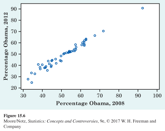
15.16 The 2008 and 2012 presidential elections. Democrat Barack Obama was elected president in 2008 and 2012. Figure 15.6 plots the percentage who voted for Obama in 2008 and 2012 for each of the 50 states and the District of Columbia.
(a) Describe in words the direction, form, and strength of the relationship between the percentage of votes for Obama in 2008 and the percentage in 2012. Are there any unusual features in the plot?
- Page 360
(b) The least-squares regression line is
Draw this line on a separate sheet of paper. (To draw the line, use the equation to predict for and for . Plot the two points and draw the line through them.)
(c) The correlation between these variables is . What percentage of the observed variation in 2012 percentages can be explained by straight-line dependence on 2008 percentages?
Fig15-6
ex15-17
Question 15.17
15.17 Beavers and beetles. Ecologists sometimes find rather strange relationships in our environment. One study seems to show that beavers benefit beetles. The researchers laid out 23 circular plots, each 4 meters in diameter, in an area where beavers were cutting down cottonwood trees. In each plot, they counted the number of stumps from trees cut by beavers and the number of clusters of beetle larvae. Here are the data:
| Stumps: | 2 | 2 | 1 | 3 | 3 |
| Larvae clusters: | 10 | 30 | 12 | 24 | 36 |
| Stumps: | 4 | 3 | 1 | 2 | 5 |
| Larvae clusters: | 40 | 43 | 11 | 27 | 56 |
| Stumps: | 1 | 3 | 2 | 1 | 2 |
| Larvae clusters: | 18 | 40 | 25 | 8 | 21 |
| Stumps: | 2 | 1 | 1 | 4 | 1 |
| Larvae clusters: | 14 | 16 | 6 | 54 | 9 |
| Stumps: | 2 | 1 | 4 | ||
| Larvae clusters: | 13 | 14 | 50 |
(a) Make a scatterplot that shows how the number of beaver-caused stumps influences the number of beetle larvae clusters. What does your plot show? (Ecologists think that the new sprouts from stumps are more tender than other cottonwood growth so that beetles prefer them.)
- Page 361
(b) The least-squares regression line is
Draw this line on your plot. (To draw the line, use the equation to predict for and for . Plot the two points and draw the line through them.)
(c) The correlation between these variables is . What percentage of the observed variation in beetle larvae counts can be explained by straight-line dependence on stump counts?
(d) Based on your work in parts (a), (b), and (c), do you think that counting stumps offers a quick and reliable way to predict beetle larvae clusters?
15.17 (a) Stumps, the explanatory variable, should be on the horizontal axis. The scatterplot shows a positive linear association. (b) 10.6, 58.2. (c) 83.9%. (d) Yes. There is a strong relationship that explains almost 84% of the variation in larvae cluster counts, and it is certainly easier to count beaver stumps than larvae clusters.
Question 15.18
15.18 Wine and heart disease. Table 15.1 gives data on wine consumption and heart disease death rates in 19 countries in 2001. A scatterplot (Exercise 15.15) shows a moderately strong relationship. The least-squares regression line for predicting heart disease death rate from wine consumption, calculated from the data in Table 15.1, is
Use this equation to predict the heart disease death rate in a country where adults average 1 liter of alcohol from wine each year and in a country that averages 8 liters per year. Use these two results to draw the least-squares line on your scatterplot.
ex15-19
Question 15.19
15.19 Strong association but no correlation. Exercise 14.24 gives these data on the speed (miles per hour) and mileage (miles per gallon) of a car:
| Speed: | 25 | 35 | 45 | 55 | 65 |
| Mileage: | 20 | 24 | 26 | 24 | 20 |
The least-squares line for predicting mileage from speed is
(a) Make a scatterplot of the data and draw this line on the plot.
(b) The correlation between mileage and speed is . What does this say about the usefulness of the regression line in predicting mileage?
15.19 (b) A regression line is worthless for predicting mpg from speed because these variables do not have a straight-line relationship. For any speed, the regression line simply predicts 22.8 mpg (the average of the five fuel efficiency numbers in our data).
Question 15.20
15.20 Wine and heart disease. In Exercises 15.15 and 15.18, you examined data on wine consumption and heart disease deaths from Table 15.1. Suggest some differences among nations that may be confounded with wine-drinking habits. (Note: What is more, data about nations may tell us little about individual people. So these data alone are not evidence that you can lower your risk of heart disease by drinking more wine.)
Question 15.21
15.21 Correlation and regression. If the correlation between two variables and is , there is no straight-line relationship between the variables. It turns out that the correlation is 0 exactly when the slope of the least-squares regression line is 0. Explain why slope 0 means that there is no straight-line relationship between and . Start by drawing a line with slope 0 and explaining why in this situation has no value for predicting .
15.21 If the regression line has slope 0, the predicted value of y is the same (the y-intercept) regardless of the value of x. In other words, knowing x does not change the predicted value of y.
Question 15.22
15.22 Acid rain. Researchers studying acid rain measured the acidity of precipitation in a Colorado wilderness area for 150 consecutive weeks. Acidity is measured by pH. Lower pH values show higher acidity. The acid rain researchers observed a straight-line pattern over time. They reported that the least-squares regression line
fit the data well.
(a) Draw a graph of this line. Is the association positive or negative? Explain in plain language what this association means.
(b) According to the regression line, what was the pH at the beginning of the study (weeks = 1)? At the end (weeks = 150)?
(c) What is the slope of the regression line? Explain clearly what this slope says about the change in the pH of the precipitation in this wilderness area.
(d) Is it reasonable to use this least-squares regression line to predict the pH of precipitation after 200 weeks? Explain your answer.
Question 15.23
15.23 Review of straight lines. Fred keeps his savings in his mattress. He began with $1000 from his mother and adds $250 each year. His total savings after years are given by the equation
(a) Draw a graph of this equation. (Choose two values of , such as 0 and 10. Compute the corresponding values of from the equation. Plot these two points on graph paper and draw the straight line joining them.)
(b) After 20 years, how much will Fred have in his mattress?
(c) If Fred had added $300 instead of $250 each year to his initial $1000, what is the equation that describes his savings after years?
15.23 (b) $6000 (c) y = 1000 + 300x.
Question 15.24
15.24 Review of straight lines. During the period after birth, a male white rat gains exactly 39 grams (g) per week. (This rat is unusually regular in his growth, but 39 g per week is a realistic rate.)
(a) If the rat weighed 110 g at birth, give an equation for his weight after weeks. What is the slope of this line?
(b) Draw a graph of this line between birth and 10 weeks of age.
(c) Would you be willing to use this line to predict the rat’s weight at age two years? Do the prediction and think about the reasonableness of the result. (There are 454 grams in a pound. A large cat weighs about 10 pounds.)
Question 15.25
15.25 More on correlation and regression. In Exercises 15.11 and 15.13, the correlation and the slope of the least-squares line for the number of boats registered in Florida and the number of manatee deaths by boats are both positive. In Exercises 15.15 and 15.18, both the correlation and the slope for wine consumption and heart disease deaths are negative. Is it possible for these two quantities (the correlation and the slope) to have opposite signs? Explain your answer.
15.25 No. The sign of the slope will always match the sign of the correlation because they have to be going the same direction.
Question 15.26
15.26 Always plot your data! Table 15.2 presents four sets of data prepared by the statistician Frank Anscombe to illustrate the dangers of calculating without first plotting the data. All four sets have the same correlation and the same least-squares regression line to several decimal places. The regression equation is
(a) Make a scatterplot for each of the four data sets and draw the regression line on each of the plots. (To draw the regression line, substitute and into the equation. Find the predicted for each . Plot these two points and draw the line through them on all four plots.)
(b) In which of the four cases would you be willing to use the regression line to predict given that ? Explain your answer in each case.
ta15-02
| Data Set A | |||||||||||
| x | 10 | 8 | 13 | 9 | 11 | 14 | 6 | 4 | 12 | 7 | 5 |
| y | 8.04 | 6.95 | 7.58 | 8.81 | 8.33 | 9.96 | 7.24 | 4.26 | 10.84 | 4.82 | 5.68 |
| Data Set B | |||||||||||
| x | 10 | 8 | 13 | 9 | 11 | 14 | 6 | 4 | 12 | 7 | 5 |
| y | 9.14 | 8.14 | 8.74 | 8.77 | 9.26 | 8.10 | 6.13 | 3.10 | 9.13 | 7.26 | 4.74 |
| Data Set C | |||||||||||
| x | 10 | 8 | 13 | 9 | 11 | 14 | 6 | 4 | 12 | 7 | 5 |
| y | 7.46 | 6.77 | 12.74 | 7.11 | 7.81 | 8.84 | 6.08 | 5.39 | 8.15 | 6.42 | 5.73 |
| Data Set D | |||||||||||
| x | 8 | 8 | 8 | 8 | 8 | 8 | 8 | 8 | 8 | 8 | 19 |
| y | 6.58 | 5.76 | 7.71 | 8.84 | 8.47 | 7.04 | 5.25 | 5.56 | 7.91 | 6.89 | 12.50 |
| Source: Frank J. Anscombe, “Graphs in statistical analysis,” The American Statistician, 27 (1973), pp. 17–21. | |||||||||||
Question 15.27
15.27 Going to class helps. A study of class attendance and grades among first-year students at a state university showed that in general students who attended a higher percentage of their classes earned higher grades. Class attendance explained 25% of the variation in grade index among the students. What is the numerical value of the correlation between percentage of classes attended and grade index?
15.27 r = .50.
ex15-28
Question 15.28
15.28 The average age of farm owners. The average age of American farm owners has risen steadily during the last 30 years. Here are data on the average age of farm owners (years) from 1982 to 2012:
| Year: | 1982 | 1987 | 1992 | 1997 |
| Average age: | 50.5 | 52.0 | 53.3 | 54.3 |
| Year: | 2002 | 2007 | 2012 | |
| Average age: | 55.3 | 57.1 | 58.3 |
(a) Make a scatterplot of these data. Draw by eye a regression line for predicting a year’s farm population.
(b) Extend your line to predict the average age of farm owners in 2100. Is this result reasonable? Why?
Question 15.29
15.29 Lots of wine. Exercise 15.18 gives us the least-squares line for predicting heart disease deaths per 100,000 people from liters of alcohol from wine consumed, per person. The line is based on data from 19 rich countries. The equation is . What is the predicted heart disease death rate for a country where wine consumption is 150 liters of alcohol per person? Explain why this result can’t be true. Explain why using the regression line for this prediction is not intelligent.
15.29 −1091.6 deaths per 100,000 people. A negative value does not make sense. Using the regression line to predict for 150 liters per person is extrapolation because the original data ranged from 1 to 9 liters per person.
Question 15.30
15.30 Do emergency personnel make injuries worse? Someone says, “There is a strong positive correlation between the number of emergency personnel at the scene of an accident and the extent of injuries of those in the accident. So sending lots of emergency personnel just causes more severe injuries.” Explain why this reasoning is wrong.
Question 15.31
 15.31 Facebook and grades. A September 2010 article on msnbc.com reported on a study that found that college students who are on Facebook while studying or doing homework wind up getting lower grades. Perhaps limiting time on Facebook will improve grades. Can you think of explanations for the association between time on Facebook and grades other than “time on Facebook causes a drop in grades”?
15.31 Answers will vary. If a student is not doing homework, he or she will probably not have high grades and will probably have more time for Facebook.
Question 15.32
15.32 Freeway exhaust and atherosclerosis. A February 2010 news story on cnet.com reported that the artery walls of people living close to a freeway thicken faster than the walls of those who don’t. Researchers correlated changes in artery wall thickness of subjects with estimates of outdoor particulate levels at each subject’s home. Does this mean that you can reduce atherosclerosis (the thickening and calcification of arteries) by avoiding living near a freeway? Why?
Question 15.33
15.33 Health and wealth. An article entitled “The Health and Wealth of Nations” says, concerning the positive correlation between health and income per capita:
This correlation is commonly thought to reflect a causal link running from income to health. . . Recently, however, another intriguing possibility has emerged: that the health-income correlation is partly explained by a causal link running the other way—from health to income.
Explain how higher income in a nation can cause better health. Then explain how better health can cause higher income. There is no simple way to determine the direction of the link.
15.33 More income in a nation means more money to spend for everything—including health care, hospitals, medicine, etc.—which presumably should lead to better health for the people of that nation. On the other hand, if the people in a nation are reasonably healthy, resources that would otherwise be used for health care can be used to generate more wealth. Additionally, healthy people are generally more productive.
Question 15.34
15.34 Is math the key to success in college? A newspaper account of a College Board study of 15,941 high school graduates noted that minority students who take algebra and geometry in high school succeed in college at a rate that is nearly the same as whites. Here is part of the opening of a newspaper account of the study:
The link between high school math and college graduation is “almost magical,” says College Board President Donald Stewart, suggesting “math is the gatekeeper for success in college.”
“These findings,” he says, “justify serious consideration of a national policy to ensure that all students take algebra and geometry.”
What lurking variables might explain the association between taking several math courses in high school and success in college? Explain why requiring algebra and geometry may have little effect on who succeeds in college.
Question 15.35
15.35 Does low-calorie salad dressing cause weight gain? People who use low-calorie salad dressing in place of regular dressing tend to be heavier than people who use regular dressing. Does this mean that low-calorie salad dressings cause weight gain? Give a more plausible explanation for this association.
15.35 In this case, there may be a causative effect, but in the direction opposite to the one suggested: people who are overweight are more likely to be on diets and so choose low-calorie salad dressings.
Question 15.36
15.36 Internet use and school grades. Children who spend many hours on the Internet get lower grades in school, on average, than those who spend less time on the Internet. Suggest some lurking variables that may explain this relationship because they contribute to both heavy Internet use and poor grades.
Question 15.37
15.37 Correlation again. The correlation between percentage voting Democrat in 1980 and percentage voting Democrat in 1984 (Example 18.2) is . The correlation between percentage of high school seniors taking the SAT and average SAT Mathematics score in the states (Exercise 15.12) is . Which of these two correlations indicates a stronger straight-line relationship? Explain your answer.
15.37 r = −.89 indicates a stronger straight-line relationship than r = .704 because r = −.89 is closer to r = −1 than r = .704 is to r = 1.
Question 15.38
15.38 Religion is best for lasting joy. An August 2015 article in the Washington Post reported a study in which researchers looked at volunteering or working with a charity; taking educational courses; participating in religious organizations; and participating in a political or community organization. Of these, participating in religious organizations was the only social activity associated with “sustained happiness.” What do you think of the claim that “joining a religious group” causes “sustained happiness?”
Question 15.39
15.39 Living on campus. A February 2, 2008, article in the Columbus Dispatch reported a study on the distances students lived from campus and average GPA. Here is a summary of the results:
| Residence | Avg. GPA |
|---|---|
| Residence hall | 3.33 |
| Walking distance | 3.16 |
| Near campus, long walk or short drive |
3.12 |
| Within the county, not near campus |
2.97 |
| Outside the county | 2.94 |
Based on these data, the association between the distance a student lives from campus and GPA is negative. Many universities require freshmen to live on campus, but these data have prompted some to suggest that sophomores should also be required to live on campus in order to improve grades. Do these data imply that living closer to campus improves grades? Why?
15.39 These data can show an association between the two, but they cannot show a cause-and-effect relationship. Correlation does not imply causation.
Question 15.40
15.40 Calculating the least-squares line. Like to know the details when you study something? Here is the formula for the least-squares regression line for predicting from . Start with the means and and the standard deviations and of the two variables and the correlation between them. The least-squares line has equation with
Example 4 in Chapter 14 (page 324) gives the means, standard deviations, and correlation for the fossil bone length data. Use these values in the formulas just given to verify the equation of the least-squares line given on page 343:
The remaining exercises require a two-variable statistics calculator or software that will calculate the least-squares regression line from data.
ex15-41
Question 15.41
15.41 Global warming. Return to the global warming data in Exercise 15.14.
(a) Verify the equation given for the least-squares line in that exercise.
(b) Suppose you were told only that the average global temperature was 14.25 degrees Celsius. You now want to “predict” the year in which this occurred. Find the equation of the least-squares regression line that is appropriate for this purpose. What is your prediction?
(c) The two lines in parts (a) and (b) are different. Explain clearly why there are two different regression lines.
15.41 (b) Year = 1410.88 + (41.05 × temperature); 1996 (c) The x and y variables are reversed, which will produce least-squares regression lines with different slopes and y-intercepts.
Question 15.42
15.42 Is wine good for your heart? Table 15.1 gives data on wine consumption and heart disease death rates in 19 countries. Verify the equation of the least-squares line given in Exercise 15.18.
Question 15.43
15.43 Always plot your data! A skeptic might wonder if the four very different data sets in Table 15.2 really do have the same correlation and least-squares line. Verify that (to a close approximation) the least-squares line is , as given in Exercise 15.26.
15.43 Each data set has a least-squares line y = 3 + 0.5x.

EXPLORING THE WEB
Follow the QR code to access exercises.