16b Planning a visual structure
Today, all writers need to think carefully about the look of any text they create and plan a visual structure for it. The design decisions you make will help guide readers by making the texts easier on the eyes and easier to understand.
 Following design principles
Designer Robin Williams, in her Non-Designer’s Design Book, points out four simple principles for designing effective texts—contrast, alignment, repetition, and proximity. These principles are illustrated here with the familiar Wikipedia page design.
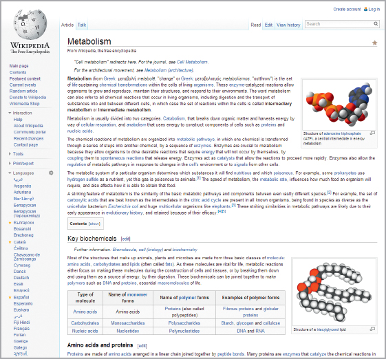
Contrast
Contrast attracts your eye to elements on a page and guides you around it, helping you follow an argument or find information. You may achieve contrast through the use of color, icons, boldface or large type size, headings, and so on. Begin with a focus point—the dominant point, image, or words where you want your reader’s eye to go first—and structure the flow of your visual information from this point.
Alignment
Alignment refers to the way visuals and text on a page are lined up, both horizontally and vertically. The overall guideline is not to mix alignments arbitrarily. That is, if you begin with a left alignment, stick with it for the major parts of your page. The result will be a cleaner and more organized look. For example, the title, text, and subheadings of a Wikipedia article align with the left margin, and images align with the right margin.
Repetition
Readers are guided by the repetition of key words and elements. Use a consistent design throughout your document for such elements as color, typeface, and images. Every Wikipedia page uses the same fonts and the same layout, so readers know what to expect.
Proximity
Parts of a text that are closely related should appear together (proximate to one another). Your goal is to position related points, text, and visuals near one another and to use clear headings to identify these clusters, as the Wikipedia page does.
Consistent overall impression
Aim for a visual structure and design that create the appropriate overall impression or mood for your text. For an academic essay, whether print or digital, you will probably make conservative choices that strike a serious scholarly note. In a newsletter for a campus group, you might choose attention-getting images. In a Web site designed to introduce yourself to future employers, you might favor a mix of material drawn from your current résumé, including writing, embedded video or links to digital content that relates to your skills and career goals, and at least one image of yourself—all in a carefully organized and easy-to-comprehend structure.
Using templates
If designing your writing yourself seems intimidating, consider using a template. Templates are basic models that show you how to lay out a particular type of text. You may have used templates in a word-processing program to create a document such as a memo or report, in PowerPoint to create slides, or in a blog-publishing service to design your content. Templates are readily available for many genres of texts in both print and digital media. Before you create a text in a genre that is new to you, it’s a good idea to look for available design templates. You can use them to familiarize yourself with conventional elements and layouts for the genre, even if you decide not to follow the template’s settings for color, fonts, and other details of formatting.