Select Appropriate Typeface Styles and Fonts
A typeface is a specific style of lettering, such as Arial, Times Roman, or Courier. Typefaces come in a variety of fonts, or sets of sizes (called the point size) and uppercases and lowercases.
APPLYING THE PRINCIPLES OF SIMPLICITY AND CONTINUITY
 Restrict your coverage to one idea per aid.
- Create concise titles that reinforce your message.
- Use phrases or single words to display the points clearly.
- Use the six-by-six rule—no more than six words per line and six lines per aid.
- Apply design decisions consistently to each aid. Use the same combinations of fonts, uppercase and lowercase lettering, styling (boldface, underlining, italics), and spacing.
- Use colors consistently across all slides to highlight key ideas and enhance readability.
- Carry through any repeating elements such as logos or pictograms across all aids.
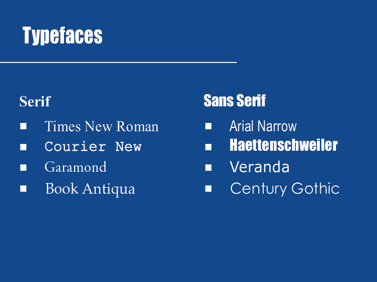
Designers divide the thousands of typefaces available today into two categories: serif and sans serif. Serif typefaces include small flourishes, or strokes, at the tops and bottoms of each letter. Sans serif typefaces are more blocklike and linear; they are designed without the tiny strokes. Some studies show that small amounts of text, such as headings, are best viewed in sans serif type (see Figure 21.2), whereas blocks of text, such as paragraphs, are better viewed in serif typefaces. Consider these guidelines when selecting type sizes for presentation aids:
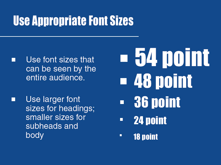
- Whether you are using a hand-drawn poster board or a slide, check your lettering for legibility, taking into consideration the audience’s distance from the presentation. Text for on-screen projection should be 18 points or larger. Generally, major headings should be displayed in 36-point type, subheadings in 24-point type, and body text in 18-point type (see Figure 21.3).
- Lettering should stand apart from the background. Use either light lettering on dark background, or dark lettering on light background.
- Use a typeface that is simple and easy to read, not distracting.
- Use standard uppercase and lowercase type rather than all capitals.
- Use boldface, underlining, or italics sparingly to emphasize only the most important points.
TIPS FOR USING TYPEFACES, FONTS, AND SIZES EFFECTIVELY
- For on-screen projection, use a minimum 18-point font for body text, perhaps 24-point in large rooms.
- Avoid ornate typefaces—they are difficult to read.
- Use a sans serif typeface for titles and major headings.
- Consider a serif typeface when the body of the text is only a few lines.
- Experiment with 36-point type for major headings and 24-point type for subheads.
- As a rule, use no more than two different typefaces in a single visual aid.
- Use uppercase and lowercase type rather than all capitals.
- Use boldface, underlining, or italics sparingly.