The Characteristics of an Effective Graphic
Printed Page 297-299
The Characteristics of an Effective Graphic
To be effective, graphics must be clear, understandable, and meaningfully related to the larger discussion. Follow these five principles:
- A graphic should serve a purpose. Don’t include a graphic unless it will help readers understand or remember information. Avoid content-free photographs and clip art, such as drawings of businesspeople shaking hands.
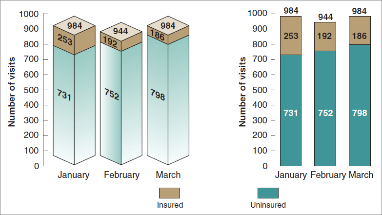
- A graphic should be simple and uncluttered. Three-dimensional bar graphs are easy to make, but they are harder to understand than two-dimensional ones, as shown in Figure 12.1.
- A graphic should present a manageable amount of information. Presenting too much information can confuse readers. Consider audience and purpose: what kinds of graphics are your readers familiar with, how much do they already know about the subject, and what do you want the document to do? Because readers learn best if you present information in small chunks, create several simple graphics rather than a single complicated one.
- A graphic should meet readers’ format expectations. Through experience, readers learn how to read different kinds of graphics. Follow the conventions—for instance, use diamonds to represent decision points in a flowchart—unless you have a good reason not to.
- A graphic should be clearly labeled. Give every graphic (except a brief, informal one) a unique, clear, informative title. Fully label the columns of a table and the axes and lines of a graph. Don’t make readers guess whether you are using meters or yards, or whether you are also including statistics from the previous year.
Unnecessary 3D is one example of chartjunk, a term used by Tufte (1983) to describe the ornamentation that clutters up a graphic, distracting readers from the message.
The two-dimensional bar graph is clean and uncluttered; the three-dimensional graph is more difficult to understand because the additional dimension obscures the main data points. The number of uninsured emergency-room visits in February, for example, is very difficult to see in the three-dimensional graph.

ETHICS NOTE
CREATING HONEST GRAPHICS
Follow these six suggestions to ensure that you represent data honestly in your graphics.
- If you did not create the graphic or generate the data, cite your source. If you want to publish a graphic that you did not create, obtain permission. Read more on citing graphics in How To Insert and Modify Graphics.
- Include all relevant data. For example, if you have a data point that you cannot explain, do not change the scale to eliminate it.
- Begin the axes in your graphs at zero—or mark them clearly—so that you represent quantities honestly.
- Do not use a table to hide a data point that would be obvious in a graph.
- Show items as they really are. Do not manipulate a photograph of a computer monitor to make the screen look bigger than it is, for example.
- Do not use color or shading to misrepresent an item’s importance. A light-shaded bar in a bar graph, for example, appears larger and nearer than a dark-shaded bar of the same size.
Common problem areas are pointed out in the discussions of various kinds of graphics throughout this chapter.
Integrating Graphics and Text

It is not enough to add graphics to your text; you have to integrate the two.
- Place the graphic in an appropriate location. If readers need the graphic in order to understand the discussion, put it directly after the relevant point in the discussion or as soon after it as possible. If the graphic merely supports or elaborates a point, include it as an appendix.
- Introduce the graphic in the text. Whenever possible, refer to a graphic before it appears (ideally, on the same page). Refer to the graphic by number (such as “see Figure 7”). Do not refer to “the figure above” or “the figure below,” because the graphic might move during the production process. If the graphic is in an appendix, cross-reference it: “For complete details of the operating characteristics, see Appendix B, page 19.”
- Explain the graphic in the text. State what you want readers to learn from it. Sometimes a simple paraphrase of the title is enough: “Figure 2 compares the costs of the three major types of coal gasification plants.” At other times, however, you might need to explain why the graphic is important or how to interpret it. If the graphic is intended to make a point, be explicit:
As Figure 2 shows, a high-sulfur bituminous coal gasification plant is more expensive than either a low-sulfur bituminous or an anthracite plant, but more than half of its cost is for cleanup equipment. If these expenses could be eliminated, high-sulfur bituminous would be the least expensive of the three types of plants.
In addition to text explanations, graphics are often accompanied by captions, ranging from a sentence to several paragraphs.
- Make the graphic clearly visible. Distinguish the graphic from the surrounding text by adding white space around it, placing rules (lines) above and below it, putting a screen behind it, or enclosing it in a box.
- Make the graphic accessible. If the document is more than a few pages long and contains more than four or five graphics, consider including a list of illustrations so that readers can find them easily.