Designing Print Documents
Before you design the individual pages of a printed document, design the overall document. Decide whether you are creating a document that looks like a book, with content on both sides of the page, or a document that looks like a report, with content on only one side of the page. Decide whether to use paper of standard size (8.5 × 11 inches) or another size, choose a grade of paper, and decide how you will bind the pages together. Decide on the accessing elements you will include, such as a table of contents, index, and tabs. You want the different elements to work together to accomplish your objectives, and you want to stay within your budget for producing and (perhaps) shipping. Then think about how to design the document pages.
ACCESSING AIDS
In a well-designed document, readers can easily find the information they seek. Most accessing aids use the design principles of repetition and contrast to help readers navigate the document. The Choices and Strategies feature explains six common kinds of accessing aids.
PAGE LAYOUT
Every page has two kinds of space: white space and space devoted to text and graphics. The best way to design a page is to make a grid: a drawing of what the page will look like. In making a grid, you decide how to use white space and determine how many columns to have on the page.
Understanding Learning Theory and Page Design

In designing the page, create visual patterns that help readers find, understand, and remember information. Three principles of learning theory, the result of research into how people learn, can help you design effective pages: chunking, queuing, and filtering.
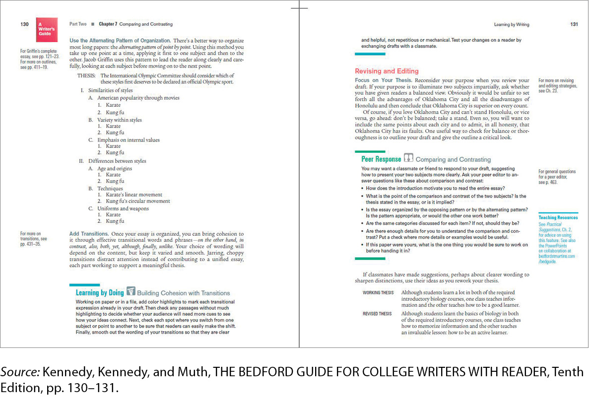
Chunking. People understand information best if it is delivered to them in chunks — small units — rather than all at once. For single-spaced type, chunking involves double-spacing between paragraphs, as shown in Figure 7.5.
 Figure 7.5: a. Without chunking
 Figure 7.6: b. With chunkingFigure 7.6: Figure 7.5 ChunkingFigure 7.6: Chunking emphasizes units of related information. Note how the use of headings creates clear chunks of information.
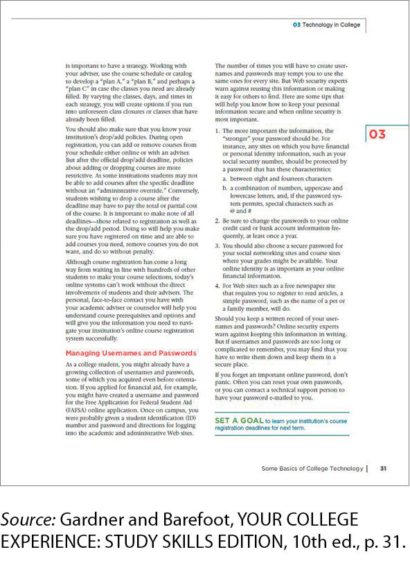
Queuing. Queuing refers to creating visual distinctions to indicate levels of importance. More-emphatic elements — those with bigger type or boldface type — are more important than less-emphatic ones. Another visual element of queuing is alignment. Designers start more-important information closer to the left margin and indent less-important information. (An exception is titles, which are often centered in reports in the United States.) Figure 7.6 shows queuing.
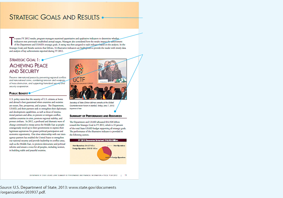 Figure 7.7: Figure 7.6 QueuingSource: U.S. Department of State, 2013: www.state.gov/documents/organization/203937.pdf.
The size of the type used for the various headings indicates their importance.
The largest type suggests that “Strategic Goals and Results” is a chapter heading.
The next largest type indicates that “Strategic Goal 1: Achieving Peace and Security” is an A head (the highest level within a chapter).
“Public Benefit” and “Summary of Performance and Resources” are B heads.
- Page 168
Filtering. Filtering is the use of visual patterns to distinguish various types of information. Introductory material might be displayed in larger type, and notes might appear in italics, another typeface, and a smaller size. Figure 7.7 shows filtering.
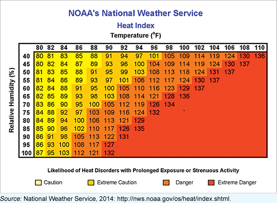 Figure 7.8: Figure 7.7 FilteringFigure 7.8: Effective technical communication presents data and explains what the data mean. In this table about the heat index, the writer uses color as a filtering device. In Western cultures, red signals danger.Source: National Weather Service, 2014: http://nws.noaa.gov/os/heat/index.shtml.
Page Grids As the phrase suggests, a page grid is like a map on which you plan where the text, the graphics, and the white space will go. Many writers like to begin with a thumbnail sketch, a rough drawing that shows how the text and graphics will look on the page. Figure 7.8 shows thumbnail sketches of several options for a page from the body of a manual.
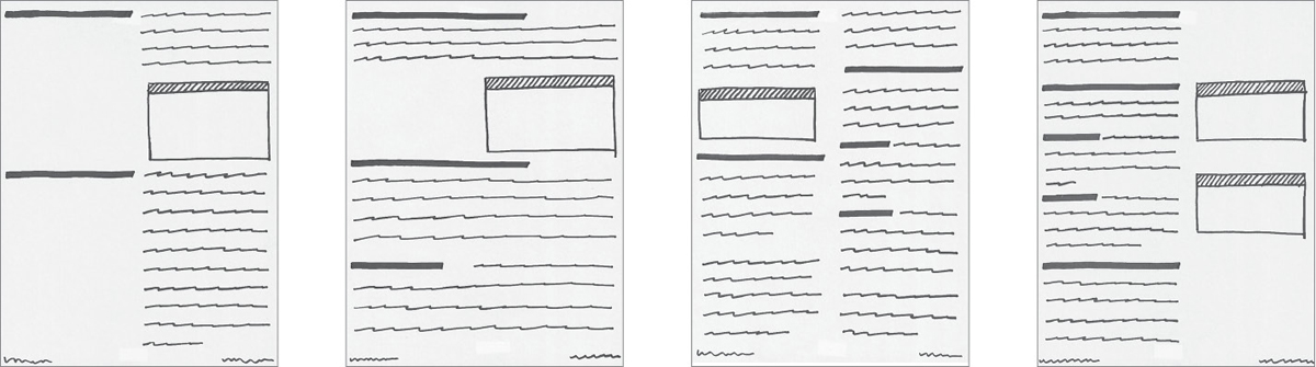
Experiment by sketching the different kinds of pages of your document: body pages, front matter, and so on. When you are satisfied, make page grids. You can use either a computer or a pencil and paper, or you can combine the two techniques.
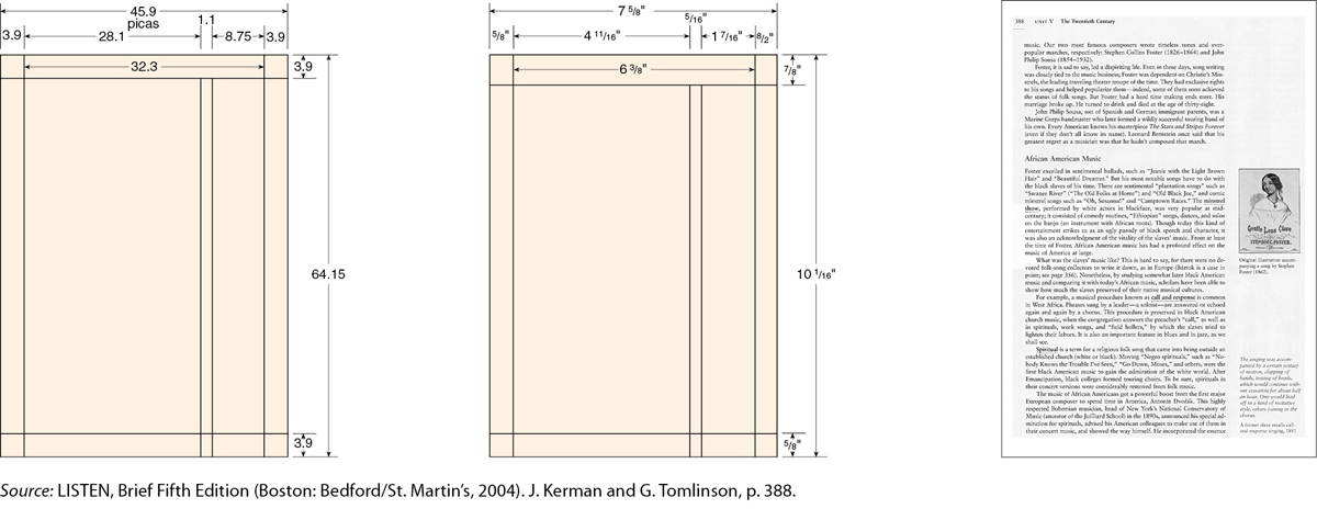
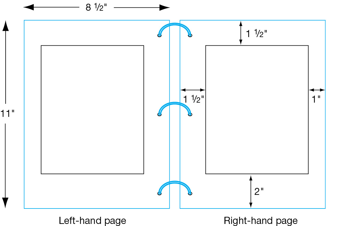
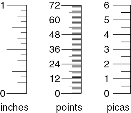
Figure 7.9 shows two simple grids: one using picas (the unit that printing professionals use, which equals one-sixth of an inch) and one using inches. On the right is an example of a page laid out using the grid in the figure.
Create different grids until the design is attractive, meets the needs of your readers, and seems appropriate for the information you are conveying. Figure 7.10 shows some possibilities.
White Space Sometimes called negative space, white space is the area of the paper with no writing or graphics: the space between two columns of text, the space between text and graphics, and, most obviously, the margins.
Increase the size of the margins if the subject is difficult or if your readers are not knowledgeable about it.
Margins, which make up close to half the area on a typical page, serve four main purposes:
For more about marginal glosses, see p. 179.
They reduce the amount of information on the page, making the document easier to read and use.
They provide space for binding and allow readers to hold the page without covering up the text.
They provide a neat frame around the type.
They provide space for marginal glosses.
Figure 7.11 shows common margin widths for an 8.5 × 11-inch document.
White space can also set off and emphasize an element on the page. For instance, white space around a graphic separates it from the text and draws readers’ eyes to it. White space between columns helps readers read the text easily. And white space between sections of text helps readers see that one section is ending and another is beginning.
COLUMNS
Many workplace documents have multiple columns. A multicolumn design offers three major advantages:
Text is easier to read because the lines are shorter.
Columns enable you to fit more information on the page, because many graphics can fit in one column or extend across two or more columns. In addition, a multicolumn design enables you to put more words on a page than a single-column design.
Columns enable you to use the principle of repetition to create a visual pattern, such as text in one column and accompanying graphics in an adjacent column.
TYPOGRAPHY
Typography, the study of type and the way people read it, encompasses typefaces, type families, case, and type size, as well as factors that affect the white space of a document: line length, line spacing, and justification.
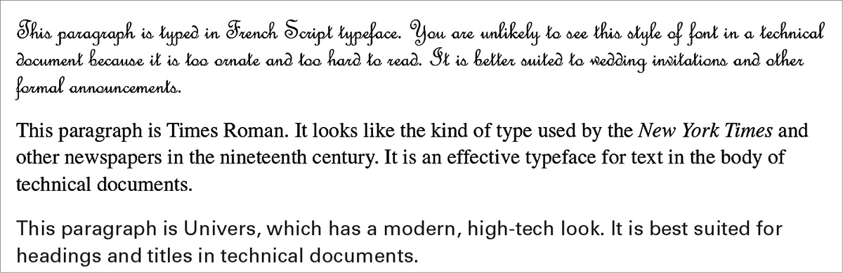
Typefaces A typeface is a set of letters, numbers, punctuation marks, and other symbols, all bearing a characteristic design. There are thousands of typefaces, and more are designed every year. Figure 7.12 shows three contrasting typefaces.
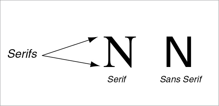
As Figure 7.13 illustrates, typefaces are generally classified into two categories: serif and sans serif.
Most of the time you will use a handful of standard typefaces such as Times New Roman, Cambria, Calibri, and Arial, which are included in your word-processing software and which your printer can reproduce.
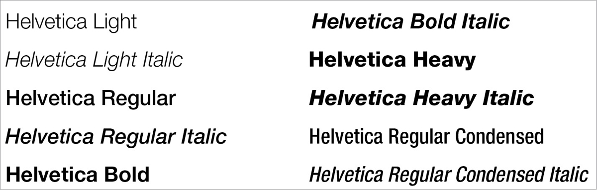
Type Families Each typeface belongs to a family of typefaces, which consists of variations on the basic style, such as italic and boldface. Figure 7.14, for example, shows the Helvetica family.
Although scholars used to think that serif typefaces were easier to read because the serifs encourage readers’ eyes to move along the line, most now believe that there is no difference in readability between serif and sans-serif typefaces, either in print or online. Readers are most comfortable with the style they see most often.
Be careful not to overload your document with too many different members of the same family. Used sparingly and consistently, these variations can help you with filtering: calling attention to various kinds of text, such as warnings and notes. Use italics for book titles and other elements, and use bold type for emphasis and headings. Stay away from outlined and shadowed variations. You can live a full, rewarding life without ever using them.
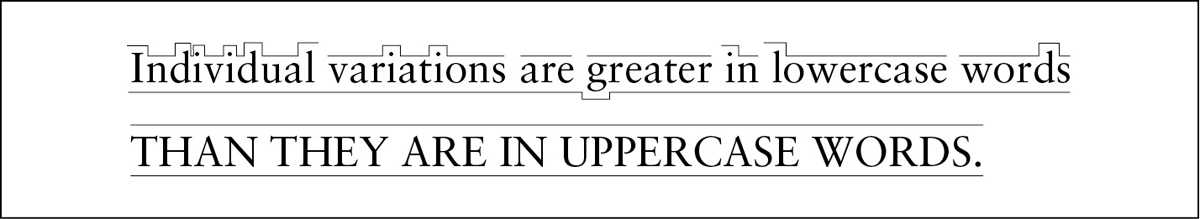
Case To make your document easy to read, use uppercase and lowercase letters as you would in any other kind of writing (see Figure 7.15). Most people require 10 to 25 percent more time to read text using all uppercase letters than to read text using both uppercase and lowercase. In addition, uppercase letters take up as much as 35 percent more space than lowercase letters (Haley, 1991). If the text includes both cases, readers will find it easier to see where new sentences begin (Poulton, 1968).
Type Size Type size is measured with a unit called a point. There are 12 points in a pica and 72 points in an inch. In most technical documents, 10-, 11-, or 12-point type is used for the body of the text:
This paragraph is printed in 10-point type. This size is easy to read, provided it is reproduced on a high-quality ink-jet printer or laser printer.
This paragraph is printed in 12-point type. If the document will be read by people over age 40, 12-point type is a good size because it is more legible than a smaller size.
This paragraph is printed in 14-point type. This size is appropriate for titles or headings.
Type sizes used for other parts of a document include the following:
| footnotes | 8- or 9-point type |
| indexes | 2 points smaller than body text |
| slides | 24- to 36-point type |
In general, aim for at least a 2- to 4-point difference between the headings and the body. Too many size variations, however, suggest a sweepstakes advertisement rather than a serious text.
ETHICS NOTE
USING TYPE SIZES RESPONSIBLY
Text set in large type contrasts with text set in small type. It makes sense to use large type to emphasize headings and other important information. But be careful with small type. It is unethical (and, according to some court rulings, illegal) to use excessively small type (such as 6-point or smaller type) to disguise information that you don’t want to stand out. When you read the fine print in an ad for cell-phone service, you get annoyed if you discover that the low rates are guaranteed for only three months or that you are committing to a long-term contract. You should get annoyed. Hiding information in tiny type is annoying. Don’t do it.
Line Length The line length most often used on an 8.5 × 11-inch page—about 80 characters—is somewhat difficult to read. A shorter line of 50 to 60 characters is easier, especially in a long document (Biggs, 1980).
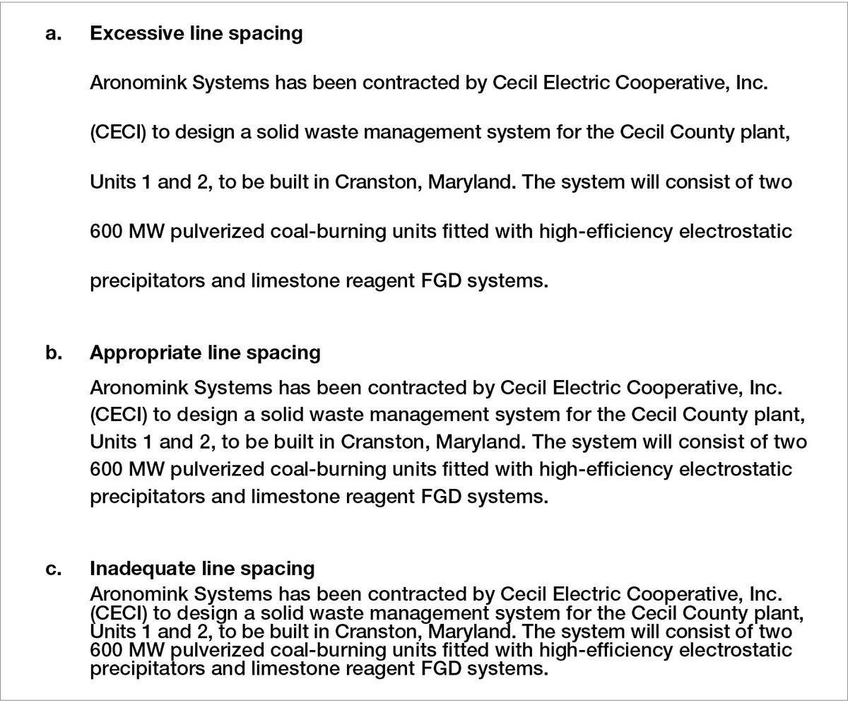
Line Spacing Sometimes called leading (pronounced “ledding”), line spacing refers to the amount of white space between lines or between a line of text and a graphic. If lines are too far apart, the page looks diffuse, the text loses coherence, and readers tire quickly. If lines are too close together, the page looks crowded and becomes difficult to read. Some research suggests that smaller type, longer lines, and sans-serif typefaces all benefit from extra line spacing. Figure 7.16 shows three variations in line spacing.
Line spacing is usually determined by the kind of document you are writing. Memos and letters are single-spaced; reports, proposals, and similar documents are often double-spaced or one-and-a-half-spaced.
Figure 7.17 shows how line spacing can be used to distinguish one section of text from another and to separate text from graphics.
The line spacing between two sections is greater than the line spacing within a section.
Line spacing is also used to separate the text from the graphics.
Justification Justification refers to the alignment of words along the left and right margins. In technical communication, text is often left-justified (also called ragged right). Except for the first line in each paragraph, which is sometimes indented, the lines begin along a uniform left margin but end on an irregular right margin. Ragged right is most common in word-processed text (even though word processors can justify the right margin).
In justified text, also called full-justified text, both the left and the right margin are justified. Justified text is seen most often in formal documents, such as books. The following passage (U.S. Department of Agriculture, 2002) is presented first in left-justified form and then in justified form:
Notice that the space between words is uniform in left-justified text.
In justified text, the spacing between words is irregular, slowing down the reader. Because a big space suggests a break between sentences, not a break between words, readers can become confused, frustrated, and fatigued.
Notice that the irregular spacing not only slows down reading but also can create “rivers” of white space. Readers are tempted to concentrate on the rivers running south rather than on the information itself.
Full justification can make the text harder to read in one more way. Some word processors and typesetting systems automatically hyphenate words that do not fit on the line. Hyphenation slows down and distracts the reader. Left-justified text does not require as much hyphenation as full-justified text.
TITLES AND HEADINGS
Titles and headings should stand out visually on the page because they introduce new ideas.
For more about titling your document, see “Writing Clear, Informative Titles” in Ch. 6.
Titles Because the title is the most-important heading in a document, it should be displayed clearly and prominently. On a cover page or a title page, use boldface type in a large size, such as 18 or 24 points. If the title also appears at the top of the first page, make it slightly larger than the rest of the text—perhaps 16 or 18 points for a document printed in 12 point—but smaller than it is on the cover or title page. Many designers center titles on the page between the right and left margins.
Headings Readers should be able to tell when you are beginning a new topic. The most effective way to distinguish one level of heading from another is to use size variations (Williams & Spyridakis, 1992). Most readers will notice a 20-percent size difference between an A head (a first-level heading) and a B head (a second-level heading). Boldface also sets off headings effectively. The least-effective way to set off headings is underlining, because the underline obscures the descenders, the portions of letters that extend below the body of the letters, such as in p and y.
In general, the more important the heading, the closer it is to the left margin: A heads usually begin at the left margin, B heads are often indented a half inch, and C heads are often indented an inch. Indented C heads can also be run into the text.
For more about using headings, see “Writing Clear, Informative Headings” in Ch. 6.
In designing headings, use line spacing carefully. A perceivable distance between a heading and the following text increases the impact of the heading. Consider these three examples:
Summary
In this example, the writer has skipped a line between the heading and the text that follows it. The heading stands out clearly.
Summary
In this example, the writer has not skipped a line between the heading that follows it. The heading stands out, but not as emphatically.
Summary. In this example, the writer has begun the text on the same line as the heading. This run-in style makes the heading stand out the least.
Other Design Features
Table 7.1 shows five other design features that are used frequently in technical communication: rules, boxes, screens, marginal glosses, and pull quotes.