Designing Online Documents
Accessing tools are vitally important for online documents, because if your audience can’t figure out how to find the information they want, they’re out of luck. With a print document, they can at least flip through the pages.
The following discussion focuses on eight principles that can help you make it easy for readers to find and understand the information they seek:
Use design to emphasize important information.
Create informative headers and footers.
Help readers navigate the document.
Include extra features your readers might need.
Help readers connect with others.
Design for readers with disabilities.
Design for multicultural readers.
Aim for simplicity.
Although some of these principles do not apply to every type of online document, they provide a useful starting point as you think about designing your document.
| TABLE 7.1 Additional Design Features for Technical Communication | ||
| Two types of rules are used here: vertical rules to separate the columns and horizontal rules to separate the items. Rules enable you to fit a lot of information on a page, but when overused they make the page look cluttered. |
|
Rules. Rule is a design term for a straight line. You can add rules to your document using the drawing tools in a word processor or as you define your styles. Horizontal rules can separate headers and footers from the body of the page or divide two sections of text. Vertical rules can separate columns on a multicolumn page or identify revised text in a manual. Rules exploit the principles of alignment and proximity. |
|
Boxes. Adding rules on all four sides of an item creates a box. Boxes can enclose graphics or special sections of text or can form a border for the whole page. Boxed text is often positioned to extend into the margin, giving it further emphasis. Boxes exploit the principles of contrast and repetition. | |
| The different-colored screens clearly distinguish the three sets of equations. |
|
Screens. The background shading used behind text or graphics for emphasis is called a screen. The density of a screen can range from 1 percent to 100 percent; 5 to 10 percent is usually enough to provide emphasis without making the text illegible. You can use screens with or without boxes. Screens exploit the principles of contrast and repetition. |
The marginal glosses present definitions of key words. |
|
Marginal glosses. A marginal gloss is a brief comment on the main discussion. Marginal glosses are usually set in a different typeface—and sometimes in a different color—from the main discussion. Although marginal glosses can be helpful in providing a quick overview of the main discussion, they can also compete with the text for readers’ attention. Marginal glosses exploit the principles of contrast and repetition. |
| This pull quote extends into the margin, but a pull quote can go anywhere on the page, even spanning two or more columns or the whole page. |
|
Pull quotes. A pull quote is a brief quotation (usually just a sentence or two) that is pulled from the text, displayed in a larger type size and usually in a different typeface, and sometimes enclosed in a box. Newspapers and magazines use pull quotes to attract readers’ attention. Pull quotes are inappropriate for reports and similar documents because they look too informal. They are increasingly popular, however, in newsletters. Pull quotes exploit the principles of contrast and repetition. |
USE DESIGN TO EMPHASIZE IMPORTANT INFORMATION
The smaller the screen, the more cluttered it can become, making it difficult for readers to see what is truly important. In documents designed to be viewed on different-sized screens, you want readers to be able to find what they want quickly and easily. As you begin planning a site, decide what types of information are most essential for your audience, and ensure that that content in particular is clearly accessible from the home screen. Give your buttons, tabs, and other navigational features clear, informative headings. For more guidance on emphasizing important information, see Chapter 6.
Once you have determined the information you want to emphasize, adhere to design principles rigorously so that users can easily identify key content. Use logical patterns of organization and the principles of proximity, alignment, repetition, and contrast so that readers know where they are and how to carry out the tasks they want to accomplish. Figure 7.22 shows a well-designed screen for a mobile phone.
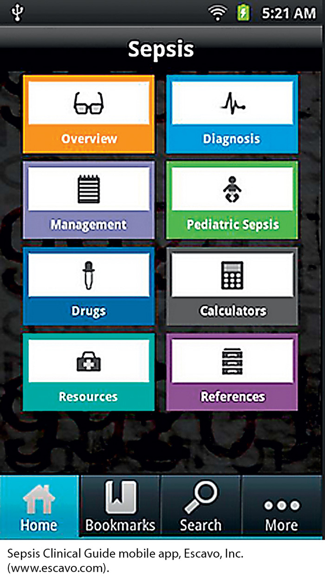
This app helps physicians diagnose sepsis quickly and effectively. The information most crucial to evaluating the condition is easily accessible on the home screen. At the top of the screen, where the reader’s eyes will initially fall, is an overview of the condition and, most importantly, the diagnostic tool. Less-essential items, such as resources and references, are located at the bottom of the screen. Supplementary information, such as a call for authors and a feedback form, is deeper on the site, behind the “More” tab.
This simple screen uses the principle of contrast effectively to highlight key content. Each of the eight main content areas has its own color and its own icon to distinguish it from the seven other areas. In addition, the four navigation items at the bottom of the screen use contrast in that the name and icon for the screen the reader is now viewing—in this case, the home page—are presented against a blue screen, whereas those for the other three navigation buttons are presented against a black screen.
CREATE INFORMATIVE HEADERS AND FOOTERS
Headers and footers help readers understand and navigate your document, and they help establish your credibility. You want readers to know that they are reading an official document from your organization and that it was created by professionals. Figure 7.23 shows a typical website header, and Figure 7.24 shows a typical footer.

The top line of the footer contains the contact information for the site.
The bottom line contains the copyright notice, as well as links to the privacy policy, the terms and conditions for using the site, and a site map.
HELP READERS NAVIGATE THE DOCUMENT
One important way to help readers navigate is to create and sustain a consistent visual design on every page or screen. Make the header, footer, background color or pattern, typography (typeface, type size, and color), and placement of the navigational links the same on every page. That way, readers will know where to look for these items.
INCLUDE EXTRA FEATURES YOUR READERS MIGHT NEED
Because readers with a range of interests and needs will visit your site, consider adding some or all of the following five features:
An FAQ page. A list of frequently asked questions helps new readers by providing basic information, explaining how to use the site, and directing them to more-detailed discussions.
A search page or engine. A search page or search engine enables readers to enter a keyword or phrase and find all the pages in the document that contain it.
Resource links. If one of the purposes of your document is to educate readers, provide links to other sites.
- Page 188
A printable version of your site. Online documents are designed for a screen, not a page. A printable version of your document, with black text on a white background and all the text and graphics consolidated into one big file, will save readers paper and toner.
A text-only version of your document. Many readers with impaired vision rely on text because their specialized software cannot interpret graphics. Consider creating a text-only version of your document for these readers, and include a link to it on your home page.
Making Your Document Easy To Navigate

Follow these five suggestions to make it easy for readers to find what they want in your document.
Include a site map or index. A site map, which lists the pages on the site, can be a graphic or a textual list of the pages, classified according to logical categories. An index is an alphabetized list of the pages. Figure 7.25 shows a portion of a site map.
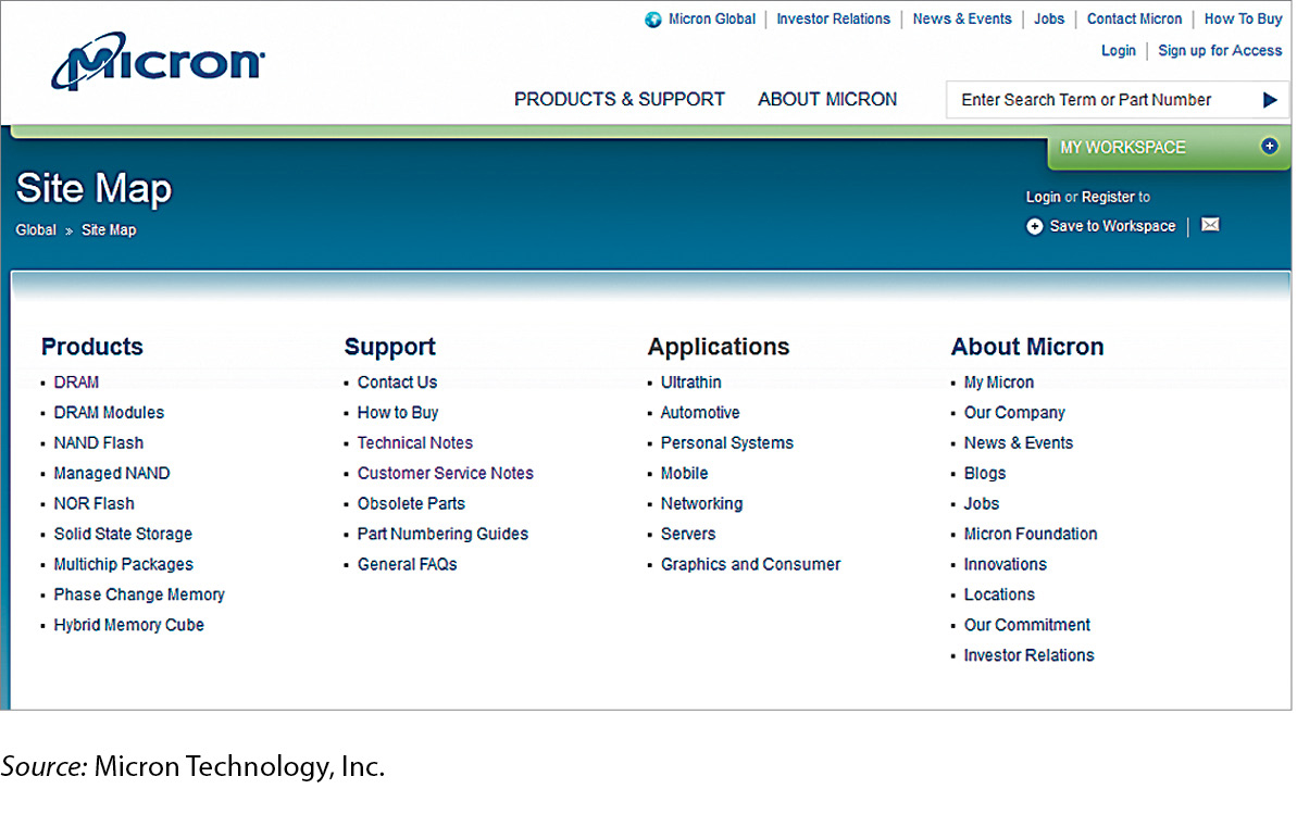 Figure 7.26: Figure 7.25 Site MapFigure 7.26: For large websites, help your readers by organizing the site map rather than just presenting an alphabetical list of the pages. In this portion of a site map, Micron Technology classifies the pages in logical categories to help visitors find the pages they seek.Source: Micron Technology, Inc.
Use a table of contents at the top of long pages. If your page extends for more than a couple of screens, include a table of contents—a set of links to the items on that page—so that your readers do not have to scroll down to find the topic they want. Tables of contents can link to information farther down on the same page or to information on separate pages. Figure 7.26 shows an excerpt from the table of contents at the top of a frequently asked questions (FAQ) page.
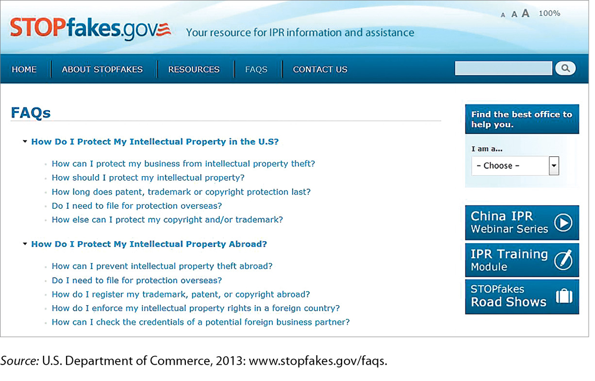 Figure 7.27: Figure 7.26 Table of ContentsFigure 7.27: The table of contents is classified by topic (first all the topics about protecting your intellectual property in the United States, then all the topics about protecting it outside the United States). For any online document, large or small, use the principles of organizing information presented in Chapter 6.Source: U.S. Department of Commerce, 2013: www.stopfakes.gov/faqs.
Help readers get back to the top of long pages. If a page is long enough to justify a table of contents, include a “Back to top” link (a textual link or a button or icon) before the start of each new chunk of information.
Include a link to the home page on every page. This link can be a simple “Back to home page” textual link, a button, or an icon.
Include textual navigational links at the bottom of the page. If you use buttons or icons for links, include textual versions of those links at the bottom of the page. Readers with impaired vision might use special software that reads the information on the screen. This software interprets text only, not graphics.
HELP READERS CONNECT WITH OTHERS
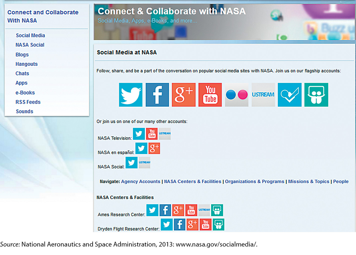
Organizations use their online documents, in particular their websites, to promote interaction with clients, customers, suppliers, journalists, government agencies, and the general public. For this reason, most organizations use their sites to encourage their various stakeholders to connect with them through social media such as discussion boards and blogs.
Use your online document to direct readers to interactive features of your own website, as well as to your pages on social-media sites such as Facebook or Twitter. Figure 7.27 shows a portion of NASA’s community page.
DESIGN FOR READERS WITH DISABILITIES
The Internet has proved to be a terrific technology for people with disabilities because it brings a world of information to their devices, enabling them to work from home and participate in virtual communities. However, most sites on the Internet are not designed to accommodate people with disabilities.
The following discussion highlights several ways to make your online documents easier for people with disabilities to use. Consider three main types of disabilities as you design your site:
Vision impairment. People who cannot see, or cannot see well, rely on text-to-speech software. Do not rely on color or graphics alone to communicate information—provide either a text-only version of your document or textual equivalents of all your graphics. Use the “alt” (alternate) tag to create a textual label that appears when the reader holds the mouse over the graphic. For example, if you use a red icon to signal a warning, also use the word warning. Use 12-point or larger type throughout your site, and provide audio feedback—for example, having a button beep when the reader presses it.
Hearing impairment. If you use video, provide captions and, if the video includes sound, a volume control. Also use visual feedback techniques; for example, make a button flash when the reader clicks on it.
Mobility impairment. Some people with mobility impairments find it easier to use the keyboard than a mouse. Therefore, build in keyboard shortcuts wherever possible. If readers have to click on an area of the screen using a pointing device, make the area large so that it is easy to see and click on.
DESIGN FOR MULTICULTURAL AUDIENCES
About 75 percent of the people using the Internet are nonnative speakers of English, and that percentage continues to grow as more people from developing nations go online (Internet World Stats, 2013). Therefore, it makes sense in planning your online documents to assume that many of your readers will not be proficient in English.
Planning for a multicultural website is similar to planning for a multicultural printed document:
Use common words and short sentences and paragraphs.
Avoid idioms, both verbal and visual, that might be confusing. For instance, don’t use sports metaphors, such as full-court press, or a graphic of an American-style mailbox to suggest an email link.
If a large percentage of your readers speak a language other than English, consider creating a version of your site in that language. The expense can be considerable, but so can the benefits.
ETHICS NOTE
DESIGNING LEGAL AND HONEST ONLINE DOCUMENTS
For more about copyright law, see “Your Ethical and Legal Obligations” in Ch. 2.
You know that the words and images that you see on the Internet are covered by copyright, even if you do not see a copyright symbol. The only exception is information that is in the public domain either because it is not covered by copyright (such as information created by entities of the U.S. federal government), because copyright has expired (the author has been dead over 70 years), or because the creator of the information has explicitly stated that the information is in the public domain and you are free to copy it.
But what about the design of a site? Almost all web designers readily admit to spending a lot of time looking at other sites and pages for inspiration. And they admit to looking at the computer code to see how that design was achieved. This is perfectly ethical. So is copying the code for routine elements such as tables. But is it ethical to download the code for a whole page, including the layout and the design, and then plug in your own data? No. Your responsibility is to create your own information, then display it with your own design.
AIM FOR SIMPLICITY
Well-designed online documents are simple, with only a few colors and nothing extraneous. The text is easy to read and chunked effectively, and the links are written carefully so readers know where they are being directed.