CHAPTER EXERCISES
Answers to the odd-numbered exercises appear in Appendix B.
Review Your Knowledge
2.01 A frequency distribution is a __________ of how often the values of a variable occur in a data set.
2.02 There are two types of frequency distribution tables: __________ and __________.
2.03 A basic frequency distribution just contains information about what __________ occur in a data set and what their __________ are.
2.04 __________ tells how many cases in a data set have a given value or a lower one.
2.05 The abbreviation for cumulative frequency is__________.
2.06 The cumulative frequency for the top row in a frequency distribution is equal to __________.
2.07 If one has __________ -level data in a frequency distribution, it should be organized in some logical fashion.
2.08 The __________ column in a frequency distribution is a restatement of the information in the cumulative frequency column.
2.09 When dealing with a variable that has a large range, a __________ frequency distribution usually makes more sense than an ungrouped frequency distribution.
2.10 As a general rule of thumb, grouped frequency distributions have from __________ to __________ intervals.
2.11 Having a small number of intervals may show the big picture, but the danger exists of losing sight of the __________ in the data set.
2.12 All intervals in a grouped frequency distribution should be the same __________, so the frequencies in different intervals can be compared meaningfully.
2.13 A __________ is the middle point of an interval.
2.14 If the value for a case in an interval is unknown, assign it the value associated with the __________.
2.15 Discrete numbers answer the question __________.
2.16 Discrete numbers take on __________ number values only.
2.17 __________- and __________-level numbers are discrete numbers.
2.18 _______ numbers answer the question “How much?”
2.19 Continuous numbers can have _______ values.
2.20 The specificity of a _______ depends on the precision of the instrument used to measure it.
2.21 Continuous numbers are always _______- or _______-level numbers.
2.22 Interval- and ratio-level numbers can be _______ or _______.
2.23 A single value of a continuous number really represents a _______ of values.
2.24 The _______ are the upper and lower bounds of a single continuous number or of an interval in a grouped frequency distribution for continuous numbers.
2.25 The distance between the real limits of an interval is _______.
2.26 Which graph is used to display a frequency distribution depends on whether the numbers in the frequency distribution are _______ or _______.
2.27 The graph used for a frequency distribution of discrete data is a _______.
2.28 To make a graph of a frequency distribution of continuous data, one can use a _______ or a _______.
2.29 In terms of size, graphs are usually _______ than _______.
2.30 Graphs should have a descriptive title and the _______ should be clearly labeled.
2.31 Frequency is marked on the _______-axis of the graph of a frequency distribution.
2.32 The intervals for the values of the variable being graphed are marked on the _______ -axis of a histogram.
2.33 In a histogram, the data are continuous, so the bars _______ each other.
2.34 In a frequency polygon, frequency is marked with a dot placed at the appropriate height above the _______of an interval.
2.35 One shouldn’t look at the shape of a graph for _______-level data.
2.36 The _______ is symmetric, has the highest point in the middle, and includes frequencies that decrease as one moves away from the midpoint.
2.37 The three aspects of the shape of a frequency distribution that are described are _______, _______, and _______.
2.38 _______ describes how many peaks exist in a frequency distribution.
2.39 If a frequency distribution has two peaks, it is called _______.
2.40 A frequency distribution that tails off on one side is said to be _______.
2.41 If a frequency distribution tails off on the left-hand side, it has _______ skewness.
2.42 Kurtosis refers to how _______ or _______ a frequency distribution is.
2.43 A stem-and-leaf display summarizes a data set like a ___________ frequency distribution.
2.44 In a stem-and-leaf display for 21, 21, 24, 25, 28, 30, 31, 34, and 39, the numbers 2 and 3 would be the ________s and 0, 1, 4, 5, 8, and 9 would be the ___________s.
Apply Your Knowledge
Making frequency distribution tables
2.45 A psychologist completes a survey in which residents in a psychiatric hospital are given diagnostic interviews in order to determine their psychiatric diagnoses. After each interview, the researcher counts how many diagnoses each resident has. Given the following data, make an ungrouped frequency distribution showing frequency, cumulative frequency, percentage, and cumulative percentage: 2, 3, 2, 1, 0, 1, 1, 4, 2, 3, 1, 0, 1, 2, 4, 3, 2, 2, 2, 2, 1, 2, 3, 2, 5, 2, 3, 2, 1, 1, 2, 3, 3, 3, 2, 2, 1, 1, 2, 2, 3, 1, 1, 2, and 2.
2.46 A cognitive psychologist wanted to investigate the stage of moral development reached by college students. She believed that people progressed, in order, through six stages of moral reasoning, from Stage I to Stage VI. She obtained a representative sample of college students in the United States and administered an inventory to classify stage of moral development. Here are the numbers of people classified at the different stages: I = 17, II = 34, III = 78, IV = 187, V = 112, and VI = 88. Make a frequency distribution table for these data, showing frequency, cumulative frequency, percentage, and cumulative percentage.
2.47 A college registrar completes a survey of classrooms on campus in order to find out how many usable seats there are in each one. Make a grouped frequency distribution for her data, using an interval width of 20 and an apparent lower limit of 10 for the bottom interval. Report midpoint, frequency, cumulative frequency, percentage, and cumulative percentage. Here are the data the registrar collected: 12, 26, 18, 17, 102, 20, 35, 46, 50, 28, 29, 53, 75, 30, 37, 45, 58, 43, 42, 36, 50, 60, 55, 45, 40, 23, 28, 38, 39, 40, 50, 60, 45, 36, 28, 40, 54, 62, 38, 58, and 24.
2.48 A professor of education was curious about students’ expectations of academic success. She obtained a sample of college students at the start of their college careers and asked them what they thought their GPAs would be for the first semester. Below are the data she obtained. Make a grouped frequency distribution for the data, using an interval width of 0.5 and an apparent lower limit of 2.1 for the bottom interval. Report midpoint, frequency, cumulative frequency, percentage, and cumulative percentage.
3.9, 4.0, 3.0, 3.5, 3.0, 3.5, 3.5, 3.9, 3.5, 2.5, 3.5, 3.8, 3.9, 3.0, 3.9, 3.5, 3.9, 3.0, 3.5, 2.8, 2.4, 2.7, 2.6, 3.4, 3.6, 2.5, 3.8, 2.9, 2.6, 2.4
Discrete vs. continuous numbers
2.49 For each variable, decide if it is discrete or continuous:
The number of cases of flu diagnosed at a college in a given semester
The weight, in grams, of a rat’s hypothalamus
The number of teachers, including substitutes, in a school district who are certified to teach high school math
The number of times that a rat pushes a lever in a Skinner box during a 15-minute period
How long, in seconds, it takes applause to die down at the end of a school assembly
2.50 For each variable, decide if it is continuous or discrete:
The depth, in inches, a person can drive a 3-inch nail with one hammer blow
The number of students in a classroom who are absent for at least one day during the month of February
The total number of days that students in a classroom are absent during the month of February
How many friends one has on Facebook
The amount of time, measured in seconds, that a person in a driving simulator keeps his or her eyes on the road while engaging in a cell phone conversation
Real vs. apparent limits
2.51 Below are sets of consecutive numbers, or intervals, from frequency distributions for continuous variables. For the second number (or interval) in each set, the one in bold, identify the real lower limit, real upper limit, interval width, and midpoint.
27–30; 31–34; 35–38
10–20; 30–40; 50–60
2.00–2.49; 2.50–2.99; 3.00–3.49
10; 11; 12
2.52 For each scenario, tell what the real limits of the number/interval are:
If a person’s temperature is reported as 100.3 (and not 100.2 or 100.4), what is the interval within which the person’s temperature really falls?
If a family has 7 children, not 6 or 8, what is the interval within which the number of children they have really falls?
If a person’s IQ is reported as 115 (and not 114 or 116), what is the interval within which the person’s IQ really falls?
If nations’ populations are reported to the nearest million and the United States has a population of 321 million, not 320 or 322, how many people really live in the United States?
If a man has 3 televisions in his house, not 4 or 5, what is the interval within which the number of televisions he has really falls?
Graphs and shapes of distributions
2.53 A developmental psychologist observes how children interact with their parents and classifies the children’s attachment as secure, avoidant, resistant, or disorganized. He classifies 33 children as securely attached, 17 as avoidant, 13 as resistant, and 21 as disorganized. Graph this frequency distribution and comment on its shape.
2.54 A music teacher held an assembly at an elementary school during which he explained the different types of instruments to the children. Afterwards, he surveyed them as to what kind of instrument each would like to play. Here are the results: percussion = 12, brass = 39, wind = 42, and string = 28. Graph the results and comment on the shape of the graph.
2.55 A psychologist administered an aggression scale to a sample of high school girls. Scores on the scale can range from 20 to 80. Fifty is considered an average score; higher scores mean more aggression. Twelve girls had scores in the 20–29 range; 33 were 30–39; 57 were 40–49; 62 were 50–59; 19 were 60–69; and 8 had scores in the 70–79 range. Graph the results and comment on the shape of the graph.
2.56 A researcher from a search engine company runs Internet searches and times how long each one takes. She found that 17 searches took 0.01 to 0.05 seconds; 57 took 0.06 to 0.10 seconds; 134 took 0.11 to 0.15 seconds; 146 took 0.16 to 0.20 seconds; 398 took 0.21 to 0.25 seconds; 82 took 0.26 to 0.30 seconds; and 56 took 0.31 to 0.35 seconds. Graph the frequency distribution and comment on its shape.
Making stem-and-leaf displays
2.57 Make a stem-and-leaf display for these data and comment on the shape of the distribution: 11, 12, 21, 23, 27, 27, 29, 30, 30, 33, 34, 35, 39, 43, 45, 47, 53, 53, 67, 75, 84, and 96.
2.58 Make a stem-and-leaf display for these data and comment on the shape of the distribution: 8, 9, 13, 13, 16, 21, 22, 24, 25, 25, 29, 33, 33, 45, 48, 55, 58, 61, 63, 64, 66, 66, 69, 71, 83, 92, 93, and 95.
Expand Your Knowledge
2.59 If the real limits and apparent limits for an interval are the same, then the variable is:
continuous.
discrete.
interval.
ratio.
Real and apparent limits are never the same.
2.60 For a row in the middle of a frequency distribution, either ungrouped or grouped, which statement is probably true?
f > fc
fc > f
f = fc
None of these statements is ever true.
2.61 If a researcher has a grouped frequency distribution for a continuous variable and there are five people in the interval ranging from 50 to 54, what X values should he assign them if he wants to assign values?
He should randomly select values from 50 to 54.
He should randomly select values from 49.5 to 54.5.
As there are five people and there are five integers from 50 through 54, he should assign them values of 50, 51, 52, 53, and 54.
50
52
52.5
54
2.62 The distribution of prices of all the new cars sold in a year, including Ferraris, Lamborghinis, and other high-end cars, is probably:
normally distributed.
positively skewed.
negatively skewed.
not skewed.
2.63 Diane wears a digital watch that reports the time to the nearest minute. At 10:16 A.M., by her watch, she left her office. She returned at 10:21 A.M. To the nearest minute, what is the shortest amount of time that she was out of her office? What is the longest?
2.64 Make a stem-and-leaf display for these data. Use an interval width of 5.
120, 122, 123, 123, 124, 125, 126, 125, 126, 130, 134, 135, 135, 138, 147
SPSS
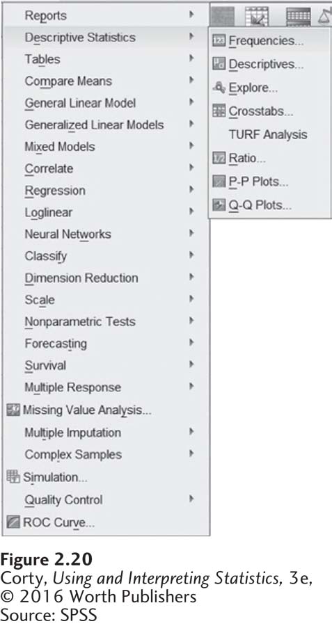
SPSS can be used to generate frequency distribution tables and graphs like those created in this chapter. The “Frequencies” command is used to generate an ungrouped frequency distribution. Figure 2.20 shows how to access the Frequencies command by clicking on “Analyze” and then “Descriptive Statistics.”
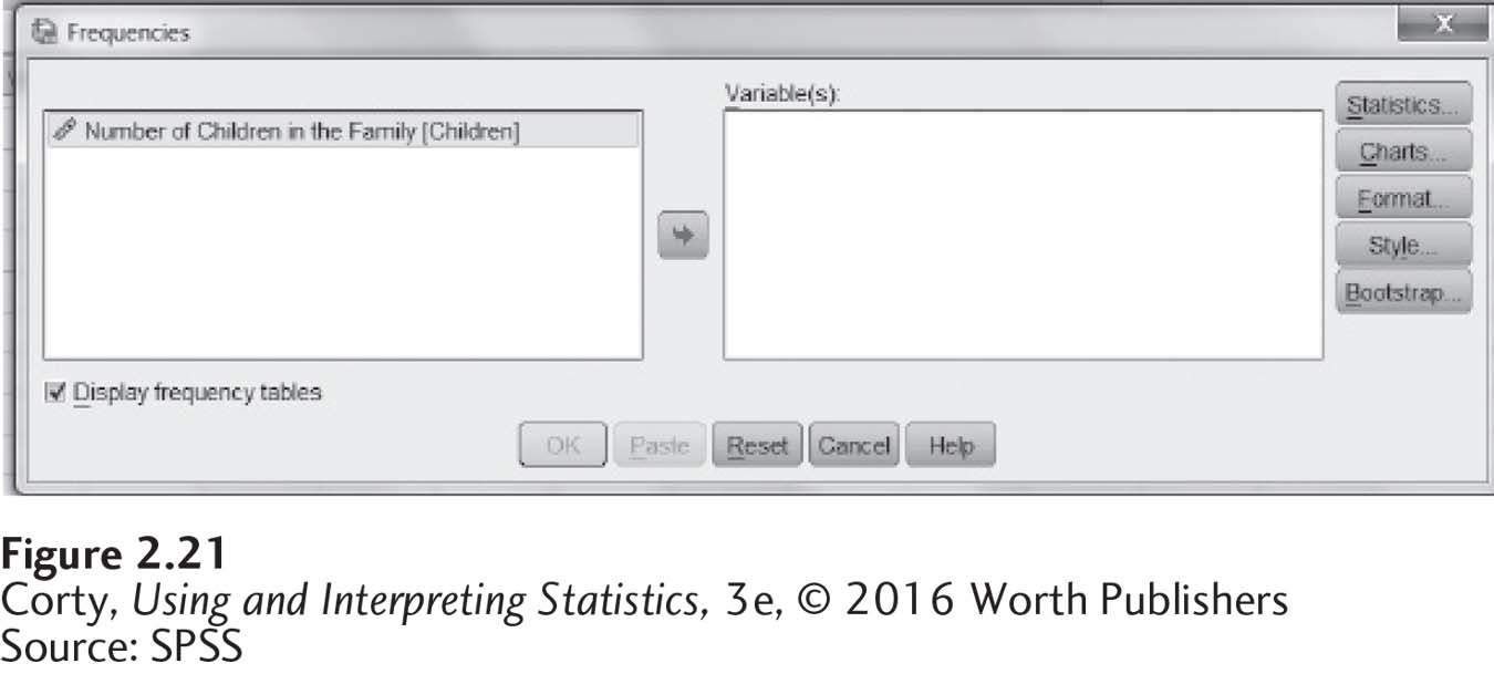
Once the menu shown in Figure 2.21 has been opened, use the arrow key to shift the variable one wants to use from the box on the left to the “Variable(s)” box. Here, the variable name is “Children.”
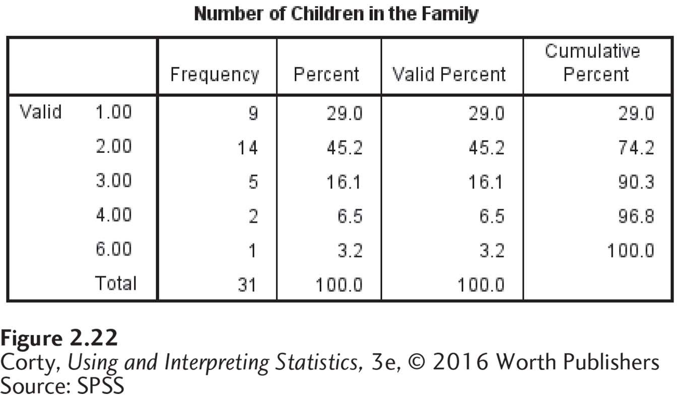
Once there’s a variable in the Variable(s) box, click on “OK” to generate an ungrouped frequency distribution. The Frequencies output can be seen in Figure 2.22.
Making a grouped frequency distribution in SPSS is more involved. One has to use “Transform” commands like “Recode” or “Visual binning” to place the data into intervals before using Frequencies.
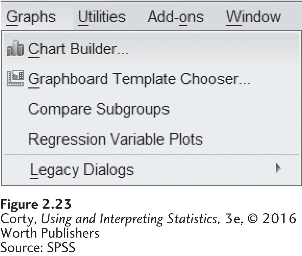
Graphing is easy with SPSS. To start making a graph, click on “Graphs” as shown in Figure 2.23.
Clicking on “Chart Builder. . .” opens up the screen shown in Figure 2.24. Note that the list of graphs SPSS can make may be seen on the bottom left.
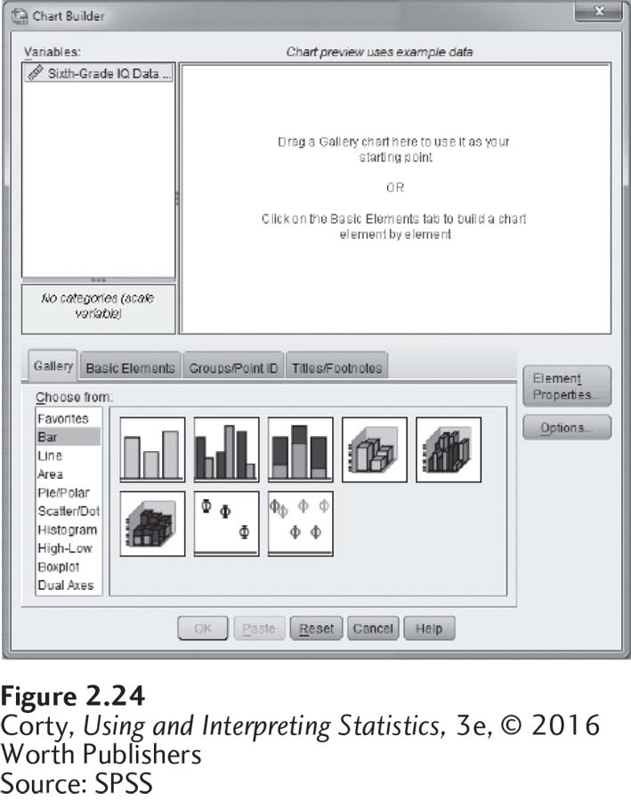
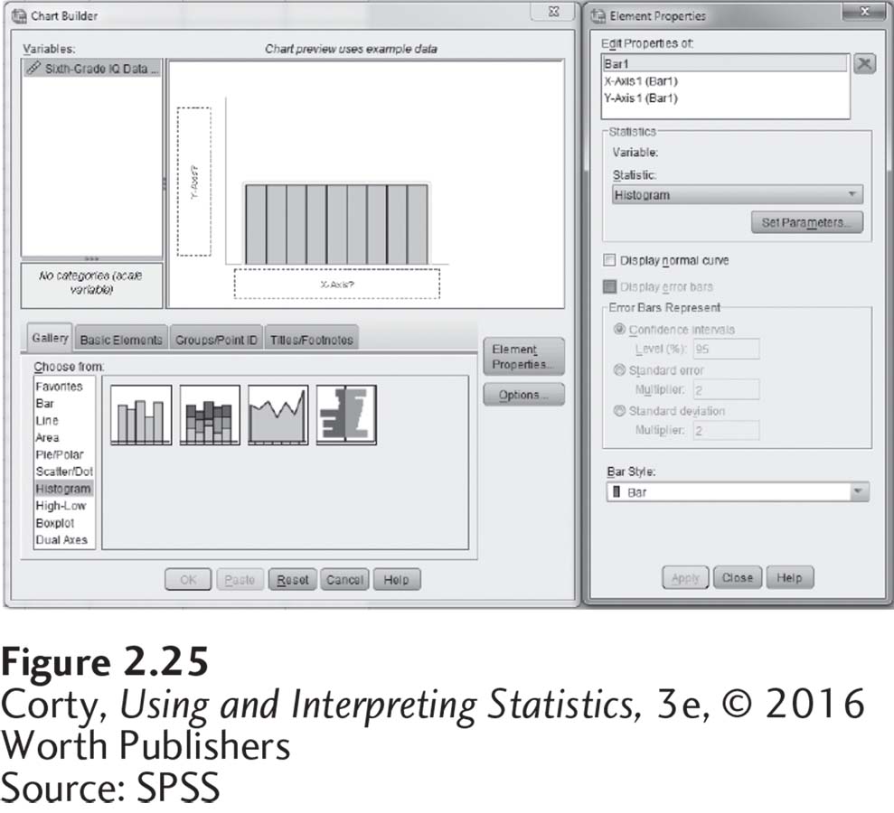
Figure 2.25 shows how to make a histogram. Histogram was highlighted in the list of graphs and the mouse was used to drag the basic histogram from the gallery of histograms to the preview pane.
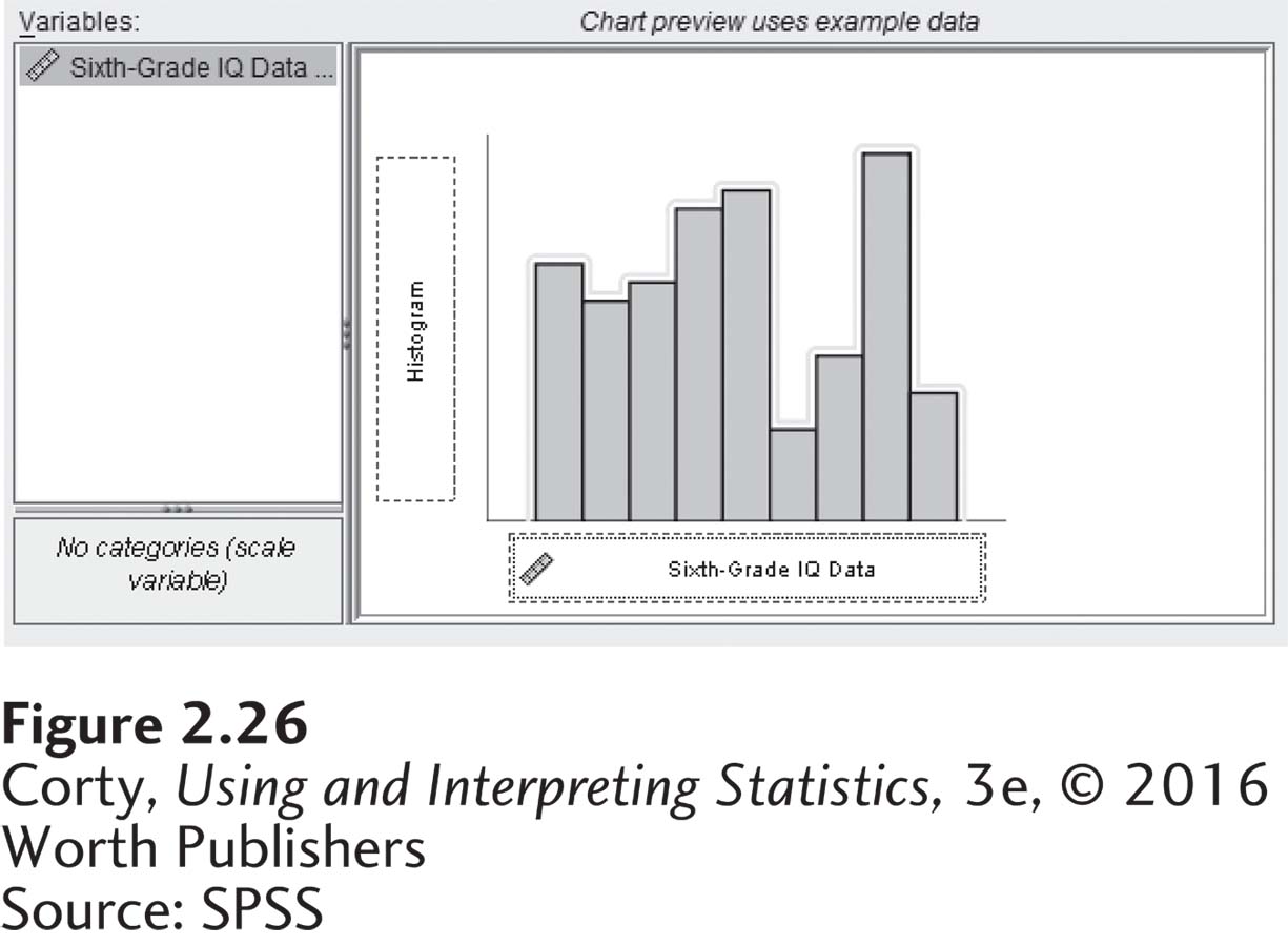
To finish the histogram commands, see Figure 2.26. Note that the variable for which the frequencies are being graphed, IQ, has been highlighted and dragged to the X-axis.
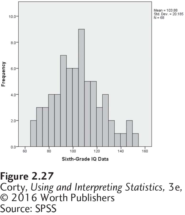
Once the “OK” button has been clicked, SPSS generates a histogram as seen in Figure 2.27. This is called the “default” version because SPSS decides how wide the intervals should be.
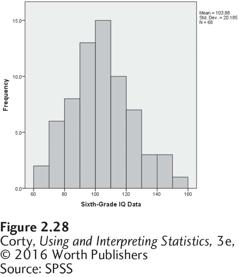
A major advantage of using SPSS to make a graph over making it by hand is that it is easy to edit a graph in SPSS. Double-click on the graph to open up the editor. With just a few clicks of the mouse, one can change the interval width, the scale on the Y-axis, the labels on the axes, or the size of the graph. Figure 2.28 shows an edited version of a histogram for the IQ data.
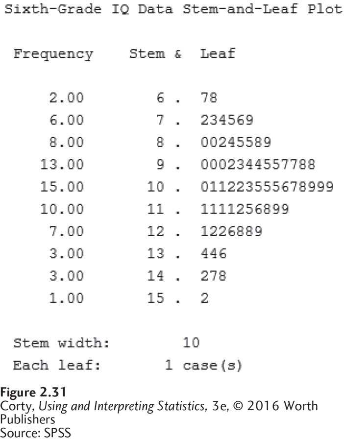
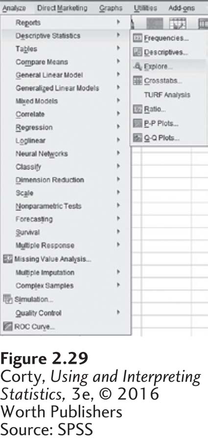
Stem-and-leaf plots can also be produced easily using SPSS. From the Analyze menu, choose “Descriptive Statistics” and then the “Explore” command as shown in Figure 2.29.
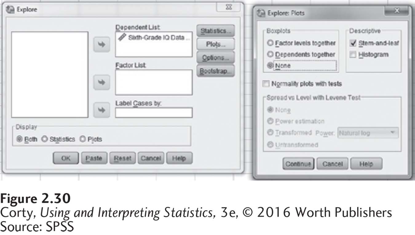
As shown in Figure 2.30, move the variable you want to analyze into the “Dependent List” by highlighting the variable and the clicking the arrow. Next, click “Plots” and make sure that under the Descriptive option “Stem-and-leaf” is checked. This is the default. You can change the default option under “Boxplots” to “None” because we are not running a boxplot.
After clicking “Continue” and “OK,” the output in Figure 2.31 will be produced.