6.5Applications of the Normal Distribution
OBJECTIVES By the end of this section, I will be able to …
- Compute probabilities for a given value of any normal random variable.
- Find the appropriate value of any normal random variable, given an area or probability.
- Use normal probability plots to assess normality.
1Finding Probabilities for Any Normal Distribution
The data in problems that we face in the real world do not usually follow the standard normal distribution, Z. Instead, a problem may be stated in terms of some normal random variable X that has a mean other than 0 or a standard deviation other than 1. In cases like these, X needs to be standardized to Z so that we can use the Section 6.4 techniques.
To standardize things means to make them all the same. For example, college applicants take standardized tests so that the admissions officers can compare students according to a consistent assessment tool. Here, we standardize many different normal random variables X into the same standard normal Z.
Standardizing X to Z
To standardize a normal random variable X, we transform that normal random variable X into the standard normal random variable Z.
Suppose that X is a normal random variable with population mean μ and population standard deviation σ. We standardize X by subtracting the mean μ and dividing by the standard deviation σ. The result of this transformation is the familiar standard normal random variable Z.
Standardizing a Normal Random Variable
Any normal random variable X can be transformed into the standard normal random variable Z by standardizing X with the formula
Z=X−μσ
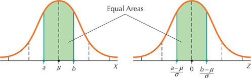
The key here is the following: for a given area of interest for a normal random variable X, the corresponding area after the transformation to Z is exactly the same. For any normal random variable X
the area between a and b
is exactly the same as
the area between Za=(a−μ)σ and Zb=(b−μ)σ (see Figure 46)
So we can solve problems about areas under the nonstandard normal X curve by using the corresponding area under the Z curve.
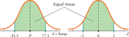
EXAMPLE 37April in Georgia

The state of Georgia reports that the mean temperature statewide for the month of April is μ=61.5̂F. Assume that the standard deviation is σ=8̂F and that temperature in Georgia in April is normally distributed. Draw the normal curve for temperatures between 45.5°F and 77.5°F, and the corresponding Z curve. Find the probability that the temperature is between 45.5°F and 77.5°F in April in Georgia.
Solution
Here, we have a=45.5 and b=77.5, giving us
Za=a−μσ=45.5−61.58=−2andZb=b−μσ=77.5−61.58=−2
In Figure 47, the area between X=45.5̂F and X=77.5̂F is the same as between Z=−2 and Z=2. In other words,
P(45.5<X<77.5)=P(−2<Z<2)
This is a Case 3 problem from Table 8 (page 355). The Z table tells us that the area to the left of Z1=−2 is 0.0228, and the area to the left of Z2=2 is 0.9772. The area between −2 and 2 is then equal to 0.9772−0.0228=0.9544. The probability that the temperature is between 45.5°F and 77.5°F in April in Georgia is 0.9544.
Finding Probabilities for Any Normal Distribution
- Step 1 Determine the random variable X, the mean μ, and the standard deviation σ. Draw the normal curve for X, and shade the desired area.
- Step 2 Standardize by using the formula Z=(X−μ)/σ to find the values of Z corresponding to the X-values.
- Step 3 Draw the standard normal curve and shade the area corresponding to the shaded area in the graph of X.
- Step 4 Find the area under the standard normal curve using either the Z table or technology. This area is equal to the area under the normal curve for X drawn in Step 1.
 Check Your Answer! According to the Empirical Rule, almost all Z-values lie between −3 and 3, so it is unlikely that a randomly selected value of Z lies outside this range. You should remember this when you are doing your calcu lations. If you are standardizing a normal random variable X and get a very large Z-value (such as Z=50), you should recheck your calculations because the probability that Z takes such a large value is very small.
EXAMPLE 38Finding probability for a normal random variable X

 SAT Scores and AP Exam Scores
The College Board reports that the population mean Math SAT score in 2013 was = 514, with a population standard deviation of σ=118, and that the scores follow a normal distribution. Suppose that a local college wants to identify at-risk math students, which it considers to be students scoring below 396 on the Math SAT Find the proportion of students who score below 396 on the Math SAT.
Remember that you may solve problems asking for proportions or percentages by finding the appropriate probability.
Solution
Step 1 Determine X, μ, and σ.
We are given that the normal random variable X = Math SAT score has mean μ=514 and standard deviation σ=118. In the center of the number line, mark the mean μ=514. Also mark on the number line the value of X about which the problem is asking. Figure 48 shows the graph of X (the Math SAT scores) with the mean of 514 and the score of 396 marked.
You need to know the proportion of scores below 396, so shade the area under the curve to the left of 396. We can express this proportion as a probability, the probability that a randomly chosen student will score less than 396, or P(X<396). Just by looking at Figure 48, you should be able to get a rough idea of what the proportion of these scores will be. Certainly, this proportion will be less than 50%. If you get an answer such as “60%” for your proportion, you should recognize that it is wrong.
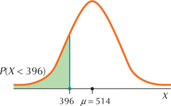 FIGURE 48 Graph of proportion of Math SAT scores lower than 396.
Step 2 Standardize.
Now standardize the random variable X to the standard normal Z:
Z=X−μσ=X−514118
Find the Z-value corresponding to the Math SAT score of 396:
396−μσ=396−514118=−1
So the Z-value associated with a score of 396 is −1, which indicates that the score of 396 is 1 standard deviation below the mean of 514.
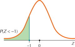 FIGURE 49 Graph of P(Z<−1).
Step 3 Draw the standard normal curve.
Scores less than 396 are more than 1 standard deviation below the mean, so shade the area to the left of −1 in Figure 49. Now find the area to the left of Z=−1 using the methods of Section 6.4.
Step 4 Find the area under the standard normal curve.
The Z table tells us that the area to the left of Z=−1 is 0.1587.
The proportion of scores below 396 is 0.1587, or 15.87%. Note that this value for P(X<396) agrees with our earlier intuition that the proportion was less than 50%.
NOW YOU CAN DO
Exercises 3–9.
YOUR TURN#19
For the scenario in Example 38, find the proportion of Math SAT scores greater than 600.
(The solution is shown in Appendix A.)
EXAMPLE 39Finding the probability that X lies between two given values
SAT Scores and AP Exam Scores
Continuing the Math SAT score problem, what percentage of students score between 215 and 595?
![]() The Normal Density Curve applet allows you to find areas associated with various values of any normal random variable.
The Normal Density Curve applet allows you to find areas associated with various values of any normal random variable.
Solution
Step 1 Determine X, μ, and σ.
We have already seen that X=Math SAT score has mean μ=514 and standard deviation σ=118. Once again, draw a graph of the distribution of scores X, with the mean 514 in the middle, the score 215 to the left of the mean, and the score 595 to the right of the mean, as in Figure 50.
Step 2 Standardize.
This is a “between” example, where two values of X are given, and we are asked to find the area between them. In this case, just standardize both of these values of X to get a Z-value for each:
Z=215−μσ=215−514118≈−2.53andZ=595−μσ=595−514118≈0.69
FIGURE 50 Graph of percentage of students scoring between 215 and 595 on the Math SAT.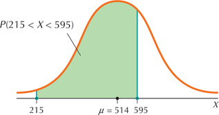
Step 3 Draw the standard normal curve.
Draw a graph of Z, shading the area between Z=−2.53 and Z=0.69, as shown in Figure 51. Again, the key is that the area between Z=−2.53 and Z=0.69 is exactly the same as the area between X=215 and X=595.
Step 4 Find area under the standard normal curve.
Figure 51 is a Case 3 problem from Table 8 (page 355). Find the area to the left of 0.69, which is 0.7549, and the area to the left of −2.53, which is 0.0057. Subtracting the smaller from the larger gives us
P(−2.53<Z<0.69)=0.7549−0.0057=0.7492
Thus, the percentage of Math SAT scores that are between 215 and 595 is 74.92%.
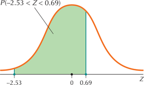 FIGURE 51 Graph of percentage of Z - values between −2.53 and 0.69.
NOW YOU CAN DO
Exercises 10–14.
YOUR TURN#20
For the scenario in Example 39, find the proportion of Math SAT scores between 305 and 605.
(The solution is shown in Appendix A.)
2Finding a Normal Data Value for a Given Area or Probability
Sometimes we are given a probability (or proportion or area), and we are asked to find the associated value of X. Questions like these are similar to the “backwards” problems of Section 6.4, which are so called because we must use the Z table backward or inside out. The formula for standardizing X gives the value for Z, so we need to use our algebra skills to find the equation for X: Start with the standard normal formula Z=(X−μ)/σ. Multiply both sides by σ to get Zσ=X−μ. Then add μ to both sides, giving us X=Zσ+μ.
Finding Normal Data Values for a Given Area or Probability
- Step 1 Determine X, μ, and σ, and draw the normal curve for X. Shade the desired area. Mark the position of X1, the unknown value of X.
- Step 2 Find the Z-value corresponding to the desired area. Look up the area you identified in Step 1 on the inside of the Z table. If you do not find the exact value of your area, by convention choose the area that is closest.
- Step 3 Transform this value of Z into a value of X, which is the solution. Use the formula X1=Zσ+μ.
EXAMPLE 40Finding a normal data value for a given area
SAT Scores and AP Exam Scores
Suppose the students in the top 1% of Math SAT scores won a fellowship to an Ivy League university. What is the score that students will have to obtain to win this fellowship?
Solution
Notice that we are not asked to find a probability (or proportion or area). Instead, we are given a percentage (1%) and asked to find the value of X (the Math SAT score) that is associated with this 1%.
Step 1 Determine X, μ, and σ, and draw the normal curve for X.
We already know that X=Math SAT score, μ=514, and σ=118. The value of X in which we are interested refers to high scores, so that X1 will be at the far right of the distribution of X. Only 1% of scores will be greater than this score, so the area to the right of X1 is 0.01, as shown in Figure 52.
FIGURE 52 X1 is the cutoff value (or critical value) of X, at which students will win a fellowship to an Ivy League university.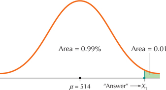 Page 373
Step 2 Find the Z-value corresponding to the desired area.
The area to the right of X1 equals 0.01, so that the area to the left of X1 equals 1−0.01=0.99. Looking up 0.99 on the inside of the Z table gives us Z=2.33.
Step 3 Transform using the formula X1=Zσ+μ.
We calculate
X1=Zσ+μ=(2.33)(118)+514=788.94
The cutoff value for the top 1% of Math SAT scores for winning a fellowship to an Ivy League university is 788.94. It won't be easy getting that fellowship.
NOW YOU CAN DO
Exercises 15–22.
YOUR TURN#21
For the situation in Example 40, what is the Math SAT score that separates the lowest 2.5% of the scores from the others?
(The solution is shown in Appendix A.)
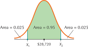
EXAMPLE 41Finding the X-values that mark the boundaries of the middle 95% of X-values
Edmunds.com reported that the average amount that people were paying for a 2015 Toyota Camry XLE was $28,720. Let X=price, and assume that price follows a normal distribution with μ=$28,720 and σ=$1000. Find the prices that separate the middle 95% of 2015 Toyota Camry XLE prices from the bottom 2.5% and the top 2.5%.
Solution
Step 1 Determine X, μ, and σ, and draw the normal curve for X.
Let X=price, μ=$28,720, and σ=$1000. The middle 95% of prices are between X1 and X2, as shown in Figure 53.
Step 2 Find the Z-values corresponding to the desired area.
The area to the left of X1 equals 0.025, and the area to the left of X2 equals 0.975. Looking up area 0.025 on the inside of the Z table gives us Z1=−1.96. Looking up area 0.975 on the inside of the Z table gives us Z2=1.96.
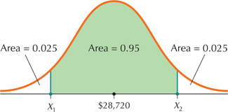 FIGURE 53 X1 and X2 mark the middle 95% of Camry XLE prices.
Step 3 Transform using the formula X1=Zσ+μ.
We calculate
X1=Zσ+μ=(−1.96)(1000)+28,720=26,760X2=Z2σ+μ=(1.96)(1000)+28,720=30,680
The prices that separate the middle 95% of 2015 Toyota Camry XLE prices from the bottom 2.5% of prices and the top 2.5% of prices are $26,760 and $30,680.
NOW YOU CAN DO
Exercises 23–26.
YOUR TURN#22
For the situation in Example 41, find the two prices that separate the middle 90% of prices from the bottom 5% and the top 5%.
(The solution is shown in Appendix A.)
 What If Scenario: How Change in Spread Affects Camry Prices
In Example 41, what if we ask the same question again, but this time the standard deviation σ of 2015 Toyota Camry XLE prices is not $1000, but some value less than $1000? How and why would this affect the following?
- The values Z1 and Z2 found in Step 2
- The value X1 separating the middle 95% of prices from the bottom 2.5%
- The value X2 separating the middle 95% of prices from the top 2.5%
Solution
Figure 54 illustrates the distribution of 2015 Toyota Camry XLE prices, where everything is the same as in Figure 53, except that the standard deviation of the prices is smaller by an unknown amount. Thus, the spread of the distribution is smaller.
- We are still asking for the middle 95% of prices, so the Z-values remain the same: −1.96 and 1.96.
Re-express the formula X1=Z1σ+μ as X1=$28,720−1.96⋅σ. If σ is smaller than $1000, then the quantity 1.96 · σ, which represents the difference between the mean price and X1, will also be smaller.
Because X1 is less than the mean μ=$28,720, the smaller difference between the mean price and X1 leads us to conclude that X1 will be larger than in Example 41. For example, if the new standard deviation is σ=$500, then X1=$28,720−1.96⋅500=$27.740, which is larger than the $26,760 in Example 41.
- Similarly, a smaller σ means a smaller quantity 1.96⋅σ, which means that X2=$28,720+1.96⋅σ will be closer to the mean μ=$28,720. Because X2 is larger than the mean, the new value for X2 will be smaller than in Example 41.
EXAMPLE 42Normal probabilities and percentiles using technology
Applying the information on Toyota Camry prices from Example 41, use the TI-83/84, Excel, Minitab, or JMP to find the following:
- The proportion of 2015 Camry XLEs costing between $27,000 and $30,000: P(27,000≤X≤30,000)
- The 99th percentile of Camry XLE prices; that is, find the value of X, namely, X1, such that P(X≤X1)=0.99
Solution
The instructions for finding these quantities are given in the Step-by-Step Technology Guide at the end of this section (page 380).
TI-83/84
- Figure 55 shows that P(27,000≤X≤30,000)=0.8570111819≈0.857.
- Figure 56 shows that the value for X1, such that P(X≤X1)=0.99, is given by X1=$31,046.34788≈$31,046.35.
 FIGURE 55 TI-83/84: Finding a probability.
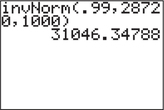 FIGURE 56 TI-83/84: Finding a value of X.
Excel
- Excel provides the cumulative probabilities P(X≤27,000) in Figure 57 and P(X≤30,000) in Figure 58. To find P(X≤27,000≤30,000), we subtract P(X≤27,000) from P(X≤30,000): P(27,000≤X≤30,000)=0.899727432−0.042716221=0.857011211≈0.8570
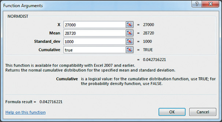 FIGURE 57 Excel: P(X≤27,000).Page 376
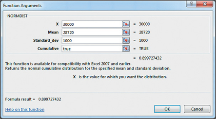 FIGURE 58 Excel: P(X≤30,000).
 - Excel provides the result shown in Figure 59: X1=$31,046.34788≈$31,046.35
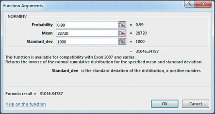 FIGURE 59 Excel: Finding a value of X.
Minitab
- Similar to Excel, Minitab asks you to take the difference of two cumulative probabilities: P(X≤27,000) in Figure 60 and P(X≤30,000) in Figure 61: P(27,000≤X≤30,000)=0.899727−0.0427162=0.8570108≈0.8570
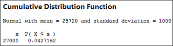 FIGURE 60 Minitab: P(X≤27,000).
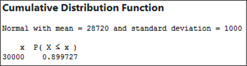 FIGURE 61 Minitab: P(X≤30,000).
 - The results are given in Figure 62: X1=$31,046.30
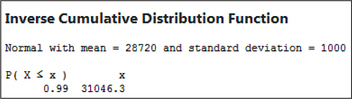 FIGURE 62 Minitab: Finding a value of X.
JMP
- JMP also asks you to take the difference of two cumulative probabilities: P(X≤27,000) in Figure 63 and P(X≤30,000) in Figure 64: P(27,000≤X≤30,000)=0.899727432−0.0427162208=0.8570112112≈0.8570
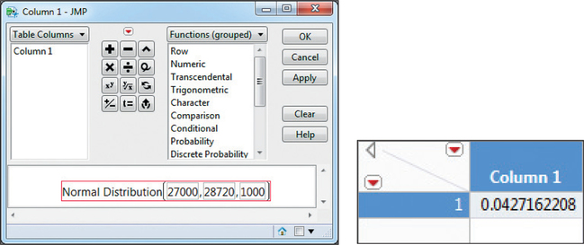 FIGURE 63 JMP: P(X≤27,000).
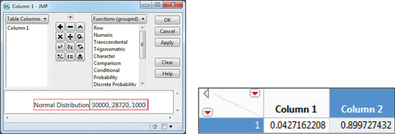 FIGURE 64 JMP: P(X≤30,000).
 - The results are given in Figure 65: X1=$31,046.30
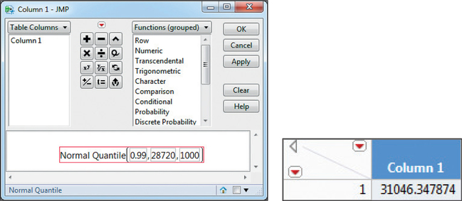 FIGURE 65 JMP: Finding a value of X.
Developing Your Statistical Sense
Text Messaging: Be Careful What You Assume
The Pew Internet and American Life Project reported in 2011 that the mean number of text messages sent per day by 18- to 24-year-old Americans is 109.5. Assume that the distribution of the number of text messages is normal, with μ=109.5 and standard deviation σ=35.
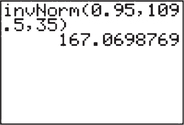
Problem 1. Suppose that cell phone customers get a special rate if the number of text messages they send per day is at or above the 95th percentile. Find the number of text messages represented by the 95th percentile.
Solution to Problem 1. On the assumption that the number of text messages is normally distributed, and working similarly to Example 42b, we find the 95th percentile of text messages to be about 167, as shown in Figure 66.
Problem 2. Pew reports further that the median number of text messages sent per day by 18- to 24-year-old Americans is 50.
- What does this say about our assumption of normality for the distribution of text messages?
- What shape does the distribution of the number of text messages actually take?
- Is the actual 95th percentile of text messages greater or less than 167, and why?
Solution to Problem 2.
- In Chapter 3, we learned that, for symmetric distributions (such as the normal distribution), the mean and the median were about equal (see Figure 5 on page 115). The mean number of text message 109.5 is much larger than the median of 50 text messages, so the distribution of text messages is not symmetric and thus cannot be normal.
- The number of text messages takes a shape like Figure 33 on page 73. Thus, the distribution of the number of text messages is actually right-skewed.
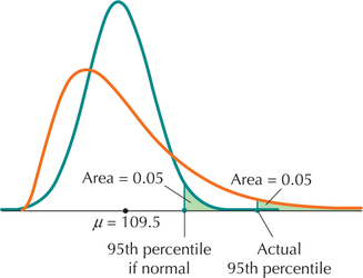
- Figure 67 shows the (wrongly) assumed normal distribution in green and the actual right-skewed distribution in orange. Both distributions have the same mean: μ=109.5. The 95th percentile for each distribution is shown. Because the right tail of the right-skewed distribution is extended, the 95th percentile of the right-skewed distribution is greater than the 95th percentile of the normal distribution. Thus, the actual 95th percentile of the number of text messages sent per day by 18- to 24-year-old Americans is greater than 167.FIGURE 67 Incorrect assumption of normality led us to underestimate the 95th percentile of the number of text messages.
3Assessing Normality Using Normal Probability Plots
Much of the analysis we conduct in this text requires that the sample data come from a population that is normally distributed. But how do we assess whether a data set is normally distributed? Histograms, dotplots, and stem-and-leaf displays may be used. But a more precise graphical tool for assessing normality is the normal probability plot. A normal probability plot is a scatterplot of the estimated cumulative normal probabilities (expressed as percents) against the corresponding data values in the data set.
Analyzing Normal Probability Plots
If the points in the normal probability plot either cluster around a straight line or nearly all fall within the curved bounds, then it is likely that the data set is normal. Systematic deviations off the straight line are evidence against the claim that the data set is normal.
Professional statistical analysts always use technology to construct normal probability plots. We show how this is done in the Step-by-Step Technology Guide at the end of this section.
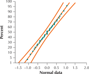
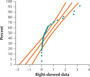
EXAMPLE 43Normal probability plots
Figures 68 and 69 show normal probability plots for two different data sets. Analyze these plots for evidence for or against the normality of each data set.
Solution
In Figure 68, the points are arrayed nicely along the straight line, and all the points lie within the curved bounds. We therefore conclude that the data represented in Figure 68 are normally distributed. (In fact, the underlying data are drawn from a normal distribution.) In Figure 69, the points do not line up in a straight line, and many points lie outside the curved bounds, indicating that the data set is not normal. We therefore conclude that the data represented in Figure 69 are not normally distributed. (In reality, the underlying data set is right-skewed.)
NOW YOU CAN DO
Exercises 27–30.