The Principles of Design
This is not an art class, and you are not reading an art textbook; why, then, is it useful to pause and learn some of the basic, art-
Primarily, it’s because a baseline goal when producing a movie is to ensure that all the things you want to be seen by viewers will, in fact, be seen as you intended, and anything you want hidden will be invisible. At the foundational level, then, you are attempting to figure out three things: how to use the physical space you have available to you, how to design sets for that space, and how to arrange elements on those sets to maximize creative success. Even when you are making a 3D movie, you are essentially conceptualizing and composing a 3D image on a two-
To be sure, you will need to do some exploration in other disciplines to get this education. Art, photography, theater, and literature are all areas in which you will learn about proportion, scale, composition, depth, color, and so on. But the basic fundamentals we will now discuss will serve you well as a solid foundation for those ongoing lessons.
Design Composition Elements
In Chapter 7, we will analyze elements of good composition as they relate to cinematography—strategies and principles for positioning people and objects for the purpose of framing images through the lens for maximum balance and impact. This essentially involves how two-dimensional space will be organized in the frame. Before we get to that lesson, though, you need to think about composition as it relates to production design. Not surprisingly, the two areas in which composition is crucial—cinematography and production design—are interrelated. A key part of the production designer’s job is to make sure elements are designed and arranged in such a way that the director and cinematographer can position or reposition people, objects, crew, and equipment to execute their visual plan for framing and executing shots. Without proper placement and spacing of elements on a set, filmmakers will have a hard time getting composition right.
 USE PAINTS
You can learn a great deal about color combinations simply and inexpensively by purchasing a set of watercolors or acrylic paints, blending them together in various ways, and then painting simple blocks of different colors and shades, or degrees of the same color, on a piece of paper. Pick a basic mood, such as joy or sadness, and try to create colors that express those feelings. This exercise will come in handy when you are trying to match mood and colors while designing sets.
Thus, from a design point of view, composition involves the proper design of spaces for filming, and the design and placement of elements on sets and locations behind—and all around—actors and other principal focal points. Keep in mind that the actor is typically the most important element in a frame—anything that competes with or dilutes the presence of your actors is usually to be avoided. The notion of designing a space to aid composition is subtly different from the notion of arranging elements in particular ways for particular shots—that is a subject we will discuss in the next section. Meanwhile, you may hear other terms that refer to the same concept as composition—form or ordering, for example. But whatever term you use, the point is, you need to get a plan together for how you want to structure spaces in every scene in your movie.
Remember that many important compositional concepts come out of the art and theatrical worlds, but their essential roles, in most cases, are similar or even identical when applied to moving-picture imagery. The most important concept of them all is the idea of space and how to use it. How you give the illusion of physical space or space between elements impacts how depth, size, and proportion are perceived by the viewer, and thus plays a direct role in the emotional impact of scenes. Cinematography and lighting are crucial to representing space in movies, but so is production design. In design, the term positive space refers to space that is filled with objects of some type. Negative space, as we will elaborate in Chapter 7, refers to wide, open space that remains empty until used by actors as they move from one position to another. There are also the concepts of shallow space and deep space in design. When two objects are placed on a set and photographed with very little depth, whereby elements or people occupy almost the same positions, it is called shallow space, resulting in a flatter image. When one element is in the foreground and the other is in the distance, it is called deep space because that juxtaposition gives the illusion of distance.
Beyond those basic definitions, however, you need to think about how your use of space is helping, or hurting, the story. Usually, if you have competing ideas or are undecided about how to use a space, your best bet is to simplify things—strip away clutter and only use colors that invoke the intended mood.
Other important compositional categories for you to understand as you strive to properly execute design include the following:
AVOID PURE WHITE
Generally, with digital cameras, it is not a good idea to film characters against pure white walls, as clothing and certain colors can cause artifacts (undesired changes in the way an image looks) against white backgrounds. If you have a creative reason to use a white wall, take that into consideration when costuming your actors, and make sure you do not use a flat lighting scheme.
 Center of interest. This is sometimes called “point of emphasis.” As either name implies, the idea revolves around the notion that every frame in a motion picture has a specific area where the filmmaker wants your attention directed. In this sense, it’s the most important part of the frame. Therefore, your design must accommodate what you want to emphasize in each shot. This might mean adding certain elements, like color or contrast or props or set pieces (see here), or avoiding things that would distract from an actor or some other non-design-related element. Every element must have a purpose in adding to the characters or the story.
-
Harmony and contrast. Similarly, these concepts out of the art world involve composing frames with matching or similarly shaped elements to avoid a distracting contrast, unless, of course, such contrast is a creative choice. Thus, you would want pieces of furniture to match or be similarly shaped or textured to achieve harmony, and you would mismatch them if you wanted to achieve contrast.
-
Value. This refers to the differences between light and dark in a design—that is, the contrast between black and white elements: the larger the value, the wider the contrast in shots.
-
Balance. This characteristic involves achieving some form of equality in terms of shapes, forms, colors, and so on, in a frame. Production design can be crucial in helping to achieve balance, so that the viewer’s attention is not unintentionally directed to one part of a shot over another.
-
Line. In frames, this term refers to shapes that essentially create a visual path for the eye to follow, usually toward the main focal point of a frame. Lines can therefore be patterns on walls, run in any number of directions, be of different thicknesses or textures, or not even be physical at all. Deliberately choreographed movement or blur can create lines, and visual illusions that mimic movement can also be incorporated.
-
Shape. In design, shape is exactly what you think it is—two-dimensional areas with specific edges to them, generally classified as either geometric shapes or organic shapes. In either case, with good design, shape can be used strategically. If a table is shaped like an oval or an octagon in a particular scene, it is because filmmakers decided that the shape would work best in terms of drawing the viewer’s eye to the primary element in the frame.
-
Color. The foundation for all color-related goals, even those finalized in postproduction, begins on-set, because color is a major tool in implying or enhancing different moods and emotions in cinematic stories. Thus, for production design, the term color refers primarily to specific hues and other properties, such as temperature, brightness, and saturation. (See Action Steps: Choosing a Color Palette, below, and Tech Talk: Color Theory in Design, also below, for more on choosing a color palette and understanding the properties of color.)
-
Form. In design, this term refers to three-dimensional objects that have a certain volume and thickness to them, and that can be lit or shaded in particular ways to create three-dimensional effects from certain angles.
-
Texture. Although viewers can’t physically enter movies and feel textures, they can subtly see them when elements are correctly designed. Texture is all about the quality or feel—smooth, rough, jagged—of object surfaces. Remember, it only matters how the set looks on screen. If your set calls for granite floors, you don’t necessarily need real granite. Very often, expensive materials and textures can be replaced with paint.
-
Size/Scale. Different sizes or differences in scale can evoke moods and emotions in viewers; therefore, size variations among elements are frequently used in production design. Keeping with the theme of simplification, you should typically apply scale in accordance to the theme or mood of the scene or the character’s situation. If the character is lonely, lost, or overwhelmed, consider using a very large space to dwarf the actor. If the character feels trapped or claustrophobic or eager to escape a situation, think about including low ceilings to make the space feel more oppressive.
-
Rhythm. In design parlance, rhythm refers to making certain elements recur or show up in some kind of regular pattern.
Mise-en-Scène
The specific arrangement of elements on a set goes hand in hand with the overall design and use of the space itself. The French term mise-en-scène has been brought over from the theatrical world to express this concept. Mise-en-scène refers to the display of every visible element in a frame—from the architectural structure to the paint on the walls down to the smallest props, and everything in between—with the notion being that everything visible has a purpose and is there to reinforce the point of the scene or aid viewers in figuring out, or contextualizing, the story’s details based on what they see and how it’s arranged.
DO YOUR HOMEWORK
Watch movies and study film history. The best way to learn production design is to examine the work of leading directors and designers; the world of film is chock-full of this kind of work.
In that regard, there are certain factors you need to think about in terms of how elements will be arranged. These include the following:
-
What or who will be dominant in the shot?
-
What type of shot and camera angle will be used—wide shot? close shot? (See Chapter 7).
-
How will you be framing the shot?
-
What should be the dominant color in the scene?
-
Form—will the set be open or closed? Will actors or elements be framed within a window? a door? an archway?
-
Where will characters be placed, and how will they be moving—in other words, how will you be blocking the scene? Will they be facing the camera? each other?
-
Depth—what kind of space will you want between characters and major elements? Will you need to emphasize any particular background elements?
These and other factors are reasons why storyboarding or digital previsualization can be valuable in helping filmmakers visualize elements in relationship to one another and in relationship to the camera and lights, even helping to block out basic camera moves and angles. But no matter what method you use to “see” these elements coming together, you need to understand the function of each of these design-related elements:
-
Decor and props. On a professional project, a separate
art director, working for the production designer, will handle the creation of decorations, or set pieces (items that are not actually used but are part of the environment in which events take place), and props (items that characters will be physically interacting with and using). In this class, you will be figuring these things out for yourself. To accomplish your own mise-en-scène, move your thinking beyond simply “finding stuff that looks good” to thinking about each element’s significance and usefulness. Will a decorative item reflect a character’s lifestyle or beliefs, such as a crucifix on the wall if the character is religious? Will another decoration indicate the character’s economic status or environment he or she is confined in? Will it indicate conditions or events, such as bars on windows or bullet holes in walls?
-
Costumes and makeup. Logically, the purpose of a costume is to clothe a character according to that character’s specific characteristics in order to enhance believability. In professional productions, costume design, makeup, and hair design are all separate disciplines, whereas you will have to handle these issues yourself. In either case, costumes, makeup, and hair eventually all need to be integrated with production design. Thus, the nature, color, patterns, texture, and placement of clothing on the actor are part of mise-en-scène—part of the larger arrangement of visual elements on your set. Therefore, you need to think about your overall design when considering costumes and makeup, rather than addressing them independently.
-
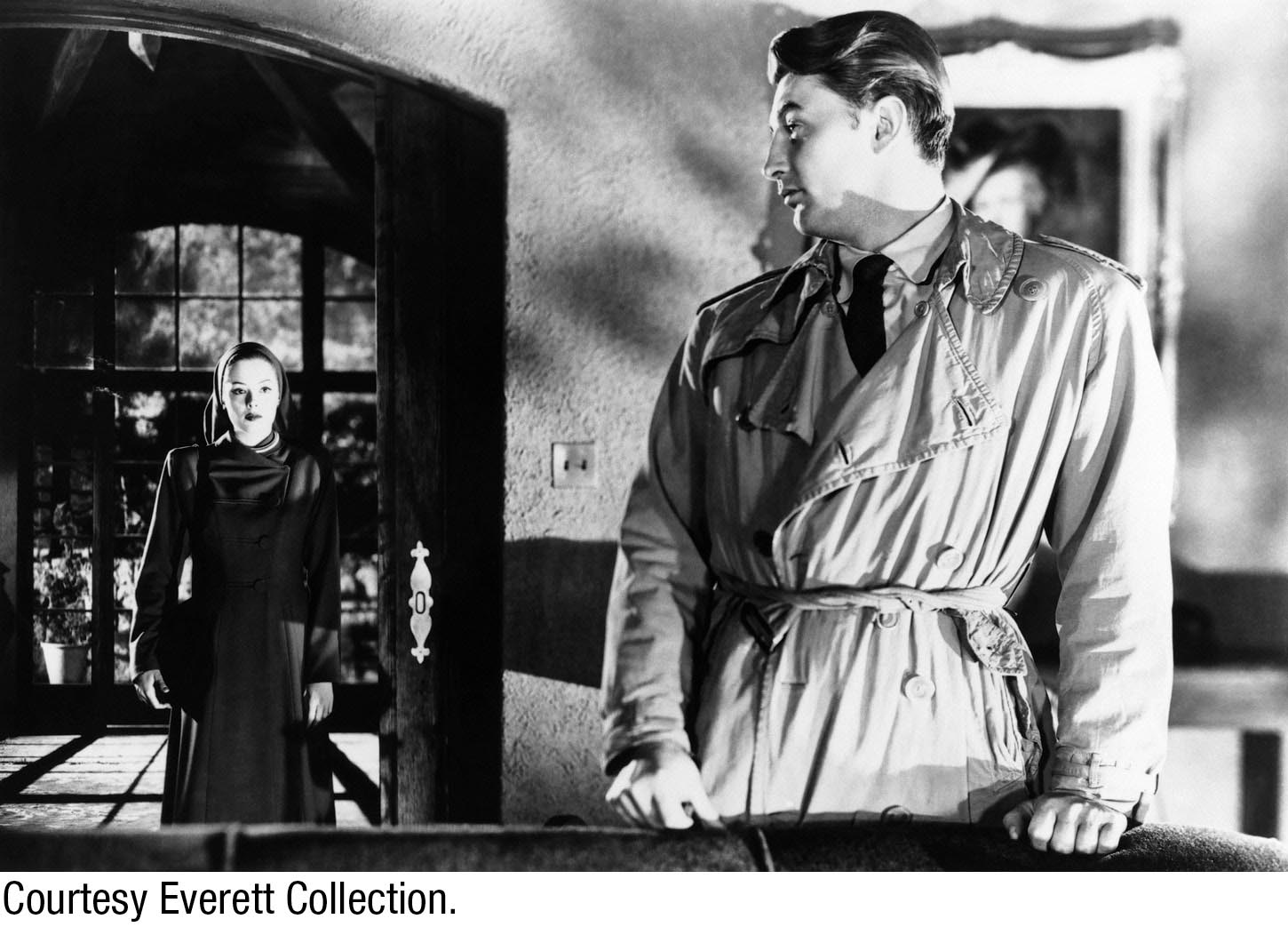
Lighting. Lighting sits at the heart of successful cinematography because of how its skillful use can contribute to emotional reactions from the audience. This is why we have devoted two chapters to the discipline (Chapters 8 and 9). Lighting impacts numerous other disciplines—production design, in particular. Simply put, light and design need each other. Design can help enhance or obstruct or manipulate light on-set, and light can help display or enhance designs or, alternatively, hide flaws, among other things. Along these lines, veteran director and production designer Catherine Hardwicke strongly urges students to study lighting in paintings and photographs. “What direction does the light come from?” she suggests you contemplate. “Don’t forget, light can expand space—even small sources of light at the far end of a room, or deep in the distance, can add great depth and production value.” In Chapter 9, we discuss high-key light and low-key light—both of which are important complements to design. High-key lighting reduces shadow and thus reduces tension; therefore, it is used in environments that are designed for those moods. Low-key lighting, by contrast, is a strong-contrast lighting approach designed to heighten tension with darkness and shadows. Orson Welles’s Touch of Evil (1958) and Carol Reed’s 1949 The Third Man (which starred Welles) perfectly illustrate how light and design can be united in tense stories. Having a close synergy between design, lighting, and camera positioning can also help you save time and money in the design process by eliminating elements that will never be seen in the frame.
-
Human beings. In Chapter 3, we had the larger discussion of how to direct and use actors for maximum effect, and we have already mentioned costuming and the impact that has on design. But the physical attributes of your actors and how they are placed and moved in scenes is also part of the mise-en-scène paradigm. In this respect, the concepts of
typage and frontality come into play. Typage involves using actors based on facial or body features, almost a stereotype of sorts, but not only for purposes of story points. Typage can also be used to enhance design ideas—people with Asian features to enhance Asian environments, short or tall people to fit properly into certain fantasy environments, and so on. Frontality refers to the idea of staging an actor so that he or she faces the camera directly. This might be done if the actor is in a scene meant to make viewers feel they are part of the same world as the events they are seeing on the screen. If the actor is facing the camera, elements around him or her may need to be specially arranged.
-
Depth. Earlier, we defined the term space as it relates to production design. Visual elements can be arranged to form shallow space or deep space. Those decisions connect directly to mise-en-scène considerations; the placement of elements will obviously be very different if your major points of focus are far away from one another in the frame rather than extremely close together.
Color Theory in Design

We discuss various aspects of color’s role in cinematic presentations in Chapter 8, including such general notions as the idea that the more colorful an environment, the warmer it appears, and the less colorful, the colder or more sterile it appears. Color theory represents an entire academic discipline beyond this book’s scope, and you will benefit from educating yourself about it in more detail beyond this course. From a production design point of view, focus not only on how to create or select particular colors for particular elements but also on how other elements will impact or be impacted by those choices. What factors influence or change colors or cause them to clash, contrast, or match up nicely with one another?
The principles of color theory can assist you with these questions. Hues (predominant color attributes), luminance (brightness), and saturation (intensity) are terms you should familiarize yourself with, because you will be considering them as you make color selections. Colors you choose can grow brighter, duller, distracting, more appealing, or confusing to the eye depending on various factors. In terms of filmmaking considerations, here are a few areas that directly impact color on-set:
 Lighting, as noted here and in Chapter 8, directly affects how color and physical elements appear to the camera and recording medium you are using.
-
Smooth surfaces tend to make colors more saturated, and dull surfaces tend to make them less saturated.
-
Dark backgrounds make foreground colors appear lighter, white backgrounds make foreground colors appear darker, and background and foreground colors can have a visual impact on the intensity of one another on the big screen.
-
Warmer colors (reds, oranges, and yellows) tend to translate to more upbeat emotional responses from viewers. They also tend to make objects appear smaller and thus are often used closer to the camera. Cooler colors (blues, greens, and purples) tend to evoke less empathetic emotional responses and make objects look larger; therefore, they are often used for objects meant to be perceived as being far away.
-
Some colors can evoke specific emotions, such as sexuality or anger in the case of red. White often suggests calm and simplicity, black often suggests evil or fear or deep mystery, and so on.
ACTION STEPS
Choosing a Color Palette
In Chapter 11, we discuss various aspects of manipulating color to achieve creative goals in postproduction, but it is important to remember that the more you get right in the design phase, the less digital color manipulations you will need to worry about later. As you design your film, keep in mind that color is one of the designer’s primary tools in helping to convey various aspects of a story’s time frame, location, character traits, emotions, moods, and motivations.
Also, remember cinematography as you choose a color scheme. Study what colors will look good when captured in the light you plan to use with the cameras you plan to use, and keep in mind that certain colors will render differently depending on the film stock or digital camera system you use, how you light the scene, and what format you are outputting the images to. For example, any form of water can take on any color based on how it is lit, time of day, or the filter choices by the cinematographer. The design choice of the water’s color will greatly influence the emotion of the shot. (Chapter 8 gives helpful insight into some of the strategic ways you can use various types of color gels on lights and filters on camera lenses to influence color tone, range, and saturation in-camera.)
Here are some tips for choosing and working with a color palette:
 Select a general color palette. This is not a hard-and-fast conceptual rule, nor is it about executing perfect color coordination. Rather, it is a useful guideline—a way of making sure everything captured by the camera stays within your story’s world. When thinking about your palette, pay attention to colors used in photos, movies, magazine articles, and other materials. If they relate to the era and story themes you are putting together, evaluate if those color schemes would be applicable to your material.
 Keep color choices consistent. Be sure that they support the characters and environments you are photographing. If your movie is based on comic book material, you might use a comic-strip-inspired color palette. If you are making a film noir piece, you will probably gravitate to blacks, browns, grays, and anything else that looks good in low light. If you are making a lighthearted romantic comedy, you will likely want to keep the
 Do color tests. Use paint and fabric swatches, actual paint, or colored markers to experiment with combinations, examine options, and study various colors.
 Create a color script. A color script is a series of color drawings that show the design arc of the story from the perspective of color. Simply by looking at where the “cool colors” and the “warm colors” are placed, you can see the ups and downs of the story arc as visualized by the production designer.