3.1 Consumer and Producer Surplus: Who Benefits in a Market?
To understand the market impact of any policy, we need a way to measure the benefit consumers and producers obtain from buying and selling goods and services in a market. Economists measure these benefits using the concepts of consumer and producer surplus.
Consumer Surplus
consumer surplus
The difference between the amount consumers would be willing to pay for a good or service and the amount they actually have to pay.
Consumer surplus is the difference between the price consumers would be willing to pay for a good (as measured by the height of their demand curves) and the price they actually have to pay. Consumer surplus is usually measured as an amount of money.
To see why we define consumer surplus this way, let’s think like an economist. Say a person is lost in the desert with no water, is getting extremely thirsty, and has $1,000 in his pocket. He stumbles upon a convenience store in this desert where he sees a bottle of water for sale. What is he willing to pay for the drink? Quite likely, his entire $1,000. Applying the concept of elasticity from Chapter 2, we can say this guy’s demand for something to drink is almost perfectly inelastic: He will demand the one bottle of water almost regardless of its price. Let’s say the store is asking $1 for the bottle of water. Mr. Thirsty was willing to pay $1,000 for the water but only had to pay the $1 market price. After the transaction, he has his drink and $999 left in his pocket. That $999—
58
We can take this one-
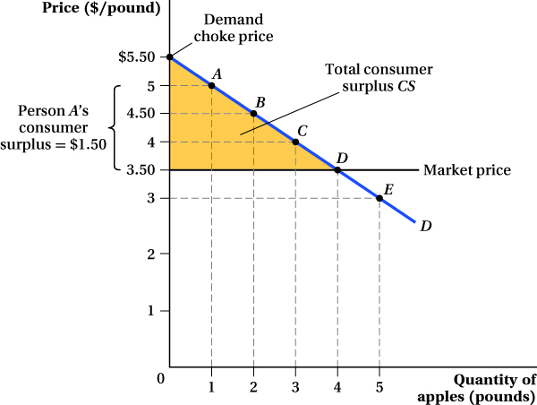
If every point along the market demand curve represents a different person’s willingness to pay for a pound of apples, we can measure each person’s consumer surplus just as we did for Mr. Thirsty. The person at point A on the demand curve is willing to pay up to $5 for a pound of apples. If the price is $3.50 per pound, he will buy the apples and have $1.50 of consumer surplus. Person B is willing to pay $4.50 per pound and receives $1 of consumer surplus, while Person C receives $0.50 of consumer surplus. The person at point D is willing to pay $3.50 for a pound of apples and must pay the market price of $3.50 a pound. Thus, there is no consumer surplus for this individual.1 Person E will not buy any apples; she is willing to pay only $3 per pound, which is below the market price. If you want to know the total consumer surplus for the entire market, add up all of the gains for each individual who buys apples—
After adding up all the gains, you will find that the total consumer surplus in the entire Pike Place apple market is the area under the demand curve and above the price. In this particular example, because the demand curve is linear, the area is the shaded triangle CS in Figure 3.1. The base of the consumer surplus triangle is the quantity sold. The height of the triangle is the difference between the market price ($3.50) and the demand choke price ($5.50 per pound), the price at which quantity demanded is reduced to zero.2
59
In this example, the demand curve represents a collection of consumers, each with a different willingness to pay for the good. Those with a high willingness to pay are located at the upper left portion of the curve; those with a lower willingness to pay are down and to the right along the curve. The same logic also applies to an individual’s demand curve, which reflects his declining willingness to pay for each additional unit of the good. For instance, an apple buyer might be willing to pay $5 for the first pound of apples he buys, but only $4 for the second pound and $3.50 for the third pound (maybe he has limited ability to store them, or just gets tired of eating apples after a while). If the market price is $3.50 per pound, he will buy 3 pounds of apples. His consumer surplus will be $1.50 for the first pound, $0.50 for the second, and zero for the third, a total of $2. Doing this calculation for all apple buyers and adding up their consumer surpluses will give a total consumer surplus of the same type shown in the triangular area in Figure 3.1.
Producer Surplus
producer surplus
The difference between the price producers actually receive for their goods and the price at which they are willing to sell them.
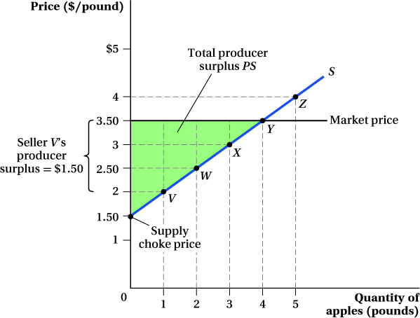
Just as consumers gain surplus from engaging in market transactions, so do producers. Producer surplus is the difference between the price producers actually receive for their goods and the price at which they are willing to sell them (measured by the height of the supply curve). The supply curve in the Pike Place apple market (Figure 3.2) tells us how many pounds of apples producers are willing to sell at any given price. If we think of every point on the supply curve as representing a different apple seller, we see that Firm V would be willing to supply apples at a price of $2 per pound. Because it can sell apples at the market price of $3.50, however, it receives a producer surplus of $1.50.3 Firm W is willing to sell apples for $2.50 per pound and so receives $1 of producer surplus, while Firm X receives $0.50 of producer surplus. Firm Y, which is only willing to sell a pound of apples for $3.50, receives no surplus. Firm Z is shut out of the market; the market price of $3.50 per pound is less than its willingness to sell ($4). The total producer surplus for the entire market is the sum of the producer surplus for every seller along the supply curve. In this example with a linear supply curve, the sum equals the triangle above the supply curve and below the price, the area of the shaded triangle PS in Figure 3.2. The base of the triangle is the quantity sold. The height of the triangle is the difference between the market price ($3.50) and the supply choke price, the price at which quantity supplied equals zero. Here, that’s $1.50 per pound; no seller is willing to sell apples below that price.
60
This particular supply curve represents a collection of producers that differ in their willingness to sell. The same logic applies to an individual producer’s supply curve in cases where the firm’s cost of producing additional output rises with its output. In these cases, the firm must be paid more to sell additional units.4 The firm’s producer surplus is the sum of the differences between the market price and the minimum price the firm would need to receive to be willing to sell each unit.
 See the problem worked out using calculus
figure it out 3.1

For interactive, step-
The demand and supply curves for newspapers in a Midwestern city are given by
QD = 152 – 20P
QS = 188P – 4
where Q is measured in thousands of newspapers per day and P in dollars per newspaper.
Find the equilibrium price and quantity.
Calculate the consumer and producer surplus at the equilibrium price.
Solution:
Equilibrium occurs where QD = QS. Therefore, we can solve for equilibrium by equating the demand and supply curves:
QD = QS
152 – 20P = 188P – 4
156 = 208P
P = $0.75
61
Therefore, the equilibrium price of a paper is $0.75. To find the equilibrium quantity, we need to plug the equilibrium price into either the demand or supply curve:
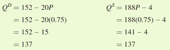
Remember that Q is measured in terms of thousands of papers per day, so the equilibrium quantity is 137,000 papers per day.
To calculate consumer and producer surplus, it is easiest to use a graph. First, we need to plot the demand and supply curves. For each curve, we can identify two points. The first point is the equilibrium, given by the combination of equilibrium price ($0.75) and equilibrium quantity (137). The second point we can identify is the choke price. The choke prices for demand and supply can be determined by setting QD and QS equal to zero and solving for P:
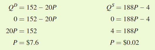
So the demand choke price is $7.60 and the supply choke price is $0.02.
The demand and supply curves are graphed in the figure below. Consumer surplus is the area below demand and above the price (area A). Its area can be calculated as
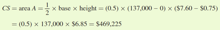
Producer surplus is the area below price and above supply (area B):
62
Application: The Value of Innovation
Equipped with the concepts of consumer and producer surplus, we can analyze one of the most important issues in economics—
A simple suggestion for valuing a new product would be to just add up what people paid for it. However, that approach would not be correct because, in reality, many consumers value the product at much more than the price they paid to get it. Consumer surplus, however, does measure the full benefit of the new product because it tells us how much consumers value the product over and above the price they pay.
A key factor in determining the amount of potential consumer surplus in a market for a new good is the steepness of the demand curve: All else equal, the steeper it is, the bigger the consumer surplus. That’s because steep demand curves mean that at least some consumers (those on the upper-
Let’s look at eyeglasses as an example. Economist Joel Mokyr explained in his book The Lever of Riches that the invention of eyeglasses around the year 1280 allowed craftsmen to do detailed work for decades longer than they could before. If we think of glasses as a “new technology” circa 1280, we can visualize what the demand curve for glasses might have looked like. Because many people in 1280 would be quite blind without glasses, the demand curve was probably very steep—
In Chapter 2, we learned that readily available substitute goods are likely to make demand more elastic. This is true of glasses, too: When contact lenses became available, the demand for glasses became more price elastic. How would this change in elasticity affect the consumer surplus people get from the existence of eyeglasses? Figure 3.3 illustrates the answer. Before contacts lenses were available, consumer surplus was large because the demand for glasses D1 was inelastic—
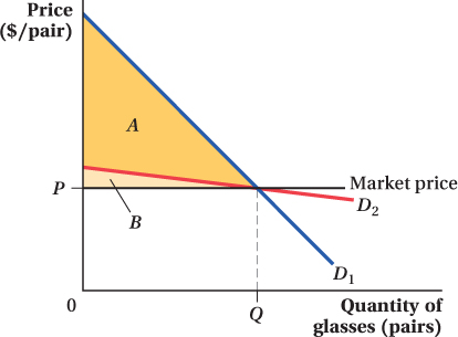
When contact lenses became available, the demand for glasses became much more elastic, as shown by curve D2. Even if just as many people bought glasses at the equilibrium price as before, a sharp rise in the price of glasses would cause many people to stop buying them because now they have an alternative. The figure shows that the consumer surplus from glasses declines after contacts come on the market. The area below the new, flatter demand curve and above the price is only area B.
After contacts are available, glasses are not worth as much to consumers because there are now other ways in which they can improve their eyesight. If glasses are the only way to fix your eyesight, you might be willing to pay thousands of dollars for them. Once you can buy contacts for, say, $300, however, there is a limit to how much you would pay for glasses. You might still buy the glasses for $200, but you would certainly not be willing to pay $1,000 for them, and the change in consumer surplus reflects that change. Glasses are a miracle invention if they are the only way to correct one’s vision (so they yield a higher consumer surplus). Remember that consumer surplus depends on the most that people would be willing to pay for the product. That maximum price goes down if alternatives are available. When alternative methods of vision correction are available, glasses are just another option rather than a virtual necessity, and the consumer surplus associated with them falls.
63
If you’re concerned these examples imply that innovation destroys surplus, remember that the substitute goods create surpluses of their own. They have their own demand curves, and the areas under those curves and above the substitute goods’ prices are also consumer surplus. For example, while the invention of contact lenses reduces the consumer surplus provided by glasses, it creates a lot of surplus in the new contact lens market. 
Application: What Is LASIK Eye Surgery Worth to Patients?
Laser-
Suppose we wanted to know how valuable LASIK surgery is to the patients who receive it. According to a market study commissioned by AllAboutVision.com, in 2013, the price of the procedure was about $2,100 per eye when performed by a reputable doctor. There were an estimated 800,000 LASIK procedures in 2013. A simple estimate for the value of this new procedure would be the number of surgeries times the cost (800,000 times $2,100, or about $1.7 billion). By now, however, you should realize that this measure of value is not a correct measure of the procedure’s benefit to consumers because many people value the procedure at more than the price they paid. To determine the full benefit, we need to compute the consumer surplus—
64
To begin this computation, we need a demand curve for LASIK surgery. Because glasses and contacts are substitutes for LASIK, the demand curve will be flatter than if there were no substitutes. If LASIK were the only way to correct vision problems, then a substantial number of the roughly three-
A hypothetical but realistic demand curve for LASIK procedures in 2013 is
QLASIK = 2,400,000 – 750PLASIK
where QLASIK is the quantity of LASIK procedures demanded and PLASIK is the price per eye of the procedure. Plugging in a price of $2,100 per eye gives a quantity demanded of 825,000 procedures, right around the 2013 estimate. We graph this demand curve in Figure 3.4. We can use this demand curve to determine the consumer surplus from LASIK.
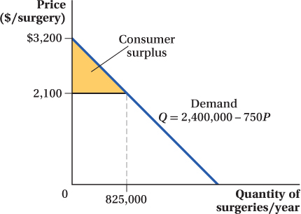
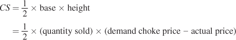
 (quantity sold) × (demand choke price – actual price), yielding a consumer surplus of approximately $454 million.
We know the consumer surplus is the area of the triangle that is under the demand curve but above the price:
Note that, for this demand curve, the demand choke price (PDChoke) occurs where QLASIK is equal to zero, or
QLASIK = 0 = 2,400,000 – 750 PDChoke
750PDChoke = 2,400,000
PDChoke = 2,400,000/750 = 3,200
So the consumer surplus from LASIK is
65
This calculation suggests that the people who got LASIK surgery in 2013 valued the surgery by about $450 million above and beyond what they paid for it. They collectively paid about $1.7 billion for the surgery, but would have been willing to pay as much as 25% more. Because LASIK didn’t exist as a product a couple of decades ago, that value was only created once the procedure was invented and a market established for it. This example suggests how important new goods can be for making consumers better off and raising the standard of living.
We can do the same sorts of calculations to compute the amount of producer surplus in a market. You’ll see such an example in the Application.
The Distribution of Gains and Losses from Changes in Market Conditions
One nice thing about our definitions of producer and consumer surpluses is that we can analyze the impact of any changes on either side of a market in a way that builds on the analysis we started in Chapter 2. There, we learned how shocks to supply and demand affect prices, quantity demanded, and quantity supplied. We can also show how these shocks affect the benefits producers and consumers receive in a market.
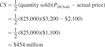
Figure 3.5 shows the initial supply and demand in the market for donuts. We see that at the market price P1, the donut buyers’ benefit from buying donuts is greater than the price they pay for the donuts (reflected in the consumer surplus area A + B + C + D). Similarly, the donut makers’ benefit from making the donuts is greater than the price at which they sell the donuts (reflected in the producer surplus area E + F + G ).
66
Now let’s suppose that a shock hits the donut market. Because of a poor berry harvest, the price of jelly filling goes up (assuming that the donut filling actually has some real fruit in it!). When this shock hits, the cost of making donuts rises, and suppliers are no longer willing to supply as many donuts at any given price. The supply of donuts falls, as reflected in the inward shift of the donut supply curve from S1 to S2. In response to the jelly shock, the equilibrium price of donuts rises to P2, and the quantity of donuts bought and sold in the donut market falls to Q2.
These changes affect both consumer and producer surplus. The higher equilibrium price and lower equilibrium quantity both act to reduce consumer surplus. Compared to triangle A + B + C + D in Figure 3.5, triangle A is much smaller. For producer surplus, the lower equilibrium quantity that results from the supply shift reduces it, but this reduction is partially counteracted by the higher price. These opposing effects can be seen in Figure 3.5. Some of the producer surplus before the shift—
We can do a similar analysis for the effects of demand shifts. An inward shift in demand leads to a lower equilibrium price and quantity, both of which reduce producer surplus. The impact on consumer surplus, however, has opposing effects. Having a smaller equilibrium quantity reduces consumer surplus, but this reduction is counteracted by the drop in price. Similar to the supply shift case above (but in the opposite direction), the inward demand shift transfers to consumers part of what was producer surplus. We see these effects in the application that follows.
Application: How Much Did 9/11 Hurt the Airline Industry?
After terrorists attacked the United States on September 11, 2001, the demand for air travel fell substantially, bringing the airline industry to its knees. Many congressional leaders wanted to compensate the airlines for the losses they suffered, but there was a great debate over how much money was at stake. Using supply and demand industry analysis and our consumer and producer surplus tools, we can estimate the reduction in producer surplus that the airlines suffered after 9/11.
Statistics from the U.S. Department of Transportation (DOT) show that in the fourth quarter (October through December) of 2000, there were about 148.9 million enplanements (an enplanement is defined as one passenger getting on a plane).5 In the fourth quarter of 2001, the first full quarter after the attack, there were only 123.6 million enplanements, a drop of 17% from the previous year. According to the DOT data, the average ticket price that airlines received per enplanement in the fourth quarter of 2000 was $122.22. In the fourth quarter of 2001, this average revenue had fallen to $104.82. This change in average revenue measures the price change over the period.
67
To figure out the damage to the industry, we need to compute the change in producer surplus.6 Let’s think of September 11th as creating a negative shift of the demand curve and assume no changes to the supply curve to make it easy: At every price, consumers demanded a lower quantity of plane travel. This shift is illustrated in Figure 3.6. Prices and quantities decreased in response to this event—
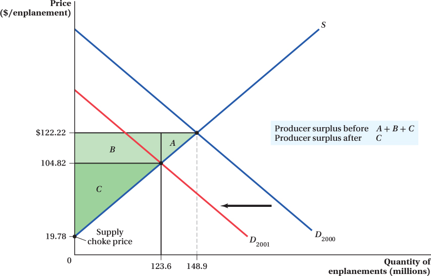
Figure 3.6 shows that the producer surplus fell when the demand curve shifted. Before the attack, producer surplus was the area above the supply curve and below the price, or A + B + C. After the attack, price and quantity fell and producer surplus fell to just area C. The loss to the airlines, then, was the area A + B.
To calculate the producer surplus in this market, we need to know the equation for the supply curve. If we assume the supply curve is linear, we can use the data from our two equilibrium points to derive the equation for our inverse supply curve. The slope of the supply curve is the ratio of the change in equilibrium prices over the change in equilibrium quantities:
68
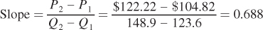
Now that we have the slope, we can use either (or even better both!) equilibrium point to determine the supply choke price (the vertical intercept of the supply curve):
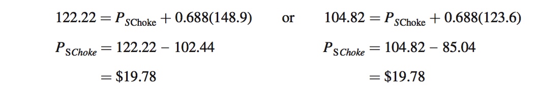
So now we know that the industry’s inverse supply curve is P = 19.78 + 0.688Q. Using the inverse supply equation allows us to match up the equation with the diagram in Figure 3.6.
With this inverse supply curve equation in hand, we can now calculate producer surplus before and after 9/11. Before 9/11, producer surplus is the area below the equilibrium price of $122.22 per enplanement and above the supply curve, for the entire quantity of 148.9 million enplanements. This would be areas A + B + C in the graph. Since these three areas combine to form a triangle, we can calculate producer surplus before 9/11 as

(The units of this producer surplus value are millions of dollars, because the quantity number is in millions of enplanements and the price is in dollars per enplanement.)
After 9/11, the equilibrium price fell to $104.82 per enplanement and the equilibrium quantity fell to 123.6 million enplanements. This means that producer surplus became only area C after 9/11, which was equal to

These calculations indicate that the producer surplus in the airline industry fell by $2,371.19 million, or over $2.3 billion, as a result of the terrorist attack on 9/11.
One interesting thing to note about this calculation is that even after the 9/11 attack, the producer surplus is a big number. Comparing the $5.255 billion of producer surplus in 2001 Q4 to that quarter’s reported (in the Air Carrier Financial Statistics) operating profit of – $3.4 billion (i.e., a $3.4 billion loss) for the industry leaves a puzzle. How can there be such a large producer surplus if the airlines had such a large loss? In reality, the puzzle is not so puzzling because producer surplus and profit are distinct concepts. The key distinction is the fixed costs firms pay—
By the way, if all we cared about was the drop in producer surplus after 9/11, there was another way to do the calculation we just did. We could have computed the size of areas A and B directly without actually solving for the supply curve. Rather than computing A + B + C and subtracting C, we could have computed the size of rectangle B and triangle A using just the quantity and price data. This calculation would have given us the same answer for the change in producer surplus, but it would not have let us compute the overall size of the producer surplus before and after 9/11.
69
figure it out 3.2
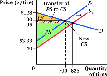
A local tire market is represented by the following equations and in the diagram below:
QD = 3,200 – 25P
QS = 15P – 800
where Q is the number of tires sold weekly and P is the price per tire. The equilibrium price is $100 per tire, and 700 tires are sold each week.
Suppose an improvement in the technology of tire production makes them cheaper to produce so that sellers are willing to sell more tires at every price. Specifically, suppose that quantity supplied rises by 200 at each price.
What is the new supply curve?
What are the new equilibrium price and quantity?
What happens to consumer and producer surplus as a result of this change?
Solution:
Quantity supplied rises by 200 units at every price, so we simply add 200 to the equation for QS:
Q2S = 15P – 800 + 200 = 15P – 600
The new equilibrium occurs where QD = Q2S:
3,200 – 25P = 15P – 600
3,800 = 40P
P = $95
We can find the equilibrium quantity by substituting the equilibrium price into either the supply or demand equation (or both):
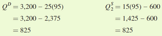
The new equilibrium quantity is 825 tires per week. Notice that because supply increased, the equilibrium price fell and the equilibrium quantity rose just as we would predict.
The easiest way to determine the changes in consumer and producer surplus is to use a graph such as the one below. To calculate all of the areas involved, we need to make sure we calculate the demand choke price and the supply choke prices before and after the increase in supply.
The demand choke price is the price at which quantity demanded is zero:
QD = 0 = 3,200 – 25P
25P = 3,200
P = $128
The demand choke price is $128.
The supply choke price is the price at which quantity supplied is zero. Because supply is shifting, we need to calculate the supply choke price for each supply curve:
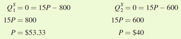
70
The initial supply choke price is $53.33 but falls to $40 when supply increases.
With the choke prices and the two equilibrium price and quantity combinations, we can draw the supply and demand diagram.
Consumer surplus: The initial consumer surplus is the area of the triangle below the demand curve but above the initial equilibrium price ($100):
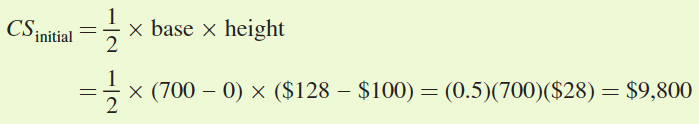
The new consumer surplus is the area of the triangle below the demand curve and above the new equilibrium price ($95):
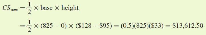
So, after the outward shift in supply, consumer surplus rises by $3,812.50.
Producer surplus: The initial producer surplus is the area of the triangle below the initial equilibrium price and above the initial supply curve (S1):
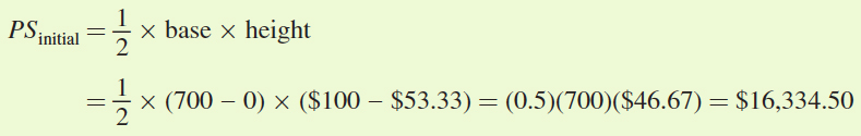
The new producer surplus is the area of the triangle below the new equilibrium price and above the new supply curve (S2):
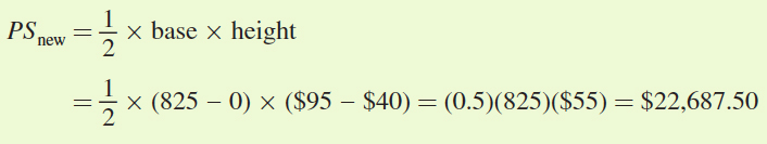
The increase in supply also led to a rise in producer surplus by $6,353.